По-русски

The “Staircase” Building

In designing the “Details” residential complex in New Moscow, Rais Baishev spiced up the now-popular Moscow theme of a “courtyard” building with an idea drawn from the surrealist drawings by Maurits Escher. He envisioned the stepped silhouettes and descending slopes as a metaphysical mega-staircase, creating a key void within the courtyard that gave the project an internal “spine”. This concept is felt both in the building’s silhouette and on its façades.

21 August 2024
Object
mainImg
The “Details” residential complex is being built in New Moscow in the village of Maryino. The Neznayka River is nearby, and the Vnukovo district is separated by the Valuyevsky forest park. Another park, Maryino, was landscaped three years ago; it’s closer to the Moscow Ring Road than Troitsk. Thus, it’s no surprise that new construction in Maryino is progressing rapidly, supplementing the cottage settlements and three-story buildings of previous years with a new scale.

I think it’s safe to say that the “Details” residential complex is the most interesting of the new projects in Maryino. At the very least, it draws inspiration from the drawings by Maurits Escher – an artist as fascinating as Giovanni Battista Piranesi, and one of the most captivating artists of the 20th century. For the architects, Maurits Escher is a treasure trove, as his works feature not only optical illusions and the transformation of mimetic figures into geometric ones but also, almost always, a plethora of staircases. It’s reminiscent of Hogwarts, and I wouldn’t be at all surprised if it was Maurits Escher who influenced the idea of the moving staircases in the magical school, just as gothic colleges and castles could have influenced the artist’s own spatial concepts.

Back to New Moscow, though! The architects illustrate their idea with Maurits Escher’s 1938 lithograph “Cycle”, where little figures run up and down a staircase, transforming into the floor pattern from which more figures emerge.

The “source of inspiration” engraving. “Details” housing complex
Copyright: © Ostozhenka Architects


This is a striking image of cyclicality. One is tempted to “ground” it somehow and interpret it as a metaphor for the infinite generation of public spaces, which aligns well with contemporary urban planning discourse – after all, these little figures in the drawings appear to be running along some kind of amphitheater.

But, of course, it’s not so much about the amphitheater, but rather, it’s about the concept of cyclicality itself. Given a large plot with demanding technical and economic parameters and requirements for sunlight exposure, the architects began to shape its volume not abstractly based on harmonious proportions – which would have been fine as well – but by rhythmically organizing their efforts around the central idea. And that’s always more interesting. Initially, a “node” appeared in the center of the site, but later it was replaced by an emptiness – an element to which Rais Baishev pays close attention. In this case, he cites Lao Tzu “Though clay is used to form a vase, in what there isn’t lies its use. Thus, by using what there is, one uses what there isn’t”.

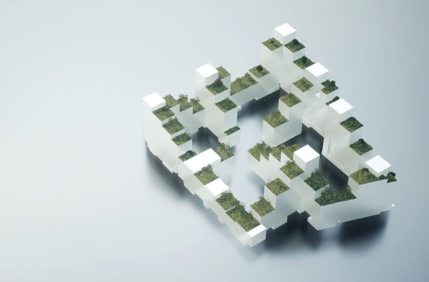
In an ideal representation on the preliminary model of form exploration – an approach that Rais Baishev considers crucial – the building indeed transforms into a series of staircases leading up and down, converging on a central square where all four courtyards meet at the corners.

Looking at the photographs of the preliminary models, one can’t help but think, “This is truly Escher”.

  • zooming
    “Details” housing complex. A model
    Copyright: © Ostozhenka Architects
  • zooming
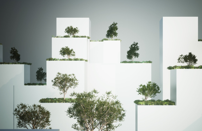
    “Details” housing complex. A model
    Copyright: © Ostozhenka Architects


Surrealism and spatial reflections rooted in probability theory, when applied to something as seemingly mundane as a residential complex, do two things: first, they shake things up, revitalizing everything; second, they create a certain magnetism, built on the simultaneous distance (what does Escher have in common with a residential complex?) and closeness of concepts: staircases are about space, and the architecture of a residential complex is also about space. This allows the authors to plant the “seed” of free creative thought within a standard task while adding an element of intrigue – so much so that the phrase “not like the others” in the brochure no longer seems like an exaggeration.

From this “seed” grows a beautiful, to the point of stunning, presentation of the idea: volumes of varying heights are illuminated by different colors and lights; there’s a tree on each terrace, and a large number of green planes. The romantic massing shows how the green surface rises from the ground with the roofs, and the volume is formed by these “columns” growing from the earth. This evokes memories of Minecraft and many other modern games where you have to hop from platform to platform, much like those little figures from 1938.


The complex indeed looks striking, sparking interest and even evoking dreams of an ideal city. The presentation of the idea feels like the next “step”, balancing between a print and a real-life project.

  • zooming
    “Details” housing complex. (Stages 2, 3)
    Copyright: © Ostozhenka Architects
  • zooming
    “Details” housing complex. (Stages 2, 3)
    Copyright: © Ostozhenka Architects


However, the idea didn’t just spring from Maurits Escher – rather, it found its way to him, discovering in his work an aesthetic and perhaps psychological support.

The project, as often happens with large residential complexes in Moscow, evolved rapidly, with numerous changes to the task made in the course of the process, demanding intense effort. “The deadlines were tight, the scope of work was large, and the brief changed more than once”, says the project leader, Rais Baishev. “That’s why we have an unusual team of about twenty participants. In my view, each participant is a co-author of this success”.

“Details” housing complex. The authors collective
Copyright: © Ostozhenka Architects


It’s not the first time I’ve heard stories about architects’ fast-paced work with many unknowns. True, this was common in Moscow before, but now it really seems to be becoming the norm. Why, for what reason? Nevertheless, we see that architects, in responding to market demands, have learned, among other things, to form “flying squads” and generally react quickly to the ever-changing rules of the game. Is this supposed to be conducive to any kind of creative work? Or maybe, on the contrary, such relentless pressure helps to mobilize all resources? The idea can indeed serve as an inner core.

However, the idea didn’t solely grow out of Maurits Escher’s metaphysical graphics. In my opinion, aside from the “master task” of interpreting the significant volume of sheer useful square footage, it stemmed from three things. First, the modern love for stepped “cutaways” – once nurtured by Moshe Safdie, later by MVRDV, but given the greatest boost by Bjarke Ingels. Now, they “march across Moscow”. Second, the terraces themselves; finally, their usefulness is recognized in Moscow. The third source lies in the fact that silhouettes of the same height – whether they are blocks or rows of towers – have become something that everyone seems to be sick and tired of.

Ostozhenka has long experimented with terraces – take, for example, the first phase of River Park (2013–2018) – and with various “cutouts” and “cutaways” in the volumes: just 10-15 years ago, these cutouts often looked like large “arches” or “inverted arches”, deep recesses at the tops of buildings. Alexander Skokan even wrote an article about “openings, voids, and holes”. In recent years, following trends, the openings have often acquired, instead of asymmetry, a certain regular step-like pattern. It seems that in “Details” we see exactly this: the search for an unobtrusive silhouette, a multi-height structure, and the alternation of elevations with pauses brought to some certain regularity. The pictures by Maurits Escher, who favored regularity alongside paradoxes – his engravings are “metaphysically” dense and stable, as if they strive to contain their own strangeness – quite resonate with such a solution. That is to say, the project incorporates the experience of deconstructing form, based on an almost 30-year tradition, but what makes this project different is the fact that the deconstruction is placed here within the framework of a modular structure.

  • zooming
    “Details” housing complex. (Stages 2, 3)
    Copyright: © Ostozhenka Architects
  • zooming
    “Details” housing complex. (Stages 2, 3)
    Copyright: © Ostozhenka Architects


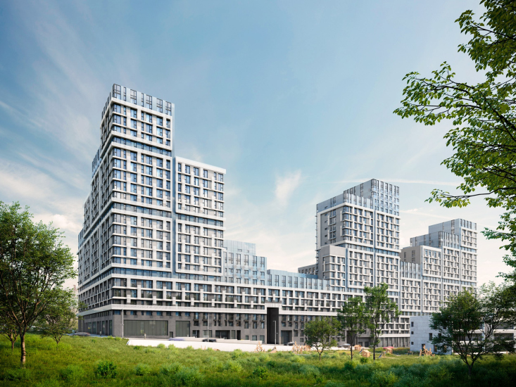
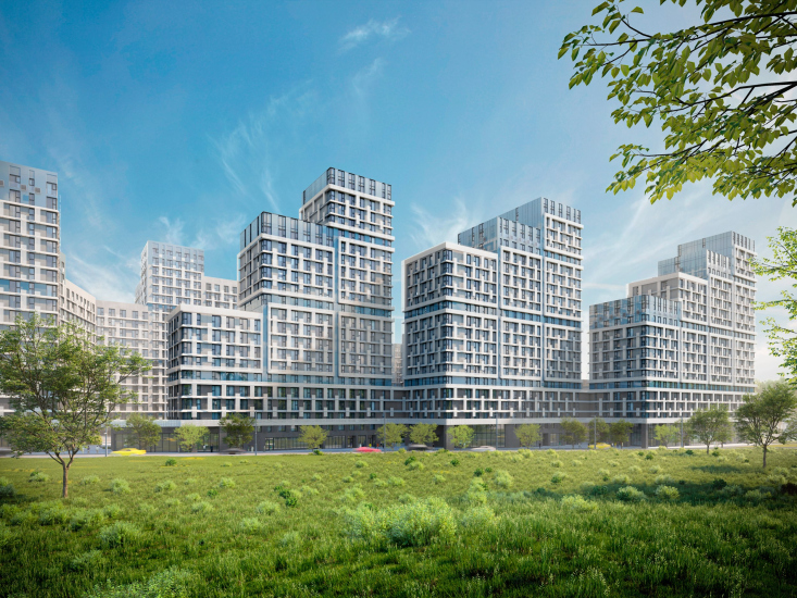
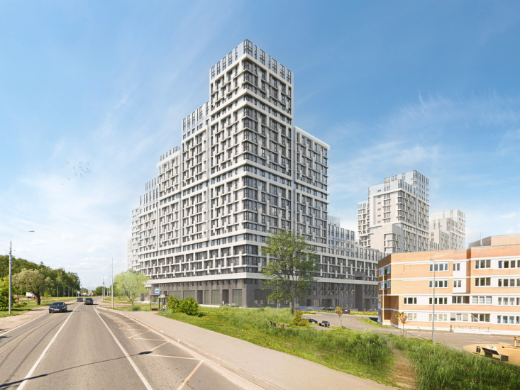
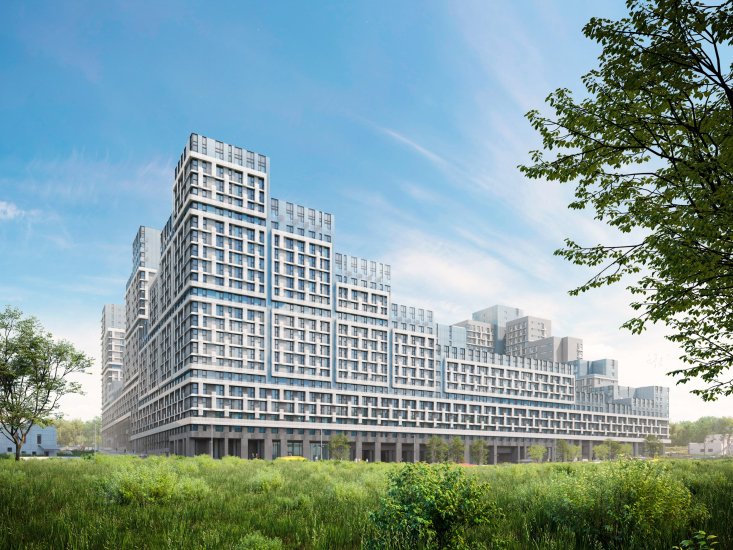
The main module of the structure is a cube with sides of 4 to 5 floors, about 15 meters tall. This module allows for the formation of a confidently stepped silhouette. And since the building is large, the module does not dictate the form rigidly; there are steps of 3 floors as well, but it still sets the overall contour. The contour of the “cubes” is also outlined on the facades – by frames, with noticeable pauses between them, forming a cross-like grid. However, this occurs only in the main part of the complex, as the lower section, up to the 7th floor, is dominated by a “base” horizontal band with one drop that echoes the terrain’s height drop of about 7 meters.

It should be noted that the façade grid is formed here by white lattice bands, concealing the air conditioning units. This, like the steps, is a fairly new trend: rhythmically organizing “boxes” on the facades is no longer customary, and the bands divert attention from the purely pragmatic things – in this case, they confidently grid the mass with supergraphics that, as a reminder, help to express the idea of mega-stairs composed of mega-cubes and outline this graphic idea at some distance from the main plane, creating shadows. Moreover, this solution helps to make the base itself (composed of glass and gray-blue polished material) look less dominating by making the façade surface look more “layered”.

“Details” housing complex. (Stages 2, 3)
Copyright: © Ostozhenka Architects


The stepped silhouette design also works well in perspective – in some views, due to the descending levels, it seems as if the street “runs into the distance” faster than it normally would, which also contributes to the shaping of space and the lighting of the building’s silhouette.

  • zooming
    “Details” housing complex. (Stages 2, 3)
    Copyright: © Ostozhenka Architects
  • zooming
    “Details” housing complex. (Stages 2, 3)
    Copyright: © Ostozhenka Architects


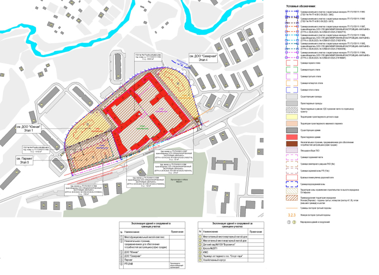
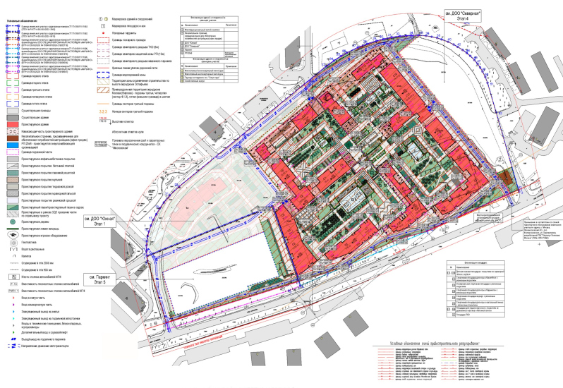
The layout of the complex follows a block format, with an external contour of approximately 200 by 200 meters, similar to the large Stalinist blocks on Kutuzovsky Prospekt. Stalinist blocks were very large, and often something was built in the middle of their courtyards, whether a school, a local administration building, or simply another partitioning structure; this was a classic approach. The approach here is similar but, in part, paradoxically the opposite of the original idea: the inner buildings do not gravitate towards the center but instead recede from the outer buildings inward, leaving the middle empty. For Rais Baishev and the architects of Ostozhenka, this emptiness holds significant meaning. Here, it even becomes a kind of “homage to emptiness”, as all the inner buildings descend towards the center with their steps. The courtyards are marked out within a modern scale, smaller than “Stalinist” courtyards but larger than what was customary during historicism, ranging from 40 to 90 meters on one side, as seen in Level Prichalny, also designed by Ostozhenka.

  • zooming
    “Details” housing complex. (Stages 2, 3). Location plan
    Copyright: © Ostozhenka Architects
  • zooming
    “Details” housing complex. (Stages 2, 3). Scheme of planning organization of the land plot, combined with the scheme of transport organization of the territory
    Copyright: © Ostozhenka Architects


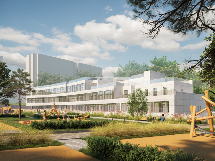
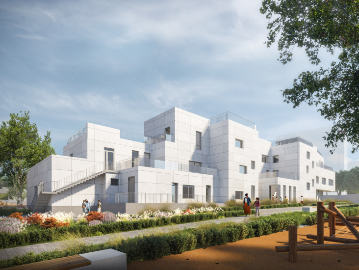
Since the plot is not square, yet the “genetic code” of the concept is essentially based on squares, the idea adapts, showing flexibility: squares stretch into rectangles, as happens with some of the steps, and where the buildings come close to the road, creating a diagonal cut in the contour, they also receive a few cuts. Behind the outer buildings are a multi-story above-ground parking garage and two kindergartens, the “northern” and “southern”. These two kindergartens are no longer orthogonal – they are stretched along a curve and contextually echo the three-story houses that make up the surroundings of the complex.

  • zooming
    Kindergarten “South” (Stage 1)
    Copyright: © Ostozhenka Architects
  • zooming
    “South” kindergarten (Stage 1)
    Copyright: © Ostozhenka Architects


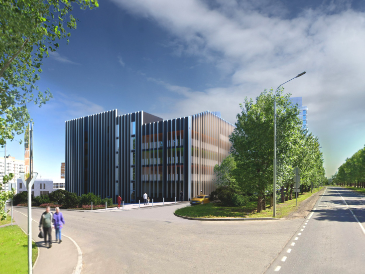
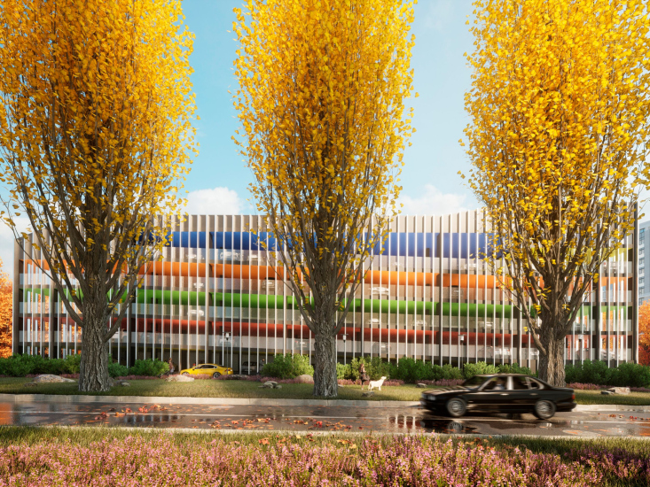
There is also a large, striped, ribbed above-ground parking area. All the “auxiliary buildings”, it must be said, are designed succinctly, without any excessive decoration.

  • zooming
    The parking garage (Stage 5)
    Copyright: © Ostozhenka Architects
  • zooming
    “Details” housing complex. (Stage 5)
    Copyright: © Ostozhenka Architects


As for the format of the residential complex, aside from the idea of linking the building to the graphics of Maurits Escher, the building offers a “hybrid” block format. It is a block, but not quite. It is multi-height, but it is not a block with towers. Finally, strictly speaking, it is not a building with terraces either – the idea of green roofs had to be abandoned at the “dream-up” stage of the concept’s development. It would have been nice to keep it... but perhaps next time.

In the end, the building “plays” with modern and accessible formats of “cubes”. It mixes a variety of elements and brings them to its own unified denominator. This kind of play doesn’t result in a fundamental breakthrough, but it definitely wins you over due to its boldness in combining available resources with internally daring ideas. These ideas, embedded in the project from the earliest stages, are reflected in the facades and felt in the silhouette. The quarter with raised volumes became established in Moscow during the 2010’s. Here, we see a subtype: a whole complex based on uniform elevations – a “staircase” building.


21 August 2024

Headlines now
The White Wing
Well, it’s not exactly white. It’s more of a beige, white-stone structure that plays with the color of limestone – smoother surfaces are lighter, while rougher ones are darker. This wing unites various elements: it absorbs and interprets the surrounding themes. It responds to everything, yet maintains a cohesive expression – a challenging task! – while also incorporating recognizable features of its own, such as the dynamic cuts at the bottom, top, and middle.
Urban Dunes
The XSA Ramps team designed and built a three-part sports hub for a park in Rostov-on-Don, welcoming people of all ages and fitness levels. The skate plaza, pump track, and playground are all meticulously crafted with details that attract a diverse range of visitors. The technical execution of the shapes and slopes transforms this space into a kind of sculptural composition.
Proportional Growth
The project for the fourth phase of the ÁLIA residential area has been announced. The buildings are situated on an elongated plot – almost a “ray” that shoots out from the center of the area towards the river. Their layout reflects both a response to Moscow’s architectural preferences over the past 15 years, shifting “from blocks to towers”, and an interpretation of the neighboring business park designed by SOM. Additionally, the best apartments here are not located at the very top but closer to the middle, forming a glowing “waistline”.
The “Staircase” Building
In designing the “Details” residential complex in New Moscow, Rais Baishev spiced up the now-popular Moscow theme of a “courtyard” building with an idea drawn from the surrealist drawings by Maurits Escher. He envisioned the stepped silhouettes and descending slopes as a metaphysical mega-staircase, creating a key void within the courtyard that gave the project an internal “spine”. This concept is felt both in the building’s silhouette and on its façades.
Projection of the Quarter
No one doubted that the building that Vladimir Plotkin designed as part of the “Garden Quarters” would be the most modernist of all. And it turned out just that way: while adhering to the common design code, the building successfully combines brick and white stone, rhythmically responding to the neighboring building designed by Ostozhenka, yet tactfully and persistently making a few statements of its own. This includes the projection of the ideal urban development composition “14–9–6”, which can be found right next door, mathematical calculations, including those for various types of terraces (and perhaps the only reminder of the Soviet past of the Kauchuk rubber factory!), and the white “cross-stitch” pattern of the façade grid.
Domus Aurea
In this issue, we examine the “Tessinsky-1” house, designed by Sergey Skuratov and completed in 2023. Located in the middle of the Serebryanicheskaya Embankment district, at the intersection of its main streets, this house assumes a sort of “nodal” role: it not only responds to everything around it and preserves many memories of the former EMA factory within itself, but it weaves all this into a newly directed pattern, reconciling bright “gold” and dark-colored brick, largely with the help of the new, modern-yet-archaic Columba brick, which, come to think about it, is the most precious element here.
The Chimney of Nikola-Lenivets
In this issue, we are examining the “Obelisk House” designed by KATARSIS and built for the Arkhstoyanie 2023 festival. However, it was only finished later on, and this is why we are examining it now. It seems to us that after the “Obelisk House” appeared in Nikola-Lenivets, a dialogue and a few inner connections appeared between the temporary structures built here. These houses no longer look like “accidental neighbors”, more of which below.
​Periscope by the Bay
The jury awarded the second place in the competition for a public and cultural center in Petropavlovsk-Kamchatsky to the companies GORA (“Mountain”) and M4. In the consortium’s proposal, the building resembles a sperm whale with a calf swimming next to it or a periscope, whose lenses capture the most spectacular views from the surrounding landscape.
From Arcs to Dolmens
While working on the competition project for Petropavlovsk-Kamchatsky, ASADOV Architects prioritized the value of the natural and urban environment, aiming to preserve the balance of the location while minimizing the resemblance of the volume that they designed to a “traditional building”. The task was challenging, and the architects created three versions, one of which having been developed after the competition, where their main proposal took third place. However, the point of interest here is not the competition result but the continuity of creative thinking.
Hide and Seek
The ID Moskovskiy house, designed by Stepan Liphart in St. Petersburg, in the courtyards near Moskovskiy Avenue beyond the Obvodny Canal and recently completed, is notable for several reasons. Firstly, it has been realized with considerable accuracy, which is particularly significant as this is the first building where the architect was responsible not only for the facades but also for the layouts, allowing for better integration between the two. On the other hand, this building is interesting as an example of the “germination” of new architecture in the city: it draws on the best examples from the neighborhood and becomes an improved and developed sum of ideas found by the architect in the surrounding context.
The Big Twelve
Yesterday, the winners of the Moscow Mayor’s Architecture Award were announced and honored. Let’s take a look at what was awarded and, in some cases, even critique this esteemed award. After all, there is always room for improvement, right?
Above the Golden Horn
The residential complex “Philosophy” designed by T+T architects in Vladivostok, is one of the new projects in the “Golubinaya Pad” area, changing its development philosophy (pun intended) from single houses to a comprehensive approach. The buildings are organized along public streets, varying in height and format, with one house even executed in gallery typology, featuring a cantilever leaning on an art object.
Nuanced Alternative
How can you rhyme a square and space? Easily! But to do so, you need to rhyme everything you can possibly think of: weave everything together, like in a tensegrity structure, and find your own optics too. The new exhibition at GES-2 does just that, offering its visitor a new perspective on the history of art spanning 150 years, infused with the hope for endless multiplicity of worlds and art histories. Read on to see how this is achieved and how the exhibition design by Evgeny Ace contributes to it.
Blinds for Ice
An ice arena has been constructed in Domodedovo based on a project by Yuri Vissarionov Architects. To prevent the long façade, a technical requirement for winter sports facilities, from appearing monotonous, the architects proposed the use of suspended structures with multidirectional slats. This design protects the ice from direct sunlight while giving the wall texture and detail.
Frozen Magma
A competition for the creation of a public and cultural center was held in Petropavlovsk-Kamchatsky. Three architectural companies made it to the final, and we consider it important to share about the work of each. Let’s start with the winner – the consortium led by Wowhaus.
Campus within a Day
In this article, we talk about what the participants of Genplan Institute of Moscow’s hackathon were doing at the MosComArchitecture booth at the “ArchMoscow” exhibition. We also discuss who won the prize and why, and what can be done with the territory of a small university on the outskirts of Moscow.
Vertical Civilization
Genpro considered the development of the vertical city concept and made it the theme of their pavilion at the “ArchMoscow” exhibition.
Marina Yegorova: “We think in terms of hectares, not square meters”
The career path of architect Marina Yegorova is quite impressive: MARHI, SPEECH, MosComArchitectura, the Genplan Institute of Moscow, and then her own architectural company. Its name Empate, which refers to the words “to draw” in Portuguese and “to empathize” in English, should not be misleading with its softness, as the firm freely works on different scales, including Integrated Territorial Development projects. We talked with Marina about various topics: urban planning experience, female leadership style, and even the love of architects for yachting.
Andrey Chuikov: “Optimum balance is achieved through economics”
The Yekaterinburg-based architectural company CNTR is in its mature stage: crystallization of principles, systematization, and standardization helped it make a qualitative leap, enhance competencies, and secure large contracts without sacrificing the aesthetic component. The head of the company, Andrey Chuikov, told us about building a business model and the bonuses that additional education in financial management provides for an architect.
The Fulcrum
Ostozhenka Architects have designed two astonishing towers practically on the edge of a slope above the Oka River in Nizhny Novgorod. These towers stand on 10-meter-tall weathered steel “legs”, with each floor offering panoramic views of the river and the city; all public spaces, including corridors, receive plenty of natural light. Here, we see a multitude of solutions that are unconventional for the residential routine of our day and age. Meanwhile, although these towers hark back to the typological explorations of the seventies, they are completely reinvented in a contemporary key. We admire Veren Group as the client – this is exactly how a “unique product” should be made – and we tell you exactly how our towers are arranged.
Crystal is Watching You
Right now, Museum Night has kicked off at the Museum of Architecture, featuring a fresh new addition – the “Crystal of Perception”, an installation by Sergey Kuznetsov, Ivan Grekov, and the KROST company, set up in the courtyard. It shimmers with light, it sings, it reacts to the approach of people, and who knows what else it can do.
The Secret Briton
The house is called “Little France”. Its composition follows the classical St. Petersburg style, with a palace-like courtyard. The decor is on the brink of Egyptian lotuses, neo-Greek acroteria, and classic 1930s “gears”; the recessed piers are Gothic, while the silhouette of the central part of the house is British. It’s quite interesting to examine all these details, attempting to understand which architectural direction they belong to. At the same time, however, the house fits like a glove in the context of the 20th line of St. Petersburg’s Vasilievsky Island; its elongated wings hold up the façade quite well.
The Wrap-Up
The competition project proposed by Treivas for the first 2021 competition for the Russian pavilion at EXPO 2025 concludes our series of publications on pavilion projects that will not be implemented. This particular proposal stands out for its detailed explanations and the idea of ecological responsibility: both the facades and the exhibition inside were intended to utilize recycled materials.
Birds and Streams
For the competition to design the Omsk airport, DNK ag formed a consortium, inviting VOX architects and Sila Sveta. Their project focuses on intersections, journeys, and flights – both of people and birds – as Omsk is known as a “transfer point” for bird migrations. The educational component is also carefully considered, and the building itself is filled with light, which seems to deconstruct the copper circle of the central entrance portal, spreading it into fantastic hyper-spatial “slices”.
Faraday Grid
The project of the Omsk airport by ASADOV Architects is another concept among the 14 finalists of a recent competition. It is called “The Bridge” and is inspired by both the West Siberian Exhibition of 1911 and the Trans-Siberian Railway bridge over the Irtysh River, built in 1896. On one hand, it carries a steampunk vibe, while on the other, there’s almost a sense of nostalgia for the heyday of 1913. However, the concept offers two variants, the second one devoid of nostalgia but featuring a parabola.
Midway upon the Journey of Our Life
Recently, Tatlin Publishing House released a book entitled “Architect Sergey Oreshkin. Selected Projects”. This book is not just a traditional book of the architectural company’s achievements, but rather a monograph of a more personal nature. The book includes 43 buildings as well as a section with architectural drawings. In this article, we reflect on the book as a way to take stock of an architect’s accomplishments.
Inverted Fortress
This year, there has been no shortage of intriguing architectural ideas around the Omsk airport. The project developed by the architectural company KPLN appeals to Omsk’s history as a wooden fortress that it was back in the day, but transforms the concept of a fortress beyond recognition: it “shaves off” the conical ends of “wooden logs”, then enlarges them, and then flips them over. The result is a hypostyle – a forest of conical columns on point supports, with skylights on top.
Transformation of Annenkirche
For Annenkirche (St. Anna Lutheran Church in St. Petersburg), Sergey Kuznetsov and the Kamen bureau have prepared a project that relies on the principles of the Venice Charter: the building is not restored to a specific date, historical layers are preserved, and modern elements do not mimic the authentic ones. Let’s delve into the details of these solutions.
The Paradox of the Temporary
The concept of the Russian pavilion for EXPO 2025 in Osaka, proposed by the Wowhaus architects, is the last of the six projects we gathered from the 2022 competition. It is again worth noting that the results of this competition were not finalized due to the cancellation of Russia’s participation in World Expo 2025. It should be mentioned that Wowhaus created three versions for this competition, but only one is being presented, and it can’t be said that this version is thoroughly developed – rather, it is done in the spirit of a “student assignment”. Nevertheless, the project is interesting in its paradoxical nature: the architects emphasized the temporary character of the pavilion, and in its bubble-like forms sought to reflect the paradoxes of space and time.
The Forum of Time
The competition project for the Russian Pavilion at EXPO 2025 in Osaka designed by Aleksey Orlov and Arena Project Institute consists of cones and conical funnels connected into a non-trivial composition, where one can feel the hand of architects who have worked extensively with stadiums and other sports facilities. It’s very interesting to delve into its logic, structurally built on the theme of clocks, hourglasses and even sundials. Additionally, the architects have turned the exhibition pavilion into a series of interconnected amphitheaters, which is also highly relevant for world exhibitions. We are reminding you that the competition results were never announced.