По-русски

​Towers Leaning Towards the Sun

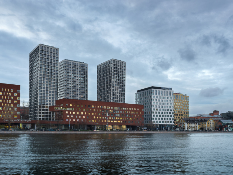
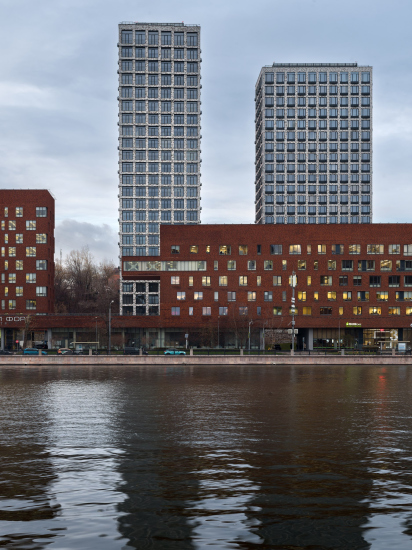
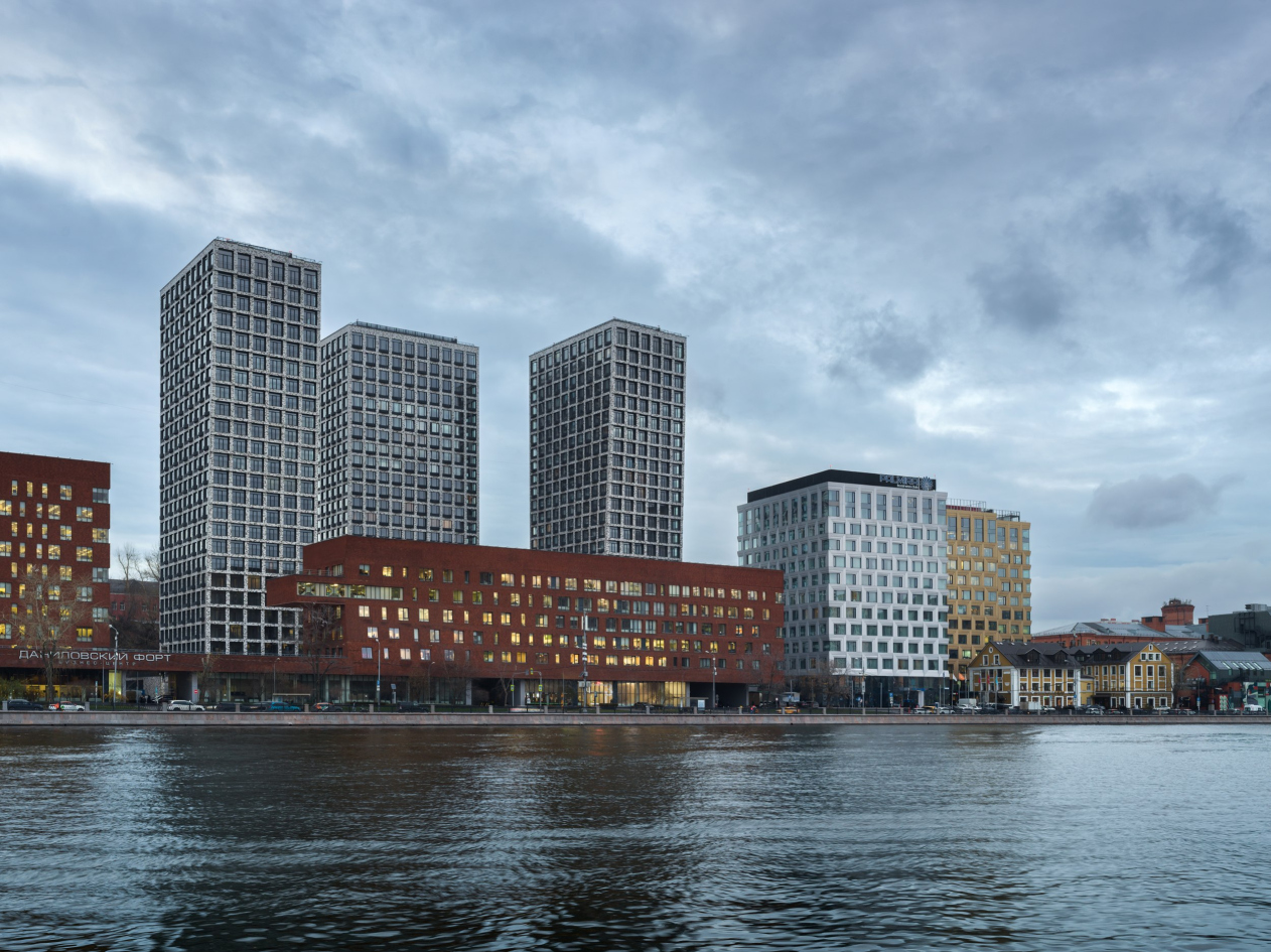
The three towers of the residential complex “Novodanilovskaya 8” are new and the tallest neighbors of the Danilovsky Manufactory, “Fort”, and “Plaza”, complementing a whole cluster of modern buildings designed by renowned masters. At the same time, the towers are unique for this setting – they are residential, they are the tallest ones here, and they are located on a challenging site. In this article, we explore how architects Andrey Romanov and Ekaterina Kuznetsova tackled this far-from-trivial task.

10 January 2024
Object
mainImg
The Moskva River is a broad and lengthy artery, and the initial buildings standing along its banks also tended to have an elongated shape, from factories to the Central House of Artists, the Kremlin, the skyscraper on Kotelnicheskaya, and the Moscow City being the few exceptions that slightly challenged the trend of elongated riverside structures. However, after the big 2014 competition, a more systematic approach to developing the riverbanks emerged – the height restrictions were elevated, new towers appeared, and it is likely that in the future the towers will become even more numerous here.

The history of the former Danilovsky Manufactory territory and the areas around it is an example of the development of this trend; buildings are acquiring greater height and vertical proportions. Initially, there was “Danilovsky Fort” business center, followed by the reconstruction of the manufactory itself into a cluster of creative industry companies, with restaurants and design bureaus. Then, between them, yet another office building, “Danilov Plaza” emerged, 12 floors high. Still a bit later, on the other side of the “Fort”, another office building, the 18-story DM Tower, appeared (a detailed overview of the area can be found here). Thus, we see that the fragment of Novodanilovskaya Embankment, the one opposite ZIL automotive plant, now ZILArt, is rapidly developing, shifting from a horizontal direction to a vertical one. A veritable “host” of new buildings has grown here, filling the entire area quite densely.

Residential complex “Novodanilovskaya 8”
Copyright: Photograph © Dmitry Chebanenko / provided by ADM architects


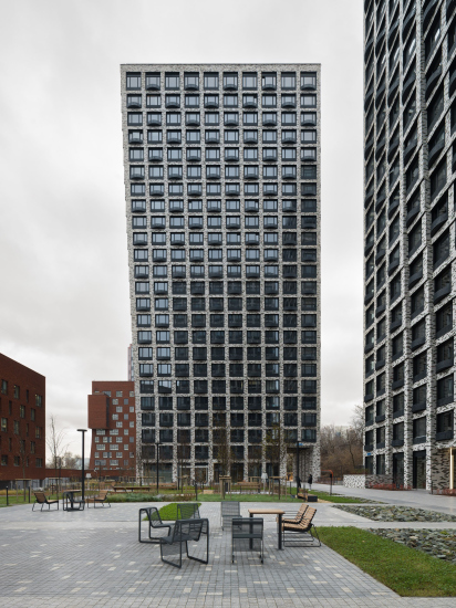
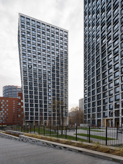
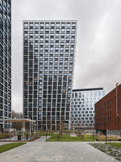
The residential complex “Novodanilovskaya 8” is the first large residential complex in this area, standing amidst office centers. At the same time, it is the tallest, consisting of three towers with a height of 100 meters placed on a podium. It is separated from the riverside boulevard by “Danilovsky Fort”, and to the west, it faces a slope approximately 17 meters high from the houses along the Varshavskoe Highway; essentially, the site is squeezed between the slope and the office complex. The towers peek out from behind the “fort”, marking, after 15 years, a new scale of development in this area; in a way, they resemble the antennae of a giant colorful snail from some retro seventies cartoon. The “Fort” and the residential complex are entirely different, but similarities still can be found. For example, in both cases, the facades facing the river have a bent shape, albeit in different ways – perhaps because many years ago, Andrey Romanov and Ekaterina Kuznetsova worked on “Danilovsky Fort” building when the two architects were still a part of Sergey Skuratov’s team?

Additionally, according to the concept of Moscow’s chief architect Sergey Kuznetsov, the residential complex “Novodanilovskaya 8” and “Danilovsky Fort” are now connected by a pedestrian link. From the side of the Danilovsky Manufactory, one can enter via a staircase to the public square on the roof of the northern part of the podium, then bypass the towers on the left, descend the stepped ramp, and exit onto the embankment through the fort’s arch.

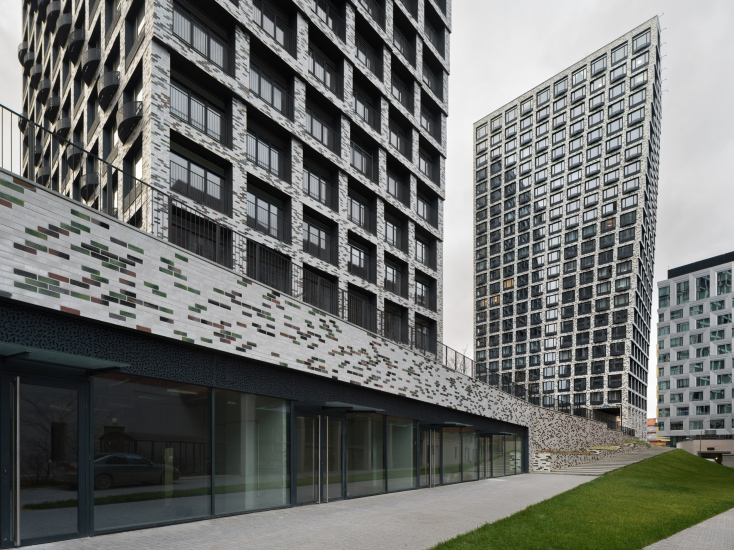
On the right side, there are shop windows located in the outer contour of the podium, the remaining part of which is designated for parking. When the rental spaces are occupied, the passage is expected to transform into a full-fledged pedestrian city street, an extension of the Manufactory’s public life.

  • zooming
    Residential complex “Novodanilovskaya 8”
    Copyright: Photograph © Dmitry Chebanenko / provided by ADM architects
  • zooming
    Residential complex “Novodanilovskaya 8”
    Copyright: Photograph © Dmitry Chebanenko / provided by ADM architects


On the right corner before the entrance to the square, there is an art object – a barrel inherited from the industrial production that was once located here before the construction of both the fort and the residential complex. Its preservation as a “memory of the place” was the subject of a separate agreement when the territory was purchased by SAMOLET Group.

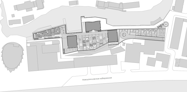
The outline of the plot, mirrored by the podium, is not just elongated but also jagged, zigzag-shaped. The three towers are positioned roughly at its geometric center and are almost symmetrical. It could even be said that the plan is laid out like a “manor”, as was customary in Moscow estates: a tower with a longitudinal plan in place of the “palace” and transverse wings in place of the outbuildings. The similarity at the plan level is complemented by the smooth recessions on the lower floors of the central tower, giving the plan the shape of an hourglass.

The masterplan. The apartment complex “Novodanilovskaya 8”
Copyright: © ADM


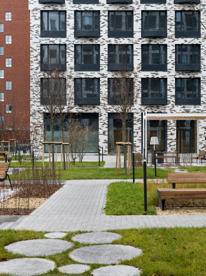
There are three courtyards: the aforementioned public square, with spaces for shops and cafes on the ground floor of the tower facing it; the central courtyard between the buildings – a kind of courtyard for the relaxation of the residents.

  • zooming
    Residential complex “Novodanilovskaya 8”
    Copyright: Photograph © Dmitry Chebanenko / provided by ADM architects
  • zooming
    Residential complex “Novodanilovskaya 8”
    Copyright: Photograph © Dmitry Chebanenko / provided by ADM architects


And, finally, the southern courtyard, situated in a narrow trapezoidal “appendix” is designed for children and houses various playgrounds. It is sheltered by the slope, the business center, and partly by the southern tower, but it extends meridian-wise and shifts to the west, so there is plenty of sunlight in it.

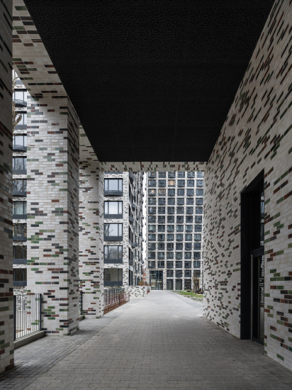
A thoroughfare between the courtyards is created through two mirror-symmetrical pylons at the ends of the side towers. One can enter from the north, from the public square on the roof of the podium, into the central courtyard through one pylon, then cross it diagonally to the right and, through another identical pylon, reach the distant “children’s” courtyard. The movement gains a distinctive feature, and the courtyard space becomes diverse and multi-compositional.

  • zooming
    Residential complex “Novodanilovskaya 8”
    Copyright: Photograph © Dmitry Chebanenko / provided by ADM architects
  • zooming
    Residential complex “Novodanilovskaya 8”
    Copyright: Photograph © Dmitry Chebanenko / provided by ADM architects


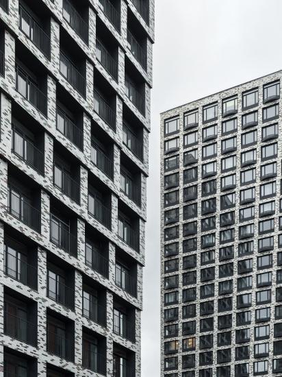
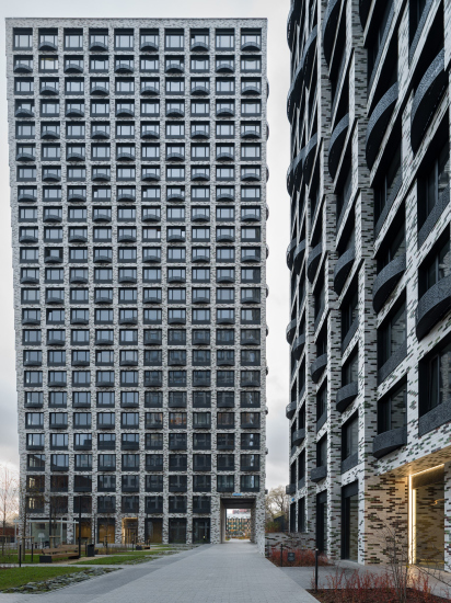
In the architecture of the towers, ADM architects employ a favorite technique: the plasticity is achieved through the gradual but consistent shifting of floors. One of the early examples of its use by the authors was the Discovery Residential Complex in 2015. Now, Romanov and Kuznetsova continue to develop the theme, but this time in glass, as seen in High Life on Letnikovskaya or the Famous Tower in the second phase of the Fili Towers Residential Complex. On “Novodanilovskaya 8”, the floor grid is marked by a light-colored of piers and structural floors of equal width. This allows the smooth expansion, growth, and overhangs to be clearly seen, even accentuated, especially when viewed in profile. This is how a tree grows, leaning towards the sun.

  • zooming
    Residential complex “Novodanilovskaya 8”
    Copyright: Photograph © Dmitry Chebanenko / provided by ADM architects
  • zooming
    Residential complex “Novodanilovskaya 8”
    Copyright: Photograph © Dmitry Chebanenko / provided by ADM architects


The technique employed helps to make the towers, fundamentally simple and honest, look slightly more sculptural.

For high-rise buildings – and this is the typology within which we are now working a lot, as it is popular in modern Moscow – silhouette is very important. In essence, the architect’s task is to work with volume, to “mold” the form, taking into account angles and views, first of all from afar, but also from near points. That is why we like the technique of cell displacement very much; it is quite accessible from the point of view of construction and at the same time allows us to form accents and revitalize the plastic.


The paradoxical effect of this upward expansion challenges our habitual perception of towers traditionally narrowing into a pyramid or spire. Here, they unfold, akin to a tree or a flower; there’s a defiance of gravity as the buildings grow in a way that seems contrary to natural expectations.

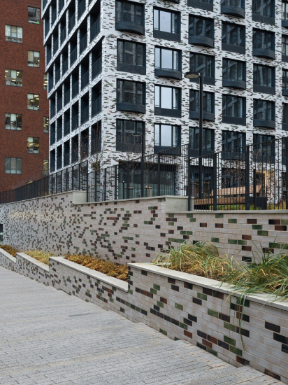
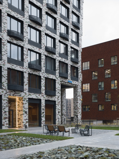
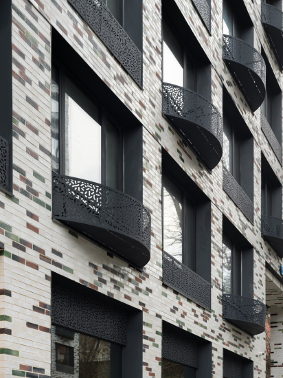
The smooth expansion is complemented by texture: the walls are clad in glazed tiles, with white as the main color and additional shades of green and reddish, evoking a Modernist feel. The white background serves to distinguish the towers from the prevailing terracotta-red tone in the area, including the facades of the Danilovsky Manufactory and DM Towers. Meanwhile, the reddish and green accents respond to the surroundings. The architects share that they carefully selected and rejected options for shades, going through five or seven iterations.

  • zooming
    Residential complex “Novodanilovskaya 8”
    Copyright: Photograph © Dmitry Chebanenko / provided by ADM architects
  • zooming
    Residential complex “Novodanilovskaya 8”
    Copyright: Photograph © Dmitry Chebanenko / provided by ADM architects


Another detail is the black openwork boxes for air conditioners. Curved and straight shapes alternate in a checkerboard pattern, adding relief and rhythm. The simple pattern of perforated metal rhymes with the inclusions of colored tiles.

  • zooming
    Residential complex “Novodanilovskaya 8”
    Copyright: Photograph © Dmitry Chebanenko / provided by ADM architects
  • zooming
    Residential complex “Novodanilovskaya 8”
    Copyright: Photograph © Dmitry Chebanenko / provided by ADM architects


Undoubtedly, the three towers on the podium mark a new stage in the development of Moscow’s urban space. Over the years, they have practically become a symbol of our time, or at least one of the popular formats for new Moscow housing. They are grand and often emerge in confined conditions, in tight surroundings – very modern, recent, and designed by renowned architects. It was not easy to fit these towers into such an environment. Nevertheless, they have found their place: tall, grid-like, symmetrical, gently leaning toward the river – a new urban growth.

10 January 2024

Headlines now
The Golden Crown
The concept for a dental clinic in Yekaterinburg, developed by CNTR Studio, revolves around the idea of a “mouth full of gold”: pristine white porcelain stoneware walls are complemented by matte brass details. To avoid an overly literal interpretation, the architects focused on the building’s proportions, skillfully navigating between sunlight requirements and fire safety regulations.
Flexibility and Integration
Not long ago, we covered the project for the fourth phase of the ÁLIA residential complex, designed by APEX. Now, we’ve been shown different fence concepts they developed to enclose the complex’s private courtyards, incorporating a variety of public functions. We believe that the sheer fact that the complex’s architects were involved in such a detail as fencing speaks volumes.
A Step Forward
The HIDE residential complex represents a major milestone for ADM architects and their leaders Andrey Romanov and Ekaterina Kuznetsova in their quest for a fresh high-rise aesthetic – one that is flexible and layered, capable of bringing vibrancy to mass and silhouette while shaping form. Over recent years, this approach has become ADM’s “signature style”, with the golden HIDE tower playing a pivotal role in its evolution. Here, we delve into the project’s story, explore the details of the complex’s design, and uncover its core essence.
Gold in the Sands
A new office for a transcontinental company specializing in resource extraction and processing has opened in Dubai. Designed by T+T Architects, masters of creating spaces that are contemporary, diverse, flexible, and original, this project exemplifies their expertise. On the executive floor, a massive brass-clad partition dominates, while layered textures of compressed earth create a contextually resonant backdrop.
Layers and Levels of Flight
This project goes way back – Reserve Union won this architectural competition at the end of 2011, and the building was completed in 2018, so it’s practically “archival”. However, despite being relatively unknown, the building can hardly be considered “dated” and remains a prime example of architectural expression, particularly in the headquarters genre. And it’s especially fitting for an aviation company office. In some ways, it resembles the Aeroflot headquarters at Sheremetyevo but with its own unique identity, following the signature style of Vladimir Plotkin. In this article, we take an in-depth look at the United Aircraft Corporation (UAC) headquarters in the Moscow agglomeration town of Zhukovsky, supplemented by recent photographs from Alexey Naroditsky – a shoot that became only recently possible due to the fact that improvements were finally made in the surrounding area.
Light and Shadow
In this article, we delve into the architectural design of the “Chaika” house by DNK ag architects, which was recently completed in 2023 as part of the collection of signature designs at ZILArt. As is well-known, all the buildings in this complex follow a design code, yet each one is distinct. This particular building stands out not only for its whiteness and minimalism but also for the refined use of a limited number of techniques that, together, create what can confidently be called synergy.
Casus Novae
A master plan was developed for a large residential area with a name of “DNS City”, but now that its implementation began, the plan has been arbitrarily reformatted and replaced with something that, while similar on the surface, is actually quite different. This is not the first time such a thing happens, but it’s always frustrating. With permission from the author, we are sharing Maria Elkina’s post.
Treasure Hunting
The GAFA bureau, in collaboration with Tegola and Arkhitail, organized an expedition to the island of Kilpola in Karelia as part of Moskomarkhitektura’s “Open City” festival. There, amidst moss and rocks, the students sought answers to questions like: what is the sacred, where does it dwell, and what sustains it? Assisting the participants in this quest were landscape engineer Evgeny Levin, artist Nicholas Roerich, a moose, and the lack of cellular connection. Here’s how the story unfolded.
Depths of the Earth, Streams of Water
In the Malaya Okhta district, the Akzent building, designed by Stepan Liphart, was constructed. It follows a classic tripartite structure, yet it’s what you might call “hand-drawn”: each façade is unique in its form and details, some of which aren’t immediately noticeable. In this article, we explore the context and, together with the architect, delve into how the form was developed.
Fir Tree Dynamics
The “Airports of Region” holding is planning to build an airport in Karachay-Cherkessia, aiming to make the Arkhyz and Dombay resorts more accessible to travelers. The project that won in an invitation-only competition, submitted by Sergey Nikeshkin’s KPLN, blends natural imagery inspired by the shape of a conifer seed, open-air waiting spaces, majestic large trees, and a green roof elevated on needle-like columns. The result is both nature-inspired and WOW.
​A Brick Shell
In the process of designing a clubhouse situated among pine trees in a prestigious suburban area near Moscow, the architectural firm “A.Len” did the façade design part. The combination of different types of brick and masonry correlates with the volumetric and plastique solutions, further enhanced by the inclusion of wood-painted fragments and metal “glazing”.
Word Forms
ATRIUM architects love ambitious challenges, and for the firm’s thirtieth anniversary, they boldly play a game of words with an exhibition that dives deep into a self-created vocabulary. They immerse their projects – especially art installations – into this glossary, as if plunging into a current of their own. You feel as if you’re flowing through the veins of pure art, immersed in a universe of vertical cities, educational spaces – of which the architects are true masters – and the cultural codes of various locations. But what truly captivates is the bold statement that Vera Butko and Anton Nadtochy make, both through their work and this exhibition: architecture, above all, is art – the art of working with form and space.
Flexibility and Acuteness of Modernity
Luxurious, fluid, large “kokoshniks” and spiral barrel columns, as if made from colorful chewing gum: there seem to be no other mansion like this in Moscow, designed in the “Neo-Russian-Modern” style. And the “Teremok” on Malaya Kaluzhskaya, previously somewhat obscure, has “come alive with new colors” and gained visibility after its restoration for the office of the “architectural ecosystem” as the architects love to call themselves. It’s evident that Julius Borisov and the architects at UNK put their hearts into finding this new office and bringing it up to date. Let’s delve into the paradoxes of this mansion’s history and its plasticity. Spoiler: two versions of modernity meet here, both balancing on the razor’s edge of “what’s current”.
Yuri Vissarionov: “A modular house does not belong to the land”
It belongs to space, or to the air... It turns out that 3D printing is more effective when combined with a modular approach: the house is built in a workshop and then adapted to the site, including on uneven terrain. Yuri Vissarionov shares his latest experience in designing tourist complexes, both in central Russia and in the south. These include houseboats, homes printed from lightweight concrete using a 3D printer, and, of course, frame houses.
​Moscow’s First
“The quality of education largely depends on the quality of the educational environment”. This principle of the last decade has been realized by Sergey Skuratov in the project for the First Moscow Gymnasium on Rostovskaya Embankment in the Khamovniki district. The building seamlessly integrates into the complex urban landscape, responding both to the pedestrian flow of the city and the quiet alleyways. It skillfully takes advantage of the height differences and aligns with modern trends in educational space design. Let’s take a closer look.
Looking at the Water
The site of Villa Sonata stretches from the road to the water’s edge, offering its own shoreline, pier, and a picturesque river panorama. To reveal these sweeping views, Roman Leonidov “cut” the façade diagonally parallel to the river, thus getting two main axes for the house and, consequently, “two heads”. The internal core – two double-height spaces, a living room and a conservatory, with a “bridge” above them – makes the house both “transparent” and filled with light.
The White Wing
Well, it’s not exactly white. It’s more of a beige, white-stone structure that plays with the color of limestone – smoother surfaces are lighter, while rougher ones are darker. This wing unites various elements: it absorbs and interprets the surrounding themes. It responds to everything, yet maintains a cohesive expression – a challenging task! – while also incorporating recognizable features of its own, such as the dynamic cuts at the bottom, top, and middle.
Urban Dunes
The XSA Ramps team designed and built a three-part sports hub for a park in Rostov-on-Don, welcoming people of all ages and fitness levels. The skate plaza, pump track, and playground are all meticulously crafted with details that attract a diverse range of visitors. The technical execution of the shapes and slopes transforms this space into a kind of sculptural composition.
Proportional Growth
The project for the fourth phase of the ÁLIA residential area has been announced. The buildings are situated on an elongated plot – almost a “ray” that shoots out from the center of the area towards the river. Their layout reflects both a response to Moscow’s architectural preferences over the past 15 years, shifting “from blocks to towers”, and an interpretation of the neighboring business park designed by SOM. Additionally, the best apartments here are not located at the very top but closer to the middle, forming a glowing “waistline”.
The “Staircase” Building
In designing the “Details” residential complex in New Moscow, Rais Baishev spiced up the now-popular Moscow theme of a “courtyard” building with an idea drawn from the surrealist drawings by Maurits Escher. He envisioned the stepped silhouettes and descending slopes as a metaphysical mega-staircase, creating a key void within the courtyard that gave the project an internal “spine”. This concept is felt both in the building’s silhouette and on its façades.
Projection of the Quarter
No one doubted that the building that Vladimir Plotkin designed as part of the “Garden Quarters” would be the most modernist of all. And it turned out just that way: while adhering to the common design code, the building successfully combines brick and white stone, rhythmically responding to the neighboring building designed by Ostozhenka, yet tactfully and persistently making a few statements of its own. This includes the projection of the ideal urban development composition “14–9–6”, which can be found right next door, mathematical calculations, including those for various types of terraces (and perhaps the only reminder of the Soviet past of the Kauchuk rubber factory!), and the white “cross-stitch” pattern of the façade grid.
Domus Aurea
In this issue, we examine the “Tessinsky-1” house, designed by Sergey Skuratov and completed in 2023. Located in the middle of the Serebryanicheskaya Embankment district, at the intersection of its main streets, this house assumes a sort of “nodal” role: it not only responds to everything around it and preserves many memories of the former EMA factory within itself, but it weaves all this into a newly directed pattern, reconciling bright “gold” and dark-colored brick, largely with the help of the new, modern-yet-archaic Columba brick, which, come to think about it, is the most precious element here.
The Chimney of Nikola-Lenivets
In this issue, we are examining the “Obelisk House” designed by KATARSIS and built for the Arkhstoyanie 2023 festival. However, it was only finished later on, and this is why we are examining it now. It seems to us that after the “Obelisk House” appeared in Nikola-Lenivets, a dialogue and a few inner connections appeared between the temporary structures built here. These houses no longer look like “accidental neighbors”, more of which below.
​Periscope by the Bay
The jury awarded the second place in the competition for a public and cultural center in Petropavlovsk-Kamchatsky to the companies GORA (“Mountain”) and M4. In the consortium’s proposal, the building resembles a sperm whale with a calf swimming next to it or a periscope, whose lenses capture the most spectacular views from the surrounding landscape.
From Arcs to Dolmens
While working on the competition project for Petropavlovsk-Kamchatsky, ASADOV Architects prioritized the value of the natural and urban environment, aiming to preserve the balance of the location while minimizing the resemblance of the volume that they designed to a “traditional building”. The task was challenging, and the architects created three versions, one of which having been developed after the competition, where their main proposal took third place. However, the point of interest here is not the competition result but the continuity of creative thinking.
Hide and Seek
The ID Moskovskiy house, designed by Stepan Liphart in St. Petersburg, in the courtyards near Moskovskiy Avenue beyond the Obvodny Canal and recently completed, is notable for several reasons. Firstly, it has been realized with considerable accuracy, which is particularly significant as this is the first building where the architect was responsible not only for the facades but also for the layouts, allowing for better integration between the two. On the other hand, this building is interesting as an example of the “germination” of new architecture in the city: it draws on the best examples from the neighborhood and becomes an improved and developed sum of ideas found by the architect in the surrounding context.
The Big Twelve
Yesterday, the winners of the Moscow Mayor’s Architecture Award were announced and honored. Let’s take a look at what was awarded and, in some cases, even critique this esteemed award. After all, there is always room for improvement, right?
Above the Golden Horn
The residential complex “Philosophy” designed by T+T architects in Vladivostok, is one of the new projects in the “Golubinaya Pad” area, changing its development philosophy (pun intended) from single houses to a comprehensive approach. The buildings are organized along public streets, varying in height and format, with one house even executed in gallery typology, featuring a cantilever leaning on an art object.
Nuanced Alternative
How can you rhyme a square and space? Easily! But to do so, you need to rhyme everything you can possibly think of: weave everything together, like in a tensegrity structure, and find your own optics too. The new exhibition at GES-2 does just that, offering its visitor a new perspective on the history of art spanning 150 years, infused with the hope for endless multiplicity of worlds and art histories. Read on to see how this is achieved and how the exhibition design by Evgeny Ace contributes to it.
Blinds for Ice
An ice arena has been constructed in Domodedovo based on a project by Yuri Vissarionov Architects. To prevent the long façade, a technical requirement for winter sports facilities, from appearing monotonous, the architects proposed the use of suspended structures with multidirectional slats. This design protects the ice from direct sunlight while giving the wall texture and detail.