По-русски

Invited to the Ice Are…

Seven ice arenas with a capacity from 500 to 14,000 spectators and with a geography spreading from Yuzhno-Sakhalinsk to Tashkent – all designed by ARENA Project Institute. In this article, we show how a complex function is combined with an expressive architectural image.

09 June 2023
Object
mainImg
In Russia, sports are a “normal way of life”, and hockey and figure skating are hardly any less popular than soccer is. ARENA’s portfolio includes more than ten ice arenas and indoor skating rinks; we selected seven most flashy ones, in which designing an already sophisticated project was made even more difficult by having to solve some location-specific task. In Sochi, for example, the architects had to calculate the “post-Olympics” use of the complex; in Yuzhno-Sakhalinsk, they had to inscribe the project into the already existing downtown scenery, and in Nizhny Novgorod they had to augment the architectural ensemble of the Spit of Nizhny Novgorod, at the same time preserving the dominant role of the cathedral.

An ice arena is a complex object that has to meet a multitude of requirements that are posed by federations of various sports, television that broadcasts live, as well by the regular fire safety agencies and other institutions. On top of it all, there is a specific task of ensuring high-quality ice in any season, which adds to the project a cooling plate with refrigerators, a whole complex of ventilation measures, units for water treatment and premises for ice filling machines. 

Since ice arenas are designed for practice sessions and competitions in hockey, sledge hockey, short track, figure skating, and curling, you need to include team locker rooms, rooms for drying tracksuits and sharpening skates, doping control facilities, rooms for the judging panels, as well as press and support teams. You also need to provide the spectators with sound and lighting systems that will ensure excellent performance regardless of the sector the ticket was bought for.

(No, we’re not finished yet!) Further on, such a grand-scale building cannot be single-functional – it must become a public center that includes sports clubs for children, fitness centers, cafes, exhibition spaces, and even offices. This makes the logistics component even more complicated because you need to separate not just the fan sectors, but also the athletes, spectators, press, service personnel, and, ultimately, boys and girls. Not the least issue is the profitability of a sports facility, which is often ensured by its ability to quickly transform into a concert venue.

We suggest checking out how the architects managed to link all these points in one object, while giving it a memorable look.

Designing large sports facilities is a traditional specialization of the Arena Design Institute, which dates back to Mosproject-4, from which we are descendants. The selection presented today reflects an individual approach to the design of such facilities, because, as a rule, they become the “visiting card” of the region. Also, arranged in chronological order, the constructions and current projects clearly show the trend of the last decades of transformation of ice arenas from exclusively professional mono-objects to publicly accessible multifunctional complexes.

Megasport Ice Palace

Architect
Studio
Mosproekt-4
Author collective
architects: Bokov A., Bush D., Chuklov S., Valuiskih V., Romanova L., Gak O., Burchuladze Z., Zolotova A., Timohov A.; architect-technologist: Shabaidash A.; engineers: Livshin M., Kelman M., Eremeev P., Bekmuhamedov E., Starikov O., Naumocheva A., Subbotina E., Starikova N.
Where
Russia, Moscow
Date
2004 — / — 2006
Function
Sport / Sports complex
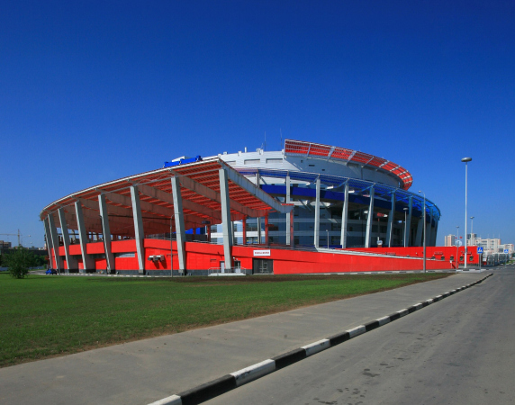
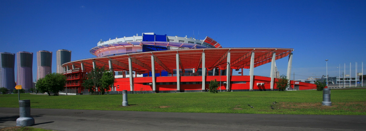
The arena has a capacity for 14,000 spectators; it was built for the World Hockey Championship 2006, when the territory around the Khodynskoe Field started taking the mottled and pretty sci-fi look the way we know it today. Even today, “Megasport” successfully holds its own against a whole galaxy of high-profile projects: towers, shopping malls, grand-scale housing complexes, and cathedrals. The arena is shaped somewhat like a spinning propeller – as Grigory Revzin notes, this is homage to the former airfield, upon which this ice arena has been built. In the center of the composition, there is a white cylindrical volume with a diameter of 120 meters and a height of almost 50 meters, with a purposefully sagging membrane of the roof. The cylinder belts the spirals of the ramps with awnings: the red ramp leads to the spectator seats of the red sector; the blue one predictably to the blue. As you go higher up, the width of the ramp shrinks from 30 meters to five, making the flow of spectators thinner. Thanks to the heating system, ice does not form on the ramps in the wintertime. The arena hosts more than 100 events a year: both sports ones, including boxing matches and gymnastics competitions, and concerts. Also, a few movie scenes were shot inside the arena.
  • zooming
    1 / 7
  • zooming
    2 / 7
  • zooming
    3 / 7
  • zooming
    4 / 7
  • zooming
    5 / 7
  • zooming
    6 / 7
  • zooming
    7 / 7

“Iceberg” Palace of Winter Sports

Studio
Mosproekt-4
Andrey Bokov Studio
Where
Russia, Adler
Date
2009 — / — 2013
Function
Sport / Sports complex
The arena’s capacity is 12,000 spectators; it was built for the Olympics 2014. This is Sochi’s only indoor skating rink that allows you to conduct practice sessions, mass skating events, and figure skating / short track competitions all year round. Ice is another aggregate state of water, so in a southern city it seemed appropriate to interpret a wave on the facade, referring to the proximity of the Black Sea and echoing the silhouettes of the mountains. In the lower part of the building, the volumetric facade is raised, revealing the stained glass windows of the foyer and main entrances. The cladding uses transparent and colored glass of several shades of blue, which overlap each other like tiles, creating visions of ripples, sun glares on the water, or foam on the waves. In total, more than 600 tons of double-glazed windows are used on the facades of the Iceberg. Inside, the color helps spectators navigate between tiers and sectors. The problem of post-Olympic use was solved in a revolutionary way: the prefabricated type of construction allows the building to be dismantled and then moved to another city. This, however, was never required.
  • zooming
    1 / 7
  • zooming
    2 / 7
  • zooming
    3 / 7
  • zooming
    4 / 7
  • zooming
    5 / 7
  • zooming
    6 / 7
  • zooming
    7 / 7
Ссылки

The multifunctional ice complex “Humo Arena”

Studio
Heerim Architects & Planners
Arena Projwect Institute
Where
Uzbekistan, Tashkent
Date
2017 — / — 2019
Function
Sport / Ice Arena
The arena’s capacity is 12,500 people. It is situated in the central part of Tashkent, and is the biggest ice palace in Central Asia, and a home of four hockey clubs. The concept was developed by the Korean company Heerim Architects. The arena is named in honor of the mythical bird Humo, the harbinger of happiness. The main volume of the building resembles the folded wing of the bird, while the fan of the buildings, ramps and paths of the adjacent park resembles the flapping and spreading feathers of the bird. The halls lined with dark marble are decorated with round panels created by artists Bobur Ismailov based on the poem “The Language of Birds” by Turkic poet Alisher Navoi. The central piece is a golden composition with a stone that was laid when the complex was built. The arena can host more than a dozen sports, but its “specialty” is still hockey. The cooled slab allows to place a hockey court of three different sizes depending on the requirements of different hockey federations, and the main arena is supplemented by a training arena. 
  • zooming
    1 / 7
  • zooming
    2 / 7
  • zooming
    3 / 7
  • zooming
    4 / 7
  • zooming
    5 / 7
  • zooming
    6 / 7
  • zooming
    7 / 7

The multifunctional ice arena in Novosibirsk

Studio
Arena Projwect Institute
Where
Russia, Novosibirsk
Date
2018 — 2019 / 2021 —
Function
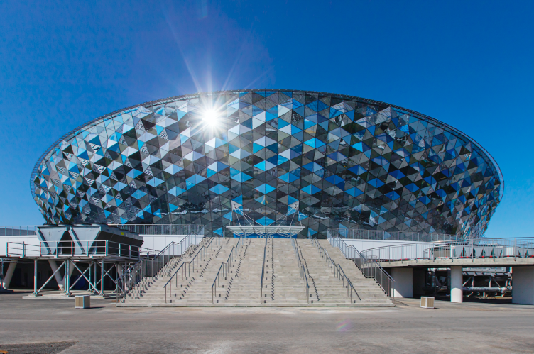
Sport / Ice Arena
The arena’s capacity is 12,500 people. It is situated in the central part of Tashkent, and is the biggest ice palace in Central Asia, and a home of four hockey clubs. The concept was developed by the Korean company Heerim Architects. The arena is named in honor of the mythical bird Humo, the harbinger of happiness. The main volume of the building resembles the folded wing of the bird, while the fan of the buildings, ramps and paths of the adjacent park resembles the flapping and spreading feathers of the bird. The halls lined with dark marble are decorated with round panels created by artists Bobur Ismailov based on the poem “The Language of Birds” by Turkic poet Alisher Navoi. The central piece is a golden composition with a stone that was laid when the complex was built. The arena can host more than a dozen sports, but its “specialty” is still hockey. The cooled slab allows to place a hockey court of three different sizes depending on the requirements of different hockey federations, and the main arena is supplemented by a training arena. 
  • zooming
    1 / 7
  • zooming
    2 / 7
  • zooming
    3 / 7
  • zooming
    4 / 7
  • zooming
    5 / 7
  • zooming
    6 / 7
  • zooming
    7 / 7

The ice palace on the territory of the Spit of Nizhny Novgorod

Studio
Where
Russia, Nizhny Novgorod
Date
2018 — /
Function
Sport / Ice Arena
The arena’s capacity is 12,500 spectators. It will complement the architectural ensemble of the Spit of Nizhny Novgorod, which already includes a soccer stadium, restored warehouses, and the Alexander Nevsky Cathedral. In order to minimize its contrastive influence on the latter, the arena was moved as much as possible towards the Samarkandskaya Street, its height from the city towards the water lowering from 38 to 14.5 meters. The streamlined “pebble” shape and the very position of the building allowed the architects to avoid obscuring the views of the cathedral from the water. The arena faces the city with a media façade and an entrance gallery with an amphitheater on the upper level. The arena is separated from the cathedral by a multi-level landscape composition, in which a cascade of stairs to the second tier is hidden. The area on the shore side will be landscaped and filled with outdoor sports fields. With the help of the stairs, landscaping, gallery and other elements, the “sprawl” of a rather large-scale building is overcome and its integration into the context is achieved. The arena will be the home arena for the Torpedo club, while the lower part of the arena will house a training arena, a four-lane curling hall and two more multipurpose halls. The construction is planned to be completed in 2025.
  • zooming
    1 / 7
  • zooming
    2 / 7
  • zooming
    3 / 7
  • zooming
    4 / 7
  • zooming
    5 / 7
  • zooming
    6 / 7
  • zooming
    7 / 7

The Crystal Ice Palace

Studio
Where
Russia, Moscow
Date
2015 / 2020 —
Function
Sport / Ice Arena
Capacity: 500 people. The arena will be situated on the territory of Luzhniki complex, instead of the skating rink, built back in the 1960s and now recognized to be in an emergency state. The building maintains not just the “posture” of its predecessor, but also the style characteristic for sports facilities of the mid-20th century. It is rather unusual for its typology: it has a rectangular plan, and the glass facades fill the halls with natural light. The ice is protected from direct sunlight by vertical metal lamellae, which like blinds can completely cover the stained glass windows. The main entrance is accented with a stained glass crystal structure. Inside there are two ice arenas with separate entrances for 250 seats each; a 25-meter swimming pool with a view of the park; office premises with windows overlooking the Moskva River; gyms and cafes. A parking lot for 130 cars is located in the underground level.
  • zooming
    1 / 7
  • zooming
    2 / 7
  • zooming
    3 / 7
  • zooming
    4 / 7
  • zooming
    5 / 7
  • zooming
    6 / 7
  • zooming
    7 / 7

Gasprom Arena

Studio
Where
Russia, Yuzhno-Sakhalinsk
Date
— 2022 /
Function
Sport / Ice Arena
The arena in fact includes two ice arenas: one is designed for competitions and has a capacity of 5,500 people, while the second is a training arena with a game and gymnasium and a shooting range. This will allow training and competitions of international level in hockey and other sports, including sport shooting. But the main purpose of the arena is to provide the city’s children with affordable sports clubs. The unified surface of the folded metal roof, passing into the facade, “envelops” the internal structure of the sports facility, manifesting its multifunctionality in the silhouette and opening up with a colonnade at the main entrance. The arena is planned to be built in the center of Yuzhno-Sakhalinsk, on the site of the bus park, which will be relocated to another place. The adjacent territory will be landscaped: landscaping, pedestrian and bicycle paths will be laid and parking for 183 cars will be organized. The construction is planned to be completed by 2025.
  • zooming
    1 / 7
  • zooming
    2 / 7
  • zooming
    3 / 7
  • zooming
    4 / 7
  • zooming
    5 / 7
  • zooming
    6 / 7
  • zooming
    7 / 7


09 June 2023

Headlines now
The Golden Crown
The concept for a dental clinic in Yekaterinburg, developed by CNTR Studio, revolves around the idea of a “mouth full of gold”: pristine white porcelain stoneware walls are complemented by matte brass details. To avoid an overly literal interpretation, the architects focused on the building’s proportions, skillfully navigating between sunlight requirements and fire safety regulations.
Flexibility and Integration
Not long ago, we covered the project for the fourth phase of the ÁLIA residential complex, designed by APEX. Now, we’ve been shown different fence concepts they developed to enclose the complex’s private courtyards, incorporating a variety of public functions. We believe that the sheer fact that the complex’s architects were involved in such a detail as fencing speaks volumes.
A Step Forward
The HIDE residential complex represents a major milestone for ADM architects and their leaders Andrey Romanov and Ekaterina Kuznetsova in their quest for a fresh high-rise aesthetic – one that is flexible and layered, capable of bringing vibrancy to mass and silhouette while shaping form. Over recent years, this approach has become ADM’s “signature style”, with the golden HIDE tower playing a pivotal role in its evolution. Here, we delve into the project’s story, explore the details of the complex’s design, and uncover its core essence.
Gold in the Sands
A new office for a transcontinental company specializing in resource extraction and processing has opened in Dubai. Designed by T+T Architects, masters of creating spaces that are contemporary, diverse, flexible, and original, this project exemplifies their expertise. On the executive floor, a massive brass-clad partition dominates, while layered textures of compressed earth create a contextually resonant backdrop.
Layers and Levels of Flight
This project goes way back – Reserve Union won this architectural competition at the end of 2011, and the building was completed in 2018, so it’s practically “archival”. However, despite being relatively unknown, the building can hardly be considered “dated” and remains a prime example of architectural expression, particularly in the headquarters genre. And it’s especially fitting for an aviation company office. In some ways, it resembles the Aeroflot headquarters at Sheremetyevo but with its own unique identity, following the signature style of Vladimir Plotkin. In this article, we take an in-depth look at the United Aircraft Corporation (UAC) headquarters in the Moscow agglomeration town of Zhukovsky, supplemented by recent photographs from Alexey Naroditsky – a shoot that became only recently possible due to the fact that improvements were finally made in the surrounding area.
Light and Shadow
In this article, we delve into the architectural design of the “Chaika” house by DNK ag architects, which was recently completed in 2023 as part of the collection of signature designs at ZILArt. As is well-known, all the buildings in this complex follow a design code, yet each one is distinct. This particular building stands out not only for its whiteness and minimalism but also for the refined use of a limited number of techniques that, together, create what can confidently be called synergy.
Casus Novae
A master plan was developed for a large residential area with a name of “DNS City”, but now that its implementation began, the plan has been arbitrarily reformatted and replaced with something that, while similar on the surface, is actually quite different. This is not the first time such a thing happens, but it’s always frustrating. With permission from the author, we are sharing Maria Elkina’s post.
Treasure Hunting
The GAFA bureau, in collaboration with Tegola and Arkhitail, organized an expedition to the island of Kilpola in Karelia as part of Moskomarkhitektura’s “Open City” festival. There, amidst moss and rocks, the students sought answers to questions like: what is the sacred, where does it dwell, and what sustains it? Assisting the participants in this quest were landscape engineer Evgeny Levin, artist Nicholas Roerich, a moose, and the lack of cellular connection. Here’s how the story unfolded.
Depths of the Earth, Streams of Water
In the Malaya Okhta district, the Akzent building, designed by Stepan Liphart, was constructed. It follows a classic tripartite structure, yet it’s what you might call “hand-drawn”: each façade is unique in its form and details, some of which aren’t immediately noticeable. In this article, we explore the context and, together with the architect, delve into how the form was developed.
Fir Tree Dynamics
The “Airports of Region” holding is planning to build an airport in Karachay-Cherkessia, aiming to make the Arkhyz and Dombay resorts more accessible to travelers. The project that won in an invitation-only competition, submitted by Sergey Nikeshkin’s KPLN, blends natural imagery inspired by the shape of a conifer seed, open-air waiting spaces, majestic large trees, and a green roof elevated on needle-like columns. The result is both nature-inspired and WOW.
​A Brick Shell
In the process of designing a clubhouse situated among pine trees in a prestigious suburban area near Moscow, the architectural firm “A.Len” did the façade design part. The combination of different types of brick and masonry correlates with the volumetric and plastique solutions, further enhanced by the inclusion of wood-painted fragments and metal “glazing”.
Word Forms
ATRIUM architects love ambitious challenges, and for the firm’s thirtieth anniversary, they boldly play a game of words with an exhibition that dives deep into a self-created vocabulary. They immerse their projects – especially art installations – into this glossary, as if plunging into a current of their own. You feel as if you’re flowing through the veins of pure art, immersed in a universe of vertical cities, educational spaces – of which the architects are true masters – and the cultural codes of various locations. But what truly captivates is the bold statement that Vera Butko and Anton Nadtochy make, both through their work and this exhibition: architecture, above all, is art – the art of working with form and space.
Flexibility and Acuteness of Modernity
Luxurious, fluid, large “kokoshniks” and spiral barrel columns, as if made from colorful chewing gum: there seem to be no other mansion like this in Moscow, designed in the “Neo-Russian-Modern” style. And the “Teremok” on Malaya Kaluzhskaya, previously somewhat obscure, has “come alive with new colors” and gained visibility after its restoration for the office of the “architectural ecosystem” as the architects love to call themselves. It’s evident that Julius Borisov and the architects at UNK put their hearts into finding this new office and bringing it up to date. Let’s delve into the paradoxes of this mansion’s history and its plasticity. Spoiler: two versions of modernity meet here, both balancing on the razor’s edge of “what’s current”.
Yuri Vissarionov: “A modular house does not belong to the land”
It belongs to space, or to the air... It turns out that 3D printing is more effective when combined with a modular approach: the house is built in a workshop and then adapted to the site, including on uneven terrain. Yuri Vissarionov shares his latest experience in designing tourist complexes, both in central Russia and in the south. These include houseboats, homes printed from lightweight concrete using a 3D printer, and, of course, frame houses.
​Moscow’s First
“The quality of education largely depends on the quality of the educational environment”. This principle of the last decade has been realized by Sergey Skuratov in the project for the First Moscow Gymnasium on Rostovskaya Embankment in the Khamovniki district. The building seamlessly integrates into the complex urban landscape, responding both to the pedestrian flow of the city and the quiet alleyways. It skillfully takes advantage of the height differences and aligns with modern trends in educational space design. Let’s take a closer look.
Looking at the Water
The site of Villa Sonata stretches from the road to the water’s edge, offering its own shoreline, pier, and a picturesque river panorama. To reveal these sweeping views, Roman Leonidov “cut” the façade diagonally parallel to the river, thus getting two main axes for the house and, consequently, “two heads”. The internal core – two double-height spaces, a living room and a conservatory, with a “bridge” above them – makes the house both “transparent” and filled with light.
The White Wing
Well, it’s not exactly white. It’s more of a beige, white-stone structure that plays with the color of limestone – smoother surfaces are lighter, while rougher ones are darker. This wing unites various elements: it absorbs and interprets the surrounding themes. It responds to everything, yet maintains a cohesive expression – a challenging task! – while also incorporating recognizable features of its own, such as the dynamic cuts at the bottom, top, and middle.
Urban Dunes
The XSA Ramps team designed and built a three-part sports hub for a park in Rostov-on-Don, welcoming people of all ages and fitness levels. The skate plaza, pump track, and playground are all meticulously crafted with details that attract a diverse range of visitors. The technical execution of the shapes and slopes transforms this space into a kind of sculptural composition.
Proportional Growth
The project for the fourth phase of the ÁLIA residential area has been announced. The buildings are situated on an elongated plot – almost a “ray” that shoots out from the center of the area towards the river. Their layout reflects both a response to Moscow’s architectural preferences over the past 15 years, shifting “from blocks to towers”, and an interpretation of the neighboring business park designed by SOM. Additionally, the best apartments here are not located at the very top but closer to the middle, forming a glowing “waistline”.
The “Staircase” Building
In designing the “Details” residential complex in New Moscow, Rais Baishev spiced up the now-popular Moscow theme of a “courtyard” building with an idea drawn from the surrealist drawings by Maurits Escher. He envisioned the stepped silhouettes and descending slopes as a metaphysical mega-staircase, creating a key void within the courtyard that gave the project an internal “spine”. This concept is felt both in the building’s silhouette and on its façades.
Projection of the Quarter
No one doubted that the building that Vladimir Plotkin designed as part of the “Garden Quarters” would be the most modernist of all. And it turned out just that way: while adhering to the common design code, the building successfully combines brick and white stone, rhythmically responding to the neighboring building designed by Ostozhenka, yet tactfully and persistently making a few statements of its own. This includes the projection of the ideal urban development composition “14–9–6”, which can be found right next door, mathematical calculations, including those for various types of terraces (and perhaps the only reminder of the Soviet past of the Kauchuk rubber factory!), and the white “cross-stitch” pattern of the façade grid.
Domus Aurea
In this issue, we examine the “Tessinsky-1” house, designed by Sergey Skuratov and completed in 2023. Located in the middle of the Serebryanicheskaya Embankment district, at the intersection of its main streets, this house assumes a sort of “nodal” role: it not only responds to everything around it and preserves many memories of the former EMA factory within itself, but it weaves all this into a newly directed pattern, reconciling bright “gold” and dark-colored brick, largely with the help of the new, modern-yet-archaic Columba brick, which, come to think about it, is the most precious element here.
The Chimney of Nikola-Lenivets
In this issue, we are examining the “Obelisk House” designed by KATARSIS and built for the Arkhstoyanie 2023 festival. However, it was only finished later on, and this is why we are examining it now. It seems to us that after the “Obelisk House” appeared in Nikola-Lenivets, a dialogue and a few inner connections appeared between the temporary structures built here. These houses no longer look like “accidental neighbors”, more of which below.
​Periscope by the Bay
The jury awarded the second place in the competition for a public and cultural center in Petropavlovsk-Kamchatsky to the companies GORA (“Mountain”) and M4. In the consortium’s proposal, the building resembles a sperm whale with a calf swimming next to it or a periscope, whose lenses capture the most spectacular views from the surrounding landscape.
From Arcs to Dolmens
While working on the competition project for Petropavlovsk-Kamchatsky, ASADOV Architects prioritized the value of the natural and urban environment, aiming to preserve the balance of the location while minimizing the resemblance of the volume that they designed to a “traditional building”. The task was challenging, and the architects created three versions, one of which having been developed after the competition, where their main proposal took third place. However, the point of interest here is not the competition result but the continuity of creative thinking.
Hide and Seek
The ID Moskovskiy house, designed by Stepan Liphart in St. Petersburg, in the courtyards near Moskovskiy Avenue beyond the Obvodny Canal and recently completed, is notable for several reasons. Firstly, it has been realized with considerable accuracy, which is particularly significant as this is the first building where the architect was responsible not only for the facades but also for the layouts, allowing for better integration between the two. On the other hand, this building is interesting as an example of the “germination” of new architecture in the city: it draws on the best examples from the neighborhood and becomes an improved and developed sum of ideas found by the architect in the surrounding context.
The Big Twelve
Yesterday, the winners of the Moscow Mayor’s Architecture Award were announced and honored. Let’s take a look at what was awarded and, in some cases, even critique this esteemed award. After all, there is always room for improvement, right?
Above the Golden Horn
The residential complex “Philosophy” designed by T+T architects in Vladivostok, is one of the new projects in the “Golubinaya Pad” area, changing its development philosophy (pun intended) from single houses to a comprehensive approach. The buildings are organized along public streets, varying in height and format, with one house even executed in gallery typology, featuring a cantilever leaning on an art object.
Nuanced Alternative
How can you rhyme a square and space? Easily! But to do so, you need to rhyme everything you can possibly think of: weave everything together, like in a tensegrity structure, and find your own optics too. The new exhibition at GES-2 does just that, offering its visitor a new perspective on the history of art spanning 150 years, infused with the hope for endless multiplicity of worlds and art histories. Read on to see how this is achieved and how the exhibition design by Evgeny Ace contributes to it.
Blinds for Ice
An ice arena has been constructed in Domodedovo based on a project by Yuri Vissarionov Architects. To prevent the long façade, a technical requirement for winter sports facilities, from appearing monotonous, the architects proposed the use of suspended structures with multidirectional slats. This design protects the ice from direct sunlight while giving the wall texture and detail.