Archi.ru
In recent years, high-rise construction has been high on the agenda, and you are an architect who designed many skyscrapers – starting from the Federation Tower in the Moscow City complex and ending with the Neva Towers in the same location. Furthermore, a few Moscow towers, designed by SPEECH, are still in the construction stage. First, a little bit of a trick question: would you design a skyscraper in your native St Petersburg?
Sergey Tchoban
Copyright: © Sergey Tchoban
Sergey Tchoban:
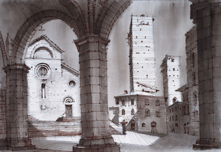
In order to start speaking on this subject, first of all, let’s try to make out just what a skyscraper is. How did it appear, and why? Skyscrapers have been around for quite a while. We know, for example, about “medieval skyscrapers” of the XIII century – most of them survived in San Gimignano, Italy – which were symbols of power and money, or, better yet, symbols of the power of money. These skyscrapers belonged to the representatives of the upper classes and business circles of their times, and were not burdened with any significant functional load, except that at times they could serve for defense, but this was not the main thing. First of all, they expressed the economic achievements and power – just look how high we can build.
The skyscrapers of San Giminiano, XIII century, 2010
Copyright: © Sergey Tchoban
“Representative” and “high” are synonymous to many people. This situation has been there since the beginning of time, and nobody so far has been able to convince people that building a tall thing is not the only possible way to make a statement about yourself.
On the other hand, as we all know, at the end of the XIX century, when the elevator was invented, there came about an opportunity to use your land site in a different way, namely, to squeeze much more square meters out of it. Let’s face it: at least since the XIX century town planning has been influenced by the economic model of city development, a model that is – let’s face it again – is not dictated by the architect.
Why am I speaking about this in connection with St Petersburg? Because, the way I see it, St Petersburg has two problems: its center and its outskirts, and both should be solved in different ways.
St Petersburg: regeneration of the center
St Petersburg is often mistakenly referred to as a city, in which nobody ever wanted to build a skyscraper. Here is the thing, however: in the second half of the XIX century and in the beginning of the XX century, when St Petersburg became an actively developing “capitalist” city, still nobody could build skyscrapers in Russia. Russia was not as technologically advanced as the USA, where high-rise construction was mastered exactly at the break of the centuries. This is why the construction in St Petersburg was densely packed, but low-rise at the same time. This is one of its features that people somehow do not like to mention when they speak about the character of its urban environment. And I grew up in St Petersburg, in one of such “well” yards, and I know that St Petersburg is dense, but it is dense in a different way. It is dense in its yards, where the sun never shines, which is, by the way, a direct violation of today’s insolation norms.
St Petersburg appeared on two premises. On the one hand, this was an imperial city, the capital of the Czar dynasty, and an example of strict regulations, just as Paris was under Napoleon I and Napoleon III. On the other hand, St Petersburg is an example of horizontal construction density. Now, here is the question: do we really need to replace this horizontal density with the vertical type? I, frankly speaking, do not see any prerequisites for this, especially where the high-rise construction may affect the architecture of the city center. St Petersburg has a very large historical center, probably one of the largest in Europe. And the main goal of St Petersburg is not building skyscrapers but coming up with ways for preserving that historical center. It is clear that you cannot preserve all the buildings – this is what we see from the example of Europe’s other large cities, Paris or Milan, Barcelona or Vienna. In these cities, a large volume of private investment was attracted within the framework of very strict protection regulations. And this experience vividly shows that the regulations for using private investment for working with historical legacy cannot ensure that the city will remain fully intact. Some things must change – for example, roofs can be built up, or yard spaces can be partially regenerated. These are the things that you need to do in St Petersburg.
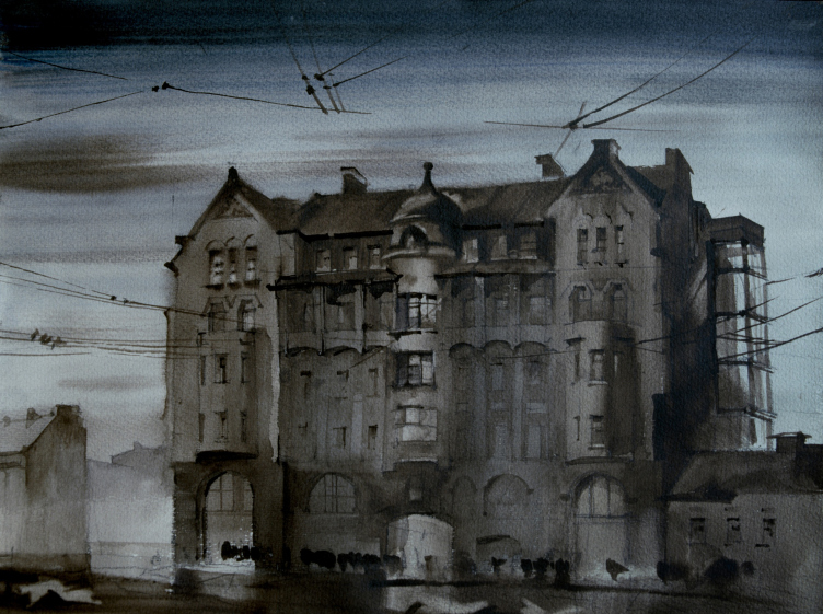
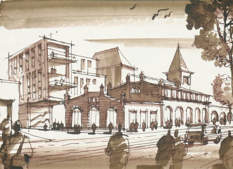
Residential building on Vladimirskaya Square in St. Petersburg. The drawing was made in 1984. By now, the house has been rebuilt and distorted beyond recognition.
Copyright: © Sergey Tchoban
And this is a huge problem because the city center is consumed by slow decay. In this instance, building skyscrapers will not help to fix the problem in any way. Even if some major corporation wants to represent itself with a skyscraper, this will become yet another display of power and money, and will not help the city.
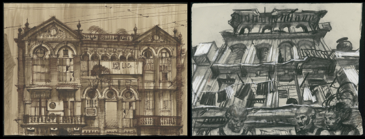
This is how dying historic quarters look like. So far, these are Mumbai and Havana, 2018 and 2019
Copyright: © Sergey Tchoban
You say, a skyscraper will not help. But what about the taxes?
Taxes from mass regeneration of the historical center are also very high. In one given point, the skyscraper will allow you to generate super-profit from the use of a square meter of its territory. However, 40% of the territory of St Petersburg is occupied by its historical center. And this huge territory must regenerate. A huge number of houses is in need of repair, but this not must be solely done on federal budgets – as we can see, this is a utopia. The large city center must again become attractive to investors with a high level of culture, investors who would be willing to accept the strict regulations, requirements for preservation, and reasonable containment of the urge to get extra profit.
We must urgently come up with an algorithm that will be interesting to money owners and will convince them that money can be made not on new construction alone, but also on regeneration and restoration with elements of new construction. The containment must not be of the kind that makes the investors lose any interest for regeneration. This task is rather complex, but it is successfully solved in many European cities, including Berlin, where, in spite of strict regulations, private investors are really interested in working with protected buildings, creating interesting yard spaces, some new little inclusions, and reinterpreting top floors and roofs. The tax influx is rather large but it does not come from a single “geyser”: figuratively speaking, the pressure of the “geysers” may be less, but their number should be greater.
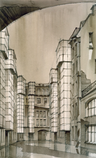
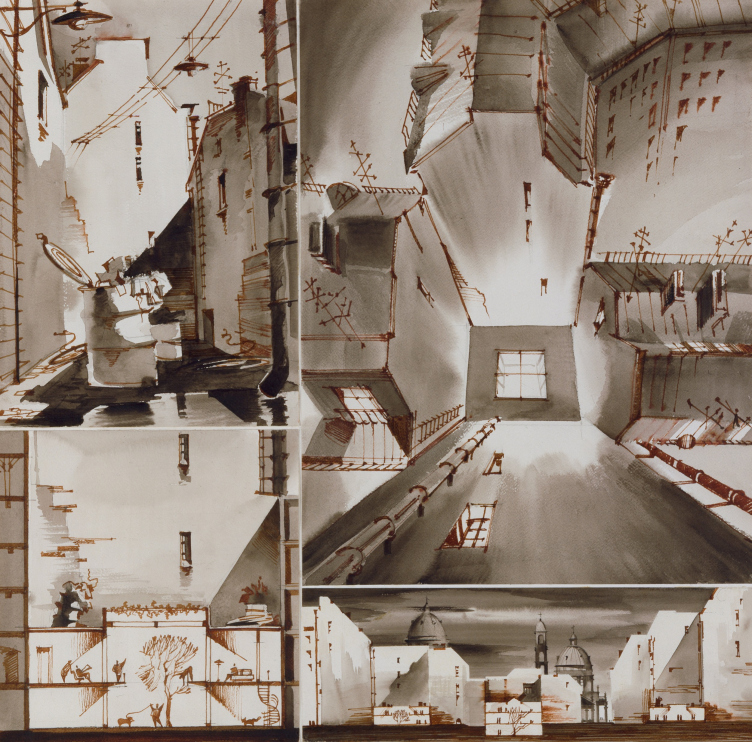
A fantasy on the theme of a St Petersburg yard, 2007
Copyright: © Sergey Tchoban
This is the task for the state and the city – to create reasonable norms and regulations, and a favorable environment for investment. Because otherwise the dangerously dilapidated city center will start falling apart! I recently read that in some houses they started to cut off balconies because they are in a hazardous state… Yes, there is a problem, and it is not in the field of high-rise construction.
St Petersburg: development of the outskirts
There is still another problem with this city – the residents of the outskirts do not really feel as if they were living in St Petersburg. So how do you spread the feeling of living in the center over to the new residential areas? The first solution that comes to mind is building like in the historical St Petersburg but not as densely because, like I already said, the quality of life in the historical yards of St Petersburg is not that great and is not up to today’s standards for living and working environment.
However, St Petersburg without the trademark density of St Petersburg can become uninteresting for investors, whose money is spent on building new residential areas. Back in the day, I proposed a ratio, within the framework of which the housing construction is allotted about 30% of the overall development, and the main construction keeps up the human-friendly scale of about 7 floors. This is a little bit higher than in the historical St Petersburg, but, since today the height of an average floor is a little bit lower, this is the perfect way to create a feeling of front construction with a developed street environment. Reasonable height, reasonable width of the street space, and reasonable proportions of the yards. Against the background of this 7-story development, taller buildings of unique architecture are also possible at important points and axes, approximately 20-30% of the total construction volume.
And, of course, you also need public buildings. All the magnets of St Petersburg’s public life are currently situated in the city center, and their expansions also appear in the center: Mariinka 1, Mariinka 2, Mariinka 3, etc. This is a false approach. You need to create not centripetal, but centrifugal or multidirectional movement, to remove places of attraction of people away from the city center. You need to create new interesting and ambitious projects – not high-rise ones, because public buildings must not be tall by definition, and that is because people move horizontally inside them. However, these buildings may be really interesting architecture-wise; they could use the most cutting-edge technologies of today’s architecture.
Here is what I wanted to say about St Petersburg in a nutshell. As you can see, I did not even use the “high-rise” term all that often because it doesn’t make much sense here. And if we are speaking about some kind of super-task, some headquarters of a company with super-ambition – well, even this task should not be solved by building a skyscraper. High-rise construction in St Petersburg is today a very theoretical problem. Lakhta Center appeared, and we know how it came about. However, I don’t see any other case or necessity for building something similar in St Petersburg. And I don’t see any point in discussing this.
[Curiously, this conversation took place literally one day before the “Lakhta-2” project was announced. The commentary on this news item was not included in the interview].
Berlin: regulations
You mentioned Berlin, and you are probably the first person in the world to ask about Berlin. What is the situation in Berlin in terms of high-rise construction and municipal restrictions?
For quite a long time, they kept building relatively low in Berlin. In the early 1990s, we took part in one large-scale competition for designing in the district of Messedamm, and won the first prize with a rather tall project. One of the other contestants in that competition was the well-known architect of that time Walter Rolfes – the project submitted by his company did not have a single high-rise building, yet it achieved the same density with the help of city blocks of reasonable height, like 6-7 floors. It also won the first prize in that competition, and, by the way, the city decided to plan and build in accordance with his project. And I remember Walter telling me: “You know, this is a strong quality – a European city without high-rise buildings”.
And this is how this city evolved up until the early 2010s. However, starting from 2015, Berlin’s economic development was on the rise, and talks about high-rise construction immediately started. Large companies want their buildings to be conspicuous. Amazon occupies one of the highest towers, the Alliance insurance company is also headquartered in the tower at the beginning of the Spree. At one time, when Daimler was planning to come to Potsdamer Platz – and the initial project for the development of the area was a low-rise one – they said that they would not buy this site and would not invest in it if it was not possible to build high-rise buildings upon it. Today, investors very often ask the city about possibilities for high-rise construction. It is generally considered that large companies will more easily agree to rent these or those premises if these premises are situated in a high-rise building. But then again, you can hardly speak about skyscrapers in Germany: in Berlin, 130 or 150 meters is already a very tall building, while in Frankfurt it is the average height of a tower. For large companies, the desire to make a statement is directly connected with high-rise construction. This is that it was, is, and will be. And it’s hard for me to comment on this situation from any standpoint.
Still another motive is the desire to make the most of your site. The city is trying to work on it. Under the guidance of the Senate, a master plan for high-rise construction has been created. Among other things, it states the necessity for providing adequate public spaces (it must be said that Moscow does the same). The presence of public spaces, where people feel comfortable, becomes a compensation for the high density of construction. For example, if you build a high-rise, you commit to also make an area open to pedestrians, and some open ground that will absorb rainwater, which is important for soil regeneration.
Another important thing: high-rise construction brings up social contradictions. The horizontal city was full of contradictions as well, but at least they were not manifested on the “high versus low” level. Today, when you look at high-rises, particularly super-slim skyscrapers, you understand that huge sums of money are spent on their construction, and, of course, apartments in such buildings are occupied by not the poorest representatives of society. My first customer – that was about 30 years ago – told me: you should be dressed so that 98% of people think that you have a C&A jacket, and only 2% understand that you can afford it. This is what you call understatement. And skyscrapers – they don’t have any understatement about them; a skyscraper is a visual manifestation of social contrast.
The city is trying to combat this. For example, the regulations stipulate that up to 30% of the space should be given to social functions and the rental price should be affordable for the widest social strata (in Berlin it is 7.9 Euro per square meter per month). The regulations also stipulate that the upper floors must be public – I have always said that high-rise buildings must not “fade upwards” but somehow work for the city. Be that a viewing gallery or a restaurant – even if it’s not exactly an affordable one – these places will still be visited by a greater number of people. The presence of the social component must lead to the fact that a high-rise building will not be perceived as an element of harsh social contrast or harsh gentrification. Even though, of course, gentrification can manifest itself both in high-rise and low-rise buildings – but then again, in Germany, even in mid-rise buildings, you must allot 30% for social housing.
Oftentimes, even architects are delusional, believing that if a territory becomes more expensive due to its development, it is good for the city. On the contrary, this is bad for the city. Development is needed, but not by pushing out those population groups that already live in this territory.
Forty years of life and then trashed
Yet another important issue has to do with the aging rate of the building. The beautiful neo-Renaissance building of the Waldorf-Astoria Hotel, built in 1896, was demolished 33 years later just to make room for the Empire State Building. As capitalism developed a taste for profit from construction, houses began to be demolished sooner. Today, just like 100 years ago, houses live 30-40 years on average. In order to make the building into a monument – and the Empire State Building does have a protected status, for that matter – you need to make a lot of effort. But with many buildings this just will not be the case – the huge amount of high-rise construction in 40 or 50 years will be replaced by new buildings. And it’s one thing if you are replacing a 6-story building, and quite a different thing when it’s 50 or even 100 floors high – New York is now witnessing that, the spring keeps unwinding, high-rise buildings give way to even higher ones, and there is not telling how and when it will end.
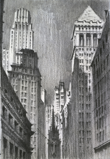
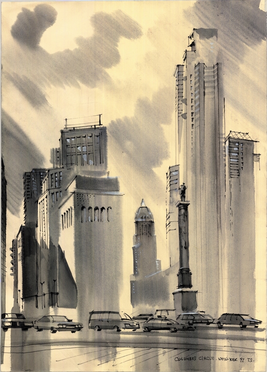
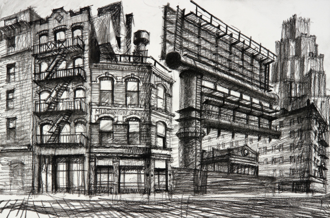
Columbus Circle intersection in New York. The drawing was made in 1992: today the building of this space has already completely changed
Copyright: © Sergey Tchoban
In any case, demolishing any building, particularly a big one, means a huge amount of junk. In Berlin, before you tear down any building, you have to do a serious research, and you have to prove that whatever you are going to build in the stead of the demolished building is going to be climatically neutral. They simply won’t allow you to tear down anything unless you prove that the new building will be climatically neutral, which happens in about 40 years. But how can you prove that, if the average life expectancy of a building is these 40 years? You just cannot imagine how everything will change by that time – the COVID-19 pandemic alone has changed so much! And Moscow is facing these same problems as Berlin.
Speaking about Moscow, by the way – is it the right thing to do to condense it by the “Singapore” scenario? Even if that is justified economically because the apartments keep on selling?
This question has several aspects. First, like you rightly said, nobody would bother to condense it if there was no demand for it. It’s quite obvious that a large city gives you advantages in terms of transport communications, and concentrating things in one place leads to the fact that people get to this or that location faster. However, this argument has limited power. It’s also quite obvious that not everyone likes high density of construction, and Moscow in this sense is no exception.
The reasons for high-rise construction remain the same – representation, life, and work in a high-rise building seem to be more prestigious. Plus the high financial efficiency of construction and unflagging demand! If a large amount of square meters on some certain territory enjoys popularity, investors try to make the most of it. This is pure economics, and it has always been that way in any country – in Manhattan, in Singapore, Shanghai, Hong-Kong, or Dubai. And in this sense Moscow is no different either.
Freedom, magnificence, and technologies
One should also mention the fact that many people, especially at the start, associated high-rise construction with entrepreneurship being set free, a feeling of freedom when nothing is getting in your way. That same city of San-Gimignano that I already mentioned, in the end of the XII century it became independent, and within two thirds of a century it witnessed the construction of 70 towers of record-breaking height by the standards of those days.
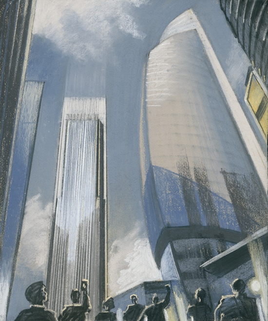
The project of “Moscow City” started back in 1992, right after the collapse of the Soviet Union, when the new capitalism straightens its shoulders and says: now we set the rules, and we can build such things too! I don’t think that we should get all excited about it, you can criticize these processes, but you still need to see the prime mover behind them. Just don’t be naive and say that this is an “aesthetic concept”. This is not an “aesthetic concept” by any means – this is an economic concept.
Moscow City, 2019
Copyright: © Sergey Tchoban
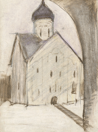
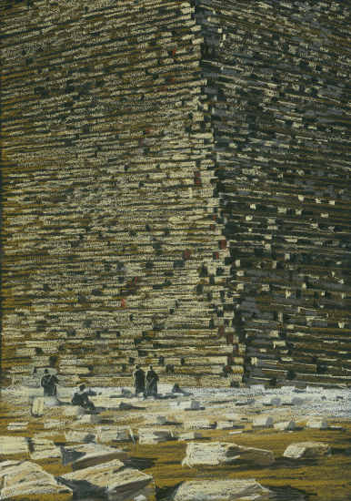
Because, folks, let’s be honest with ourselves – the quality of the work of art has never depended on its size. Size-wise, you can squeeze Vermeer’s entire legacy in one picture by Anselm Kiefer. And it would be wrong, of course, to claim that high-rise buildings are more aesthetically appealing. On the other hand, there is a whole series of works of architecture or, say, monumental art, which went down in history precisely for their very large, striking dimensions. The Egyptian pyramids, for example. In other words, the size of the structure does make a difference, and at some point it can really begin to replace the true value of the work. I will say a seditious thing: I, for example, do not understand the aesthetic value of the Egyptian pyramids. In my opinion, they only mesmerize you with their sheer size. At the same time, of course, the size is not a sign of a work of art. The Church of the Savior on Ilyin, for example, is many times more interesting than the much larger St. George Cathedral of the Yuryev Monastery.
At the same time, however, architecture also has an enticing and even treacherous side to it. What sets architecture apart from other arts is that it is directly connected with modern technological achievements. And architects (me included) want to be up to these achievements, want to implement them in their work. All these large arenas, tall buildings, and huge covered spaces, are the visual proof of the incredible technical achievements of our days. It’s nothing short of a royal discipline. Architects are into it because it is an amazing play with shapes and technologies, and it quenches their desire to design something technically unique, something that’s cutting edge and groundbreaking.
The guilt of an architect is the guilt of an accomplice.
Squeezed between economy and technology – what else can he do? Propose pure shape?
What the architect can do is carry on with his search – in contact with all the stakeholders of the process, politicians and developers – for some unique aesthetics within the already found density and economic model. This is the way it has always been. There is a popular misconception that “back in the day, the architect was the man in the chair, and now he does not make decisions”. I need to disappoint those who think so – because architects of the past were faced with tasks just as specific. Did any of the architects ever ask if tearing down the GUM store was the right thing to do? Neither Leonidov, nor Melnikov, nor Vesnin Brothers, nor Ivan Fomin asked this question. Neither Corbusier, nor any of the participants of the competition for the Palace of Soviets worried about the demolition of the Temple of Christ the Savior, and this was pure sacrilege – blowing up a temple in order to make room for a public building. Architects are chiefly occupied with artistic implementation of the task that has been set before them.
I honestly don’t think that Pharaoh Ramses would have listened to someone who would have approached him and said: you know, these things seem a little too big to me. Neither can I visualize Michelangelo saying: let’s make this some three times smaller. Quite the opposite – the architects generally strive to make three times bigger, pushing the limits of what’s technically possible. The exceptions – which deservedly score awards from the professional community – are few and far between, and only confirm the general rule.
Yes, that’s true, but later on, around the 1970s and 1980s such a thing as environmental protection appeared…
When did it appear? When they were building the Palace of Congresses in the Kremlin? There is a commonly accepted opinion that it fits in perfectly well with the Kremlin ensemble but I don’t think it fits at all – even though I like the building the way it looks on its own. Or when they were building Kalininsky Avenue (now Novy Arbat Street)? It was a devastating, the scale of Osman, blow that they dealt to the center of Moscow, even though, again, I like the way the building looks on its own. Or when a new Izvestia building was built in the 1970s next to the constructivist Barkhin building on the site of Rimsky-Korsakov’s estate, the prototype of Famusov’s house from Woe from Wit? Or when they tore down a few historical buildings at the Nikitsky Gate in order to build the TASS building?
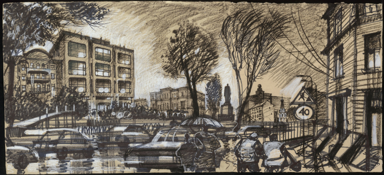
The TASS building on the site and in the structure of the historical quarters of the Boulevard Ring, Moscow, 2018
Copyright: © Sergey Tchoban
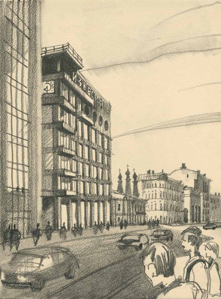
The new Izvestia building was built to the left of the constructivist building of Barkhin on the site of the prototype of Famusov′s house from Griboyedov′s play Woe from Wit. 2019
Copyright: © Sergey Tchoban
There are two major tasks. One is the task of federal protection of monuments of architecture, which is to compile, with the help of consultants, a register of architectural heritage buildings that must be preserved by all means. If this register is not formed thoroughly enough, then, of course, you can make claims to architects who take part in the subsequent work with historical buildings and heritage sites. And, of course, every architect must make his own decision whether he wants to take part in some obviously irresponsible action. However, the guilt of an architect is the guilt of an accomplice. Since the beginning of time, the architects were invited only to be told: the decision has been made, now let’s implement it in the best way possible. The only way an architect can influence this is to refuse to take up the project, and, by the way, today refusing is probably a lot less dangerous than it was in the times of the competition for Palace of Congresses.
Well, somehow I don’t have a feeling that anyone was forced to take part in those competitions.
Of course, not! They always proceeded from the fact that the decision has been made and will be implemented, with or without them. But without their participation it would not be as beautiful. This is what I would call the evil naïveté of the profession of an architect – somehow we all think that we will propose the best possible solution, that others will come up with worse things, and we just have to participate in the competition so as to stop others from making a mistake. This is, of course, naive to the point of stupid, but, sadly, this is the truth. Seriously, I don’t think there was any coercion under the Soviet regime, like “if you refuse to participate in this competition, we will throw you in jail”, of course not!
A city as a record of economic and political history
What do you think of the skyscraper on Myasnitskaya Street?
I think it is totally misplaced. Quite deplorably, it is replacing two tenements that remained as the only trace of Moscow of the 1910’s. Today, Myasnitskaya Street is very much like a museum of architecture, in which buildings from different epochs are collected: Tsentrsoyuz by Corbusier, a building of the 1930’s, Gosplan by Pavlov, the office building by Nikita Biryukov, which, by the way, I don’t like that much. So, like I said, the way I see it, the new tower will become a replacement, not an addition.
So what is the difference between replacement and addition?
Replacement is when you tear down one building and build another in its stead, at the same time tearing out one page of history, writing another one instead of it, which paves the way for tearing out other pages of history in this place.
There was a time when at the Architectural Council of Moscow I spoke against the Tatlin Apartments building on Bakuninskaya Street, where the new volume is built up directly above the constructivist building of the former telephone station. I said – let’s make a new modern house with the same yield of floor space, only standing deeper in the site. You don’t go and spoil a symmetric work of art with an asymmetric buildup. You will ruin one building and not fully get the other. This technique is very risky, and projects where it was a success are few and far between. You don’t have to create a conglomerate. At that time, I was left alone with my dissenting opinion. I lost the argument; the building is now almost ready, and, for the record, it turned out quite well. But I still think it would be more correct to leave the modern building aside and leave the telephone station of the 1930s alone.
Regeneration of a brewery without demolition. On the first building line, single-storey buildings remain unchanged. Berlin, 2019
Copyright: © Sergey Tchoban
Back to Myasnitskaya, though! If there was a vacant site, on which you could build a high-rise, I would say that this would be an option to seriously consider. Then this fragment of the city could be developed in accordance with the “collage” principle, and not replacement.
However, on the other hand, if a developer comes to you and says: the decision has been made, these two houses will be torn down – what difference does your decision make not to build anything in this place? This is a difficult question. I wasn’t offered to build there, and it’s easy for me to say that I consider this decision to be wrong. But if I had been offered, it would have been much more difficult for me.
Meanwhile, these two tenements of the early XX century are nothing to write home about. But still you insist that the decision to tear them down is wrong – why?
Because a city is a book, a historical record, each page of which is valuable. I think it is important to keep these two buildings, considering the outstanding significance of this whole part of the city. The Corbusier building, like it or lump it, became asymmetric because of the proximity of these buildings, it draws attention to them. This is like with a tree – it may grow lopsided for some reason, but if you take out the reason for this distortion, nobody will understand why this tree is the way it is. This is very important.
I don’t believe that a well-balanced city can be artificially created by large fragments. Even if such a thing was ever possible, it was in the epoch of emperors. But I think it’s very important to create a city as a record of our political and economic history. This record is more objective and truthful than any other. Just walking around the city, you can read the history of the country.
Contrasts and contradictions, which, among other things, manifest themselves in high-rise construction – they all are evidence of the political and economic processes, this is the way it was, and the way it will always be. Therefore, it is very important not to destroy historical buildings, unless you really have no other choice. And not just because, by doing this, you destroy some people’s labor and their energy – even though this is also a reason – but because you tear out pages from the book of history. And then you will not be able to read the whole of it.
These two houses in this context present a rather interesting page of the epoch when Moscow was small-format, and was built not in large complexes, but in small increments. And today you can see here, what the city looked like in the 1920s, 1960s, 1970s, and 1990s. Personally for me, it is a lot more interesting than replacing something outdated with something modern.
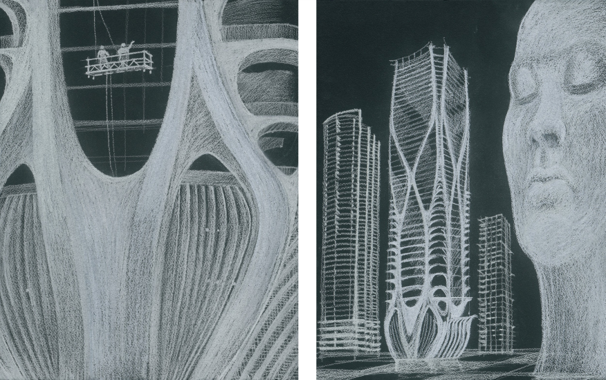
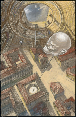
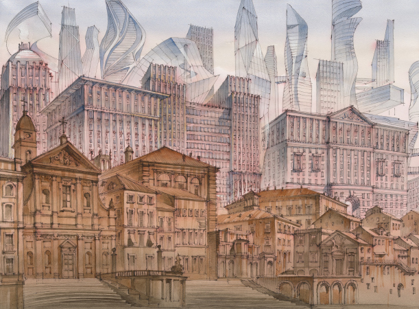
Is your “Imprint of the Future” series about this? Please, give me a clue: is this satire? Or a reproach?
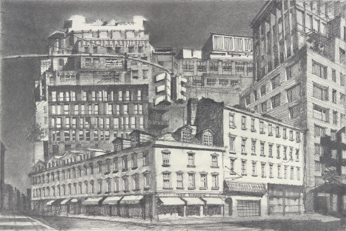
Neither satire nor reproach. This is what is happening now to our cities – they are taking on this “collage” character that we prefer not to notice. However, it is there, and we need to form our attitude to it. We need to stop perceiving cities as some kind of “lost harmony” and start reading them as historical records, where respectful coexistence – not mutual worship or wariness – but contrasts, including overlapping of some elements of development, present a valuable factor that will allow us to read history by these cities, admiring or getting appalled at some of its pages. Oh, and by the way, if we are to get back to that “Imprint of the Future” exhibition of mine, Piranesi, back in his time, shared quite a lot about the constant urge for replacement: baroque temples, cut into antique basilicas, are the perfect example of the barbarism of the old days, so visible in the cities with a thousand year old history.

