По-русски

The Faraday Cage

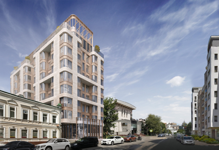
The project of the boutique apartment complex in the 1st Truzhenikov Lane is the architects’ attempt to squeeze a considerable volume into a tiny spot of land, at the same time making it look graceful and respectable. What came to their rescue was metal, stone, and curvilinear glass.

07 July 2020
Object
mainImg
The district of Khamovniki is considered to be one of the most prestigious in Moscow. However, while during the construction boom the developers would build on the territories located as close as possible to the city center, now, when there is not a single vacant strip of land left on Ostozhenka, they gradually shifted towards the central and southwest parts of this district. In the recent years, this area has attracted the most expensive construction in the nation’s capital. Thus, it comes as no surprise that this area is now seeing new projects pop up here and there, the vacant space rapidly shrinking, which, on the other hand, is not much of a problem for high-end residential complexes.

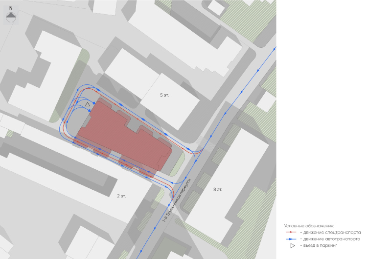
The residential complex that will be built in the 1st Truzhenikov Lane is a vivid example of such kind. The land site allotted for its construction is currently occupied by a miniature two-story building to be soon torn down. From all sides, it is surrounded by various constructions: on the right, there is a five-story house built in the 1990’s, on the left, there is an elongated two-story house; behind it, there is a polytechnic college. In such “reduced circumstances”, what was left for the new construction was only an elongated trapeze-shaped strip of land, and, to make things still more complicated, it is the narrow side that faces the lane.

The high-end residential complex in the 1st Truzhenikov Lane. Location plan
Copyright: © ASADOV architects


In search of the most effective solution for such a challenging territory, the developer organized a closed-door competition, inviting several reputed architectural companies to participate. ASADOV Architects was one of them. For the record, the concept that was proposed by the company was not chosen to be the winning one.

The high-end residential complex in the 1st Truzhenikov Lane
Copyright: © ASADOV architects


Andrey Asadov shared that the participants were facing a challenging task of designing, on a really limited land site, a boutique apartment complex project with a rather high yield of useful floor space (the total area being 12.300 Sqm).

The neighboring house on the Plyushchikha, composed of several volumes of different size, connected by a metallic pergola, only has 22 apartments in it, which is quite an appropriate amount for a downtown boutique apartment complex. In the new project, the developer expected to get almost twice and a half that number. This was a challenge for the architects.

The construction of the typically-Moscow, winding Truzhenikov Lane, is rather multifaceted. We can see here the surviving pre-Revolution two- and three-story mansions, many of them being used as embassies, the buildings of the Stalin and Soviet periods. Some houses, on the other hand, appeared in the 1990’s and 2000’s, their height being as diverse as the time of their construction. For example, in the perspective of the street, we can see the dome of the miniature Church of the Exaltation of the Holy Cross. However, what stands directly across from the land plot in question is an eight-story house built in 2001 one upon the project by Sergey Kiselev and Partners; next to it, there is a 14-story high residential building.

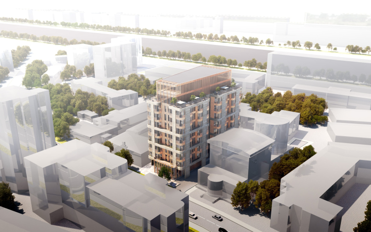
The high-end residential complex in the 1st Truzhenikov Lane. Top view from the side of the Savvinskaya Embankment
Copyright: © ASADOV architects


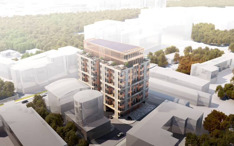
The high-end residential complex in the 1st Truzhenikov Lane. Top view from the side of the lane
Copyright: © ASADOV architects


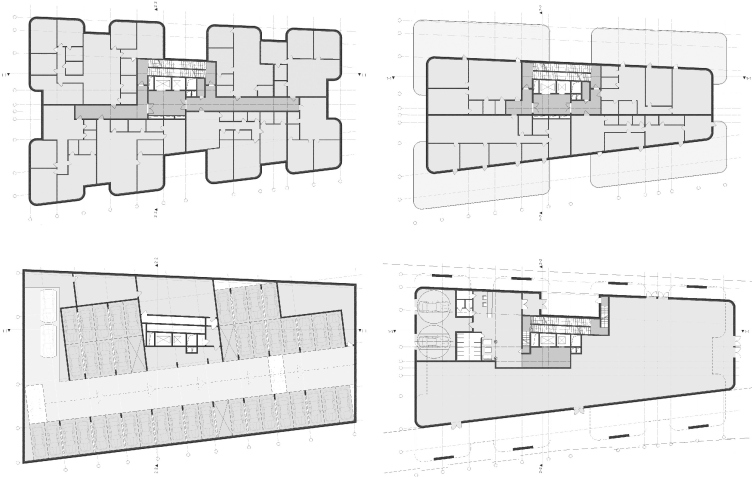
The architects decided to settle down for ten stories, at the same time making the most of the land site: the first floor stepped back from the redline only the distance necessary to make way for emergency vehicles. In the project, the first floor is a public one, the two top floors are penthouses; there is also an underground parking garage.

The high-end residential complex in the 1st Truzhenikov Lane. Plans of the 1st floor the parking garage, the standard floor, and the penthouses
Copyright: © ASADOV architects


From the second to the eighth floor, the house grows thicker, even though it does not lose any of its gracefulness: bay windows alternate with deep recessed balconies, while grouping the floors in twos and threes softens down the sheer perceived size of the building. The bay windows are so big that the house rather looks like a group of towers placed at regular intervals and “bound” between themselves with stone belts at the floor level of the second, fourth, and sixth floors – their residents are getting open recessed balconies. The alternating of the cantilevers and deep pauses makes the volume porous, reducing its presence in space, while the prevalence of verticals ensures the overall slenderness.

The high-end residential complex in the 1st Truzhenikov Lane.
Copyright: © ASADOV architects


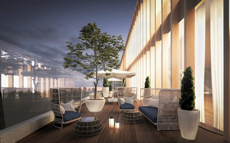
On top of the house, glass walls recede far back from the facade line, leaving broad patios before the penthouses. The glass is covered by lamellas, while on the sidewalls, from the street and the yard side, their grid “grows through” with transparent pergolas.

The high-end residential complex in the 1st Truzhenikov Lane. The patio on the roof
Copyright: © ASADOV architects


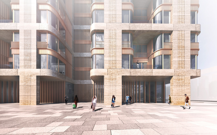
The facade decoration combines light-colored stone, copper, and curvilinear glass. The stone, light and porous, looking like travertine creates the outside framework, the verticals being highlighted by flutes. The copper recedes in the background, marking the intermediate floors and supporting the vertical direction with a multitude of lamellas in the ledges of the first floor, on the facades of the penthouses, and the pergola. The combination of stone and metal yields an image that unambiguously refers us to Art Deco, while the reddish color of the copper lightens up the overall composition.

The high-end residential complex in the 1st Truzhenikov Lane. A fragment of the facade design
Copyright: © ASADOV architects


However, the curves of the glass with extremely rare seams bring us back to reality, if not even to futurism – the mercury-flowing substance, looking like some kind of force field, caged in two types of grids, stone and copper, like a Faraday Cage, still remains agile and alive, being the matter that constitutes the basis of the house. Glass also prevails in the decoration of the first floor, stepping forward on the redline of the street with the volume of a small cafe. Behind the cafe, underneath the bay windows of the longitudinal facades, the architects designed pedestrian galleries, which were also to function as the aforementioned emergency vehicle drives.

The project of this house, albeit remaining on paper as a competition proposal, actively develops two architectural directions vital for Moscow. One of them is the excessive construction density on a small land site that must be “packed” into an internally consistent shape. The other is the facade that combines the response to the Moscow buyers and marketing department managers’ love of the Art Deco style, combined with reserved, yet persistent futurism. In the XX century, during its “righteous” historical period, the Art Deco style somehow was unable to develop its full potential – it simply did not have enough clients, and a style that’s commercially unpopular cannot really develop successfully. Therefore, we are probably in for a lot of new attempts to give Moscow the appropriate versions of the prestigious decorative style. Possibly, the image of the boutique apartment complex, proposed in this project, which would have brought a New York accent into the variety imagery of the Truzhenikov lanes, would have been an appropriate answer.

07 July 2020

Headlines now
Four Different Surveys
The “Explore the City” competition, organized this year by the Genplan Institute of Moscow, stands out as a pretty unconventional one for the architectural field but aligns perfectly well with the character of urban planning work. The winning project analyzed contemporary residential complexes, combining urban planning insights with a realtor’s perspective to propose a hybrid approach. Other entries explored public centers, motivations for car ownership, and housing vacancy rates. A fifth participant withdrew. Here’s a closer look at the four completed works.
Scheduled Evolution
ASADOV Architects unveiled the EvyCenter pavilion, a microcultural hub for fostering personal growth, organizing workshops, and doing gymnastics. Additionally, this pavilion serves as a prototype for a scalable country house, drawing inspiration from the “Loskutok” project, and constructed from CLT panels in a factory. This marks the beginning of a developer project initiated by the architectural firm (sic!), which is seeking partners to expand both small Evy settlements and even larger Evy cities, which are, according to Andrey Asadov, aimed at fostering the “evolutionary” development of the people who will inhabit them.
The Golden Crown
The concept for a dental clinic in Yekaterinburg, developed by CNTR Studio, revolves around the idea of a “mouth full of gold”: pristine white porcelain stoneware walls are complemented by matte brass details. To avoid an overly literal interpretation, the architects focused on the building’s proportions, skillfully navigating between sunlight requirements and fire safety regulations.
Flexibility and Integration
Not long ago, we covered the project for the fourth phase of the ÁLIA residential complex, designed by APEX. Now, we’ve been shown different fence concepts they developed to enclose the complex’s private courtyards, incorporating a variety of public functions. We believe that the sheer fact that the complex’s architects were involved in such a detail as fencing speaks volumes.
A Step Forward
The HIDE residential complex represents a major milestone for ADM architects and their leaders Andrey Romanov and Ekaterina Kuznetsova in their quest for a fresh high-rise aesthetic – one that is flexible and layered, capable of bringing vibrancy to mass and silhouette while shaping form. Over recent years, this approach has become ADM’s “signature style”, with the golden HIDE tower playing a pivotal role in its evolution. Here, we delve into the project’s story, explore the details of the complex’s design, and uncover its core essence.
Gold in the Sands
A new office for a transcontinental company specializing in resource extraction and processing has opened in Dubai. Designed by T+T Architects, masters of creating spaces that are contemporary, diverse, flexible, and original, this project exemplifies their expertise. On the executive floor, a massive brass-clad partition dominates, while layered textures of compressed earth create a contextually resonant backdrop.
Layers and Levels of Flight
This project goes way back – Reserve Union won this architectural competition at the end of 2011, and the building was completed in 2018, so it’s practically “archival”. However, despite being relatively unknown, the building can hardly be considered “dated” and remains a prime example of architectural expression, particularly in the headquarters genre. And it’s especially fitting for an aviation company office. In some ways, it resembles the Aeroflot headquarters at Sheremetyevo but with its own unique identity, following the signature style of Vladimir Plotkin. In this article, we take an in-depth look at the United Aircraft Corporation (UAC) headquarters in the Moscow agglomeration town of Zhukovsky, supplemented by recent photographs from Alexey Naroditsky – a shoot that became only recently possible due to the fact that improvements were finally made in the surrounding area.
Light and Shadow
In this article, we delve into the architectural design of the “Chaika” house by DNK ag architects, which was recently completed in 2023 as part of the collection of signature designs at ZILArt. As is well-known, all the buildings in this complex follow a design code, yet each one is distinct. This particular building stands out not only for its whiteness and minimalism but also for the refined use of a limited number of techniques that, together, create what can confidently be called synergy.
Casus Novae
A master plan was developed for a large residential area with a name of “DNS City”, but now that its implementation began, the plan has been arbitrarily reformatted and replaced with something that, while similar on the surface, is actually quite different. This is not the first time such a thing happens, but it’s always frustrating. With permission from the author, we are sharing Maria Elkina’s post.
Treasure Hunting
The GAFA bureau, in collaboration with Tegola and Arkhitail, organized an expedition to the island of Kilpola in Karelia as part of Moskomarkhitektura’s “Open City” festival. There, amidst moss and rocks, the students sought answers to questions like: what is the sacred, where does it dwell, and what sustains it? Assisting the participants in this quest were landscape engineer Evgeny Levin, artist Nicholas Roerich, a moose, and the lack of cellular connection. Here’s how the story unfolded.
Depths of the Earth, Streams of Water
In the Malaya Okhta district, the Akzent building, designed by Stepan Liphart, was constructed. It follows a classic tripartite structure, yet it’s what you might call “hand-drawn”: each façade is unique in its form and details, some of which aren’t immediately noticeable. In this article, we explore the context and, together with the architect, delve into how the form was developed.
Fir Tree Dynamics
The “Airports of Region” holding is planning to build an airport in Karachay-Cherkessia, aiming to make the Arkhyz and Dombay resorts more accessible to travelers. The project that won in an invitation-only competition, submitted by Sergey Nikeshkin’s KPLN, blends natural imagery inspired by the shape of a conifer seed, open-air waiting spaces, majestic large trees, and a green roof elevated on needle-like columns. The result is both nature-inspired and WOW.
​A Brick Shell
In the process of designing a clubhouse situated among pine trees in a prestigious suburban area near Moscow, the architectural firm “A.Len” did the façade design part. The combination of different types of brick and masonry correlates with the volumetric and plastique solutions, further enhanced by the inclusion of wood-painted fragments and metal “glazing”.
Word Forms
ATRIUM architects love ambitious challenges, and for the firm’s thirtieth anniversary, they boldly play a game of words with an exhibition that dives deep into a self-created vocabulary. They immerse their projects – especially art installations – into this glossary, as if plunging into a current of their own. You feel as if you’re flowing through the veins of pure art, immersed in a universe of vertical cities, educational spaces – of which the architects are true masters – and the cultural codes of various locations. But what truly captivates is the bold statement that Vera Butko and Anton Nadtochy make, both through their work and this exhibition: architecture, above all, is art – the art of working with form and space.
Flexibility and Acuteness of Modernity
Luxurious, fluid, large “kokoshniks” and spiral barrel columns, as if made from colorful chewing gum: there seem to be no other mansion like this in Moscow, designed in the “Neo-Russian-Modern” style. And the “Teremok” on Malaya Kaluzhskaya, previously somewhat obscure, has “come alive with new colors” and gained visibility after its restoration for the office of the “architectural ecosystem” as the architects love to call themselves. It’s evident that Julius Borisov and the architects at UNK put their hearts into finding this new office and bringing it up to date. Let’s delve into the paradoxes of this mansion’s history and its plasticity. Spoiler: two versions of modernity meet here, both balancing on the razor’s edge of “what’s current”.
Yuri Vissarionov: “A modular house does not belong to the land”
It belongs to space, or to the air... It turns out that 3D printing is more effective when combined with a modular approach: the house is built in a workshop and then adapted to the site, including on uneven terrain. Yuri Vissarionov shares his latest experience in designing tourist complexes, both in central Russia and in the south. These include houseboats, homes printed from lightweight concrete using a 3D printer, and, of course, frame houses.
​Moscow’s First
“The quality of education largely depends on the quality of the educational environment”. This principle of the last decade has been realized by Sergey Skuratov in the project for the First Moscow Gymnasium on Rostovskaya Embankment in the Khamovniki district. The building seamlessly integrates into the complex urban landscape, responding both to the pedestrian flow of the city and the quiet alleyways. It skillfully takes advantage of the height differences and aligns with modern trends in educational space design. Let’s take a closer look.
Looking at the Water
The site of Villa Sonata stretches from the road to the water’s edge, offering its own shoreline, pier, and a picturesque river panorama. To reveal these sweeping views, Roman Leonidov “cut” the façade diagonally parallel to the river, thus getting two main axes for the house and, consequently, “two heads”. The internal core – two double-height spaces, a living room and a conservatory, with a “bridge” above them – makes the house both “transparent” and filled with light.
The White Wing
Well, it’s not exactly white. It’s more of a beige, white-stone structure that plays with the color of limestone – smoother surfaces are lighter, while rougher ones are darker. This wing unites various elements: it absorbs and interprets the surrounding themes. It responds to everything, yet maintains a cohesive expression – a challenging task! – while also incorporating recognizable features of its own, such as the dynamic cuts at the bottom, top, and middle.
Urban Dunes
The XSA Ramps team designed and built a three-part sports hub for a park in Rostov-on-Don, welcoming people of all ages and fitness levels. The skate plaza, pump track, and playground are all meticulously crafted with details that attract a diverse range of visitors. The technical execution of the shapes and slopes transforms this space into a kind of sculptural composition.
Proportional Growth
The project for the fourth phase of the ÁLIA residential area has been announced. The buildings are situated on an elongated plot – almost a “ray” that shoots out from the center of the area towards the river. Their layout reflects both a response to Moscow’s architectural preferences over the past 15 years, shifting “from blocks to towers”, and an interpretation of the neighboring business park designed by SOM. Additionally, the best apartments here are not located at the very top but closer to the middle, forming a glowing “waistline”.
The “Staircase” Building
In designing the “Details” residential complex in New Moscow, Rais Baishev spiced up the now-popular Moscow theme of a “courtyard” building with an idea drawn from the surrealist drawings by Maurits Escher. He envisioned the stepped silhouettes and descending slopes as a metaphysical mega-staircase, creating a key void within the courtyard that gave the project an internal “spine”. This concept is felt both in the building’s silhouette and on its façades.
Projection of the Quarter
No one doubted that the building that Vladimir Plotkin designed as part of the “Garden Quarters” would be the most modernist of all. And it turned out just that way: while adhering to the common design code, the building successfully combines brick and white stone, rhythmically responding to the neighboring building designed by Ostozhenka, yet tactfully and persistently making a few statements of its own. This includes the projection of the ideal urban development composition “14–9–6”, which can be found right next door, mathematical calculations, including those for various types of terraces (and perhaps the only reminder of the Soviet past of the Kauchuk rubber factory!), and the white “cross-stitch” pattern of the façade grid.
Domus Aurea
In this issue, we examine the “Tessinsky-1” house, designed by Sergey Skuratov and completed in 2023. Located in the middle of the Serebryanicheskaya Embankment district, at the intersection of its main streets, this house assumes a sort of “nodal” role: it not only responds to everything around it and preserves many memories of the former EMA factory within itself, but it weaves all this into a newly directed pattern, reconciling bright “gold” and dark-colored brick, largely with the help of the new, modern-yet-archaic Columba brick, which, come to think about it, is the most precious element here.
The Chimney of Nikola-Lenivets
In this issue, we are examining the “Obelisk House” designed by KATARSIS and built for the Arkhstoyanie 2023 festival. However, it was only finished later on, and this is why we are examining it now. It seems to us that after the “Obelisk House” appeared in Nikola-Lenivets, a dialogue and a few inner connections appeared between the temporary structures built here. These houses no longer look like “accidental neighbors”, more of which below.
​Periscope by the Bay
The jury awarded the second place in the competition for a public and cultural center in Petropavlovsk-Kamchatsky to the companies GORA (“Mountain”) and M4. In the consortium’s proposal, the building resembles a sperm whale with a calf swimming next to it or a periscope, whose lenses capture the most spectacular views from the surrounding landscape.
From Arcs to Dolmens
While working on the competition project for Petropavlovsk-Kamchatsky, ASADOV Architects prioritized the value of the natural and urban environment, aiming to preserve the balance of the location while minimizing the resemblance of the volume that they designed to a “traditional building”. The task was challenging, and the architects created three versions, one of which having been developed after the competition, where their main proposal took third place. However, the point of interest here is not the competition result but the continuity of creative thinking.
Hide and Seek
The ID Moskovskiy house, designed by Stepan Liphart in St. Petersburg, in the courtyards near Moskovskiy Avenue beyond the Obvodny Canal and recently completed, is notable for several reasons. Firstly, it has been realized with considerable accuracy, which is particularly significant as this is the first building where the architect was responsible not only for the facades but also for the layouts, allowing for better integration between the two. On the other hand, this building is interesting as an example of the “germination” of new architecture in the city: it draws on the best examples from the neighborhood and becomes an improved and developed sum of ideas found by the architect in the surrounding context.
The Big Twelve
Yesterday, the winners of the Moscow Mayor’s Architecture Award were announced and honored. Let’s take a look at what was awarded and, in some cases, even critique this esteemed award. After all, there is always room for improvement, right?
Above the Golden Horn
The residential complex “Philosophy” designed by T+T architects in Vladivostok, is one of the new projects in the “Golubinaya Pad” area, changing its development philosophy (pun intended) from single houses to a comprehensive approach. The buildings are organized along public streets, varying in height and format, with one house even executed in gallery typology, featuring a cantilever leaning on an art object.