По-русски

​An Outgoing Introvert

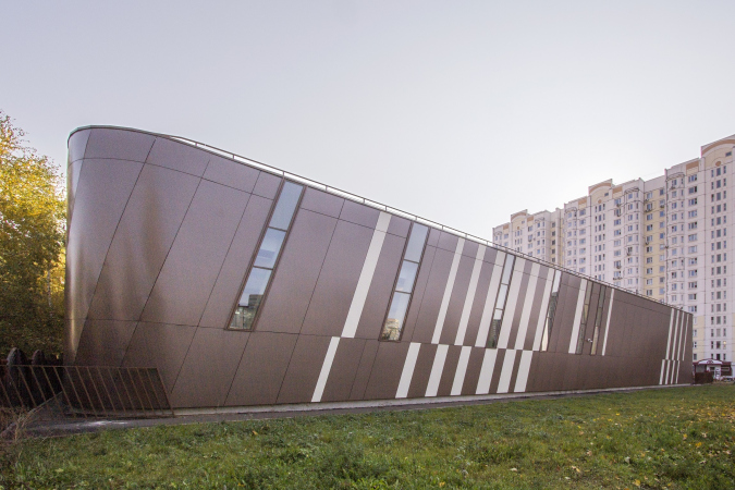
Designing and building in Moscow area’s Lyublino a fitness club called La Salute (which translates as “health” from the Italian), ASADOV architects did make the life of this area healthier by bringing designer architecture and new useful functions into the standard environment. The dramatic tectonics of the building empathize its sporty intentions.

30 September 2019
News
mainImg

The Mission

“The fitness club La Salute is not our first joint project with Andrew and Alexander Asadovs – shares the commissioner of La Salute, Larisa Khanokhova – We already built together a bilingual kindergarten in the Maly Poluyaroslavsky Alley, the best kindergarten in Moscow, in my opinion. It was designed as a magic theater, and it’s also unique from the point of view of children’s education. We have been doing educational projects for quite a while now. Also, together with ASADOV architects, we are expanding the “School of Cooperation” on Taganka. As far as this fitness center is concerned, Lublino consists basically of bleak architecture consisting of rank-and-file prefabricated houses. Therefore, in addition to the business task, I had this idea of lifting up the status of this area with a new infrastructure project – a world-class fitness center. At the same time, it is quite accessible to the local residents price-wise”.

Extrovert / Introvert

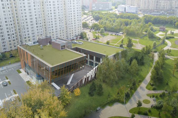
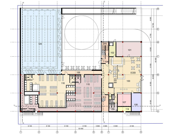
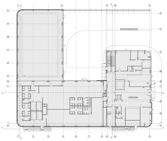
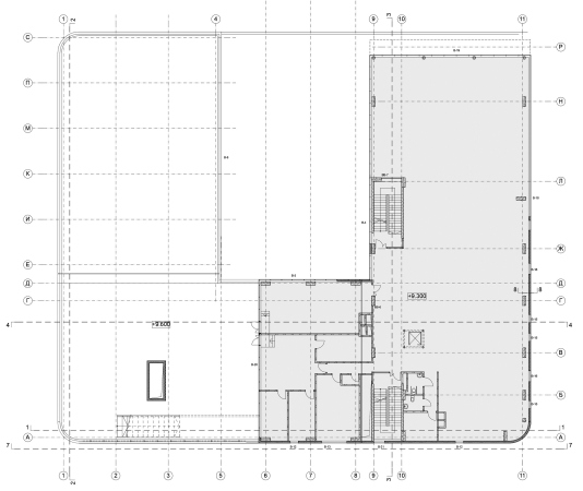
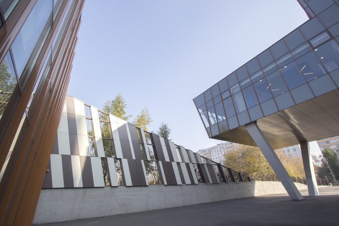
The volume of the fitness center is rather simple: the U-shaped plan is turned with its “back” to the residential houses, facing the park, the right wing two stories high, left three stories high. On the lintel, appears a ledge of transition from two stories to three, the taller left part ending in a large cantilevered structure that takes on the role of a marquee because the main entrance is situated underneath it.

Fitness center La Salute on the Belorechenskaya Street
Copyright: © ASADOV architects
  • zooming
    1 / 7
    Fitness center La Salute on the Belorechenskaya Street
    Copyright: © ASADOV architects
  • zooming
    2 / 7
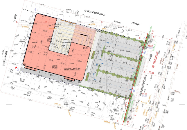
    Fitness center La Salute on the Belorechenskaya Street. THe master plan
    Copyright: © ASADOV architects
  • zooming
    3 / 7
    Fitness center La Salute on the Belorechenskaya Street
    Copyright: © ASADOV architects
  • zooming
    4 / 7
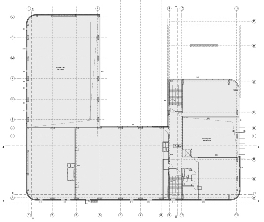
    Fitness center La Salute on the Belorechenskaya Street. Plan of the 1st floor
    Copyright: © ASADOV architects
  • zooming
    5 / 7
    Fitness center La Salute on the Belorechenskaya Street
    Copyright: © ASADOV architects
  • zooming
    6 / 7
    Fitness center La Salute on the Belorechenskaya Street
    Copyright: © ASADOV architects
  • zooming
    7 / 7
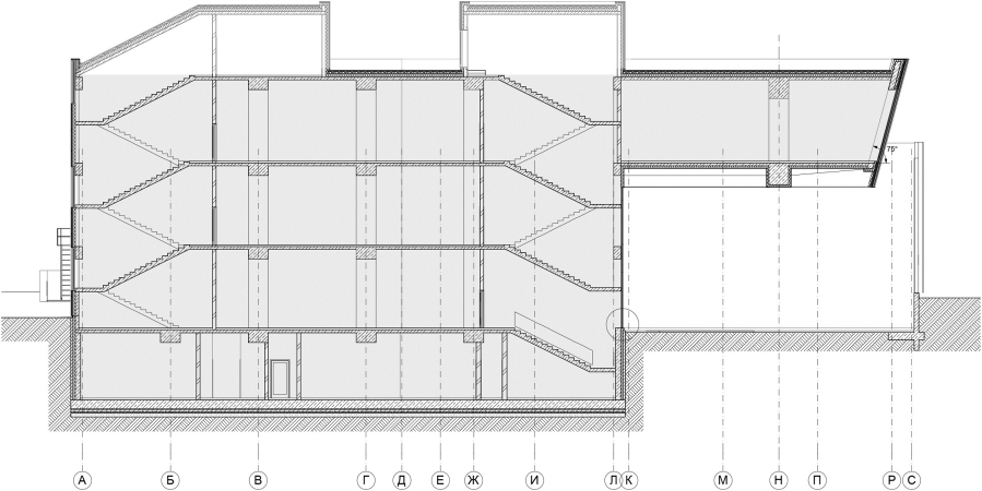
    Fitness center La Salute on the Belorechenskaya Street. Section view
    Copyright: © ASADOV architects


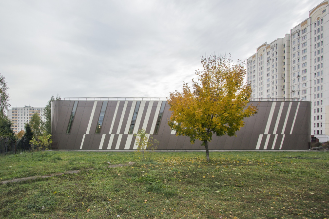
Basically, what we are seeing here is a clearly readable composition, motivated by the function and the specifics of the land site. However, the architects, strengthening some of the features, enhanced the building’s imagery – they made it look like a lizard that curled into a ball and is basking in the sun, straining its neck to peek into the garden. The role of the tail is played by the fence on the side of the park: its triangular silhouette starts from the ground opposite the entrance, and then grows up to the roof of the right wing, the tilted pylons growing denser as they approach the building, sparser in the beginning. The tail, this way, is not exactly a volume, which is right too – because a lizard can shed its tail. The further likeness is determined by the design solution of the façade – the diagonal pattern, set by the fence, continues on the whole building’s body: the metallic panels of a glittering brownish hue alternate with white ones; the windows, long and slanted, are also inserted into the dynamic pattern of tiled strokes, this all sheds a glitter, like a lizard’s skin, while the diagonal creates a feeling of a latent motion within this creature of a building. This same effect is also supported by the rounded corners: all the three outer ones and the curvilinear glass of the entrance underneath the cantilever. And the fact that the building is “curled into a ball” around the yard is enhanced by the large meander in the paving pattern.

  • zooming
    1 / 4
    Fitness center La Salute on the Belorechenskaya Street
    Copyright: © ASADOV architects
  • zooming
    2 / 4
    Fitness center La Salute on the Belorechenskaya Street
    Copyright: © ASADOV architects
  • zooming
    3 / 4
    Fitness center La Salute on the Belorechenskaya Street
    Copyright: © ASADOV architects
  • zooming
    4 / 4
    Fitness center La Salute on the Belorechenskaya Street
    Copyright: © ASADOV architects


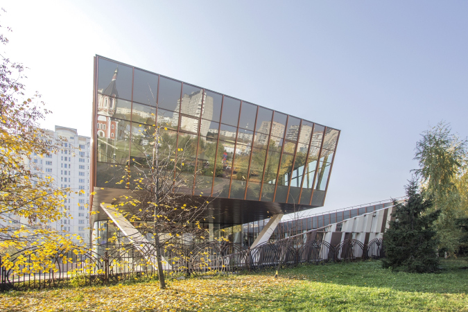
Meanwhile, our lizard is also a little bit of a chameleon: “the façade material is going through various transformations and is used with different frequencies” – Andrey Asadov stresses. Indeed, the eastern wall, the one that faces the Belorechenskaya Street, is not brown but terra cotta orange, and the panels become ceramic – which, first of all, makes the building more noticeable, because the fitness center must not be “lost” against the backdrop of the existing construction, at least in order to attract the clients. On the other hand, this “reddish” warmth also works towards creating a “creature” image, and one can even wonder at this point what kind of animal curled up into a ball – a lizard or maybe a fox. But then again, it’s not really important which animal that is. What is important is the fact that the glass “head” of the cantilever with a ground-bound chamfer is facing the park and the Church of Tatyana of Rome, reflecting it. The two unconventional-looking nonresidential buildings, standing against the background of rather dull prefabricated houses, get involved in a dialogue, which makes perfect sense for two public buildings, however different, in this sleeping belt neighborhood.

Fitness center La Salute on the Belorechenskaya Street
Copyright: © ASADOV architects


The fact that this beast of ours – be that a fox, a lizard, or even a snail with a striped shell – is turning away from the residential houses, lying almost precisely with its back to them, also makes absolutely perfect sense. People come to train here in order to divert themselves from the stress of the hard day’s work, and the monotonous windows of the prefabricated houses are not exactly the kind of landscape that is highly conducive to emotional rest. However, the trees of the park and the church, a building that’s unique to at least some extent, are a different matter. Thus, the fitness center is open to greenery, especially its glass cantilever above the entrance; the main gym that it contains is well lit and opened to daylight and a positive natural view. Thus, it comes as no surprise that Andrey Asadov describes the building of the fitness center on the Belorechenskaya Street as both introvert and extrovert: wherever it’s needed, it coils into a ball, opening up when such an opportunity arises.

Fitness center La Salute on the Belorechenskaya Street
Copyright: © ASADOV architects


Decorating the rounded corners became a challenge for the manufacturers of terra cotta and metallic cassettes: it was required of them to produce totally nonstandard elements, and slanting ones, too. All the ceramic tiles have been chiseled by complex guages: the overall curve was one and the same, but it was the tilted stroke pattern that added to the complexity of the task. The metallic composite cassettes have double curvilinearity. The joints between them are also very neat. Their size is more than 5 meters high, and this makes the building look more compact than it really is.

The Flight and the Balance

The dynamics of the volumes of this building is truly sporty because the fitness center (forgive me the sports and dancing terminology!) is there in the foreground. The building is focused on the park. The main terra cotta façade emphasizes that particularly vividly because it’s not solid, unlike the metallic one, but a long segment of its two bottom floors is made of glass, and it is just one terra cotta “leg” that remains, the whole building “leaping” forward with its park-bound cantilever. At the same time, the complex grows more transparent as it gets closer to the park. Meaning – its gravity center remains within the thick terra cotta part, i.e. in the “leg”. Also interesting is the fact that in the first floor the architects added a narrow window – the massiveness of the wall comes in increments, and thus gets lighter. The cantilever gazing at the park rests on a V-shaped support.
zooming


Andrey Asadov:

“Together with the chief architect of the project, Tatiana Konovalova, we spent quite a long time working with designers in order to zero in on the crisp and simple solution. Ultimately, we came up with this elegant V-shaped support. Behind the glass, there is only a continuation of the slanted pillars, the rest being the overhanging cantilevered structures. We were able to achieve that because the floor and the ceiling of the cantilevered part are made from pretension concrete”.

Fitness center La Salute on the Belorechenskaya Street
Copyright: © ASADOV architects


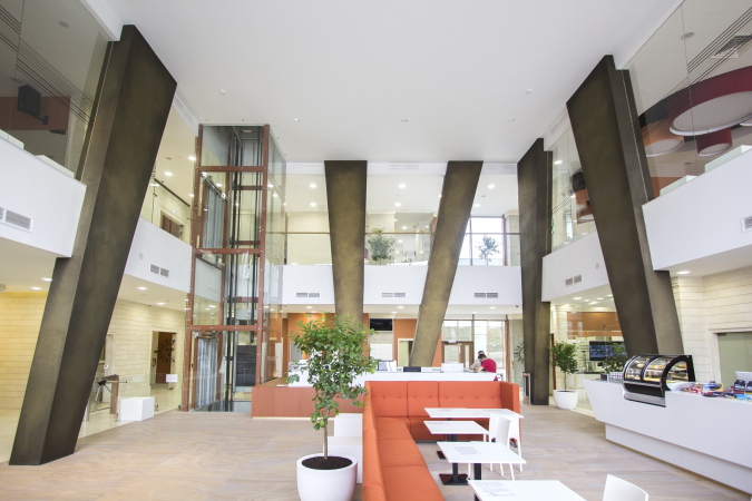
V-shaped columns make a very dramatic image in all senses. Construction-wise, they support the pretension concrete, while visually they look like muscles and tendons of an athlete. These tensed up “muscles” and stretched “strings” artistically express real forces that are in play within this construction. The tilting angles of the columns and “ribbon” windows on the façade do not match. In the enhanced tilt of the columns one can see something like athlete’s plunge at the start, something like extra acceleration. The V-shaped support is viewable on several floors in the interior, and from the outside through the glass. In addition, however trivial this may sound, V may stand for “victory”, which is appropriate in any sports center.

Show in Wonderland

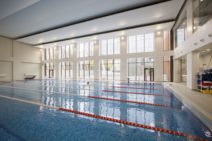
From the yard, which is due to be later on organized for open air sports, one can gaze either at the park or at the glass walls of the atrium. They form some kind of curious offline screens, upon which beautiful people in beautiful clothes move freely. The glass wall of the swimming pool also overlooks the yard.

The athletes behind the glass also enjoy the transparency: they can watch the would go by, and expose themselves to the world as well. This transparency is like the main luxury here. This sporty “theater” also has a commercial meaning: one can see at once what is situated where, and one see which new sports he wants to try.

Cylinders Inspired by Le Corbusier

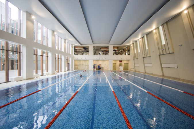
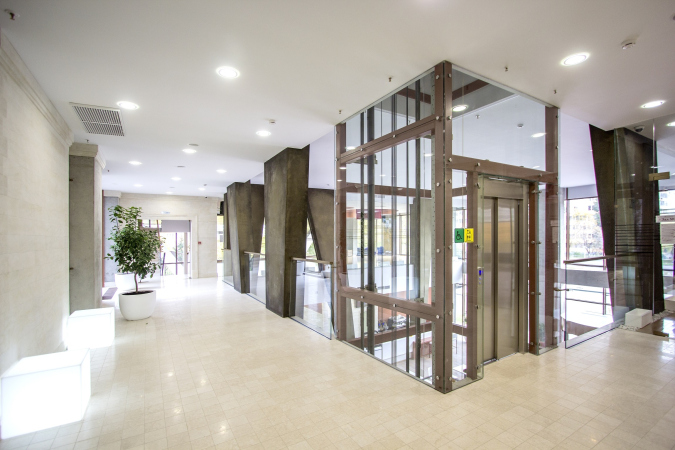
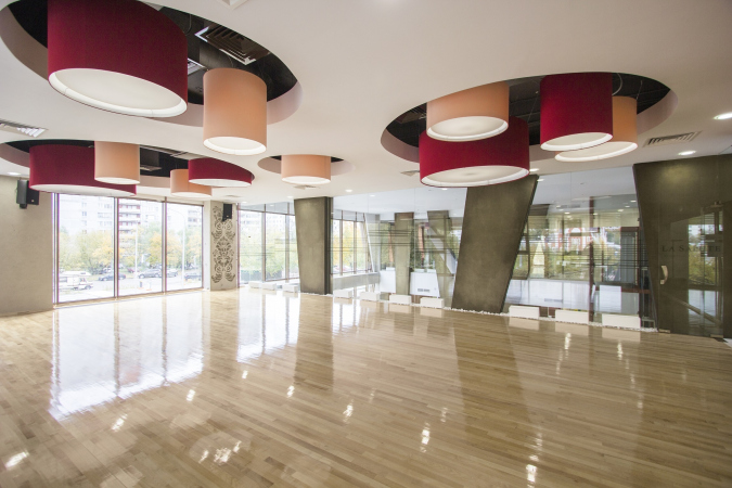
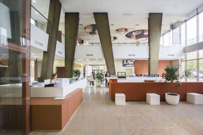
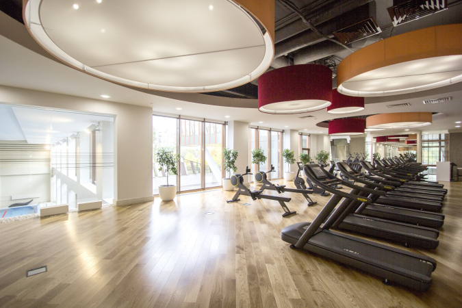
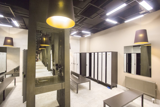
The interior design is based on a combination of white, orange, and wine red. The theme of tilted V-shaped supports is continued in the interior by bronze columns, also tilted. Passing through the main entrance, the visitor gets into a spacious double-height reception area that also includes a bar, sofas, and tables for the visitors. This area opens access to the locker rooms and gyms with panoramic views. From the public area, once can also see through the glass walls what is going on inside the gyms and the other way around. The principle of total transparency, important for the architects, applies at all levels. In addition to the gyms, La Salute also has saunas and steam baths in it, a swimming pool with sea water, and even a Cardio Theater. The latter was proposed by the commissioner, Larisa Khanukhova: she took an active part in doing the interior design.

  • zooming
    1 / 9
    Fitness center La Salute on the Belorechenskaya Street
    Copyright: © ASADOV architects
  • zooming
    2 / 9
    Fitness center La Salute on the Belorechenskaya Street
    Copyright: © ASADOV architects
  • zooming
    3 / 9
    Fitness center La Salute on the Belorechenskaya Street
    Copyright: © ASADOV architects
  • zooming
    4 / 9
    Fitness center La Salute on the Belorechenskaya Street
    Copyright: © ASADOV architects
  • zooming
    5 / 9
    Fitness center La Salute on the Belorechenskaya Street
    Copyright: © ASADOV architects
  • zooming
    6 / 9
    Fitness center La Salute on the Belorechenskaya Street
    Copyright: © ASADOV architects
  • zooming
    7 / 9
    Fitness center La Salute on the Belorechenskaya Street
    Copyright: © ASADOV architects
  • zooming
    8 / 9
    Fitness center La Salute on the Belorechenskaya Street
    Copyright: © ASADOV architects
  • zooming
    9 / 9
    Fitness center La Salute on the Belorechenskaya Street
    Copyright: © ASADOV architects


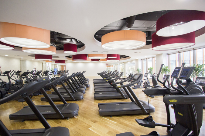
“The building of the club is outwardly dynamic, and we tried to keep this character on the inside as well, trying to make it look chic by finding some bright dramatic detail – Larisa Khanukhova is saying – This is how we came up with the idea of colorful lights: this cylindrical shape with a chamfered opening can be seen in Le Corbusier’s church in Firmini. From the functional standpoint, our club offers not just fitness, but an opportunity to relax as well. The Italian name La Salute translates as “health”. We tried to create a matching visual image by means of art and design: we placed art objects there, and decorated the Cardio Theater in the vein of the amphitheater in the city of Lucci”.

The theme of a sportive theater, as we can see, pops up here more than once. The same purpose is served by the green roofs of the building, which are not operated – yet – but the architects already designed an exit to them and provided for the low-maintenance “sportive” coating material. Doing sports on the roof will be quite a sight to see for the locals, and a great promotion for the club, too. This club, offering fitness and yoga, will be quite a big deal for this sleeping-belt neighborhood.

30 September 2019

Headlines now
Four Different Surveys
The “Explore the City” competition, organized this year by the Genplan Institute of Moscow, stands out as a pretty unconventional one for the architectural field but aligns perfectly well with the character of urban planning work. The winning project analyzed contemporary residential complexes, combining urban planning insights with a realtor’s perspective to propose a hybrid approach. Other entries explored public centers, motivations for car ownership, and housing vacancy rates. A fifth participant withdrew. Here’s a closer look at the four completed works.
Scheduled Evolution
ASADOV Architects unveiled the EvyCenter pavilion, a microcultural hub for fostering personal growth, organizing workshops, and doing gymnastics. Additionally, this pavilion serves as a prototype for a scalable country house, drawing inspiration from the “Loskutok” project, and constructed from CLT panels in a factory. This marks the beginning of a developer project initiated by the architectural firm (sic!), which is seeking partners to expand both small Evy settlements and even larger Evy cities, which are, according to Andrey Asadov, aimed at fostering the “evolutionary” development of the people who will inhabit them.
The Golden Crown
The concept for a dental clinic in Yekaterinburg, developed by CNTR Studio, revolves around the idea of a “mouth full of gold”: pristine white porcelain stoneware walls are complemented by matte brass details. To avoid an overly literal interpretation, the architects focused on the building’s proportions, skillfully navigating between sunlight requirements and fire safety regulations.
Flexibility and Integration
Not long ago, we covered the project for the fourth phase of the ÁLIA residential complex, designed by APEX. Now, we’ve been shown different fence concepts they developed to enclose the complex’s private courtyards, incorporating a variety of public functions. We believe that the sheer fact that the complex’s architects were involved in such a detail as fencing speaks volumes.
A Step Forward
The HIDE residential complex represents a major milestone for ADM architects and their leaders Andrey Romanov and Ekaterina Kuznetsova in their quest for a fresh high-rise aesthetic – one that is flexible and layered, capable of bringing vibrancy to mass and silhouette while shaping form. Over recent years, this approach has become ADM’s “signature style”, with the golden HIDE tower playing a pivotal role in its evolution. Here, we delve into the project’s story, explore the details of the complex’s design, and uncover its core essence.
Gold in the Sands
A new office for a transcontinental company specializing in resource extraction and processing has opened in Dubai. Designed by T+T Architects, masters of creating spaces that are contemporary, diverse, flexible, and original, this project exemplifies their expertise. On the executive floor, a massive brass-clad partition dominates, while layered textures of compressed earth create a contextually resonant backdrop.
Layers and Levels of Flight
This project goes way back – Reserve Union won this architectural competition at the end of 2011, and the building was completed in 2018, so it’s practically “archival”. However, despite being relatively unknown, the building can hardly be considered “dated” and remains a prime example of architectural expression, particularly in the headquarters genre. And it’s especially fitting for an aviation company office. In some ways, it resembles the Aeroflot headquarters at Sheremetyevo but with its own unique identity, following the signature style of Vladimir Plotkin. In this article, we take an in-depth look at the United Aircraft Corporation (UAC) headquarters in the Moscow agglomeration town of Zhukovsky, supplemented by recent photographs from Alexey Naroditsky – a shoot that became only recently possible due to the fact that improvements were finally made in the surrounding area.
Light and Shadow
In this article, we delve into the architectural design of the “Chaika” house by DNK ag architects, which was recently completed in 2023 as part of the collection of signature designs at ZILArt. As is well-known, all the buildings in this complex follow a design code, yet each one is distinct. This particular building stands out not only for its whiteness and minimalism but also for the refined use of a limited number of techniques that, together, create what can confidently be called synergy.
Casus Novae
A master plan was developed for a large residential area with a name of “DNS City”, but now that its implementation began, the plan has been arbitrarily reformatted and replaced with something that, while similar on the surface, is actually quite different. This is not the first time such a thing happens, but it’s always frustrating. With permission from the author, we are sharing Maria Elkina’s post.
Treasure Hunting
The GAFA bureau, in collaboration with Tegola and Arkhitail, organized an expedition to the island of Kilpola in Karelia as part of Moskomarkhitektura’s “Open City” festival. There, amidst moss and rocks, the students sought answers to questions like: what is the sacred, where does it dwell, and what sustains it? Assisting the participants in this quest were landscape engineer Evgeny Levin, artist Nicholas Roerich, a moose, and the lack of cellular connection. Here’s how the story unfolded.
Depths of the Earth, Streams of Water
In the Malaya Okhta district, the Akzent building, designed by Stepan Liphart, was constructed. It follows a classic tripartite structure, yet it’s what you might call “hand-drawn”: each façade is unique in its form and details, some of which aren’t immediately noticeable. In this article, we explore the context and, together with the architect, delve into how the form was developed.
Fir Tree Dynamics
The “Airports of Region” holding is planning to build an airport in Karachay-Cherkessia, aiming to make the Arkhyz and Dombay resorts more accessible to travelers. The project that won in an invitation-only competition, submitted by Sergey Nikeshkin’s KPLN, blends natural imagery inspired by the shape of a conifer seed, open-air waiting spaces, majestic large trees, and a green roof elevated on needle-like columns. The result is both nature-inspired and WOW.
​A Brick Shell
In the process of designing a clubhouse situated among pine trees in a prestigious suburban area near Moscow, the architectural firm “A.Len” did the façade design part. The combination of different types of brick and masonry correlates with the volumetric and plastique solutions, further enhanced by the inclusion of wood-painted fragments and metal “glazing”.
Word Forms
ATRIUM architects love ambitious challenges, and for the firm’s thirtieth anniversary, they boldly play a game of words with an exhibition that dives deep into a self-created vocabulary. They immerse their projects – especially art installations – into this glossary, as if plunging into a current of their own. You feel as if you’re flowing through the veins of pure art, immersed in a universe of vertical cities, educational spaces – of which the architects are true masters – and the cultural codes of various locations. But what truly captivates is the bold statement that Vera Butko and Anton Nadtochy make, both through their work and this exhibition: architecture, above all, is art – the art of working with form and space.
Flexibility and Acuteness of Modernity
Luxurious, fluid, large “kokoshniks” and spiral barrel columns, as if made from colorful chewing gum: there seem to be no other mansion like this in Moscow, designed in the “Neo-Russian-Modern” style. And the “Teremok” on Malaya Kaluzhskaya, previously somewhat obscure, has “come alive with new colors” and gained visibility after its restoration for the office of the “architectural ecosystem” as the architects love to call themselves. It’s evident that Julius Borisov and the architects at UNK put their hearts into finding this new office and bringing it up to date. Let’s delve into the paradoxes of this mansion’s history and its plasticity. Spoiler: two versions of modernity meet here, both balancing on the razor’s edge of “what’s current”.
Yuri Vissarionov: “A modular house does not belong to the land”
It belongs to space, or to the air... It turns out that 3D printing is more effective when combined with a modular approach: the house is built in a workshop and then adapted to the site, including on uneven terrain. Yuri Vissarionov shares his latest experience in designing tourist complexes, both in central Russia and in the south. These include houseboats, homes printed from lightweight concrete using a 3D printer, and, of course, frame houses.
​Moscow’s First
“The quality of education largely depends on the quality of the educational environment”. This principle of the last decade has been realized by Sergey Skuratov in the project for the First Moscow Gymnasium on Rostovskaya Embankment in the Khamovniki district. The building seamlessly integrates into the complex urban landscape, responding both to the pedestrian flow of the city and the quiet alleyways. It skillfully takes advantage of the height differences and aligns with modern trends in educational space design. Let’s take a closer look.
Looking at the Water
The site of Villa Sonata stretches from the road to the water’s edge, offering its own shoreline, pier, and a picturesque river panorama. To reveal these sweeping views, Roman Leonidov “cut” the façade diagonally parallel to the river, thus getting two main axes for the house and, consequently, “two heads”. The internal core – two double-height spaces, a living room and a conservatory, with a “bridge” above them – makes the house both “transparent” and filled with light.
The White Wing
Well, it’s not exactly white. It’s more of a beige, white-stone structure that plays with the color of limestone – smoother surfaces are lighter, while rougher ones are darker. This wing unites various elements: it absorbs and interprets the surrounding themes. It responds to everything, yet maintains a cohesive expression – a challenging task! – while also incorporating recognizable features of its own, such as the dynamic cuts at the bottom, top, and middle.
Urban Dunes
The XSA Ramps team designed and built a three-part sports hub for a park in Rostov-on-Don, welcoming people of all ages and fitness levels. The skate plaza, pump track, and playground are all meticulously crafted with details that attract a diverse range of visitors. The technical execution of the shapes and slopes transforms this space into a kind of sculptural composition.
Proportional Growth
The project for the fourth phase of the ÁLIA residential area has been announced. The buildings are situated on an elongated plot – almost a “ray” that shoots out from the center of the area towards the river. Their layout reflects both a response to Moscow’s architectural preferences over the past 15 years, shifting “from blocks to towers”, and an interpretation of the neighboring business park designed by SOM. Additionally, the best apartments here are not located at the very top but closer to the middle, forming a glowing “waistline”.
The “Staircase” Building
In designing the “Details” residential complex in New Moscow, Rais Baishev spiced up the now-popular Moscow theme of a “courtyard” building with an idea drawn from the surrealist drawings by Maurits Escher. He envisioned the stepped silhouettes and descending slopes as a metaphysical mega-staircase, creating a key void within the courtyard that gave the project an internal “spine”. This concept is felt both in the building’s silhouette and on its façades.
Projection of the Quarter
No one doubted that the building that Vladimir Plotkin designed as part of the “Garden Quarters” would be the most modernist of all. And it turned out just that way: while adhering to the common design code, the building successfully combines brick and white stone, rhythmically responding to the neighboring building designed by Ostozhenka, yet tactfully and persistently making a few statements of its own. This includes the projection of the ideal urban development composition “14–9–6”, which can be found right next door, mathematical calculations, including those for various types of terraces (and perhaps the only reminder of the Soviet past of the Kauchuk rubber factory!), and the white “cross-stitch” pattern of the façade grid.
Domus Aurea
In this issue, we examine the “Tessinsky-1” house, designed by Sergey Skuratov and completed in 2023. Located in the middle of the Serebryanicheskaya Embankment district, at the intersection of its main streets, this house assumes a sort of “nodal” role: it not only responds to everything around it and preserves many memories of the former EMA factory within itself, but it weaves all this into a newly directed pattern, reconciling bright “gold” and dark-colored brick, largely with the help of the new, modern-yet-archaic Columba brick, which, come to think about it, is the most precious element here.
The Chimney of Nikola-Lenivets
In this issue, we are examining the “Obelisk House” designed by KATARSIS and built for the Arkhstoyanie 2023 festival. However, it was only finished later on, and this is why we are examining it now. It seems to us that after the “Obelisk House” appeared in Nikola-Lenivets, a dialogue and a few inner connections appeared between the temporary structures built here. These houses no longer look like “accidental neighbors”, more of which below.
​Periscope by the Bay
The jury awarded the second place in the competition for a public and cultural center in Petropavlovsk-Kamchatsky to the companies GORA (“Mountain”) and M4. In the consortium’s proposal, the building resembles a sperm whale with a calf swimming next to it or a periscope, whose lenses capture the most spectacular views from the surrounding landscape.
From Arcs to Dolmens
While working on the competition project for Petropavlovsk-Kamchatsky, ASADOV Architects prioritized the value of the natural and urban environment, aiming to preserve the balance of the location while minimizing the resemblance of the volume that they designed to a “traditional building”. The task was challenging, and the architects created three versions, one of which having been developed after the competition, where their main proposal took third place. However, the point of interest here is not the competition result but the continuity of creative thinking.
Hide and Seek
The ID Moskovskiy house, designed by Stepan Liphart in St. Petersburg, in the courtyards near Moskovskiy Avenue beyond the Obvodny Canal and recently completed, is notable for several reasons. Firstly, it has been realized with considerable accuracy, which is particularly significant as this is the first building where the architect was responsible not only for the facades but also for the layouts, allowing for better integration between the two. On the other hand, this building is interesting as an example of the “germination” of new architecture in the city: it draws on the best examples from the neighborhood and becomes an improved and developed sum of ideas found by the architect in the surrounding context.
The Big Twelve
Yesterday, the winners of the Moscow Mayor’s Architecture Award were announced and honored. Let’s take a look at what was awarded and, in some cases, even critique this esteemed award. After all, there is always room for improvement, right?
Above the Golden Horn
The residential complex “Philosophy” designed by T+T architects in Vladivostok, is one of the new projects in the “Golubinaya Pad” area, changing its development philosophy (pun intended) from single houses to a comprehensive approach. The buildings are organized along public streets, varying in height and format, with one house even executed in gallery typology, featuring a cantilever leaning on an art object.