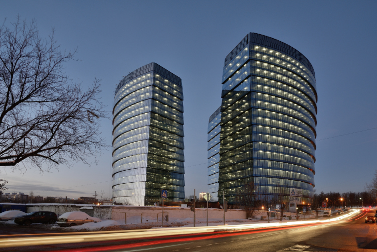
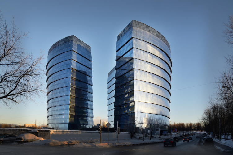
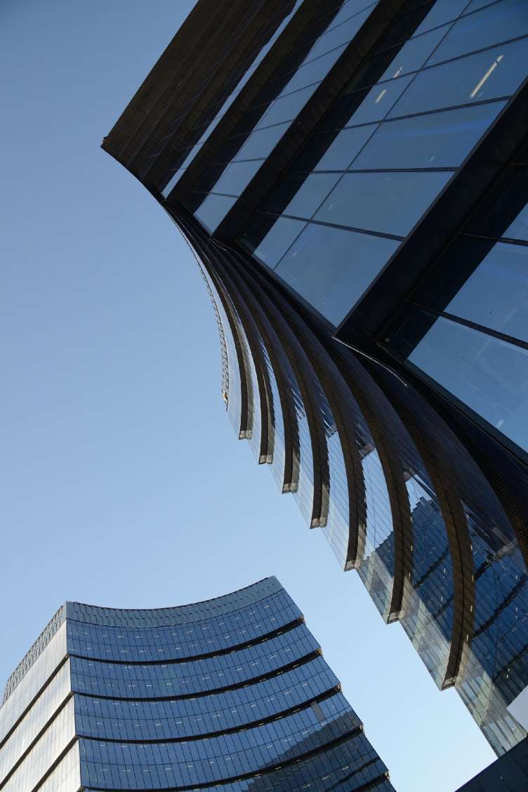
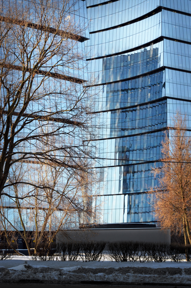
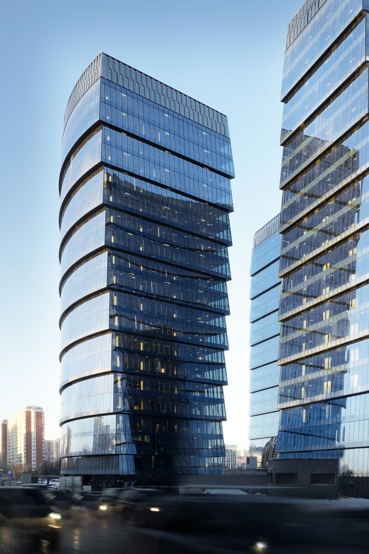
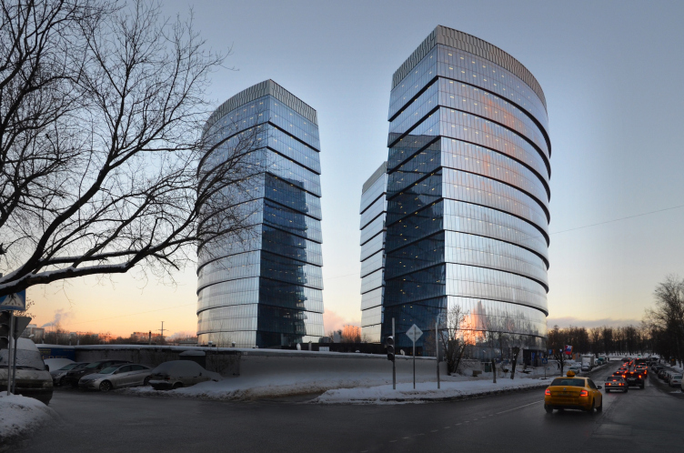
We already shared in detail about the project of this multifunctional (still, predominantly office) center situated in the district of Zyuzino on the Odesskaya Street, next to "Nakhimovsky Prospect" metro station and the small Kotlovka River (the authors of the project being Sergey Tchoban, Sergey Kuznetsov, Aleksey Ilin, and SPEECH). By the end of 2014, it was implemented practically the way it was designed, got the name of "Lotus", and was nominated for numerous prestigious Russian architectural awards. In other words, this building is as high-profile as it is conspicuous, among other reasons, because of the fact that this is one of the projects that were designed right before the economic crisis of 2008, but still were successfully implemented when the recession was in full swing. But then again, this project is a high-profile one not only in theory: the complex is viewable from many sides, from long distances, and, of course, it makes a striking impression on those who drive down the Nakhimovsky Avenue, when, among the dusty vistas of panel buildings, shabby five-story affairs, the inevitable road repair, and abundant but still scraggy trees, they suddenly see a large but self-sufficient glittering volume, compactly packed, and at the same time looking as it it was spinning a little bit - sort of like a glass tornado.
Multifunctional complex "Lotus". Construction 2011-2014. Photograph © Aleksey Naroditskiy
Multifunctional complex "Lotus". Construction 2011-2014. Photograph © Aleksey Naroditskiy
What first met my eye was the total "extraterrestrial" quality of this project. The crumbly and monotonous background of the "sleeping belt" area where five-story affairs and panel-house neighborhoods alternate with all-but-abandoned industrial parks and wastelands suddenly gives way to a smooth glittering dark-blue monster 85 meters tall that looks as if it had grown up (or, should I say "drilled up") from underground, if not fallen from the sky. The building is a total alien, and so it feels – it stays within its self-imposed circle – not timidly but quite confidently. The whole thing also feels a bit like the Ancient Greek fable about a dragon's teeth that would grow up in a field: what we are seeing here is a strong and self-sufficient edifice. In the Moscow contest, the only thing that it is emotionally on a par with is the complex of Moscow City – it also fills a casual observer with awe at its sheer magnitude and the quality of its surfaces. Yes, this building definitely seems like a distant offshoot of the host of skyscrapers of Moscow City. Most parallels can be drawn, of course, with the Federation Tower because it was built, with Peter Schweger as the co-author, by Sergey Tchoban – but it's not so much this likeness that's important – rather, both Moscow City and Lotus belong to one and the same genre of an "honest" office giant that does not even think of keeping a low profile, which implies huge glass façades, a giant scale, and the integrity of the 3D technology-born form. The thirty years of postmodernism have shown that mimicry is not something that such buildings should be about, and it is not their strong point either – honesty and straightforwardness are much more appropriate in such cases.
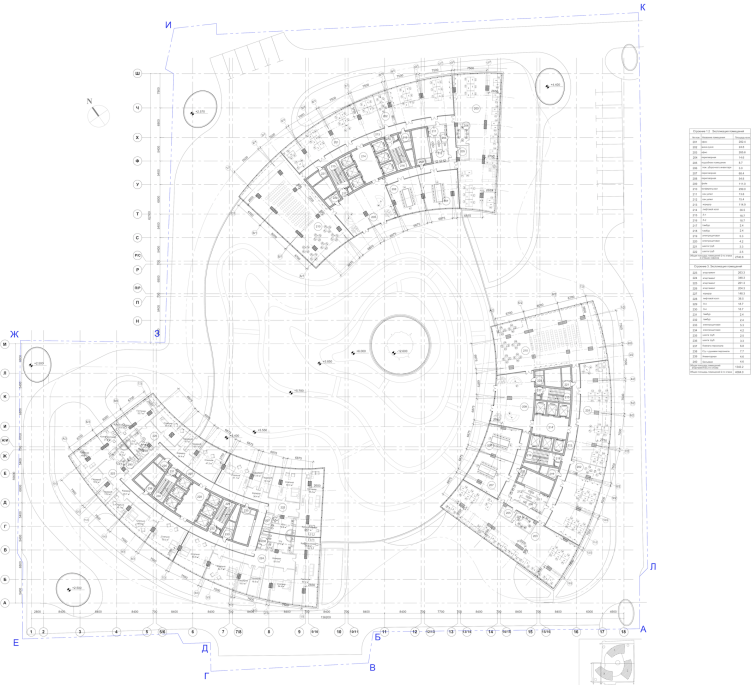
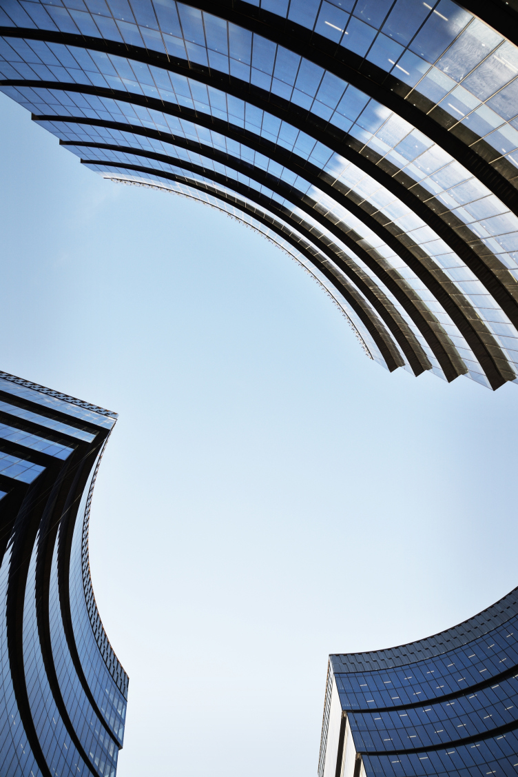
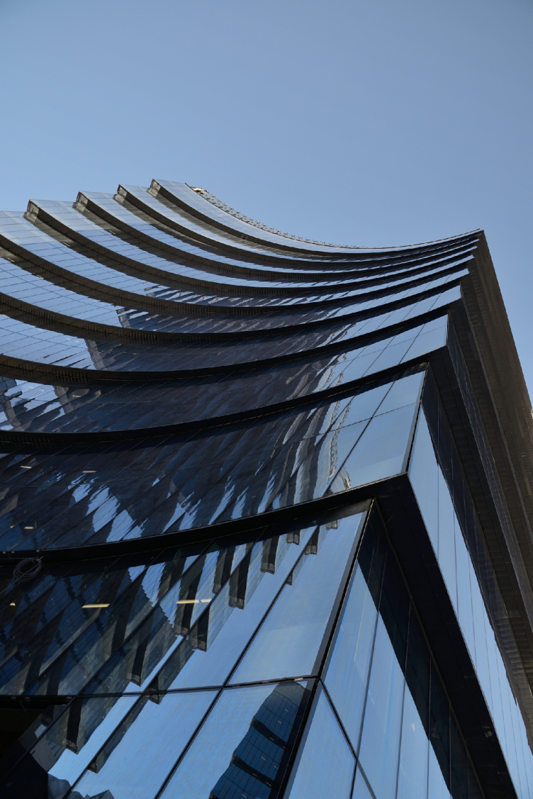
Back to the topic of drilling from beneath the ground, though! First of all, the building's spiral plan consists of three blade-shaped buildings that do suggest some sort of a propeller, maybe the helicopter kind in the avant-garde spirit, or maybe of some other type. Second of all, the faceting of the two bottom floors reminds – particularly for a casual observer glancing from below - a jagged edge of some sharpened tool. It can be, of course, traced back to the classic attic with pylons alternating in a staggered order but the image of the building, which is rather on the technology side, brings more associations with some sophisticated machine rather than with an attic. And third: the glass façade springs directly from the ground, without any basement floor, and at some points it only opens the recession of the entrance, which suggests that there's plenty more of such matter left underground.
Multifunctional complex "Lotus". Construction 2011-2014. Axis diagram © SPEECH
Multifunctional complex "Lotus". Construction 2011-2014. Photograph © Aleksey Naroditskiy
Multifunctional complex "Lotus". Construction 2011-2014. Photograph © Aleksey Naroditskiy
Which is partially true: underneath, there are four levels of the parking garage. In its center, there is an atrium covered with a dome, inside of which it was planned, according to the project, to grow a tree – we already wrote about that. Right about that time, proceeding from the idea of a living tree planted in the middle of a "mechanical" building, a logical structure came about: the skyscraper is all about glass and concrete but the living tree went a long way to make it come alive.
Multifunctional complex "Lotus". Construction 2011-2014. Photograph © Aleksey Naroditskiy
Yes, all this is true. Looking at the building for the first time, one, is, of course, impressed by its sheer size. On second sight, however, you notice a lot of signs of subtle silhouette play that unfolds on a superhuman scale but does not lose any intensity because of that – rather, gains extra momentum.
First of all, the shape of each of the units - and they look pretty much alike – combines a cylinder and a cone, giving an interesting spin to the tension that appears between these different but still akin shapes. Each unit can be viewed as a third of a cylinder but this is not the whole of it. If we are to take a look at their sides, we will see that they are trapeze-shaped, one tapering and one widening towards the top. The entire volume is covered with some eternal ripples that bring associations with light waves or magnetic fields – on the one hand. On the other hand, it resembles the curvatures of the classical column adapted the post-Einsteinian language of modern architecture.
Multifunctional complex "Lotus". Construction 2011-2014. Photograph © Aleksey Naroditskiy
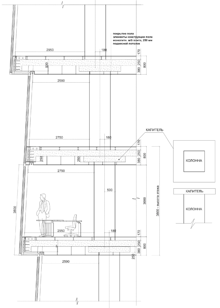
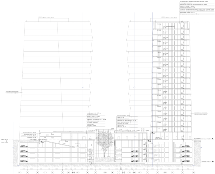
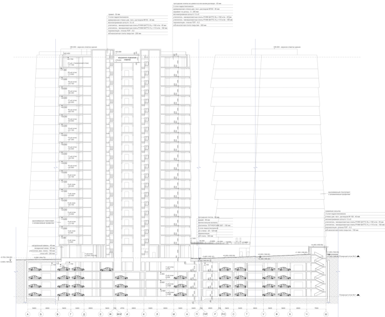
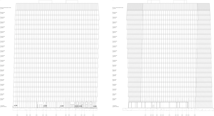
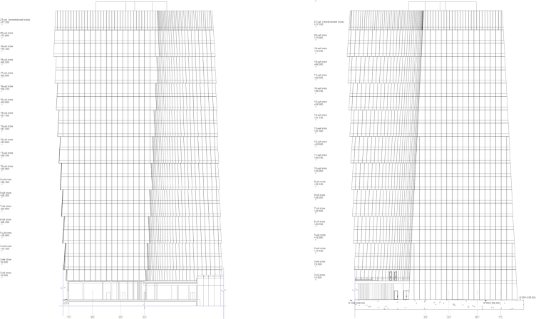
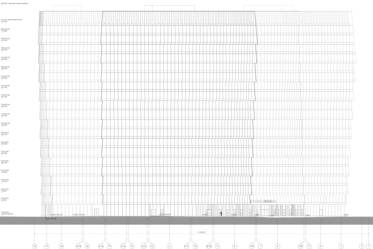
Because of the geometry that makes each of the volumes make an unconventional twist from a usual trapeze to an inverted one, the outside walls are non-vertical almost at all points. This is clearly seen on the drawings and section views. And, if we are to take a walk around the building, one's eyes do not take in the details at once, and an impression is created as if the signal of the immanent complexity of this giant comes out from one's subconscious. Suddenly you realize that this building, however large, sturdy, and simple, has a soul, and it not just stands, it teeters, and not because of the wind but in time to its inner tune.
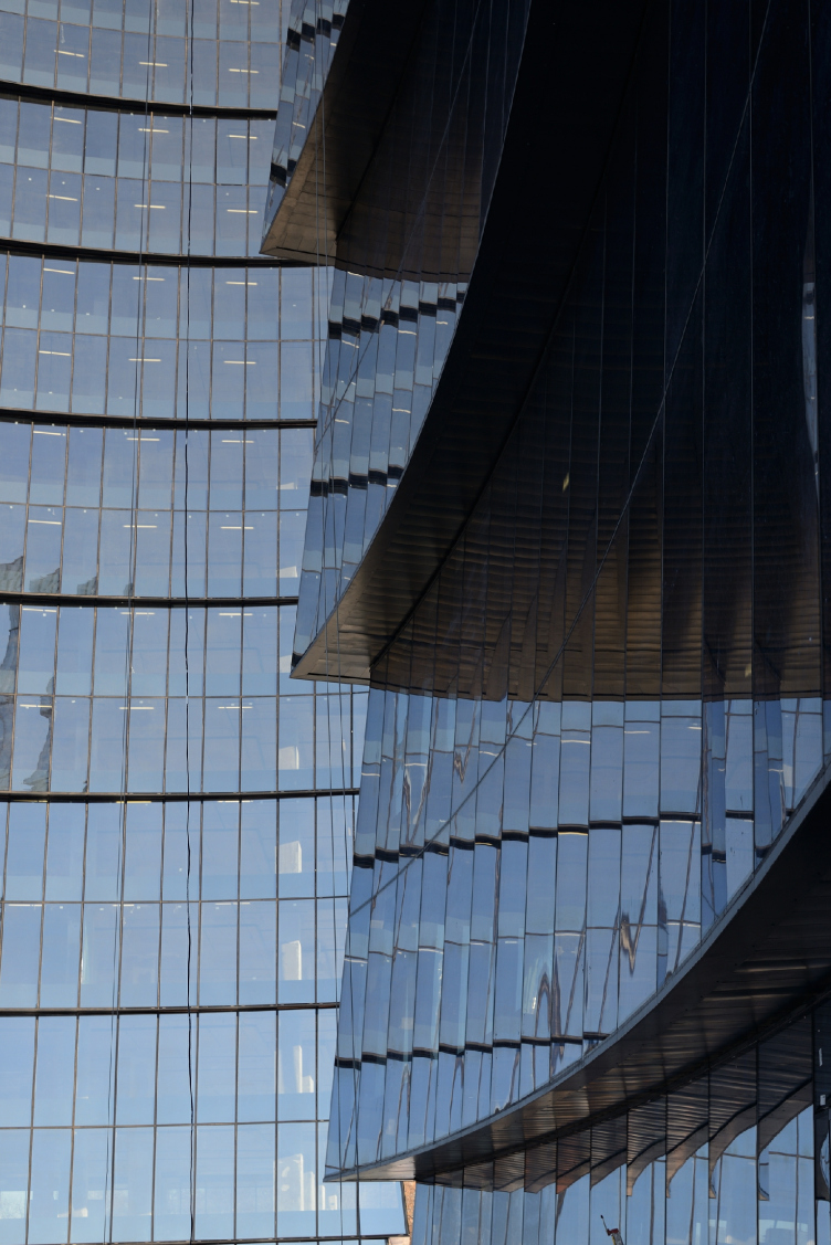
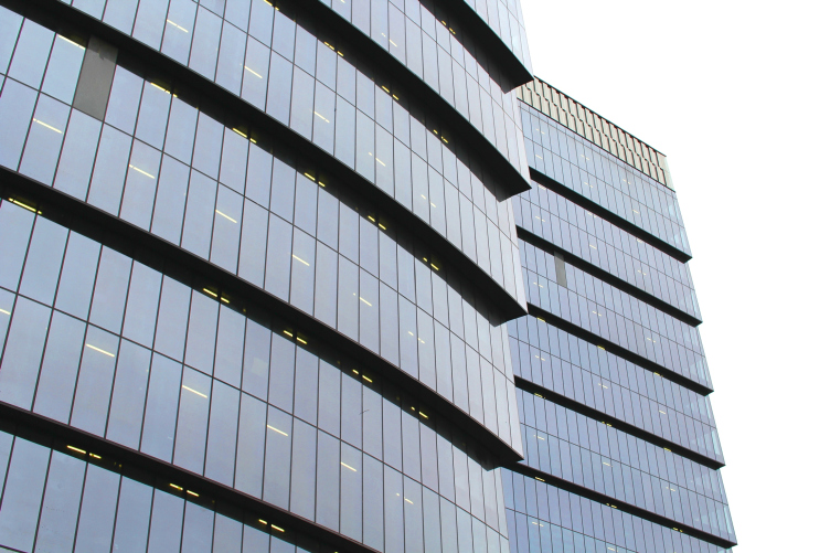
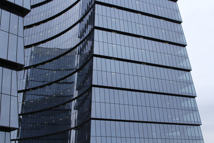
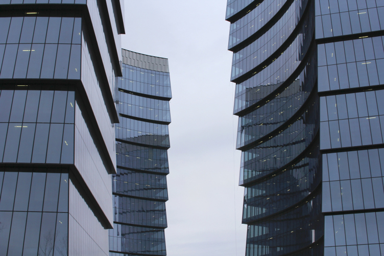
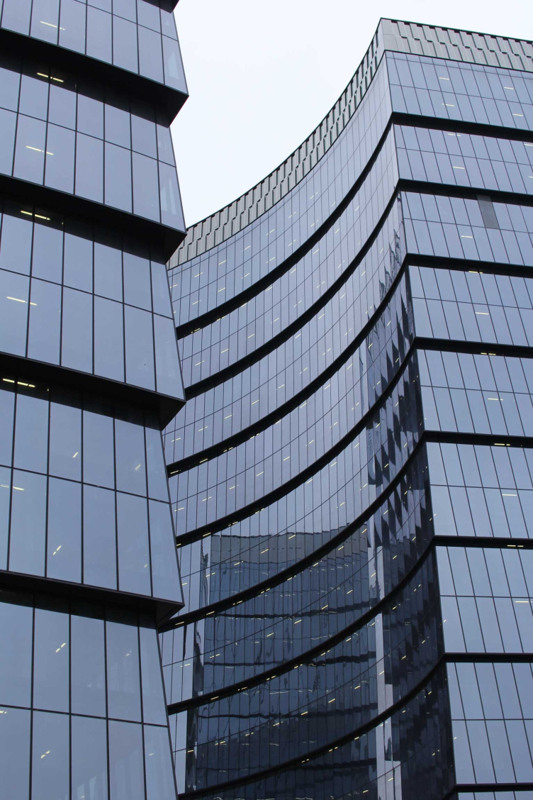
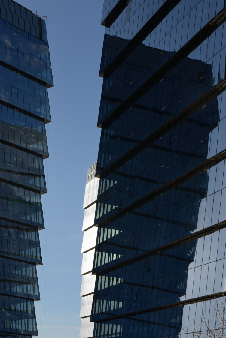
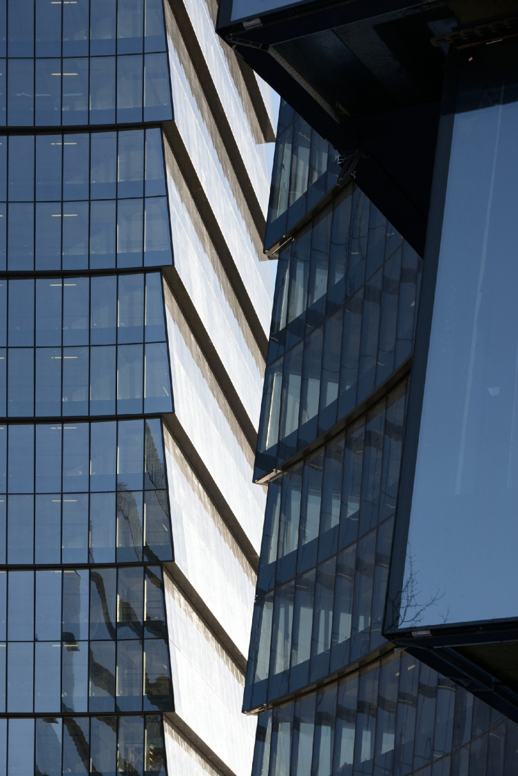
That's not how the story ends, however. All the glass stories are grouped in twos, and the outside glass of the broad glass bands is tilted toward the sky; their bottom edge functions as a cantilever, forming a semblance of a marquee that protects each following pair of floors from the sun – the architects proudly stress. The tilted surfaces reflect the sky better, and this is why the building looks so navy blue, while the so-popular-nowadays rhythm helps to "eat away" the scale to a certain extent. The black shadows of the cantilevers dissect the volumes with graphic lines looking like they were made in black Indian ink. The outlines of the "strokes" smoothly change as they go into perspective, grow thinner and painted as a line skillfully drawn on Chinese silk (it looks particularly like silk on a sunset), and bring out the best features in the volume. And these features are so powerful that, while looking at them, one really starts having doubts about whether the cantilevers stick out evenly or whether they also take an active role in the game of light and shade. But – make no mistake – they stand out evenly, only the lines of the shadows deceive one's eyes inviting them to follow. The impression is very much like a watercolor painting, drawn with a feather: dissected by a regular grid pattern of thin joints, the façades serve as a canvas for broad "strokes" of cantilevers, at some places the circular ones from the curved surfaces meeting the straight ones from the sides – in these places the powerful tension of the volumes is felt particularly strong. Anybody who has ever applied strokes on a cylinder will get what I am talking about. The transparency of the corners seen against the light, just as the fact that the buildings reflect one another, adds to the complex's beauty and picturesqueness, due to the colorful spots of varying intensity getting fractured at the bends of the walls.
Multifunctional complex "Lotus". Construction 2011-2014. Photograph © Aleksey Naroditskiy
Multifunctional complex "Lotus". Construction 2011-2014. Photograph © Aleksey Naroditskiy
Multifunctional complex "Lotus". Detail of the facade © SPEECH
Multifunctional complex "Lotus". Construction 2011-2014. Photograph © Julia Tarabarina
Multifunctional complex "Lotus". Construction 2011-2014. Photograph © Julia Tarabarina
Multifunctional complex "Lotus". Construction 2011-2014. Photograph © Julia Tarabarina
Multifunctional complex "Lotus". Construction 2011-2014. Photograph © Julia Tarabarina
Multifunctional complex "Lotus". Construction 2011-2014. Photograph © Aleksey Naroditskiy
One should also say that, apart from the above-mentioned "drill", the complex looks like the mechanism of a clutch pencil: some of you must remember these pencils that hold the graphite with three-four tiny metallic paws. So, if you take away the graphite, push the button at the back of the pencil, and pry the petals open – they really look like this complex. And if we are to remember that both Sergey Tchoban and Sergey Kuznetsov – who also worked on this project when he wasn't yet the chief architect of Moscow - are passionate drawing artists, the resemblance ceases to look all that improbable.
The glass is a bit on the smoked side: it only lets in 45% of the visible ambient light and 30% of heat. It still retains its transparency letting an outside observer see the white strokes of fluorescent lights on the ceiling of each floor: particularly noticeable on an overcast day, they fall together to form a laconic pattern that makes the stripes of cantilevers come alive. At night, the building glows from the inside like an anthill of fireflies – this, incidentally, also reminds me of Moscow City. Visible from the outside, the lines of light add to the building's openness: for a person going down the street at night, the chandeliers shining on the ceilings of other people's apartments are a comforting sight to see; without being a peeping Tom, we still sort of feel as if we are a tiny part of somebody else's life, and, therefore, not so lonely anymore - the white strokes on the ceiling of the office complex explore this particular emotion – a technique that adds a soul to this multi-dimensional giant, making it closer, warmer, and more alive.
Multifunctional complex "Lotus". Construction 2011-2014. Photograph © Aleksey Naroditskiy
Multifunctional complex "Lotus". Construction 2011-2014. Photograph © Aleksey Naroditskiy
***
In these days and in this country (other countries excepted), few people are really willing to examine architecture. On the other hand, most people are quick to hang labels without ever seeing the project in question. An "office building" project is a "bad" project; a "compacted" or a "pointed" one – still worse. And, as for "building of glass and concrete" term, ever since the 1980's it has been as close to an insult as an architectural term could ever get. In such surroundings, office towers inevitably try to keep a low profile, try to make themselves inconspicuous – which, as we remember, is something they are not good at, anyway, and the awkward attempts at disguising themselves only ruin their looks. What we are seeing here is a totally different case: Lotus establishes itself as something that's glass and concrete – yes, this is all true, but that's only one side of the story. It still reserves the right to be agile and moving, or maybe even meditate on its own architectural genre, molding its thoughts, and maybe even controversies, into the barely noticeable subtleties of the design solution. This giant baby has a soul to it – which is what the whole project was all about. It has been proven many times: this is exactly the way one must work within this genre.
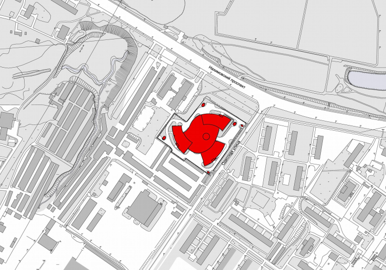
Multifunctional complex "Lotus". Location plan © SPEECH
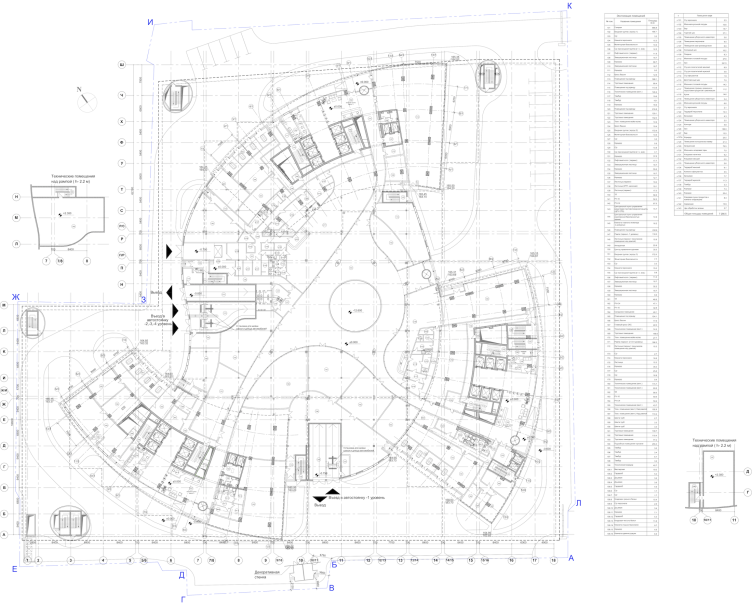
Multifunctional complex "Lotus". Plan of the 1st floor © SPEECH
Multifunctional complex "Lotus". Plan of the 2nd floor © SPEECH
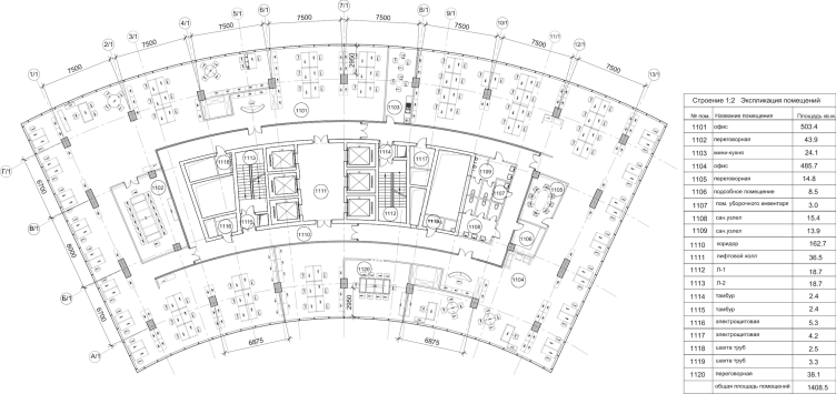
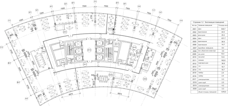
Multifunctional complex "Lotus". Plan of the 11th floor (offices) © SPEECH
Multifunctional complex "Lotus". Plan of the 20th floor © SPEECH
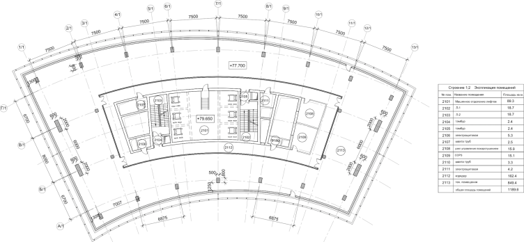
Multifunctional complex "Lotus". Plan of the 21st floor (offices, maintenance part) © SPEECH
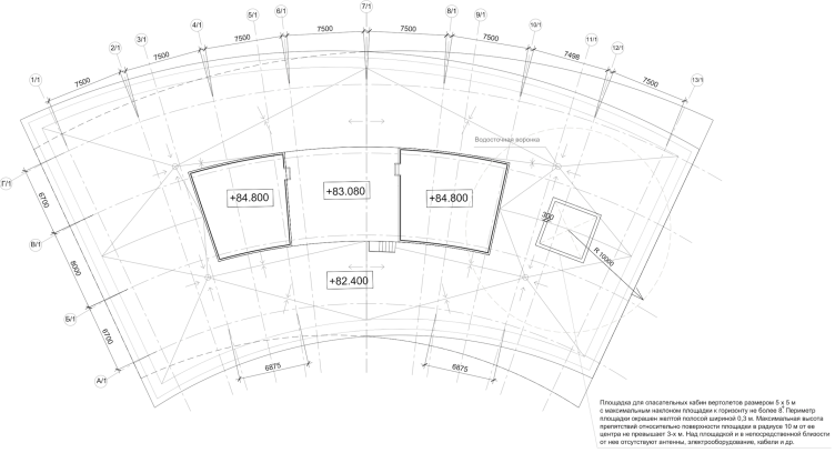
Multifunctional complex "Lotus". Plan of the usable roof © SPEECH
Multifunctional complex "Lotus". Section view © SPEECH
Multifunctional complex "Lotus". Section view © SPEECH
Multifunctional complex "Lotus". Section view © SPEECH
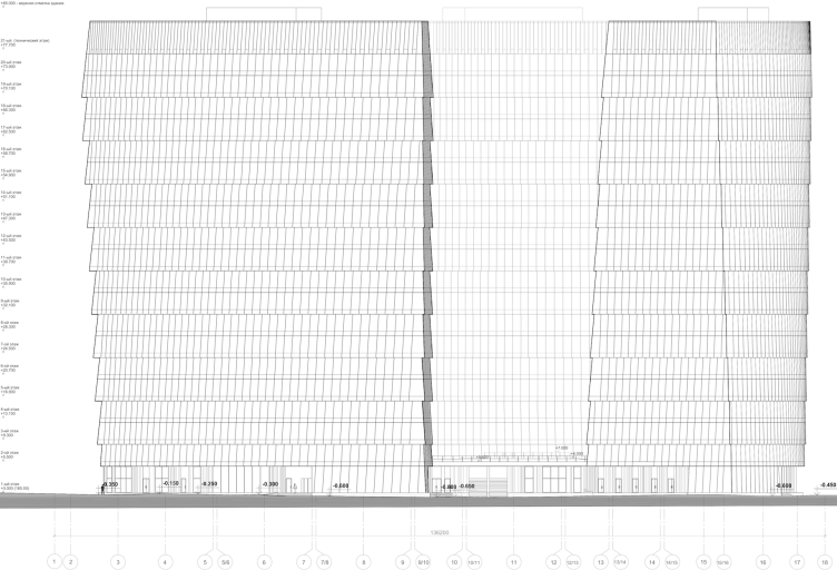
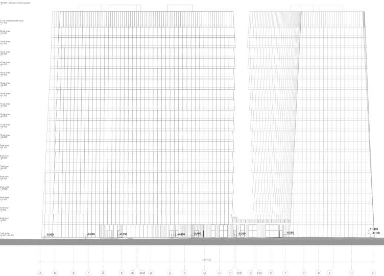
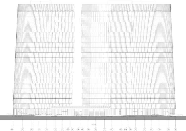
Multifunctional complex "Lotus". Facade © SPEECH
Multifunctional complex "Lotus". Facade © SPEECH
Multifunctional complex "Lotus". Facade © SPEECH
Multifunctional complex "Lotus". Facade © SPEECH
Multifunctional complex "Lotus". Facade © SPEECH
Multifunctional complex "Lotus". Facade © SPEECH


