По-русски

Engineering Oasis

The engineering system of the renovated swimming complex of "Luzhniki" designed by Engex as part of Asadov Consortium: the optimum balance between comfort and cost/energy efficiency.

13 March 2015
Object
Enginenriya
mainImg

Contest Project
The contest for the best concept of reconstructing the swimming complex of "Luzhniki" was organized in the spring of 2014 at the commission of Codest Company and we gave it a fairly detailed coverage. The architects were to revise the complex that was built in 1956 turning the open-air swimming pool into a covered aqua park, at the same time keeping facades as much intact as possible - they were a fine example of Stalin "empire" style. The contest consisted of two rounds, and the finalists who were fine-tuning their projects in the second round were required to come up with detailed proposals, including the engineering and economic ones: not the way that it is usually required in the case of architectural concepts that are usually more of a general construct nature. 

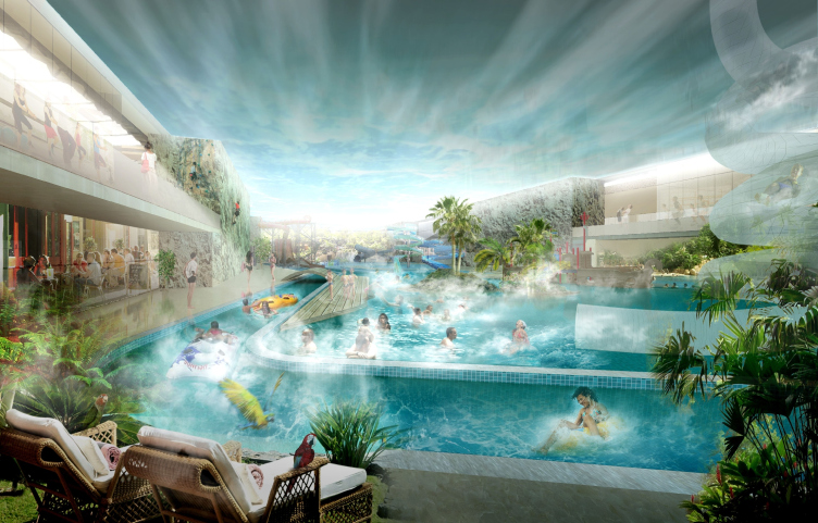
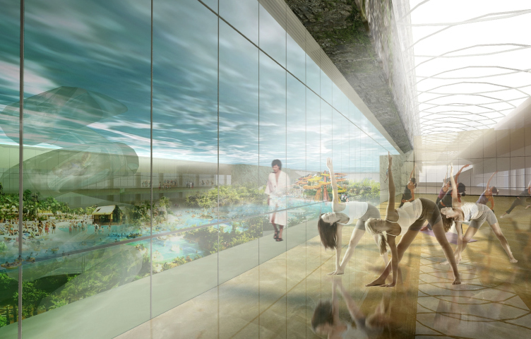
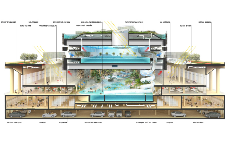
Thus, the engineering part of the concept of "Lost World" project - proposed by the consortium headed by Asadov Architectural Bureau and developed by the experts of Engex Company - deserves special attention. We will remind you at this point that the project was about turning the "antiquated" Stalin peripteral building into a "romantic ruin" hiding inside of it the luxurious natural world of a cascade oasis. In terms of organizing its space, the climax of this multilevel garden is the block of premises that covers the existing complex, shifted in the direction of the Major Sport Arena and overhanging above the summer terrace. 

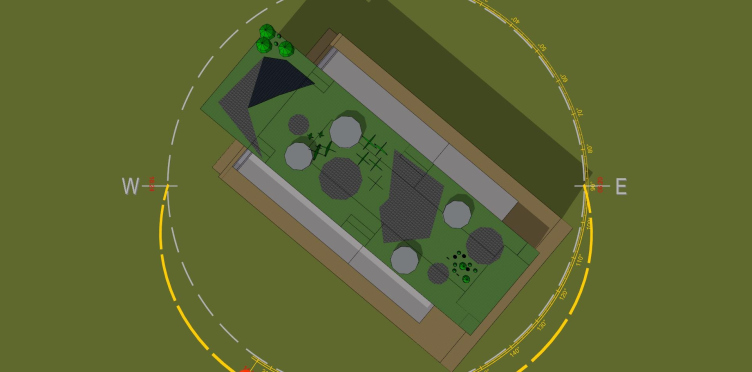
Concept of reconstructing the swimming complex of "Luzhniki" © Asadov Architectural Bureau
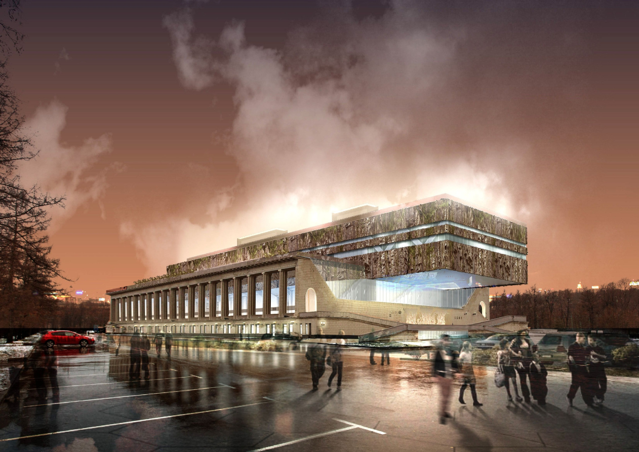

Concept of reconstructing the swimming complex of "Luzhniki" © Asadov Architectural Bureau
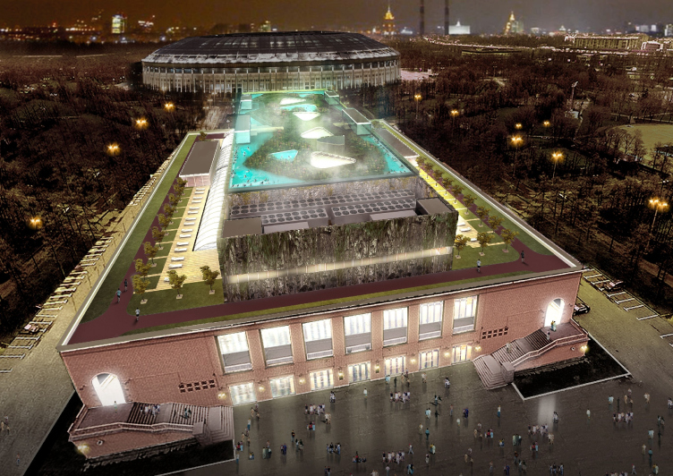

Hiding a new volume inside the old walls, whimsically shifting it off at least one axis, is a technique that is not entirely new for the reconstruction projects but still capable of yielding some interesting results. And when the presence of the original building is marked not with walls but with a colonnade, the possibilities for the architects and the engineers are virtually unlimited - which, luckily, was the case here. 

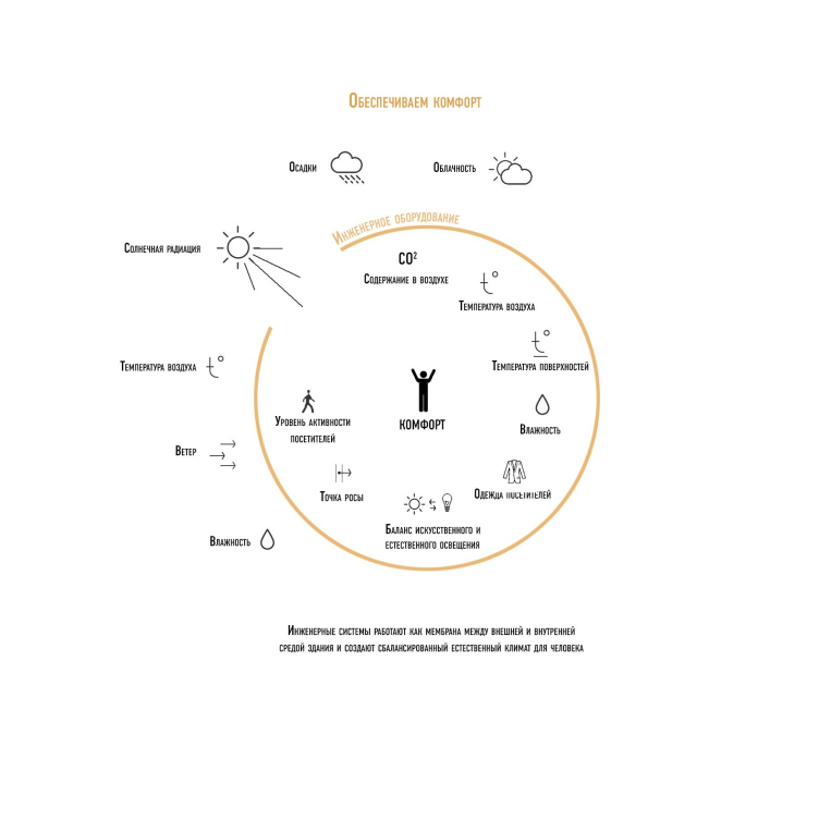
The Comfort Concept
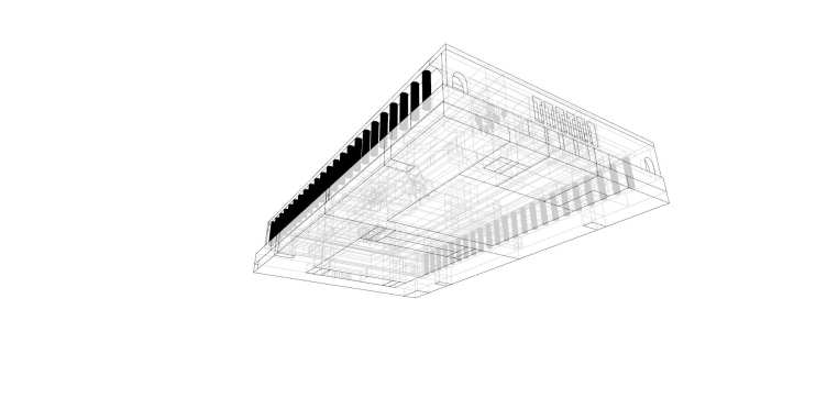
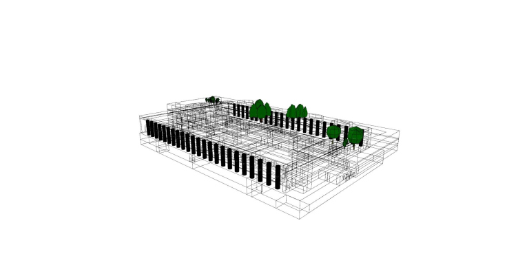
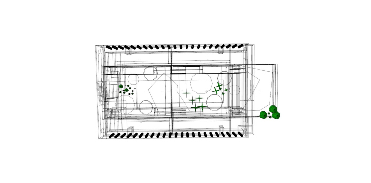
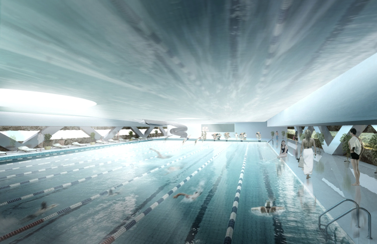
As far as the engineering solution is concerned, it is all about forming an inside environment that must be as comfortable and energy-efficient as possible. In order to achieve that, the Engex experts had to divide the building's engineering systems into three levels based on the differences between the functions of the swimming pools: Water Park on the first floor, the sport pool on the fourth floor, and expo spa zone on the roof. In accordance to its mode of operation and the specifics of the technical requirements, each swimming pool must be served by its own independent system situated on the same level with it. This was the paramount condition.

Concept of reconstructing the swimming complex of "Luzhniki" © Asadov Architectural Bureau


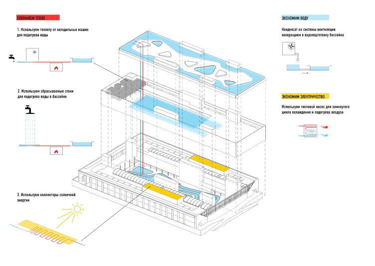
Arrangement of the building's premises in accordance with their functional purpose and the engineering approaches © Engex Engineering Bureau


Arrangement of the building's premises in accordance with their functional purpose and the engineering approaches © Engex Engineering Bureau


Arrangement of the building's premises in accordance with their functional purpose and the engineering approaches © Engex Engineering Bureau


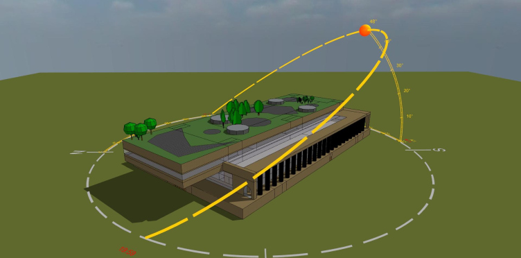
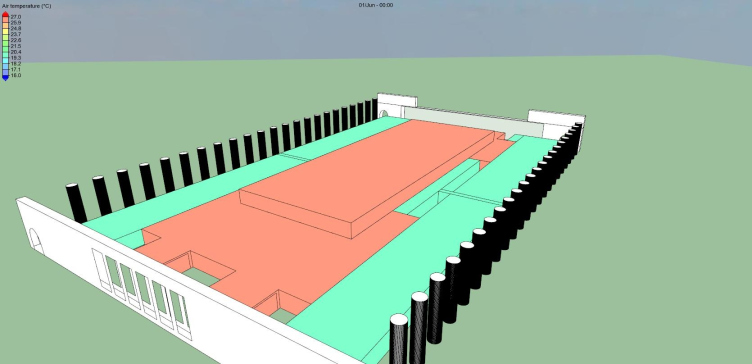
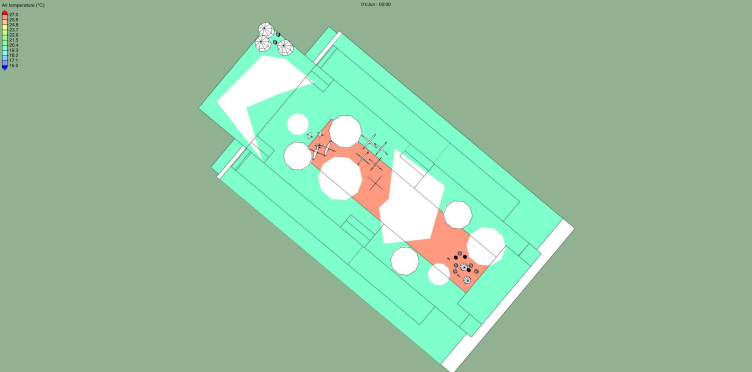
Assessing these environment-forming independent elements and seeing the situation in general was made possible by the building energy modeling - first it was used for finding the heating parameters of the entire volume of the building and then it was used for developing the algorithm of defining the operational parameters of its engineering systems and equipment. 

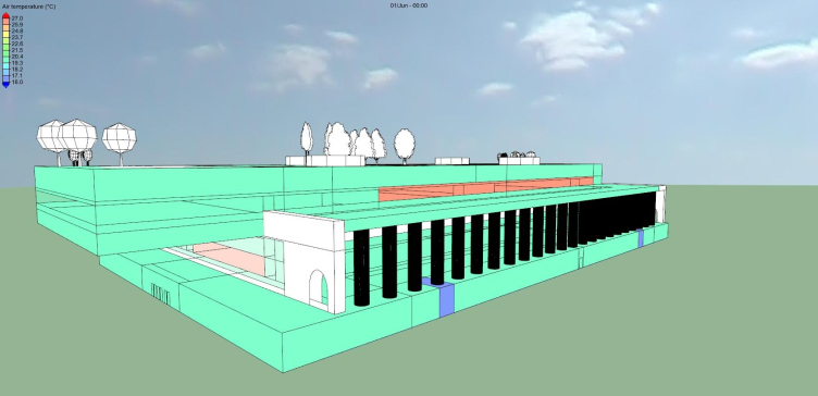
3D model of the swimming complex and its interaction with Moscow's climatic conditions © Engex Engineering Bureau


3D model of the swimming complex and its interaction with Moscow's climatic conditions © Engex Engineering Bureau


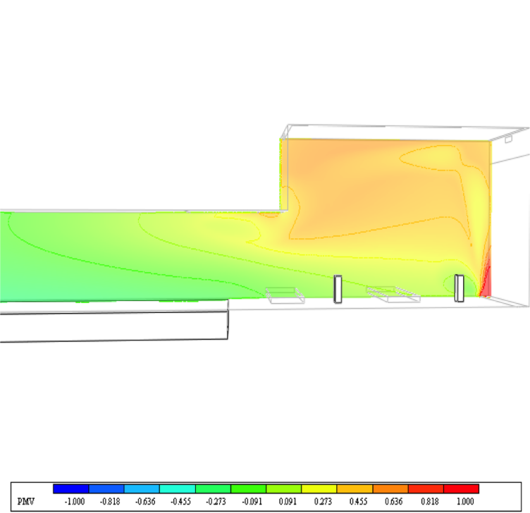
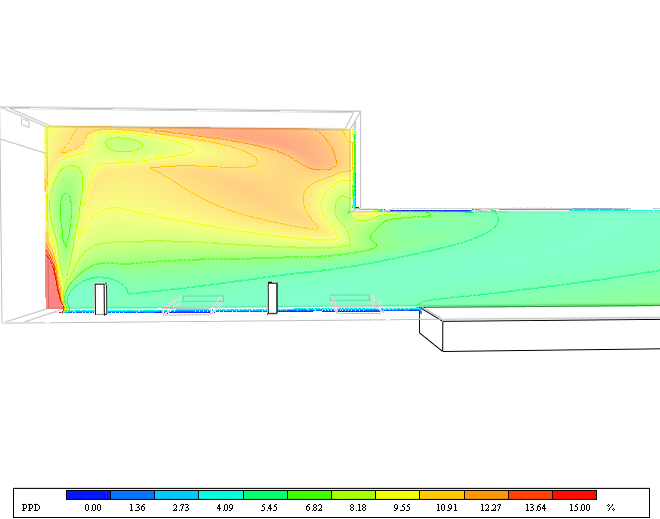
Building energy modeling is not just about analyzing the parameters of independent systems - it also implies accurately defining their operation in various temperature and climatic modes, and under different functional loads. At the stage of developing the architectural concept, this process was, of course, treated in a rather general way: the calculation was only done for the basic extreme months (in Moscow these being February and July), and for the workloads during the opening and closing hours. The experts took into consideration the level of solar radiation during different seasons, as well as the possibility and the necessity of adjusting the temperature inside of the complex during the day. Meanwhile, in spite of a fair share of generalization, the designers' goal was to achieve a high level of accuracy of calculation, for which they used two internationally recognized indexes of evaluation of thermal comfort. The first one, PMV (Predicted Mean Vote), allows for forecasting the average evaluation of the comfort of the environment done by the visitors; the index consists of seven points, from minus three to plus three, and, in this case, according to the calculations, it must oscillate within the limits of one point in the neighborhood of the "perfect" zero, between -0.5 and +0.5. The second index, PPD (Predicted Percentage Dissatisfied), evaluates the percentage of possible dissatisfaction of the guests of the water park and their negative comments; according to the authors, it must not exceed 10%. Thus, the calculations are aimed at creating a predictable and controllable environment whose comfort is not a subjective but objective criterion.

Parameters of comfort evaluation: PMV (Predicted Mean Vote) and PPD. Optimum conditions: -0,5 < PMV<+0,5 © Engex Engineering Bureau


zooming
Parameters of comfort evaluation: PMV and PPD (Predicted Percentage Dissatisfied). Optimum conditions: PPD < 10% © Engex Engineering Bureau
Individual microclimate parameters © Engex Engineering Bureau


Efficient Approach
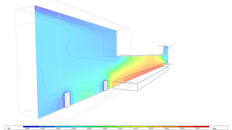
It is perfectly obvious that the approaches to creating an environment that is comfortable to be in must be totally obvious in the office part of the building and in the swimming pool zone. For the business part of the complex, the main indicator of the inner microclimate is the air temperature, and the designers, accordingly, proceed from the strength of the flow of people whose presence in a room inevitably increases the air temperature inside of it. The critical characteristic for the "wet" premises, as well as for the swimming pools, is the air humidity: this determines the volume of the vapor rising from the water surface. Paradoxical though it may sound, it is the combination of these seemingly irreconcilable functions within one closed energy circuit that allows for using the heat of the hot office air in the swimming pools. At the same time, the architects also had to consider the fact that the building's main heat consumer is the very system of swimming pools and the system that heats the water for them. In the existing since 1956 structure of the building with an open-air water surface one could safely speak about the heat going into the environment - meaning, to waste. The locker rooms were only separated from the air outside by the heat curtains in the aisles, and the relatively comfortable environment in the pool area was created at the expense of the high water temperature: 27-29 degrees Celsius, while the expected water temperature for the new complex is 26 degrees.

Individual microclimate parameters © Engex Engineering Bureau


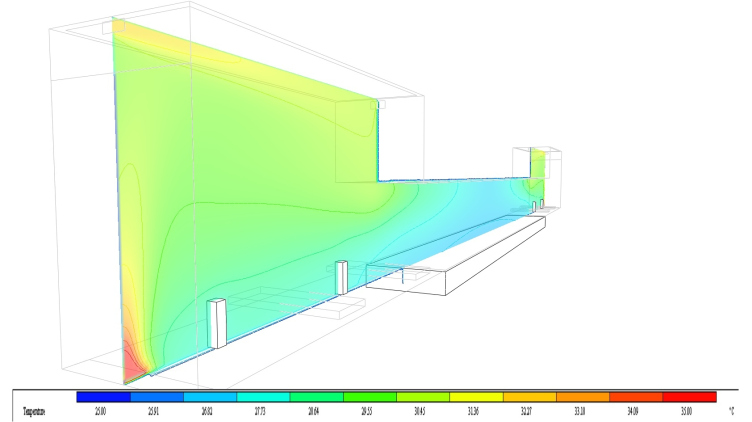
Temperature field in the swimming pool hall. The perimeter of the pool is heated by the convectors © Engex Engineering Bureau


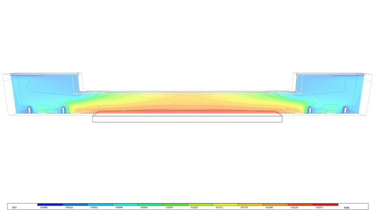
Humidity © Engex Engineering Bureau


Humidity © Engex Engineering Bureau


In order to save on the power and water consumption, even the purified condensed water that forms with the cooling of the air will be fed back into the pool, while the warmth of the "gray drains" - the disposed water from the swimming pool - will be used for heating the inflow of air and the water inside of it. 
***

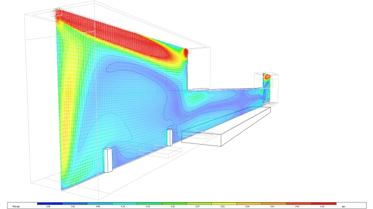
Because of the high air humidity, the main problem of any swimming pool is the formation of condensate on the cold surfaces of its stained-glass windows and the outside glass surfaces. In order to avoid that, the surface of the glass is blown over by a stream of warm air from the air dispensers installed in the floor - on the same principle of the "air curtain". As for the ventilation airflow, it is controlled by the humidity sensors - this allows for adjusting the expenditure of the air and the operation of the electrical drives in accordance with the main parameter - meaning, the level of humidity because of which people basically come to this blessed oasis. 

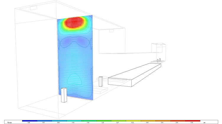
Field of the air speed in the pool hall. Feeding of the slow-speed air into the recreation area. Blow-over of the stained-glass window © Engex Engineering Bureau


Field of the air speed in the pool hall. Feeding of the slow-speed air into the recreation area. Blow-over of the stained-glass window © Engex Engineering Bureau


In order to increase the level of comfort and avoid the risk of creating draughts in the main premises of the complex, as well as for organizing the inflow of air in the public swimming area, the architects use the system of displacement ventilation - the vertical air dispensers through which the inflow of air passes at a low speed. All these things are done with but one goal in mind - not to exceed the "predicted percentage dissatisfied" - the "good old" PPD. This is no place for dissatisfaction by any means. 

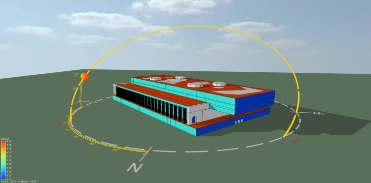
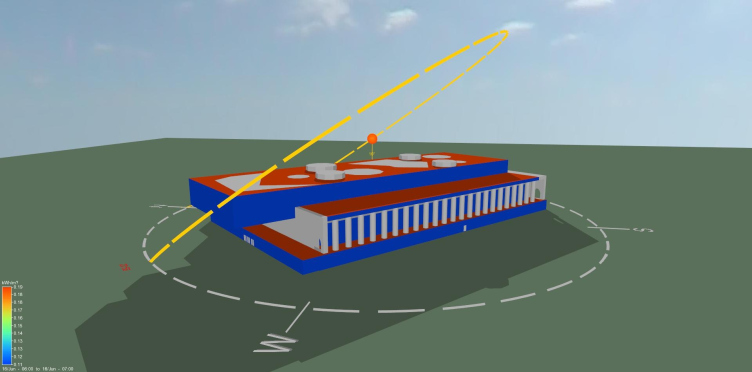
Estimation of the influence of the solar radiation and the wind on the temperature mode of operation of the building © Engex Engineering Bureau


Estimation of the influence of the solar radiation and the wind on the temperature mode of operation of the building © Engex Engineering Bureau


Architecture of the Light
The architectural proposal by Asadov Studio provided for a lot of ambient light: both at the expense of the light coming from above and from the sides (the stained-glass windows). In order to make the most of it, some groups of spotlights - most of which are installed along the perimeter of the building - are smoothly regulated by the light sensors to only be an addition to the ambient light during the day. At the same time, the lights on top of the existing building are equipped with solar collectors that accumulate extra energy - at the expense of the solar radiation. This is done by using the moisture-resistant and transparent ETFE film with photo galvanic elements upon it that transform the direct light into the ambient kind. At night, however, the building does not need the daytime temperature, and the authors proposed to gradually lower the temperature during the closing hours. In the case of nighttime events, this energy-saving mode can be disabled manually. And in the morning - on a regular day - the temperature in the premises is again raised to the operational value because the heating of the complex starts two hours ahead of the first visitors coming in. 

Concept of reconstructing the swimming complex of "Luzhniki" © Asadov Architectural Bureau


Concept of reconstructing the swimming complex of "Luzhniki" © Asadov Architectural Bureau

Balance of the Interests
Despite the high-profile status of the project and the doubtless ingenuity of the concept, the architects had to forego a whole number of the engineering solutions they came up with - because some of them turned out to be prohibitively expensive. This category even includes the seemingly indispensable for any swimming pool "gray drain" processing technology for the recycling of the used water. Thus, the whole engineering system became the result of the architects searching for the reasonable balance between the comfort of the environment, energy conservation, and the financial efficiency of the project.
Concept of reconstructing the swimming complex of "Luzhniki" © Asadov Architectural Bureau

13 March 2015

Headlines now
Four Different Surveys
The “Explore the City” competition, organized this year by the Genplan Institute of Moscow, stands out as a pretty unconventional one for the architectural field but aligns perfectly well with the character of urban planning work. The winning project analyzed contemporary residential complexes, combining urban planning insights with a realtor’s perspective to propose a hybrid approach. Other entries explored public centers, motivations for car ownership, and housing vacancy rates. A fifth participant withdrew. Here’s a closer look at the four completed works.
Scheduled Evolution
ASADOV Architects unveiled the EvyCenter pavilion, a microcultural hub for fostering personal growth, organizing workshops, and doing gymnastics. Additionally, this pavilion serves as a prototype for a scalable country house, drawing inspiration from the “Loskutok” project, and constructed from CLT panels in a factory. This marks the beginning of a developer project initiated by the architectural firm (sic!), which is seeking partners to expand both small Evy settlements and even larger Evy cities, which are, according to Andrey Asadov, aimed at fostering the “evolutionary” development of the people who will inhabit them.
The Golden Crown
The concept for a dental clinic in Yekaterinburg, developed by CNTR Studio, revolves around the idea of a “mouth full of gold”: pristine white porcelain stoneware walls are complemented by matte brass details. To avoid an overly literal interpretation, the architects focused on the building’s proportions, skillfully navigating between sunlight requirements and fire safety regulations.
Flexibility and Integration
Not long ago, we covered the project for the fourth phase of the ÁLIA residential complex, designed by APEX. Now, we’ve been shown different fence concepts they developed to enclose the complex’s private courtyards, incorporating a variety of public functions. We believe that the sheer fact that the complex’s architects were involved in such a detail as fencing speaks volumes.
A Step Forward
The HIDE residential complex represents a major milestone for ADM architects and their leaders Andrey Romanov and Ekaterina Kuznetsova in their quest for a fresh high-rise aesthetic – one that is flexible and layered, capable of bringing vibrancy to mass and silhouette while shaping form. Over recent years, this approach has become ADM’s “signature style”, with the golden HIDE tower playing a pivotal role in its evolution. Here, we delve into the project’s story, explore the details of the complex’s design, and uncover its core essence.
Gold in the Sands
A new office for a transcontinental company specializing in resource extraction and processing has opened in Dubai. Designed by T+T Architects, masters of creating spaces that are contemporary, diverse, flexible, and original, this project exemplifies their expertise. On the executive floor, a massive brass-clad partition dominates, while layered textures of compressed earth create a contextually resonant backdrop.
Layers and Levels of Flight
This project goes way back – Reserve Union won this architectural competition at the end of 2011, and the building was completed in 2018, so it’s practically “archival”. However, despite being relatively unknown, the building can hardly be considered “dated” and remains a prime example of architectural expression, particularly in the headquarters genre. And it’s especially fitting for an aviation company office. In some ways, it resembles the Aeroflot headquarters at Sheremetyevo but with its own unique identity, following the signature style of Vladimir Plotkin. In this article, we take an in-depth look at the United Aircraft Corporation (UAC) headquarters in the Moscow agglomeration town of Zhukovsky, supplemented by recent photographs from Alexey Naroditsky – a shoot that became only recently possible due to the fact that improvements were finally made in the surrounding area.
Light and Shadow
In this article, we delve into the architectural design of the “Chaika” house by DNK ag architects, which was recently completed in 2023 as part of the collection of signature designs at ZILArt. As is well-known, all the buildings in this complex follow a design code, yet each one is distinct. This particular building stands out not only for its whiteness and minimalism but also for the refined use of a limited number of techniques that, together, create what can confidently be called synergy.
Casus Novae
A master plan was developed for a large residential area with a name of “DNS City”, but now that its implementation began, the plan has been arbitrarily reformatted and replaced with something that, while similar on the surface, is actually quite different. This is not the first time such a thing happens, but it’s always frustrating. With permission from the author, we are sharing Maria Elkina’s post.
Treasure Hunting
The GAFA bureau, in collaboration with Tegola and Arkhitail, organized an expedition to the island of Kilpola in Karelia as part of Moskomarkhitektura’s “Open City” festival. There, amidst moss and rocks, the students sought answers to questions like: what is the sacred, where does it dwell, and what sustains it? Assisting the participants in this quest were landscape engineer Evgeny Levin, artist Nicholas Roerich, a moose, and the lack of cellular connection. Here’s how the story unfolded.
Depths of the Earth, Streams of Water
In the Malaya Okhta district, the Akzent building, designed by Stepan Liphart, was constructed. It follows a classic tripartite structure, yet it’s what you might call “hand-drawn”: each façade is unique in its form and details, some of which aren’t immediately noticeable. In this article, we explore the context and, together with the architect, delve into how the form was developed.
Fir Tree Dynamics
The “Airports of Region” holding is planning to build an airport in Karachay-Cherkessia, aiming to make the Arkhyz and Dombay resorts more accessible to travelers. The project that won in an invitation-only competition, submitted by Sergey Nikeshkin’s KPLN, blends natural imagery inspired by the shape of a conifer seed, open-air waiting spaces, majestic large trees, and a green roof elevated on needle-like columns. The result is both nature-inspired and WOW.
​A Brick Shell
In the process of designing a clubhouse situated among pine trees in a prestigious suburban area near Moscow, the architectural firm “A.Len” did the façade design part. The combination of different types of brick and masonry correlates with the volumetric and plastique solutions, further enhanced by the inclusion of wood-painted fragments and metal “glazing”.
Word Forms
ATRIUM architects love ambitious challenges, and for the firm’s thirtieth anniversary, they boldly play a game of words with an exhibition that dives deep into a self-created vocabulary. They immerse their projects – especially art installations – into this glossary, as if plunging into a current of their own. You feel as if you’re flowing through the veins of pure art, immersed in a universe of vertical cities, educational spaces – of which the architects are true masters – and the cultural codes of various locations. But what truly captivates is the bold statement that Vera Butko and Anton Nadtochy make, both through their work and this exhibition: architecture, above all, is art – the art of working with form and space.
Flexibility and Acuteness of Modernity
Luxurious, fluid, large “kokoshniks” and spiral barrel columns, as if made from colorful chewing gum: there seem to be no other mansion like this in Moscow, designed in the “Neo-Russian-Modern” style. And the “Teremok” on Malaya Kaluzhskaya, previously somewhat obscure, has “come alive with new colors” and gained visibility after its restoration for the office of the “architectural ecosystem” as the architects love to call themselves. It’s evident that Julius Borisov and the architects at UNK put their hearts into finding this new office and bringing it up to date. Let’s delve into the paradoxes of this mansion’s history and its plasticity. Spoiler: two versions of modernity meet here, both balancing on the razor’s edge of “what’s current”.
Yuri Vissarionov: “A modular house does not belong to the land”
It belongs to space, or to the air... It turns out that 3D printing is more effective when combined with a modular approach: the house is built in a workshop and then adapted to the site, including on uneven terrain. Yuri Vissarionov shares his latest experience in designing tourist complexes, both in central Russia and in the south. These include houseboats, homes printed from lightweight concrete using a 3D printer, and, of course, frame houses.
​Moscow’s First
“The quality of education largely depends on the quality of the educational environment”. This principle of the last decade has been realized by Sergey Skuratov in the project for the First Moscow Gymnasium on Rostovskaya Embankment in the Khamovniki district. The building seamlessly integrates into the complex urban landscape, responding both to the pedestrian flow of the city and the quiet alleyways. It skillfully takes advantage of the height differences and aligns with modern trends in educational space design. Let’s take a closer look.
Looking at the Water
The site of Villa Sonata stretches from the road to the water’s edge, offering its own shoreline, pier, and a picturesque river panorama. To reveal these sweeping views, Roman Leonidov “cut” the façade diagonally parallel to the river, thus getting two main axes for the house and, consequently, “two heads”. The internal core – two double-height spaces, a living room and a conservatory, with a “bridge” above them – makes the house both “transparent” and filled with light.
The White Wing
Well, it’s not exactly white. It’s more of a beige, white-stone structure that plays with the color of limestone – smoother surfaces are lighter, while rougher ones are darker. This wing unites various elements: it absorbs and interprets the surrounding themes. It responds to everything, yet maintains a cohesive expression – a challenging task! – while also incorporating recognizable features of its own, such as the dynamic cuts at the bottom, top, and middle.
Urban Dunes
The XSA Ramps team designed and built a three-part sports hub for a park in Rostov-on-Don, welcoming people of all ages and fitness levels. The skate plaza, pump track, and playground are all meticulously crafted with details that attract a diverse range of visitors. The technical execution of the shapes and slopes transforms this space into a kind of sculptural composition.
Proportional Growth
The project for the fourth phase of the ÁLIA residential area has been announced. The buildings are situated on an elongated plot – almost a “ray” that shoots out from the center of the area towards the river. Their layout reflects both a response to Moscow’s architectural preferences over the past 15 years, shifting “from blocks to towers”, and an interpretation of the neighboring business park designed by SOM. Additionally, the best apartments here are not located at the very top but closer to the middle, forming a glowing “waistline”.
The “Staircase” Building
In designing the “Details” residential complex in New Moscow, Rais Baishev spiced up the now-popular Moscow theme of a “courtyard” building with an idea drawn from the surrealist drawings by Maurits Escher. He envisioned the stepped silhouettes and descending slopes as a metaphysical mega-staircase, creating a key void within the courtyard that gave the project an internal “spine”. This concept is felt both in the building’s silhouette and on its façades.
Projection of the Quarter
No one doubted that the building that Vladimir Plotkin designed as part of the “Garden Quarters” would be the most modernist of all. And it turned out just that way: while adhering to the common design code, the building successfully combines brick and white stone, rhythmically responding to the neighboring building designed by Ostozhenka, yet tactfully and persistently making a few statements of its own. This includes the projection of the ideal urban development composition “14–9–6”, which can be found right next door, mathematical calculations, including those for various types of terraces (and perhaps the only reminder of the Soviet past of the Kauchuk rubber factory!), and the white “cross-stitch” pattern of the façade grid.
Domus Aurea
In this issue, we examine the “Tessinsky-1” house, designed by Sergey Skuratov and completed in 2023. Located in the middle of the Serebryanicheskaya Embankment district, at the intersection of its main streets, this house assumes a sort of “nodal” role: it not only responds to everything around it and preserves many memories of the former EMA factory within itself, but it weaves all this into a newly directed pattern, reconciling bright “gold” and dark-colored brick, largely with the help of the new, modern-yet-archaic Columba brick, which, come to think about it, is the most precious element here.
The Chimney of Nikola-Lenivets
In this issue, we are examining the “Obelisk House” designed by KATARSIS and built for the Arkhstoyanie 2023 festival. However, it was only finished later on, and this is why we are examining it now. It seems to us that after the “Obelisk House” appeared in Nikola-Lenivets, a dialogue and a few inner connections appeared between the temporary structures built here. These houses no longer look like “accidental neighbors”, more of which below.
​Periscope by the Bay
The jury awarded the second place in the competition for a public and cultural center in Petropavlovsk-Kamchatsky to the companies GORA (“Mountain”) and M4. In the consortium’s proposal, the building resembles a sperm whale with a calf swimming next to it or a periscope, whose lenses capture the most spectacular views from the surrounding landscape.
From Arcs to Dolmens
While working on the competition project for Petropavlovsk-Kamchatsky, ASADOV Architects prioritized the value of the natural and urban environment, aiming to preserve the balance of the location while minimizing the resemblance of the volume that they designed to a “traditional building”. The task was challenging, and the architects created three versions, one of which having been developed after the competition, where their main proposal took third place. However, the point of interest here is not the competition result but the continuity of creative thinking.
Hide and Seek
The ID Moskovskiy house, designed by Stepan Liphart in St. Petersburg, in the courtyards near Moskovskiy Avenue beyond the Obvodny Canal and recently completed, is notable for several reasons. Firstly, it has been realized with considerable accuracy, which is particularly significant as this is the first building where the architect was responsible not only for the facades but also for the layouts, allowing for better integration between the two. On the other hand, this building is interesting as an example of the “germination” of new architecture in the city: it draws on the best examples from the neighborhood and becomes an improved and developed sum of ideas found by the architect in the surrounding context.
The Big Twelve
Yesterday, the winners of the Moscow Mayor’s Architecture Award were announced and honored. Let’s take a look at what was awarded and, in some cases, even critique this esteemed award. After all, there is always room for improvement, right?
Above the Golden Horn
The residential complex “Philosophy” designed by T+T architects in Vladivostok, is one of the new projects in the “Golubinaya Pad” area, changing its development philosophy (pun intended) from single houses to a comprehensive approach. The buildings are organized along public streets, varying in height and format, with one house even executed in gallery typology, featuring a cantilever leaning on an art object.