Sergey Tchoban’s victorious return to Russia started with the Moscow project of a high-rise complex “Federacia”, later the projects for his home city St. Petersburg were more known. One project goes after another, the architect wins one contest after another. Well, today Moscow also can show off with the new works by Sergey Tchoban. We have told about the two projects: the complex on Mozhaisky Val and about the “Byzantine House” in Granatny. Recently there has been started the realization of another idea – a business multi-use complex, created within the SPeeCh studio.
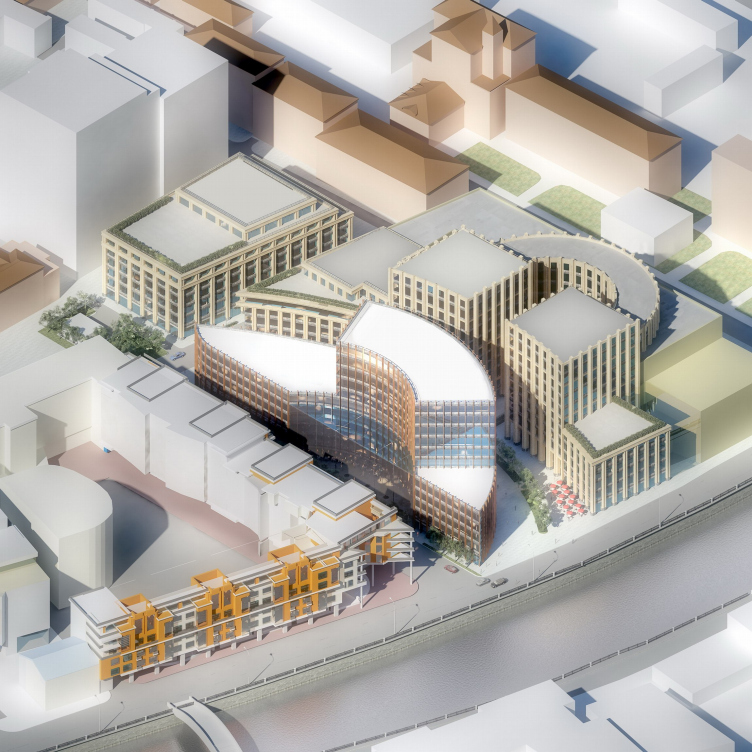
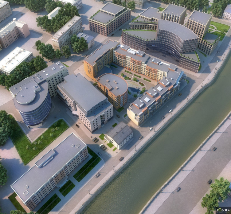
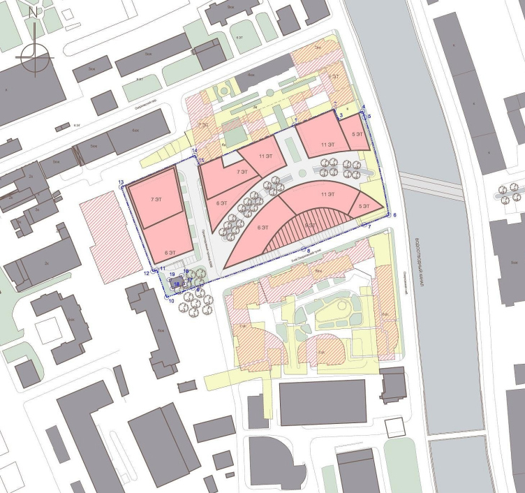
The project has been developed for the client who owns the three neighboring sites along the Vodootvodny canal. On one of them there is a carcass of a residential complex “Aquamarine” by another studio. SPeeCH started the work with two of them but then developed only the middle one. There will be the four constructions of the new complex gathered around the arch of the central walk boulevard.
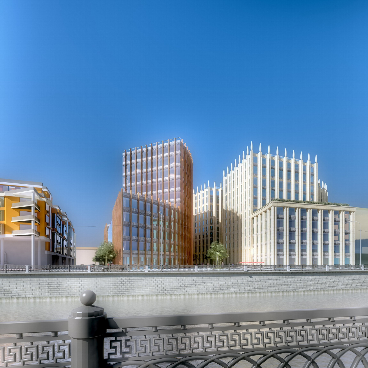
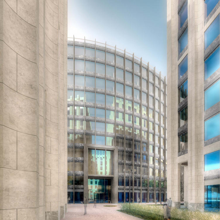
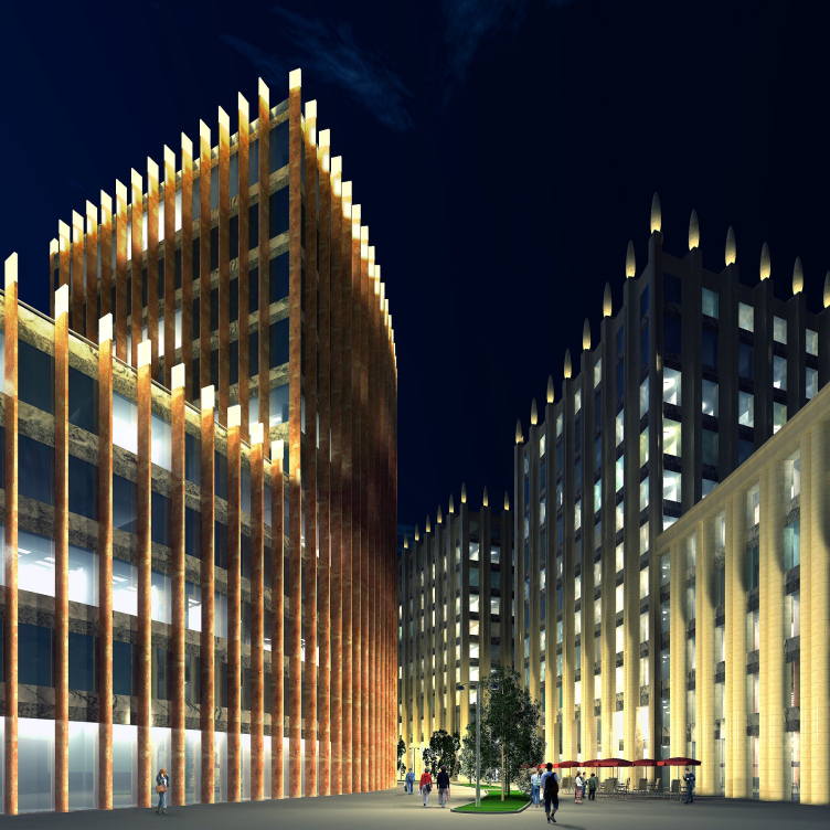
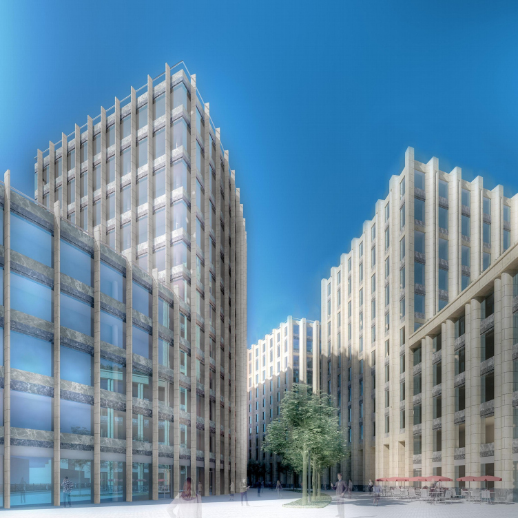
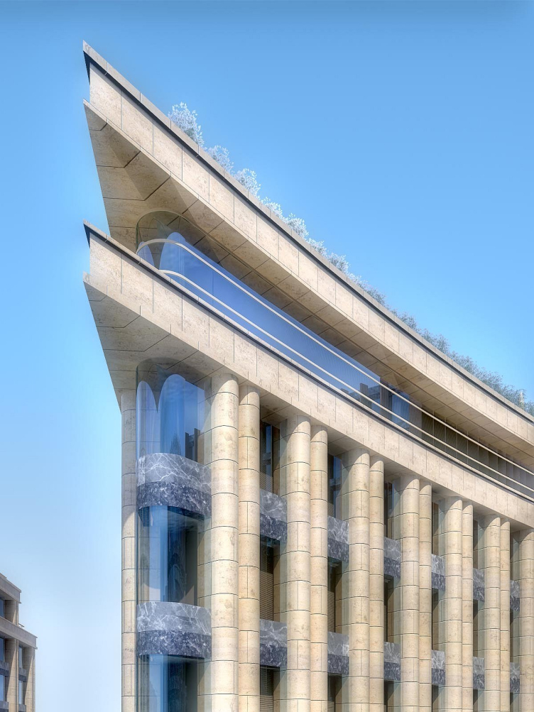
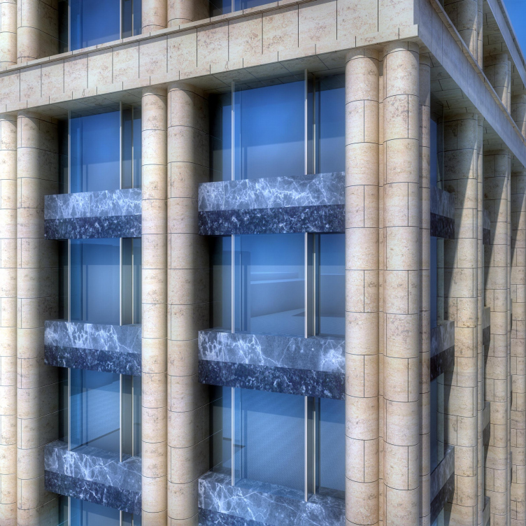
The architects explain this arch as a wish to make it interesting for those who like to walk. Just a straight street, like those nearby, leading from the embankment to the far third construction, which is separated from the others with new, but not yet made driveway, would be monotonous for a strolling even if the first storeys would be filled with shops and boutiques. Here we have the facades with alternating “orders”: round double columns, thin stone copies of lamellas, incurved pylons – they create the required variety and in the end there is seen a sharp-angle console of the 5storey part of the second construction which has a role of some guide mark so important for an end of any road whatever length it have.
At the same time the curved inner street made it possible to unfold the reserved structure of the complex to the nearby residential block – and respond the canted corner on the embankment. Due to the arched boulevard between “Aquamarine”, the second, the third and the fourth constructions there shapes a small square, undoubtedly very important for the urban structure. By the way, if examine the situational map of the district – there will be ell seen that different curves have become characteristic for the layout: behind the “Aquamarine” there is a business construction with an ellipse volume. The block part of “Aquamarine” on the layout has shape of semicircle with a couple of ledges. So, a curve is natural theme for the block and the complex of constructions by Sergey Tchoban takes it up and maintains.
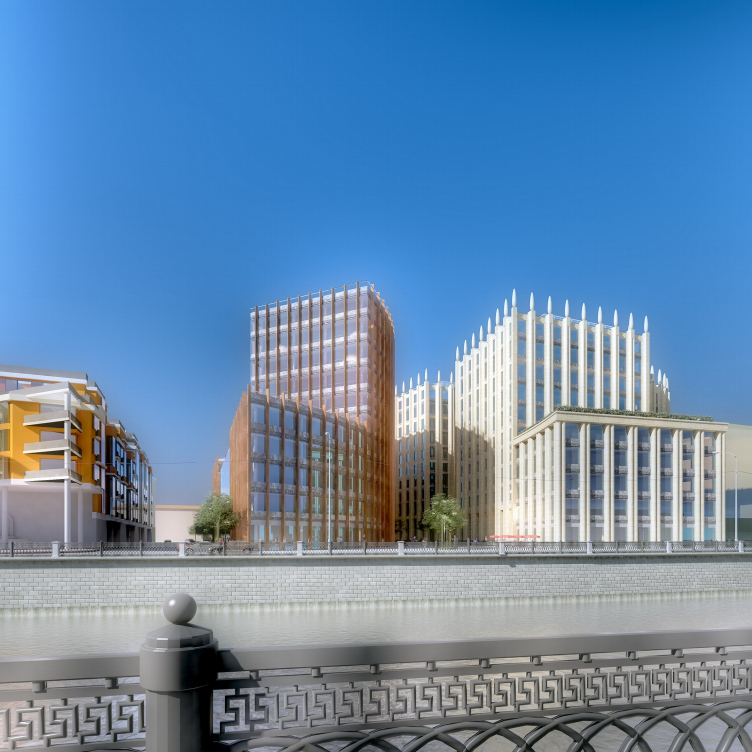
The stylistic of the project is very gradual – it is definitely a paraphrase of art-deco of 1930’s. Verticals roughly, from floor to ceiling structuring the glass volumes, resemble of most peculiar buildings of that time, abroad as well as in Moscow. Paired pulling lines, full-height stretched .. of giant columns bring a lively image of the constructions by Fomin and Langmann built at the turn of 20’s and 30’s: the society “Dinamo” on Lubyanka and the building by Mossovet. On the picture the columns of the 1st and the 2d constructions were crowned with knobbles characteristic for the Stalin period architecture and it more of 30’s but than they were removed and the project become more of the earlier time. Or more like something Italian, of Mussolini’s time. Anyhow this is the first Russian building by Sergey Tchoban with so obvious architectural reminiscences. Before the allusions were more of some story or were in ornaments or were expressed in texture.
Then this is a true art-deco, flavored with modern glass curves but everything is original and recognized. Especially if look at the pictures of the project, you’ll see them in a movie-like smoke, the “Sky Captain”. Even though this style has been popular for some time, there are few it’s truly good variations appeared in Moscow, except for the building in Levshinsky by Ilya Utkin, but that is classics, seen “inside”, and here is a modernist fancy on theme of a splendid structure.
Splendor is probably a key theme of the centre’s architecture. A curved “court of honor” compliments it – sometimes it seems the ensemble have emerged from a built over or rebuilt palace. Such role has stone columns, symmetrical composition and the 11storeys height itself – there are no such buildings around, only the two old bearing-wall houses afar.
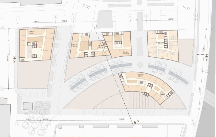
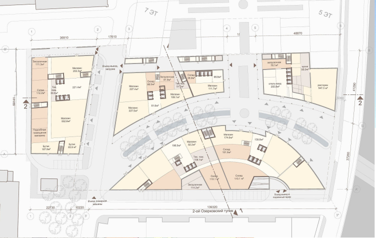
Though the layout design of the office constructions allows dividing each of the storeys into four independent, minimum 500 sq m, office spaces, we can assume they will be occupied by a large company with fine top-down command structure, stuff of which can be more proud for their company due to they place of work. Besides, by infrastructure this is a mini-business park with shops, two restaurants and even an apart-hotel so important for foreign companies who have to look for accommodation for their stuff. And this all is within Sadovoe Kolco.
It is interesting to compare Sergey Tchoban’s projects for St.Petersburg and Moscow – the architect seems to create some special “myth” for each city. He sees St.Petersburg as an ephemeral literature-graphics city. Maybe an illusion, maybe a book. This is why Sergey Tchoba’s buildings in St.Petersburg are minimalist, with ornaments over glass surfaces.
But Moscow is of stone, imperious, Byzantine and of Stalin’s time. Stone, more material, more conservatives ideas. The main Moscow style Tchoban considers the classicism of Stalin period – though picks most fine of it and as a rule “verify” that by world art-deco. The project for Mozhaisky Val has common for the style net of square windows, “Byzantine building” looks over the laced experiments by Burov. And here, on Ozerovskaya there are no less known verticals of Fomin’s columns. There shapes a fine stone variant of art-deco, akind of small bridge between the beginning of 21th century and the end of 20’s of the 20’s century. The bridge in some meaning echoes to the high-rise building on Kotelnicheskaya, which is quite well seen from here, from the canal.


