По-русски

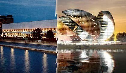
The modernist building of the Central House of Artists and the State Tretyakov Gallery or “Apelsin” by the Foster’s studio? Short interviews with the top Moscow architects

We asked the noted Moscow architects and general public members the two questions: Do they like the Foster’s project “Apelsin”? And whether we ought to save the existing building of the Central House of Artists and the State Tretyakov Gallery, built in 1960’s by the architects Nikolay Sukoyan and Yuri Sheverdyaev?

31 March 2008
Object
mainImg
Architect:
Norman Foster
Object:
Project Orange
Russia, Moscow

2008

At MIPIM-2008, held in Cannes, Elena Baturina presented the concept-project of mixed-use complex “Apelsin” [Orange], approved by Norman Foster. It has also been announced that the project will take part in tender for reconstruction of the existing Central House of Artists and State Tretyakov Gallery, it haven not been stated publicly yet and it is not known if it will ever be held. But the project is being grandly promoted, and discussions in media more often end with the conclusion that the old building is, well, of Brezhnev period and it is time to replace it with a nice one, designed by a world-known architect. They have torn down “Rossia” and “Inturist” hotels, and even “Moscow”, why not change something else to a brand-new international piece of work? Well, especially since not only Lord Foster has taken part in the project but also the developer Elena Baturina.

There are many questions concerning “Apelsin”. It combines the Tretyakov Gallery with elite residential accommodation and is a typical model of an “investment construction” when a developer builds something for a city adding more constructions to profit from. Do we have to give away the Central House of Artists and the State Tretyakov Gallery that have become popular centers of culture in Moscow, for investment construction? Does “Apelsin” look fine at that place? Is this the work of the world-famous “star” or more of the developer?

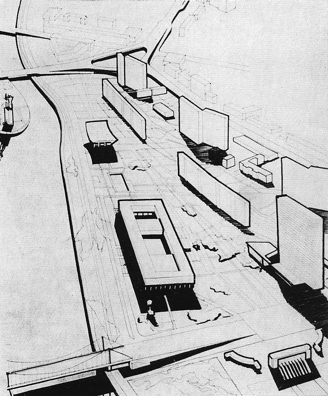
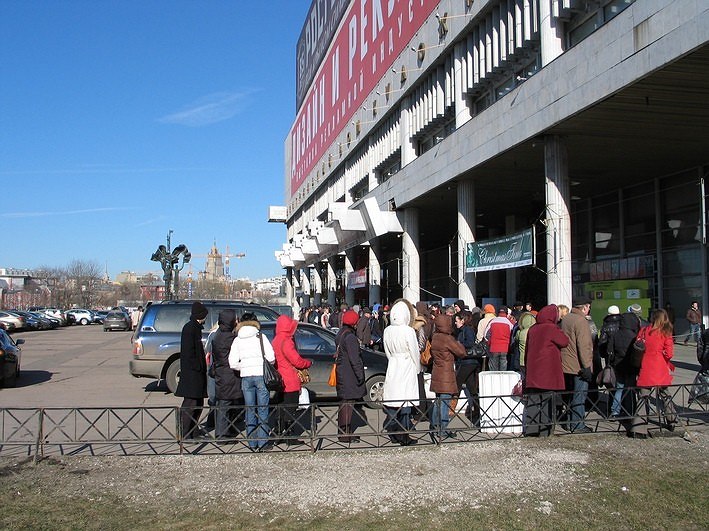
There is an important issue that is not to be left behind. Is it really necessary to pull the building down just because it is of Brezhnev period? Massimiliano Fuksas, the Italian architect and curator of Venice Biennale, speaking in Moscow, asked, “When will you start to value your 70’s”? Really – when? Very soon there will be nothing left. And that was an epoch. Indeed, it is full of panel stuff, but there were great works and the key constructions of the time – without them it will be hard to have a right image of it. It is well known that in those times the building by Nikolay Sukoyan and Yuri Sheverdyaev was a kind of manifest of modernist architecture. For USSR it was “our answer to Pompidou”, a high-technology development – after the project was done they gave about 100 applications for invention patents. Now, the building needs only a high-quality reconstruction and servicing.

Well, the project is already being widely discussed in media. And we think they lack professional opinions. Editorial stuff of archi.ru asked the architects and those who are interested in saving of the monuments, the two questions: Do they like Foster’s project? Is it better to save the present building of the Central House of Artists and the State Tretyakov Gallery?

We find the answers very interesting and comprehensive. These are the opinions of the professionals who know well and love Moscow.

Yuri Avvakumov:
First, Moscow had the Las-Vegas look with pseudo-towers, illumination and casinos, then resembled a central European office with checked glass, and now there is a new trend – Dubai with buildings-paintings. Moscow has been accurately destroying its uniqueness, its modernism of 1920’s and 1960’s, historical development of 19th century. Remarkably, architecture of Stalin epoch remains untouched. Might be due to fear for the Leader.

Evgeny Ass, the architect:
I would not like to discuss the architecture of “Apelsin”, though I do not like it. It is less important in this case. What is significant is cynicism of the developer and the architect, who do not really care what and where to build. The possible reason that he might be has not had the full information is groundless. If they asked him to design a project in the place of the Kremlin, he would pull it down and construct there because he would be paid for that. We have a precedent that makes worry for the professional ethics of “stars” and the ethics of developers who are ready for anything to gain money. They are ready to give away a national treasure, in particularly the collection of the Tretyakov Gallery. As to the Central House of Artists and the State Tretyakov Gallery – I liked to work with it, particularly, to take part in the contest for its reconstruction. And it seems to me the building really is much better than those that are being constructed nowadays. And I totally disagree this is a concrete monster as some people think, it just needs to be worked with, serviced and cared. I believe the building is absolutely adequate to the time and its position in the city does not bother me at all.

Yuri Grigoryan, the architect:
In my opinion, “Apelsin” is an unsuccessful project, even a bold one. I would not like it to be constructed. If they decide to destroy the present building – and I realize it will be hard for it to survive on the background of costly ground and ill taste that surrounds us – well, if they will destroy it, then it must be an open contest with a few rounds with open public discussions of the projects, with selection according to special criteria.
The “invasion” of the place has been offensive for Moscow citizens. I do not feel like talking about that, but the recent events rather point out the fact that the worse is likely to happen. But let hope for the better.

Bart Goldhoorn, the president of the holding company “Project Media”:
I do not understand why they need to tear down the Central House of Artists if there is a grand vacant territory around it. The land of the so-called park of art costs a lot but is used very ineffectively. Sadly the provocation is aimed at this building, whereas the problem is that the Moscow authorities has no urban management will, and for this reason now there is a dull empty space around the Central House of Artists. Why don’t they build museums, residential accommodation, shops, offices there.

Nikolay Lyzlov, the architect:
It seems to me this project (“Apelsin”) repeats mistakes of the previous one. The change is not at all smart, a box is replaced with a ball. All the bad qualities of the box remain in the ball. I guess the more rational solution is that the whole territory of the present Central House of Artists and the State Tretyakov Gallery is potential territory for development. There is no need at all in the existing park of sculptures. It is necessary to compact the area. I think they could get even more meters saving the building. All it needs is to be modernized and reconstructed, and the cemetery of sculptures could be turned into a fine residential accommodation. It requires work, the embankment should be maintained, the entrance to the museum must be placed from the embankment side – now the entrance to the Tretyakovka is not visible. This all could be turned into the Uffizi. But the ball is the same that there has been before. It is not really important whether I like it or not – but in a few years we will get what we have got today – reasonless spending.
Certainly I’m sorry for the building of the Central House of Artists and the State Tretyakov Gallery. I like this architecture and I think soon it will become a monument. And I’m awfully sad for the buildings of 1970’s that are being demolished today in Moscow. This layer is vanishing and I guess soon they will be very sorry for the lost. The reconstruction contest of the Central House of Artists and the State Tretyakov Gallery held a few years ago shocked me with the familiarity of approach to the development. As if there is a portrait of a person and everybody comes up and draws there something like moustache or horns or anything. No better than vandalism. There is nothing so bad in the contest itself, but it could be not that barbarian.

David Sarkisyan, the director of Museum of Architecture:
Many negative opinions of the present building are such because people are not wise enough to appreciate the epoch. Many people of fine taste told me, “what a superior building, are you really going to tear it down!” It has grand foyer, it is a grand building itself. The statements that it is in bad condition appear because we service it badly. Let’s repair it! The Central House of Artists and the State Tretyakov Gallery complements Moscow, it is a part of history and is a monument of a particular time. Will repeat myself – no doubt the building must be saved.
The project of “Zolotoi Apelsin” [Golden Orange] is a co-creation of the developer and the Lord Foster – such things happen. The project itself is fine, I like Foster’s work and what he has already done for Moscow. But it is a too edgy urban planning solution to place “Apelsin” there. It is too large – the wish to make more money “blown” it to incredible size. Even if there have never been the building of the Central House of Artists and the State Tretyakov Gallery, they should have think whether it was right to place such a big orange there. It is wrong. There could be another place for “Aplesin” in Moscow. If someone is eager about that, there is municipal territory within “muzeuma”, houses can be built there. Price of land is high there, a wish to build and gain money is quite understandable. But let’s leave alone the architectural monuments! I think the building of the Central House of Artists and the State Tretyakov Gallery must become a monument. Besides, there is another lapse – a gallery of such level cannot be built together with residential accommodation. A most valuable collection of Russian avant-garde is kept in Tretyakovskaya Gallery. A person cannot live in an apartment and know that there are avant-garde masterpieces under it. This is a wrong treatment of our collection.

Mikhail Khazanov, the architect:
I have always treated Sir Norman Foster with respect for his contribution in profession, for innovations in architecture, for honored regalia.
Actually it is fine that the best architects come to Moscow, there is a hope that there will appear outstanding, super-technological, super-modern objects.
The history of the Central House of Artist and the Tretyakov Gallery might be lacked the full information, and so maestro and his partners-architects did not completely realized the particular historical, cultural and law contexts.
Most likely they all got in wrongly with the object, they did not have the detailed information about all those many years of its hard history.
The Central House of Artists is the theme so familiar to all Moscow architects, artists, sculptors, art historians.
Not so long ago there was a contest on reconstruction of the building and development of the adjacent territories, and there were the winners. By all the open and silent rules of international architectural society they did not have to cross out the contest project at once, chosen by the reputable professional jury, even if it was not relevant anymore, not rational and not profitable. I’m not sure about the procedure in such situation – it is an issue for a professional discussion, but if results of the architectural contest, held according to all the established rules, are suddenly canceled without any explanations, it will be understood as a challenge not only to architectural corporate ethics but also to urban cultural life.
Seemingly this is an odd story, it has some hastiness, emotionality, some impulsiveness. Well, they did not have to “demonize” the situation at all, because hardly such an active object of aggressive-nonlinear architecture will soon be really constructed by the Kremlin. Though, the story with the Gazprom’s skyscraper in St. Petersburg also was firstly considered as something not that serious…
And in our environment there is a risk to discredit, by a single and quite occasional urban planning replica of the whole “new wave”, the entire architectural mainstream, particularly in sovereign and conservative Moscow, where all got tired from everlasting historical reminiscences, but at the same time they can hardly think of anything greater than decorative boxes and chests.
I believe Moscow is worth to have new grand and challenging architectural events of international scale, everything depends on how precise, intelligent and correct new urban sights will be, but not destructive for history of the formed urban environment.
Definitely, the situation is not ordinary. Well, in architecture not so often radical avant-garde and radical derriere-garde change places.
And I am still sure there must be professional architectural contests for significant urban objects of the capital, they must be open, and juries must have the best of world-known architects, architects-theorists, and architectural critics.

zooming
zooming
zooming
zooming
zooming
zooming


Architect:
Norman Foster
Object:
Project Orange
Russia, Moscow

2008

31 March 2008

Headlines now
The Golden Crown
The concept for a dental clinic in Yekaterinburg, developed by CNTR Studio, revolves around the idea of a “mouth full of gold”: pristine white porcelain stoneware walls are complemented by matte brass details. To avoid an overly literal interpretation, the architects focused on the building’s proportions, skillfully navigating between sunlight requirements and fire safety regulations.
Flexibility and Integration
Not long ago, we covered the project for the fourth phase of the ÁLIA residential complex, designed by APEX. Now, we’ve been shown different fence concepts they developed to enclose the complex’s private courtyards, incorporating a variety of public functions. We believe that the sheer fact that the complex’s architects were involved in such a detail as fencing speaks volumes.
A Step Forward
The HIDE residential complex represents a major milestone for ADM architects and their leaders Andrey Romanov and Ekaterina Kuznetsova in their quest for a fresh high-rise aesthetic – one that is flexible and layered, capable of bringing vibrancy to mass and silhouette while shaping form. Over recent years, this approach has become ADM’s “signature style”, with the golden HIDE tower playing a pivotal role in its evolution. Here, we delve into the project’s story, explore the details of the complex’s design, and uncover its core essence.
Gold in the Sands
A new office for a transcontinental company specializing in resource extraction and processing has opened in Dubai. Designed by T+T Architects, masters of creating spaces that are contemporary, diverse, flexible, and original, this project exemplifies their expertise. On the executive floor, a massive brass-clad partition dominates, while layered textures of compressed earth create a contextually resonant backdrop.
Layers and Levels of Flight
This project goes way back – Reserve Union won this architectural competition at the end of 2011, and the building was completed in 2018, so it’s practically “archival”. However, despite being relatively unknown, the building can hardly be considered “dated” and remains a prime example of architectural expression, particularly in the headquarters genre. And it’s especially fitting for an aviation company office. In some ways, it resembles the Aeroflot headquarters at Sheremetyevo but with its own unique identity, following the signature style of Vladimir Plotkin. In this article, we take an in-depth look at the United Aircraft Corporation (UAC) headquarters in the Moscow agglomeration town of Zhukovsky, supplemented by recent photographs from Alexey Naroditsky – a shoot that became only recently possible due to the fact that improvements were finally made in the surrounding area.
Light and Shadow
In this article, we delve into the architectural design of the “Chaika” house by DNK ag architects, which was recently completed in 2023 as part of the collection of signature designs at ZILArt. As is well-known, all the buildings in this complex follow a design code, yet each one is distinct. This particular building stands out not only for its whiteness and minimalism but also for the refined use of a limited number of techniques that, together, create what can confidently be called synergy.
Casus Novae
A master plan was developed for a large residential area with a name of “DNS City”, but now that its implementation began, the plan has been arbitrarily reformatted and replaced with something that, while similar on the surface, is actually quite different. This is not the first time such a thing happens, but it’s always frustrating. With permission from the author, we are sharing Maria Elkina’s post.
Treasure Hunting
The GAFA bureau, in collaboration with Tegola and Arkhitail, organized an expedition to the island of Kilpola in Karelia as part of Moskomarkhitektura’s “Open City” festival. There, amidst moss and rocks, the students sought answers to questions like: what is the sacred, where does it dwell, and what sustains it? Assisting the participants in this quest were landscape engineer Evgeny Levin, artist Nicholas Roerich, a moose, and the lack of cellular connection. Here’s how the story unfolded.
Depths of the Earth, Streams of Water
In the Malaya Okhta district, the Akzent building, designed by Stepan Liphart, was constructed. It follows a classic tripartite structure, yet it’s what you might call “hand-drawn”: each façade is unique in its form and details, some of which aren’t immediately noticeable. In this article, we explore the context and, together with the architect, delve into how the form was developed.
Fir Tree Dynamics
The “Airports of Region” holding is planning to build an airport in Karachay-Cherkessia, aiming to make the Arkhyz and Dombay resorts more accessible to travelers. The project that won in an invitation-only competition, submitted by Sergey Nikeshkin’s KPLN, blends natural imagery inspired by the shape of a conifer seed, open-air waiting spaces, majestic large trees, and a green roof elevated on needle-like columns. The result is both nature-inspired and WOW.
​A Brick Shell
In the process of designing a clubhouse situated among pine trees in a prestigious suburban area near Moscow, the architectural firm “A.Len” did the façade design part. The combination of different types of brick and masonry correlates with the volumetric and plastique solutions, further enhanced by the inclusion of wood-painted fragments and metal “glazing”.
Word Forms
ATRIUM architects love ambitious challenges, and for the firm’s thirtieth anniversary, they boldly play a game of words with an exhibition that dives deep into a self-created vocabulary. They immerse their projects – especially art installations – into this glossary, as if plunging into a current of their own. You feel as if you’re flowing through the veins of pure art, immersed in a universe of vertical cities, educational spaces – of which the architects are true masters – and the cultural codes of various locations. But what truly captivates is the bold statement that Vera Butko and Anton Nadtochy make, both through their work and this exhibition: architecture, above all, is art – the art of working with form and space.
Flexibility and Acuteness of Modernity
Luxurious, fluid, large “kokoshniks” and spiral barrel columns, as if made from colorful chewing gum: there seem to be no other mansion like this in Moscow, designed in the “Neo-Russian-Modern” style. And the “Teremok” on Malaya Kaluzhskaya, previously somewhat obscure, has “come alive with new colors” and gained visibility after its restoration for the office of the “architectural ecosystem” as the architects love to call themselves. It’s evident that Julius Borisov and the architects at UNK put their hearts into finding this new office and bringing it up to date. Let’s delve into the paradoxes of this mansion’s history and its plasticity. Spoiler: two versions of modernity meet here, both balancing on the razor’s edge of “what’s current”.
Yuri Vissarionov: “A modular house does not belong to the land”
It belongs to space, or to the air... It turns out that 3D printing is more effective when combined with a modular approach: the house is built in a workshop and then adapted to the site, including on uneven terrain. Yuri Vissarionov shares his latest experience in designing tourist complexes, both in central Russia and in the south. These include houseboats, homes printed from lightweight concrete using a 3D printer, and, of course, frame houses.
​Moscow’s First
“The quality of education largely depends on the quality of the educational environment”. This principle of the last decade has been realized by Sergey Skuratov in the project for the First Moscow Gymnasium on Rostovskaya Embankment in the Khamovniki district. The building seamlessly integrates into the complex urban landscape, responding both to the pedestrian flow of the city and the quiet alleyways. It skillfully takes advantage of the height differences and aligns with modern trends in educational space design. Let’s take a closer look.
Looking at the Water
The site of Villa Sonata stretches from the road to the water’s edge, offering its own shoreline, pier, and a picturesque river panorama. To reveal these sweeping views, Roman Leonidov “cut” the façade diagonally parallel to the river, thus getting two main axes for the house and, consequently, “two heads”. The internal core – two double-height spaces, a living room and a conservatory, with a “bridge” above them – makes the house both “transparent” and filled with light.
The White Wing
Well, it’s not exactly white. It’s more of a beige, white-stone structure that plays with the color of limestone – smoother surfaces are lighter, while rougher ones are darker. This wing unites various elements: it absorbs and interprets the surrounding themes. It responds to everything, yet maintains a cohesive expression – a challenging task! – while also incorporating recognizable features of its own, such as the dynamic cuts at the bottom, top, and middle.
Urban Dunes
The XSA Ramps team designed and built a three-part sports hub for a park in Rostov-on-Don, welcoming people of all ages and fitness levels. The skate plaza, pump track, and playground are all meticulously crafted with details that attract a diverse range of visitors. The technical execution of the shapes and slopes transforms this space into a kind of sculptural composition.
Proportional Growth
The project for the fourth phase of the ÁLIA residential area has been announced. The buildings are situated on an elongated plot – almost a “ray” that shoots out from the center of the area towards the river. Their layout reflects both a response to Moscow’s architectural preferences over the past 15 years, shifting “from blocks to towers”, and an interpretation of the neighboring business park designed by SOM. Additionally, the best apartments here are not located at the very top but closer to the middle, forming a glowing “waistline”.
The “Staircase” Building
In designing the “Details” residential complex in New Moscow, Rais Baishev spiced up the now-popular Moscow theme of a “courtyard” building with an idea drawn from the surrealist drawings by Maurits Escher. He envisioned the stepped silhouettes and descending slopes as a metaphysical mega-staircase, creating a key void within the courtyard that gave the project an internal “spine”. This concept is felt both in the building’s silhouette and on its façades.
Projection of the Quarter
No one doubted that the building that Vladimir Plotkin designed as part of the “Garden Quarters” would be the most modernist of all. And it turned out just that way: while adhering to the common design code, the building successfully combines brick and white stone, rhythmically responding to the neighboring building designed by Ostozhenka, yet tactfully and persistently making a few statements of its own. This includes the projection of the ideal urban development composition “14–9–6”, which can be found right next door, mathematical calculations, including those for various types of terraces (and perhaps the only reminder of the Soviet past of the Kauchuk rubber factory!), and the white “cross-stitch” pattern of the façade grid.
Domus Aurea
In this issue, we examine the “Tessinsky-1” house, designed by Sergey Skuratov and completed in 2023. Located in the middle of the Serebryanicheskaya Embankment district, at the intersection of its main streets, this house assumes a sort of “nodal” role: it not only responds to everything around it and preserves many memories of the former EMA factory within itself, but it weaves all this into a newly directed pattern, reconciling bright “gold” and dark-colored brick, largely with the help of the new, modern-yet-archaic Columba brick, which, come to think about it, is the most precious element here.
The Chimney of Nikola-Lenivets
In this issue, we are examining the “Obelisk House” designed by KATARSIS and built for the Arkhstoyanie 2023 festival. However, it was only finished later on, and this is why we are examining it now. It seems to us that after the “Obelisk House” appeared in Nikola-Lenivets, a dialogue and a few inner connections appeared between the temporary structures built here. These houses no longer look like “accidental neighbors”, more of which below.
​Periscope by the Bay
The jury awarded the second place in the competition for a public and cultural center in Petropavlovsk-Kamchatsky to the companies GORA (“Mountain”) and M4. In the consortium’s proposal, the building resembles a sperm whale with a calf swimming next to it or a periscope, whose lenses capture the most spectacular views from the surrounding landscape.
From Arcs to Dolmens
While working on the competition project for Petropavlovsk-Kamchatsky, ASADOV Architects prioritized the value of the natural and urban environment, aiming to preserve the balance of the location while minimizing the resemblance of the volume that they designed to a “traditional building”. The task was challenging, and the architects created three versions, one of which having been developed after the competition, where their main proposal took third place. However, the point of interest here is not the competition result but the continuity of creative thinking.
Hide and Seek
The ID Moskovskiy house, designed by Stepan Liphart in St. Petersburg, in the courtyards near Moskovskiy Avenue beyond the Obvodny Canal and recently completed, is notable for several reasons. Firstly, it has been realized with considerable accuracy, which is particularly significant as this is the first building where the architect was responsible not only for the facades but also for the layouts, allowing for better integration between the two. On the other hand, this building is interesting as an example of the “germination” of new architecture in the city: it draws on the best examples from the neighborhood and becomes an improved and developed sum of ideas found by the architect in the surrounding context.
The Big Twelve
Yesterday, the winners of the Moscow Mayor’s Architecture Award were announced and honored. Let’s take a look at what was awarded and, in some cases, even critique this esteemed award. After all, there is always room for improvement, right?
Above the Golden Horn
The residential complex “Philosophy” designed by T+T architects in Vladivostok, is one of the new projects in the “Golubinaya Pad” area, changing its development philosophy (pun intended) from single houses to a comprehensive approach. The buildings are organized along public streets, varying in height and format, with one house even executed in gallery typology, featuring a cantilever leaning on an art object.
Nuanced Alternative
How can you rhyme a square and space? Easily! But to do so, you need to rhyme everything you can possibly think of: weave everything together, like in a tensegrity structure, and find your own optics too. The new exhibition at GES-2 does just that, offering its visitor a new perspective on the history of art spanning 150 years, infused with the hope for endless multiplicity of worlds and art histories. Read on to see how this is achieved and how the exhibition design by Evgeny Ace contributes to it.
Blinds for Ice
An ice arena has been constructed in Domodedovo based on a project by Yuri Vissarionov Architects. To prevent the long façade, a technical requirement for winter sports facilities, from appearing monotonous, the architects proposed the use of suspended structures with multidirectional slats. This design protects the ice from direct sunlight while giving the wall texture and detail.