По-русски

Andrew Gnezdilov: Visions of the Possible Future

An interview with Andrew Gnezdilov, associate director and chief architect of "Ostozhenka" bureau, a long-standing team-mate of Alexander Skokan. On the Big Moscow and Ostozhenka Street; on the trends of city development on a large and on a small scale; on "mystical" intuition that springs from quite rational and no-nonsense work with large amounts of information in a big city.

09 August 2012
Interview
mainImg

When I came to do an interview with Andrew Gnezdilov in "Ostozhenka" bureau, I was able to see part of the corporate seminar dedicated to the development of Moscow megalopolis area. As is known, the bureau made Russia's top ten list of the teams working on this concept, and on the fourth seminar it won, according to the voting of experts, the honorary second place. I immediately found out that Andrew was actively working on that particular project, so our conversation inevitably started off with the issue of the Big Moscow.


Archi.ru

What are your impressions of working on the concept of development of Moscow Megalopolis area?


Andrew Gnezdilov:

Frankly speaking, I am happy to be doing this work. Moscow, together with Podmoskovie (Moscow area) is quite an exciting project for me to do. Moscow is exciting to study, too: I was born here and I used to think that I knew this city fairly well - but over the last few months I've learned lots of new interesting things about my city, which both surprises me and makes me happy.


And what do such panel discussions give you?


Conversation per se is an indispensable part of this kind of work. We always discuss things. We speak to the writer, historian, and architect Andrew Baldin. We speak to Arkadiy Tishkov, associate director of Institute of Geography of Russian Academy of Sciences. We speak to our French colleagues. We do a lot of talking - to find the right way to go in the long run.


The thing here is you do not have to create a project from scratch. Rather, it's like making a diagnosis and suggesting a treatment: it is obvious that this city is unhealthy. A city is an organism rather than a mechanism: a lot of complex systems that are interconnected. What you have to do here is examine these systems separately, send them to different doctors, if you like, and then study the connections between them just as diligently.


Are you an advocate or an opponent of cars?


In some cases I will drive my car, in some - use the public transportation.

Our city is not the perfect place to live in, regardless of whether you are driving your car or use the public transportation. The situation is significantly better downtown but beyond the Third Transport Ring it is a different world with laws of its own. But then again, it is not quite city out there, rather, the proverbial metropolitan area that consists of neighborhoods built in place of the former villages and settlements. The connection between them is rather poor because our city has been developing on a star-like model, just like any single-nucleus megalopolis. Besides, the star shape of the city is very characteristic of the centrally-controlled power that we have here.


Speaking of the powers that be - are you going to literally implement the decision of the city authorities and use in your project the southwest territories recently adjoined to Moscow?


The contest regulations do not contain any specific requirements to build something on this particular territory. Here's how the task runs: development of the joined territories in connection with the old Moscow. There is not a single word about us having to move somebody to live over there or building necessarily residential houses on those territories. One has to view this territory the way we do: like a garden in front of your house. What you ultimately get is bipolar city, with a stone and a green pole respectively. These are the opposites, and they create tension - the green city and the stone city.


Now you are working on the giant project of Moscow metropolitan area, and you started off with planning Moscow's neighborhood of Ostozhenka.  What was most important in that work back then? Can you compare the two commissions?


With Moscow agglomeration, we apply the same fundamentals as we did with Ostozhenka: before you start changing anything you have to understand how this organism functions, how it is wired.


Speaking on the particular subject of Ostozhenka neighborhood, the key idea was that you cannot reorganize the city based on the principles that are aliens to it, that are forced on it from elsewhere. It was then that we turned for guidance to the old "Moscow Statute" that was adopted in the middle XIX century and contained simple but very wise fundamentals, an important rule for a fire wall, for instance, according to which the wall of the house located at the end of a land plot was to be built completely blind so that in case of a fire the neighboring house would not catch. Apart from that, in Ostozhenka case, the main planning module for us was the territory of the historical households - we did quite a bit of research, established their boundaries, and did our planning in accordance with these boundaries.


This was back in 1989 - still living in USSR, we drew and got the official approval for a "capitalist" plotting of the neighborhoods. A few years passed, and the capitalist requirements became a reality. I do not rule out the possibility that Ostozhenka experienced such a rapid growth particularly because of that: everything was ready, the contracts were really easy to draw up, and it was easy to get the approvals for your development concepts - because we carefully planned everything is such a way that the neighbors would not get into one another's way.


But there must be a multitude of layers as well: the medieval city, then the capitalist one, then the modernist town planning...


This is a scar. But it will heal in time.

Actually, there is nothing heroic about humans changing the landscape. The landscape will always ultimately get an upper hand. I am quite the fatalist in this sense.


What is your favorite project?


Well, it's the Big Moscow, as a matter of fact. This is probably the ms exciting project for me. Out of the other projects, it's hard to tell. "Embassy House" promised to be my favorite but as far as the quality of construction work is concerned, especially in the details, it turned unsatisfactory for me. Besides, the critical reviews started to compare it to Melnikov house, which is not correct.


You did not think of Melnikov at all when you were designing that one?


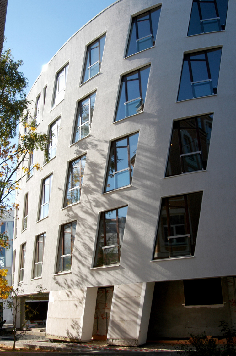
Not at all, and I have always denied that. Our facade with its triangular and diamond-shaped windows is not a formal or decorative "stylistic device" but a solution that sprang out of necessity: the land plot was tight, and we made a pedestrian passage on the level of the ground floor. We also turned the wall above it into an arched girder, very much like a bridge. Here we worked with a great engineer Mityukov who sadly tragically died later on. He had a passion for doing this work and we ultimately got a house that was great from the construction standpoint. I think that all of its artistic merits are based on the successful engineering solutions. So, this house must be my favorite.


So, designing a tiny pedestrian passage running along the house and designing on a megalopolis scale - these two things are of equal interest to you?


Well, yes! Besides, as a rule, I have to do both at a time.


It is a common misconception that architects are the guys that draw the facades. Because we use the urban fundamentals in our work! We work with loads of information, deduce the regularities and consistent patterns in order to understand how we should be developing this or that area.


I recently bought a pair of anti-glare glasses, the kind that is made for drivers or for fishermen. You put them on and they cut off the flares, cut off things that you don't need so you can now see what's important, things you could not see behind the ripples. We do just about the same thing: we try to see how things operate, foresee the development logic, if you like.  There is nothing mystical or mysterious about it, everything is as rational as it can be, if only you might need some intuition.


How did Alexander Skokan influence you?


We really go back a long way; you can say that I grew up by his side: back then I was 30, now I am 55 - I have known him practically my whole life. This man has an amazing intuition. To have a vision of the possible future - I guess he can do it like nobody else can. He is not some sort of medium, of course, just a very intelligent and insightful person. I guess I am really lucky to work with him.

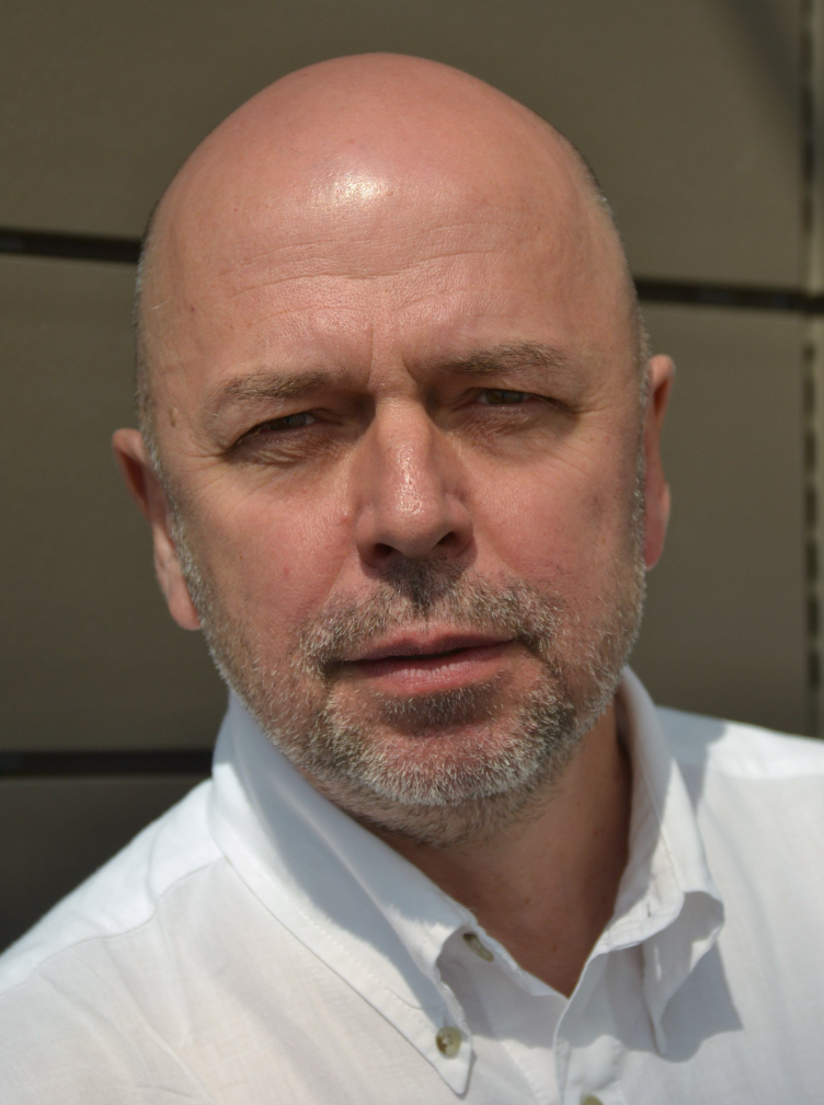
Andrew Gnezdilov. Photo by courtesy of "Ostozhenka" Bureau
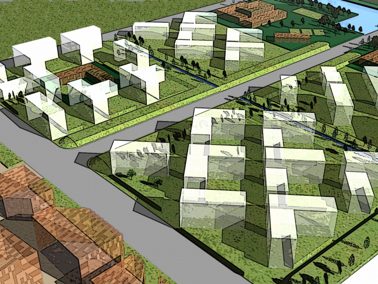
Development concept of "Vostochno-Kruglinsky" residential area in Krasnodar city. Photo by courtesy of "Ostozhenka" Bureau
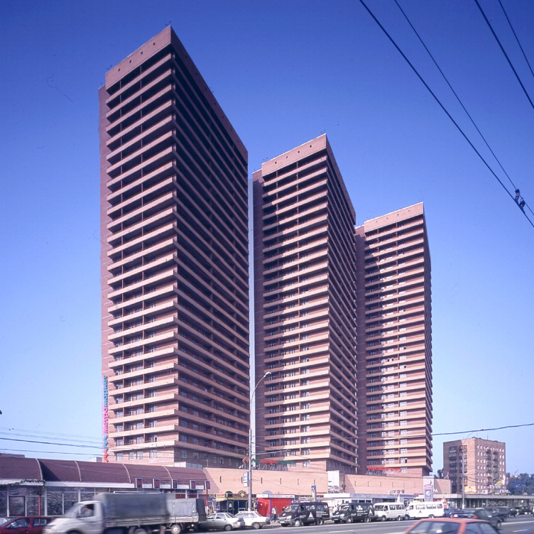
Residential complex on Dmitrovskoe Highway. Photo by courtesy of "Ostozhenka" Bureau
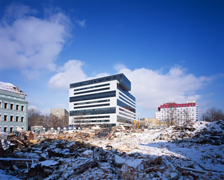
"Capital Plaza" Business Center. Photo by courtesy of "Ostozhenka" Bureau
"Embassy House" residential building. Photo by courtesy of "Ostozhenka" Bureau


09 August 2012

Headlines now
The Golden Crown
The concept for a dental clinic in Yekaterinburg, developed by CNTR Studio, revolves around the idea of a “mouth full of gold”: pristine white porcelain stoneware walls are complemented by matte brass details. To avoid an overly literal interpretation, the architects focused on the building’s proportions, skillfully navigating between sunlight requirements and fire safety regulations.
Flexibility and Integration
Not long ago, we covered the project for the fourth phase of the ÁLIA residential complex, designed by APEX. Now, we’ve been shown different fence concepts they developed to enclose the complex’s private courtyards, incorporating a variety of public functions. We believe that the sheer fact that the complex’s architects were involved in such a detail as fencing speaks volumes.
A Step Forward
The HIDE residential complex represents a major milestone for ADM architects and their leaders Andrey Romanov and Ekaterina Kuznetsova in their quest for a fresh high-rise aesthetic – one that is flexible and layered, capable of bringing vibrancy to mass and silhouette while shaping form. Over recent years, this approach has become ADM’s “signature style”, with the golden HIDE tower playing a pivotal role in its evolution. Here, we delve into the project’s story, explore the details of the complex’s design, and uncover its core essence.
Gold in the Sands
A new office for a transcontinental company specializing in resource extraction and processing has opened in Dubai. Designed by T+T Architects, masters of creating spaces that are contemporary, diverse, flexible, and original, this project exemplifies their expertise. On the executive floor, a massive brass-clad partition dominates, while layered textures of compressed earth create a contextually resonant backdrop.
Layers and Levels of Flight
This project goes way back – Reserve Union won this architectural competition at the end of 2011, and the building was completed in 2018, so it’s practically “archival”. However, despite being relatively unknown, the building can hardly be considered “dated” and remains a prime example of architectural expression, particularly in the headquarters genre. And it’s especially fitting for an aviation company office. In some ways, it resembles the Aeroflot headquarters at Sheremetyevo but with its own unique identity, following the signature style of Vladimir Plotkin. In this article, we take an in-depth look at the United Aircraft Corporation (UAC) headquarters in the Moscow agglomeration town of Zhukovsky, supplemented by recent photographs from Alexey Naroditsky – a shoot that became only recently possible due to the fact that improvements were finally made in the surrounding area.
Light and Shadow
In this article, we delve into the architectural design of the “Chaika” house by DNK ag architects, which was recently completed in 2023 as part of the collection of signature designs at ZILArt. As is well-known, all the buildings in this complex follow a design code, yet each one is distinct. This particular building stands out not only for its whiteness and minimalism but also for the refined use of a limited number of techniques that, together, create what can confidently be called synergy.
Casus Novae
A master plan was developed for a large residential area with a name of “DNS City”, but now that its implementation began, the plan has been arbitrarily reformatted and replaced with something that, while similar on the surface, is actually quite different. This is not the first time such a thing happens, but it’s always frustrating. With permission from the author, we are sharing Maria Elkina’s post.
Treasure Hunting
The GAFA bureau, in collaboration with Tegola and Arkhitail, organized an expedition to the island of Kilpola in Karelia as part of Moskomarkhitektura’s “Open City” festival. There, amidst moss and rocks, the students sought answers to questions like: what is the sacred, where does it dwell, and what sustains it? Assisting the participants in this quest were landscape engineer Evgeny Levin, artist Nicholas Roerich, a moose, and the lack of cellular connection. Here’s how the story unfolded.
Depths of the Earth, Streams of Water
In the Malaya Okhta district, the Akzent building, designed by Stepan Liphart, was constructed. It follows a classic tripartite structure, yet it’s what you might call “hand-drawn”: each façade is unique in its form and details, some of which aren’t immediately noticeable. In this article, we explore the context and, together with the architect, delve into how the form was developed.
Fir Tree Dynamics
The “Airports of Region” holding is planning to build an airport in Karachay-Cherkessia, aiming to make the Arkhyz and Dombay resorts more accessible to travelers. The project that won in an invitation-only competition, submitted by Sergey Nikeshkin’s KPLN, blends natural imagery inspired by the shape of a conifer seed, open-air waiting spaces, majestic large trees, and a green roof elevated on needle-like columns. The result is both nature-inspired and WOW.
​A Brick Shell
In the process of designing a clubhouse situated among pine trees in a prestigious suburban area near Moscow, the architectural firm “A.Len” did the façade design part. The combination of different types of brick and masonry correlates with the volumetric and plastique solutions, further enhanced by the inclusion of wood-painted fragments and metal “glazing”.
Word Forms
ATRIUM architects love ambitious challenges, and for the firm’s thirtieth anniversary, they boldly play a game of words with an exhibition that dives deep into a self-created vocabulary. They immerse their projects – especially art installations – into this glossary, as if plunging into a current of their own. You feel as if you’re flowing through the veins of pure art, immersed in a universe of vertical cities, educational spaces – of which the architects are true masters – and the cultural codes of various locations. But what truly captivates is the bold statement that Vera Butko and Anton Nadtochy make, both through their work and this exhibition: architecture, above all, is art – the art of working with form and space.
Flexibility and Acuteness of Modernity
Luxurious, fluid, large “kokoshniks” and spiral barrel columns, as if made from colorful chewing gum: there seem to be no other mansion like this in Moscow, designed in the “Neo-Russian-Modern” style. And the “Teremok” on Malaya Kaluzhskaya, previously somewhat obscure, has “come alive with new colors” and gained visibility after its restoration for the office of the “architectural ecosystem” as the architects love to call themselves. It’s evident that Julius Borisov and the architects at UNK put their hearts into finding this new office and bringing it up to date. Let’s delve into the paradoxes of this mansion’s history and its plasticity. Spoiler: two versions of modernity meet here, both balancing on the razor’s edge of “what’s current”.
Yuri Vissarionov: “A modular house does not belong to the land”
It belongs to space, or to the air... It turns out that 3D printing is more effective when combined with a modular approach: the house is built in a workshop and then adapted to the site, including on uneven terrain. Yuri Vissarionov shares his latest experience in designing tourist complexes, both in central Russia and in the south. These include houseboats, homes printed from lightweight concrete using a 3D printer, and, of course, frame houses.
​Moscow’s First
“The quality of education largely depends on the quality of the educational environment”. This principle of the last decade has been realized by Sergey Skuratov in the project for the First Moscow Gymnasium on Rostovskaya Embankment in the Khamovniki district. The building seamlessly integrates into the complex urban landscape, responding both to the pedestrian flow of the city and the quiet alleyways. It skillfully takes advantage of the height differences and aligns with modern trends in educational space design. Let’s take a closer look.
Looking at the Water
The site of Villa Sonata stretches from the road to the water’s edge, offering its own shoreline, pier, and a picturesque river panorama. To reveal these sweeping views, Roman Leonidov “cut” the façade diagonally parallel to the river, thus getting two main axes for the house and, consequently, “two heads”. The internal core – two double-height spaces, a living room and a conservatory, with a “bridge” above them – makes the house both “transparent” and filled with light.
The White Wing
Well, it’s not exactly white. It’s more of a beige, white-stone structure that plays with the color of limestone – smoother surfaces are lighter, while rougher ones are darker. This wing unites various elements: it absorbs and interprets the surrounding themes. It responds to everything, yet maintains a cohesive expression – a challenging task! – while also incorporating recognizable features of its own, such as the dynamic cuts at the bottom, top, and middle.
Urban Dunes
The XSA Ramps team designed and built a three-part sports hub for a park in Rostov-on-Don, welcoming people of all ages and fitness levels. The skate plaza, pump track, and playground are all meticulously crafted with details that attract a diverse range of visitors. The technical execution of the shapes and slopes transforms this space into a kind of sculptural composition.
Proportional Growth
The project for the fourth phase of the ÁLIA residential area has been announced. The buildings are situated on an elongated plot – almost a “ray” that shoots out from the center of the area towards the river. Their layout reflects both a response to Moscow’s architectural preferences over the past 15 years, shifting “from blocks to towers”, and an interpretation of the neighboring business park designed by SOM. Additionally, the best apartments here are not located at the very top but closer to the middle, forming a glowing “waistline”.
The “Staircase” Building
In designing the “Details” residential complex in New Moscow, Rais Baishev spiced up the now-popular Moscow theme of a “courtyard” building with an idea drawn from the surrealist drawings by Maurits Escher. He envisioned the stepped silhouettes and descending slopes as a metaphysical mega-staircase, creating a key void within the courtyard that gave the project an internal “spine”. This concept is felt both in the building’s silhouette and on its façades.
Projection of the Quarter
No one doubted that the building that Vladimir Plotkin designed as part of the “Garden Quarters” would be the most modernist of all. And it turned out just that way: while adhering to the common design code, the building successfully combines brick and white stone, rhythmically responding to the neighboring building designed by Ostozhenka, yet tactfully and persistently making a few statements of its own. This includes the projection of the ideal urban development composition “14–9–6”, which can be found right next door, mathematical calculations, including those for various types of terraces (and perhaps the only reminder of the Soviet past of the Kauchuk rubber factory!), and the white “cross-stitch” pattern of the façade grid.
Domus Aurea
In this issue, we examine the “Tessinsky-1” house, designed by Sergey Skuratov and completed in 2023. Located in the middle of the Serebryanicheskaya Embankment district, at the intersection of its main streets, this house assumes a sort of “nodal” role: it not only responds to everything around it and preserves many memories of the former EMA factory within itself, but it weaves all this into a newly directed pattern, reconciling bright “gold” and dark-colored brick, largely with the help of the new, modern-yet-archaic Columba brick, which, come to think about it, is the most precious element here.
The Chimney of Nikola-Lenivets
In this issue, we are examining the “Obelisk House” designed by KATARSIS and built for the Arkhstoyanie 2023 festival. However, it was only finished later on, and this is why we are examining it now. It seems to us that after the “Obelisk House” appeared in Nikola-Lenivets, a dialogue and a few inner connections appeared between the temporary structures built here. These houses no longer look like “accidental neighbors”, more of which below.
​Periscope by the Bay
The jury awarded the second place in the competition for a public and cultural center in Petropavlovsk-Kamchatsky to the companies GORA (“Mountain”) and M4. In the consortium’s proposal, the building resembles a sperm whale with a calf swimming next to it or a periscope, whose lenses capture the most spectacular views from the surrounding landscape.
From Arcs to Dolmens
While working on the competition project for Petropavlovsk-Kamchatsky, ASADOV Architects prioritized the value of the natural and urban environment, aiming to preserve the balance of the location while minimizing the resemblance of the volume that they designed to a “traditional building”. The task was challenging, and the architects created three versions, one of which having been developed after the competition, where their main proposal took third place. However, the point of interest here is not the competition result but the continuity of creative thinking.
Hide and Seek
The ID Moskovskiy house, designed by Stepan Liphart in St. Petersburg, in the courtyards near Moskovskiy Avenue beyond the Obvodny Canal and recently completed, is notable for several reasons. Firstly, it has been realized with considerable accuracy, which is particularly significant as this is the first building where the architect was responsible not only for the facades but also for the layouts, allowing for better integration between the two. On the other hand, this building is interesting as an example of the “germination” of new architecture in the city: it draws on the best examples from the neighborhood and becomes an improved and developed sum of ideas found by the architect in the surrounding context.
The Big Twelve
Yesterday, the winners of the Moscow Mayor’s Architecture Award were announced and honored. Let’s take a look at what was awarded and, in some cases, even critique this esteemed award. After all, there is always room for improvement, right?
Above the Golden Horn
The residential complex “Philosophy” designed by T+T architects in Vladivostok, is one of the new projects in the “Golubinaya Pad” area, changing its development philosophy (pun intended) from single houses to a comprehensive approach. The buildings are organized along public streets, varying in height and format, with one house even executed in gallery typology, featuring a cantilever leaning on an art object.
Nuanced Alternative
How can you rhyme a square and space? Easily! But to do so, you need to rhyme everything you can possibly think of: weave everything together, like in a tensegrity structure, and find your own optics too. The new exhibition at GES-2 does just that, offering its visitor a new perspective on the history of art spanning 150 years, infused with the hope for endless multiplicity of worlds and art histories. Read on to see how this is achieved and how the exhibition design by Evgeny Ace contributes to it.
Blinds for Ice
An ice arena has been constructed in Domodedovo based on a project by Yuri Vissarionov Architects. To prevent the long façade, a technical requirement for winter sports facilities, from appearing monotonous, the architects proposed the use of suspended structures with multidirectional slats. This design protects the ice from direct sunlight while giving the wall texture and detail.