По-русски

Interior Design: the Healing Power

The interior design department of “ABD Architects” has completed the remodelling project for the multi-field hospital “Klinika 31”.
25 April 2012
Object
mainImg
Architect:
Boris Stuchebryukov
Boris Levyant
Object:
“Klinika 31” Medical Center
Russia, Moscow, Lobachevsky st., 42, Bld. 4

Project Team:
Maria Korneeva – Chief architect of the project Peter Fidelman – Architect Sophie Arsenyeva – Architect Aleksey Litin – project manager S. Ananyev - photographer

7.2009 — 5.2010 / 3.2010 — 5.2011
Since we, as humans, tend to react to colours above anything else, the coloristics issue was given particular attention in developing this interior design solution. It will be safe to say that most of us associate medical institutions with the white colour in the first place, and "Klinika 31" became no exception: the interior of its premises is dominated by this particular colour. However, to make it look clearer and more "resonant", the architects introduced the black colour as well (in some floor areas), and added a light-grey tone to soften the contrast. Such monochrome palette, on the other side, needed some accents. The authors and the commissioner spent a long time deciding on the colour that was become the "anchor" one in the interior, and finally made their choice in favour of the orange colour, bright and "positive-looking" by default. The orange is used to mark the public areas of the clinic, which makes it easier for the patients to get their bearings in the place. The offices and wards are less dramatic, and the monochrome palette is cut with blue as the accent colour. Just like the corridors, the offices are divided into clearly marked areas - the floor covering of different colours marks the desk area, the entrance area, and the examination area.

From our own experience, most of us know that the main problem of the public clinics is their long corridors, and in this building this problem is worsened by the low ceilings, because initially it had been built for a different purpose and was not meant to support the huge amount of communications that are inevitably concealed behind the ceiling panels in any medical institution. The architects had no other option than to come up with a whole arsenal of planning tricks and ideas to compensate for the monotonousness of the corridors. The different heights of the ceiling, for example, add to their dynamics, and the waiting rooms that are "cut into" the long corridors help mask the excessive "straightforwardness" of the communication lines. This same function is also performed by the diagonal stripes on the floor; they are echoed by the lamp patterns on the ceiling.

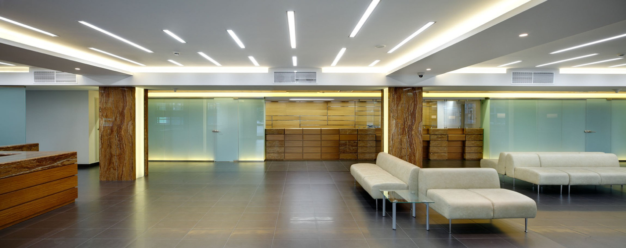
The hall of the first floor and the reception desk is designed in the way as traditional as possible. It is finished with a combination of wooden and travertine panels that ideally fit one another and are divided with a metal bracing. The direction of the movement of visitors in the hall is set by the lighting.


Architect:
Boris Stuchebryukov
Boris Levyant
Object:
“Klinika 31” Medical Center
Russia, Moscow, Lobachevsky st., 42, Bld. 4

Project Team:
Maria Korneeva – Chief architect of the project Peter Fidelman – Architect Sophie Arsenyeva – Architect Aleksey Litin – project manager S. Ananyev - photographer

7.2009 — 5.2010 / 3.2010 — 5.2011

25 April 2012

Headlines now
Grace and Unity
Villa “Grace”, designed by Roman Leonidov’s studio and built in the Moscow suburbs, strikes a balance between elegant minimalism and the expansive gestures of the Russian soul. The main house is conceived as a sequence of four self-contained volumes – each could exist independently, yet it chooses to be part of a whole. Unity is achieved through color and a system of shared spaces, while the rich plasticity of the forms – refined throughout the construction process – compensates for the near-total absence of decorative elements.
Daring Brilliance
In this article, we are exploring “New Vision”, the first school built in the past 25 years in Moscow’s Khamovniki. The building has three main features: it is designed in accordance with the universal principles of modern education, fostering learning through interaction and more; second, the façades combine structural molded glass and metallic glazed ceramics – expensive and technologically advanced materials. Third, this is the school of Garden Quarters, the latest addition to Moscow’s iconic Khamovniki district. Both a costly and, in its way, audacious acquisition, it carries a youthful boldness in its statement. Let’s explore how the school is designed and where the contrasts lie.
A Twist of the Core
A clever and concise sculptural solution – rotating each floor by N degrees – has created an ensemble of “dancing” towers: similar yet different, simple yet complex. The designers meticulously refined a single structural node and spent considerable effort on the column construction – after that, “everything else was easy”. The architects also rotated the core walls on each floor to maximize the efficiency of the office spaces.
The Sculpting of Spring Forest Matter
We’ve been observing this building for a couple of years now: seemingly simple, perhaps even unassuming, it fits in remarkably well with the micro-district context shaped by the Moscow MCD road junctions. This building sticks in the memory of everyone who drives along the highway, even occasionally. In our opinion, Sergey Nikeshkin, by blending popular architectural techniques and approaches of the 2010s, managed to turn a seemingly simple structure into a statement “on the theme of a house as such”. Let’s figure out how this happened.