|
Published on Archi.ru (https://archi.ru) |
|
| 25.04.2012 | |
|
Interior Design: the Healing Power |
|
|
Tatiana Shovskaya |
|
| Studio: | |
| ABD architects | |
|
The interior design department of “ABD Architects” has completed the remodelling project for the multi-field hospital “Klinika 31”.
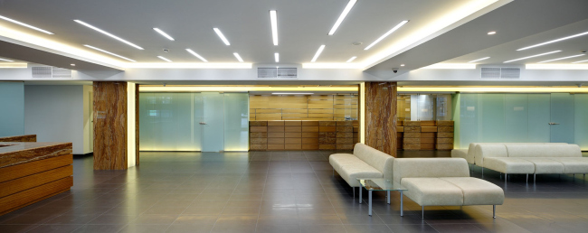
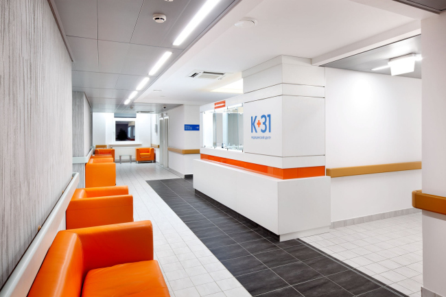
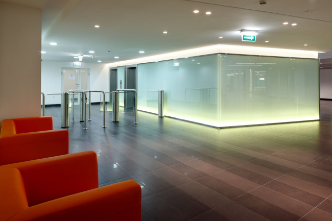
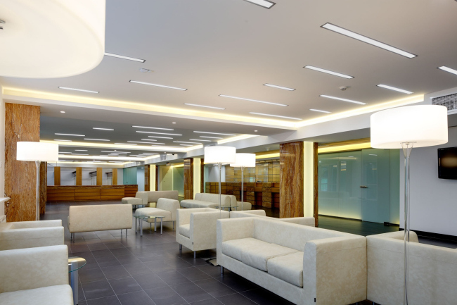
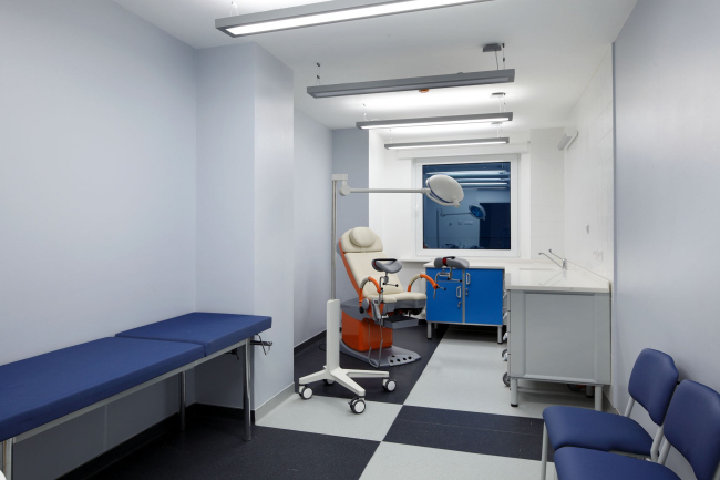
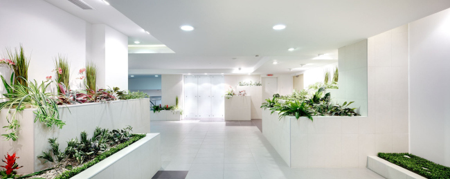
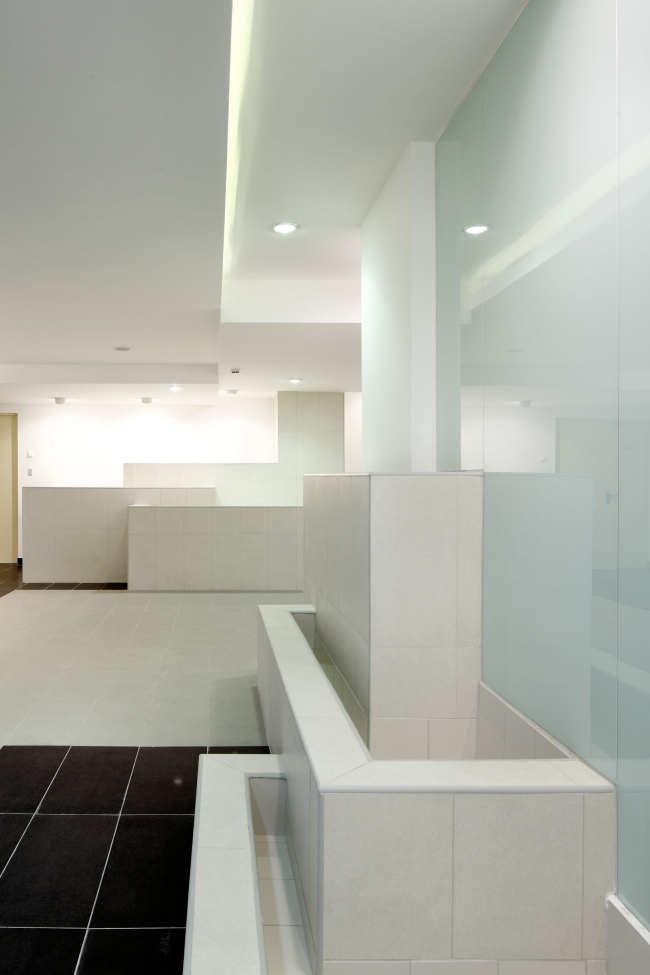
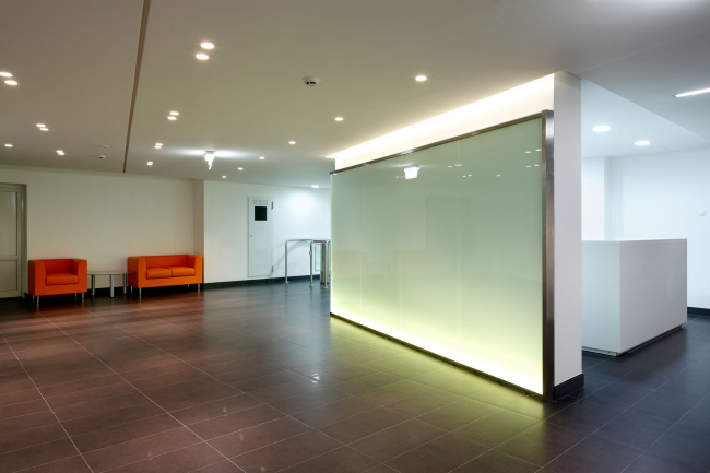
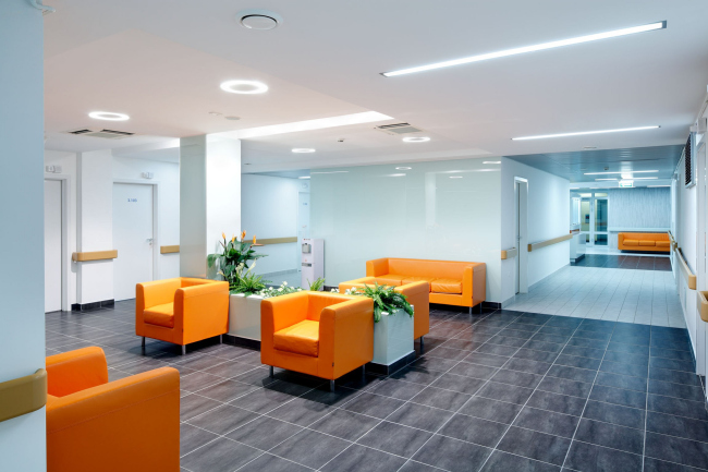
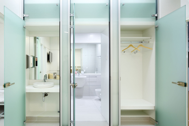
Since we, as humans, tend to react to colours above anything else, the coloristics issue was given particular attention in developing this interior design solution. It will be safe to say that most of us associate medical institutions with the white colour in the first place, and "Klinika 31" became no exception: the interior of its premises is dominated by this particular colour. However, to make it look clearer and more "resonant", the architects introduced the black colour as well (in some floor areas), and added a light-grey tone to soften the contrast. Such monochrome palette, on the other side, needed some accents. The authors and the commissioner spent a long time deciding on the colour that was become the "anchor" one in the interior, and finally made their choice in favour of the orange colour, bright and "positive-looking" by default. The orange is used to mark the public areas of the clinic, which makes it easier for the patients to get their bearings in the place. The offices and wards are less dramatic, and the monochrome palette is cut with blue as the accent colour. Just like the corridors, the offices are divided into clearly marked areas - the floor covering of different colours marks the desk area, the entrance area, and the examination area. NoneNoneNoneNoneNoneNoneNoneNoneNoneNone |
|
