По-русски

Arch, Pearl, Wing, Wind

In the social media of the governor of the Omsk region, voting was conducted for the best project for the city’s new airport. We asked the finalists to send over their projects and are now showcasing them. The projects are quite interesting: the client requested that the building be visually permeable throughout, and the images that the architects are working with include arches, wings, gusts of wind, and even the “Pearl” painting by Vrubel, who was actually born in Omsk.

14 March 2024
News
mainImg
At an open meeting of the architectural and urban planning council of the Omsk region, four finalists were chosen for the competition for the project of the new “Omsk-Fedorovka” airport. The current airport is located in the city center (no less!), creating significant noise pollution and no longer coping with the growing flow of passengers. The site for the new airport near the village of Fedorovka was agreed upon still back in the 1980s. As Wikipedia writes, this site, along with the unfinished Fedorovka metro station, is a symbol of unfulfilled hopes. However, now the prospect of implementing the project is quite real, as the construction will be carried out by the company “Airports of Regions”.

It was “Airports of Regions” that suggested to all participants the idea of making an airport where airplanes are all visible from the entrance – a terminally transparent airport. Hence, all the projects turned out to be very transparent. The airport area will feature passenger and cargo terminals, administrative buildings, a hotel, and a railway station. The new facility will serve about 3,500,000 passengers per year.

The architectural council considered seven applications, three of which did not reach the public vote – these are proposals from the GORA bureau, Nefa, and DNK ag, you can see them here. Four projects made it to the final: IND, HVOYA, “Studio 44”, and UNK. It is rumored that during the council’s deliberations, the first place went to “Studio 44”.

Later on, however, the projects were sent for “popular vote”. You could leave your vote for one of the works until March 29 in the telegram channel and VK account of the governor of the Omsk region, Vitaliy Khotsenko. They promised that the project with the highest number of votes would be implemented.

Ultimately, the popular vote was won by HVOYA

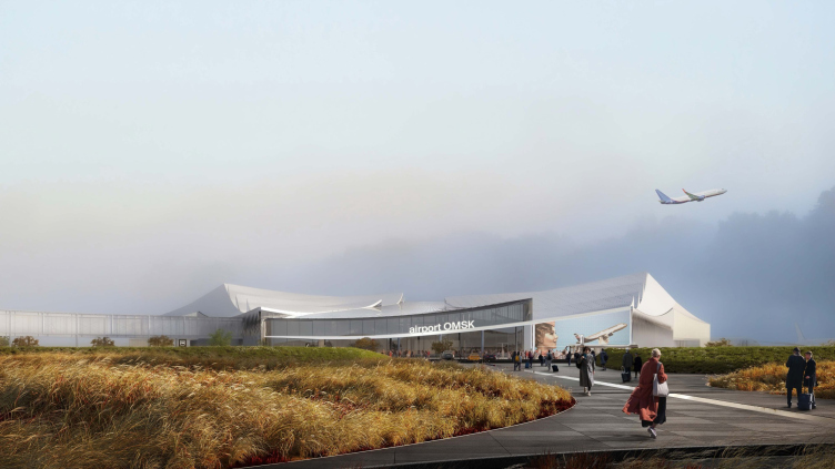
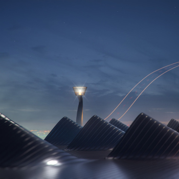
IND / “Wind Dance”

Omsk-Fedorovka Airport. Competition bid by IND
Copyright: © IND


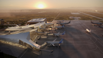
The architects were inspired by the nature of the region, which includes not only forests but also the windswept Kurumbalskaya steppe. The terminal’s design visualizes air currents: colliding with each other, they blend and form soft waves. The architectural solution symbolizes the interweaving of cultures and people united by the hospitable land of Omsk.

“We literally designed in a windswept field, and this is the uniqueness of the new airport, and we found inspiration in the nature of the steppe, the movement of the wind, freedom, space, and the interweaving of cultures. All these layers and juxtapositions formed into a shape reminiscent of flight” write the architects.

Omsk-Fedorovka Airport. Competition bid by IND
Copyright: © IND


Another authorial clarification: “And we also wanted to find a personality for inspiration, and we decided that for the theme of ‘wind dance’, we needed to find a female image – so we found Valentina Tulupova, a ballerina who worked in Omsk, an honorary citizen of Omsk, and we named the airport after her”.

Indeed, both the airport itself and all the surrounding structures appear as if they were sculpted by the wind.

Columns in airport spaces have also become a popular theme: “It was very important for us to make the structures the main ‘highlight’ of the project. The central large-span space rests on columns, which, due to their shape, seem to float in the air”.


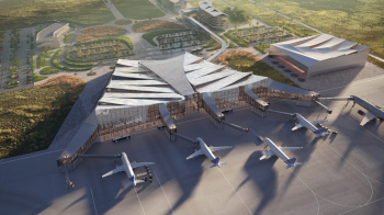
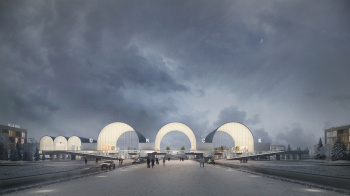
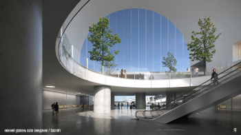
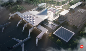
HVOYA / “The Gate”

Omsk-Fedorovka Airport. Competition bid by HVOYA
Copyright: © HVOYA


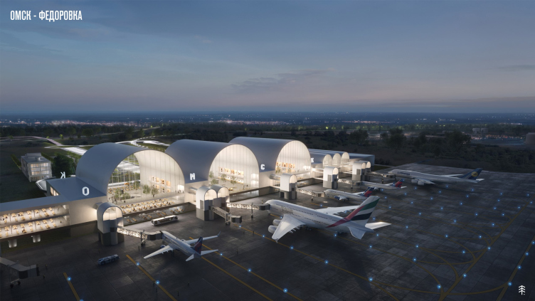
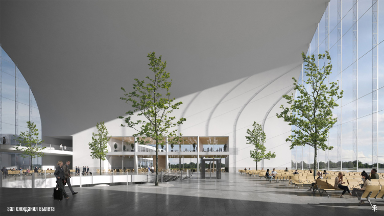
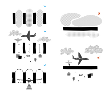
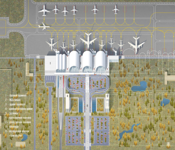
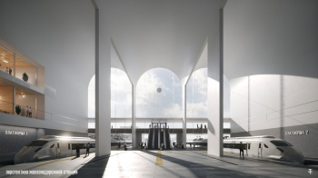
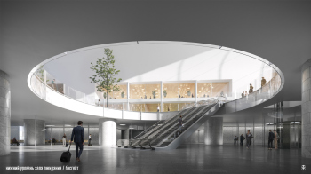
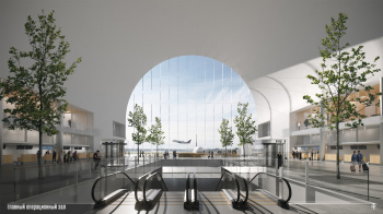
The team abandoned the standard layout in favor of permeability and easy navigation: “In our project, we abandoned the standard layout of the terminal, which involves a rigid longitudinal division of the building into uncontrolled and controlled airspace, respectively facing the city and airfield facades. Instead of a maze-like building where disoriented passengers move according to navigation signs, we propose a clear, convenient, and permeable terminal. All the passenger areas – both uncontrolled airspace (registration hall and café for escorts and meeting guests) and controlled (waiting rooms for domestic and international flights) – visually connect with the city and the airfield platform”.

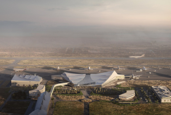
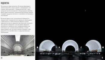
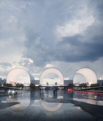
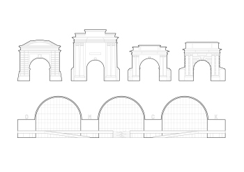
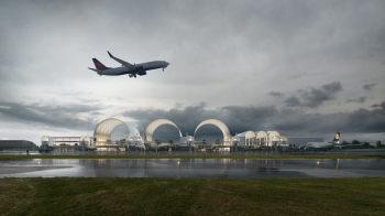
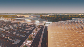
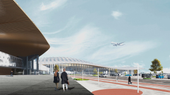
Entering the terminal, the passengers can see takeoffs and landings through large arched windows throughout their journey, turning the building into a portal between sky and earth. Enhancing this image are the city’s landmarks – Tarsk and Tobolsk gates. Three large and bright “hangars” mark the airport zone, while three smaller arches denote the railway terminal.

Omsk-Fedorovka Airport. Competition bid by HVOYA
Copyright: © HVOYA


The arches, reminiscent of the Basilica of Maxentius – only larger – are very impressive; a wide esplanade leads to them in the project.

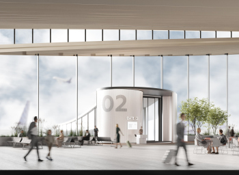
The trees inside the airport terminal are a highlight. There is plenty of natural light for them, you can feel it.


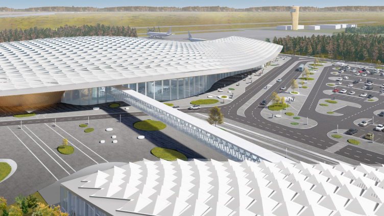
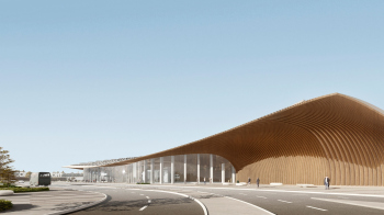
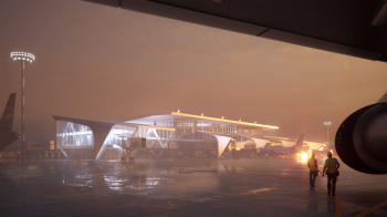
Studio 44 / “Scaly Wing”

Omsk-Fedorovka Airport. Competition bid by Studio 44
Copyright: © Studio 44


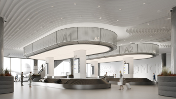
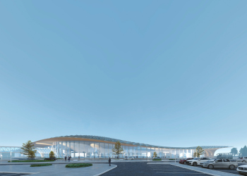
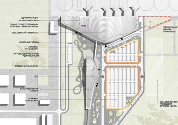
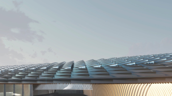
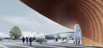
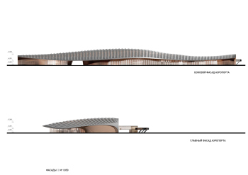
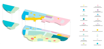
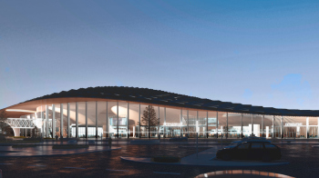
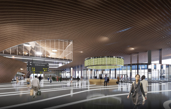
The architects propose to combine the terminals and administrative sections into a single building, which has a streamlined wing or even a fin-like shape. In the event of possible airport expansion, the building should have a mirrored pair. Parametric panels on the roof resemble slightly ruffled feathers caught by the wind, and the finish of the canopy with wooden rails waves flows into the interior spaces of the terminal, creating the sensation of a powerful wing stroke.

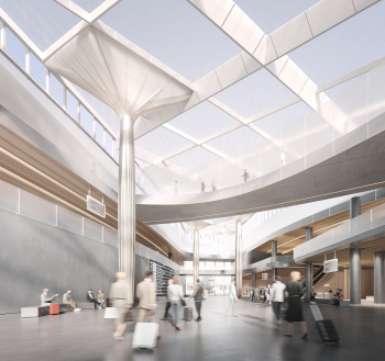
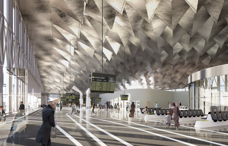
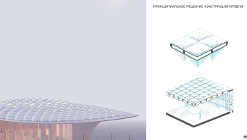
What it results in is a sculptural, emotional, and technically justified contrast. The wave of the ceiling consists of glass pyramid prisms; their peaks are pointed downward, while the facets gently open towards the sun. The ceiling takes on a “crested” appearance.

Omsk-Fedorovka Airport. Competition bid by Studio 44
Copyright: © Studio 44


The effect of such a ceiling, simultaneously rugged and luminous, is even stronger inside than outside. Another important aspect is that it is parametrically calculated. The wooden waves are different and smoother; they deflect over long distances, making way for the flow of movement, and reacting to passenger flows – as is known, this is one of the trademark techniques of Studio 44.


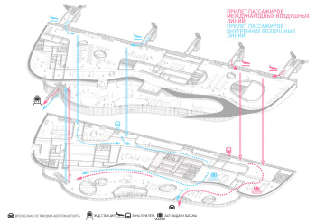
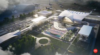
UNK / “The Pearl of Siberia”

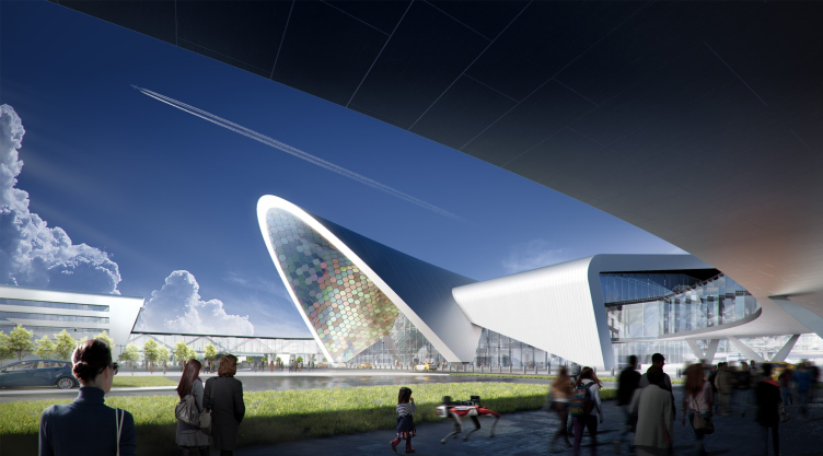
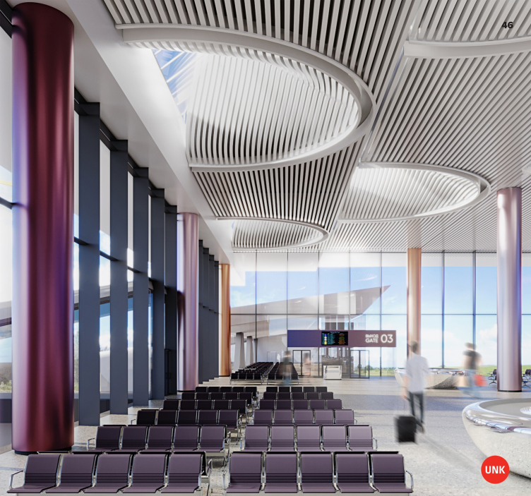
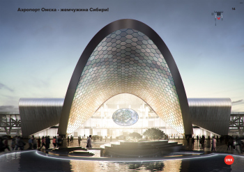
Omsk-Fedorovka Airport. Competition bid by UNK
Copyright: © UNK


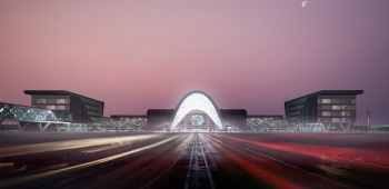
“We are confident that the new airport should become the pearl of Siberia, emphasizing local identity. The key images of the project are the river pearls, an integral element of the adornments of the peoples of Siberia, and the rivers Irtysh and Om – the natural treasures of the region” say the architects.

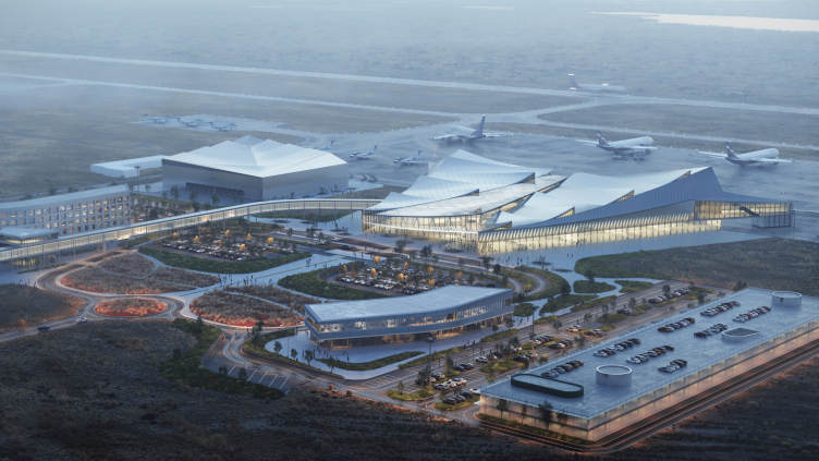
The centerpiece of the composition will be the entrance arch faced with mother-of-pearl panels, adorned with Mikhail Vrubel’s “Pearl” (the artist was born in Omsk) – not long ago we admired his painting in the Tretyakov Gallery. The pearl also reminds of the traditional decorations and riches of the rivers Om and Irtysh.

Omsk-Fedorovka Airport. Competition bid by UNK
Copyright: © UNK


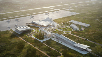
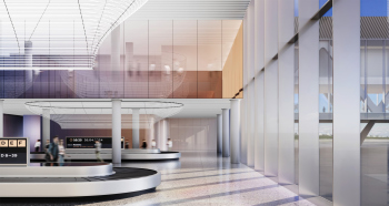
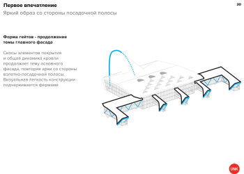
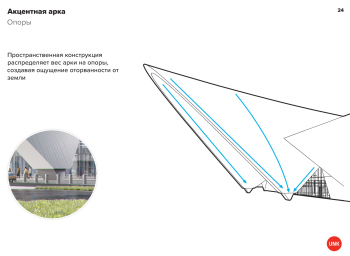
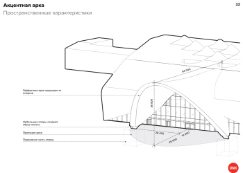
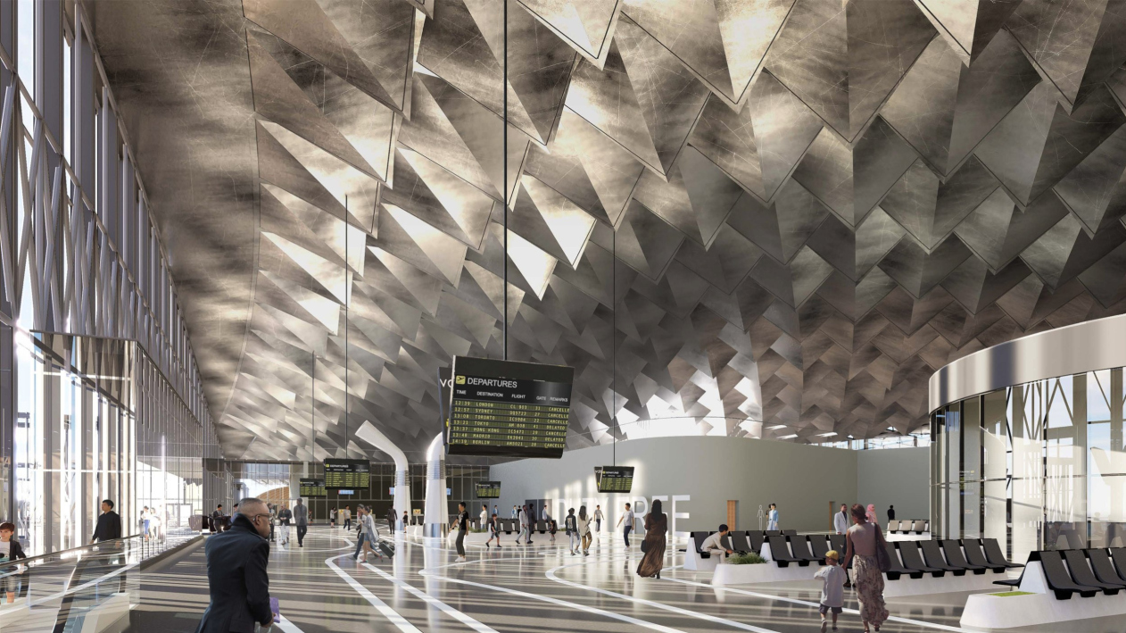
The main arch is pointedly parabolic and protruding forward – the architects emphasize that it will protect a sufficiently large area in front of the entrance from the rain. On the roof, it is echoed by a neat “bird’s beak” composed of streamlined skylights – on the inside, they are elongated into large “pipes” smoothly flowing into a striped white ceiling.

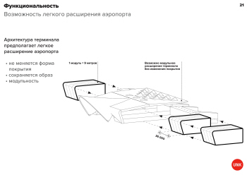
The project includes the possibility of future expansion, and according to the architects, it is cost-efficient and easily implementable.


14 March 2024

Headlines now
The Golden Crown
The concept for a dental clinic in Yekaterinburg, developed by CNTR Studio, revolves around the idea of a “mouth full of gold”: pristine white porcelain stoneware walls are complemented by matte brass details. To avoid an overly literal interpretation, the architects focused on the building’s proportions, skillfully navigating between sunlight requirements and fire safety regulations.
Flexibility and Integration
Not long ago, we covered the project for the fourth phase of the ÁLIA residential complex, designed by APEX. Now, we’ve been shown different fence concepts they developed to enclose the complex’s private courtyards, incorporating a variety of public functions. We believe that the sheer fact that the complex’s architects were involved in such a detail as fencing speaks volumes.
A Step Forward
The HIDE residential complex represents a major milestone for ADM architects and their leaders Andrey Romanov and Ekaterina Kuznetsova in their quest for a fresh high-rise aesthetic – one that is flexible and layered, capable of bringing vibrancy to mass and silhouette while shaping form. Over recent years, this approach has become ADM’s “signature style”, with the golden HIDE tower playing a pivotal role in its evolution. Here, we delve into the project’s story, explore the details of the complex’s design, and uncover its core essence.
Gold in the Sands
A new office for a transcontinental company specializing in resource extraction and processing has opened in Dubai. Designed by T+T Architects, masters of creating spaces that are contemporary, diverse, flexible, and original, this project exemplifies their expertise. On the executive floor, a massive brass-clad partition dominates, while layered textures of compressed earth create a contextually resonant backdrop.
Layers and Levels of Flight
This project goes way back – Reserve Union won this architectural competition at the end of 2011, and the building was completed in 2018, so it’s practically “archival”. However, despite being relatively unknown, the building can hardly be considered “dated” and remains a prime example of architectural expression, particularly in the headquarters genre. And it’s especially fitting for an aviation company office. In some ways, it resembles the Aeroflot headquarters at Sheremetyevo but with its own unique identity, following the signature style of Vladimir Plotkin. In this article, we take an in-depth look at the United Aircraft Corporation (UAC) headquarters in the Moscow agglomeration town of Zhukovsky, supplemented by recent photographs from Alexey Naroditsky – a shoot that became only recently possible due to the fact that improvements were finally made in the surrounding area.
Light and Shadow
In this article, we delve into the architectural design of the “Chaika” house by DNK ag architects, which was recently completed in 2023 as part of the collection of signature designs at ZILArt. As is well-known, all the buildings in this complex follow a design code, yet each one is distinct. This particular building stands out not only for its whiteness and minimalism but also for the refined use of a limited number of techniques that, together, create what can confidently be called synergy.
Casus Novae
A master plan was developed for a large residential area with a name of “DNS City”, but now that its implementation began, the plan has been arbitrarily reformatted and replaced with something that, while similar on the surface, is actually quite different. This is not the first time such a thing happens, but it’s always frustrating. With permission from the author, we are sharing Maria Elkina’s post.
Treasure Hunting
The GAFA bureau, in collaboration with Tegola and Arkhitail, organized an expedition to the island of Kilpola in Karelia as part of Moskomarkhitektura’s “Open City” festival. There, amidst moss and rocks, the students sought answers to questions like: what is the sacred, where does it dwell, and what sustains it? Assisting the participants in this quest were landscape engineer Evgeny Levin, artist Nicholas Roerich, a moose, and the lack of cellular connection. Here’s how the story unfolded.
Depths of the Earth, Streams of Water
In the Malaya Okhta district, the Akzent building, designed by Stepan Liphart, was constructed. It follows a classic tripartite structure, yet it’s what you might call “hand-drawn”: each façade is unique in its form and details, some of which aren’t immediately noticeable. In this article, we explore the context and, together with the architect, delve into how the form was developed.
Fir Tree Dynamics
The “Airports of Region” holding is planning to build an airport in Karachay-Cherkessia, aiming to make the Arkhyz and Dombay resorts more accessible to travelers. The project that won in an invitation-only competition, submitted by Sergey Nikeshkin’s KPLN, blends natural imagery inspired by the shape of a conifer seed, open-air waiting spaces, majestic large trees, and a green roof elevated on needle-like columns. The result is both nature-inspired and WOW.
​A Brick Shell
In the process of designing a clubhouse situated among pine trees in a prestigious suburban area near Moscow, the architectural firm “A.Len” did the façade design part. The combination of different types of brick and masonry correlates with the volumetric and plastique solutions, further enhanced by the inclusion of wood-painted fragments and metal “glazing”.
Word Forms
ATRIUM architects love ambitious challenges, and for the firm’s thirtieth anniversary, they boldly play a game of words with an exhibition that dives deep into a self-created vocabulary. They immerse their projects – especially art installations – into this glossary, as if plunging into a current of their own. You feel as if you’re flowing through the veins of pure art, immersed in a universe of vertical cities, educational spaces – of which the architects are true masters – and the cultural codes of various locations. But what truly captivates is the bold statement that Vera Butko and Anton Nadtochy make, both through their work and this exhibition: architecture, above all, is art – the art of working with form and space.
Flexibility and Acuteness of Modernity
Luxurious, fluid, large “kokoshniks” and spiral barrel columns, as if made from colorful chewing gum: there seem to be no other mansion like this in Moscow, designed in the “Neo-Russian-Modern” style. And the “Teremok” on Malaya Kaluzhskaya, previously somewhat obscure, has “come alive with new colors” and gained visibility after its restoration for the office of the “architectural ecosystem” as the architects love to call themselves. It’s evident that Julius Borisov and the architects at UNK put their hearts into finding this new office and bringing it up to date. Let’s delve into the paradoxes of this mansion’s history and its plasticity. Spoiler: two versions of modernity meet here, both balancing on the razor’s edge of “what’s current”.
Yuri Vissarionov: “A modular house does not belong to the land”
It belongs to space, or to the air... It turns out that 3D printing is more effective when combined with a modular approach: the house is built in a workshop and then adapted to the site, including on uneven terrain. Yuri Vissarionov shares his latest experience in designing tourist complexes, both in central Russia and in the south. These include houseboats, homes printed from lightweight concrete using a 3D printer, and, of course, frame houses.
​Moscow’s First
“The quality of education largely depends on the quality of the educational environment”. This principle of the last decade has been realized by Sergey Skuratov in the project for the First Moscow Gymnasium on Rostovskaya Embankment in the Khamovniki district. The building seamlessly integrates into the complex urban landscape, responding both to the pedestrian flow of the city and the quiet alleyways. It skillfully takes advantage of the height differences and aligns with modern trends in educational space design. Let’s take a closer look.
Looking at the Water
The site of Villa Sonata stretches from the road to the water’s edge, offering its own shoreline, pier, and a picturesque river panorama. To reveal these sweeping views, Roman Leonidov “cut” the façade diagonally parallel to the river, thus getting two main axes for the house and, consequently, “two heads”. The internal core – two double-height spaces, a living room and a conservatory, with a “bridge” above them – makes the house both “transparent” and filled with light.
The White Wing
Well, it’s not exactly white. It’s more of a beige, white-stone structure that plays with the color of limestone – smoother surfaces are lighter, while rougher ones are darker. This wing unites various elements: it absorbs and interprets the surrounding themes. It responds to everything, yet maintains a cohesive expression – a challenging task! – while also incorporating recognizable features of its own, such as the dynamic cuts at the bottom, top, and middle.
Urban Dunes
The XSA Ramps team designed and built a three-part sports hub for a park in Rostov-on-Don, welcoming people of all ages and fitness levels. The skate plaza, pump track, and playground are all meticulously crafted with details that attract a diverse range of visitors. The technical execution of the shapes and slopes transforms this space into a kind of sculptural composition.
Proportional Growth
The project for the fourth phase of the ÁLIA residential area has been announced. The buildings are situated on an elongated plot – almost a “ray” that shoots out from the center of the area towards the river. Their layout reflects both a response to Moscow’s architectural preferences over the past 15 years, shifting “from blocks to towers”, and an interpretation of the neighboring business park designed by SOM. Additionally, the best apartments here are not located at the very top but closer to the middle, forming a glowing “waistline”.
The “Staircase” Building
In designing the “Details” residential complex in New Moscow, Rais Baishev spiced up the now-popular Moscow theme of a “courtyard” building with an idea drawn from the surrealist drawings by Maurits Escher. He envisioned the stepped silhouettes and descending slopes as a metaphysical mega-staircase, creating a key void within the courtyard that gave the project an internal “spine”. This concept is felt both in the building’s silhouette and on its façades.
Projection of the Quarter
No one doubted that the building that Vladimir Plotkin designed as part of the “Garden Quarters” would be the most modernist of all. And it turned out just that way: while adhering to the common design code, the building successfully combines brick and white stone, rhythmically responding to the neighboring building designed by Ostozhenka, yet tactfully and persistently making a few statements of its own. This includes the projection of the ideal urban development composition “14–9–6”, which can be found right next door, mathematical calculations, including those for various types of terraces (and perhaps the only reminder of the Soviet past of the Kauchuk rubber factory!), and the white “cross-stitch” pattern of the façade grid.
Domus Aurea
In this issue, we examine the “Tessinsky-1” house, designed by Sergey Skuratov and completed in 2023. Located in the middle of the Serebryanicheskaya Embankment district, at the intersection of its main streets, this house assumes a sort of “nodal” role: it not only responds to everything around it and preserves many memories of the former EMA factory within itself, but it weaves all this into a newly directed pattern, reconciling bright “gold” and dark-colored brick, largely with the help of the new, modern-yet-archaic Columba brick, which, come to think about it, is the most precious element here.
The Chimney of Nikola-Lenivets
In this issue, we are examining the “Obelisk House” designed by KATARSIS and built for the Arkhstoyanie 2023 festival. However, it was only finished later on, and this is why we are examining it now. It seems to us that after the “Obelisk House” appeared in Nikola-Lenivets, a dialogue and a few inner connections appeared between the temporary structures built here. These houses no longer look like “accidental neighbors”, more of which below.
​Periscope by the Bay
The jury awarded the second place in the competition for a public and cultural center in Petropavlovsk-Kamchatsky to the companies GORA (“Mountain”) and M4. In the consortium’s proposal, the building resembles a sperm whale with a calf swimming next to it or a periscope, whose lenses capture the most spectacular views from the surrounding landscape.
From Arcs to Dolmens
While working on the competition project for Petropavlovsk-Kamchatsky, ASADOV Architects prioritized the value of the natural and urban environment, aiming to preserve the balance of the location while minimizing the resemblance of the volume that they designed to a “traditional building”. The task was challenging, and the architects created three versions, one of which having been developed after the competition, where their main proposal took third place. However, the point of interest here is not the competition result but the continuity of creative thinking.
Hide and Seek
The ID Moskovskiy house, designed by Stepan Liphart in St. Petersburg, in the courtyards near Moskovskiy Avenue beyond the Obvodny Canal and recently completed, is notable for several reasons. Firstly, it has been realized with considerable accuracy, which is particularly significant as this is the first building where the architect was responsible not only for the facades but also for the layouts, allowing for better integration between the two. On the other hand, this building is interesting as an example of the “germination” of new architecture in the city: it draws on the best examples from the neighborhood and becomes an improved and developed sum of ideas found by the architect in the surrounding context.
The Big Twelve
Yesterday, the winners of the Moscow Mayor’s Architecture Award were announced and honored. Let’s take a look at what was awarded and, in some cases, even critique this esteemed award. After all, there is always room for improvement, right?
Above the Golden Horn
The residential complex “Philosophy” designed by T+T architects in Vladivostok, is one of the new projects in the “Golubinaya Pad” area, changing its development philosophy (pun intended) from single houses to a comprehensive approach. The buildings are organized along public streets, varying in height and format, with one house even executed in gallery typology, featuring a cantilever leaning on an art object.
Nuanced Alternative
How can you rhyme a square and space? Easily! But to do so, you need to rhyme everything you can possibly think of: weave everything together, like in a tensegrity structure, and find your own optics too. The new exhibition at GES-2 does just that, offering its visitor a new perspective on the history of art spanning 150 years, infused with the hope for endless multiplicity of worlds and art histories. Read on to see how this is achieved and how the exhibition design by Evgeny Ace contributes to it.
Blinds for Ice
An ice arena has been constructed in Domodedovo based on a project by Yuri Vissarionov Architects. To prevent the long façade, a technical requirement for winter sports facilities, from appearing monotonous, the architects proposed the use of suspended structures with multidirectional slats. This design protects the ice from direct sunlight while giving the wall texture and detail.