По-русски

The Yauza Towers

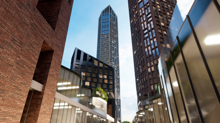
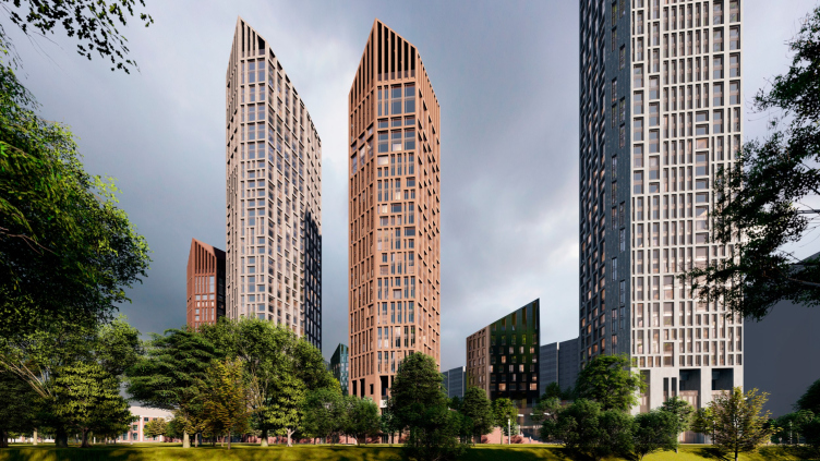
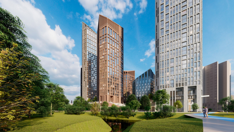
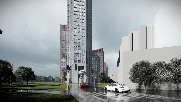
In Moscow, there aren’t that many buildings or projects designed by Nikita Yavein and Studio 44. In this article, we present to you the concept of a large multifunctional complex on the Yauza River, located between two parks, featuring a promenade, a crossroads of two pedestrian streets, a highly developed public space, and an original architectural solution. This solution combines a sophisticated, asymmetric façade grid, reminiscent of a game of fifteen puzzle, and bold protrusions of the upper parts of the buildings, completely masking the technical floors and sculpting the complex’s silhouette.

22 March 2024
Object
mainImg

The Yauza River is the largest of the small rivers in Moscow, and its banks have recently become the focus of attention for urban authorities and improvement projects. Parks are already scattered along almost the entire length of the river, and now, if different parts are to be connected, it has the potential to turn into a “super-park”, which is undoubtedly a positive factor for nearby residents. Along the Yauza, like almost any river, there are industrial zones, and this combination of water, parks, and industrial zones adds up to a simple equation – a few housing complexes have already appeared on the banks of the river, and more will appear in the future.

The exact location of the proposed residential complex is not disclosed, but it is known to be a high-rise one, located on the territory of a former factory, one of whose brick buildings will be preserved and converted into a school. It also borders the Yauza River, which encircles its territory on two sides in a whimsical loop, providing ample space for a fairly extensive promenade; on the right and left are two parks – a very convenient location indeed!

The housing complex on the Yauza River
Copyright: © Studio 44


“Studio 44” led by Nikita Yavein was invited to work on the concept for this territory. The company is very well-known and operates not only in St. Petersburg but throughout the country; their project, geographically most close to the capital, is the Primakov School. When it comes to Moscow, however, the architects have designed relatively few big projects here, if any, and what we have before us is a little bit of a premiere.

This project is Studio 44’s first experience with high-rise construction in Moscow. One of the client’s requirements was to find a non-trivial image of the skyscraper, different from other Moscow projects.

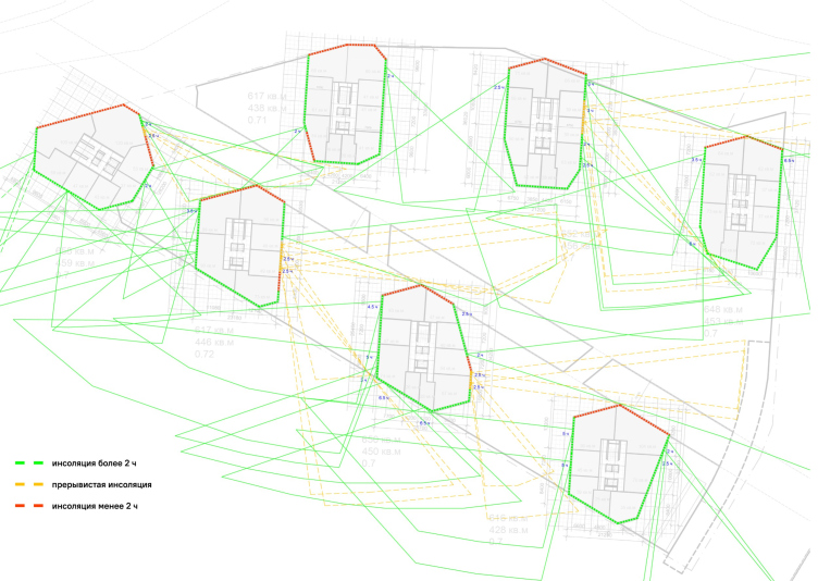
Surprisingly, the silhouette was largely determined by insolation: in order to “capture” more sunlight, we had to cut off the corners of the rectangular volumes. Another wish of the client was to use pitched roofs. This is how the asymmetrical faceted outline of the top was created, which emphasizes the brick-industrial style of the area.

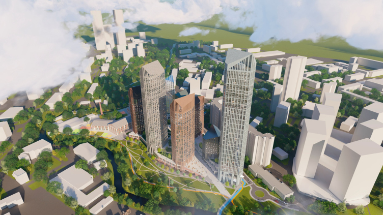
Thus, simple boxes were transformed into a multidimensional, complex volume of buildings grouped around a central green recreation area.


The insolation development. The housing complex on the Yauza River
Copyright: © Studio 44


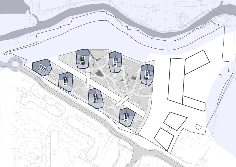
So! The territory covering an area of 5.1 hectares, on one side, is integrated into the developing part of the city, while on the other side it is partially isolated by the contour of the river, neighboring parks, and a distance of 300-600 meters from the busy urban highways.

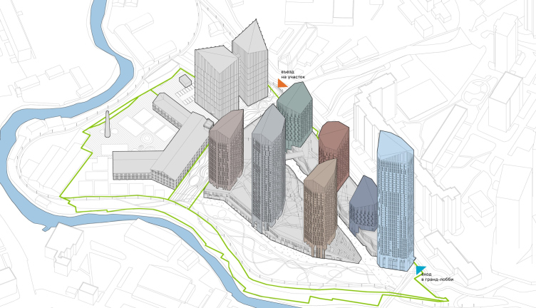
Currently, the territory of the future complex is occupied by a former factory, where there already exists a transverse boulevard dividing the site from north to south; its width in the project is 25 meters. To the east of the boulevard, the architects have placed two towers of a business center and a school with a kindergarten: they plan to accommodate them in one of the preserved brick buildings, adding an extra wing to it. Here, we will see a peculiar contrast between the “crystalline” glass towers and a brick industrial building adapted for the school. We recently mentioned that placing a school in a former industrial building happened in Moscow for the first time in the “Republic” housing complex, and almost immediately, a second such case appeared here. And it is certainly not the first time for Nikita Yavein to place classrooms in historical buildings, it is enough to remember Eifman Dance Academy in St. Petersburg.

Center: the complex of schools and preschools. Right: business center. Left: residential buildings. The housing complex on the Yauza River
Copyright: © Studio 44


A random fun fact: next to the school, they will preserve one of the chimneys of the former factory.

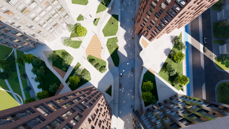
The western, larger part is occupied by residential towers resting on stylobates. Across the territory, a collector passes, over which construction is prohibited – together they form a spatial cross, the intersection of future vehicle-free pedestrian arteries, and unite the complex, stringing it onto the urban axes.

The housing complex on the Yauza River
Copyright: © Studio 44


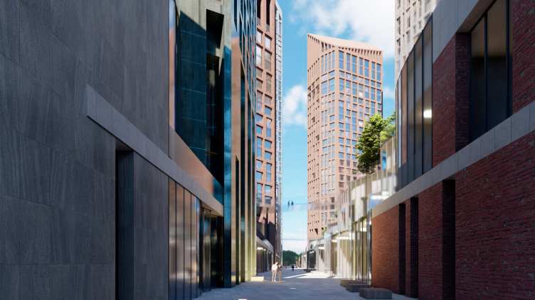
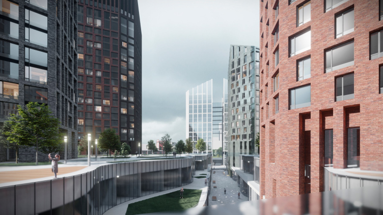
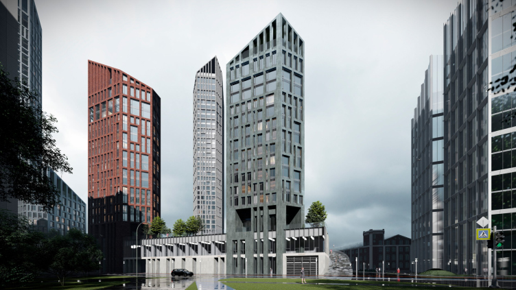
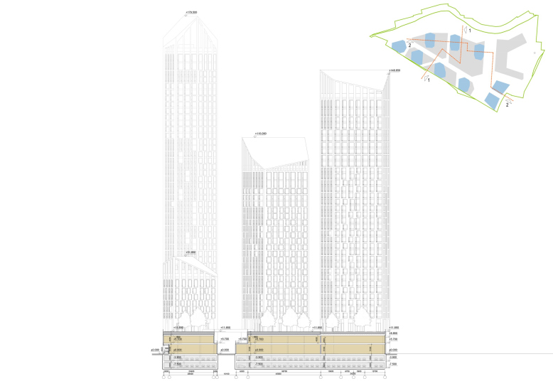
All these connections at the lower levels are organized into a coherent system of urban spaces built according to modern rules. The height of the stylobates is 11.8 meters, which is a three-story medium-sized building, with two floors inside allocated for shops and other “commercial premises of flexible purpose”. To prevent the pedestrian street over the collector from turning into a gorge, the architects vary its width, making the contours of the floors wavy, and for pedestrian permeability, they throw two pedestrian bridges over the street, connecting the stylobates. Such bridges, besides being useful from the purely utilitarian standpoint, always look pretty spectacular.

The housing complex on the Yauza River
Copyright: © Studio 44


The housing complex on the Yauza River
Copyright: © Studio 44


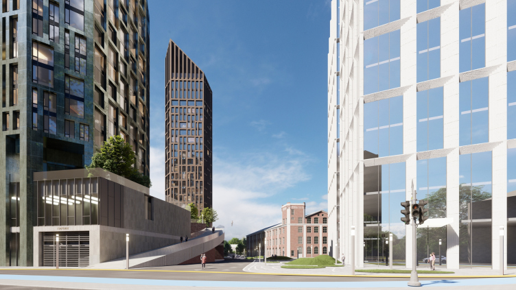
By the way, the bridges resonate with a large glass bridge – suspended floors that connect the two towers of the business center, opening up a boundless perspective view at the lower part – a visual axis.

View to the pedestrian street at the roof level of the stylobate. The business center in the background. The housing complex on the Yauza River
Copyright: © Studio 44


A complex of such scale is inconceivable without visual axes: the architects have considered several perspectives, including views from the city to the business center; they suggest slightly adjusting the lines of the existing boulevard to better integrate the intersection of the new complex into the spatial structure of the surroundings. And this solution is undoubtedly correct – when each new development seeks not to overcrowd but to structure the urban fabric, the latter becomes a lot more coherent. Here one can easily recognize the St. Petersburg origin of the architects and their professional approach.

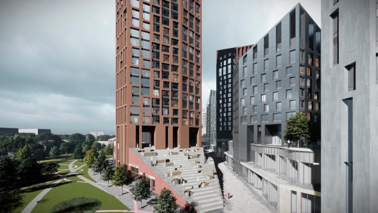
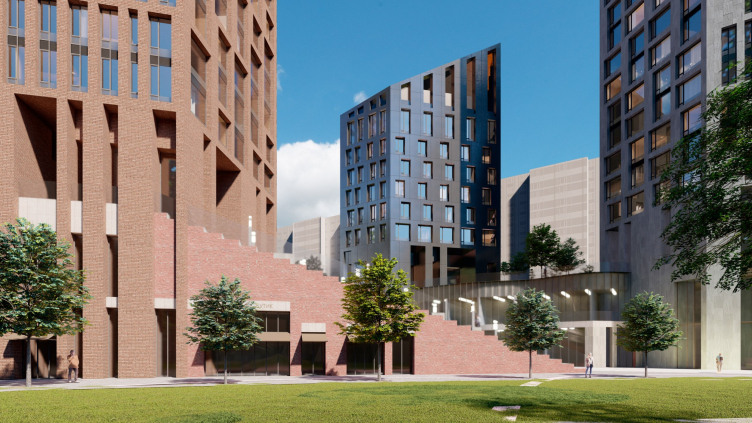
On the side of the park, which is situated closer to the metro station – a 10-minute walk across the bridge over the Yauza River – the architects place the “entrance” square. Here begins the axial street, and to the left of it, the stylobate descends with a triangular amphitheater (which somehow subtly resembles the amphitheater in the Saint Petersburg Joint Staff building, the one at the end of the enfilade).

The housing complex on the Yauza River
Copyright: © Studio 44


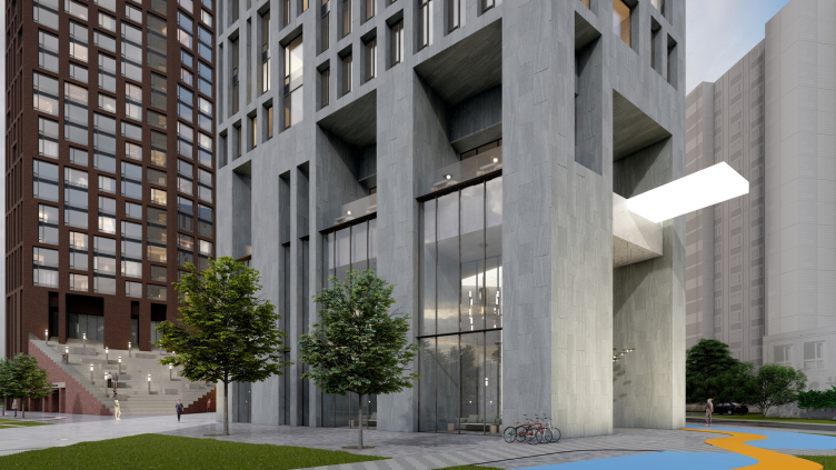
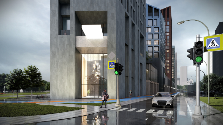
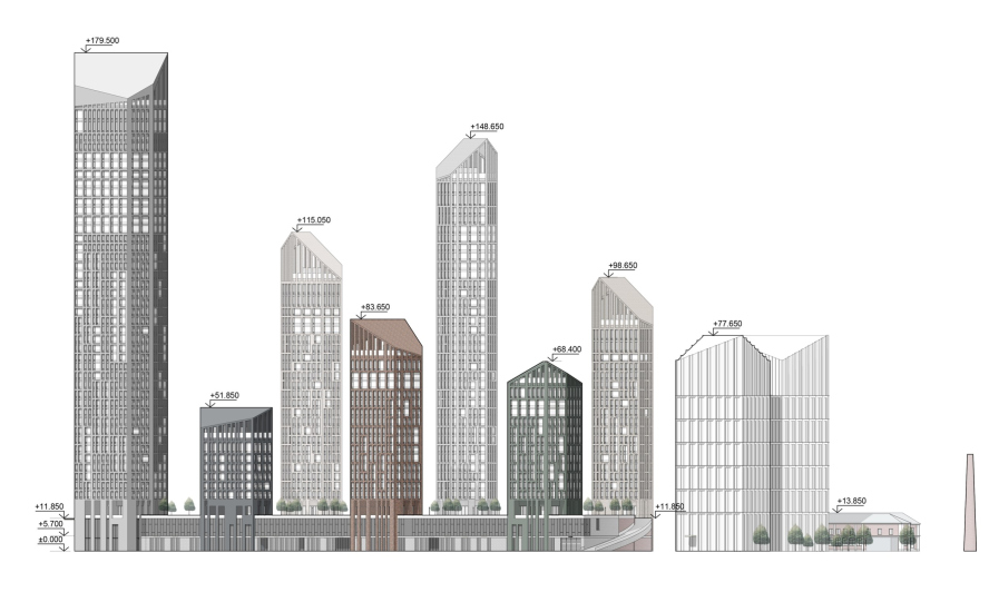
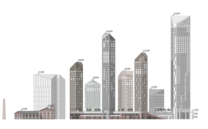
On the right side stands the tallest residential tower, 179.5 meters high with 42 floors in it, opening up to the residents with a grand lobby under a flashy illuminated canopy. From here, you can access any of the towers and the roof of the stylobate.

The housing complex on the Yauza River
Copyright: © Studio 44


The housing complex on the Yauza River
Copyright: © Studio 44


The housing complex on the Yauza River
Copyright: © Studio 44


The housing complex on the Yauza River
Copyright: © Studio 44


Walking through the pedestrian street through the residential area – with shops on both sides, which make it a true urban street – we arrive at the business center (likely to seek Chinese tenants as the Chinese center is nearby). Here, too, there’s a city square, more of a business nature, as the architects explain, and here, too, an amphitheater is designed.

While the business center is oriented towards the intersection of the street and the boulevard, the school and kindergarten, on the contrary, require some measure of privacy: the L-shaped historical building in the project receives a new wing, set at an angle, turning the plan into a trapezoid, and the inner courtyard faces the river and is separated from the urban public spaces. This provides children with more tranquility, and the noise of their games is less audible from the other side.

The roof of the stylobate is a private courtyard shared by all the residents. Here, a sufficiently large layer of soil, 1.5 meters, is planned to be placed, along with a network of diagonal pathways.

The housing complex on the Yauza River
Copyright: © Studio 44


The housing complex on the Yauza River
Copyright: © Studio 44


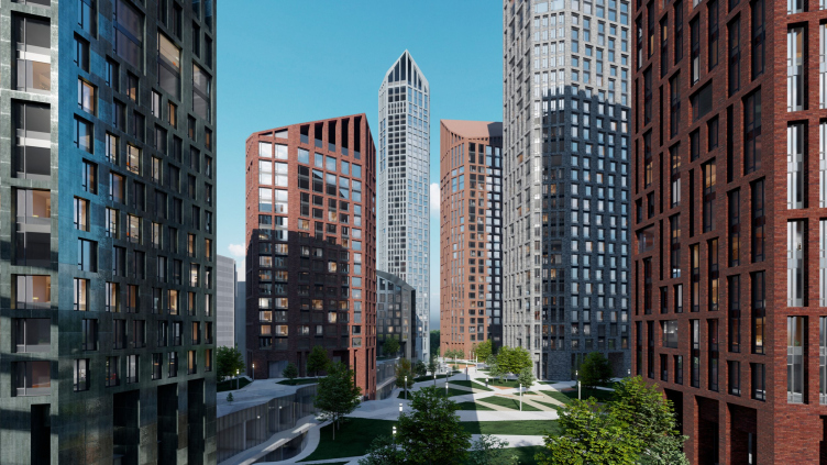
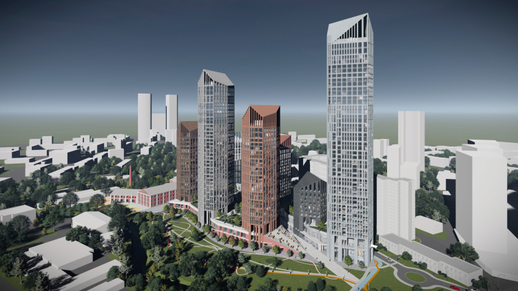
The buildings themselves – towers ranging from 12 to 42 floors – are arranged on the stylobate in a checkerboard pattern, avoiding the “window-to-window” view and maximizing sunlight exposure to each other. Three towers are placed on one side, with five, starting from the tallest, on the other. The taller towers – closer to the river and the northern part – enjoy more views (in the previous project by other authors for the same location, everything was the opposite). The varying heights create a diverse silhouette.

  • zooming
    View from the south. The housing complex on the Yauza River
    Copyright: © Studio 44
  • zooming
    View from the north. The housing complex on the Yauza River
    Copyright: © Studio 44


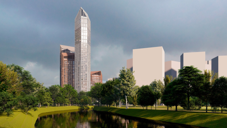
Particularly impressive are the rooftops cut at different angles. They echo the faceted contours of the towers, but sharper and more radical in profile. The architects transform the towers into “pencils” – not blunt, but sharpened, which looks quite refreshing considering the abundance of towers with flat tops that have appeared in Moscow in recent years. It’s evident that for the architects from St. Petersburg, working with the client’s request for pitched roofs, as was voiced here, is quite a habitual thing to do. One might recall here the project by Studio 44 for the historic center of Kaliningrad, which, albeit completely different, also interprets the theme of pitched roofs.

It looks more like the result of a new search. And it’s worth noting that there’s nothing traditional here, no enlarged repetition of historical buildings – it’s not felt at all. The asymmetrical, high protrusions almost seem daringly “cut off” at the top. This is quite an original move, and by no means conservative. The entire silhouette takes on a contour similar not so much to the typical Moscow “cluster of towers”, but to the Moscow City, and not even necessarily that specific business center, but rather the generalized downtown skyscraper area. The Moscow City complex is known for the desire of each tower to assert itself so densely that they compete with each other, resulting in a distinctive silhouette. In this case, however, it’s not quite the same: the towers vary in size, their heights differ, yet the protrusions, despite their diversity, are unified by one technique. However, the silhouette typology is precisely that.

It’s also interesting that in some places, the slopes are arranged to protrude outward: the silhouettes of the groups diverge, expanding outward – which gives uniqueness to the shapes of the roofs, which in themselves, one would think, should adhere to tradition, but in this case, they don’t seem to.

The housing complex on the Yauza River
Copyright: © Studio 44


Moreover, here one can see a kind of light deconstruction of the diverging “Kremlin battlements”, a subtle trolling of Moscow by Saint Petersburg.

The protrusions not only form original attics and allow the architects to mask the technical floors – it’s possible that these “pergolas” could host the terraces for upper-floor apartments, which also feature higher ceilings – 4.2 meters instead of the regular 3.3 meters.

The uniqueness of the architectural solution is also enhanced by the facade grid. It is designed deliberately irregularly, resembling densely packed Tetris figures. The façade grid can also be compared to a characteristic modernist technique – if you look at it closely, you will see that a similar pattern was used in the buildings of the Optics House next to the Cosmos Hotel and the Institute of Mechanical Engineering on Zvezdny Boulevard (now the Nix store); both were built in the 1970s, and the pattern is based on alternating sequentially inverted cells: a strip at the bottom, a strip at the top.

In this case, however, the technique is noticeably more sophisticated – I would say, if in the 1970s it was used arithmetically, now it’s used algebraically: there are more variations, and the compositions are harder to predict, not only because they are defined by the artistic will of their authors but also by the orientation of the facades, by insolation, and by the viewing angles.

The housing complex on the Yauza River
Copyright: © Studio 44


The housing complex on the Yauza River
Copyright: © Studio 44


To some extent, this pattern can be seen as a depiction of a “downward flow” of apartments packed inside a large building. The apartments here, by the way, come in five types with subtypes, from studios to four-room apartments of 95 square meters – predominately two and three-room ones.

  • zooming
    Plan of the standard floor. The housing complex on the Yauza River
    Copyright: © Studio 44
  • zooming
    Section view. The housing complex on the Yauza River
    Copyright: © Studio 44


The color of the facades, on the other hand, falls more into the Moscow trend of recent years – a love for brick in natural brownish, grayish, and greenish shades. Equally, it resonates with Studio 44’s recent work in St. Petersburg – a residential complex in the territory of Mytny Dvor; only there, it’s subtly emerald green/ceramic, while here it’s aluminum, composite, or fiber cement. The shades allow distinguishing the buildings, but the commonality of the restrained palette gives the residential part integrity and distinction from the contrasting buildings of the business center and school.

The housing complex on the Yauza River
Copyright: © Studio 44


The housing complex on the Yauza River
Copyright: © Studio 44


So, the “Moscow” scale and the format of towers relevant to the capital, a demand for original form and simultaneously pitched roofs, requirements for insolation and views, plus the St. Petersburg view on things and Studio 44’s interest in avant-garde solutions, all together have resulted in a cohesive complex with developed internal space, which, when and if realized – currently, the project is in the concept stage – will be interesting to visit. And the complex is quite capable of revitalizing the silhouette of this part of the city, which is now actively growing.


22 March 2024

Headlines now
The Golden Crown
The concept for a dental clinic in Yekaterinburg, developed by CNTR Studio, revolves around the idea of a “mouth full of gold”: pristine white porcelain stoneware walls are complemented by matte brass details. To avoid an overly literal interpretation, the architects focused on the building’s proportions, skillfully navigating between sunlight requirements and fire safety regulations.
Flexibility and Integration
Not long ago, we covered the project for the fourth phase of the ÁLIA residential complex, designed by APEX. Now, we’ve been shown different fence concepts they developed to enclose the complex’s private courtyards, incorporating a variety of public functions. We believe that the sheer fact that the complex’s architects were involved in such a detail as fencing speaks volumes.
A Step Forward
The HIDE residential complex represents a major milestone for ADM architects and their leaders Andrey Romanov and Ekaterina Kuznetsova in their quest for a fresh high-rise aesthetic – one that is flexible and layered, capable of bringing vibrancy to mass and silhouette while shaping form. Over recent years, this approach has become ADM’s “signature style”, with the golden HIDE tower playing a pivotal role in its evolution. Here, we delve into the project’s story, explore the details of the complex’s design, and uncover its core essence.
Gold in the Sands
A new office for a transcontinental company specializing in resource extraction and processing has opened in Dubai. Designed by T+T Architects, masters of creating spaces that are contemporary, diverse, flexible, and original, this project exemplifies their expertise. On the executive floor, a massive brass-clad partition dominates, while layered textures of compressed earth create a contextually resonant backdrop.
Layers and Levels of Flight
This project goes way back – Reserve Union won this architectural competition at the end of 2011, and the building was completed in 2018, so it’s practically “archival”. However, despite being relatively unknown, the building can hardly be considered “dated” and remains a prime example of architectural expression, particularly in the headquarters genre. And it’s especially fitting for an aviation company office. In some ways, it resembles the Aeroflot headquarters at Sheremetyevo but with its own unique identity, following the signature style of Vladimir Plotkin. In this article, we take an in-depth look at the United Aircraft Corporation (UAC) headquarters in the Moscow agglomeration town of Zhukovsky, supplemented by recent photographs from Alexey Naroditsky – a shoot that became only recently possible due to the fact that improvements were finally made in the surrounding area.
Light and Shadow
In this article, we delve into the architectural design of the “Chaika” house by DNK ag architects, which was recently completed in 2023 as part of the collection of signature designs at ZILArt. As is well-known, all the buildings in this complex follow a design code, yet each one is distinct. This particular building stands out not only for its whiteness and minimalism but also for the refined use of a limited number of techniques that, together, create what can confidently be called synergy.
Casus Novae
A master plan was developed for a large residential area with a name of “DNS City”, but now that its implementation began, the plan has been arbitrarily reformatted and replaced with something that, while similar on the surface, is actually quite different. This is not the first time such a thing happens, but it’s always frustrating. With permission from the author, we are sharing Maria Elkina’s post.
Treasure Hunting
The GAFA bureau, in collaboration with Tegola and Arkhitail, organized an expedition to the island of Kilpola in Karelia as part of Moskomarkhitektura’s “Open City” festival. There, amidst moss and rocks, the students sought answers to questions like: what is the sacred, where does it dwell, and what sustains it? Assisting the participants in this quest were landscape engineer Evgeny Levin, artist Nicholas Roerich, a moose, and the lack of cellular connection. Here’s how the story unfolded.
Depths of the Earth, Streams of Water
In the Malaya Okhta district, the Akzent building, designed by Stepan Liphart, was constructed. It follows a classic tripartite structure, yet it’s what you might call “hand-drawn”: each façade is unique in its form and details, some of which aren’t immediately noticeable. In this article, we explore the context and, together with the architect, delve into how the form was developed.
Fir Tree Dynamics
The “Airports of Region” holding is planning to build an airport in Karachay-Cherkessia, aiming to make the Arkhyz and Dombay resorts more accessible to travelers. The project that won in an invitation-only competition, submitted by Sergey Nikeshkin’s KPLN, blends natural imagery inspired by the shape of a conifer seed, open-air waiting spaces, majestic large trees, and a green roof elevated on needle-like columns. The result is both nature-inspired and WOW.
​A Brick Shell
In the process of designing a clubhouse situated among pine trees in a prestigious suburban area near Moscow, the architectural firm “A.Len” did the façade design part. The combination of different types of brick and masonry correlates with the volumetric and plastique solutions, further enhanced by the inclusion of wood-painted fragments and metal “glazing”.
Word Forms
ATRIUM architects love ambitious challenges, and for the firm’s thirtieth anniversary, they boldly play a game of words with an exhibition that dives deep into a self-created vocabulary. They immerse their projects – especially art installations – into this glossary, as if plunging into a current of their own. You feel as if you’re flowing through the veins of pure art, immersed in a universe of vertical cities, educational spaces – of which the architects are true masters – and the cultural codes of various locations. But what truly captivates is the bold statement that Vera Butko and Anton Nadtochy make, both through their work and this exhibition: architecture, above all, is art – the art of working with form and space.
Flexibility and Acuteness of Modernity
Luxurious, fluid, large “kokoshniks” and spiral barrel columns, as if made from colorful chewing gum: there seem to be no other mansion like this in Moscow, designed in the “Neo-Russian-Modern” style. And the “Teremok” on Malaya Kaluzhskaya, previously somewhat obscure, has “come alive with new colors” and gained visibility after its restoration for the office of the “architectural ecosystem” as the architects love to call themselves. It’s evident that Julius Borisov and the architects at UNK put their hearts into finding this new office and bringing it up to date. Let’s delve into the paradoxes of this mansion’s history and its plasticity. Spoiler: two versions of modernity meet here, both balancing on the razor’s edge of “what’s current”.
Yuri Vissarionov: “A modular house does not belong to the land”
It belongs to space, or to the air... It turns out that 3D printing is more effective when combined with a modular approach: the house is built in a workshop and then adapted to the site, including on uneven terrain. Yuri Vissarionov shares his latest experience in designing tourist complexes, both in central Russia and in the south. These include houseboats, homes printed from lightweight concrete using a 3D printer, and, of course, frame houses.
​Moscow’s First
“The quality of education largely depends on the quality of the educational environment”. This principle of the last decade has been realized by Sergey Skuratov in the project for the First Moscow Gymnasium on Rostovskaya Embankment in the Khamovniki district. The building seamlessly integrates into the complex urban landscape, responding both to the pedestrian flow of the city and the quiet alleyways. It skillfully takes advantage of the height differences and aligns with modern trends in educational space design. Let’s take a closer look.
Looking at the Water
The site of Villa Sonata stretches from the road to the water’s edge, offering its own shoreline, pier, and a picturesque river panorama. To reveal these sweeping views, Roman Leonidov “cut” the façade diagonally parallel to the river, thus getting two main axes for the house and, consequently, “two heads”. The internal core – two double-height spaces, a living room and a conservatory, with a “bridge” above them – makes the house both “transparent” and filled with light.
The White Wing
Well, it’s not exactly white. It’s more of a beige, white-stone structure that plays with the color of limestone – smoother surfaces are lighter, while rougher ones are darker. This wing unites various elements: it absorbs and interprets the surrounding themes. It responds to everything, yet maintains a cohesive expression – a challenging task! – while also incorporating recognizable features of its own, such as the dynamic cuts at the bottom, top, and middle.
Urban Dunes
The XSA Ramps team designed and built a three-part sports hub for a park in Rostov-on-Don, welcoming people of all ages and fitness levels. The skate plaza, pump track, and playground are all meticulously crafted with details that attract a diverse range of visitors. The technical execution of the shapes and slopes transforms this space into a kind of sculptural composition.
Proportional Growth
The project for the fourth phase of the ÁLIA residential area has been announced. The buildings are situated on an elongated plot – almost a “ray” that shoots out from the center of the area towards the river. Their layout reflects both a response to Moscow’s architectural preferences over the past 15 years, shifting “from blocks to towers”, and an interpretation of the neighboring business park designed by SOM. Additionally, the best apartments here are not located at the very top but closer to the middle, forming a glowing “waistline”.
The “Staircase” Building
In designing the “Details” residential complex in New Moscow, Rais Baishev spiced up the now-popular Moscow theme of a “courtyard” building with an idea drawn from the surrealist drawings by Maurits Escher. He envisioned the stepped silhouettes and descending slopes as a metaphysical mega-staircase, creating a key void within the courtyard that gave the project an internal “spine”. This concept is felt both in the building’s silhouette and on its façades.
Projection of the Quarter
No one doubted that the building that Vladimir Plotkin designed as part of the “Garden Quarters” would be the most modernist of all. And it turned out just that way: while adhering to the common design code, the building successfully combines brick and white stone, rhythmically responding to the neighboring building designed by Ostozhenka, yet tactfully and persistently making a few statements of its own. This includes the projection of the ideal urban development composition “14–9–6”, which can be found right next door, mathematical calculations, including those for various types of terraces (and perhaps the only reminder of the Soviet past of the Kauchuk rubber factory!), and the white “cross-stitch” pattern of the façade grid.
Domus Aurea
In this issue, we examine the “Tessinsky-1” house, designed by Sergey Skuratov and completed in 2023. Located in the middle of the Serebryanicheskaya Embankment district, at the intersection of its main streets, this house assumes a sort of “nodal” role: it not only responds to everything around it and preserves many memories of the former EMA factory within itself, but it weaves all this into a newly directed pattern, reconciling bright “gold” and dark-colored brick, largely with the help of the new, modern-yet-archaic Columba brick, which, come to think about it, is the most precious element here.
The Chimney of Nikola-Lenivets
In this issue, we are examining the “Obelisk House” designed by KATARSIS and built for the Arkhstoyanie 2023 festival. However, it was only finished later on, and this is why we are examining it now. It seems to us that after the “Obelisk House” appeared in Nikola-Lenivets, a dialogue and a few inner connections appeared between the temporary structures built here. These houses no longer look like “accidental neighbors”, more of which below.
​Periscope by the Bay
The jury awarded the second place in the competition for a public and cultural center in Petropavlovsk-Kamchatsky to the companies GORA (“Mountain”) and M4. In the consortium’s proposal, the building resembles a sperm whale with a calf swimming next to it or a periscope, whose lenses capture the most spectacular views from the surrounding landscape.
From Arcs to Dolmens
While working on the competition project for Petropavlovsk-Kamchatsky, ASADOV Architects prioritized the value of the natural and urban environment, aiming to preserve the balance of the location while minimizing the resemblance of the volume that they designed to a “traditional building”. The task was challenging, and the architects created three versions, one of which having been developed after the competition, where their main proposal took third place. However, the point of interest here is not the competition result but the continuity of creative thinking.
Hide and Seek
The ID Moskovskiy house, designed by Stepan Liphart in St. Petersburg, in the courtyards near Moskovskiy Avenue beyond the Obvodny Canal and recently completed, is notable for several reasons. Firstly, it has been realized with considerable accuracy, which is particularly significant as this is the first building where the architect was responsible not only for the facades but also for the layouts, allowing for better integration between the two. On the other hand, this building is interesting as an example of the “germination” of new architecture in the city: it draws on the best examples from the neighborhood and becomes an improved and developed sum of ideas found by the architect in the surrounding context.
The Big Twelve
Yesterday, the winners of the Moscow Mayor’s Architecture Award were announced and honored. Let’s take a look at what was awarded and, in some cases, even critique this esteemed award. After all, there is always room for improvement, right?
Above the Golden Horn
The residential complex “Philosophy” designed by T+T architects in Vladivostok, is one of the new projects in the “Golubinaya Pad” area, changing its development philosophy (pun intended) from single houses to a comprehensive approach. The buildings are organized along public streets, varying in height and format, with one house even executed in gallery typology, featuring a cantilever leaning on an art object.
Nuanced Alternative
How can you rhyme a square and space? Easily! But to do so, you need to rhyme everything you can possibly think of: weave everything together, like in a tensegrity structure, and find your own optics too. The new exhibition at GES-2 does just that, offering its visitor a new perspective on the history of art spanning 150 years, infused with the hope for endless multiplicity of worlds and art histories. Read on to see how this is achieved and how the exhibition design by Evgeny Ace contributes to it.
Blinds for Ice
An ice arena has been constructed in Domodedovo based on a project by Yuri Vissarionov Architects. To prevent the long façade, a technical requirement for winter sports facilities, from appearing monotonous, the architects proposed the use of suspended structures with multidirectional slats. This design protects the ice from direct sunlight while giving the wall texture and detail.