По-русски

Architecture and Leisure Park

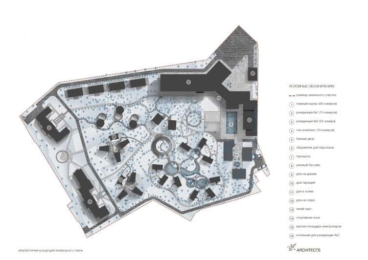
For the suburban hotel complex, which envisages various formats of leisure, the architectural company T+T Architects proposed several types of accommodation, ranging from the classic “standard” in a common building to a “cave in the hill” and a “house in a tree”. An additional challenge consisted in integrating a few classic-style residences already existing on this territory into the “architectural forest park”.

13 March 2024
Object
mainImg
The new hotel complex, tentatively named Levitan Holiday Park, is being built near Zvenigorod, on the territory of the former young pioneer camp “Krasnaya Zvezdochka” – a picturesque wooded area situated relatively close to Moscow and offering various natural and historical attractions.

Over time, the approach to developing this prestigious location has changed rapidly and sometimes quite dramatically. Initially, two luxurious residences in a classic style were built here, but they never found private owners. About a year ago, the plot along with the buildings was acquired by the development and investment company Rentaved, which decided to develop it with serial barnhouses, adding treehouses as a highlight.


But then the company ultimately took a different, more exclusive path – it retained the idea of diverse housing formats, i.e., room typologies, but decided to make them original – like, for example, in Yasnopole, Pirogovo, or Veretievo. Then the development company turned to T+T Architects for assistance.

In joint discussions, a concept emerged: a picturesque park with six thematic zones, for each of which its own type of bungalow house is designed. The diversity should compel visitors to return – after trying a treehouse, they will want to experience living inside a hill or by the water. Additionally, the launch of a word-of-mouth campaign is ensured – such objects and experiences cannot be kept from sharing on social networks.

In addition to the picturesque forested park area, which guests can explore on foot or using electric cars, there will be a restaurant and a spa complex at the guests’ disposal. The hotel is primarily designed for adult leisure and hosting business events, conferences, and retreats.

Hotel complex in Zvenigorod
Copyright: © Т+Т Architects


The Heart of the Complex

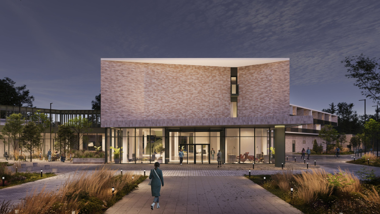
The guests are welcomed by the main hotel building, which separates the territory from the external noise and the check-in hustle, and also consolidates the accompanying leisure services.

After leaving the car in the parking lot, the guest heads towards the entrance portal, where they symbolically cross the border of the mundane world and enter a special space that can be likened to either an enchanted forest or some sort of amusement park for adults: here, they can swim, stroll, gaze at the fire and stars, listen to the rustle of the trees, and experience new culinary delights. The glazing of the first floor makes this boundary transparent and seems to slightly draw back the curtain.

Hotel complex in Zvenigorod
Copyright: © Т+Т Architects


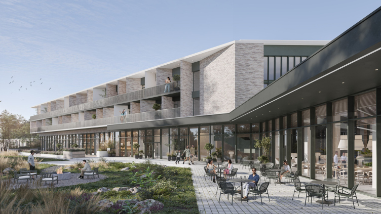
From the lobby, through a warm passage, one can enter the spa complex with pools and saunas. On the other side is the residential wing, on the first floor of which there is a co-working space and a restaurant with panoramic glazing.

The architectural solution of the hotel building is traditional for its typology. Long horizontals are emphasized by a “ribbon” fence and plastered cornices, while the rhythm is set by dividing loggias on pylons, turned at different angles. Inserts of green metal are used as accents. According to the architects, the inserts are intended to “connect the development with the forest environment and make the urban image look and feel more natural”.

The contradiction arising between the distinctly modern stylistics of the new buildings and the grandeur of the existing residences is resolved through a shared color palette. And furthermore, as the architects add: “The transition from the classical architectural style of the reconstructed residences to the main building, designed in a modern stylistic manner, is smoothened somewhat by a chain of blocked houses, which are connected to each other by colonnades with terraces inside”.

Hotel complex in Zvenigorod
Copyright: © Т+Т Architects


Suburbia

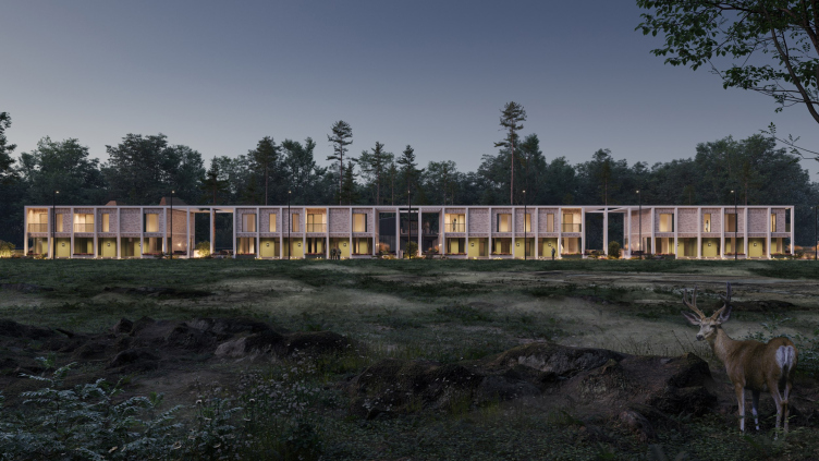
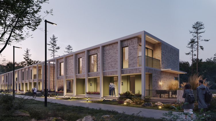
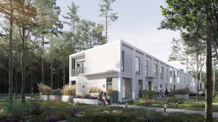
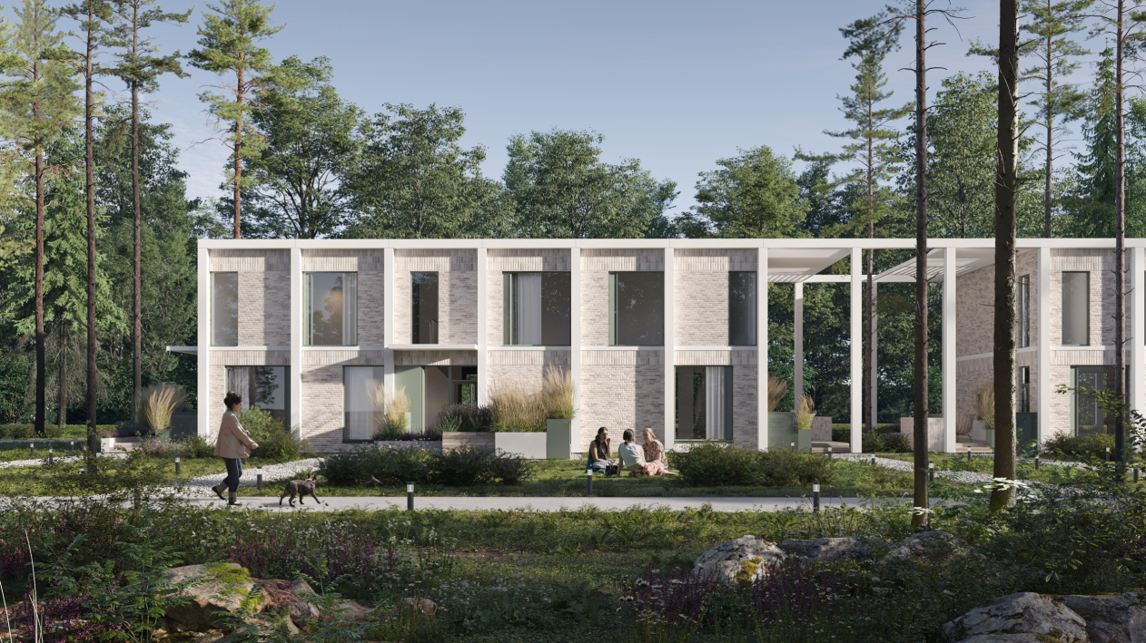
Along the northern border of the plot stretch townhouses designed for large groups or families. Four blocks of three units each are connected by a gallery, which sometimes becomes part of the facade and sometimes forms large portals that open forest views. The supports of the gallery complement the slender trunks of pine trees, for the unhindered growth of which “hatches” are made in the floor. The close proximity of artificial and natural “columns”, together with lush perennials and other additional plantings, creates a sense of the architecture being “captured” or “seized” by the landscape. This technique also produces a feeling of abundance and the power of nature, seemingly capable of nourishing people.

Hotel complex in Zvenigorod
Copyright: © Т+Т Architects


Hotel complex in Zvenigorod
Copyright: © Т+Т Architects


Similar to the hotel building, the architects use conventionally “urban” materials for cladding the townhouses – light brick, plaster, and the aforementioned green metal panels. The strict rhythm of the colonnade is occasionally disrupted by asymmetrically placed windows of different sizes. Thanks to the gaps between the blocks, the doors to the units are arranged in such a way that neighbors may not encounter each other face to face throughout their stay.

Hotel complex in Zvenigorod
Copyright: © Т+Т Architects


Hotel complex in Zvenigorod
Copyright: © Т+Т Architects


Together with the main building and the existing residences, the “suburbia” outlines the territory. All these buildings face the park, inside of which the “bungalows” are distributed. They no longer have “urban planning” tasks, so the architects choose wood as the main material and opt for more “freehand” spatial and compositional solutions.

The Quiet Pool

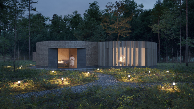
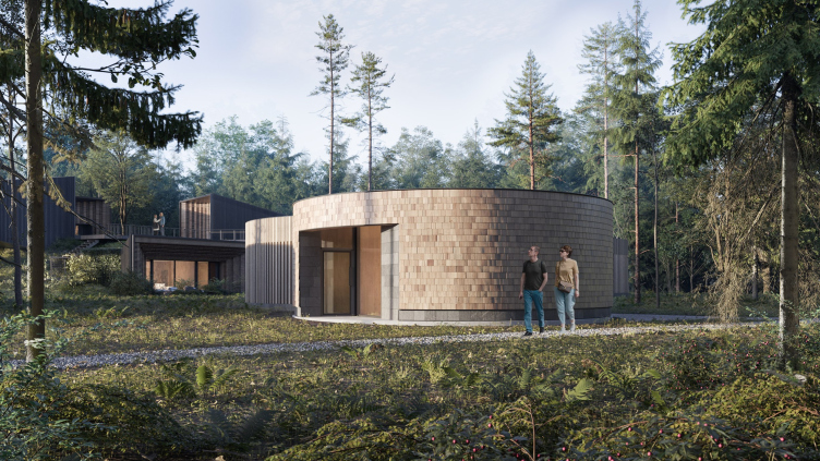
The closest to the suburbia are three round-plan cottages with flat roofs, adjacent to which are enclosed courtyards where one can cook over an open fire. This “sealed” layout allows for a sense of seclusion. The façade of the residential part is clad in light Klinker, while the entrance groups and window portals are decorated with basalt tiles.

Hotel complex in Zvenigorod
Copyright: © Т+Т Architects


Hotel complex in Zvenigorod
Copyright: © Т+Т Architects


Alpine Village

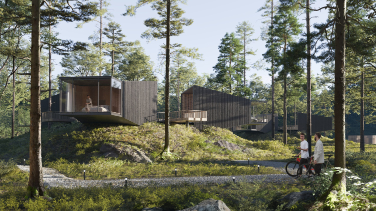
The next endeavor involves two artificial hills, into which “cave houses” or “houses in the hill” are embedded, with an entrance in the form of a narrowing wooden “funnel” and an outward-facing panoramic terrace. “The exterior wall of the house is made of panoramic glazing to provide the necessary illumination and unity with nature, while the terrace canopy ensures privacy from prying eyes and casts shade on a hot day” explains Sofia Burmistrova, head of the architectural department at T+T.

At the summit of each hill, there are three “hovering houses”, whose silhouette also resembles a funnel. In the narrow part of each house, there are cantilevered bedrooms, while the entrances are in the wider part; in this direction, the houses expand with welcoming flares, and the facades, facing each other and the neighboring mini-square, are designed as arched recesses formed by voluminous ornaments made of light wood shingles.

Hotel complex in Zvenigorod
Copyright: © Т+Т Architects


The Lakeland

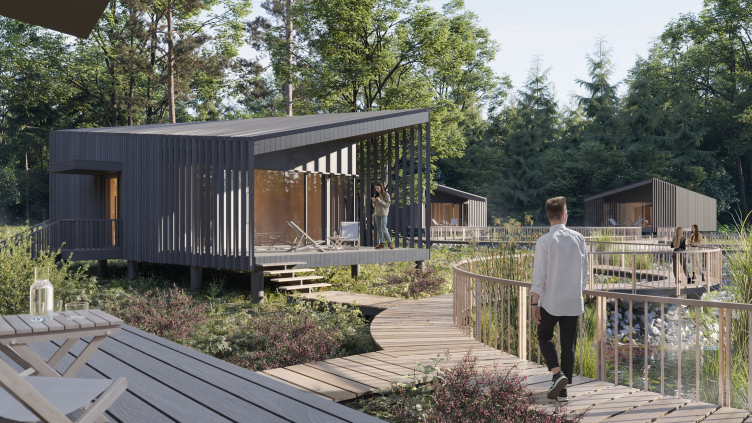
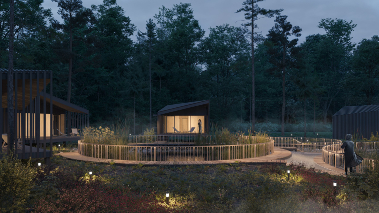
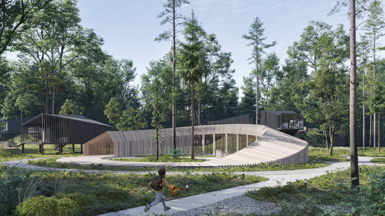
Nine houses with gable roofs, panoramic windows, and terraces facing the water are grouped around artificial ponds. Along the wooden decking that connects all three lakes in a circular route, one can reach a minimalist playground reminiscent of a Möbius strip.

Hotel complex in Zvenigorod
Copyright: © Т+Т Architects


Hotel complex in Zvenigorod
Copyright: © Т+Т Architects


Hotel complex in Zvenigorod
Copyright: © Т+Т Architects


Swallow Nests

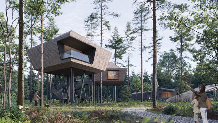
For those who care about their inner child, two “treehouses” are installed in the preserved forest area. Not a single pine tree was harmed; seven-meter metal piles with welded frames, camouflaged at the foundation level with fertile soil, serve as supports. To reach the house, whose shape and cladding are inspired by swallow nests, one can use a spiral staircase. Hammocks are suspended from the piles, and in the evening, lighting reminiscent of a swarm of fireflies illuminates them.

Hotel complex in Zvenigorod
Copyright: © Т+Т Architects


Despite the diverse formats, all buildings contribute to the overall concept – a natural park that also accommodates architectural experiences. In part, it resembles an open-air museum – like Vitoslavitsy near Veliky Novgorod or Vasilevo near Torzhok, where wooden structures from different eras are collected. Partly, it draws on the success of projects like Nikola-Lenivets. And, of course, it reflects the demand for an environment that doesn’t dominate nature but delicately integrates with it.

13 March 2024

Headlines now
The Golden Crown
The concept for a dental clinic in Yekaterinburg, developed by CNTR Studio, revolves around the idea of a “mouth full of gold”: pristine white porcelain stoneware walls are complemented by matte brass details. To avoid an overly literal interpretation, the architects focused on the building’s proportions, skillfully navigating between sunlight requirements and fire safety regulations.
Flexibility and Integration
Not long ago, we covered the project for the fourth phase of the ÁLIA residential complex, designed by APEX. Now, we’ve been shown different fence concepts they developed to enclose the complex’s private courtyards, incorporating a variety of public functions. We believe that the sheer fact that the complex’s architects were involved in such a detail as fencing speaks volumes.
A Step Forward
The HIDE residential complex represents a major milestone for ADM architects and their leaders Andrey Romanov and Ekaterina Kuznetsova in their quest for a fresh high-rise aesthetic – one that is flexible and layered, capable of bringing vibrancy to mass and silhouette while shaping form. Over recent years, this approach has become ADM’s “signature style”, with the golden HIDE tower playing a pivotal role in its evolution. Here, we delve into the project’s story, explore the details of the complex’s design, and uncover its core essence.
Gold in the Sands
A new office for a transcontinental company specializing in resource extraction and processing has opened in Dubai. Designed by T+T Architects, masters of creating spaces that are contemporary, diverse, flexible, and original, this project exemplifies their expertise. On the executive floor, a massive brass-clad partition dominates, while layered textures of compressed earth create a contextually resonant backdrop.
Layers and Levels of Flight
This project goes way back – Reserve Union won this architectural competition at the end of 2011, and the building was completed in 2018, so it’s practically “archival”. However, despite being relatively unknown, the building can hardly be considered “dated” and remains a prime example of architectural expression, particularly in the headquarters genre. And it’s especially fitting for an aviation company office. In some ways, it resembles the Aeroflot headquarters at Sheremetyevo but with its own unique identity, following the signature style of Vladimir Plotkin. In this article, we take an in-depth look at the United Aircraft Corporation (UAC) headquarters in the Moscow agglomeration town of Zhukovsky, supplemented by recent photographs from Alexey Naroditsky – a shoot that became only recently possible due to the fact that improvements were finally made in the surrounding area.
Light and Shadow
In this article, we delve into the architectural design of the “Chaika” house by DNK ag architects, which was recently completed in 2023 as part of the collection of signature designs at ZILArt. As is well-known, all the buildings in this complex follow a design code, yet each one is distinct. This particular building stands out not only for its whiteness and minimalism but also for the refined use of a limited number of techniques that, together, create what can confidently be called synergy.
Casus Novae
A master plan was developed for a large residential area with a name of “DNS City”, but now that its implementation began, the plan has been arbitrarily reformatted and replaced with something that, while similar on the surface, is actually quite different. This is not the first time such a thing happens, but it’s always frustrating. With permission from the author, we are sharing Maria Elkina’s post.
Treasure Hunting
The GAFA bureau, in collaboration with Tegola and Arkhitail, organized an expedition to the island of Kilpola in Karelia as part of Moskomarkhitektura’s “Open City” festival. There, amidst moss and rocks, the students sought answers to questions like: what is the sacred, where does it dwell, and what sustains it? Assisting the participants in this quest were landscape engineer Evgeny Levin, artist Nicholas Roerich, a moose, and the lack of cellular connection. Here’s how the story unfolded.
Depths of the Earth, Streams of Water
In the Malaya Okhta district, the Akzent building, designed by Stepan Liphart, was constructed. It follows a classic tripartite structure, yet it’s what you might call “hand-drawn”: each façade is unique in its form and details, some of which aren’t immediately noticeable. In this article, we explore the context and, together with the architect, delve into how the form was developed.
Fir Tree Dynamics
The “Airports of Region” holding is planning to build an airport in Karachay-Cherkessia, aiming to make the Arkhyz and Dombay resorts more accessible to travelers. The project that won in an invitation-only competition, submitted by Sergey Nikeshkin’s KPLN, blends natural imagery inspired by the shape of a conifer seed, open-air waiting spaces, majestic large trees, and a green roof elevated on needle-like columns. The result is both nature-inspired and WOW.
​A Brick Shell
In the process of designing a clubhouse situated among pine trees in a prestigious suburban area near Moscow, the architectural firm “A.Len” did the façade design part. The combination of different types of brick and masonry correlates with the volumetric and plastique solutions, further enhanced by the inclusion of wood-painted fragments and metal “glazing”.
Word Forms
ATRIUM architects love ambitious challenges, and for the firm’s thirtieth anniversary, they boldly play a game of words with an exhibition that dives deep into a self-created vocabulary. They immerse their projects – especially art installations – into this glossary, as if plunging into a current of their own. You feel as if you’re flowing through the veins of pure art, immersed in a universe of vertical cities, educational spaces – of which the architects are true masters – and the cultural codes of various locations. But what truly captivates is the bold statement that Vera Butko and Anton Nadtochy make, both through their work and this exhibition: architecture, above all, is art – the art of working with form and space.
Flexibility and Acuteness of Modernity
Luxurious, fluid, large “kokoshniks” and spiral barrel columns, as if made from colorful chewing gum: there seem to be no other mansion like this in Moscow, designed in the “Neo-Russian-Modern” style. And the “Teremok” on Malaya Kaluzhskaya, previously somewhat obscure, has “come alive with new colors” and gained visibility after its restoration for the office of the “architectural ecosystem” as the architects love to call themselves. It’s evident that Julius Borisov and the architects at UNK put their hearts into finding this new office and bringing it up to date. Let’s delve into the paradoxes of this mansion’s history and its plasticity. Spoiler: two versions of modernity meet here, both balancing on the razor’s edge of “what’s current”.
Yuri Vissarionov: “A modular house does not belong to the land”
It belongs to space, or to the air... It turns out that 3D printing is more effective when combined with a modular approach: the house is built in a workshop and then adapted to the site, including on uneven terrain. Yuri Vissarionov shares his latest experience in designing tourist complexes, both in central Russia and in the south. These include houseboats, homes printed from lightweight concrete using a 3D printer, and, of course, frame houses.
​Moscow’s First
“The quality of education largely depends on the quality of the educational environment”. This principle of the last decade has been realized by Sergey Skuratov in the project for the First Moscow Gymnasium on Rostovskaya Embankment in the Khamovniki district. The building seamlessly integrates into the complex urban landscape, responding both to the pedestrian flow of the city and the quiet alleyways. It skillfully takes advantage of the height differences and aligns with modern trends in educational space design. Let’s take a closer look.
Looking at the Water
The site of Villa Sonata stretches from the road to the water’s edge, offering its own shoreline, pier, and a picturesque river panorama. To reveal these sweeping views, Roman Leonidov “cut” the façade diagonally parallel to the river, thus getting two main axes for the house and, consequently, “two heads”. The internal core – two double-height spaces, a living room and a conservatory, with a “bridge” above them – makes the house both “transparent” and filled with light.
The White Wing
Well, it’s not exactly white. It’s more of a beige, white-stone structure that plays with the color of limestone – smoother surfaces are lighter, while rougher ones are darker. This wing unites various elements: it absorbs and interprets the surrounding themes. It responds to everything, yet maintains a cohesive expression – a challenging task! – while also incorporating recognizable features of its own, such as the dynamic cuts at the bottom, top, and middle.
Urban Dunes
The XSA Ramps team designed and built a three-part sports hub for a park in Rostov-on-Don, welcoming people of all ages and fitness levels. The skate plaza, pump track, and playground are all meticulously crafted with details that attract a diverse range of visitors. The technical execution of the shapes and slopes transforms this space into a kind of sculptural composition.
Proportional Growth
The project for the fourth phase of the ÁLIA residential area has been announced. The buildings are situated on an elongated plot – almost a “ray” that shoots out from the center of the area towards the river. Their layout reflects both a response to Moscow’s architectural preferences over the past 15 years, shifting “from blocks to towers”, and an interpretation of the neighboring business park designed by SOM. Additionally, the best apartments here are not located at the very top but closer to the middle, forming a glowing “waistline”.
The “Staircase” Building
In designing the “Details” residential complex in New Moscow, Rais Baishev spiced up the now-popular Moscow theme of a “courtyard” building with an idea drawn from the surrealist drawings by Maurits Escher. He envisioned the stepped silhouettes and descending slopes as a metaphysical mega-staircase, creating a key void within the courtyard that gave the project an internal “spine”. This concept is felt both in the building’s silhouette and on its façades.
Projection of the Quarter
No one doubted that the building that Vladimir Plotkin designed as part of the “Garden Quarters” would be the most modernist of all. And it turned out just that way: while adhering to the common design code, the building successfully combines brick and white stone, rhythmically responding to the neighboring building designed by Ostozhenka, yet tactfully and persistently making a few statements of its own. This includes the projection of the ideal urban development composition “14–9–6”, which can be found right next door, mathematical calculations, including those for various types of terraces (and perhaps the only reminder of the Soviet past of the Kauchuk rubber factory!), and the white “cross-stitch” pattern of the façade grid.
Domus Aurea
In this issue, we examine the “Tessinsky-1” house, designed by Sergey Skuratov and completed in 2023. Located in the middle of the Serebryanicheskaya Embankment district, at the intersection of its main streets, this house assumes a sort of “nodal” role: it not only responds to everything around it and preserves many memories of the former EMA factory within itself, but it weaves all this into a newly directed pattern, reconciling bright “gold” and dark-colored brick, largely with the help of the new, modern-yet-archaic Columba brick, which, come to think about it, is the most precious element here.
The Chimney of Nikola-Lenivets
In this issue, we are examining the “Obelisk House” designed by KATARSIS and built for the Arkhstoyanie 2023 festival. However, it was only finished later on, and this is why we are examining it now. It seems to us that after the “Obelisk House” appeared in Nikola-Lenivets, a dialogue and a few inner connections appeared between the temporary structures built here. These houses no longer look like “accidental neighbors”, more of which below.
​Periscope by the Bay
The jury awarded the second place in the competition for a public and cultural center in Petropavlovsk-Kamchatsky to the companies GORA (“Mountain”) and M4. In the consortium’s proposal, the building resembles a sperm whale with a calf swimming next to it or a periscope, whose lenses capture the most spectacular views from the surrounding landscape.
From Arcs to Dolmens
While working on the competition project for Petropavlovsk-Kamchatsky, ASADOV Architects prioritized the value of the natural and urban environment, aiming to preserve the balance of the location while minimizing the resemblance of the volume that they designed to a “traditional building”. The task was challenging, and the architects created three versions, one of which having been developed after the competition, where their main proposal took third place. However, the point of interest here is not the competition result but the continuity of creative thinking.
Hide and Seek
The ID Moskovskiy house, designed by Stepan Liphart in St. Petersburg, in the courtyards near Moskovskiy Avenue beyond the Obvodny Canal and recently completed, is notable for several reasons. Firstly, it has been realized with considerable accuracy, which is particularly significant as this is the first building where the architect was responsible not only for the facades but also for the layouts, allowing for better integration between the two. On the other hand, this building is interesting as an example of the “germination” of new architecture in the city: it draws on the best examples from the neighborhood and becomes an improved and developed sum of ideas found by the architect in the surrounding context.
The Big Twelve
Yesterday, the winners of the Moscow Mayor’s Architecture Award were announced and honored. Let’s take a look at what was awarded and, in some cases, even critique this esteemed award. After all, there is always room for improvement, right?
Above the Golden Horn
The residential complex “Philosophy” designed by T+T architects in Vladivostok, is one of the new projects in the “Golubinaya Pad” area, changing its development philosophy (pun intended) from single houses to a comprehensive approach. The buildings are organized along public streets, varying in height and format, with one house even executed in gallery typology, featuring a cantilever leaning on an art object.
Nuanced Alternative
How can you rhyme a square and space? Easily! But to do so, you need to rhyme everything you can possibly think of: weave everything together, like in a tensegrity structure, and find your own optics too. The new exhibition at GES-2 does just that, offering its visitor a new perspective on the history of art spanning 150 years, infused with the hope for endless multiplicity of worlds and art histories. Read on to see how this is achieved and how the exhibition design by Evgeny Ace contributes to it.
Blinds for Ice
An ice arena has been constructed in Domodedovo based on a project by Yuri Vissarionov Architects. To prevent the long façade, a technical requirement for winter sports facilities, from appearing monotonous, the architects proposed the use of suspended structures with multidirectional slats. This design protects the ice from direct sunlight while giving the wall texture and detail.