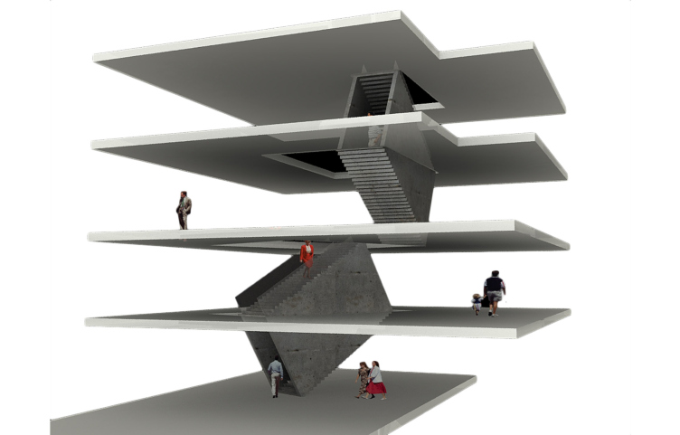
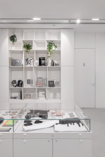
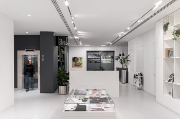
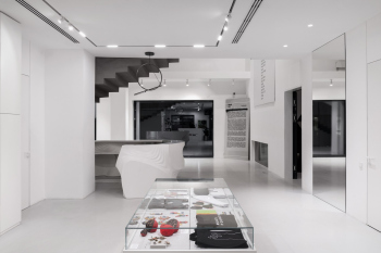
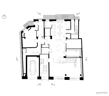
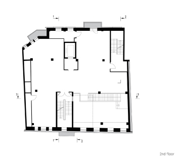
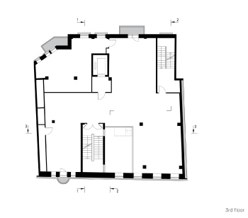
When we talk about continuity, we first of all mean the RuArts gallery on Ostozhenka, whose inner space was designed by the same architects 20 years ago. Back then, the gallery also was hosted in a former residential building, or, rather, it occupied two large 2-story apartments. The main technique that set this project apart from the others was concrete staircases that united the exposition halls, and not just in the usual navigational sense but in terms of organizing space as well – the solution was a little bit Asher-esque, but slightly more predictable: the architects turned the staircases into gray concrete parallelepipeds that cut the floors at a tilting angle, comfortable enough to make an ascent.
RuArts Gallery 2022-2005. The inner space
Copyright: © ATRIUM
Back in 2005, this solution was a total stunner, and the gallery (and later on the foundation itself) – I don’t know whether by chance or by design – used the stairway image as part of their logo. This, of course, may mean a few other things: RuArts position themselves as an institution open to the professional community’s agenda; furthermore, the foundation not just buys but also sponsors art projects – for example, art performances, so the staircase can be interpreted as a metaphor for upward motion for the participants of the process.
Thus, it comes as no surprise that the new place for the foundation was chosen to be a multistory building in the center of the city: its very location is conducive to it, the format is now habitual, and the very motion from one floor to another seems to have become a signature metaphor for RuArts. However, the Trubnikov Lane features six floors instead of four.
It must be said that reforming a former residential building into a housing gallery is a pretty tall order – starting with the fact that these are two different typologies. One of the things that come to mind here is the memory of “kvartirniks”, private underground unplugged performances by outlaw Russian bands that were staged in people’s apartments (the Russian for “apartment” is “kvartira”, hence the term). Now imagine that the “kvartirnik” has expanded and filled the entire house. Well, I digress – there is no direct resemblance to a “kvartirnik” here – RuArts does attract nonconformist artists, but its galleries are quite glamorous.
So! The main typological difference between a housing project and an art gallery lies in the fact that an apartment building of any kind is essentially composed of multiple contained cells, while a gallery of modern art must be as open as possible, and not just this particular one – this is an unwritten rule for the entire typology. The exposition hall is by default much better if a visitor has an opportunity to flow from one space to another, and it is extremely advisable that they can see one hall from another, so that they want to go there. Of course, one of the best examples of how this task can be brilliantly solved is Wright’s Guggenheim Museum with its spiral ramp and open atrium – and architects around the world are trying to copy it in this or that way.
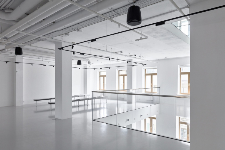
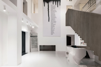
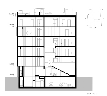
But what do you do with a former tenement house – narrow, tall, and having 6 floors in it? The obvious choice was to cut an atrium right through it, which was what the architects did. The atrium adjoins the street facade, cuts through four floors, and stops at the fifth in a band of glass, through which you can look down and see everything right through. The atrium also adjoins the staircase for the visitors with glazed gaps running down to the floor – they provide light to the staircase and create a presence effect thanks to the fact that you can always “peek outside”, while the exposition halls located on floors 2-4 overlook the atrium with large balconies.
In other words, you can look both upward and downward here, and, being on a floor, you at the same remain in the overall space, not fully leaving it – not counting a couple of nooks on the left, but they also serve a purpose – you need them for a contrast and for filming videos.
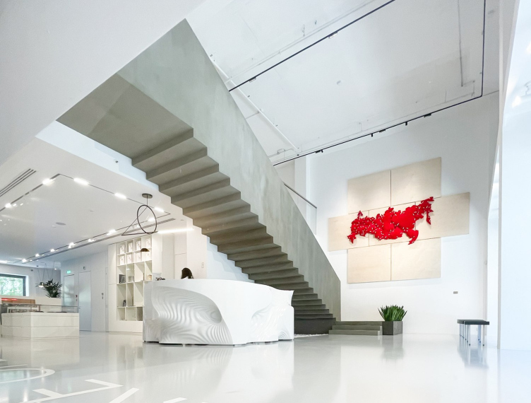
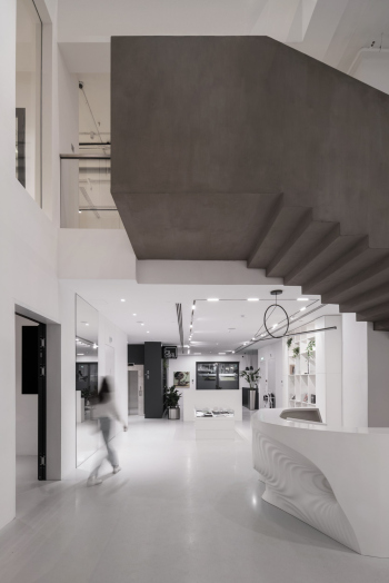
One should hardly mention the fact that the staircase that connects all the floors is the main, but not the chief one. The chief one is the concrete staircase, and it connects the first floor to the second.
RuArts Foundation. Trubnikovsky Lane, 6
Copyright: Photo © Sergey Nadtochiy / provided by ATRIUM
One can easily see this staircase from the outside through the floor-to-ceiling windows of the first floor, and it bears clear resemblance with the RuArts logo, publicly exposed here: you can see it not just inside, but on the outside as well. I want to emphasize that in this case we are dealing with a situation when the architects proposed a “sign”, the client accepted it, and then it was played back 18 years later – by mutual consent, as the gallery said. This is a rare occurrence by any standards, and particularly by Moscow ones. I would happily provide similar examples, but nothing comes to mind. Even though nowadays virtually every architect offers a logo for his project, that’s not the point I am trying to make – I would be thrilled to find other such examples of mutual agreement and stability of perception.
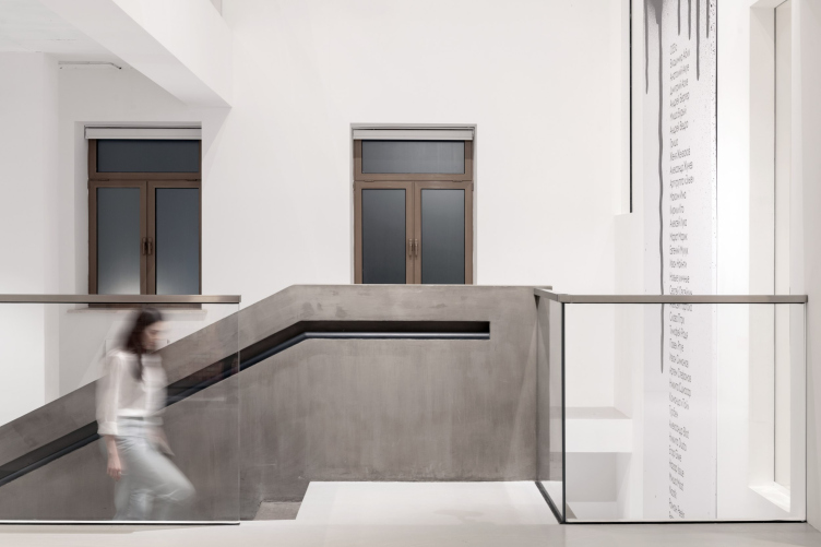
The concrete staircase is the same, yet… it’s not the same because the space itself is different. It adjoins the balcony because it only has two runs in it, and then makes a sharp turn. In the first version, each staircase was “a thing in itself” with steps running on the inner and outer surfaces of the parallelepiped, and the turn was made by virtue of placing one volume at an angle to the other. In this sense, the staircase of the foundation is more “classic”, even though it is acutely similar to its prototype due to the “comb” of the stairs, which you see from below, and the gray “concrete” color, in which it is painted. What also makes it different is a “gothic” railing, embedded in the wall – looks really beautiful.
The concrete staircase. RuArts Foundation. Trubnikovsky Lane, 6
Copyright: Photo © Daniel Annenkov / provided by ATRIUM
While the staircase is more classic, the rest of the space is bolder – at least because of the fact that the atrium is taller and more open. The very opportunity to take a look at the first floor from the height of the fourth is exciting as it is, but here yet another nuance comes into play, particularly noticeable when you look from the balconies: we see the wall with windows from the inside, like a decoration. You cannot have so many windows on the inside, and their vertical sequence helps to emphasize the intermediate situation of the atrium between “inside” and “outside”.
RuArts Foundation. Trubnikovsky Lane, 6
Copyright: Photo: RuArts Foundation
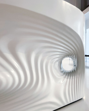
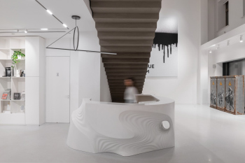
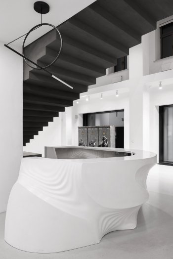
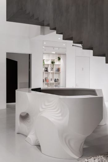
Another thing that indicates the new approach is the reception desk – it has a nonlinear shape, it is asymmetric, it has dents of various sizes that look like circles on the water, and the impression is completed by a run-through hole. One can imagine that ATRIUM has collected here, in this atrium (yes, pun intended) its past and its future: the past is represented by the staircase, and the future is represented by the digital shape that the architects are actively developing even in metaverse – the sculptural reception desk as a new starting point of sorts.
Well, the reception desk wasn’t designed by a neural network, but sooner or later something like this is to be expected. In addition, the architects originally planned to make the desk on a 3D printer but then they cast it in a composite material – but then again, the production method did not affect its shape in any way.
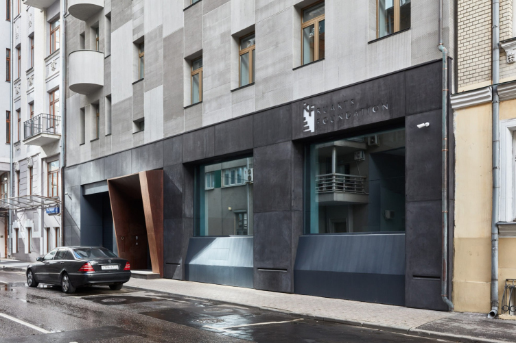
Usually, buildings are described from the outside in: the floor plan, the facade, and, finally, the interior. However, in this case, it turned out to be the opposite because the interior is more important here. Still, the façade has a curious story of its own. Let me begin by saying that if you search for the building online, you’ll find that it’s an income-generating property built in 1915 by the architect Konstantin Apollonov. To some extent, that’s true; it likely still retains some of the load-bearing structures from the early 20th century. However, from 2008 to 2011, the building underwent significant reconstruction, initially for housing, but during this process, it acquired a peculiar pink facade, only vaguely reminiscent of Apollonov’s design. So, the proud inscription in Roman numerals on the canopy “2015” had nothing to do with the building’s external appearance.
The main feature of the foundation is not at all about a love for the pseudo-classicism of the late years but about collecting and supporting contemporary art. Thus, the architects, in collaboration with the client, decided to make the façade modern.
RuArts Foundation. Trubnikovsky Lane, 6
Copyright: Photo: RuArts Foundation
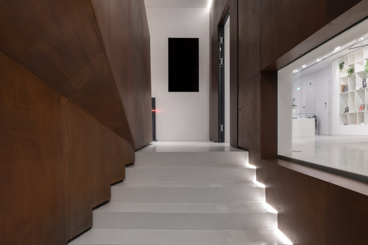
It retained the proportions and somewhat clumsy, although now even brutal, volume of the mansard floor. Still, the main plane of the façade became gray, textured plaster in a strip. I must note that this plaster skillfully imitates fiber cement panels of different sizes, shades, and relief strip placements. So, the façade is not flat; rather, it has acquired a mosaic-like pattern. The lower floor is dark, faced with fiber cement. As we recall, the windows are enlarged to display cases, and a strict linear lighting is embedded. The entrance portal, another element connecting the “inside” and “outside”, is transformed into an austere Corten frame. According to the laws of modern architecture and art, this frame continues inside on the staircase, serving as a gateway into the interior.
The entrance portal. RuArts Foundation. Trubnikovsky Lane, 6
Copyright: Photo © Daniel Annenkov / provided by ATRIUM
And let someone now tell me that every income-generating house in Moscow must be preserved exactly as it was or very close to the original. In this case, it’s both similar and dissimilar, but certainly fresher than what preceded it.
Interestingly, bloggers casually attribute the pink facade of 2008 to the year 1915. Make no mistake, this is NOT the original façade!


