По-русски

The Cemetery: Inside and Outside

The workshop organized by the Genplan Institute of Moscow scored one of the two first places at the “Open City” festival. Its subject is reorganization of municipal cemeteries. Two action plans were proposed, diametrically opposite: one for the downtown and one for the suburbs.

17 November 2023
mainImg
The project of the “Open City” workshop, created by a team working under the guidance of Genplan Institute of Moscow, was recently announced as one of the two winners of the festival. Its authors will be premiered with an expenses-paid participation in Kazanysh festival in Kazan.

I must say, the project is well developed, detailed and beautifully presented on its own web page. Therefore, it probably does not make much sense to republish it in its entirety – I will tell you only about the highlights.

“Open City” 2023
Copyright: Photograph © Julia Tarabarina, Archi.ru


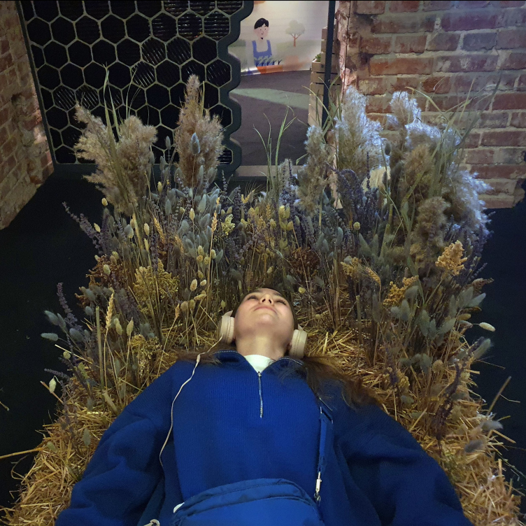
First, the project is presented at the exhibition with a meditative installation in the form of a bed made of hay, where you can lie down, relax, and listen to music.

Second, the project itself begins with a research of the relevance of reforming cemeteries as such – their number, their specifics, and growth trends – among other things, we find out that in Moscow and New Moscow combined cemeteries occupy 2017 hectares, 641 of them lying within the Moscow Ring Road. We also learn that the nation’s capital buries an average of 345 people a day, which within a year adds up to a territory roughly equivalent to two Zaryadye parks. Another thing that we learn is that the cemetery design is chaotic to the point of being repulsive, and this is something that I 100% agree with – because once you come to a cemetery, the first thing you want is to get out of there. Another random fact: cremation cuts down the burial area by about a hundred times.

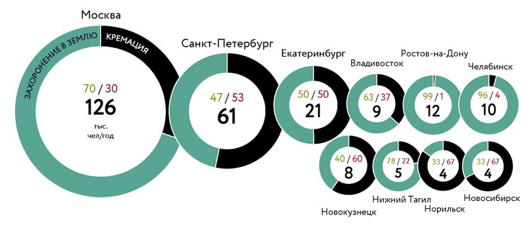
Still another random fact: the largest number of cremations falls on Norilsk, followed by Novosibirsk and Novomoskovsk; cremation and conventional burying are split by 50% in Ekaterinburg and St. Petersburg, Moscow clearly prefers the conservative method, and there is even a city with zero cremations – it is Rostov-on-Don.

zooming
Statistics on traditional burials and cremations by city. Quiet Neighbors Workshop
Copyright: Materials of the workshop of the “Open City Festival”, curated by the Genplan Institute of Moscow


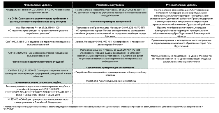
Meanwhile, the authors of the report not just provide stats, prove relevance, and showcase their projects – they also developed recommendations for optimizing the legal base: sanitary regulations, federal standards, and the operation of Ritual (“The Last Rites”) bureau. 

This means that the workshop “Lighting Inclusion” is not the only one who developed this manual. And, since we are talking about the Genplan Institute of Moscow here, then I can safely define the prospects of implementing the recommendations as optimistic ones. In a word, this is a great initiative.

“Quiet Neighbors” Workshop
Copyright: Materials of the workshop of the “Open City Festival”, curated by the Genplan Institute of Moscow


Workshop participants: Luisa Karimova, Tatiana Magon (Genplan Institute of Moscow), Nikolai Potapenko, Anna Potapenko, Darius Nazarov, Iya Viktorova (MARKHI), Ekaterina Sokolova (HSE), Anna Belashova (MARCH), Maria Nakadovskaya (GUZ)
Workshop curators: Vitaly Lutz, Irina Lobanova (Genplan Institute of Moscow), Anna Antokhina (Lug Architects)


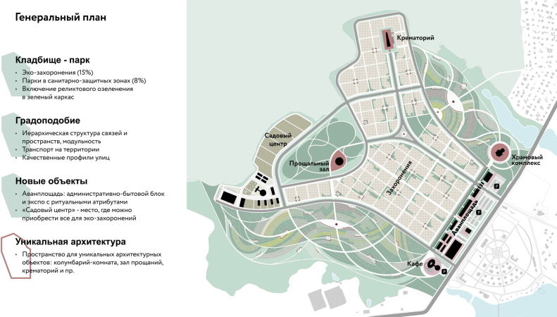
Another feature of the workshop “Quiet Neighbors” is that it consists of two projects: a cemetery for the outskirts and for the center of the historical city. The first one was developed on a specific site and looks like it is almost ready and real; it is largely based on the existing standard of the Okolomoskovsky cemetery, although it has ideas that, I suppose, not everyone will understand and approve of.

Becoming a Tree

Usually, a cemetery combines grave sites and a crematorium, with someone putting urns in a columbarium, and someone digging in a family plot. All this, as a rule, is overgrown with trees; they are dissected by asphalt roads, bright artificial and real flowers accumulating at their foot. One has a hard time trying to pass between the fences, both old metal and new granite; sometimes they close together and “catch” the person walking, forcing them to turn back and go around. In short, wandering around the cemetery, as the romantics bequeathed, is a little difficult for us. Except maybe for Donskoy and Novodevichy, where they conduct guided tours. 

Workshop participants suggest complementing the traditional structure, from which many people are, of course, not ready to part – with a cemetery-park, or an eco-cemetery.

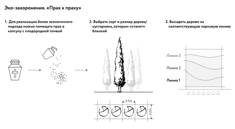
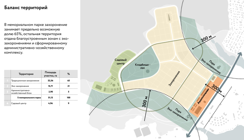
The idea is to mix the crematorium ashes with soil, place them in a biodegradable urn, and plant a tree there. The trees are arranged in a meditative, quiet, and aesthetically appealing space that can be walked through. What is also important is that such areas do not conform to the sanitary norms of distancing from the cemetery territory. Consequently, the park part of the cemetery “extends outward” and saves space.

  • zooming
    1 / 6
    Eco-burial scheme: "ashes to ashes«. »Quiet Neighbors" Workshop
    Copyright: Materials of the workshop of the “Open City Festival”, curated by the Genplan Institute of Moscow
  • zooming
    2 / 6
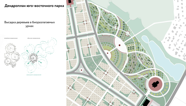
    Southeast Park Dendroplan. Quiet Neighbors Workshop
    Copyright: Materials of the workshop of the “Open City Festival”, curated by the Genplan Institute of Moscow
  • zooming
    3 / 6
    Searching for the image of an eco-cemetery. Quiet Neighbors Workshop
    Copyright: Materials of the workshop of the “Open City Festival”, curated by the Genplan Institute of Moscow
  • zooming
    4 / 6
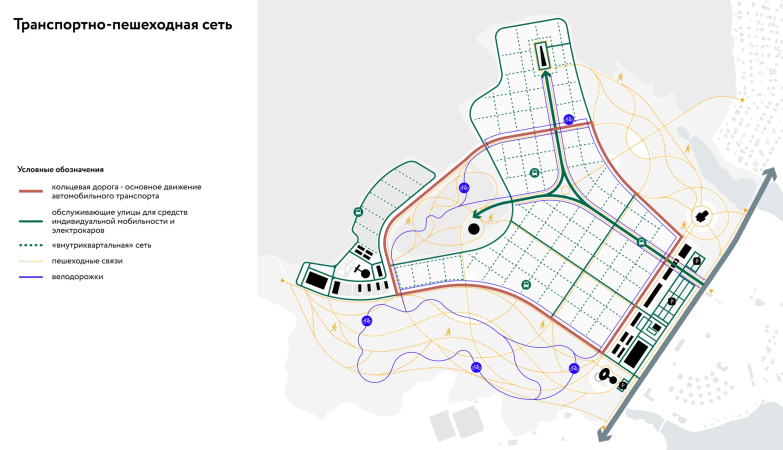
    Transportation and Pedestrian Network. Quiet Neighbors Workshop
    Copyright: Materials of the workshop of the “Open City Festival”, curated by the Genplan Institute of Moscow
  • zooming
    5 / 6
    The master plan. “Quiet Neighbors” Workshop
    Copyright: Materials of the workshop of the “Open City Festival”, curated by the Genplan Institute of Moscow
  • zooming
    6 / 6
    The territory balance. “Quiet Neighbors” Workshop
    Copyright: Materials of the workshop of the “Open City Festival”, curated by the Genplan Institute of Moscow


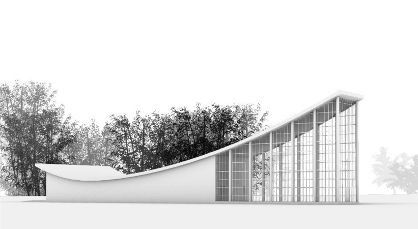
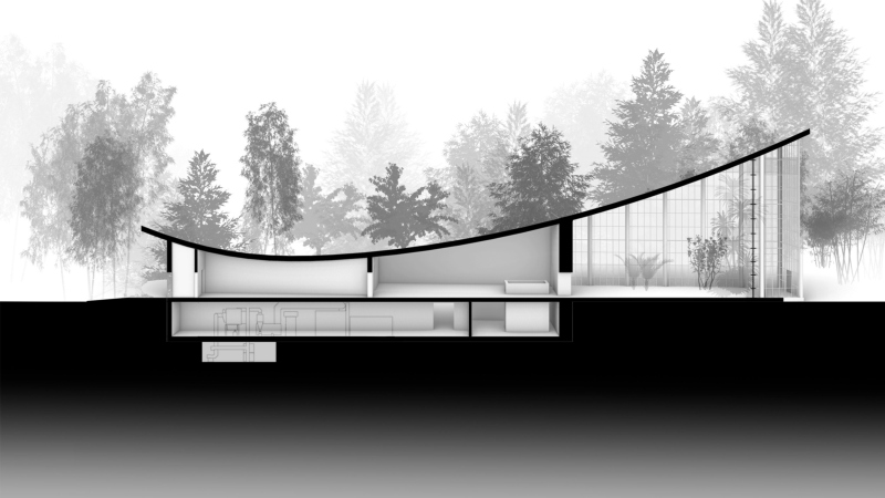
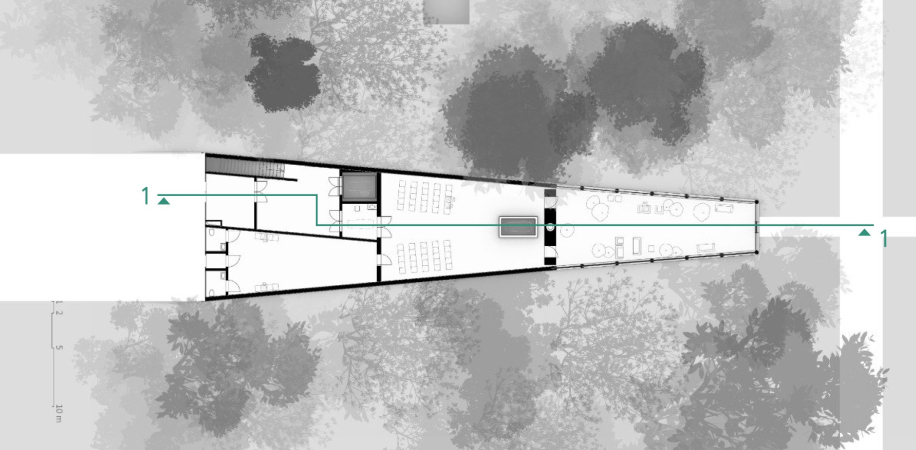
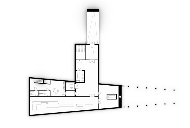
In addition to this original but, in my opinion, attractive solution, everything else is well thought out: a front square with a retail space, a plant nursery garden, and a rather charming, not gloomy, crematorium building. It subtly resembles the Montreal Pavilion, but perhaps, in this case, the rising spire can be associated with the soul’s journey to the sky.

  • zooming
    1 / 5
    The crematorium. “Quiet Neighbors” Workshop
    Copyright: Materials of the workshop of the “Open City Festival”, curated by the Genplan Institute of Moscow
  • zooming
    2 / 5
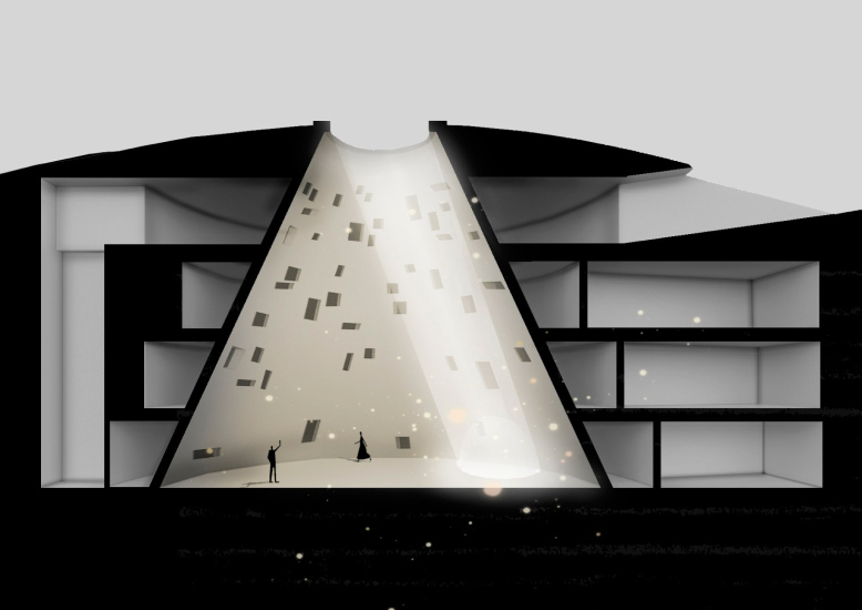
    Crematorium. Cross section view. Quiet Neighbors Workshop
    Copyright: Materials of the workshop of the “Open City Festival”, curated by the Genplan Institute of Moscow
  • zooming
    3 / 5
    Crematorium Plan at 0 elevation. “Quiet Neighbors” Workshop
    Copyright: Materials of the workshop of the “Open City Festival”, curated by the Genplan Institute of Moscow
  • zooming
    4 / 5
    Crematorium Plan at 4.0 elevation. “Quiet Neighbors” Workshop
    Copyright: Materials of the workshop of the “Open City Festival”, curated by the Genplan Institute of Moscow
  • zooming
    5 / 5
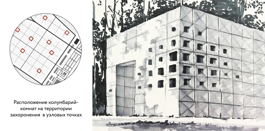
    Columbarium Rooms. Quiet Neighbors Workshop
    Copyright: Materials of the workshop of the “Open City Festival”, curated by the Genplan Institute of Moscow


Moving with Your Relative

The second proposal is more conceptual, falling into the category of “paper” projects and is intended for the densely built historical center.

It is called – by analogy with a well-known program – “My Columbarium”. The authors suggest creating a network of columbariums within the city program, one for each district. They place the columbariums underground: this way, space can be saved, and, at the very least, an original atmosphere can be created – at least an oculus among the images has already appeared. Naturally, the early Christian catacombs come to mind, although the authors do not seem to refer to them.

  • zooming
    "My Columbarium«. »Quiet Neighbors" Workshop
    Copyright: Materials of the workshop of the “Open City Festival”, curated by the Genplan Institute of Moscow
  • zooming
    "My Columbarium«. »Quiet Neighbors" Workshop
    Copyright: Materials of the workshop of the “Open City Festival”, curated by the Genplan Institute of Moscow


The main idea, however, is to make the urns mobile. So, when moving to another district, a person can take the urn with them and place it in another columbarium within the network.

It turns out to be a counterpoise: cemeteries at the city borders are very stable in terms of location – a tree grows there, and it’s there forever, while cemeteries within the city are as mobile as city dwellers. And at the same time, there is a sense of attachment for a city center resident to their relative, as if they are not letting go, unlike the burial-tree. Well, urns with ashes on the mantelpieces from American movies also come to mind. Another question: all this is proposed for Moscow. What if a Muscovite decides to move to another city?

However, what is truly important here is the diversity of the proposed, not entirely traditional formats, not only for Muscovites but also for Russians, corresponding to the direction of society’s development. If columbariums have found acceptance, perhaps these will someday too. Personally, I wouldn’t mind continuing my eternal life as a tree.


17 November 2023

Headlines now
The Golden Crown
The concept for a dental clinic in Yekaterinburg, developed by CNTR Studio, revolves around the idea of a “mouth full of gold”: pristine white porcelain stoneware walls are complemented by matte brass details. To avoid an overly literal interpretation, the architects focused on the building’s proportions, skillfully navigating between sunlight requirements and fire safety regulations.
Flexibility and Integration
Not long ago, we covered the project for the fourth phase of the ÁLIA residential complex, designed by APEX. Now, we’ve been shown different fence concepts they developed to enclose the complex’s private courtyards, incorporating a variety of public functions. We believe that the sheer fact that the complex’s architects were involved in such a detail as fencing speaks volumes.
A Step Forward
The HIDE residential complex represents a major milestone for ADM architects and their leaders Andrey Romanov and Ekaterina Kuznetsova in their quest for a fresh high-rise aesthetic – one that is flexible and layered, capable of bringing vibrancy to mass and silhouette while shaping form. Over recent years, this approach has become ADM’s “signature style”, with the golden HIDE tower playing a pivotal role in its evolution. Here, we delve into the project’s story, explore the details of the complex’s design, and uncover its core essence.
Gold in the Sands
A new office for a transcontinental company specializing in resource extraction and processing has opened in Dubai. Designed by T+T Architects, masters of creating spaces that are contemporary, diverse, flexible, and original, this project exemplifies their expertise. On the executive floor, a massive brass-clad partition dominates, while layered textures of compressed earth create a contextually resonant backdrop.
Layers and Levels of Flight
This project goes way back – Reserve Union won this architectural competition at the end of 2011, and the building was completed in 2018, so it’s practically “archival”. However, despite being relatively unknown, the building can hardly be considered “dated” and remains a prime example of architectural expression, particularly in the headquarters genre. And it’s especially fitting for an aviation company office. In some ways, it resembles the Aeroflot headquarters at Sheremetyevo but with its own unique identity, following the signature style of Vladimir Plotkin. In this article, we take an in-depth look at the United Aircraft Corporation (UAC) headquarters in the Moscow agglomeration town of Zhukovsky, supplemented by recent photographs from Alexey Naroditsky – a shoot that became only recently possible due to the fact that improvements were finally made in the surrounding area.
Light and Shadow
In this article, we delve into the architectural design of the “Chaika” house by DNK ag architects, which was recently completed in 2023 as part of the collection of signature designs at ZILArt. As is well-known, all the buildings in this complex follow a design code, yet each one is distinct. This particular building stands out not only for its whiteness and minimalism but also for the refined use of a limited number of techniques that, together, create what can confidently be called synergy.
Casus Novae
A master plan was developed for a large residential area with a name of “DNS City”, but now that its implementation began, the plan has been arbitrarily reformatted and replaced with something that, while similar on the surface, is actually quite different. This is not the first time such a thing happens, but it’s always frustrating. With permission from the author, we are sharing Maria Elkina’s post.
Treasure Hunting
The GAFA bureau, in collaboration with Tegola and Arkhitail, organized an expedition to the island of Kilpola in Karelia as part of Moskomarkhitektura’s “Open City” festival. There, amidst moss and rocks, the students sought answers to questions like: what is the sacred, where does it dwell, and what sustains it? Assisting the participants in this quest were landscape engineer Evgeny Levin, artist Nicholas Roerich, a moose, and the lack of cellular connection. Here’s how the story unfolded.
Depths of the Earth, Streams of Water
In the Malaya Okhta district, the Akzent building, designed by Stepan Liphart, was constructed. It follows a classic tripartite structure, yet it’s what you might call “hand-drawn”: each façade is unique in its form and details, some of which aren’t immediately noticeable. In this article, we explore the context and, together with the architect, delve into how the form was developed.
Fir Tree Dynamics
The “Airports of Region” holding is planning to build an airport in Karachay-Cherkessia, aiming to make the Arkhyz and Dombay resorts more accessible to travelers. The project that won in an invitation-only competition, submitted by Sergey Nikeshkin’s KPLN, blends natural imagery inspired by the shape of a conifer seed, open-air waiting spaces, majestic large trees, and a green roof elevated on needle-like columns. The result is both nature-inspired and WOW.
​A Brick Shell
In the process of designing a clubhouse situated among pine trees in a prestigious suburban area near Moscow, the architectural firm “A.Len” did the façade design part. The combination of different types of brick and masonry correlates with the volumetric and plastique solutions, further enhanced by the inclusion of wood-painted fragments and metal “glazing”.
Word Forms
ATRIUM architects love ambitious challenges, and for the firm’s thirtieth anniversary, they boldly play a game of words with an exhibition that dives deep into a self-created vocabulary. They immerse their projects – especially art installations – into this glossary, as if plunging into a current of their own. You feel as if you’re flowing through the veins of pure art, immersed in a universe of vertical cities, educational spaces – of which the architects are true masters – and the cultural codes of various locations. But what truly captivates is the bold statement that Vera Butko and Anton Nadtochy make, both through their work and this exhibition: architecture, above all, is art – the art of working with form and space.
Flexibility and Acuteness of Modernity
Luxurious, fluid, large “kokoshniks” and spiral barrel columns, as if made from colorful chewing gum: there seem to be no other mansion like this in Moscow, designed in the “Neo-Russian-Modern” style. And the “Teremok” on Malaya Kaluzhskaya, previously somewhat obscure, has “come alive with new colors” and gained visibility after its restoration for the office of the “architectural ecosystem” as the architects love to call themselves. It’s evident that Julius Borisov and the architects at UNK put their hearts into finding this new office and bringing it up to date. Let’s delve into the paradoxes of this mansion’s history and its plasticity. Spoiler: two versions of modernity meet here, both balancing on the razor’s edge of “what’s current”.
Yuri Vissarionov: “A modular house does not belong to the land”
It belongs to space, or to the air... It turns out that 3D printing is more effective when combined with a modular approach: the house is built in a workshop and then adapted to the site, including on uneven terrain. Yuri Vissarionov shares his latest experience in designing tourist complexes, both in central Russia and in the south. These include houseboats, homes printed from lightweight concrete using a 3D printer, and, of course, frame houses.
​Moscow’s First
“The quality of education largely depends on the quality of the educational environment”. This principle of the last decade has been realized by Sergey Skuratov in the project for the First Moscow Gymnasium on Rostovskaya Embankment in the Khamovniki district. The building seamlessly integrates into the complex urban landscape, responding both to the pedestrian flow of the city and the quiet alleyways. It skillfully takes advantage of the height differences and aligns with modern trends in educational space design. Let’s take a closer look.
Looking at the Water
The site of Villa Sonata stretches from the road to the water’s edge, offering its own shoreline, pier, and a picturesque river panorama. To reveal these sweeping views, Roman Leonidov “cut” the façade diagonally parallel to the river, thus getting two main axes for the house and, consequently, “two heads”. The internal core – two double-height spaces, a living room and a conservatory, with a “bridge” above them – makes the house both “transparent” and filled with light.
The White Wing
Well, it’s not exactly white. It’s more of a beige, white-stone structure that plays with the color of limestone – smoother surfaces are lighter, while rougher ones are darker. This wing unites various elements: it absorbs and interprets the surrounding themes. It responds to everything, yet maintains a cohesive expression – a challenging task! – while also incorporating recognizable features of its own, such as the dynamic cuts at the bottom, top, and middle.
Urban Dunes
The XSA Ramps team designed and built a three-part sports hub for a park in Rostov-on-Don, welcoming people of all ages and fitness levels. The skate plaza, pump track, and playground are all meticulously crafted with details that attract a diverse range of visitors. The technical execution of the shapes and slopes transforms this space into a kind of sculptural composition.
Proportional Growth
The project for the fourth phase of the ÁLIA residential area has been announced. The buildings are situated on an elongated plot – almost a “ray” that shoots out from the center of the area towards the river. Their layout reflects both a response to Moscow’s architectural preferences over the past 15 years, shifting “from blocks to towers”, and an interpretation of the neighboring business park designed by SOM. Additionally, the best apartments here are not located at the very top but closer to the middle, forming a glowing “waistline”.
The “Staircase” Building
In designing the “Details” residential complex in New Moscow, Rais Baishev spiced up the now-popular Moscow theme of a “courtyard” building with an idea drawn from the surrealist drawings by Maurits Escher. He envisioned the stepped silhouettes and descending slopes as a metaphysical mega-staircase, creating a key void within the courtyard that gave the project an internal “spine”. This concept is felt both in the building’s silhouette and on its façades.
Projection of the Quarter
No one doubted that the building that Vladimir Plotkin designed as part of the “Garden Quarters” would be the most modernist of all. And it turned out just that way: while adhering to the common design code, the building successfully combines brick and white stone, rhythmically responding to the neighboring building designed by Ostozhenka, yet tactfully and persistently making a few statements of its own. This includes the projection of the ideal urban development composition “14–9–6”, which can be found right next door, mathematical calculations, including those for various types of terraces (and perhaps the only reminder of the Soviet past of the Kauchuk rubber factory!), and the white “cross-stitch” pattern of the façade grid.
Domus Aurea
In this issue, we examine the “Tessinsky-1” house, designed by Sergey Skuratov and completed in 2023. Located in the middle of the Serebryanicheskaya Embankment district, at the intersection of its main streets, this house assumes a sort of “nodal” role: it not only responds to everything around it and preserves many memories of the former EMA factory within itself, but it weaves all this into a newly directed pattern, reconciling bright “gold” and dark-colored brick, largely with the help of the new, modern-yet-archaic Columba brick, which, come to think about it, is the most precious element here.
The Chimney of Nikola-Lenivets
In this issue, we are examining the “Obelisk House” designed by KATARSIS and built for the Arkhstoyanie 2023 festival. However, it was only finished later on, and this is why we are examining it now. It seems to us that after the “Obelisk House” appeared in Nikola-Lenivets, a dialogue and a few inner connections appeared between the temporary structures built here. These houses no longer look like “accidental neighbors”, more of which below.
​Periscope by the Bay
The jury awarded the second place in the competition for a public and cultural center in Petropavlovsk-Kamchatsky to the companies GORA (“Mountain”) and M4. In the consortium’s proposal, the building resembles a sperm whale with a calf swimming next to it or a periscope, whose lenses capture the most spectacular views from the surrounding landscape.
From Arcs to Dolmens
While working on the competition project for Petropavlovsk-Kamchatsky, ASADOV Architects prioritized the value of the natural and urban environment, aiming to preserve the balance of the location while minimizing the resemblance of the volume that they designed to a “traditional building”. The task was challenging, and the architects created three versions, one of which having been developed after the competition, where their main proposal took third place. However, the point of interest here is not the competition result but the continuity of creative thinking.
Hide and Seek
The ID Moskovskiy house, designed by Stepan Liphart in St. Petersburg, in the courtyards near Moskovskiy Avenue beyond the Obvodny Canal and recently completed, is notable for several reasons. Firstly, it has been realized with considerable accuracy, which is particularly significant as this is the first building where the architect was responsible not only for the facades but also for the layouts, allowing for better integration between the two. On the other hand, this building is interesting as an example of the “germination” of new architecture in the city: it draws on the best examples from the neighborhood and becomes an improved and developed sum of ideas found by the architect in the surrounding context.
The Big Twelve
Yesterday, the winners of the Moscow Mayor’s Architecture Award were announced and honored. Let’s take a look at what was awarded and, in some cases, even critique this esteemed award. After all, there is always room for improvement, right?
Above the Golden Horn
The residential complex “Philosophy” designed by T+T architects in Vladivostok, is one of the new projects in the “Golubinaya Pad” area, changing its development philosophy (pun intended) from single houses to a comprehensive approach. The buildings are organized along public streets, varying in height and format, with one house even executed in gallery typology, featuring a cantilever leaning on an art object.
Nuanced Alternative
How can you rhyme a square and space? Easily! But to do so, you need to rhyme everything you can possibly think of: weave everything together, like in a tensegrity structure, and find your own optics too. The new exhibition at GES-2 does just that, offering its visitor a new perspective on the history of art spanning 150 years, infused with the hope for endless multiplicity of worlds and art histories. Read on to see how this is achieved and how the exhibition design by Evgeny Ace contributes to it.
Blinds for Ice
An ice arena has been constructed in Domodedovo based on a project by Yuri Vissarionov Architects. To prevent the long façade, a technical requirement for winter sports facilities, from appearing monotonous, the architects proposed the use of suspended structures with multidirectional slats. This design protects the ice from direct sunlight while giving the wall texture and detail.