Now, 10 years after the start of the planning process, the building can be considered completely finished.
“Park Huaming” business center on Wilhelm Pieck Street in Moscow
Copyright: Photo © Aleksey Naroditsky / provided by Reserve Union
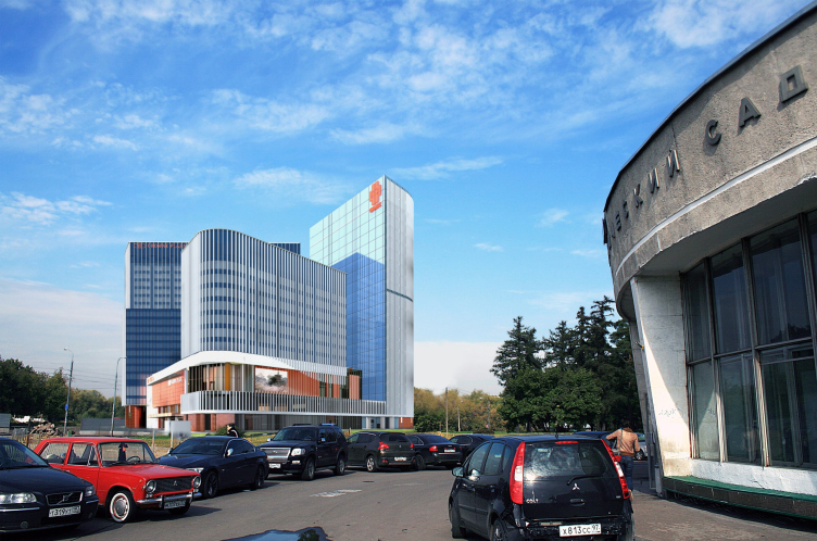
While the complex was being built, the area around it changed radically. In the 2000s, the area was rather empty: a lone “hockey puck” of a subway pavilion, vegetation of varying degrees of untidiness, a railroad, and Soviet residential buildings looming in the distance.
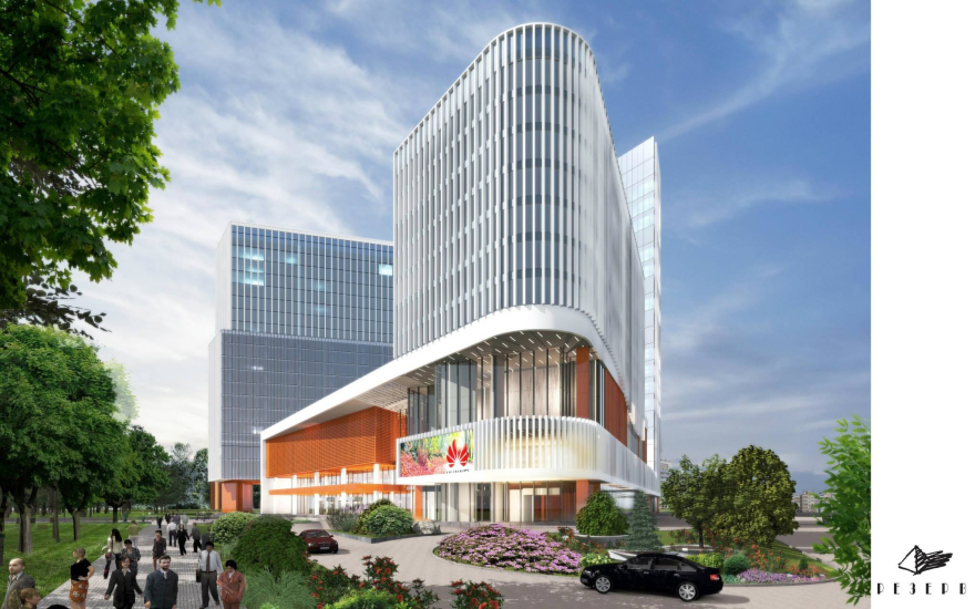
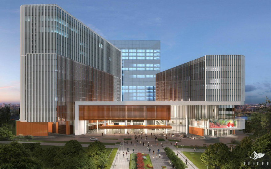
Project, 3D render, view from the metro station. “Park Huaming” business center on Wilhelm Pieck Street in Moscow
Copyright © Reserve Union
Now there is a large transport hub here and many new residential blocks, 20 stories high; the color in the surrounding buildings is predominantly beige, and the windows are united vertically so that they resemble thickets of very large reeds. The old subway pavilion is built up by a shopping center with an office tower, and the Moscow Northern Diameter overpass has passed behind the railroad.
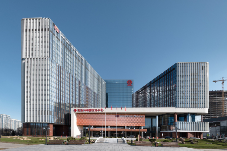
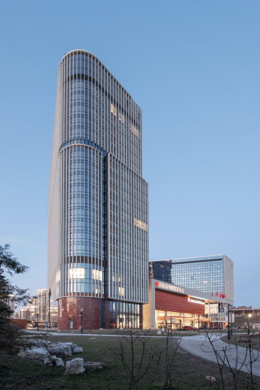
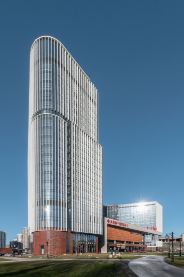
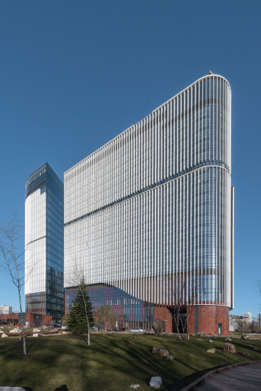
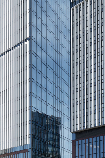
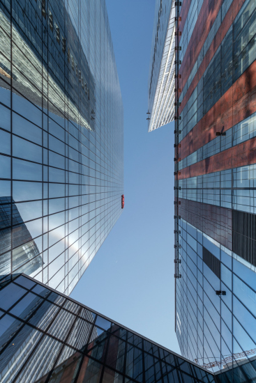
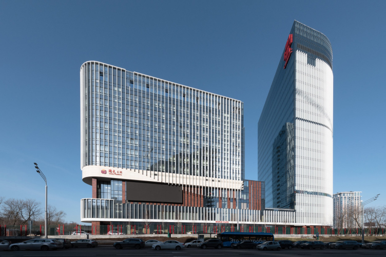
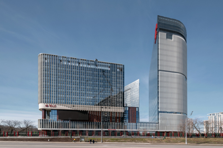
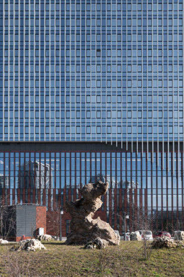
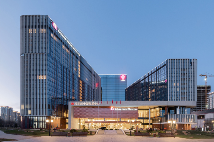
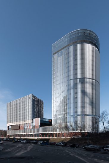
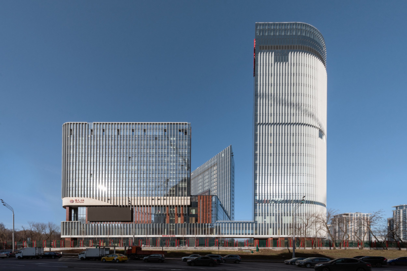
In the bustling “thicket” of new development, the Huaming Park building looks like a foreign body: light, glassy, thinly striped, like a New York – but then again, why not a Beijing? – skyscraper. However, the building is a little short of a real skyscraper: the height of the office part is a little less than a hundred meters, which is not exactly a high-rise by the modern Moscow standards. On the other hand, the building stands on an elevation, it is visible from afar, and it is noticeably different from everything that’s around it – first of all, as a capacious stereometric statement. We see large roundings and planes from different angles – the building looks a bit like a giant netsuke, vigorously dissected, but nonetheless stable. Vertical lamellas delineate the volume in a laconic and contrasting manner – they catch the sunlight and intensify the contrast of light and shade, especially on the curves. In the perspective, they grow thicker, opening the glass to the direct view, mitigating the excessive sculpture-like effect and visually pulling the building together.
From the very beginning, i.e. since 2001, Huaming Park was conceived, at the highest level, as an instrument for the development of international relations – a fragment of China in Moscow, and it was almost the main task to make it figuratively consonant with the Far Eastern culture.
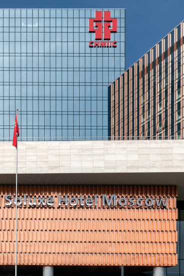
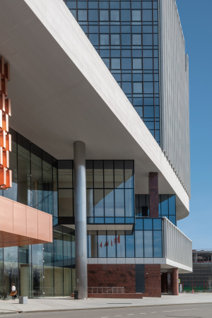
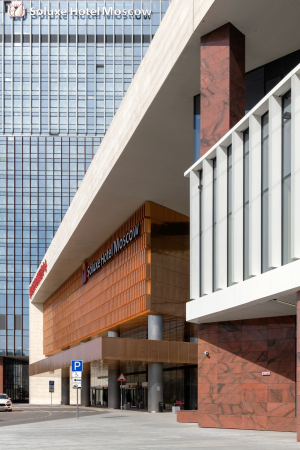
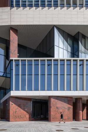
We immersed ourselves in the context of Chinese tradition and studied its modern interpretation, which allows for a fairly flexible interpretation of meanings. We oriented the building to the east – I consider this decision one of the most successful, as the sunrise holds immense significance in Chinese culture. Research into traditional color schemes led to three primary colors: white, red, and gold. In our case, “gold” is represented by natural copper, while the majority of the lamellae are white, and red is the color of the granite used to clad the stylobate. It took us a long time to select the quarry and the stone’s color.
Other adjustments related to the Chinese mentality were made by the client, Huaming Company: we were asked to soften the sharp angles since they are negatively perceived in traditional culture. As a result, the building’s contour became more streamlined. On the other hand, the client wanted the facades to be very modern but still strict and dignified, so we abandoned dynamic options that were initially considered.
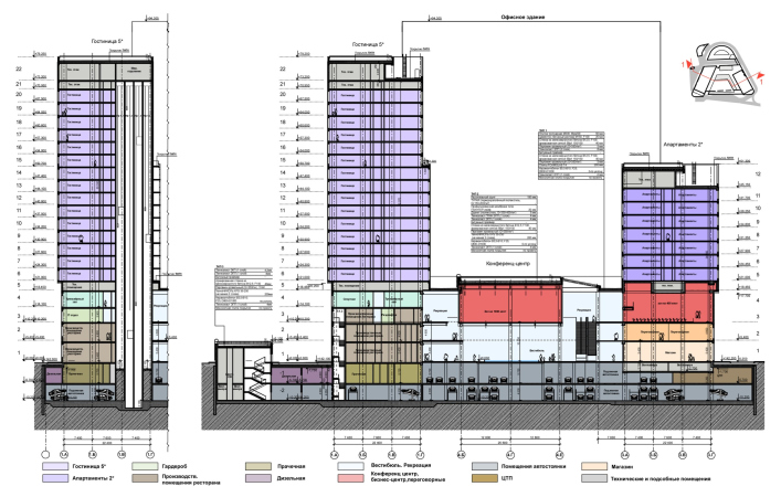
However, one of the main features of the center is its true versatility. It combines offices, apartments, a hotel, two large conference halls, a sports block, shops, cafes, and restaurants serving national cuisine, all in one place. It’s practically a mini-city.
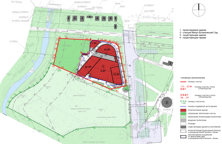
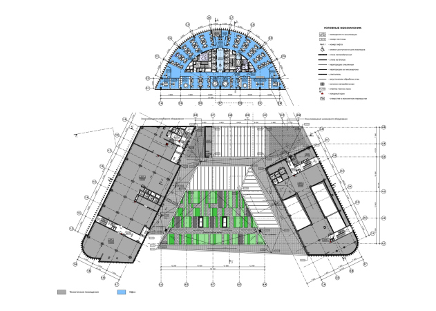
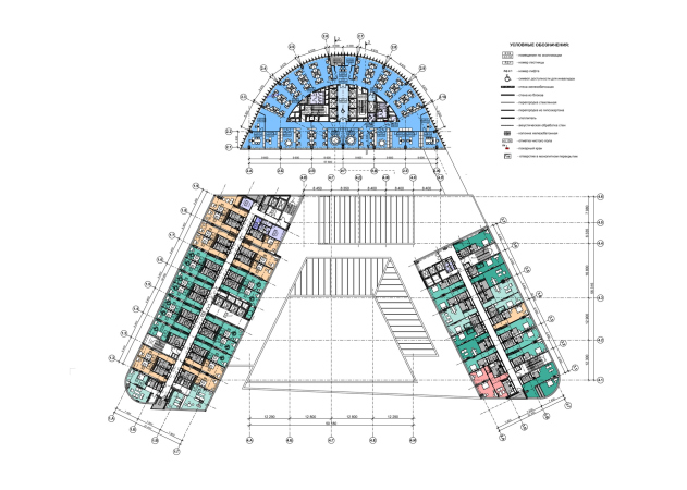
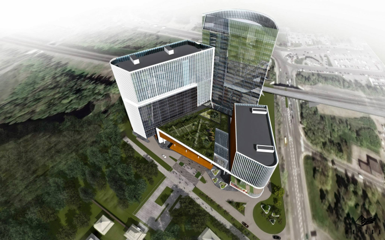
In the complex, indeed, if you wish, you can live and work comfortably without ever leaving it. Five key functions – an office tower, a hotel, apartments, a sports center with a swimming pool, and a large conference hall – are elegantly distributed within a triangular plan that is strict and almost centrally symmetrical.
Location plan. “Park Huaming” business center on Wilhelm Pieck Street in Moscow
Copyright © Reserve Union
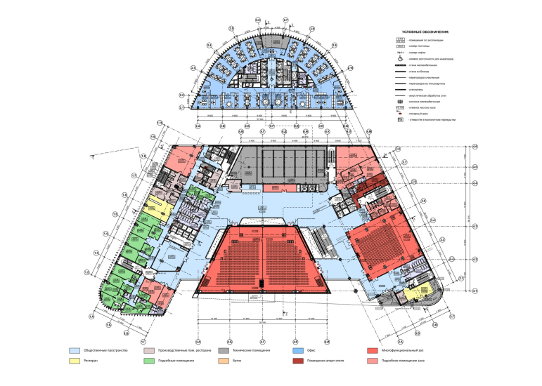
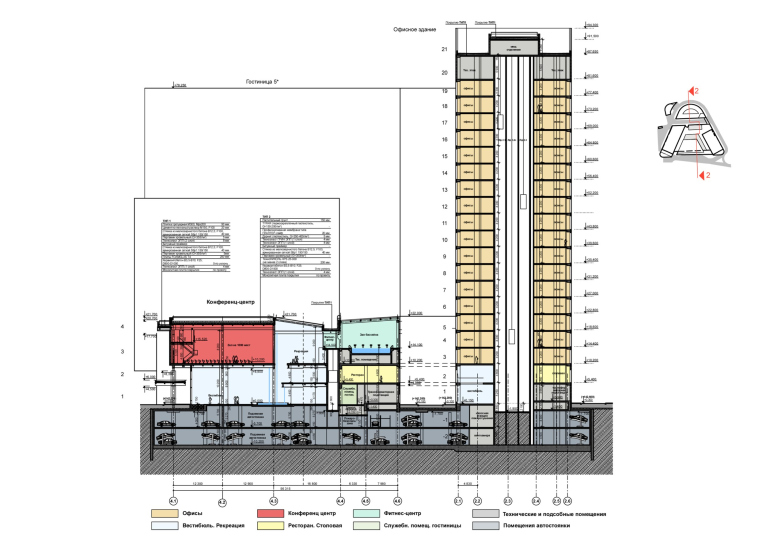
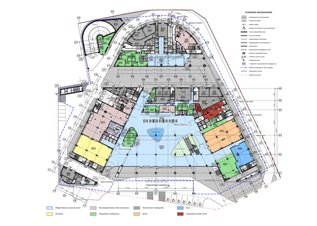
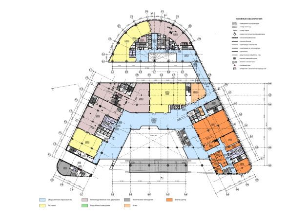
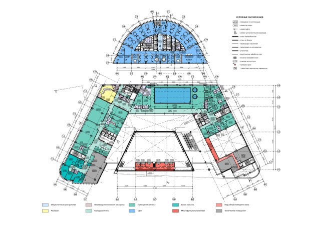
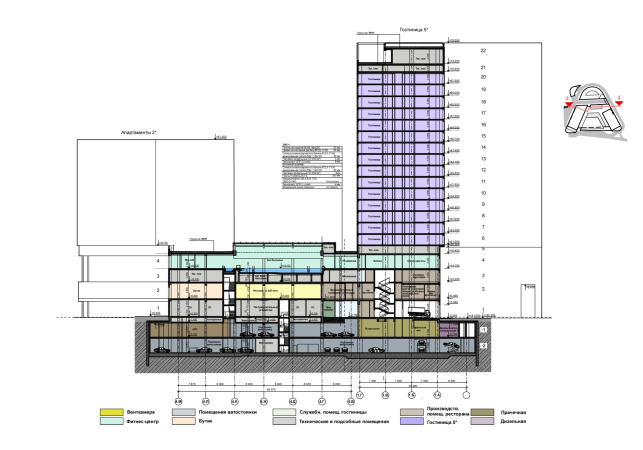
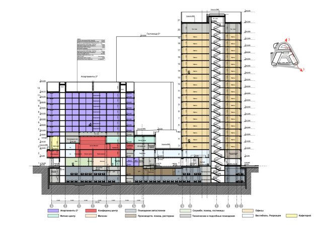
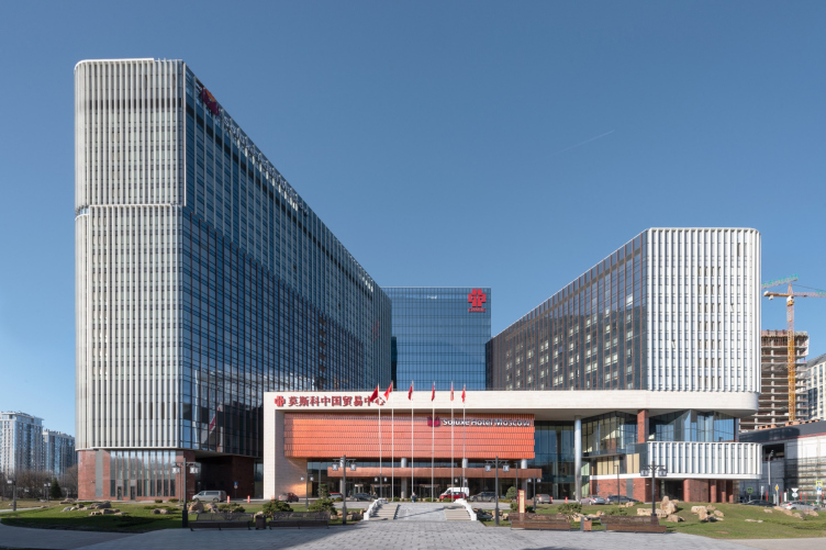
The northern apex of the triangle is occupied by a semicircular office tower, while the southern part is a trapezoid framed by two wings: a hotel on the left and apartments on the right. Between the wings, there is a four-height atrium, in the middle of which the main conference hall, a kind of the core of the complex, is suspended on a grid of supports. It “hovers” over a spacious lobby of 9-meter height, well-lit through the southern facade; from the north side, the lobby is flanked by two tiers of balconies, and from the second tier the visitors get into the conference hall. The ceiling height of the second tier is also 9 meters, and it is additionally illuminated by two large skylights with a tilt to the north. In other words, the lobby catches both northern and southern sun; it is spacious and high.
The other conference hall is located on the third and fourth floors underneath the apartments, in the right-hand wing. In the 3rd floor level, in the northern lintel of the stylobate and in the hotel wing, there is a large fitness center with a 25-meter-long swimming pool, under a 6-meter ceiling and another skylight. The roof of the stylobate is landscaped, as envisioned in the project, and serves as a “fifth facade” for beautiful views from the windows.
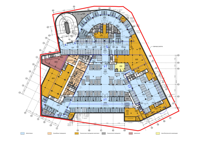
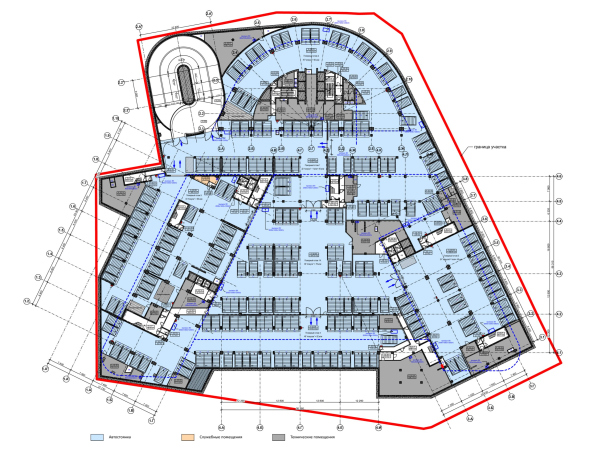
The first and second floors include several restaurants, a bank, boutiques, and a business center situated in the apartment wing. There is also a restaurant on the 2nd floor of the office tower, which can be accessed either by going through the lobby or through the passage on the right. The two underground levels are occupied by a parking garage, including an automated one.
This whole set is composed in a dialectical way, based on two opposing principles: separation and unification, symmetry and asymmetry.
The three main buildings differ in height: the office tower is 95 m high, the hotel building is 80 m high, and the apartments are 51 m high – the narrowest and the highest volume is located near the railroad, along the city street the height is noticeably lower, as the complex seems to descend with large steps. Moreover, the reduction of the height is dictated not only by the proximity to the city street, but it also makes it possible to open the facades of the hotel to the eastern and south-eastern sun – according to Vladimir Plotkin, the eastern light is available for 70% of the complex.
“Park Huaming” business center on Wilhelm Pieck Street in Moscow
Copyright © Reserve Union
One of the most curious techniques of the volumetric composition – it contains a kind of urban planning puzzle – is the cut of the inner boulevard separating the office tower from the rest of the complex. Whether it is a boulevard or not will be decided by the management company of the complex in the sense that it will be landscaped and beautified or not, but the northern tower with a semicircular lenticular plan has been moved away from the stylobate of the southern part by 12 meters, only one “string”remaining: the lintel of the overhead passage from Wilhelm Pieck Street.
The impression of a “slice” forming a Manhattan-type gorge arises primarily because of the smooth surface of the structural glazing, contrasting with the lamella-covered walls, both interior and exterior. It also looks that way because the glass planes on the office tower and the sidewall of the hotel, 95 and 80 meters high respectively, are perfectly straight, even though the 22-meter height of the stylobate would have been quite sufficient. It is here that the “city effect” is particularly strong, as well as the ricochet of reflections.
The sharp corners have been preserved here, but that is not the most interesting thing. The “slice” continues the axes of the city streets: 1st Leonov Street from the east and Berezovaya Alley from the west, visually connecting the territories of two former Moscow suburban villages. Both the cut and the “sliced” semicircle are clearly visible from both sides – for example, from the Tricolor housing complex (also designed by Vladimir Plotkin) – two large-scale projects designed by the same architect salute each other, separated by a two-kilometer distance.
The inner boulevard is not included in the life of the city, as Huaming Park’s territory is enclosed by a fence, and it does not restore the lines of historical roads either – its role is visual: it connects the axes that exist in the city now, and allows us to look a little further into the distant perspective through ourselves. And this, of course, is not a coincidence, but the result of the architects’ research into the urban context.
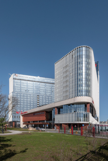
View from the east. “Park Huaming” business center on Wilhelm Pieck Street in Moscow
Copyright: Photo © Aleksey Naroditsky / provided by Reserve Union
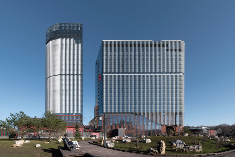
View from the west. “Park Huaming” business center on Wilhelm Pieck Street in Moscow
Copyright: Photo © Aleksey Naroditsky / provided by Reserve Union
Here we can remember about the land of the rising sun. If you look at the building now on the Yandex aerial photo with a great approximation, it is taken at the moment when the sun shines through the boulevard, in a straight line, from the east with a slight tilt to the south. A very distinct and monumental shadow lies at the western end of the park, and the building appears to be something akin to a prehistoric dolmen, which, according to one theory, was oriented to catch the sun rays at a particular moment. The difference is that this is a very large “dolmen”, built on a modern scale.
In addition to large-scale gestures, the building features many “fine-tuning” elements. For example, the elevation changes of the buildings are projected onto the facades by subtle horizontal breaks in the “shading” of the lamellae, and the stylobate is shown as a separate element, on which the volumes of the hotel and apartments are set. The northern end of the apartments is beveled and slightly pushed back, opening a doorway for the rays of the eastern sun to the hotel and, at the same time, a view from Leonov Street side.
“Park Huaming” business center on Wilhelm Pieck Street in Moscow
Copyright: Photo © Aleksey Naroditsky / provided by Reserve Union
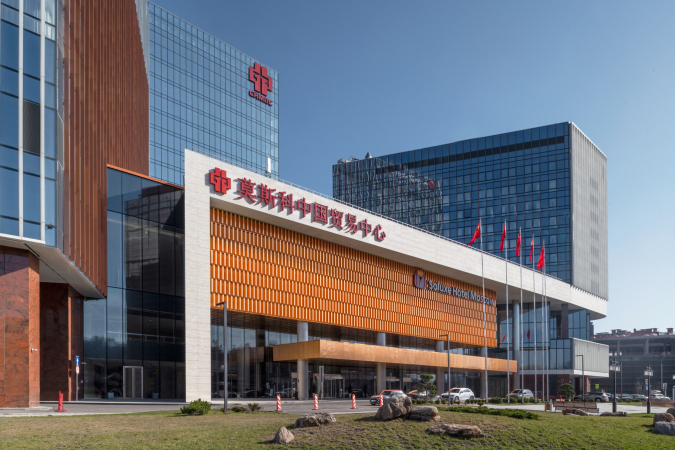
The wings also look as though they salute each other – two rectangles on the facades of the hotel are moved slightly forward: one repeats the dimensions of the opposite facade of the apartments, the other echoes its end. It is as if the wings were once identical, but then the western one was added on, “drowning” the former volume in it. In addition, the planes saluting each other are delineated not with white, but with copper lamellae, which creates another duplicate perspective when looking at the main facade, reinforced by the fact that the buildings are placed at an angle to each other, and, as a consequence, look quite energetic – the complex opens towards the park like a book.
“Park Huaming” business center on Wilhelm Pieck Street in Moscow
Copyright: Photo © Aleksey Naroditsky / provided by Reserve Union
“Park Huaming” business center on Wilhelm Pieck Street in Moscow
Copyright: Photo © Aleksey Naroditsky / provided by Reserve Union
This may remind you of other Reserve Union projects – for example, the two wings of Aeroflot’s office, placed parallel to each other, echo each other with reflections and white stripes drawn by the vis-a-vis. But then again, in Huaming Park, reflections also play a significant role – they play their own game, and if you look closely, there are more planes in this triangular composition than you see at first.
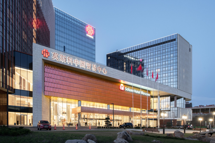
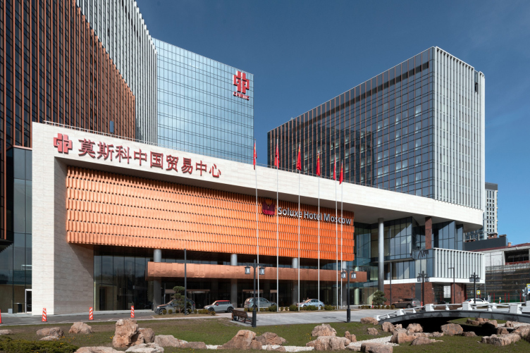
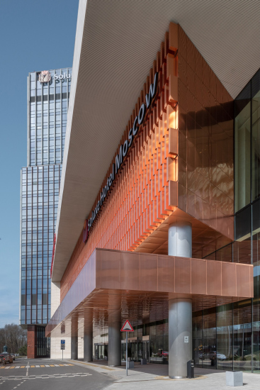
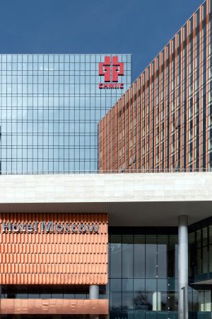
However, the highlight of the representative southern facade is the conference hall. It is “suspended” in the space of the atrium, tracing the trapezoidal shape of its plan, while the southern wall of the hall is extended from the stained-glass window by a block on columns. It is lined with natural copper, and it shines with a kind of black light, “ignited” by the sun, which shines on it from different sides almost all day long, from sunrise to sunset. It is virtually a full-fledged art object that explores the theme of the sun. It is supported by the copper plate of the canopy strung on the columns below; the canopy not only rhythmically balances the entrance part, but also, if you think about it, signifies the position of the hall within the atrium.
“Park Huaming” business center on Wilhelm Pieck Street in Moscow
Copyright: Photo © Aleksey Naroditsky / provided by Reserve Union
The staggered copper strips help to catch the sun rays – they can be compared to lamellas cut into pieces and arranged in a strict pattern logic. They practically “absorb” light and then amplify it noticeably better than a cool, flat surface of the same material – it is the copper lamellae that create the shining effect.
And here too, when approaching from the city, the angle of turn looks very energetic.
The copper facade is encircled by an asymmetrical frame of light-colored limestone: on the right, on the street side, it is open to the flow of incoming traffic, while on the left it “stops” it; at the level of the lower floors, the building is more actively transformed, interacting with the city and its people.
While the upper volumes are like a rock, facing the “city and the world”, down here, asymmetrical displacements, zigzag facades, balconies, and transitions form something that you may call “the ups and downs of life”; the analogy is further supported by the curved contour of the lower edge of the lamellae, as if the imprint of waves.
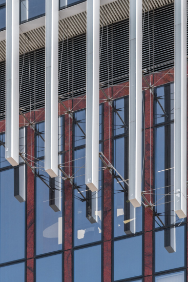
This edge slightly disguises the horizontal line of the stylobate edge, and if you get closer, you can see that it is implemented spectacularly, on “spider” stretches.
The “respectable” granite cladding of the stylobate, which was created by the client’s request, causes some dislike for me personally. Originally, it was planned to use natural copper for the stylobate, which “works” so well on facades – and I think this would have been the right thing to do because, besides glass, the building would have only two colors in it: white and copper as an organic alloy of red and gold. Granite, even when lightened and “refined” by its frequent proximity to glass, and in some places quite masterfully transformed into round and oval columns, still seems to me to be slightly superfluous in such a modern building.
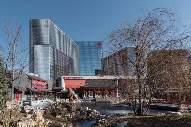
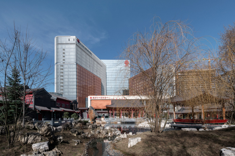
However, there are many contrasts associated with this building, derived from the peculiarities of contemporary Chinese culture, which apparently sees no contradiction in the simple juxtaposition of the modern international and the completely traditional – and perhaps even sees such stylistic equanimity as a kind of advantage based on the maxim “let all the flowers bloom”. In Beijing’s panoramas, it is actually easy to find landscapes where red lacquer buildings with curved corners of tiled roofs neighbor not only with skyscrapers, but also with actual architecture. No fusion, just simple juxtaposition! This is what happened here: both the Chinese park in front of the southern façade and the interiors of the center were realized by Chinese authors. The park is completely authentic, with hand-painted tiles and sacred stones brought from China, echoed by the shape of the fence. The interior is orientally luxurious.
View from the Chinese garden. “Park Huaming” business center on Wilhelm Pieck Street in Moscow
Copyright: Photo © Aleksey Naroditsky / provided by Reserve Union
Let’s, however, get back to the building of the center.
If we compare the actual photos with the 3D renders, we will see that the key angles are also very similar and the main solutions have been implemented almost exactly as intended.
In addition, there are quite a lot of expensive technical solutions (it is interesting that the list of engineers in the architects’ team is actually longer than the list of architects, although it is usually the other way around). Among the notable ones are the large-sized glass – up to 11 meters high – or the media façade, one of the highlights of the project.
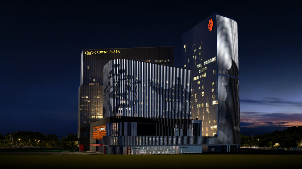
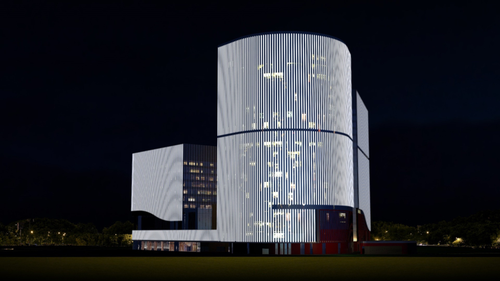
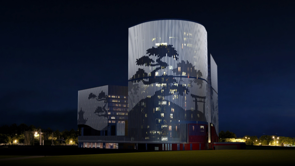
The width of the outer white lamellae is 16 cm, and for good reason: their milk glass side ends are fitted with controllable backlighting. The entire facade can be illuminated in its entirety or turned into large-scale pictures – not the way it’s done on ordinary media screens, which are abundant in the city (and there is one here too) – but into discrete striped, large and generalized ones.
I feel like calling this type of media facade architectural because it does not simply turn the building into a large television set, but develops it without suppressing the volumetric solution; Vladimir Plotkin used a similar approach in the building of the shopping center “Vremena Goda” (“The Four Seasons”), where media backlighting is built into points evenly distributed on metal panels. In this case it is not dots, but strips.
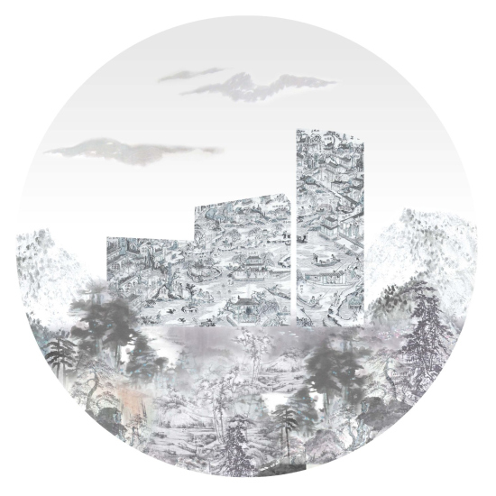
The authors even preface the project with a logo showing that the volumes here are seen as paintings or the basis for paintings.
It should be quite spectacular in the middle of the night city, especially when seen against the dark forest of the reserve area of the Botanical Garden. It is well visible that the illumination on the ends of the lamellae has indeed been implemented, but I have not managed to catch it in the active state yet. Never mind – maybe they will turn it on someday.
However, the shadows from the construction cranes of the neighboring site, when they lie on the lamellae, give a somewhat similar effect in the sunlight during the day.
Now white vertical lamellae, the heirs of the thin pylons that organized the form in classical modernist buildings, have become quite popular in Moscow. In the 1990s and 2000s, the technique was almost forgotten, and few architects used it. So Huaming Park, designed in 2013 and completed recently – though I’ll call it finally completed when the lights come on – seems to be a kind of “bridge” through the decade. The architecture is modern, but to some extent timeless because of its high level of generalization, international – and taking into account the peculiarities of Chinese thinking, “Chinese” – and at the same time skillfully "stitched" into the Moscow landscape.
And how good it is that a Moscow architect is responsible for the modern international part of the ensemble here. You begin to respect your city.


