По-русски

Gustave Falconnier

In the “ruin” wing of Moscow’s Museum of Architecture, an exhibition of “glass bricks” by Gustave Falconnier is open. These “bricks” are essentially the predecessors of glass blocks, but more complex and beautiful. The exhibition shows genuine “bricks”, buildings composed of them, the history of the destruction of Falconnier windows in the building of the State Archives, and it also became one of the reasons to revive this unique production technology.

17 April 2023
Review
mainImg
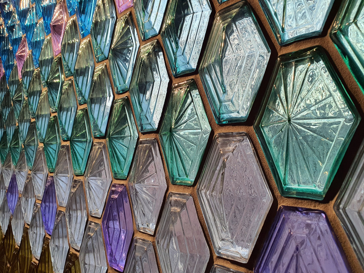
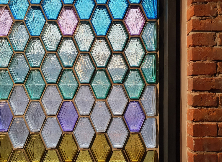
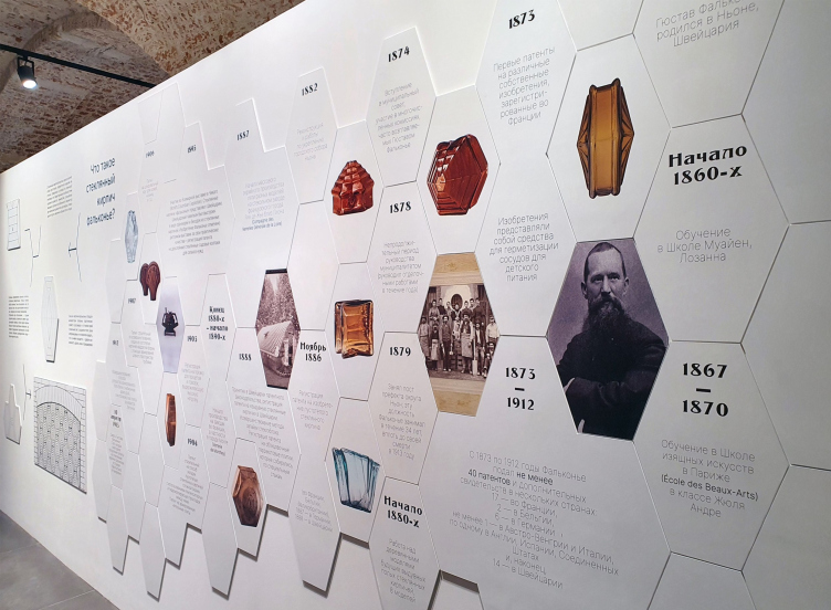
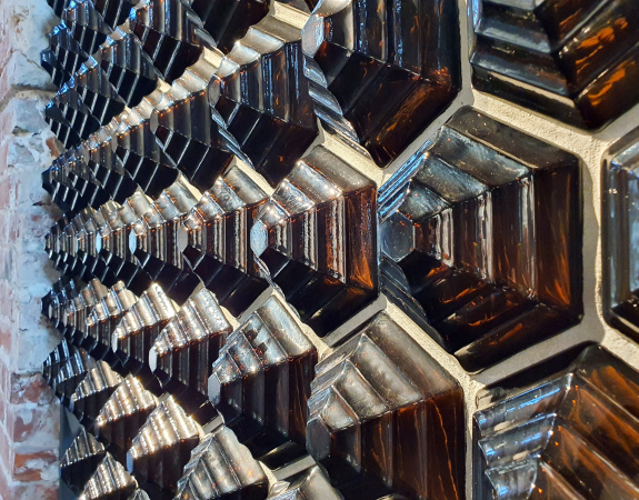
Gustave Falconnier was an architect by training and he even opened his own architectural bureau. However, he was not very interested in architecture and was more interested in politics. He spent 34 years as the prefect of his native district of Nyon and was also interested in invention in the construction industry. He obtained patents for lightweight masonry, reinforced concrete floors, and the blown glass bricks in question (1888). The latter made him famous. At the World’s Fair in Chicago in 1893, the Swiss pavilion was almost entirely made of glass bricks, and the technology soon became popular. Patents were purchased in various countries, and after Poland, glass bricks were soon produced in Russia. A special Russian form is even known: a hexagon elongated like slabs in the Zaryadye Park, sporting a “star” spider on the front side.

"Falconnier. Architecture of Light" exhibition. Museum of Architecture, the “Ruin” wing, 07.04.2023 – 20.08.2023
Copyright: Photograph © Julia tarabarina / Archi.ru

"Falconnier. Architecture of Light" exhibition. Museum of Architecture, the “Ruin” wing, 07.04.2023 – 20.08.2023
Copyright: Photograph © Julia tarabarina / Archi.ru


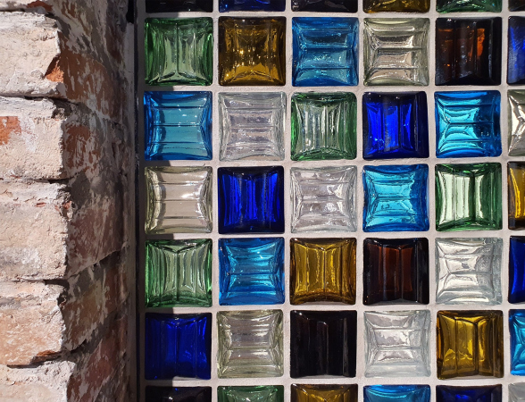
In 1913, Gustave Falconnier died, and the patent was suspended. However, the bricks were still produced until around the 1930s, after which they were replaced by glass blocks that were more predictable, cheaper, did not require the glassblower’s lungs, and could be stamped into shape. Predictably, they were also more uniform, usually square.

"Falconnier. Architecture of Light" exhibition. Museum of Architecture, the “Ruin” wing, 07.04.2023 – 20.08.2023
Copyright: Photograph © Julia tarabarina / Archi.ru


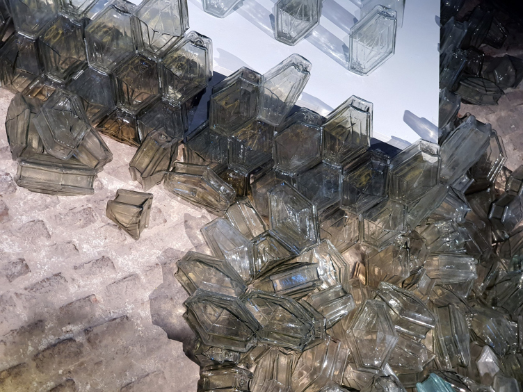
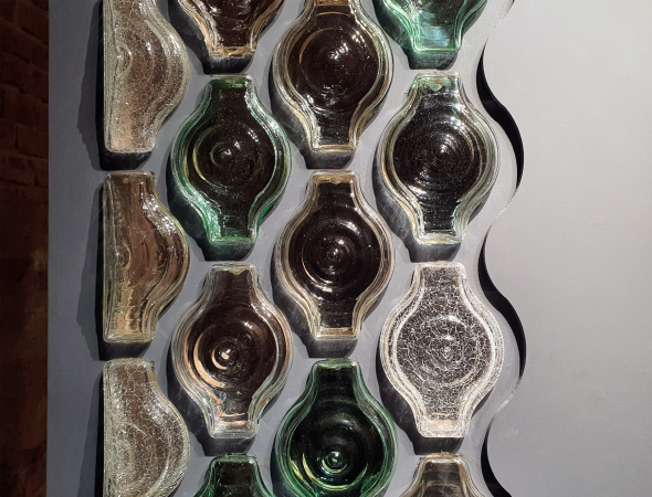
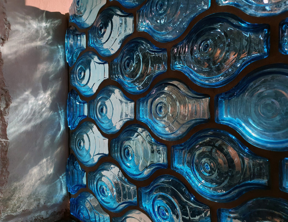
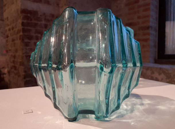
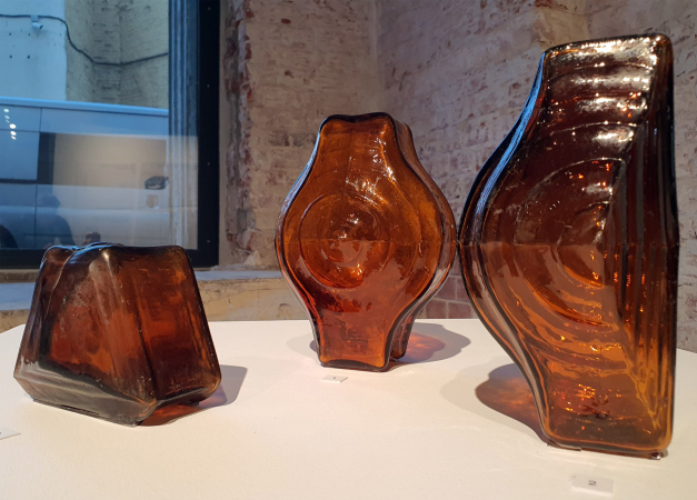
The Falconnier glass bricks now come in 16 different types, with the most complex shape resembling a baluster or a chubby pitcher; one of the most common is the elongated hexagon, but there are also flattened hexagons with stepped “hills”; there are also simple squares. Plus color. Glass blocks are not often colored, but I have seen white, light-blue, and yellow ones. In the case of Falconnier’s bricks, however, there’s almost the entire spectrum presented: cobalt blue and light-blue, brown and yellow, and a multitude of pastel shades. Strangely, there is little or no red. Sometimes an artificial crackle is added to the shape and color, as shown on the entrance stand.

  • zooming
    1 / 7
    "Falconnier. Architecture of Light" exhibition. Museum of Architecture, the “Ruin” wing, 07.04.2023 – 20.08.2023
    Copyright: Photograph © Julia tarabarina / Archi.ru
  • zooming
    2 / 7
    "Falconnier. Architecture of Light" exhibition. Museum of Architecture, the “Ruin” wing, 07.04.2023 – 20.08.2023
    Copyright: Photograph © Julia tarabarina / Archi.ru
  • zooming
    3 / 7
    "Falconnier. Architecture of Light" exhibition. Museum of Architecture, the “Ruin” wing, 07.04.2023 – 20.08.2023
    Copyright: Photograph © Julia tarabarina / Archi.ru
  • zooming
    4 / 7
    "Falconnier. Architecture of Light" exhibition. Museum of Architecture, the “Ruin” wing, 07.04.2023 – 20.08.2023
    Copyright: Photograph © Julia tarabarina / Archi.ru
  • zooming
    5 / 7
    "Falconnier. Architecture of Light" exhibition. Museum of Architecture, the “Ruin” wing, 07.04.2023 – 20.08.2023
    Copyright: Photograph © Julia tarabarina / Archi.ru
  • zooming
    6 / 7
    "Falconnier. Architecture of Light" exhibition. Museum of Architecture, the “Ruin” wing, 07.04.2023 – 20.08.2023
    Copyright: Photograph © Julia tarabarina / Archi.ru
  • zooming
    7 / 7
    "Falconnier. Architecture of Light" exhibition. Museum of Architecture, the “Ruin” wing, 07.04.2023 – 20.08.2023
    Copyright: Photograph © Julia tarabarina / Archi.ru
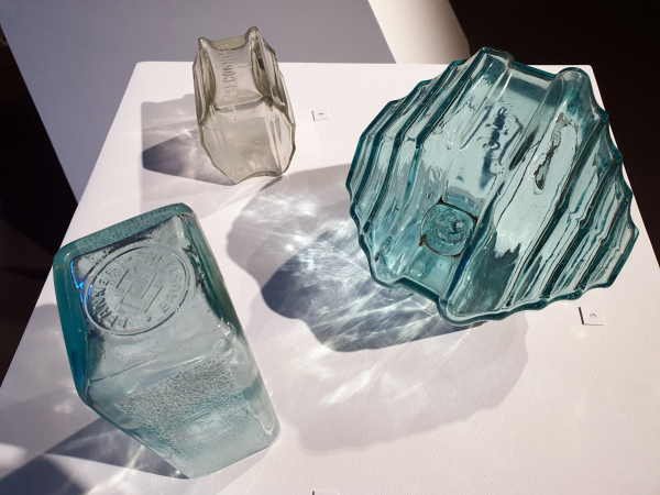

The benefit of Falconnier glass bricks was twofold. Before glass blocks became widespread, the Falconnier bricks were the only ones that allowed an opening to be covered without depriving the room of natural light, but without providing a window-to-window view. This was particularly useful for firewalls, where such proximity was prohibited by regulations, or to separate the rooms of the servants, which was also understandable and practical.

However, the bricks are very beautiful, and it would be surprising if their aesthetics were not appreciated. They allow for the creation of colorful stained-glass windows, which are absolutely luxurious, and even better, glass domes that are lightweight and quite large. In Moscow, one such dome remains in the building of the Indian embassy, which is located in the Bardygin estate of 1911 in the Vorontsovo Field Street. Glass domes and walls are, of course, already part of the architecture, a technology that dictates both the lighting and the volumetric/spatial solution. Sometimes, however, domes fell, since the load was not always correctly calculated, and the bricks were glued together with a special solution.

The meaning of the exhibition is also twofold. On the one hand, it is research based on previous studies and information obtained from the Falconnier glass collection, which was exhibited in Nyon in 2018, inspiring the current exhibition at the Museum of Architecture. At some point, the museum actively collaborated with Nyon, and they planned to bring part of the collection, but for objective reasons, it did not work out, which is why the current exhibition may seem a bit empty.

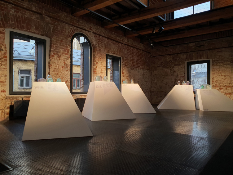
The feeling is enhanced by the pedestals offered by the exhibition designer Agnia Sterligova: they are white pyramids that widen significantly towards the bottom, as if slightly pushing the viewer away from the object. The reception was designed so as not to “cover the glass with glass” and at the same time somehow prevent viewers from touching the originals. Even though the objects are open, people still tend to reach out to touch them, making it even less stable. Therefore, I cannot say that the pyramid solution is very successful. But it is elegant, and overall, it seems that Agnia Sterligova has moved from bright, colorful, and “tell-tale” embellished exhibition designs to more concise solutions.

"Falconnier. Architecture of Light" exhibition. Museum of Architecture, the “Ruin” wing, 07.04.2023 – 20.08.2023
Copyright: Photograph © Julia tarabarina / Archi.ru

"Falconnier. Architecture of Light" exhibition. Museum of Architecture, the “Ruin” wing, 07.04.2023 – 20.08.2023
Copyright: Photograph © Julia tarabarina / Archi.ru

On the other hand, there is a stand where “you can touch everything” – you just have to endure until you reach the second floor, where there is a showcase dedicated to the revival of the Falconnier technology. There is a blowing pipe, scissors for cutting, and models of forms, including those printed from historical samples for analysis.

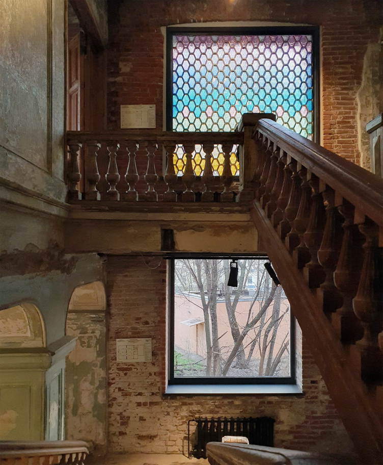
The revival of technology is the second, and perhaps even the primary, meaning and feature of the exhibition, after exploration, as it has become a “driver” for the restoration of production. Here’s the story: Nikita Andreev, an art historian, a graduate of the Stieglitz Academy, and a roofer, found a window in the Bashevich house in St. Petersburg that was filled with glass bricks. He took a “couple of fallen samples” and became interested in studying the subject. In 2018, he learned about the Falconnier exhibition in Nyon, shared the information with the Museum of Architecture, and its director, Elizaveta Likhacheva, invited Nikita Andreev to curate an exhibition dedicated to Falconnier bricks at the museum. For the exhibition (!), the revival of brick production was organized – Ivan Kozitsyn, a teacher at the Stieglitz Academy and the NWGlass.lab workshop, took on this task. Now, the workshop produces restoration-quality bricks, and their use has already been applied in restoring windows in the Eroshenko house in St. Petersburg and the Shelukhin house in Nizhny Novgorod. But the biggest order at the moment was from the museum for the exhibition: variously shaped and colored bricks were used to create several openings on the 1st and 2nd floors, and a lilac-and-pink window on the 3rd floor on the stairs – the latter is likely to be preserved. The exhibition shows videos of the brick-blowing process, defective samples, and molds, including those that were part of the technology development process.

"Falconnier. Architecture of Light" exhibition. Museum of Architecture, the “Ruin” wing, 07.04.2023 – 20.08.2023
Copyright: Photograph © Julia tarabarina / Archi.ru
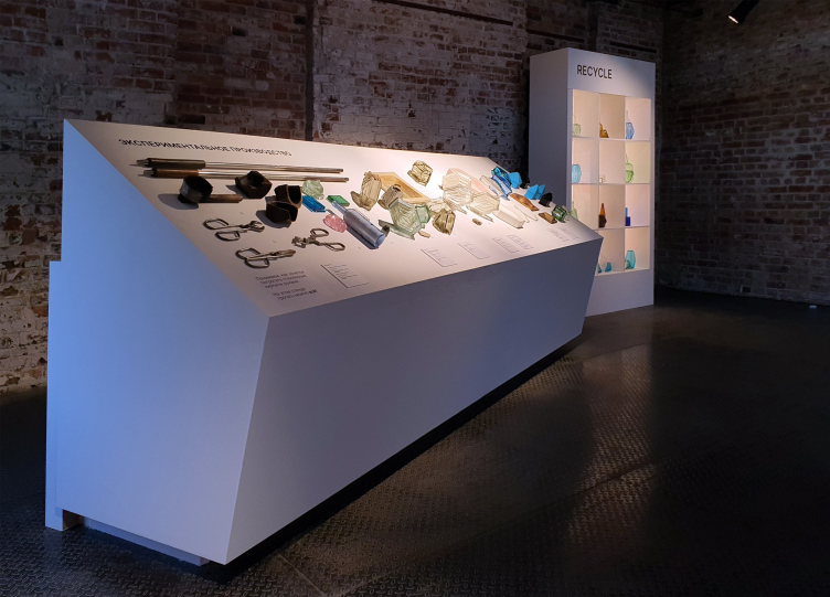

"Falconnier. Architecture of Light" exhibition. Museum of Architecture, the “Ruin” wing, 07.04.2023 – 20.08.2023
Copyright: Photograph © Julia tarabarina / Archi.ru
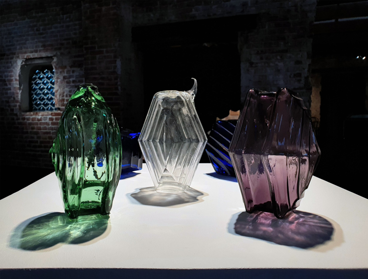

The bricks are currently blown from recycled glass bottles, selecting bottles by color – the museum staff and curators collected these bottles from bars. In other words, the exhibition shows a living process, and it even became a part of it. A hundred years ago, Falconnier showed a pavilion made of glass bricks in Chicago, and they became popular. In that case, maybe it could happen again now, at least for restoration purposes. However, the bricks are already sold as souvenirs, both in the museum shop and online.

"Falconnier. Architecture of Light" exhibition. Museum of Architecture, the “Ruin” wing, 07.04.2023 – 20.08.2023
Copyright: Photograph © Julia tarabarina / Archi.ru
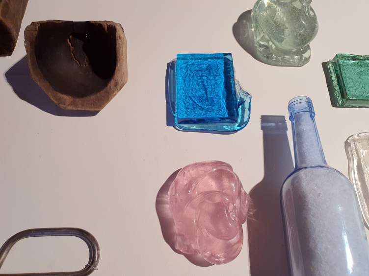

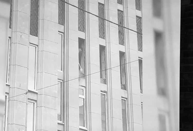
There is another part of the living process, and that is destruction. In 2018, a Falconnier exhibition was held in Nyon, and at the end of 2019 in Moscow, despite protests by the local preservation activists, all the glass brick windows in the building of the State Archives on Bolshaya Pirogovskaya Street were smashed and replaced with double-glazed windows. Employees of the Museum of Architecture saved some of the bricks from the archive building – the story is described here by the second curator of the Moscow Falconnier exhibition, Anna Kistanova. Some of the “bricks” were taken into storage by the museum, while others are simply kept – they make up an installation at the exhibition accompanied by a video recording of a builder hitting bricks with a hammer.

"Falconnier. Architecture of Light" exhibition. Museum of Architecture, the “Ruin” wing, 07.04.2023 – 20.08.2023
Copyright: Photograph © Julia Tarabarina / Archi.ru


"Falconnier. Architecture of Light" exhibition. Museum of Architecture, the “Ruin” wing, 07.04.2023 – 20.08.2023
Copyright: Photograph © Julia Tarabarina / Archi.ru


In short, it is a rather curious slice of life from birth to death and back to revival again: here things are broken, and rebuilt.

The technology is quite precise and intricate, not designed for large volumes and pragmatic use – but they say that now it’s possible to make 20-25 Falconnier bricks in a day – provided, you have enough bottles, of course.
"Falconnier. Architecture of Light" exhibition. Museum of Architecture, the “Ruin” wing, 07.04.2023 – 20.08.2023
Copyright: Photograph © Julia tarabarina / Archi.ru

17 April 2023

Headlines now
The Golden Crown
The concept for a dental clinic in Yekaterinburg, developed by CNTR Studio, revolves around the idea of a “mouth full of gold”: pristine white porcelain stoneware walls are complemented by matte brass details. To avoid an overly literal interpretation, the architects focused on the building’s proportions, skillfully navigating between sunlight requirements and fire safety regulations.
Flexibility and Integration
Not long ago, we covered the project for the fourth phase of the ÁLIA residential complex, designed by APEX. Now, we’ve been shown different fence concepts they developed to enclose the complex’s private courtyards, incorporating a variety of public functions. We believe that the sheer fact that the complex’s architects were involved in such a detail as fencing speaks volumes.
A Step Forward
The HIDE residential complex represents a major milestone for ADM architects and their leaders Andrey Romanov and Ekaterina Kuznetsova in their quest for a fresh high-rise aesthetic – one that is flexible and layered, capable of bringing vibrancy to mass and silhouette while shaping form. Over recent years, this approach has become ADM’s “signature style”, with the golden HIDE tower playing a pivotal role in its evolution. Here, we delve into the project’s story, explore the details of the complex’s design, and uncover its core essence.
Gold in the Sands
A new office for a transcontinental company specializing in resource extraction and processing has opened in Dubai. Designed by T+T Architects, masters of creating spaces that are contemporary, diverse, flexible, and original, this project exemplifies their expertise. On the executive floor, a massive brass-clad partition dominates, while layered textures of compressed earth create a contextually resonant backdrop.
Layers and Levels of Flight
This project goes way back – Reserve Union won this architectural competition at the end of 2011, and the building was completed in 2018, so it’s practically “archival”. However, despite being relatively unknown, the building can hardly be considered “dated” and remains a prime example of architectural expression, particularly in the headquarters genre. And it’s especially fitting for an aviation company office. In some ways, it resembles the Aeroflot headquarters at Sheremetyevo but with its own unique identity, following the signature style of Vladimir Plotkin. In this article, we take an in-depth look at the United Aircraft Corporation (UAC) headquarters in the Moscow agglomeration town of Zhukovsky, supplemented by recent photographs from Alexey Naroditsky – a shoot that became only recently possible due to the fact that improvements were finally made in the surrounding area.
Light and Shadow
In this article, we delve into the architectural design of the “Chaika” house by DNK ag architects, which was recently completed in 2023 as part of the collection of signature designs at ZILArt. As is well-known, all the buildings in this complex follow a design code, yet each one is distinct. This particular building stands out not only for its whiteness and minimalism but also for the refined use of a limited number of techniques that, together, create what can confidently be called synergy.
Casus Novae
A master plan was developed for a large residential area with a name of “DNS City”, but now that its implementation began, the plan has been arbitrarily reformatted and replaced with something that, while similar on the surface, is actually quite different. This is not the first time such a thing happens, but it’s always frustrating. With permission from the author, we are sharing Maria Elkina’s post.
Treasure Hunting
The GAFA bureau, in collaboration with Tegola and Arkhitail, organized an expedition to the island of Kilpola in Karelia as part of Moskomarkhitektura’s “Open City” festival. There, amidst moss and rocks, the students sought answers to questions like: what is the sacred, where does it dwell, and what sustains it? Assisting the participants in this quest were landscape engineer Evgeny Levin, artist Nicholas Roerich, a moose, and the lack of cellular connection. Here’s how the story unfolded.
Depths of the Earth, Streams of Water
In the Malaya Okhta district, the Akzent building, designed by Stepan Liphart, was constructed. It follows a classic tripartite structure, yet it’s what you might call “hand-drawn”: each façade is unique in its form and details, some of which aren’t immediately noticeable. In this article, we explore the context and, together with the architect, delve into how the form was developed.
Fir Tree Dynamics
The “Airports of Region” holding is planning to build an airport in Karachay-Cherkessia, aiming to make the Arkhyz and Dombay resorts more accessible to travelers. The project that won in an invitation-only competition, submitted by Sergey Nikeshkin’s KPLN, blends natural imagery inspired by the shape of a conifer seed, open-air waiting spaces, majestic large trees, and a green roof elevated on needle-like columns. The result is both nature-inspired and WOW.
​A Brick Shell
In the process of designing a clubhouse situated among pine trees in a prestigious suburban area near Moscow, the architectural firm “A.Len” did the façade design part. The combination of different types of brick and masonry correlates with the volumetric and plastique solutions, further enhanced by the inclusion of wood-painted fragments and metal “glazing”.
Word Forms
ATRIUM architects love ambitious challenges, and for the firm’s thirtieth anniversary, they boldly play a game of words with an exhibition that dives deep into a self-created vocabulary. They immerse their projects – especially art installations – into this glossary, as if plunging into a current of their own. You feel as if you’re flowing through the veins of pure art, immersed in a universe of vertical cities, educational spaces – of which the architects are true masters – and the cultural codes of various locations. But what truly captivates is the bold statement that Vera Butko and Anton Nadtochy make, both through their work and this exhibition: architecture, above all, is art – the art of working with form and space.
Flexibility and Acuteness of Modernity
Luxurious, fluid, large “kokoshniks” and spiral barrel columns, as if made from colorful chewing gum: there seem to be no other mansion like this in Moscow, designed in the “Neo-Russian-Modern” style. And the “Teremok” on Malaya Kaluzhskaya, previously somewhat obscure, has “come alive with new colors” and gained visibility after its restoration for the office of the “architectural ecosystem” as the architects love to call themselves. It’s evident that Julius Borisov and the architects at UNK put their hearts into finding this new office and bringing it up to date. Let’s delve into the paradoxes of this mansion’s history and its plasticity. Spoiler: two versions of modernity meet here, both balancing on the razor’s edge of “what’s current”.
Yuri Vissarionov: “A modular house does not belong to the land”
It belongs to space, or to the air... It turns out that 3D printing is more effective when combined with a modular approach: the house is built in a workshop and then adapted to the site, including on uneven terrain. Yuri Vissarionov shares his latest experience in designing tourist complexes, both in central Russia and in the south. These include houseboats, homes printed from lightweight concrete using a 3D printer, and, of course, frame houses.
​Moscow’s First
“The quality of education largely depends on the quality of the educational environment”. This principle of the last decade has been realized by Sergey Skuratov in the project for the First Moscow Gymnasium on Rostovskaya Embankment in the Khamovniki district. The building seamlessly integrates into the complex urban landscape, responding both to the pedestrian flow of the city and the quiet alleyways. It skillfully takes advantage of the height differences and aligns with modern trends in educational space design. Let’s take a closer look.
Looking at the Water
The site of Villa Sonata stretches from the road to the water’s edge, offering its own shoreline, pier, and a picturesque river panorama. To reveal these sweeping views, Roman Leonidov “cut” the façade diagonally parallel to the river, thus getting two main axes for the house and, consequently, “two heads”. The internal core – two double-height spaces, a living room and a conservatory, with a “bridge” above them – makes the house both “transparent” and filled with light.
The White Wing
Well, it’s not exactly white. It’s more of a beige, white-stone structure that plays with the color of limestone – smoother surfaces are lighter, while rougher ones are darker. This wing unites various elements: it absorbs and interprets the surrounding themes. It responds to everything, yet maintains a cohesive expression – a challenging task! – while also incorporating recognizable features of its own, such as the dynamic cuts at the bottom, top, and middle.
Urban Dunes
The XSA Ramps team designed and built a three-part sports hub for a park in Rostov-on-Don, welcoming people of all ages and fitness levels. The skate plaza, pump track, and playground are all meticulously crafted with details that attract a diverse range of visitors. The technical execution of the shapes and slopes transforms this space into a kind of sculptural composition.
Proportional Growth
The project for the fourth phase of the ÁLIA residential area has been announced. The buildings are situated on an elongated plot – almost a “ray” that shoots out from the center of the area towards the river. Their layout reflects both a response to Moscow’s architectural preferences over the past 15 years, shifting “from blocks to towers”, and an interpretation of the neighboring business park designed by SOM. Additionally, the best apartments here are not located at the very top but closer to the middle, forming a glowing “waistline”.
The “Staircase” Building
In designing the “Details” residential complex in New Moscow, Rais Baishev spiced up the now-popular Moscow theme of a “courtyard” building with an idea drawn from the surrealist drawings by Maurits Escher. He envisioned the stepped silhouettes and descending slopes as a metaphysical mega-staircase, creating a key void within the courtyard that gave the project an internal “spine”. This concept is felt both in the building’s silhouette and on its façades.
Projection of the Quarter
No one doubted that the building that Vladimir Plotkin designed as part of the “Garden Quarters” would be the most modernist of all. And it turned out just that way: while adhering to the common design code, the building successfully combines brick and white stone, rhythmically responding to the neighboring building designed by Ostozhenka, yet tactfully and persistently making a few statements of its own. This includes the projection of the ideal urban development composition “14–9–6”, which can be found right next door, mathematical calculations, including those for various types of terraces (and perhaps the only reminder of the Soviet past of the Kauchuk rubber factory!), and the white “cross-stitch” pattern of the façade grid.
Domus Aurea
In this issue, we examine the “Tessinsky-1” house, designed by Sergey Skuratov and completed in 2023. Located in the middle of the Serebryanicheskaya Embankment district, at the intersection of its main streets, this house assumes a sort of “nodal” role: it not only responds to everything around it and preserves many memories of the former EMA factory within itself, but it weaves all this into a newly directed pattern, reconciling bright “gold” and dark-colored brick, largely with the help of the new, modern-yet-archaic Columba brick, which, come to think about it, is the most precious element here.
The Chimney of Nikola-Lenivets
In this issue, we are examining the “Obelisk House” designed by KATARSIS and built for the Arkhstoyanie 2023 festival. However, it was only finished later on, and this is why we are examining it now. It seems to us that after the “Obelisk House” appeared in Nikola-Lenivets, a dialogue and a few inner connections appeared between the temporary structures built here. These houses no longer look like “accidental neighbors”, more of which below.
​Periscope by the Bay
The jury awarded the second place in the competition for a public and cultural center in Petropavlovsk-Kamchatsky to the companies GORA (“Mountain”) and M4. In the consortium’s proposal, the building resembles a sperm whale with a calf swimming next to it or a periscope, whose lenses capture the most spectacular views from the surrounding landscape.
From Arcs to Dolmens
While working on the competition project for Petropavlovsk-Kamchatsky, ASADOV Architects prioritized the value of the natural and urban environment, aiming to preserve the balance of the location while minimizing the resemblance of the volume that they designed to a “traditional building”. The task was challenging, and the architects created three versions, one of which having been developed after the competition, where their main proposal took third place. However, the point of interest here is not the competition result but the continuity of creative thinking.
Hide and Seek
The ID Moskovskiy house, designed by Stepan Liphart in St. Petersburg, in the courtyards near Moskovskiy Avenue beyond the Obvodny Canal and recently completed, is notable for several reasons. Firstly, it has been realized with considerable accuracy, which is particularly significant as this is the first building where the architect was responsible not only for the facades but also for the layouts, allowing for better integration between the two. On the other hand, this building is interesting as an example of the “germination” of new architecture in the city: it draws on the best examples from the neighborhood and becomes an improved and developed sum of ideas found by the architect in the surrounding context.
The Big Twelve
Yesterday, the winners of the Moscow Mayor’s Architecture Award were announced and honored. Let’s take a look at what was awarded and, in some cases, even critique this esteemed award. After all, there is always room for improvement, right?
Above the Golden Horn
The residential complex “Philosophy” designed by T+T architects in Vladivostok, is one of the new projects in the “Golubinaya Pad” area, changing its development philosophy (pun intended) from single houses to a comprehensive approach. The buildings are organized along public streets, varying in height and format, with one house even executed in gallery typology, featuring a cantilever leaning on an art object.
Nuanced Alternative
How can you rhyme a square and space? Easily! But to do so, you need to rhyme everything you can possibly think of: weave everything together, like in a tensegrity structure, and find your own optics too. The new exhibition at GES-2 does just that, offering its visitor a new perspective on the history of art spanning 150 years, infused with the hope for endless multiplicity of worlds and art histories. Read on to see how this is achieved and how the exhibition design by Evgeny Ace contributes to it.
Blinds for Ice
An ice arena has been constructed in Domodedovo based on a project by Yuri Vissarionov Architects. To prevent the long façade, a technical requirement for winter sports facilities, from appearing monotonous, the architects proposed the use of suspended structures with multidirectional slats. This design protects the ice from direct sunlight while giving the wall texture and detail.