По-русски

Exemplary Adaptation

In Novosibirsk, the construction of a school has been completed, whose project is standing every chance to set a new standard for the nation’s educational institutions. SVESMI Architects and Brusnika company started by developing the brief that would answer the modern teaching practices, and then they proposed the optimum plan, versatile classrooms, and reserved, yet expressive, image in the spirit of this Amsterdam alliance.

01 June 2023
Object
mainImg
School 220 is situated in the center of the “Evrobereg” district, whose master plan was developed in 2016 by the Dutch company KCAP at the commission of the development company Brusnika. Since in 2018 the city had prepared a standard school project that met only Soviet standards, Brusnika took the initiative and financed the new work: the Rotterdam bureau SVESMI was responsible for the architectural concept and facades, the interior design and layout were done by Brusnika’s design studio, and the landscape was designed by Buro Novascape (Netherlands).

As a result, the architects were able to solve the master task: the school matches the modern architecture of Evrobereg, and the solutions found by the architects proved to be so effective that the Deputy Prime Minister Marat Khusnullin proposed to make the project a model for other cities in Russia. We tell you about the key details.

The school in “Evrobereg” district
Copyright: Photograph © Dmitry Chebanenko / provided by Brusnika


The Territory of New Pedagogy

Since the endgame of the project is not new computer classes, but new ways of thinking and cognition, the first stage of the work was formulating the very task for creating a modern educational environment. The architects prepared it in cooperation with the center for development of educational systems “Smart School”.

Given that the school is a state-run one, it was necessary to rely on the Federal State Educational Standards. Experts argue, however, that the FSES are not as scary as they are commonly thought of, since they allow for individualization of curricula, varying group sizes, and timing of subjects. In this sense, much depends on the team of teachers and administrators, but also space is capable of pushing new practices. Therefore the authors rejected rigid hierarchy and division into thematic classes, striving for openness, synergy, and adaptability.

Modern school education is not limited to mastering the same amount of knowledge for everyone, and the educational process is not limited to frontal teaching methods. They have been replaced by group and individual forms of work, projects and research, discussions, mixed analogue and digital learning. The educational program itself has been transformed from a general one into a set of individual curricula, which should be implemented for all students of the school simultaneously in a single space. An important feature of the modern school is its inclusiveness, readiness to joint learning of all children, regardless of their social status, abilities and health conditions. In the process of developing the project we visited many schools, including municipal ones, where different formats of lessons were implemented, and the feedback on their effectiveness is only positive. Therefore we see the future of educational architecture precisely in the adaptability of spaces to various educational tasks.


The school in “Evrobereg” district
Copyright: Photograph © Valery Kostyunin / provided by Brusnika


The plan is simple, hence beautiful

The team of the project at once rejected the idea of an H- or U-shaped plan, characteristic of standard Soviet schools. One of the main issues with such solutions is a large schoolyard that is hardly ever used.

Plans of the standard school and the new school in Evrobereg district
Copyright: SVESMI © image courtesy by Brusnika


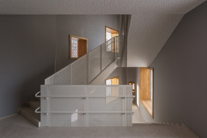
Instead, the architects proposed a closed rectangular contour. The courtyard evolved into a multifunctional atrium, joined by a block of small gyms, sanitary and technical rooms, resulting in most of the outer contour being free for classrooms. Vertical connections between the floors are located in the corner staircases. All of this allowed for looping corridors, avoiding dead ends, maintaining clear navigation while offering a variety of routes instead of going straight and up and down.

The concept. The school in “Evrobereg” district
Copyright: SVESMI © image courtesy by Brusnika


Another benefit is that the area of school spaces per student compared to typical projects is larger, and the volume of structures smaller. We remind you at this point that 825 students are planned.

  • zooming
    1 / 4
    Plan of the 1st floor. The school in “Evrobereg” district
    Copyright: SVESMI © image courtesy by Brusnika
  • zooming
    2 / 4
    Plan of the 2nd floor. The school in “Evrobereg” district
    Copyright: SVESMI © image courtesy by Brusnika
  • zooming
    3 / 4
    Plan of the 3rd floor. The school in “Evrobereg” district
    Copyright: SVESMI © image courtesy by Brusnika
  • zooming
    4 / 4
    Plan of the 4th floor. The school in “Evrobereg” district
    Copyright: SVESMI © image courtesy by Brusnika


Democracy of the Facades 

The school is located in an open area, at the intersection of two important streets, and is visible from many points of Evrobereg. Therefore, all the facades clad in terracotta Klinker brick are identical, and differ only in the entrance groups and the rhythmic pattern of the large windows: the classrooms have windows measuring 2.5 x 4.5 meters, and the canteen and music room have 14 x 3.2 and 10.6 x 3.2 meters. At nightfall, the school becomes a shining beacon, radiating light.

We have always been interested in the architecture of the so-called Amsterdam Association, which is famous for its picturesque brickwork and bold forms. Its architects were inspired by exotic motifs, the poetics of ships and forts, and always talked about architecture as an adventure. It was with this same spirit that we designed the school for learning and also as a space for games, communication and unpredictable events. We very much hope that the new image of the place we invented will make school life seem less monotonous to students.


The school in “Evrobereg” district
Copyright: Photograph © Dmitry Chebanenko / provided by Brusnika


The school in “Evrobereg” district
Copyright: Photograph © Natalia Bochkova / provided by Brusnika


The school in “Evrobereg” district
Copyright: Photograph © Natalia Bochkova / provided by Brusnika


The “folds” of the corner accents host the staircases. These strong verticals are identical, but each successive one rotates 90°, forming a “swirl” when viewed from above, and making each facade look slightly different from the “human” line of vision. The massive wall takes on the malleability of a sheet of paper, capable of turning into a crane or a ship in somebody’s skillful hands.

The school in “Evrobereg” district
Copyright: Photograph © Valery Kostyunin / provided by Brusnika


The school in “Evrobereg” district
Copyright: Photograph © Valery Kostyunin / provided by Brusnika


  • zooming
    1 / 4
    The school in “Evrobereg” district
    Copyright: Photograph © Valery Kostyunin / provided by Brusnika
  • zooming
    2 / 4
    The school in “Evrobereg” district
    Copyright: Photograph © Valery Kostyunin / provided by Brusnika
  • zooming
    3 / 4
    The school in “Evrobereg” district
    Copyright: Photograph © Valery Kostyunin / provided by Brusnika
  • zooming
    4 / 4
    The school in “Evrobereg” district
    Copyright: Photograph © Valery Kostyunin / provided by Brusnika


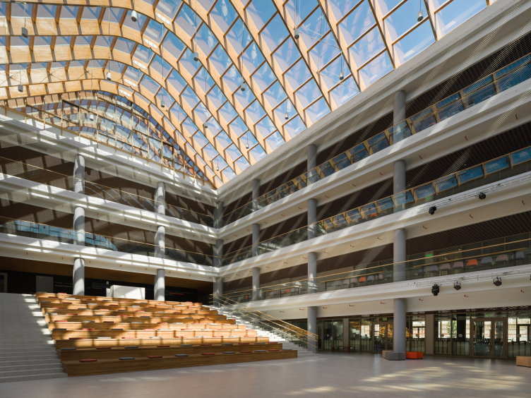
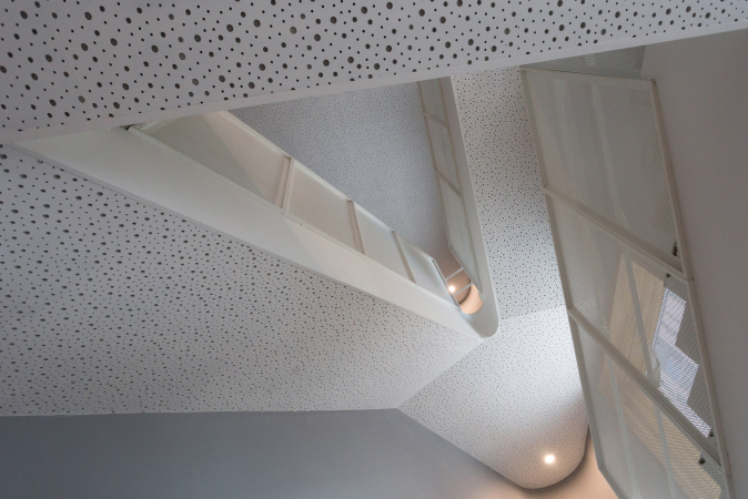
The smoothness of the angular accents echoes in the rounded pylons of the main entrance niche, as well as in the arch of the skylight. Because the utilities are hidden in the troughs and rooms on the first and last floors, the roof acts as a fifth façade. The folds of the stair walls protrude above it, “pointing” to the skylight made of bent wooden beams and stained glass windows.

The school in “Evrobereg” district
Copyright: Photograph © Valery Kostyunin / provided by Brusnika


The school in “Evrobereg” district
Copyright: Photograph © Valery Kostyunin / provided by Brusnika


The school in “Evrobereg” district
Copyright: Photograph © Dmitry Chebanenko / provided by Brusnika


The school in “Evrobereg” district
Copyright: Photograph © Natalia Bochkova / provided by Brusnika


The educational space

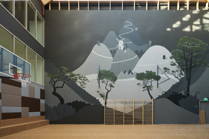
Classrooms of different sizes are located along the outer contour of the three facades and simultaneously around the inner core of the atrium. The canteen and gymnasium are located on the fourth north side. The classrooms are separated from the corridors by glass partitions, which expose the educational process and allow natural light to permeate the entire building.

The school in “Evrobereg” district
Copyright: Photograph © Valery Kostyunin / provided by Brusnika


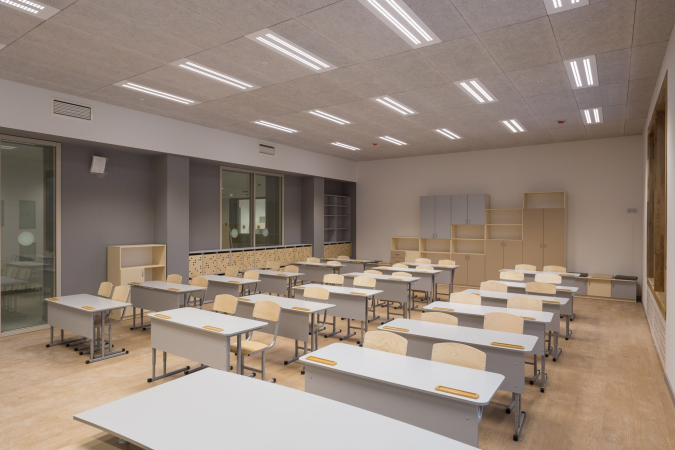
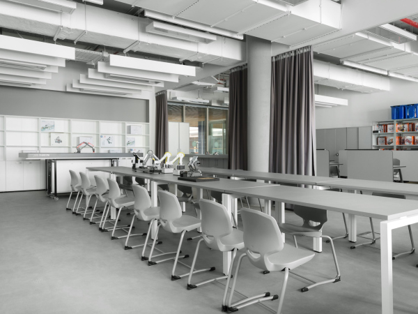
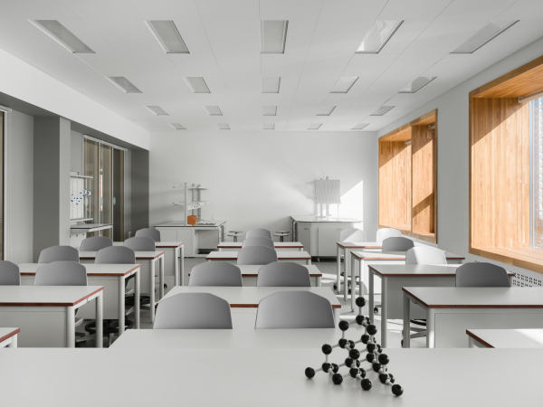
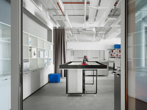
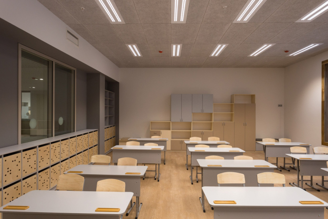
Specialized classrooms have been replaced by clusters – media and art, sports, science, and technology. At the same time, all classrooms are cross-functional and can be used to study several subjects. Their size and configuration allow for adapting to different methods of the educational process: mobile furniture can be quickly rearranged and the classroom can be prepared for a regular lesson, group work, discussion, or informal classes. About ten laboratories and workshops are designed for creative classes and after-school groups.

  • zooming
    1 / 7
    The school in “Evrobereg” district
    Copyright: Photograph © Valery Kostyunin / provided by Brusnika
  • zooming
    2 / 7
    The school in “Evrobereg” district
    Copyright: Photograph © Valery Kostyunin / provided by Brusnika
  • zooming
    3 / 7
    The school in “Evrobereg” district
    Copyright: Photograph © Natalia Bochkova / provided by Brusnika
  • zooming
    4 / 7
    The school in “Evrobereg” district
    Copyright: Photograph © Dmitry Chebanenko / provided by Brusnika
  • zooming
    5 / 7
    The school in “Evrobereg” district
    Copyright: Photograph © Dmitry Chebanenko / provided by Brusnika
  • zooming
    6 / 7
    The school in “Evrobereg” district
    Copyright: Photograph © Dmitry Chebanenko / provided by Brusnika
  • zooming
    7 / 7
    The school in “Evrobereg” district
    Copyright: Photograph © Valery Kostyunin / provided by Brusnika


The Social Life

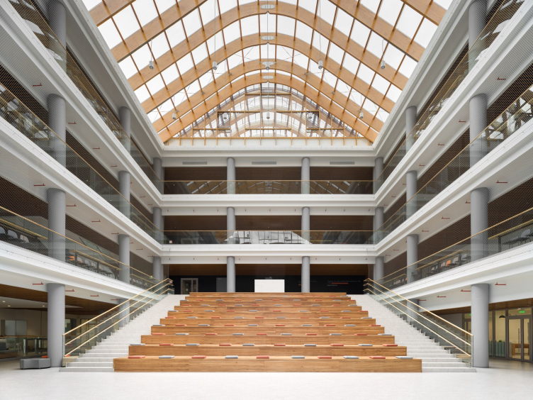
School life pulsates in the atrium with an amphitheater. Most of the time, it serves as an indoor plaza for meetings, reading, games, and recess. It also assumes the function of an auditorium, convenient for ceremonial meetings, film screenings, concerts, and plays. A timber-framed skylight floods the atrium and corridor galleries with natural light; from the galleries, almost the entire school can be seen.

The school in “Evrobereg” district
Copyright: Photograph © Dmitry Chebanenko / provided by Brusnika


The school in “Evrobereg” district
Copyright: Photograph © Dmitry Chebanenko / provided by Brusnika


The school in “Evrobereg” district
Copyright: Photograph © Dmitry Chebanenko / provided by Brusnika


On the first tier level, the atrium is connected to the music room and a 400-seat dining room. These rooms have access to terraces where students and teachers can hold informal classes, picnics, and just enjoy the fresh air.

The school in “Evrobereg” district
Copyright: Photograph © Dmitry Chebanenko / provided by Brusnika


The school in “Evrobereg” district
Copyright: Photograph © Dmitry Chebanenko / provided by Brusnika

 
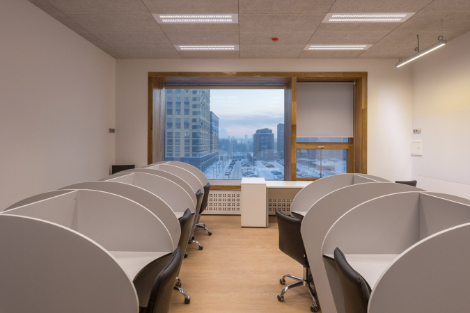
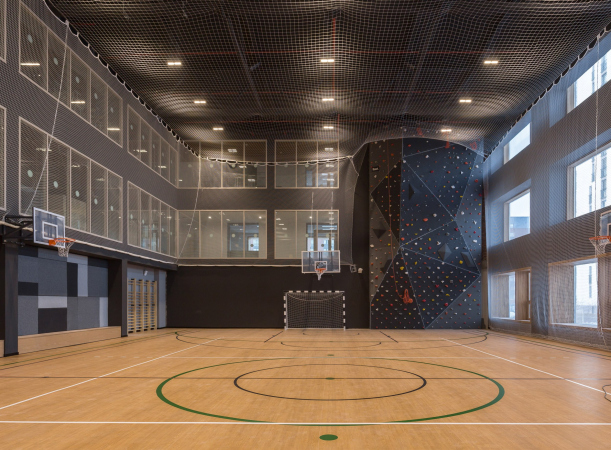
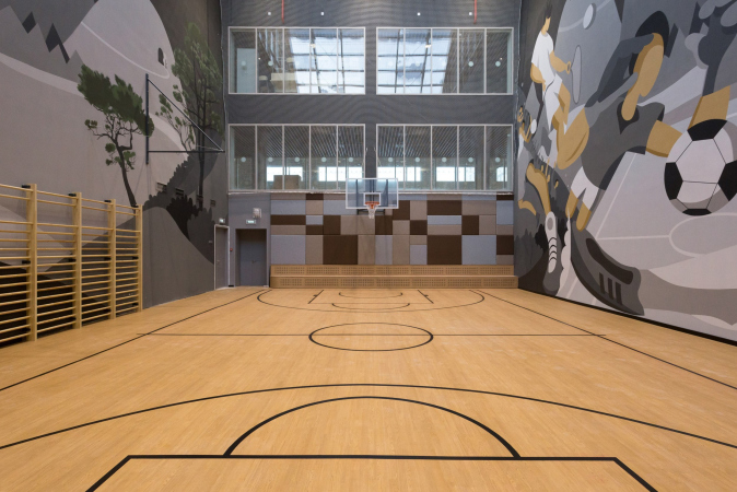
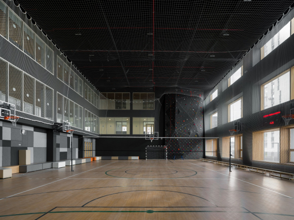
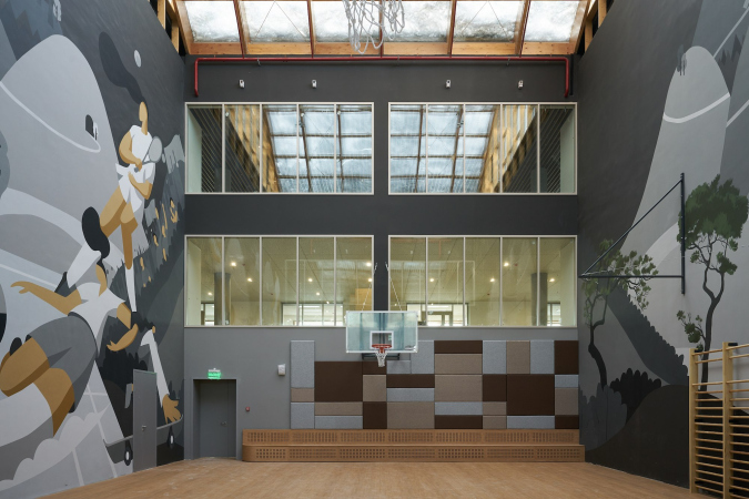
The media cluster combines a library, lab, press center, co-working space, and book repository. The teachers’ lounge is conceived as an administrative open space with six zones: an open space for teachers to work and relax, an office, a secretariat, meeting rooms, a kitchenette, and the principal’s desk. Transparent partitions add to the openness of the teachers’ work. There are two gyms: the small one adjoins the atrium, and the large one faces the northern façade.

  • zooming
    1 / 5
    The school in “Evrobereg” district
    Copyright: Photograph © Valery Kostyunin / provided by Brusnika
  • zooming
    2 / 5
    The school in “Evrobereg” district
    Copyright: Photograph © Natalia Bochkova / provided by Brusnika
  • zooming
    3 / 5
    The school in “Evrobereg” district
    Copyright: Photograph © Valery Kostyunin / provided by Brusnika
  • zooming
    4 / 5
    The school in “Evrobereg” district
    Copyright: Photograph © Natalia Bochkova / provided by Brusnika
  • zooming
    5 / 5
    The school in “Evrobereg” district
    Copyright: Photograph © Dmitry Chebanenko / provided by Brusnika


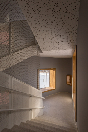
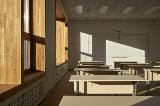
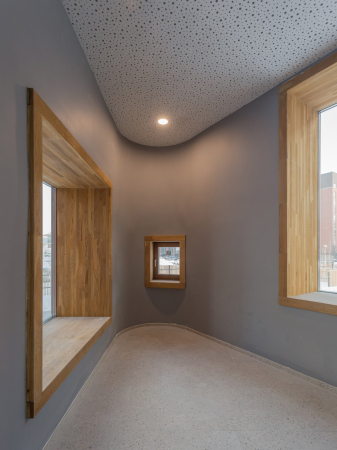
Wood and concrete are used in the finishing of all rooms. The window panes are coated with a special coating that protects the rooms from overheating in summer and keeps them warm in winter. The navigation and layout of the rooms are comfortable for children with hearing, vision, or mobility impairments.

The school in “Evrobereg” district
Copyright: Photograph © natalia Bochkova / provided by Brusnika


The school in “Evrobereg” district
Copyright: Photograph © Dmitry Chebanenko / provided by Brusnika


The school in “Evrobereg” district
Copyright: Photograph © Dmitry Chebanenko / provided by Brusnika


Open air lessons

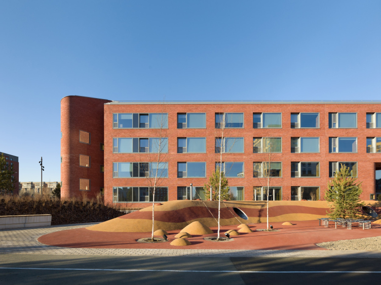
For the landscaping, Brusnika invited the Novascape company, which was able to continue the educational process outside the walls and adapt the area to different functions. On the green slopes with wooden decking and pavilions you can relax or do your homework. The sports field for ball games simultaneously acts as an amphitheater and open-air laboratory. The workout and active play area with slides, balancers, trampolines, and climbing walls will help switch from mental to physical activity. In winter, an ice rink can be poured and a ski track can be laid.

The school in “Evrobereg” district
Copyright: Photograph © Dmitry Chebanenko / provided by Brusnika

The school in “Evrobereg” district
Copyright: Photograph © Dmitry Chebanenko / provided by Brusnika

In this project, we decided not to experiment with plants, and selected plants that are low-maintenance, resistant to the climatic conditions of Siberia. Around the perimeter of the site, there will appear 107 pine and poplar trees with a height of 8-12 meters, inside, there will be small linden, berry apple tree, small-leaved birch and bird cherry. The latter will bloom and give shade from the first year. The green “mass” will be formed by shrubs and perennials, selected according to the flourish calendar, and by grasses. Bushes will become buffers – meaning, they will divide zones of active games and quiet rest. About 17,000 plants will be planted here during the season.
In winter, the area won’t look like a black-and-white movie either. Coniferous trees will make the landscape attractive even in the cold season. With the onset of warmer days, the students will be able to grow greens and vegetables in the school vegetable garden, dine on the outdoor terrace, and study botany with live examples growing in the courtyard.


The school in “Evrobereg” district
Copyright: Photograph © Valery Kostyunin / provided by Brusnika


***

The school project, as was already mentioned, is included in the practice of reapplication in the Ministry of Construction of the Russian Federation, that is, it can be replicated at the federal and regional levels. The architects believe that only the key principles and approaches should be standardized, but each individual school should claim an identity of its own.
The school in “Evrobereg” district
Copyright: Photograph © Valery Kostyunin / provided by Brusnika
The school in “Evrobereg” district
Copyright: Photograph © Dmitry Chebanenko / provided by Brusnika

01 June 2023

Headlines now
The Golden Crown
The concept for a dental clinic in Yekaterinburg, developed by CNTR Studio, revolves around the idea of a “mouth full of gold”: pristine white porcelain stoneware walls are complemented by matte brass details. To avoid an overly literal interpretation, the architects focused on the building’s proportions, skillfully navigating between sunlight requirements and fire safety regulations.
Flexibility and Integration
Not long ago, we covered the project for the fourth phase of the ÁLIA residential complex, designed by APEX. Now, we’ve been shown different fence concepts they developed to enclose the complex’s private courtyards, incorporating a variety of public functions. We believe that the sheer fact that the complex’s architects were involved in such a detail as fencing speaks volumes.
A Step Forward
The HIDE residential complex represents a major milestone for ADM architects and their leaders Andrey Romanov and Ekaterina Kuznetsova in their quest for a fresh high-rise aesthetic – one that is flexible and layered, capable of bringing vibrancy to mass and silhouette while shaping form. Over recent years, this approach has become ADM’s “signature style”, with the golden HIDE tower playing a pivotal role in its evolution. Here, we delve into the project’s story, explore the details of the complex’s design, and uncover its core essence.
Gold in the Sands
A new office for a transcontinental company specializing in resource extraction and processing has opened in Dubai. Designed by T+T Architects, masters of creating spaces that are contemporary, diverse, flexible, and original, this project exemplifies their expertise. On the executive floor, a massive brass-clad partition dominates, while layered textures of compressed earth create a contextually resonant backdrop.
Layers and Levels of Flight
This project goes way back – Reserve Union won this architectural competition at the end of 2011, and the building was completed in 2018, so it’s practically “archival”. However, despite being relatively unknown, the building can hardly be considered “dated” and remains a prime example of architectural expression, particularly in the headquarters genre. And it’s especially fitting for an aviation company office. In some ways, it resembles the Aeroflot headquarters at Sheremetyevo but with its own unique identity, following the signature style of Vladimir Plotkin. In this article, we take an in-depth look at the United Aircraft Corporation (UAC) headquarters in the Moscow agglomeration town of Zhukovsky, supplemented by recent photographs from Alexey Naroditsky – a shoot that became only recently possible due to the fact that improvements were finally made in the surrounding area.
Light and Shadow
In this article, we delve into the architectural design of the “Chaika” house by DNK ag architects, which was recently completed in 2023 as part of the collection of signature designs at ZILArt. As is well-known, all the buildings in this complex follow a design code, yet each one is distinct. This particular building stands out not only for its whiteness and minimalism but also for the refined use of a limited number of techniques that, together, create what can confidently be called synergy.
Casus Novae
A master plan was developed for a large residential area with a name of “DNS City”, but now that its implementation began, the plan has been arbitrarily reformatted and replaced with something that, while similar on the surface, is actually quite different. This is not the first time such a thing happens, but it’s always frustrating. With permission from the author, we are sharing Maria Elkina’s post.
Treasure Hunting
The GAFA bureau, in collaboration with Tegola and Arkhitail, organized an expedition to the island of Kilpola in Karelia as part of Moskomarkhitektura’s “Open City” festival. There, amidst moss and rocks, the students sought answers to questions like: what is the sacred, where does it dwell, and what sustains it? Assisting the participants in this quest were landscape engineer Evgeny Levin, artist Nicholas Roerich, a moose, and the lack of cellular connection. Here’s how the story unfolded.
Depths of the Earth, Streams of Water
In the Malaya Okhta district, the Akzent building, designed by Stepan Liphart, was constructed. It follows a classic tripartite structure, yet it’s what you might call “hand-drawn”: each façade is unique in its form and details, some of which aren’t immediately noticeable. In this article, we explore the context and, together with the architect, delve into how the form was developed.
Fir Tree Dynamics
The “Airports of Region” holding is planning to build an airport in Karachay-Cherkessia, aiming to make the Arkhyz and Dombay resorts more accessible to travelers. The project that won in an invitation-only competition, submitted by Sergey Nikeshkin’s KPLN, blends natural imagery inspired by the shape of a conifer seed, open-air waiting spaces, majestic large trees, and a green roof elevated on needle-like columns. The result is both nature-inspired and WOW.
​A Brick Shell
In the process of designing a clubhouse situated among pine trees in a prestigious suburban area near Moscow, the architectural firm “A.Len” did the façade design part. The combination of different types of brick and masonry correlates with the volumetric and plastique solutions, further enhanced by the inclusion of wood-painted fragments and metal “glazing”.
Word Forms
ATRIUM architects love ambitious challenges, and for the firm’s thirtieth anniversary, they boldly play a game of words with an exhibition that dives deep into a self-created vocabulary. They immerse their projects – especially art installations – into this glossary, as if plunging into a current of their own. You feel as if you’re flowing through the veins of pure art, immersed in a universe of vertical cities, educational spaces – of which the architects are true masters – and the cultural codes of various locations. But what truly captivates is the bold statement that Vera Butko and Anton Nadtochy make, both through their work and this exhibition: architecture, above all, is art – the art of working with form and space.
Flexibility and Acuteness of Modernity
Luxurious, fluid, large “kokoshniks” and spiral barrel columns, as if made from colorful chewing gum: there seem to be no other mansion like this in Moscow, designed in the “Neo-Russian-Modern” style. And the “Teremok” on Malaya Kaluzhskaya, previously somewhat obscure, has “come alive with new colors” and gained visibility after its restoration for the office of the “architectural ecosystem” as the architects love to call themselves. It’s evident that Julius Borisov and the architects at UNK put their hearts into finding this new office and bringing it up to date. Let’s delve into the paradoxes of this mansion’s history and its plasticity. Spoiler: two versions of modernity meet here, both balancing on the razor’s edge of “what’s current”.
Yuri Vissarionov: “A modular house does not belong to the land”
It belongs to space, or to the air... It turns out that 3D printing is more effective when combined with a modular approach: the house is built in a workshop and then adapted to the site, including on uneven terrain. Yuri Vissarionov shares his latest experience in designing tourist complexes, both in central Russia and in the south. These include houseboats, homes printed from lightweight concrete using a 3D printer, and, of course, frame houses.
​Moscow’s First
“The quality of education largely depends on the quality of the educational environment”. This principle of the last decade has been realized by Sergey Skuratov in the project for the First Moscow Gymnasium on Rostovskaya Embankment in the Khamovniki district. The building seamlessly integrates into the complex urban landscape, responding both to the pedestrian flow of the city and the quiet alleyways. It skillfully takes advantage of the height differences and aligns with modern trends in educational space design. Let’s take a closer look.
Looking at the Water
The site of Villa Sonata stretches from the road to the water’s edge, offering its own shoreline, pier, and a picturesque river panorama. To reveal these sweeping views, Roman Leonidov “cut” the façade diagonally parallel to the river, thus getting two main axes for the house and, consequently, “two heads”. The internal core – two double-height spaces, a living room and a conservatory, with a “bridge” above them – makes the house both “transparent” and filled with light.
The White Wing
Well, it’s not exactly white. It’s more of a beige, white-stone structure that plays with the color of limestone – smoother surfaces are lighter, while rougher ones are darker. This wing unites various elements: it absorbs and interprets the surrounding themes. It responds to everything, yet maintains a cohesive expression – a challenging task! – while also incorporating recognizable features of its own, such as the dynamic cuts at the bottom, top, and middle.
Urban Dunes
The XSA Ramps team designed and built a three-part sports hub for a park in Rostov-on-Don, welcoming people of all ages and fitness levels. The skate plaza, pump track, and playground are all meticulously crafted with details that attract a diverse range of visitors. The technical execution of the shapes and slopes transforms this space into a kind of sculptural composition.
Proportional Growth
The project for the fourth phase of the ÁLIA residential area has been announced. The buildings are situated on an elongated plot – almost a “ray” that shoots out from the center of the area towards the river. Their layout reflects both a response to Moscow’s architectural preferences over the past 15 years, shifting “from blocks to towers”, and an interpretation of the neighboring business park designed by SOM. Additionally, the best apartments here are not located at the very top but closer to the middle, forming a glowing “waistline”.
The “Staircase” Building
In designing the “Details” residential complex in New Moscow, Rais Baishev spiced up the now-popular Moscow theme of a “courtyard” building with an idea drawn from the surrealist drawings by Maurits Escher. He envisioned the stepped silhouettes and descending slopes as a metaphysical mega-staircase, creating a key void within the courtyard that gave the project an internal “spine”. This concept is felt both in the building’s silhouette and on its façades.
Projection of the Quarter
No one doubted that the building that Vladimir Plotkin designed as part of the “Garden Quarters” would be the most modernist of all. And it turned out just that way: while adhering to the common design code, the building successfully combines brick and white stone, rhythmically responding to the neighboring building designed by Ostozhenka, yet tactfully and persistently making a few statements of its own. This includes the projection of the ideal urban development composition “14–9–6”, which can be found right next door, mathematical calculations, including those for various types of terraces (and perhaps the only reminder of the Soviet past of the Kauchuk rubber factory!), and the white “cross-stitch” pattern of the façade grid.
Domus Aurea
In this issue, we examine the “Tessinsky-1” house, designed by Sergey Skuratov and completed in 2023. Located in the middle of the Serebryanicheskaya Embankment district, at the intersection of its main streets, this house assumes a sort of “nodal” role: it not only responds to everything around it and preserves many memories of the former EMA factory within itself, but it weaves all this into a newly directed pattern, reconciling bright “gold” and dark-colored brick, largely with the help of the new, modern-yet-archaic Columba brick, which, come to think about it, is the most precious element here.
The Chimney of Nikola-Lenivets
In this issue, we are examining the “Obelisk House” designed by KATARSIS and built for the Arkhstoyanie 2023 festival. However, it was only finished later on, and this is why we are examining it now. It seems to us that after the “Obelisk House” appeared in Nikola-Lenivets, a dialogue and a few inner connections appeared between the temporary structures built here. These houses no longer look like “accidental neighbors”, more of which below.
​Periscope by the Bay
The jury awarded the second place in the competition for a public and cultural center in Petropavlovsk-Kamchatsky to the companies GORA (“Mountain”) and M4. In the consortium’s proposal, the building resembles a sperm whale with a calf swimming next to it or a periscope, whose lenses capture the most spectacular views from the surrounding landscape.
From Arcs to Dolmens
While working on the competition project for Petropavlovsk-Kamchatsky, ASADOV Architects prioritized the value of the natural and urban environment, aiming to preserve the balance of the location while minimizing the resemblance of the volume that they designed to a “traditional building”. The task was challenging, and the architects created three versions, one of which having been developed after the competition, where their main proposal took third place. However, the point of interest here is not the competition result but the continuity of creative thinking.
Hide and Seek
The ID Moskovskiy house, designed by Stepan Liphart in St. Petersburg, in the courtyards near Moskovskiy Avenue beyond the Obvodny Canal and recently completed, is notable for several reasons. Firstly, it has been realized with considerable accuracy, which is particularly significant as this is the first building where the architect was responsible not only for the facades but also for the layouts, allowing for better integration between the two. On the other hand, this building is interesting as an example of the “germination” of new architecture in the city: it draws on the best examples from the neighborhood and becomes an improved and developed sum of ideas found by the architect in the surrounding context.
The Big Twelve
Yesterday, the winners of the Moscow Mayor’s Architecture Award were announced and honored. Let’s take a look at what was awarded and, in some cases, even critique this esteemed award. After all, there is always room for improvement, right?
Above the Golden Horn
The residential complex “Philosophy” designed by T+T architects in Vladivostok, is one of the new projects in the “Golubinaya Pad” area, changing its development philosophy (pun intended) from single houses to a comprehensive approach. The buildings are organized along public streets, varying in height and format, with one house even executed in gallery typology, featuring a cantilever leaning on an art object.
Nuanced Alternative
How can you rhyme a square and space? Easily! But to do so, you need to rhyme everything you can possibly think of: weave everything together, like in a tensegrity structure, and find your own optics too. The new exhibition at GES-2 does just that, offering its visitor a new perspective on the history of art spanning 150 years, infused with the hope for endless multiplicity of worlds and art histories. Read on to see how this is achieved and how the exhibition design by Evgeny Ace contributes to it.
Blinds for Ice
An ice arena has been constructed in Domodedovo based on a project by Yuri Vissarionov Architects. To prevent the long façade, a technical requirement for winter sports facilities, from appearing monotonous, the architects proposed the use of suspended structures with multidirectional slats. This design protects the ice from direct sunlight while giving the wall texture and detail.