По-русски

A School of Our Time

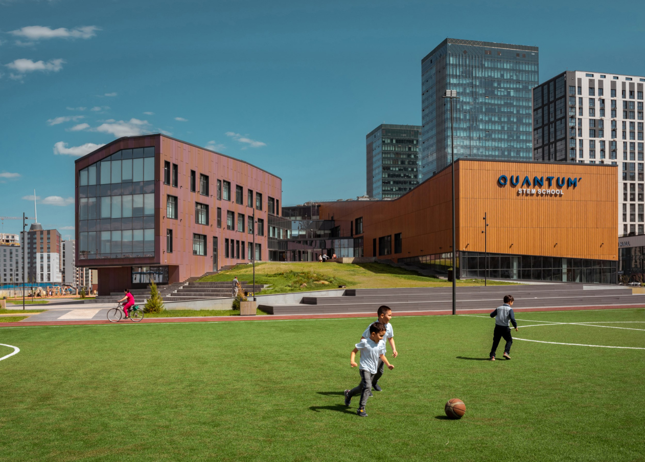
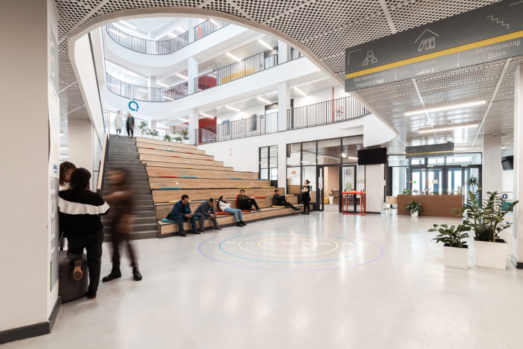
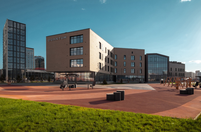
On the eve of the presentation of the new book by ATRIUM, dedicated to the design of schools and other educational facilities, based on the architects’ considerable experience, as well as expert judgments, we are examining the Quantum STEM school building, constructed according to their project in Astana. Furthermore, this building is planned to be the first one to start a new chain. The architects designed it in full accordance with modern standards but sometimes they did break away from them – only to confirm the general development rules. For example, there are two amphitheaters in the atrium, and there is an artificial hill in the yard that is meant to make the flat terrain of the Kazakhstan steppe more eventful.

14 February 2023
Object
mainImg
The Quantum STEM school in Astana is the first complete building of this private school network in Kazakhstan. Its principles are most modern and cutting-edge: to inspire, to develop, and to motivate the students, among other things, for “intellectual adventurism”. Also, the schools will pay special attention to technological disciplines and natural sciences, while instruction will be given in three languages: Kazakh, Russian, and English.

The design of the Quantum school buildings, which will be rather numerous in the country – at least two in Astana and Almaty each and one in Shymkent – was commissioned to ATRIUM architects as competent and efficient experts in modern school design.

Private school QUANTUM
Copyright: Photograph © Evgeny Tkachenko / provided by ATRIUM Architects


Private school QUANTUM
Copyright: Photograph © Evgeny Tkachenko / provided by ATRIUM Architects


One of these days, ATRIUM are presenting a book based on examples from their own practice of designing school buildings, as well as experts’ reviews and other materials – some sort of compendium on the issues of working with educational institutions. The architects have a tremendous 20-years’ experience in that, starting with the orphanage school in Moscow’s Kozhukhovo.

The Quantum school in Astana is the newest of the buildings designed by ATRIUM, whose construction is now complete, and this is why we decided to give a detailed coverage of this project now. And we do recommend reading the book too.

So far, we have worked on the concepts of three buildings within the Quantum STEM network of private schools. Schools in Almaty and Shymkent are still in the design stage, the building in Astana has been built in a surprisingly short time, from the delivery of the concept to the completion of construction and the start of the school in September 2021, only 9 months passed, which is very little. All the three projects are different, they are by no means “standardized”, and their architecture is highly individual; perhaps they are united by a common approach – in each case, volumes with different functions look different, but they “bleed together” through the public space of the atrium, which becomes the basis for movement and communication, and by spaces “flowing” into one another, which makes their perception more complex, and therefore interesting.

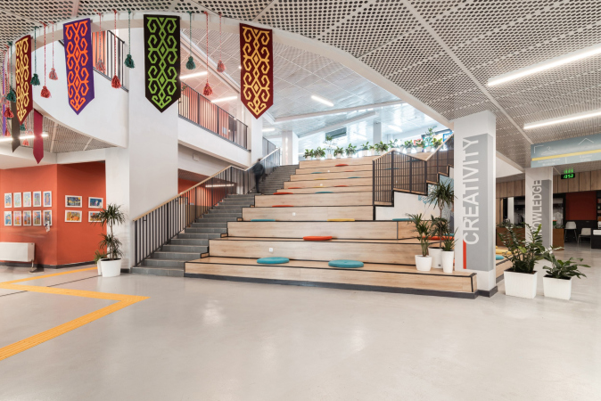
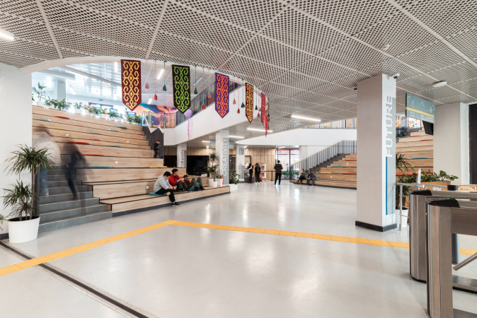
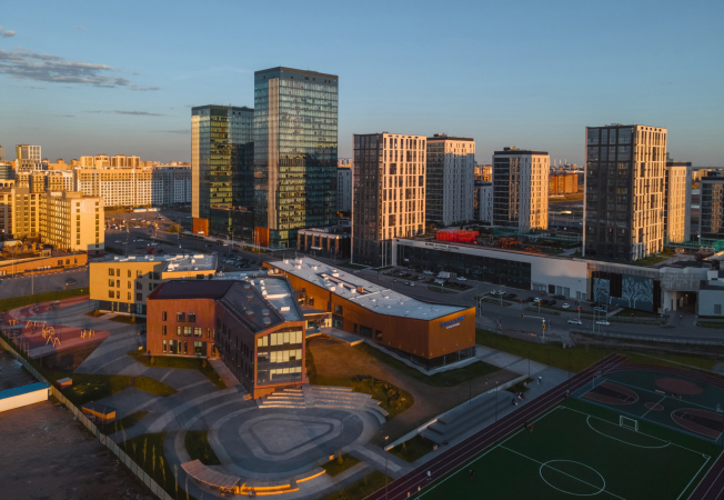
The task that was set for us in the case of a school in Astana was not exactly “exceptional”, but it was very close and interesting to us – all we were required to do was design a school based on the requirements of modern education: with a space that ensures de-confliction of streams, in particular, middle and high schools (children study here from the 6th grade) – and at the same time provides opportunities for communication, multifunctional use and creates a variety of ways of movement. For example, in this case, it is possible to reach the ground level from both first and second floors, and at the same time, the artificial hill creates – on a completely smooth and even terrain of Astana – a courtyard protected from the wind, not to mention the fact that the hill now commands sweeping views. Another feature is that in Astana we have not one, but two amphitheaters in a common atrium space, such a solution is not very common.

We also liked the client’s desire to make the building cutting-edge, convenient and relevant, without any specific references to national culture.


The school was built very fast, within 9 months. The ATRIUM architects developed the concept and consulted the Kazakh company that prepared the working documentation. It is only the interiors that were executed without the architects’ direct supervision, even though all the key ideas were also implemented here. On the whole, the authors are happy with the end result, even though they do not conceal their surprise at the incredible rate of its implementation.

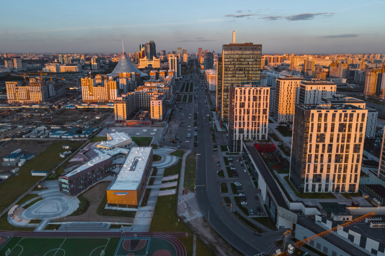
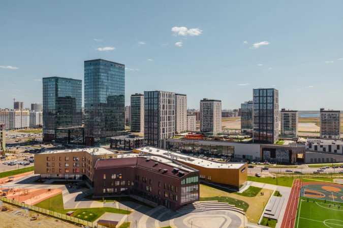
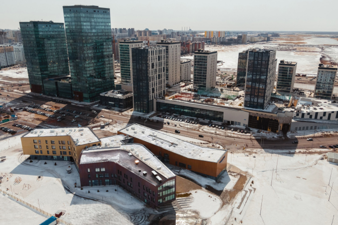
The school is located in the center of Astana, next to the central, regularly planned parks of the new capital. Norman Foster’s Khan’s Tent is 800 meters to the east. Nearby, across the street, there is a residential complex; the city in this part is growing and developing.

Private school QUANTUM
Copyright: Photograph © Evgeny Tkachenko / provided by ATRIUM Architects


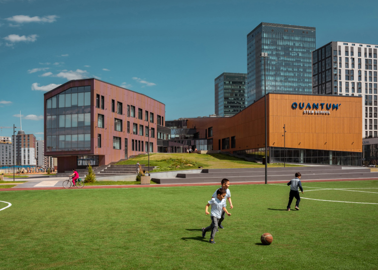
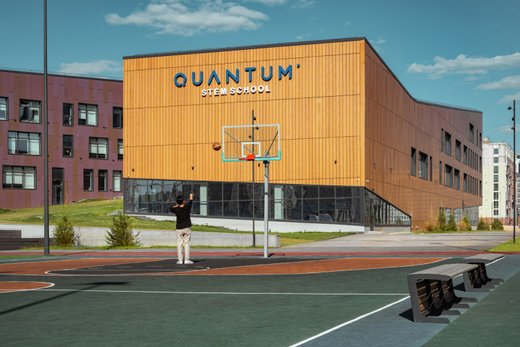
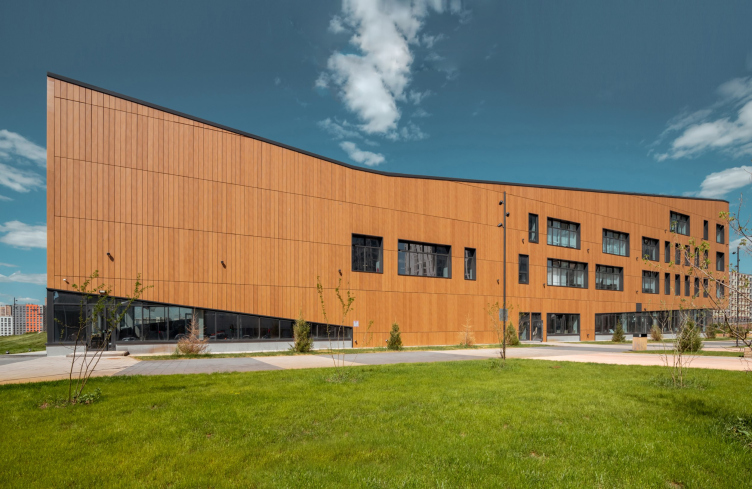
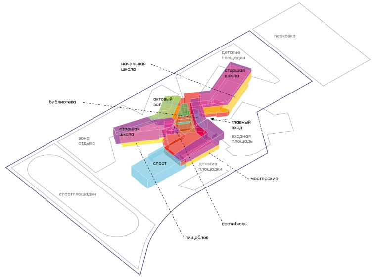
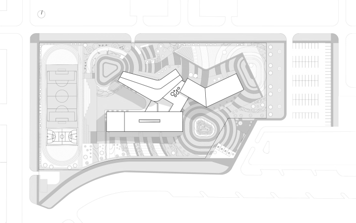
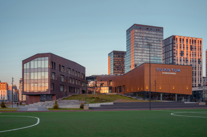
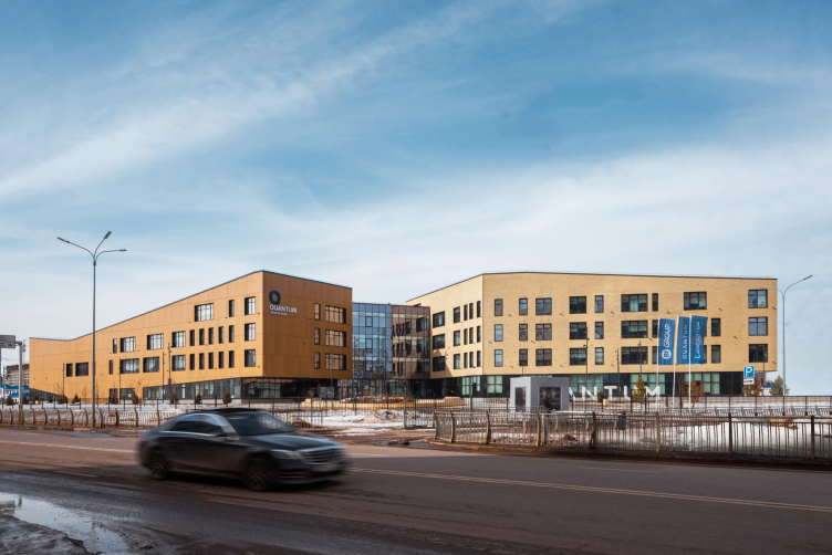
The building in fact consists of three units: the sports one stretches by the south border of the site; its elongated volume, coated with panels the color of warm yellow wood, has a roof that elevates towards both ends, so, when viewed from an angle, this unit looks a little bit like a swing, the effect being further strengthened by the glazing that expands from east to west.

Private school QUANTUM
Copyright: Photograph © Evgeny Tkachenko / provided by ATRIUM Architects


Private school QUANTUM
Copyright: Photograph © Evgeny Tkachenko / provided by ATRIUM Architects


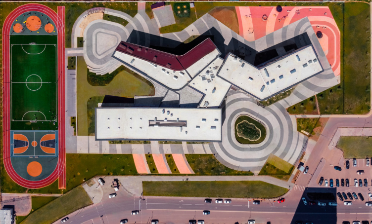
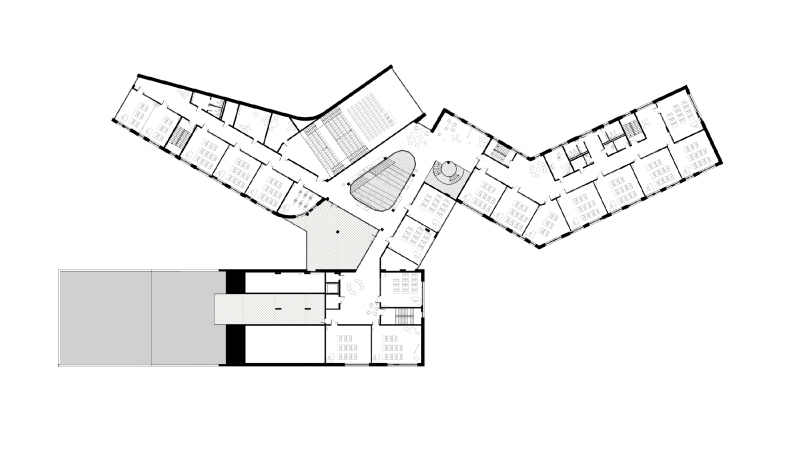
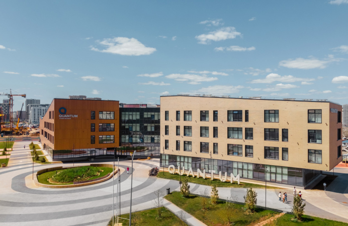
The two academic units: the western one (meant predominantly for grades 6-9), and the eastern one (meant for higher grades), are also bent like “bird signs”, each “spreading its wings”, which is clearly visible on the plan or drone footage.

Private school QUANTUM
Copyright: Photograph © Evgeny Tkachenko / provided by ATRIUM Architects


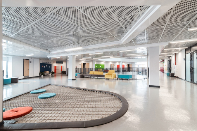
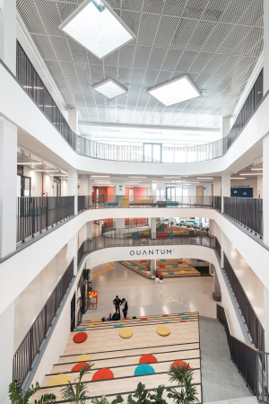
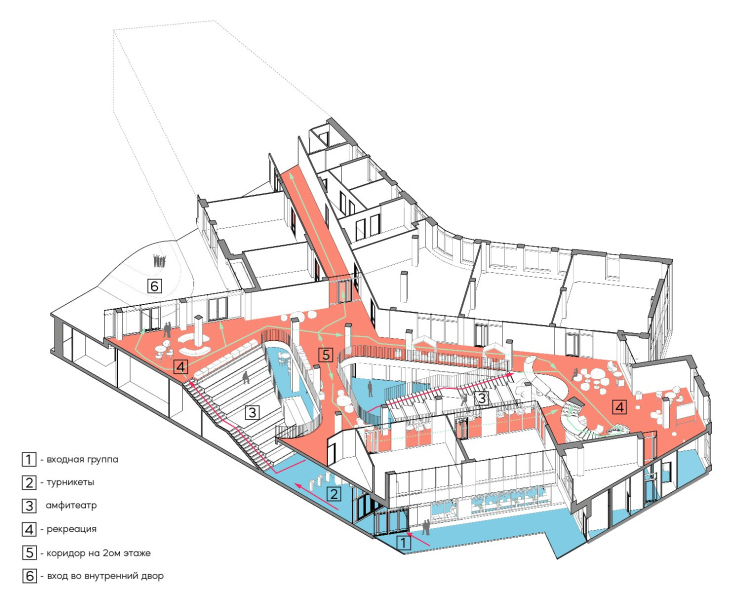
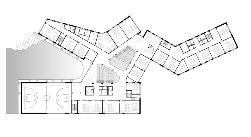
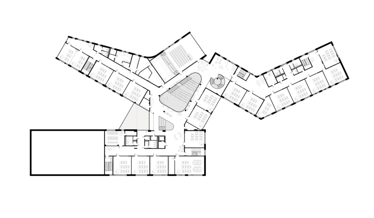
All the three units are connected by an atrium, and at this point we are remembering Anton Nadtochiy’s words that the atrium here is not just large, but also far from simple. It has two amphitheaters in it, veering up and to the sides from the central space; on the level of the second floor, there is an overpass that connects them. In the upper part, however, the amphitheaters develop in different ways. One of them is larger, and the third and fourth floors encircle it in galleries.

The other amphitheater is smaller. In the ceiling of the third floor above it, there is a triangle with a trampoline. All the extra safety measures have, of course, been observed, including double safety nets, and the experience of jumping on the trampoline will probably be unforgettable.

  • zooming
    1 / 4
    Private school QUANTUM
    Copyright: Photograph © Evgeny Tkachenko / provided by ATRIUM Architects
  • zooming
    2 / 4
    Private school QUANTUM
    Copyright: Photograph © Evgeny Tkachenko / provided by ATRIUM Architects
  • zooming
    3 / 4
    Private school QUANTUM
    Copyright: Photograph © Evgeny Tkachenko / provided by ATRIUM Architects
  • zooming
    4 / 4
    Private school QUANTUM
    Copyright: Photograph © Evgeny Tkachenko / provided by ATRIUM Architects


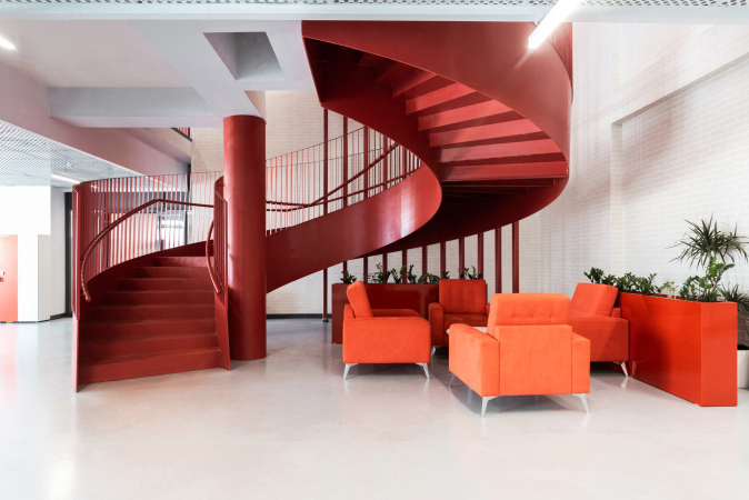
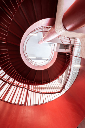
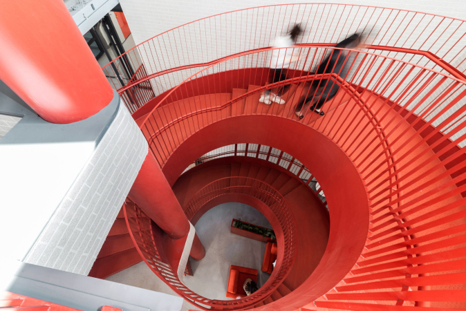
There is also a spiral staircase in the same atrium space – as the architects specify, you can ascend to the second floor by the amphitheaters, and then use the spiral staircase to get to the third and fourth.

  • zooming
    1 / 3
    Private school QUANTUM
    Copyright: Photograph © Evgeny Tkachenko / provided by ATRIUM Architects
  • zooming
    2 / 3
    Private school QUANTUM
    Copyright: Photograph © Evgeny Tkachenko / provided by ATRIUM Architects
  • zooming
    3 / 3
    Private school QUANTUM
    Copyright: Photograph © Evgeny Tkachenko / provided by ATRIUM Architects


The contained-space event hall is, of course, also there in the building; it is placed parallel to the large one consisting of the two amphitheaters in the upper floors of the west unit. The main entrance to it is from the top, from the gallery of the public space.

In a word, the center of the building receives a spatial core – I think this is the most adequate term. On the outside, it manifests itself in elevating the glass facades chamfered on the plan: there is a ziggurat that appears in the cavity between the units. On each of the roofs, there is a terrace, on which you can also walk out in summer. There are no skylights, but the atrium is well-lit through glass walls.

Private school QUANTUM
Copyright: Photograph © Evgeny Tkachenko / provided by ATRIUM Architects


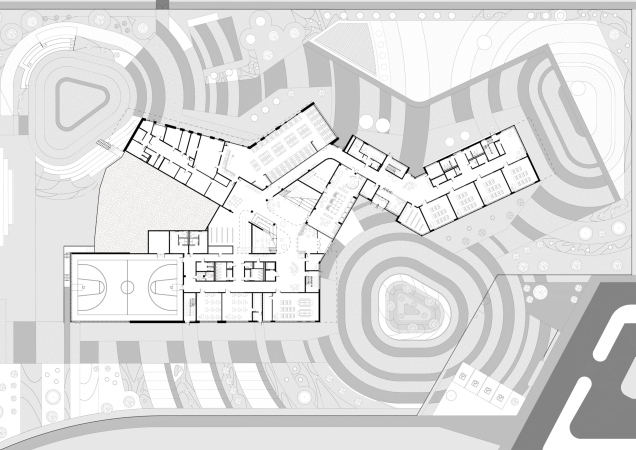
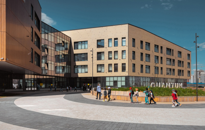
Thus, the central spatial core “grows through” to the outside world: you can enter and exit at different levels, and the multilevel quality of the inner space is further developed in the landscape forms closest to the building. As we remember, you can exit to the hill from the level of the second floor, having entered on the first and ascending the staircase of one of the amphitheaters: this is how a spatial “loop” appears that connects the outer and the inner spaces.

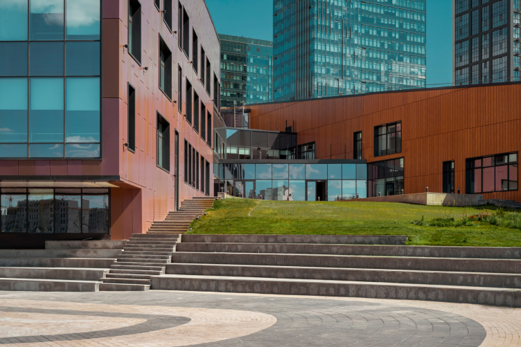
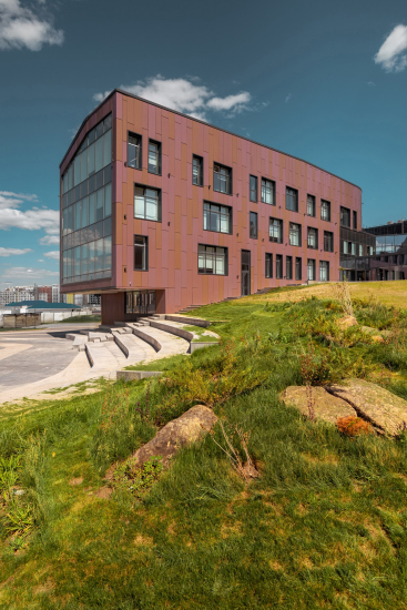
We must remember, however, that the steppe-encircled Astana is a pretty windy place. This is why the hill has not just aesthetic value but it also protects the plaza before the entrance from hard winds that do occur here. The outdoor amphitheaters are made on the slopes of the hill, both on the inside and on the outside.

Private school QUANTUM
Copyright: Photograph © Evgeny Tkachenko / provided by ATRIUM Architects


The distribution of functions. Private school QUANTUM
Copyright: Photograph © Evgeny Tkachenko / provided by ATRIUM Architects


Curiously, the landscape – the contours of the hill and the pavement – is subjugated to the pattern of rounded lines that soften the angles of the triangles, which resembles the pavement pattern in the Symbol housing complex. The contours of the galleries in the atrium space are rounded – and this is how yet another kind of echoing appears – this time of the imagery nature – between the landscape on the outside and the public spaces inside.

  • zooming
    1 / 5
    Private school QUANTUM. Plan of the 1 floor
    Copyright: Photograph © Evgeny Tkachenko / provided by ATRIUM Architects
  • zooming
    2 / 5
    Private school QUANTUM. Plan of the 2 floor
    Copyright: Photograph © Evgeny Tkachenko / provided by ATRIUM Architects
  • zooming
    3 / 5
    Private school QUANTUM. Plan of the 3 floor
    Copyright: Photograph © Evgeny Tkachenko / provided by ATRIUM Architects
  • zooming
    4 / 5
    Private school QUANTUM. Plan of the 4 floor
    Copyright: Photograph © Evgeny Tkachenko / provided by ATRIUM Architects
  • zooming
    5 / 5
    Private school QUANTUM. The master plan
    Copyright: Photograph © Evgeny Tkachenko / provided by ATRIUM Architects


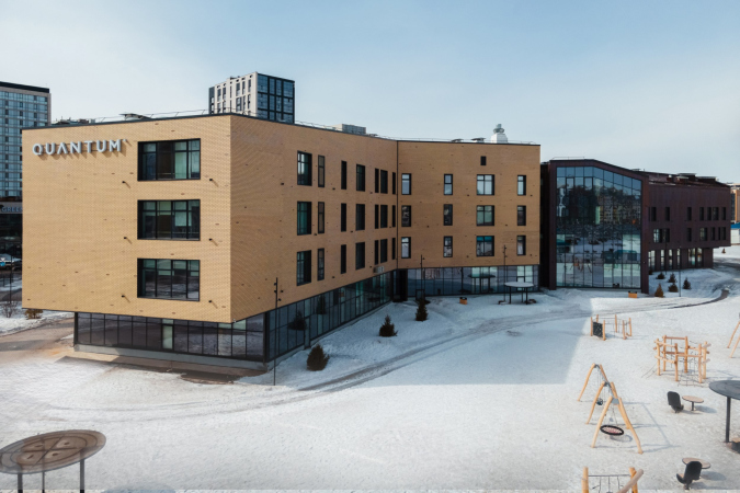
Meanwhile, the outlines of the units themselves – asymmetric and rather jagged – are rather based on collisions of planes than on curves. But then again, the construction, which looks almost symmetrical when viewed from one side, looks like a multibeam star on the outside, which is currently considered to be one of the best options for designing a modern school building because it yields a maximum amount of natural sunlight for the classrooms – the building clearly makes the most of the benefits of this approach.

  • zooming
    1 / 4
    Private school QUANTUM
    Copyright: Photograph © Evgeny Tkachenko / provided by ATRIUM Architects
  • zooming
    2 / 4
    Private school QUANTUM
    Copyright: Photograph © Evgeny Tkachenko / provided by ATRIUM Architects
  • zooming
    3 / 4
    Private school QUANTUM
    Copyright: Photograph © Evgeny Tkachenko / provided by ATRIUM Architects
  • zooming
    4 / 4
    Private school QUANTUM
    Copyright: Photograph © Evgeny Tkachenko / provided by ATRIUM Architects


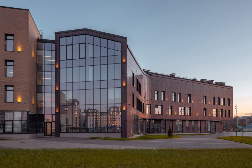
On the outside, the units look noticeably different – this helps the students get their bearings – but the contrast is not accentuated; rather, it is aimed at finding “faces of its own”, different and alike at the same time.
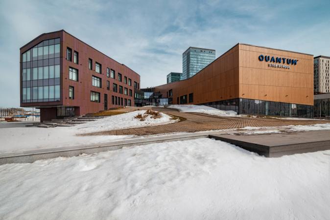
The junior high unit (grades 6-9) in the center is characterized by a crimson-brownish tone, and greater “flexibility” – this building is the only one here that has a rounded “breaking angle”, and even a pitched roof.

Its west pitch is covered with the same material as the facade; the side end of the event hall is encased in a contoured pentagon frame, a characteristic technique of modern architecture during the moments when you suddenly remember that you need to pay tribute to tradition. It even seems to me that this “pitched instance”, the only one in the entire complex, salutes to the dacha houses that survived on a moor to the north of the complex. Probably, they will soon disappear, but their “shadow” as the outline on the sidewall of the school building will remain.

  • zooming
    Private school QUANTUM
    Copyright: Photograph © Evgeny Tkachenko / provided by ATRIUM Architects
  • zooming
    Private school QUANTUM
    Copyright: Photograph © Evgeny Tkachenko / provided by ATRIUM Architects


The shape of the west unit is the most “tell-tale” of all; it gives the school complex a certain air of coziness, yet it does it very tactfully, staying within the limits of the nuance. The composition, however, is noticeably livened up, and it received a certain intrigue.

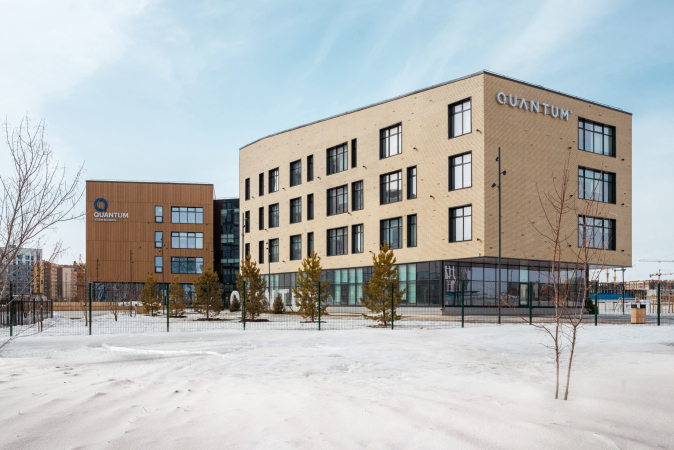
The other two units have a lighter color. The sports one is decorated with slender vertical panels with a “wood” effect, and the “high school” one is coated with light-colored brick. Their roofs, flat, yet inclined, resonate with each other.

Private school QUANTUM
Copyright: Photograph © Evgeny Tkachenko / provided by ATRIUM Architects


An important part is played by the cantilevers, there are several of them here, and you can only be surprised and happy with the fact that all these subtleties were implemented to a letter at such a short notice. Without them, the school would have been quite different. And form is something that is very important for a school if you really think of it as a place where personality develops.

  • zooming
    1 / 6
    Private school QUANTUM
    Copyright: Photograph © Evgeny Tkachenko / provided by ATRIUM Architects
  • zooming
    2 / 6
    Private school QUANTUM
    Copyright: Photograph © Evgeny Tkachenko / provided by ATRIUM Architects
  • zooming
    3 / 6
    Private school QUANTUM
    Copyright: Photograph © Evgeny Tkachenko / provided by ATRIUM Architects
  • zooming
    4 / 6
    Private school QUANTUM
    Copyright: Photograph © Evgeny Tkachenko / provided by ATRIUM Architects
  • zooming
    5 / 6
    Private school QUANTUM
    Copyright: Photograph © Evgeny Tkachenko / provided by ATRIUM Architects
  • zooming
    6 / 6
    Private school QUANTUM
    Copyright: Photograph © Evgeny Tkachenko / provided by ATRIUM Architects


Just as significant was the client’s request to design a “generally modern” school without any extra specifications. In this day and age, “modern” may mean both globalism and anti globalism, depending how you look at it, expressed in the search for identity that almost inevitably comes down to something overly ornamental, something that looks like a “steppe tent”. Such a search is exciting, yet at the same time there is a risk that it will muddle the process. At the same time, instruction, given in three different languages, is conducive to forming an open-minded worldview. So I think these people are on the right track.

The search for the spatial structure and architectural image of the new school is also, I think, productive. Generally speaking, for 10 years, if not more, there has been a lot of talk about how a modern, “efficient” school building can help the growth of personality. These conversations probably date back to the postwar 1950s. Is a building capable of shaping a person, changing him or her for the better, helping to develop with every of its cantilevers, floors, and windows? Something in this equation, of course, depends not only on the building, but also on the person and on other circumstances of his life, both in-school and extracurricular. Meanwhile, Vera Butko and Anton Nadtochiy believe in the healing role of architecture, as it seems, quite sincerely, and are engaged in school projects with full dedication.

And they also promised us to show their book about schools pretty soon.

14 February 2023

Headlines now
The Golden Crown
The concept for a dental clinic in Yekaterinburg, developed by CNTR Studio, revolves around the idea of a “mouth full of gold”: pristine white porcelain stoneware walls are complemented by matte brass details. To avoid an overly literal interpretation, the architects focused on the building’s proportions, skillfully navigating between sunlight requirements and fire safety regulations.
Flexibility and Integration
Not long ago, we covered the project for the fourth phase of the ÁLIA residential complex, designed by APEX. Now, we’ve been shown different fence concepts they developed to enclose the complex’s private courtyards, incorporating a variety of public functions. We believe that the sheer fact that the complex’s architects were involved in such a detail as fencing speaks volumes.
A Step Forward
The HIDE residential complex represents a major milestone for ADM architects and their leaders Andrey Romanov and Ekaterina Kuznetsova in their quest for a fresh high-rise aesthetic – one that is flexible and layered, capable of bringing vibrancy to mass and silhouette while shaping form. Over recent years, this approach has become ADM’s “signature style”, with the golden HIDE tower playing a pivotal role in its evolution. Here, we delve into the project’s story, explore the details of the complex’s design, and uncover its core essence.
Gold in the Sands
A new office for a transcontinental company specializing in resource extraction and processing has opened in Dubai. Designed by T+T Architects, masters of creating spaces that are contemporary, diverse, flexible, and original, this project exemplifies their expertise. On the executive floor, a massive brass-clad partition dominates, while layered textures of compressed earth create a contextually resonant backdrop.
Layers and Levels of Flight
This project goes way back – Reserve Union won this architectural competition at the end of 2011, and the building was completed in 2018, so it’s practically “archival”. However, despite being relatively unknown, the building can hardly be considered “dated” and remains a prime example of architectural expression, particularly in the headquarters genre. And it’s especially fitting for an aviation company office. In some ways, it resembles the Aeroflot headquarters at Sheremetyevo but with its own unique identity, following the signature style of Vladimir Plotkin. In this article, we take an in-depth look at the United Aircraft Corporation (UAC) headquarters in the Moscow agglomeration town of Zhukovsky, supplemented by recent photographs from Alexey Naroditsky – a shoot that became only recently possible due to the fact that improvements were finally made in the surrounding area.
Light and Shadow
In this article, we delve into the architectural design of the “Chaika” house by DNK ag architects, which was recently completed in 2023 as part of the collection of signature designs at ZILArt. As is well-known, all the buildings in this complex follow a design code, yet each one is distinct. This particular building stands out not only for its whiteness and minimalism but also for the refined use of a limited number of techniques that, together, create what can confidently be called synergy.
Casus Novae
A master plan was developed for a large residential area with a name of “DNS City”, but now that its implementation began, the plan has been arbitrarily reformatted and replaced with something that, while similar on the surface, is actually quite different. This is not the first time such a thing happens, but it’s always frustrating. With permission from the author, we are sharing Maria Elkina’s post.
Treasure Hunting
The GAFA bureau, in collaboration with Tegola and Arkhitail, organized an expedition to the island of Kilpola in Karelia as part of Moskomarkhitektura’s “Open City” festival. There, amidst moss and rocks, the students sought answers to questions like: what is the sacred, where does it dwell, and what sustains it? Assisting the participants in this quest were landscape engineer Evgeny Levin, artist Nicholas Roerich, a moose, and the lack of cellular connection. Here’s how the story unfolded.
Depths of the Earth, Streams of Water
In the Malaya Okhta district, the Akzent building, designed by Stepan Liphart, was constructed. It follows a classic tripartite structure, yet it’s what you might call “hand-drawn”: each façade is unique in its form and details, some of which aren’t immediately noticeable. In this article, we explore the context and, together with the architect, delve into how the form was developed.
Fir Tree Dynamics
The “Airports of Region” holding is planning to build an airport in Karachay-Cherkessia, aiming to make the Arkhyz and Dombay resorts more accessible to travelers. The project that won in an invitation-only competition, submitted by Sergey Nikeshkin’s KPLN, blends natural imagery inspired by the shape of a conifer seed, open-air waiting spaces, majestic large trees, and a green roof elevated on needle-like columns. The result is both nature-inspired and WOW.
​A Brick Shell
In the process of designing a clubhouse situated among pine trees in a prestigious suburban area near Moscow, the architectural firm “A.Len” did the façade design part. The combination of different types of brick and masonry correlates with the volumetric and plastique solutions, further enhanced by the inclusion of wood-painted fragments and metal “glazing”.
Word Forms
ATRIUM architects love ambitious challenges, and for the firm’s thirtieth anniversary, they boldly play a game of words with an exhibition that dives deep into a self-created vocabulary. They immerse their projects – especially art installations – into this glossary, as if plunging into a current of their own. You feel as if you’re flowing through the veins of pure art, immersed in a universe of vertical cities, educational spaces – of which the architects are true masters – and the cultural codes of various locations. But what truly captivates is the bold statement that Vera Butko and Anton Nadtochy make, both through their work and this exhibition: architecture, above all, is art – the art of working with form and space.
Flexibility and Acuteness of Modernity
Luxurious, fluid, large “kokoshniks” and spiral barrel columns, as if made from colorful chewing gum: there seem to be no other mansion like this in Moscow, designed in the “Neo-Russian-Modern” style. And the “Teremok” on Malaya Kaluzhskaya, previously somewhat obscure, has “come alive with new colors” and gained visibility after its restoration for the office of the “architectural ecosystem” as the architects love to call themselves. It’s evident that Julius Borisov and the architects at UNK put their hearts into finding this new office and bringing it up to date. Let’s delve into the paradoxes of this mansion’s history and its plasticity. Spoiler: two versions of modernity meet here, both balancing on the razor’s edge of “what’s current”.
Yuri Vissarionov: “A modular house does not belong to the land”
It belongs to space, or to the air... It turns out that 3D printing is more effective when combined with a modular approach: the house is built in a workshop and then adapted to the site, including on uneven terrain. Yuri Vissarionov shares his latest experience in designing tourist complexes, both in central Russia and in the south. These include houseboats, homes printed from lightweight concrete using a 3D printer, and, of course, frame houses.
​Moscow’s First
“The quality of education largely depends on the quality of the educational environment”. This principle of the last decade has been realized by Sergey Skuratov in the project for the First Moscow Gymnasium on Rostovskaya Embankment in the Khamovniki district. The building seamlessly integrates into the complex urban landscape, responding both to the pedestrian flow of the city and the quiet alleyways. It skillfully takes advantage of the height differences and aligns with modern trends in educational space design. Let’s take a closer look.
Looking at the Water
The site of Villa Sonata stretches from the road to the water’s edge, offering its own shoreline, pier, and a picturesque river panorama. To reveal these sweeping views, Roman Leonidov “cut” the façade diagonally parallel to the river, thus getting two main axes for the house and, consequently, “two heads”. The internal core – two double-height spaces, a living room and a conservatory, with a “bridge” above them – makes the house both “transparent” and filled with light.
The White Wing
Well, it’s not exactly white. It’s more of a beige, white-stone structure that plays with the color of limestone – smoother surfaces are lighter, while rougher ones are darker. This wing unites various elements: it absorbs and interprets the surrounding themes. It responds to everything, yet maintains a cohesive expression – a challenging task! – while also incorporating recognizable features of its own, such as the dynamic cuts at the bottom, top, and middle.
Urban Dunes
The XSA Ramps team designed and built a three-part sports hub for a park in Rostov-on-Don, welcoming people of all ages and fitness levels. The skate plaza, pump track, and playground are all meticulously crafted with details that attract a diverse range of visitors. The technical execution of the shapes and slopes transforms this space into a kind of sculptural composition.
Proportional Growth
The project for the fourth phase of the ÁLIA residential area has been announced. The buildings are situated on an elongated plot – almost a “ray” that shoots out from the center of the area towards the river. Their layout reflects both a response to Moscow’s architectural preferences over the past 15 years, shifting “from blocks to towers”, and an interpretation of the neighboring business park designed by SOM. Additionally, the best apartments here are not located at the very top but closer to the middle, forming a glowing “waistline”.
The “Staircase” Building
In designing the “Details” residential complex in New Moscow, Rais Baishev spiced up the now-popular Moscow theme of a “courtyard” building with an idea drawn from the surrealist drawings by Maurits Escher. He envisioned the stepped silhouettes and descending slopes as a metaphysical mega-staircase, creating a key void within the courtyard that gave the project an internal “spine”. This concept is felt both in the building’s silhouette and on its façades.
Projection of the Quarter
No one doubted that the building that Vladimir Plotkin designed as part of the “Garden Quarters” would be the most modernist of all. And it turned out just that way: while adhering to the common design code, the building successfully combines brick and white stone, rhythmically responding to the neighboring building designed by Ostozhenka, yet tactfully and persistently making a few statements of its own. This includes the projection of the ideal urban development composition “14–9–6”, which can be found right next door, mathematical calculations, including those for various types of terraces (and perhaps the only reminder of the Soviet past of the Kauchuk rubber factory!), and the white “cross-stitch” pattern of the façade grid.
Domus Aurea
In this issue, we examine the “Tessinsky-1” house, designed by Sergey Skuratov and completed in 2023. Located in the middle of the Serebryanicheskaya Embankment district, at the intersection of its main streets, this house assumes a sort of “nodal” role: it not only responds to everything around it and preserves many memories of the former EMA factory within itself, but it weaves all this into a newly directed pattern, reconciling bright “gold” and dark-colored brick, largely with the help of the new, modern-yet-archaic Columba brick, which, come to think about it, is the most precious element here.
The Chimney of Nikola-Lenivets
In this issue, we are examining the “Obelisk House” designed by KATARSIS and built for the Arkhstoyanie 2023 festival. However, it was only finished later on, and this is why we are examining it now. It seems to us that after the “Obelisk House” appeared in Nikola-Lenivets, a dialogue and a few inner connections appeared between the temporary structures built here. These houses no longer look like “accidental neighbors”, more of which below.
​Periscope by the Bay
The jury awarded the second place in the competition for a public and cultural center in Petropavlovsk-Kamchatsky to the companies GORA (“Mountain”) and M4. In the consortium’s proposal, the building resembles a sperm whale with a calf swimming next to it or a periscope, whose lenses capture the most spectacular views from the surrounding landscape.
From Arcs to Dolmens
While working on the competition project for Petropavlovsk-Kamchatsky, ASADOV Architects prioritized the value of the natural and urban environment, aiming to preserve the balance of the location while minimizing the resemblance of the volume that they designed to a “traditional building”. The task was challenging, and the architects created three versions, one of which having been developed after the competition, where their main proposal took third place. However, the point of interest here is not the competition result but the continuity of creative thinking.
Hide and Seek
The ID Moskovskiy house, designed by Stepan Liphart in St. Petersburg, in the courtyards near Moskovskiy Avenue beyond the Obvodny Canal and recently completed, is notable for several reasons. Firstly, it has been realized with considerable accuracy, which is particularly significant as this is the first building where the architect was responsible not only for the facades but also for the layouts, allowing for better integration between the two. On the other hand, this building is interesting as an example of the “germination” of new architecture in the city: it draws on the best examples from the neighborhood and becomes an improved and developed sum of ideas found by the architect in the surrounding context.
The Big Twelve
Yesterday, the winners of the Moscow Mayor’s Architecture Award were announced and honored. Let’s take a look at what was awarded and, in some cases, even critique this esteemed award. After all, there is always room for improvement, right?
Above the Golden Horn
The residential complex “Philosophy” designed by T+T architects in Vladivostok, is one of the new projects in the “Golubinaya Pad” area, changing its development philosophy (pun intended) from single houses to a comprehensive approach. The buildings are organized along public streets, varying in height and format, with one house even executed in gallery typology, featuring a cantilever leaning on an art object.
Nuanced Alternative
How can you rhyme a square and space? Easily! But to do so, you need to rhyme everything you can possibly think of: weave everything together, like in a tensegrity structure, and find your own optics too. The new exhibition at GES-2 does just that, offering its visitor a new perspective on the history of art spanning 150 years, infused with the hope for endless multiplicity of worlds and art histories. Read on to see how this is achieved and how the exhibition design by Evgeny Ace contributes to it.
Blinds for Ice
An ice arena has been constructed in Domodedovo based on a project by Yuri Vissarionov Architects. To prevent the long façade, a technical requirement for winter sports facilities, from appearing monotonous, the architects proposed the use of suspended structures with multidirectional slats. This design protects the ice from direct sunlight while giving the wall texture and detail.