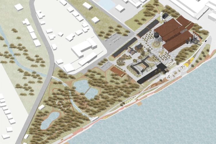
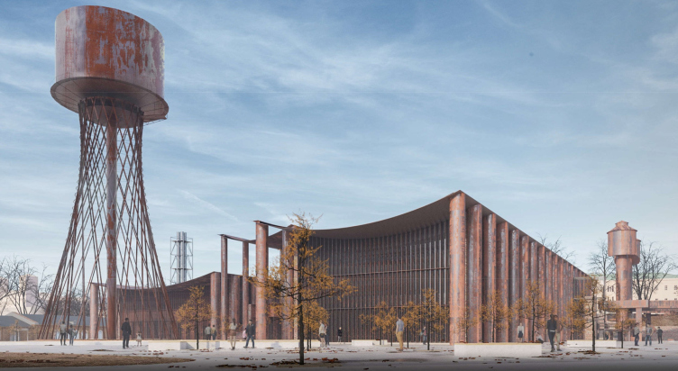
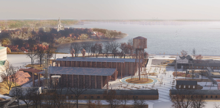
Meanwhile, the project of Shukhov Park is an initiative of a quite different scale. It is situated in the city center, stretching along the dam of the Verkhnevyksynsky Pond that has a protected status as a heritage site of local importance, because it was built still in the XVIII century. The park starts from the Metallurgov Square in front of the Batashevs palace, where now the museum house of these factory owners is situated. The embankment was landscaped in 2019 in accordance with the project developed by Wowhaus; this same company developed the concept for the entire park. Soon, key engineering exhibits from the Vyksa OMK plant will be moved over here, these being the water tower and the grid shell of the sheet rolling shop, both having to do with the engineering research by engineer Vladimir Shukhov. The park will also include the building of Quantorium, an educational technology park for children, which, in addition to standard laboratories, will feature a metallurgical quantumum, engineered specifically for Vyksa. The Quantorium is being designed by Ostozhenka and Andrey Gnezdilov; and the hotel, which will stretch along the embankment – by Front Architecture. In a word, this project is a resonant one, and in many respects unique, at least due to its sheer scale, and also because of the fact that the entire park is situated about 6 or 8 meters below the water level, like fields in the Netherlands.
As for the “Center of Industrial Progress” museum, this is the key, the most noticeable, and the fundamental part of the ambitious Vyksa project. The museum will be built on the territory of the Batashevs’ first iron foundry, which has existed here since the XVIII century (the dam was built specifically for it).
“Shukhov park”. Master plan. Vyksa, project, 2022. The Center of Industrial Progress is top right, in the northern part, next to the Metallurgov Square
Copyright: © Studio 44
In the project, developed by Nikita Yavein (Studio 44) and Sergey Padalko (Vitruvius and Sons), the building of the future museum justifies the ambitions connected with it: the architects not just set for themselves a task to competently design a public building (that’s something that’s expected!) – but to make the building bring forward and express the very essence and intrinsic nature of metal and metallurgy.
This project is very important to me. We were able to touch something that we rarely get to work with: the very origins, the primacy of the material, and something that I would describe as the basics of our material world and life in general. This is a kind of “pre-architecture”, an architecture that comes before architecture.
The main idea is that metal has the ability to stretch, whereas most of the traditional structures as we know them – brick and stone walls, domes, vaults – are designed to utilize compression. Of course, stretching has always existed as a kind of parallel culture in tents, including architectural ones. But the metal’s ability to stretch began to be used much later, in the constructions of the XX century, including Shukhov, and especially in the works of engineers of the post-war period. In my opinion, the building of the St. Petersburg CCM stadium, which has unfortunately been torn down now, was very characteristic in this sense: its sag, a kind of “belly” hanging over the interior space, was very spectacular, and it precisely stretching-based.
In the Vyksa project of the “Center of Industrial Progress”, we return this primary function and expressiveness of metal.
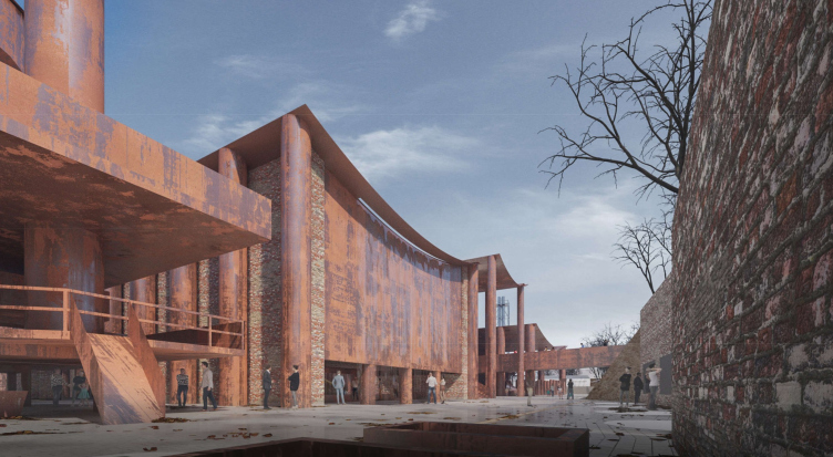
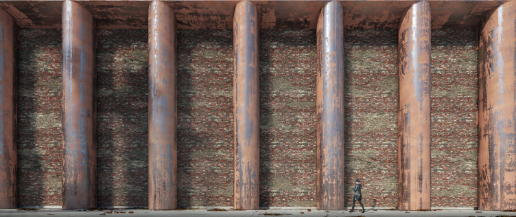
In addition, we plan to use only those materials that are available locally. The plant produces, among other things, pipes and rolled steel – we take pipes of different grades and make columns of the peripters out of these materials. We take rolled steel and make “stretching” ceilings out of it. All this will be made of natural metal, which will be naturally and gradually covered with a patina, turning into a semblance of Corten steel. We consider the rusting of metal to be also a sort of installation.
Nikita Yavein calls this museum “The Temple of Metal” or “The Temple of Hephaestus”.
It does look like a temple, or even a temple complex – an ancient monument of some Paestum archaic, austere and laconic, like a megalith, maybe unearthed or maybe growing from the earth, intrinsically wild and akin to this earth itself, from which, as a matter of fact, metal is extracted.
The museum complex “Center of Industrial Progress”, Vyksa, project, 2022
Copyright: © Studio 44
Of course, this project was a very interesting one; it is my personal favorite. There are a lot of unique things in it, starting from building things below the water level: walking down the embankment at the level of the city pavement, you will be able to see the roof of the two-tiered exhibition building, that’s for sure. We were very impressed with the place, the factory, and the Shukhov structures. There was a time when we were thinking about how to work with this material, like, what can be opposed to it? And I would say that we came up with something that to some extent can be considered as “anti-Shukhov”: the roof sheets that stretch between the columns are completely different, and at the same time their functioning is interesting from an engineering point of view. We calculated that a thickness of 6 mm would be enough, but we laid 8 mm as a margin of corrosion.
And I have been observing the process of patina formation for six months in real time: it was a pity to throw away the column that was part of our installation at the ArchMoscow exhibition – I took it to my country home, and it stands there, changing from month to month. This thing is really a living being – and I think that it will be exciting to watch this effect on the scale of a whole building.
And I have been observing the process of patina formation for six months in real time: it was a pity to throw away the column that was part of our installation at the ArchMoscow exhibition – I took it to my country home, and it stands there, changing from month to month. This thing is really a living being – and I think that it will be exciting to watch this effect on the scale of a whole building.
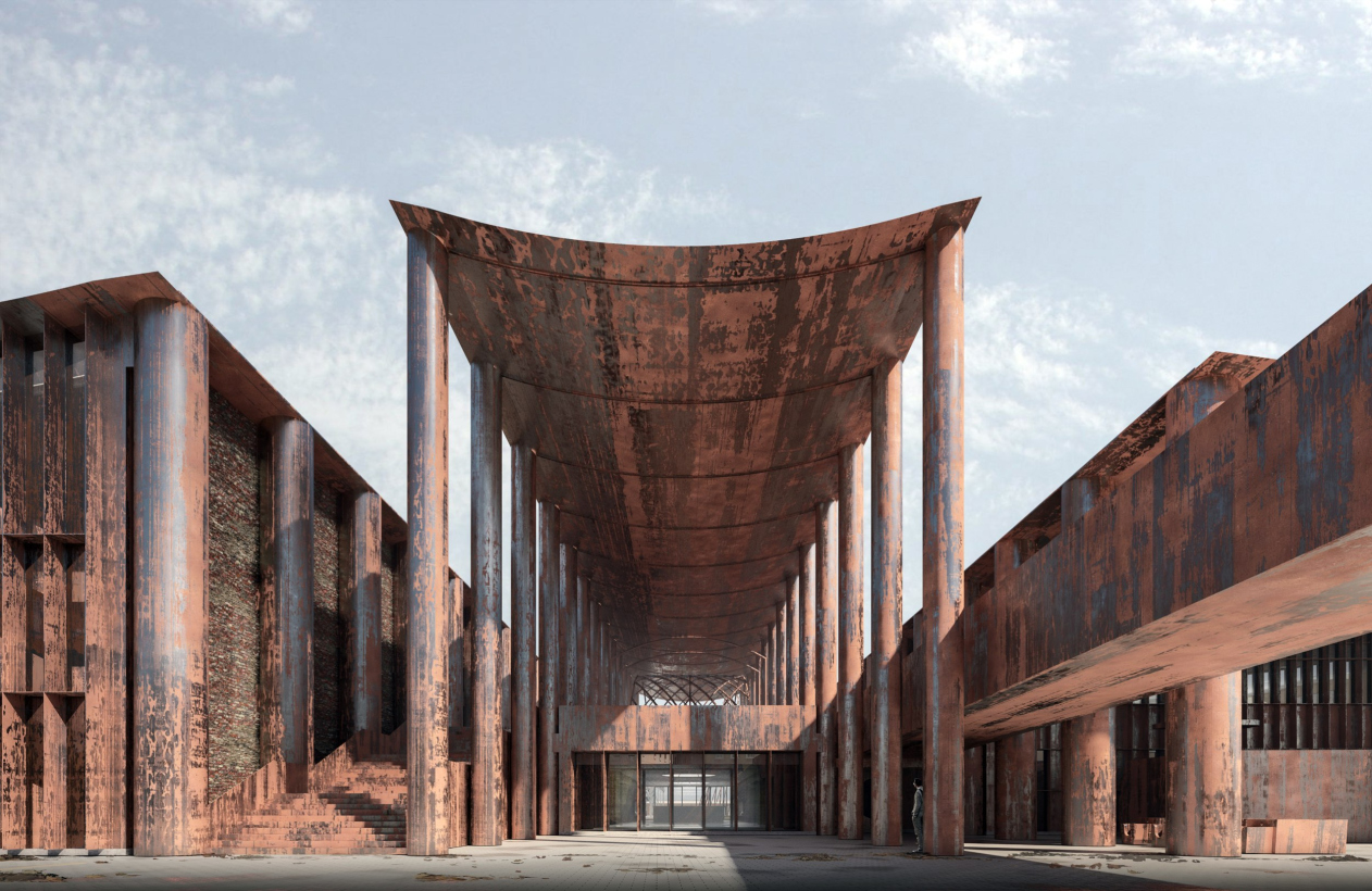
First things first, though. The territory stretches along the pond bank, starting from the Metallurgov Square in front of the Batashevs house. Here, in the north part, three museum buildings of different size and width are situated, standing parallel to one another and the bank. Each of the volumes is a “peripter”, even though the term is not quite accurate because the columns (which are in fact metal pipes of varying diameter!) are only present on the longitudinal sides. Between the rows of columns, the architects “suspended” metal sheets that form the ceilings. The metal sheets will be exposed, and the water will simply flow down at a small angle, in the most natural of ways. Only in the warm contour, a ceiling with heat insulation is provided.
Thus, the structure is as exposed as can be, and a certain bravado of metal can be seen in it – heavy and hovering at the same time.
A layout.The museum complex “Center of Industrial Progress”, Vyksa, project, 2022
Copyright: © Studio 44
Since the rows of columns, as we already said, are only longitudinal, what comes to mind is a comparison not just with the peripters, but also with the streets of the antique – and, broader, southern – cities, protected from the sunlight by awnings.
Both comparisons are appropriate; it is even important that there are two of them: the similarity to the peripters makes one feel the whole monumental character of the structures – and at the same time can be traced back to 200-year history of designing European museums in the form of Ancient Greek temples, and, moreover, the asymmetry of the complex is precisely in the paradigm of the neo-Greek architectural design. At the same time, the analogy with the streets allows you to feel the composition and the town planning meaning of the museum ensemble, because it is skillfully inscribed into the context, reveals axes and views, at the same time avoiding closing or “cutting” the space, and interconnecting it with new “rays”.
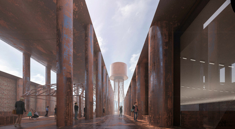
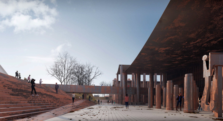
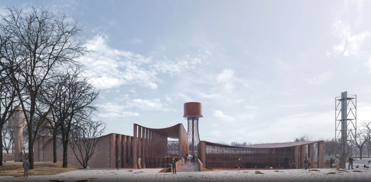
The main axis starts from the Batashevs house and the Metallurgov Square, immediately taking a visible shape of a metallic pedestrian bridge, whose line is continued (on the level of the second floor) by a “street” running between the eastern and central buildings, and points to the main landmark – the Shukhov water tower at the square behind the museum. The bridge and the “street” behind it allows you to pass on the same level from the city and through the museum, finally descending the three staircases to the farther square and then into the park.
We will note here that the narrow central “peripter” has no walls on its second floor: this is an open colonnade that displays just one (although very big) exhibit – judging from the project, this is the grid shell dome; its surging contour “salutes” to the sag of the metallic ceiling. Thus, entering by the bridge, walking in a straight line from the city, on the level of the second floor, you can not only reach the tower but also wander amidst the columns underneath the vault and cross over to the next street. As was already said, the “pipe” columns are of varying diameter – they are thinner in the central part, and thicker at the side ends. One can see three streets here or maybe a hypostyle hall – a public space. In this place, a few auxiliary museum exits/entrances will be provided.
The main axis running from the Mettalurgov Square, the Shukhov Tower ahead. The museum complex “Center of Industrial Progress”, Vyksa, project, 2022
Copyright: © Studio 44
Another museum square is situated before the pedestrian bridge, 6 meters lower than the water level in the pond or the Metallurgov city square. The level of the first floor is accessed by a wide staircase, cut with ramps, which streams over the slope. Here, left of the entrance, one will see another outdoor exposition zone – the so-called “Martin Garden”, consisting of “large-sized production machinery” used in the open-hearth workshop. In one version of the project, the authors even proposed a waterfall on one of the sidewalls. Further, from the side of the dam, the two remaining furnaces from the cast-iron plant are exposed, being also a part of the outdoor exposition.
The museum complex “Center of Industrial Progress”, Vyksa, project, 2022
Copyright: © Studio 44
All of this – the outdoor exposition zone, the giant staircase, and the double-level space with a bridge overhead – even the very thought that we are lower than the waterline – works to create a wow-effect, and is, of course, mesmerizing. We descend the iron staircase and find ourselves in a garden of “aging” iron.
The museum complex “Center of Industrial Progress”, Vyksa, project, 2022
Copyright: © Studio 44
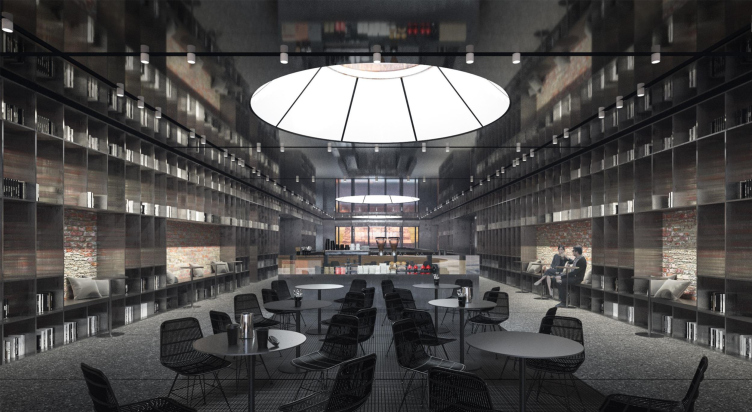
I will remind you that the ensemble is asymmetrical, and all the three buildings are of different sizes. The central one is long and narrow, it’s only 12 meters wide, and the width of the “streets” on its sides is 6 meters, only half of that length. The first floor of the central building includes the museum vestibule and a cafe, lit by circular skylights that look like the ones in Saint Petersburg‘s Pulkovo airport.
The cafe zone. The central building, teh 1st floor. The skylight in the ceiling. Version 2. The museum complex “Center of Industrial Progress”, Vyksa, project, 2022
Copyright: © Studio 44
The western building of the museum, situated right of the Batashevs house, is squatting and almost square. On the 1st floor there is a storage room, administration offices, guide rooms and toilets, and on the 2nd floor there are halls for temporary exhibitions.
The eastern building, on the other hand, is the longest and the tallest. On the inside, there is a three-tier, triple-height space, surrounded by galleries; in the north end, there is an amphitheater the full height of the building. It is planned to place the permanent exposition here. In this particular case, the tall space in the center of the hall is necessary not only from the aesthetic standpoint: this place keeps the remnants of the walls of blast furnace and foundry workshops of the XVIII century, endowed with the cultural heritage status. Essentially, the museum hall is built around them like a semblance of a “case”. Needless to say, the preserved remains of the walls in the interior will look like dinosaur skeletons in the atrium of the Museum of Paleontology – that is, quite spectacular and atmospheric.
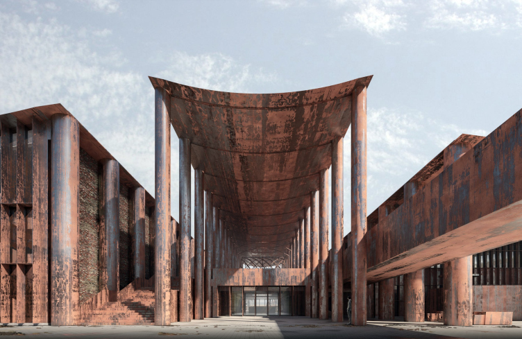
Anyway, the central building is the tallest one. It is also exquisite and transparent; it is a landmark, a vestibule, and a portico. Preserving yet another relic, it points to another one, the water tower.
The museum complex “Center of Industrial Progress”, Vyksa, project, 2022
Copyright: © Studio 44
The museum complex “Center of Industrial Progress”, Vyksa, project, 2022
Copyright: © Studio 44
The Shukhov tower rises above the territory of the museum having a full right to it, like the monument to engineering thought, standing tall its entire historical height of 32 meters. As for the museum itself – a modern building – it behaves quite tactfully, observing the height restrictions set by the vicinity of the Batashevs house. Its height, counting from the zero elevation mark, is 14.4 meters, and if we are to count the 6-meter deepening of the museum territory, the colonnade of the central building rises by no more than 8 meters, and the two other volumes simply “sprawl” on the ground.
The museum complex “Center of Industrial Progress”, Vyksa, project, 2022
Copyright: © Studio 44
Thus, several conceptual tensions appear in the project. One tension is between the contextual tact and the bold architectural statement, quite in the spirit of modern art. It is for a good reason that Nikita Yavein likens this museum to an installation.
Another kind of tension is the one between the purity of the idea and the subtleties of realization, which are, of course, there. The architects admit that the “raw” factory metal will nevertheless receive some additives for beautiful aging – i.e. the material will still be treated specially for this building. They also admit that the ceiling will conceal extra beams meant to reinforce the structure. And, finally, the stained glass windows, to be quite honest, will not be of local origin, but will be brought from elsewhere – in the “performance” architecture they occupy a neutral position. But then again, the building is not a chemical experiment – it requires purity not so much from the ingredients as from the imagery.
The third (and the main) esthetic tension is between the past and the future, and it is the most complicated of all, too. According to the organizers, the museum will “explain the history of human civilization, refracting it through the prism of metal”. Meanwhile, the press calls it “The Center of Industrial Progress”, which makes us presuppose two components: history and something that is directed into the future. The history component is more or less clear: it is represented by the cupola towers, the remains of the walls of the Blast Furnace and Foundry buildings with the cultural heritage status, and even by a pile of bricks of different times – from the XVIII century to the 1960s – extracted from later-dismantled buildings, similar to the material from the archaeological excavation, reused for the walls of the museum.
The other pole is all about “raw” factory metal of pipes and intermediate floors. Taken in its current state, it starts its life from the moment of construction, and it is prescribed to rust naturally, to gradually change, and to live a life of its own, so that after a while this “new” substance would cyclically become similar to “old”, sinking into an earthy velvety tone similar to that of the brick wall. Are we witnessing progress getting old?
The museum complex “Center of Industrial Progress”, Vyksa, project, 2022
Copyright: © Studio 44
At the same time, aging the metal and inviting us to watch the aging process, the architects work with a new, quite modern type of construction, which utilizes – let’s go back to the beginning of this article – the ability of metal to stretch. They turn to the history of modernism, hence the suspended vaults and skylights, yet at the same time they emphasize the relevance and modern character of these structures, just “thrown” over the colonnades. What we see is an interesting attitude towards the progress: it is productive, yet fleeting, it is devoured by patina, and it is “unearthed” like a pseudo ruin.
Pseudo-ruins are very relevant today: essentially, they are all about new progress, they are all about the dream to unearth some powerful artifact, something that will change your life forever. Science fiction movies and books immediately come to mind. It is these movies and books that show us, jam-packing the retrospective as much as possible, how progress turns into historical layers, goes underground and resurfaces again. And it shows us just how strange powerful things may look.
Thus, the first episode of Star Wars and the timeless image of the Russian “gravitsapa”, a rusty nut that is nonetheless capable of ensuring intergalactic travel, also come to mind.
***
As an epilogue, I must say that the Vyksa museum project is but one of a whole series of museums in the portfolio of Studio 44, and it inherits numerous interesting solutions: the search for axes and working with the space, including public spaces, staircases, squares and amphitheaters (indoor and outdoor), “megalithic” inclusions, contrastive pairs, bold, to the point of brutal, shapes, and striving for integrity, combined with carefully calculated, clear and logic distribution of functions that comes together as a jigsaw puzzle, or, rather, like a 3D erector set. It is enough to recall the wing of the General Staff and the Museum of Locomotives, the projects of the Sovrisk Museum in Ufa, the Blockade Museum in St. Petersburg, the Museum of Technology in Tomsk – the list may continue.
The Vyksa metal museum fits in perfectly among the “megalith museums”; it is easy to find the same techniques and advantages in it. The architectural language is reinforced by industrial themes, and is raised to the level of modern art.
In other words, everyone now loves the old industrial buildings preserved and reconstructed – but how do we take the next step, turn these sympathies into a figurative statement? The “beautifully rusting” museum in Vyksa, perhaps, gives an answer to the question.

