По-русски

The Beams of Energy Effectiveness

On August 22, Berlin saw an official opening of the new HQ of the energy company Vattenfall, the office complex named EDGE. One of its buildings is Germany’s biggest wood hybrid building. The term means that its supporting frame is made of glued timber, but in certain places wood cooperates with metal, reinforced concrete and fiberglass. Below, we are sharing about the inner design of this structure, not just environmentally friendly but energy efficient as well.

22 August 2022
Object
mainImg
The EDGE complex is situated in the very beginning of the so-called Schöneberger Linse – an area in Berlin’s southeast between Highway A100, the 6-lane Sachsendamm Straße and railroad tracks. Situated between the roadways, this area lay undeveloped for a long time, even though in recent years Linse has been getting some office centers, shopping malls, and residential buildings. The proximity of the two thoroughfares, on the other hand, creates good transport accessibility – a hundred meters away from the EDGE Suedkreuz Berlin, there is the Suedkreuz U-Bahn station, which explains this “addition” to the name of the complex.

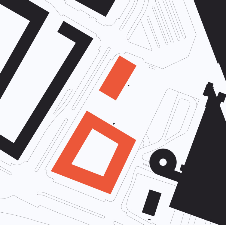
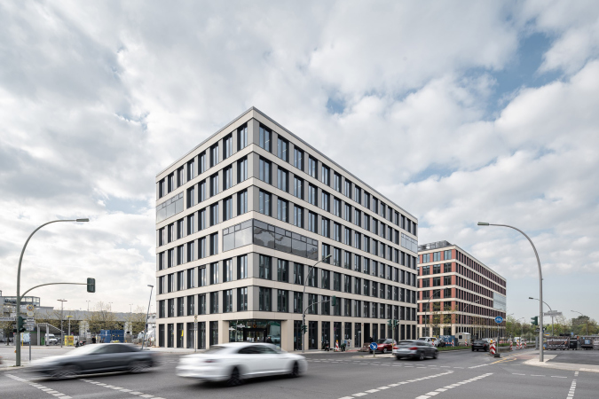
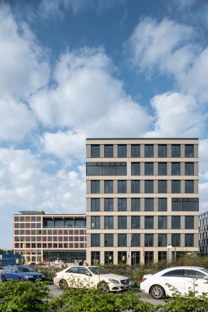
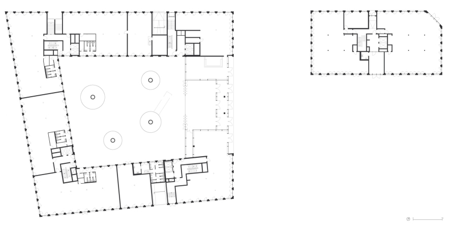
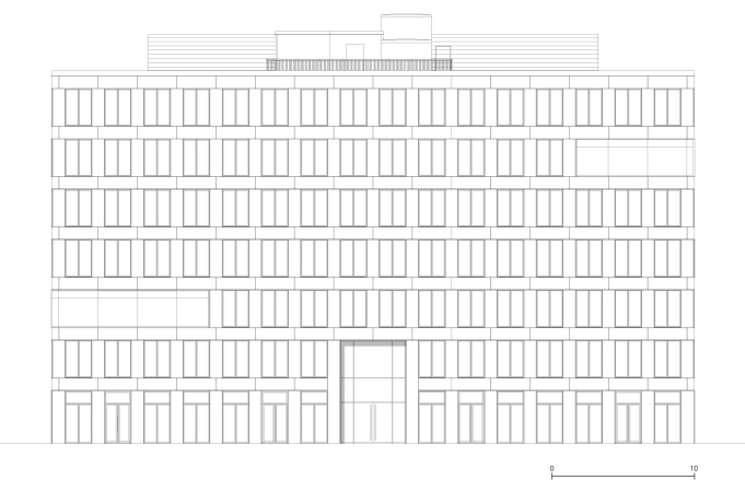
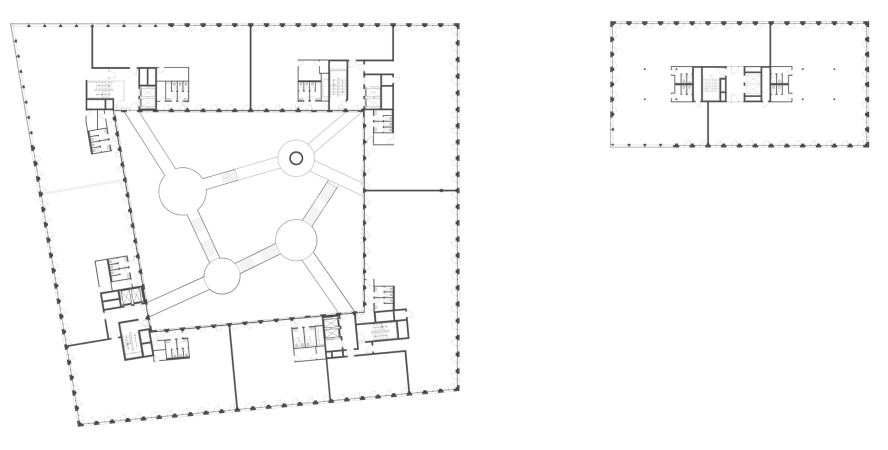
EDGE Suedkreuz Berlin consists of two seven-floor buildings separated by a new city plaza – its public space also serves as a pedestrian path to the station. The smaller building, named Solitaire, is essentially a single-cut parallelepiped. The larger four-section building is constructed around a spacious light atrium in a slightly asymmetric triangle with a contour that follows the shape of the site. It also received a “telltale” name of Carré.

Location plan. The EDGE HQ for the energy company Vattenfall
Copyright: © TCHOBAN VOSS Architekten


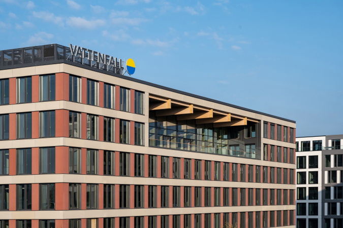
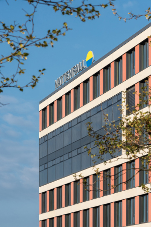
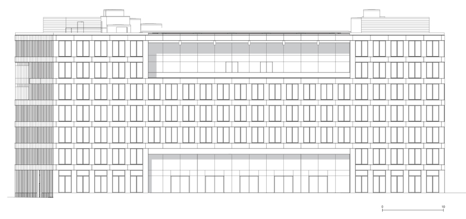
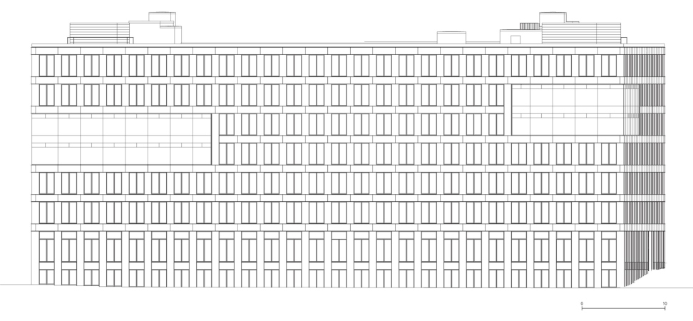
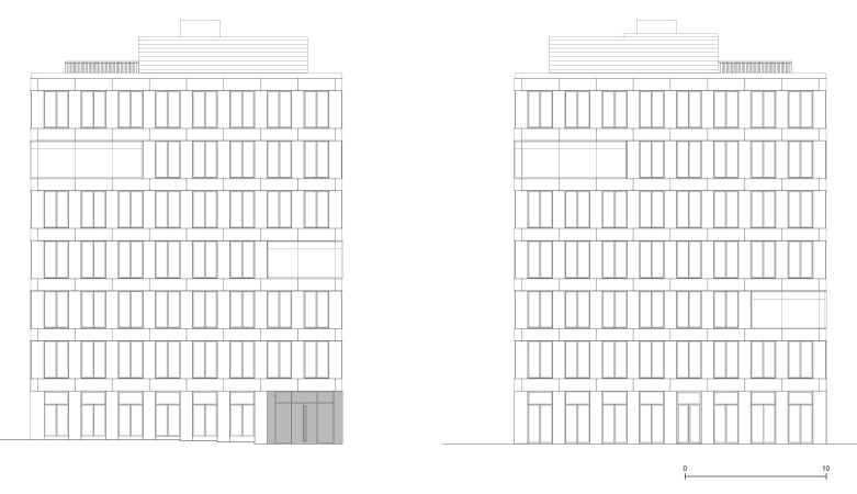
The facades of both buildings are formed by a regular grid of panels made of fiberglass concrete with a common rhythm: everywhere, the horizontals received a light-sand hue, while the verticals are different from building to building: in Solitaire, they are dark-gray, in Carré crimson terra cotta. Sometimes, the grid is livened up with large stained glass rectangles, recessed balconies and terraces – but on the whole the buildings look very reserved and austere, very much in the spirit of Berlin’s modern office architecture.

  • zooming
    1 / 4
    The EDGE HQ for the energy company Vattenfall
    Copyright: Photograph © Ilia Ivanov / TCHOBAN VOSS Architekten
  • zooming
    2 / 4
    The EDGE HQ for the energy company Vattenfall
    Copyright: Photograph © Ilia Ivanov / TCHOBAN VOSS Architekten
  • zooming
    3 / 4
    The Carre building. The EDGE HQ for the energy company Vattenfall
    Copyright: Photograph © Ilia Ivanov / TCHOBAN VOSS Architekten
  • zooming
    4 / 4
    The Carre building. The EDGE HQ for the energy company Vattenfall
    Copyright: Photograph © Ilia Ivanov / TCHOBAN VOSS Architekten


What really makes EDGE unique is the combination of construction scale and construction method. By the moment of writing this article, Carré is the largest wood hybrid (i.e. combining a wooden framework with other materials) building in Germany and one of the largest in Europe. Its area is about 20,000 sqm (the entire area of the complex is 32,000 sqm).

The client of the project is Vattefall energy company. In 2019, 35% of the company’s total capacity was accounted for by renewable energy sources: solar, wind and water. In the future, this indicator is expected to increase significantly.

EDGE became for Vattenfall not just a new HQ in Europe but also a “trademark” tower: it is largely built using sustainable, climate- and resource-saving technologies of modular construction and, most importantly, it is built of wood – here it is about 60% of the total volume of materials, and it is used everywhere: in load-bearing structures, ceilings and interior decoration. The construction took about 1,300 firs grown in Slovakia. They were used to manufacture 1190 hybrid wooden ceiling elements resting on 1280 glued facade supports and 445 wall sections with a total area of 16,000 square meters.

Meanwhile, wood was used in the construction of this building for a reason:

Sergey Tchoban, TCHOBAN VOSS Architekten

Building a wooden house” has now become one of the popular dreams of a modern architect. But in this case, in addition to working with wood as a renewable resource and generally a very pleasant material, we set ourselves other tasks – specifically, to make the building easier, its construction more accurate, and the construction process faster. To lighten the total mass of materials, to reduce structures in the cross–section, and, as a result, to reduce energy costs both for construction and for subsequent operation and maintenance of the building. This is exactly the kind of almost scientific task that was set for us, including by climate experts.


Both buildings of EDGE Suedkreuz Berlin are constructed in accordance with the technology of modular construction. The wall and the ceiling wooden modules, just as the ceiling modules of fiberglass concrete, were prefabricated and then assembled on the construction site – this ensured an exact schedule and a faster, i.e. more efficient, construction process. Due to the fact that the weight of a wood hybrid building is about a third of a conventional concrete structure of a similar size, the architects were able to make the foundation plate 30% thinner than is usually done for such a volume. The small weight is an advantage – and, at the same time, a weakness – of a wooden framework. Being lightweight, it requires reducing the weight of all the other construction elements as well: first of all, a wooden framework cannot support a stone or a brick facade. And in this case the fiberglass concrete turned out to be a game changer: glass fiber reinforcement makes the plates strong and light, their weight is about 30 kg/m2; in addition, their outer surface is able to absorb CO2 from the atmosphere.

The company often describes the project as “smart”. It is the “smart” ratio of wooden and concrete structures that allowed the architects to save up to 80% of carbon emissions per square meter of the area. Reinforced concrete is only used for the foundation plate, fireproof partitions and stiffness ribs. Metal is only used for columns, staircases, and the roof construction. According to Tchoban Voss Architekten, the carbon emissions constituted just 0.15 ton instead of 0.75 ton, which would have corresponded to a building of similar size constructed in a traditional way. Wood turned out to be unparalleled by this and many other parameters: it is lighter in transportation than mineral building materials, and it has a high heat capacity, which means it cools down more slowly, retains heat better, and requires less heating.

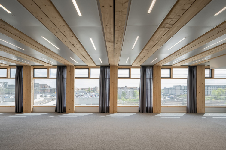
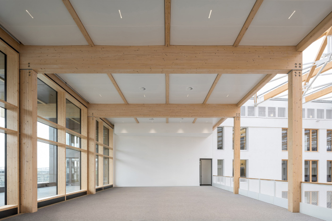
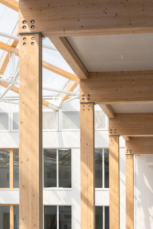
And, finally, timber, unlike other materials, is capable, thanks to sheer exposed beams alone, save office spaces from feeling “sterile”. And, while on the outside the EDGE facades display very little noticeable wood, the imagery and emotional coloring of the interiors is defined by wood and wood alone. It sets their character, adding life and clarity, and being omnipresent: from beams and supports to windows and doors and staircase railings.

The EDGE HQ for the energy company Vattenfall
Copyright: Photograph © Ilia Ivanov / TCHOBAN VOSS Architekten


In this sense, both buildings turn out to be a “box with a secret” of sorts because all the exclusive things in terms of not just construction technology and space but also means of artistic expression are hidden inside. 

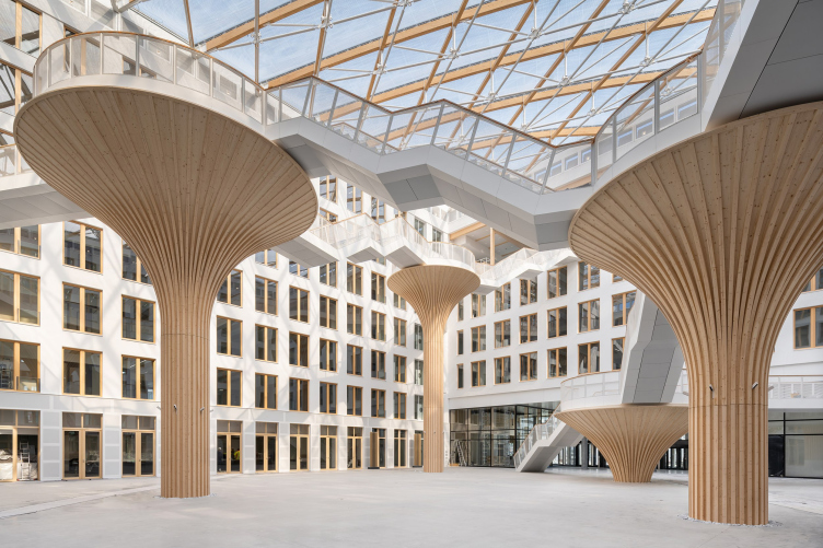
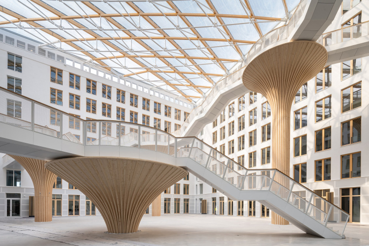
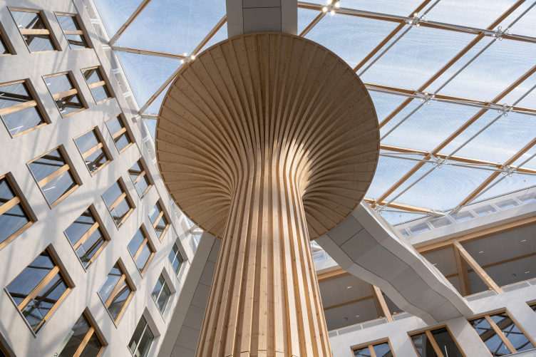
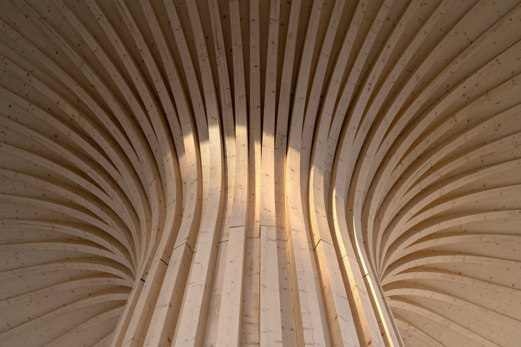
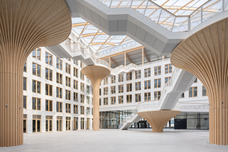
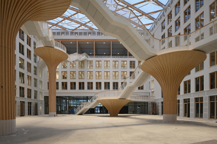
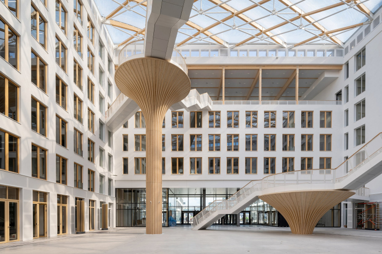
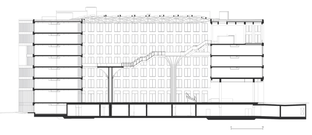
Particularly interesting in this sense is the Carré building. Its conceptual and compositional center is a square atrium with ribbed tree-like columns that look like giant mushrooms due to their plated structure, which is also conditioned by the use of wood.

The EDGE HQ for the energy company Vattenfall
Copyright: Photograph © Ilia Ivanov / TCHOBAN VOSS Architekten


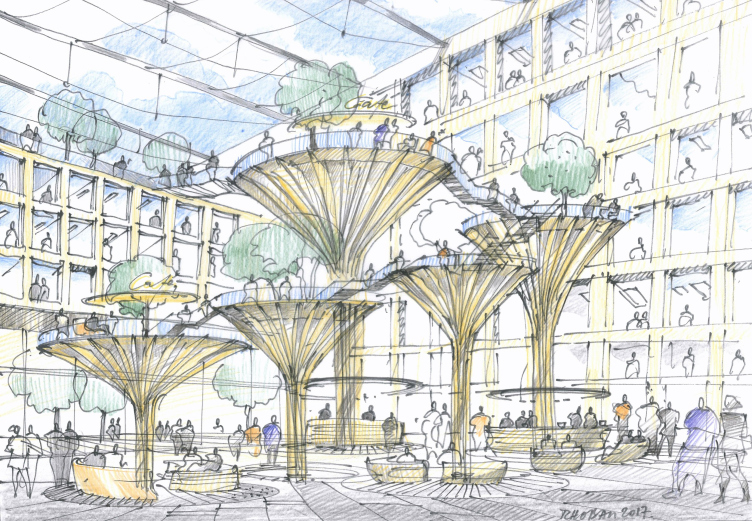
The EDGE HQ for the energy company Vattenfall / a sketch by Sergey Tchoban
Copyright: © Sergey Tchoban


On the inside, the columns are made of metal, just as the staircases and bridges – according to Sergey Tchoban, their shapes and constructions grew from the architects’ desire to create an interesting volume and at the same time make the most of the materials used. The columns have two main functions: they support hovering staircases and overpasses, and they serve as places for rest; it is planned that tubs with trees will be installed on them. The staircases rise from the floor up to the top tiers – accordingly, the columns, which support the node platforms of this path, grow gradually, again, like mushrooms: the initial column barely rises with its umbrella head above the floor (height 4.28 m, diameter 7.2 m), while the fourth, final, stretches to its full height (height 14.87 m, diameter 6.2 m).

The EDGE HQ for the energy company Vattenfall
Copyright: Photograph © Ilia Ivanov / TCHOBAN VOSS Architekten


The EDGE HQ for the energy company Vattenfall
Copyright: Photograph © Ilia Ivanov / TCHOBAN VOSS Architekten


The EDGE HQ for the energy company Vattenfall
Copyright: Photograph © Ilia Ivanov / TCHOBAN VOSS Architekten


The atrium is filled with natural light that streams from a height of 26 meters through a transparent roof of three-ply EFTE film, as well as from the windows – in all of the offices, they run from floor to ceiling on both sides – and a panoramic window in the hall. Currently, while tenants have not yet moved in, the offices look particularly transparent.

The EDGE HQ for the energy company Vattenfall
Copyright: Photograph © Ilia Ivanov / TCHOBAN VOSS Architekten


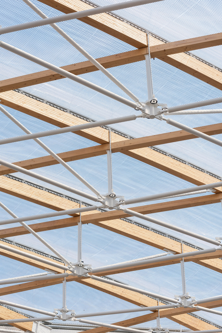
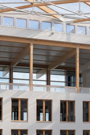
The construction of the atrium coverage, to a large extent due to the small weight of the EFTE film, is light and transparent: two levels of elegant-looking wooden beams are supported by a network of seemingly even more fragile metallic structures of white color – for them, for the sake of better precision and strength, special nodes were developed. The top beams are arched, which gives the coverage a sail-like look; we will emphasize that the film is laid not in rhombuses but in bands running from one wall to the other. Its layers are capable of coming together and going apart under the pressure of the air, thus regulating the tension of the roof that is designed to withstand very significant wind loads.

The EDGE HQ for the energy company Vattenfall
Copyright: Photograph © Ilia Ivanov / TCHOBAN VOSS Architekten


Meanwhile, the film was chosen to make the translucent coverage not just for its lightness and transparency: it also provides protection from the sunlight and absorbs sounds – there is virtually no echo in the atrium. In the event of a fire, the film simply melts down, and it is not as dangerous as glass. By the way, there are no sprinklers in the building at all – they were made redundant due to the fact that the modern wooden structures were specially treated to become totally fireproof. 

The EDGE HQ for the energy company Vattenfall
Copyright: Photograph © Ilia Ivanov / TCHOBAN VOSS Architekten


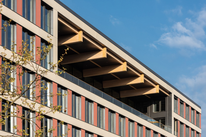
The “cobweb” of pedestrian connections – the authors call it “architectural network of communications” – hovering in the wide space of the atrium, is connected by bridges to each of its four walls, forming alternative and free ways of getting to various floors of the building, from second to sixth, where a sky lounge commanding the view of north Berlin is situated – Alexanderplatz, the TV tower, and the cathedral. This end-to-end recessed balcony, organized in the two upper floors of the entrance volume, is very interesting composition-wise. Its integral see-through space unites the two top floors just as the two bottom floors are united by the bottom lobby; between them, the three “office” tiers are hovering.

The EDGE HQ for the energy company Vattenfall
Copyright: Photograph © Ilia Ivanov / TCHOBAN VOSS Architekten


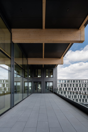
The stained glass window of the warm contour divides the upper recessed balcony into two spacious terraces: one of them is open to the city, its walls painted white (and this is the only place from the city sides where the wooden beams are exposed), and the other one, which is deeper, overlooks the atrium, its walls painted light-gray, like everything else inside.

  • zooming
    1 / 5
    The EDGE HQ for the energy company Vattenfall
    Copyright: Photograph © Ilia Ivanov / TCHOBAN VOSS Architekten
  • zooming
    2 / 5
    The EDGE HQ for the energy company Vattenfall
    Copyright: Photograph © Ilia Ivanov / TCHOBAN VOSS Architekten
  • zooming
    3 / 5
    The EDGE HQ for the energy company Vattenfall
    Copyright: Photograph © Ilia Ivanov / TCHOBAN VOSS Architekten
  • zooming
    4 / 5
    The EDGE HQ for the energy company Vattenfall
    Copyright: Photograph © Ilia Ivanov / TCHOBAN VOSS Architekten
  • zooming
    5 / 5
    The Carre building. The EDGE HQ for the energy company Vattenfall
    Copyright: Photograph © Ilia Ivanov / TCHOBAN VOSS Architekten


***

Sergey Tchoban speaks about EDGE Seudkreuz Berlin as a “pioneer” project that develops the progressive European trends of energy-effective modular smart construction, and is essentially “the next big thing”. Meanwhile, on the other hand, the project is an experimental one: we cannot tell for sure how these wooden buildings will “behave” in a few decades’ time – the architect stresses. But then again, misgivings are an inevitable companion of any innovation. The number of buildings like this will probably grow in proportion to the use of renewable energy – and the technique that has been fully tested here has every chance of becoming a given for many other projects. In any case, for Sergey Tchoban, the work on the complex marked a certain turn in his professional thinking.

Sergey Tchoban, TCHOBAN VOSS Architekten

Personally for me, this is a whole new story. Until recently, I supported and defended the fundamental values of architecture, such as materiality, tectonic nature of the building, and the depth of detailing. But any massive elements are by definition very resource-consuming. And the current prices for construction and energy, as well as the general state of the climate, do not fall in with this trend. Therefore, it makes perfect sense that architects, although they remain the organizers and catalysts of project activities, are increasingly working with specialists whose efforts are not aimed at making the building more complex and sculptural. Rather, on the contrary, buildings designed for fast and efficient construction, convenient maintenance and even, if necessary, for dismantling and recycling with minimal energy consumption are becoming more and more relevant today.


EDGE is Germany’s first project to be awarded the golden WELL Core & Shell certificate. This certificate is awarded by the International construction institute WELL (IWBI), the world leader in the field of evaluating the influence of architecture on people’s health and well-being. The building was also awarded the golden certificate of DGNB (Deutsche Gesellschaft für Nachhaltiges Bauen, the German Council for Sustainable Development), a voluntary certification system designed to support green construction, and assessment of environmentally friendly, economically and energy efficient buildings. Now EDGE Suedkreuz Berlin has been shortlisted for the WAF 2022 award.

  • zooming
    1 / 8
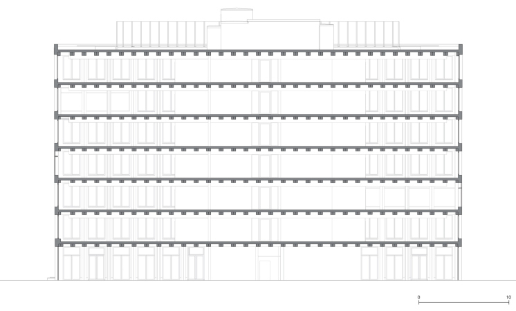
    The Carre building, cross-section by the atrium. The EDGE HQ for the energy company Vattenfall
    Copyright: © TCHOBAN VOSS Architekten
  • zooming
    2 / 8
    The Carre building, the northeast facade. The EDGE HQ for the energy company Vattenfall
    Copyright: © TCHOBAN VOSS Architekten
  • zooming
    3 / 8
    The Carre building, the west facade. The EDGE HQ for the energy company Vattenfall
    Copyright: © TCHOBAN VOSS Architekten
  • zooming
    4 / 8
    The plan of the first floor. The EDGE HQ for the energy company Vattenfall
    Copyright: © TCHOBAN VOSS Architekten
  • zooming
    5 / 8
    The Solitaire building, the east facade. The EDGE HQ for the energy company Vattenfall
    Copyright: © TCHOBAN VOSS Architekten
  • zooming
    6 / 8
    The Solitaire building, the north and south facade. The EDGE HQ for the energy company Vattenfall
    Copyright: © TCHOBAN VOSS Architekten
  • zooming
    7 / 8
    The Solitaire building, longitudinal cross-section. The EDGE HQ for the energy company Vattenfall
    Copyright: © TCHOBAN VOSS Architekten
  • zooming
    8 / 8
    The plan of the standard floor. The EDGE HQ for the energy company Vattenfall
    Copyright: © TCHOBAN VOSS Architekten


22 August 2022

Headlines now
The Golden Crown
The concept for a dental clinic in Yekaterinburg, developed by CNTR Studio, revolves around the idea of a “mouth full of gold”: pristine white porcelain stoneware walls are complemented by matte brass details. To avoid an overly literal interpretation, the architects focused on the building’s proportions, skillfully navigating between sunlight requirements and fire safety regulations.
Flexibility and Integration
Not long ago, we covered the project for the fourth phase of the ÁLIA residential complex, designed by APEX. Now, we’ve been shown different fence concepts they developed to enclose the complex’s private courtyards, incorporating a variety of public functions. We believe that the sheer fact that the complex’s architects were involved in such a detail as fencing speaks volumes.
A Step Forward
The HIDE residential complex represents a major milestone for ADM architects and their leaders Andrey Romanov and Ekaterina Kuznetsova in their quest for a fresh high-rise aesthetic – one that is flexible and layered, capable of bringing vibrancy to mass and silhouette while shaping form. Over recent years, this approach has become ADM’s “signature style”, with the golden HIDE tower playing a pivotal role in its evolution. Here, we delve into the project’s story, explore the details of the complex’s design, and uncover its core essence.
Gold in the Sands
A new office for a transcontinental company specializing in resource extraction and processing has opened in Dubai. Designed by T+T Architects, masters of creating spaces that are contemporary, diverse, flexible, and original, this project exemplifies their expertise. On the executive floor, a massive brass-clad partition dominates, while layered textures of compressed earth create a contextually resonant backdrop.
Layers and Levels of Flight
This project goes way back – Reserve Union won this architectural competition at the end of 2011, and the building was completed in 2018, so it’s practically “archival”. However, despite being relatively unknown, the building can hardly be considered “dated” and remains a prime example of architectural expression, particularly in the headquarters genre. And it’s especially fitting for an aviation company office. In some ways, it resembles the Aeroflot headquarters at Sheremetyevo but with its own unique identity, following the signature style of Vladimir Plotkin. In this article, we take an in-depth look at the United Aircraft Corporation (UAC) headquarters in the Moscow agglomeration town of Zhukovsky, supplemented by recent photographs from Alexey Naroditsky – a shoot that became only recently possible due to the fact that improvements were finally made in the surrounding area.
Light and Shadow
In this article, we delve into the architectural design of the “Chaika” house by DNK ag architects, which was recently completed in 2023 as part of the collection of signature designs at ZILArt. As is well-known, all the buildings in this complex follow a design code, yet each one is distinct. This particular building stands out not only for its whiteness and minimalism but also for the refined use of a limited number of techniques that, together, create what can confidently be called synergy.
Casus Novae
A master plan was developed for a large residential area with a name of “DNS City”, but now that its implementation began, the plan has been arbitrarily reformatted and replaced with something that, while similar on the surface, is actually quite different. This is not the first time such a thing happens, but it’s always frustrating. With permission from the author, we are sharing Maria Elkina’s post.
Treasure Hunting
The GAFA bureau, in collaboration with Tegola and Arkhitail, organized an expedition to the island of Kilpola in Karelia as part of Moskomarkhitektura’s “Open City” festival. There, amidst moss and rocks, the students sought answers to questions like: what is the sacred, where does it dwell, and what sustains it? Assisting the participants in this quest were landscape engineer Evgeny Levin, artist Nicholas Roerich, a moose, and the lack of cellular connection. Here’s how the story unfolded.
Depths of the Earth, Streams of Water
In the Malaya Okhta district, the Akzent building, designed by Stepan Liphart, was constructed. It follows a classic tripartite structure, yet it’s what you might call “hand-drawn”: each façade is unique in its form and details, some of which aren’t immediately noticeable. In this article, we explore the context and, together with the architect, delve into how the form was developed.
Fir Tree Dynamics
The “Airports of Region” holding is planning to build an airport in Karachay-Cherkessia, aiming to make the Arkhyz and Dombay resorts more accessible to travelers. The project that won in an invitation-only competition, submitted by Sergey Nikeshkin’s KPLN, blends natural imagery inspired by the shape of a conifer seed, open-air waiting spaces, majestic large trees, and a green roof elevated on needle-like columns. The result is both nature-inspired and WOW.
​A Brick Shell
In the process of designing a clubhouse situated among pine trees in a prestigious suburban area near Moscow, the architectural firm “A.Len” did the façade design part. The combination of different types of brick and masonry correlates with the volumetric and plastique solutions, further enhanced by the inclusion of wood-painted fragments and metal “glazing”.
Word Forms
ATRIUM architects love ambitious challenges, and for the firm’s thirtieth anniversary, they boldly play a game of words with an exhibition that dives deep into a self-created vocabulary. They immerse their projects – especially art installations – into this glossary, as if plunging into a current of their own. You feel as if you’re flowing through the veins of pure art, immersed in a universe of vertical cities, educational spaces – of which the architects are true masters – and the cultural codes of various locations. But what truly captivates is the bold statement that Vera Butko and Anton Nadtochy make, both through their work and this exhibition: architecture, above all, is art – the art of working with form and space.
Flexibility and Acuteness of Modernity
Luxurious, fluid, large “kokoshniks” and spiral barrel columns, as if made from colorful chewing gum: there seem to be no other mansion like this in Moscow, designed in the “Neo-Russian-Modern” style. And the “Teremok” on Malaya Kaluzhskaya, previously somewhat obscure, has “come alive with new colors” and gained visibility after its restoration for the office of the “architectural ecosystem” as the architects love to call themselves. It’s evident that Julius Borisov and the architects at UNK put their hearts into finding this new office and bringing it up to date. Let’s delve into the paradoxes of this mansion’s history and its plasticity. Spoiler: two versions of modernity meet here, both balancing on the razor’s edge of “what’s current”.
Yuri Vissarionov: “A modular house does not belong to the land”
It belongs to space, or to the air... It turns out that 3D printing is more effective when combined with a modular approach: the house is built in a workshop and then adapted to the site, including on uneven terrain. Yuri Vissarionov shares his latest experience in designing tourist complexes, both in central Russia and in the south. These include houseboats, homes printed from lightweight concrete using a 3D printer, and, of course, frame houses.
​Moscow’s First
“The quality of education largely depends on the quality of the educational environment”. This principle of the last decade has been realized by Sergey Skuratov in the project for the First Moscow Gymnasium on Rostovskaya Embankment in the Khamovniki district. The building seamlessly integrates into the complex urban landscape, responding both to the pedestrian flow of the city and the quiet alleyways. It skillfully takes advantage of the height differences and aligns with modern trends in educational space design. Let’s take a closer look.
Looking at the Water
The site of Villa Sonata stretches from the road to the water’s edge, offering its own shoreline, pier, and a picturesque river panorama. To reveal these sweeping views, Roman Leonidov “cut” the façade diagonally parallel to the river, thus getting two main axes for the house and, consequently, “two heads”. The internal core – two double-height spaces, a living room and a conservatory, with a “bridge” above them – makes the house both “transparent” and filled with light.
The White Wing
Well, it’s not exactly white. It’s more of a beige, white-stone structure that plays with the color of limestone – smoother surfaces are lighter, while rougher ones are darker. This wing unites various elements: it absorbs and interprets the surrounding themes. It responds to everything, yet maintains a cohesive expression – a challenging task! – while also incorporating recognizable features of its own, such as the dynamic cuts at the bottom, top, and middle.
Urban Dunes
The XSA Ramps team designed and built a three-part sports hub for a park in Rostov-on-Don, welcoming people of all ages and fitness levels. The skate plaza, pump track, and playground are all meticulously crafted with details that attract a diverse range of visitors. The technical execution of the shapes and slopes transforms this space into a kind of sculptural composition.
Proportional Growth
The project for the fourth phase of the ÁLIA residential area has been announced. The buildings are situated on an elongated plot – almost a “ray” that shoots out from the center of the area towards the river. Their layout reflects both a response to Moscow’s architectural preferences over the past 15 years, shifting “from blocks to towers”, and an interpretation of the neighboring business park designed by SOM. Additionally, the best apartments here are not located at the very top but closer to the middle, forming a glowing “waistline”.
The “Staircase” Building
In designing the “Details” residential complex in New Moscow, Rais Baishev spiced up the now-popular Moscow theme of a “courtyard” building with an idea drawn from the surrealist drawings by Maurits Escher. He envisioned the stepped silhouettes and descending slopes as a metaphysical mega-staircase, creating a key void within the courtyard that gave the project an internal “spine”. This concept is felt both in the building’s silhouette and on its façades.
Projection of the Quarter
No one doubted that the building that Vladimir Plotkin designed as part of the “Garden Quarters” would be the most modernist of all. And it turned out just that way: while adhering to the common design code, the building successfully combines brick and white stone, rhythmically responding to the neighboring building designed by Ostozhenka, yet tactfully and persistently making a few statements of its own. This includes the projection of the ideal urban development composition “14–9–6”, which can be found right next door, mathematical calculations, including those for various types of terraces (and perhaps the only reminder of the Soviet past of the Kauchuk rubber factory!), and the white “cross-stitch” pattern of the façade grid.
Domus Aurea
In this issue, we examine the “Tessinsky-1” house, designed by Sergey Skuratov and completed in 2023. Located in the middle of the Serebryanicheskaya Embankment district, at the intersection of its main streets, this house assumes a sort of “nodal” role: it not only responds to everything around it and preserves many memories of the former EMA factory within itself, but it weaves all this into a newly directed pattern, reconciling bright “gold” and dark-colored brick, largely with the help of the new, modern-yet-archaic Columba brick, which, come to think about it, is the most precious element here.
The Chimney of Nikola-Lenivets
In this issue, we are examining the “Obelisk House” designed by KATARSIS and built for the Arkhstoyanie 2023 festival. However, it was only finished later on, and this is why we are examining it now. It seems to us that after the “Obelisk House” appeared in Nikola-Lenivets, a dialogue and a few inner connections appeared between the temporary structures built here. These houses no longer look like “accidental neighbors”, more of which below.
​Periscope by the Bay
The jury awarded the second place in the competition for a public and cultural center in Petropavlovsk-Kamchatsky to the companies GORA (“Mountain”) and M4. In the consortium’s proposal, the building resembles a sperm whale with a calf swimming next to it or a periscope, whose lenses capture the most spectacular views from the surrounding landscape.
From Arcs to Dolmens
While working on the competition project for Petropavlovsk-Kamchatsky, ASADOV Architects prioritized the value of the natural and urban environment, aiming to preserve the balance of the location while minimizing the resemblance of the volume that they designed to a “traditional building”. The task was challenging, and the architects created three versions, one of which having been developed after the competition, where their main proposal took third place. However, the point of interest here is not the competition result but the continuity of creative thinking.
Hide and Seek
The ID Moskovskiy house, designed by Stepan Liphart in St. Petersburg, in the courtyards near Moskovskiy Avenue beyond the Obvodny Canal and recently completed, is notable for several reasons. Firstly, it has been realized with considerable accuracy, which is particularly significant as this is the first building where the architect was responsible not only for the facades but also for the layouts, allowing for better integration between the two. On the other hand, this building is interesting as an example of the “germination” of new architecture in the city: it draws on the best examples from the neighborhood and becomes an improved and developed sum of ideas found by the architect in the surrounding context.
The Big Twelve
Yesterday, the winners of the Moscow Mayor’s Architecture Award were announced and honored. Let’s take a look at what was awarded and, in some cases, even critique this esteemed award. After all, there is always room for improvement, right?
Above the Golden Horn
The residential complex “Philosophy” designed by T+T architects in Vladivostok, is one of the new projects in the “Golubinaya Pad” area, changing its development philosophy (pun intended) from single houses to a comprehensive approach. The buildings are organized along public streets, varying in height and format, with one house even executed in gallery typology, featuring a cantilever leaning on an art object.
Nuanced Alternative
How can you rhyme a square and space? Easily! But to do so, you need to rhyme everything you can possibly think of: weave everything together, like in a tensegrity structure, and find your own optics too. The new exhibition at GES-2 does just that, offering its visitor a new perspective on the history of art spanning 150 years, infused with the hope for endless multiplicity of worlds and art histories. Read on to see how this is achieved and how the exhibition design by Evgeny Ace contributes to it.
Blinds for Ice
An ice arena has been constructed in Domodedovo based on a project by Yuri Vissarionov Architects. To prevent the long façade, a technical requirement for winter sports facilities, from appearing monotonous, the architects proposed the use of suspended structures with multidirectional slats. This design protects the ice from direct sunlight while giving the wall texture and detail.