So, you are the leader of this research project. Who are your coauthors?
Sergey Nadtochiy, ATRIUM:
Yes, I’ve been coordinating this project for about two years, but a lot of people contributed to writing this book. This is not just a traditional research project: we tried to look at the problem first of all from the architect’s perspective because architecture is a profession that is meant to accumulate and generalize the best practices developed in different areas of human activity, and integrate them in the actual building with regard to a huge number of limitations and factors that apply in every specific situation. Dealing with the most diverse scales and typologies, we came to realize that designing schools is one of the most challenging tasks, and in this book we share our own experience, providing detailed analysis of various professional aspects of architectural design.
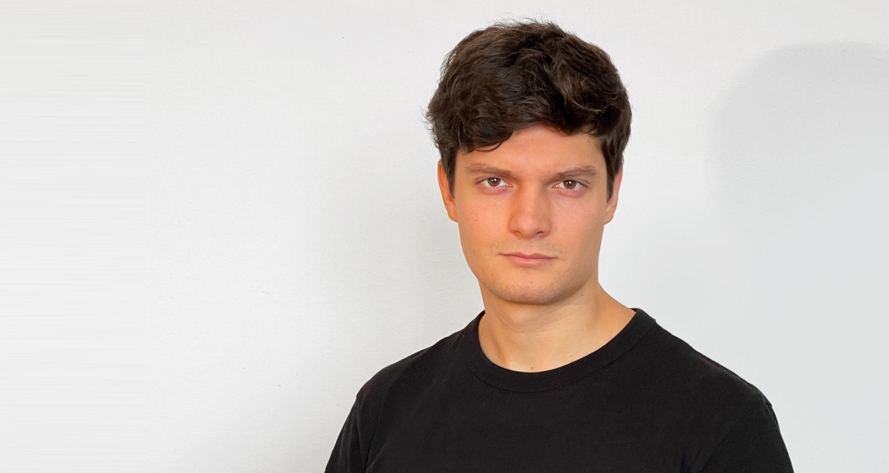
Sergey Nadtochiy
Copyright: © ATRIUM
In order to broaden the professional examination of this question, we also involved people from different areas of expertise. These were psychologists, teachers, methodologists, school principals, builders and developers, and producers of materials and technologies in one way or another related to education.
The book is published by “Project Russia”; its editor-in-chief Julia Shishalova helps us tremendously.
Why did you decide to do research on designing educational facilities?
We enjoy designing educational environments because this typology makes it possible to combine solutions that are complex and at the same time unique space-wise. And, even more importantly, we believe in the huge educational role of the environment that we form. Our kids spend a good deal of their time at school; this is where their habits and basic values form, this is where they learn interacting with other people, where they learn individual and team work, and lots of other things.
The decision to systematize our experience in designing educational environments and get a deeper understanding of its pedagogical role, was the logical continuation of ATRIUM’s almost 30-year history. We have more than 30 various educational facilities in our portfolio: large and small, state and privately owned, mass-construction and custom-designed, for children and adults. Many of them are quite ambitious and complex. Working from Kaliningrad to Yakutsk and Kazakhstan, we developed an expertise in designing these things in very diverse cultural and geographical contexts.
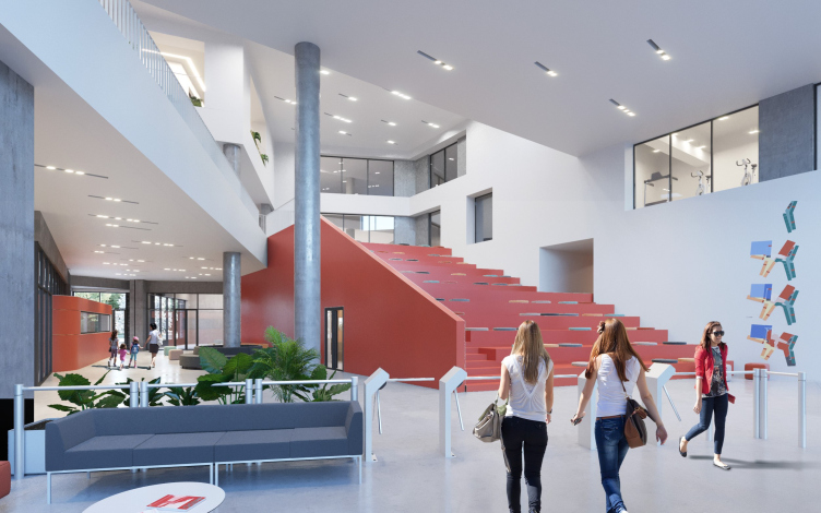
The educational complex in Nur-Sultan, a project, 2020
Copyright: © ATRIUM
Throughout its history, our company has worked and collaborated with many progressive specialists and clients. Our educational projects received much critical acclaim and many Russian and international professional awards. We have been invited to be on the judging panels of the competitions that formed the most up-to-date agenda in terms of designing school buildings, and we participated in numerous thematic conferences and seminars. In short, we know our stuff. This is why when two years ago I started working as the art director of our company, the task of generalizing our experience in working with educational facilities in such a way that it could be easily shared seemed to us to be something that was interesting from the architectural standpoint, and something that could generally make a positive difference. This subject is becoming increasingly popular, and we wanted to arouse even more interest to it. We ourselves were surprised at how popular it turned out to be: among other things, I never expected that the Telegram channel of our research would gather 500 subs within a couple of weeks.
What materials were you based upon? The ATRIUM projects?
Of course. We began analyzing our own projects, technical specifications, and then – the already known and widely discussed research publications within the industry. We re-watched our BuildSchool videos. Sometimes the information lay in the open sources, sometimes we had access to members-only research papers and briefs related to our practice – and we analyzed them as well. Then we realized that we could indeed make sense of it all, and systematize the problems, helping other people. On the other hand, as we delved deeper into the subject, more questions appeared. This is how we got this idea of involving industry experts, psychologists, developers, and so on.
Which of those questions could you call the main or the most relevant ones?
The main question – from our point of view as architects – is the question of architecture itself. Not facades or decor, but first of all the spatial organization of the functions of the environment. What properties must these spaces possess to form a fundamentally new environment? What is this environment all about? And this entails a huge amount of other tasks that require professional solutions. Among these tasks, there are those that are not really solved effectively yet, such as using green technologies. Yes, they are much talked about, but adequate examples of them in Russia are virtually nonexistent. Then the problems of inclusion and children’s mental health: as it seems to us, this topic is also becoming increasingly relevant. And, of course, we are very much interested in how modern technologies, such as AR and VR will influence the educational process. We realize that in about 10 years VR glasses will be used by everyone, and we are sure to be learning using these technologies. There are already companies out there that try to integrate them into the educational process. Having examined their experience, we assumed that it would be possible to combine several classrooms scattered all around the globe into one common virtual auditorium, using virtual and augmented reality for the gamification of the educational process. All of these scenarios are yet to be developed in the future, but the architects should start addressing these potential challenges already now, otherwise solutions for them will be proposed by technology companies instead, which – with all due respect – are no experts in organizing space.
What is the audience of your research? Architects, developers, state officials? For whom is it intended? Does it have a prime client or, let’s say, a title partner?
The publication is intended for a very wide variety of readers, from professional architects to school teachers and principals. Basically, for everyone who is one way or another involved with educational processes and creation of educational spaces – and that’s a pretty long list of people.
We discussed the idea of supporting our research project with some advanced development companies, and received a lot of positive feedback. However, ultimately it turned out that they are too engrossed in their current tasks, and we gave up on the idea of making analytics for one specific company. There was a similar situation with the state, although a little bit different: they have a very pragmatic goal of building so many schools across the country by a certain date, so all of our attempts to develop unique solutions and go beyond standardized projects seemed to be excessive to them.
Therefore, we decided: what makes our publication different is that it does not take orders from anyone. We have already grown up to the level where we can do our own in-company analytics, form our own agenda, and share them with everyone who is interested in bettering our educational environment. Essentially, this book is an architectural project, only devised for an unlimited audience; a project that we ourselves finance with the support of our partners whom we invite to participate. This will be our own social mission!
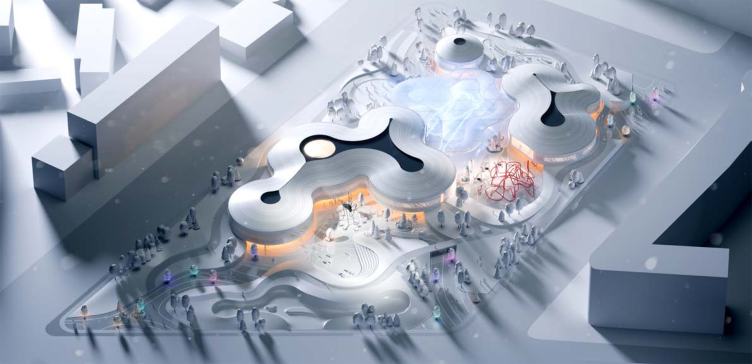
Concept of the “Park of the Future Generations” in Yakutsk © Atrium, Vostok+
Copyright: © ATRIUM, Vostok+
In what format will you distribute your project? What is the circulation? Do you have any plans for making a PDF and posting it online?
We did have such an idea, but after we analyzed other projects posted online we came to a conclusion that such a format slightly devalues the depth of the research. It is one thing if you upload a 50-page book that you can scroll through and use in a quick mode, and it is quite another thing when you have a 300-page book. What we ultimately got is quite a fundamental work, and you cannot read it at one sitting, much less on a monitor screen. That’s why we settled for the format of a book, an actual book. We generally like books, I even call myself “the company’s librarian”; we have more than seven hundred books and more than a thousand magazines.
So far, we decided to publish 1000 copies, and then we will see if we will need to print extras. We will buy out part of the press run and present it to our colleagues; the rest of the books will be sold in specialized stores. It would be just great if we could get meaningful feedback, and maybe some criticism… then in a couple of years we could publish the next version, “corrected and supplemented”, as they say.
What do you think about the recommendations from Moskomarkhitektura? You studied them, didn’t you?
Of course we did. It seems to me this is a very useful work, only on a different pole. We nicely complement each other. If our research project makes an attempt to define what makes a great modern school, and form the idea of the upper bar for quality, Moskomarkhitektura is trying to tackle it from the opposite side: they try – and I will emphasize this – without addressing the functional and planning solutions – to propose a minimum level for aesthetic solutions. This is also very important and useful, but our messages do not cross here. However paradoxical this may seem, in our research project we speak very little about aesthetics and such details as the rhythm of the windows, and such like – we just give examples. Oh, and by the way, the Moskomarkhitektura recommendations contain three of our projects as examples: we are happy that our work was noticed and appreciated.
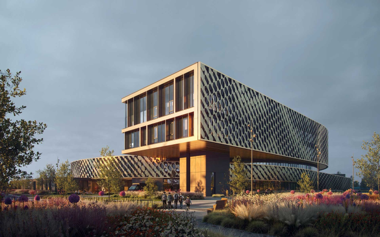
A boarding school in Kozhukhovo, Moscow
Copyright: © ATRIUM
What is the structure of your research? Do you analyze your 30 projects?
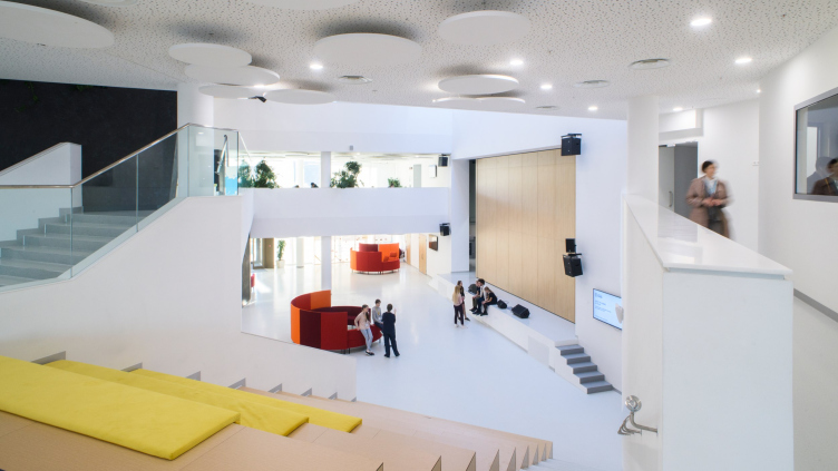
We one way or another use the projects from our portfolio simply because we know them well. The goal of the book, however, is not to showcase our projects – one can easily look them up at our website. We gave a lot of thought to coming up with the right structure of presentation: there is the classic approach when each project is analyzed from all sides. We decided to try a different approach: we start from the problems that we are faced with, and break them down using our projects as examples. For example, if we are speaking about the yards or atrium spaces, we give various complex examples, typologically diverse: for example, in this instance this auditorium also works as a lobby, and in this instance we see two atriums… And we try to find interesting parallels from the world practice. But then again, we did not analyze each project in great detail – rather, we just used the most interesting moments as examples. We analyzed not just schools, but also universities; we searched for cool ideas and interesting technologies.
How many such themes/problems do you have?
Currently, we have 11 or 12 chapters: pedagogical theory, general strategy, and so on… The biggest section is dedicated to functional and spatial solutions. We paid special attention to analyzing entrance halls, cafeterias, classrooms, lounges, and so on – all the key spaces that just must be there in accordance with the state standards, yet at the same time must be revised. We also gave examples of secondary optional functions – these things are relevant today. There is also a big chapter dedicated to working with the adjacent territories. It is followed by the “Effectiveness” block: a go-to set of the key solutions that will help you to streamline your project. Even though we are trying to ultimately get “the ideal school”, this does not mean that it must become an amusement park. Then there is a separate narrative of school and city. Currently, there is a shortage of schools, but I hope that by 2025 we will hit a plateau, then there will be fewer students due to the demographic decline, and then the extracurricular use of school spaces will become more and more relevant. To a large degree, our project is all-inclusive: it covers the students’ mental health, AR and VR technologies. A large block before that consists of technological solutions, for which we are actively searching for partners in order to share about specific materials, specific furniture that will be used, specific lighting, and so on. Some of this we know from our practice, but it’s always important to get information firsthand, possibly, even share the results of in-company research provided by companies that actively operate on the market.
What are the practical benefits from this research for the future ATRIUM projects? Will you do something new and unusual, something that you haven’t done before?
Not quite that way. Of course, we will be growing, but one of the important goals of this research is to create some quality basis for creating educational facilities. So far, the industry on the whole lacks such experience, and the cases are few and far between. While with apartments, for example, the developers have already achieved a level where they know everything about each square inch of their product, with schools, it’s not yet the case. Yes, schools are indeed talked about, and even advertised, but they are not a part of the product so far. What never ceases to amaze me is that everyone in Moscow knows what “business class housing” is – and this is about a half of all the projects that are currently in construction – but nobody is in a hurry to form a level of a “business class school”, even though the high-quality educational environment must be accessible to anyone regardless of their income and/or place residence.
Often, we are approached by customers who want to build a modern school but without a clear brief, and in a very short time (deadlines are one of the main issues with schools because if they are postponed, they are postponed for a whole year). Building something unique is always a risk, but we try to show the whole range of cool ideas that we analyzed in order to select a few fundamentals and include them in our design brief. This approach ensures a more predictable and effective work process, which ultimately yields a better result.
A classic example is obtaining the so-called “special technical conditions”. This takes time and money, and our customers often opt out of obtaining special technical conditions because they don’t understand what they need them for. However, if you show them real examples of the benefits that they will get with special technical conditions, and what they will be missing without, it all becomes clear and simple.
I hope that this research project will become a tool that will help you make sense of the complex process of creating a school and at once define some key steps and make very early on key decisions that will ultimately take your construction project to a whole new level. This way, you will be able to avoid the necessity to start your project from scratch every time, and optimize our work as well.
Could you give us more examples? And, by the way, multifunctional is hot now, but where does it end?
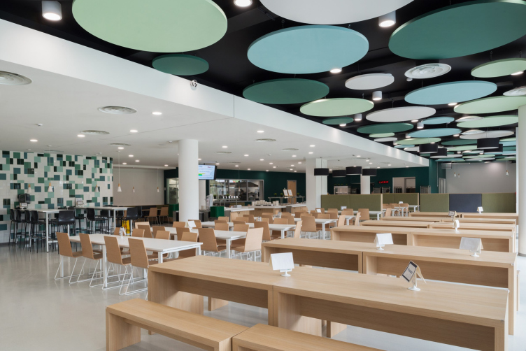
The multifunctional approach gives interesting architectural ideas and allows you to make the most of the space available to you, which sometimes does matter a lot. Let’s take the cafeteria zone, for example: you can also use it as a students’ lounge, which lets you save up a huge amount of space, but it’s seldom done. Another favorite example of mine is libraries. According to all construction regulations, they are essentially archives or book storages fitted with reading rooms – a place that is not exactly attractive to high school students. When I went to school back in my days, I visited the library a couple of times at most, and then only because I forgot some textbook. However, if we use the agile principle, you can turn the library into a coworking space, a lecture hall, a place for individual work, and a video room… Speaking about a specific school in a specific city – we had an experience of building a school in the Symbol housing complex: we found a solution based on creating a few extra entrances, and thus the library could also be used as a community center, and there was also a gym built right next to it, which was also a useful vicinity.
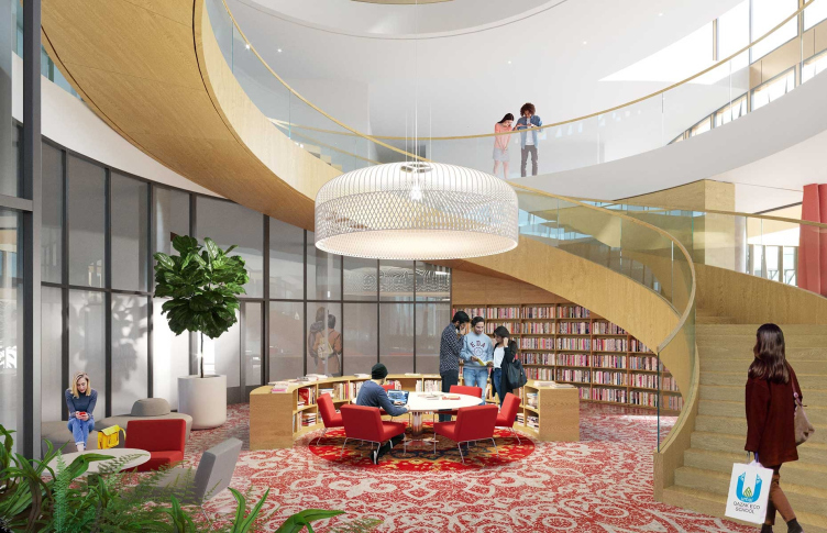
The atrium. The school within the “Symbol” housing complex
Copyright: © ATRIUM
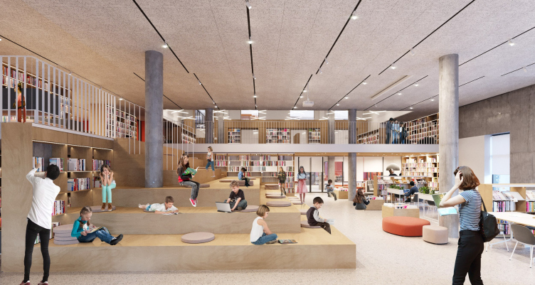
The library. The school within the “Symbol” housing complex
Copyright: © ATRIUM
Was it OK with the safety norms?
The safety norms keep toggling between “allow everything” and “prohibit everything”. An interesting solution was making two checkpoints instead of just one: one at the entrance to the school grounds, and one at the entrance to the school building. This way, the territory would be open to transit on non-school days, and its sports facilities would be open to the general public. One of such projects of a school with two checkpoints, as far as I know, was built by A101 in New Moscow: they took the lobby where the parents usually wait for their kids, and organized a cafe in there, so that the place would be less crowded, and people could spend their time in a more pleasant way.
On the other hand, it often happens that the architect proposes and even implements an interesting solution, such as a little yard or an open-air gym on the roof, but then the school management keeps it under lock and key, and never uses it. Do you know of such instances?
I do. We did have a gym on the roof in the project of an international school within the “Life Botanical Garden” housing complex built by Pioneer developers. We did not do the architectural part in that project; we just did the interiors and the yards. A lot of questions came up, but they all were resolved through negotiations. The decisions were collectively taken: by the architects, the developers, and the teachers’ team.
The architect can indeed propose a lot of “groundbreaking” and “mind-blowing” ideas that will never be ultimately used, and this is why it’s critical that you understand the client’s needs. 10 or 15 years ago, there was a popular opinion that a school outfitted with a full-size swimming pool was a breakthrough, but as time went by it turned out that the operational costs were prohibitively high, and you had better spent the funds on other functions: enlarge the gyms or purchase better equipment for workshops and creative studios. Or – another vivid example – we asked school principals to give us feedback on whether they use pull-out partitions, and, if they do, then how often. Here you also need to draw a line at some point: a teacher cannot spend time constantly opening and closing these things; teachers also need some time to rest. We came to a conclusion that not every classroom needs pullout partitions, and not every classroom needs to be transformable – you do need this feature in two or three cases, and that’s it. This is why it is important that the operator joins the project very early on; it is important that you use consultants because this will allow you to pay unnecessary extra costs and remake different things. This is especially true if your client is building his first school. The consultant must work on the client’s side; he must adjust and fine-tune the process, using his expertise: he can not only say whether this is beautiful or not but also calculate the economic balance.
The educational complex in Nur_Sultan, a project, 2020
Copyright: © ATRIUM
Where can the recommendations from your research be applied? How are they suited for governmental schools with all their special technical conditions that you need to obtain for every modern quality project?
We obtain special technical conditions virtually on every project, and, as far as I know, so do our colleagues. I would say that our recommendations, analysis, and examples can be used everywhere. In our research project, we do not provide a recipe for such unique projects as “Khoroshkola”, “Point of the Future” or the Letovo school, which were all created by teams of highly skilled professionals who managed gigantic budgets, even though we hope that our project will come in handy for solving such grand-scale tasks as well. We see that the gap between such projects and the mid-class ones is just huge, even though there are a lot of not-too-complicated solutions that still can be used to bridge it.
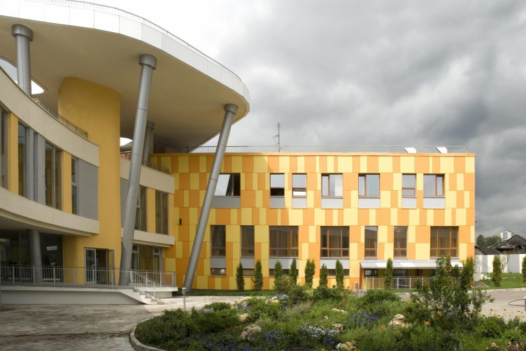
The Letovo school
Copyright: Photograph © Aleksey Naroditskiy
The Letovo school
Copyright: Photograph © Dmitry Voinov
Creating the project of a school building and its construction is a complex process that involves a large number of stakeholders, if you want to take it to a new level. Everyone must propose new ideas and try to make the project better. For example, the department of education also issues its recommendations, many of which we also take into consideration, but many of them we consider to be too complex and even excessive. However, the more we share our ideas and our experience, the more professionals from different areas of expertise will be invited to the discussion, the more archive will be the qualitative growth of the industry on the whole, and the more will be there unique projects, and the mid-class level will also rise. Ultimately, this will take us to the realization of our global goal – raising the level of education.
How do you plan to announce your publication at the Arch Moscow convention?
On June 10 we are going to hold a roundtable discussion, to which we invited very different speakers: experts in international trends and in integrating new international formats in the school buildings of new housing complexes, the authors of the Moskomarkhitektura research and the managers of the already complete schools, which already have the experience in operating these or those solutions. We will speak about why a well-designed school is something that both developers and the city must be interested in, what benefits a good school as an institution gives to its area, and about how to form the process of interaction between the government, the developer, and the educational operator to achieve the best result.
All of our guests will automatically become the experts of the research project, and the materials of the round table will supplement its results. In addition, we are inviting to the discussion everyone who is impartial to this subject, and we hope to receive their feedback. As I already said, the question of a quality educational environment is so important and multifaceted that the more important experts are invited to solve it the better. Do join in!

