По-русски

Julia Tryaskina: “Modern public interiors are about the super-goal, not about unnecessary embellishments”

The new IPI Award for design of public interiors considers the projects from the point of view of today’s trends of the modern world, and even broader – from the point of view of a super-goal set by the client and achieved by the architect. In this article, we are speaking to the initiator of the award: about the specifics of rating the projects, about the priorities, fears, and hopes.

23 May 2022
Interview
mainImg
The new IPI Award was announced on the 28th of March. It is about searching for unique innovative trends in the area of designing public interiors. Eligible are interior design projects implemented over the last three years, in seven typological nominations by four criteria: innovative, functional, sustainable, creative. The deadline for submitting the applications is June 30.

In this article, we are speaking to the initiator and co-organizer of the new award Julia Tryaskina – about the mission, about the trends, the architect’s paths to achieving the super-goal, and about the subtleties of rating the projects. There are already about a hundred participants, many of whom come from non-capital cities.

Archi.ru
How long ago did you come up with the idea of this new award, and what is its super-goal?
zooming


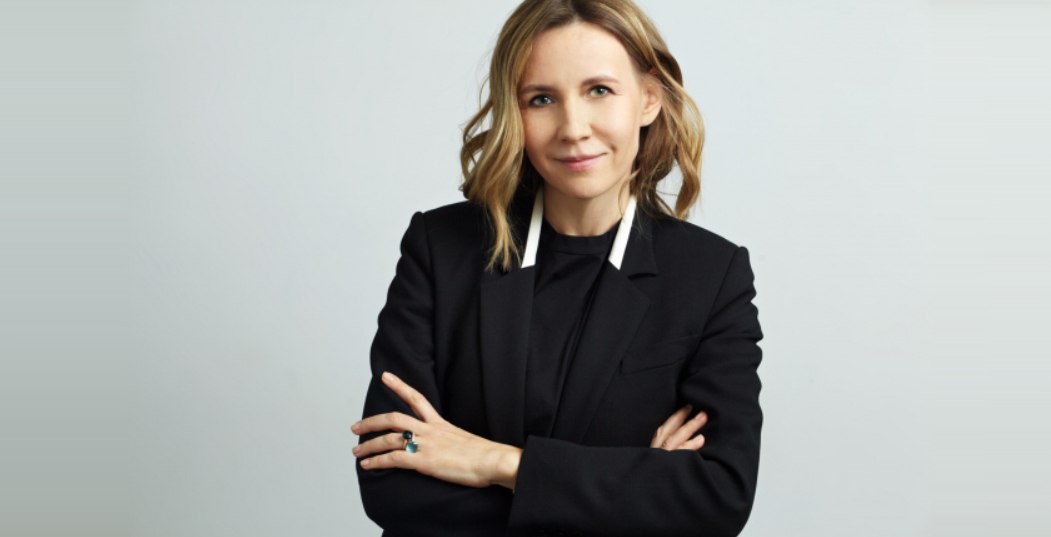
Julia Tryaskina:
The idea to change the very approach to public interior awards, which have appeared here in recent years, is something that I’ve been entertaining for quite a while now. In recent years, they all turned into awards for fancy pictures, where all the judging panel does is they check them out and decide whether they like them or not – nobody goes any deeper than this. This approach is slightly outdated, and individuality is lost altogether. Spaces aimed at forming an unconventional perception of the world, new technologies, and inclusion were not covered by the topics of these awards because they spoke a different language and used different approaches. The architects, who posed (and achieved!) certain super-goals in their interiors, simply did not fit in with the vacuum created by the “diverse beauty” of recent awards.

Can you give a couple of examples of such interiors: innovative, inclusive, advanced? Just so that we could understand the benchmark of your new award.

Well, it would be incorrect to cite probable winners as examples but, generally speaking, this could be a school for children whose eyesight is impaired or an eco-hotel operating on full-cycle utilization of water and source materials. “Sustainable” becomes a synonym for “modern”. One of such examples is the new flagship Bulgari store, designed recently in Shanghai by MVRDV. The material for the facade panels was recycled bottles. Of course, sustainability of the solution does affect the image: specifically, for the power received from photovoltaic batteries, not every fashionable designer light will be the best choice.

Yet another example is the (SO)What Chengdu boutique in Shanghai from Various Associates – its interior actively uses multimedia technologies. Modern technologies in general are a subject that we have very much interest in. It includes 3D printing of individual elements or even whole houses, and design of their interiors as well.

If we are to speak about inclusion, in this country it is often limited to access ramps; otherwise, inside the buildings, people with disabilities need to be escorted. And the ramps are something that the architects seem to be somehow embarrassed of as the elements that ruin the aesthetics of the space they designed. If you want to honestly build a public space that would function as an inclusive one, you need to have a desire for it, you need to have patience, as well as courage and taste; you also need understanding on the part of the client. The public urban spaces have already achieved that, but the public interiors are only moving in that direction.

One of your evaluation criteria is sustainability. How do you see it?

Environment is, of course, the next big topic. And in this area, regrettably, there is also more conversation than action. Every detail is important: you need to convince your client to use this or that equipment, and use it systematically, saving the resources and minimizing the damage. All architects, for example, love large-format materials. However, such materials are expensive to come by, and their production often harms the environment. What is important is not just the feel of the material, but the method of its production as well, and what consequences it entails. None of this is ever reflected in the beautiful 3D renders. Creating truly sustainable spaces changes your way of thinking.

When were you exposed to such a “different” approach? What made you change your mind?

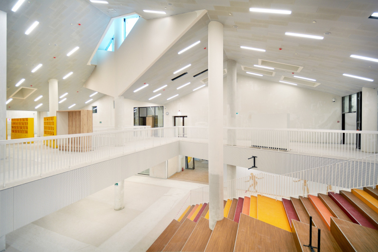
What became for me such a discovery, and a professional challenge, was the experience of working with the “School of the Future” in Irkutsk. We worked with the idea of subjugating everything – every little detail and every solution – to the super-goal of changing the child‘s life and giving the child a chance to change the world. We checked every solution with this question: why this staircase? What purpose does it serve? This experience turned out to be very valuable, and even working with small routine tasks I tried to break away as much as possible from thinking in beautiful pictures, and think functionality.

“Point of the Future” educational complex
Copyright: Photograph: “Point of the Future”


When your approach to design changes, you proceed not so much from the beautiful material as from the function, from the super-goal of the specific space, new technologies, and solving social tasks.

I also want our award to cover this aspect as well – I want the architect to think out of the box, and have the courage to do more than just the routine decoration tasks. 

What will you award the Grand Prix for? For a maximum of innovations?

Rather, for the interior that is best conceived in terms of the super-goal: one that solves specific problems of the society, or, possibly, even aimed at changing the society and individuals. Definitely, not for the beautiful pictures. On the other hand, the fact of implementing the idea is important – the fact that both the architect and the client were able to see the value of the idea and make it a reality.

How many participants are there so far?

About a hundred projects. We’re looking for the projects as if we were digging for gold. And, surprisingly, these are not just Moscow and St. Petersburg. Many of them are regional. There are many architects in the regions, which, while solving specific tasks posed by their customers, ultimately change the habitual view of the world for themselves and for people around them. They know their world better, and they want to show that you can create a different environment, and live in a different way. 

Do you consider only the projects that have been implemented?

Yes, because implementing your ideas is a heroic deed in itself.

How will the screening be organized?

If you look at the experts list, you will see that there are not so many architects in it. We have a rather large circle of experts, from technologists to progressive bloggers, who specifically cover the topic of understanding the new human being. We want our project to be evaluated from different sides. We will have interviews not just with architects but with clients as well. If a person is a missionary, he will speak about it, and it’s important for him to be heard. 

Tell us about the leader of the project, Lavlish Tanedzha. Why him?

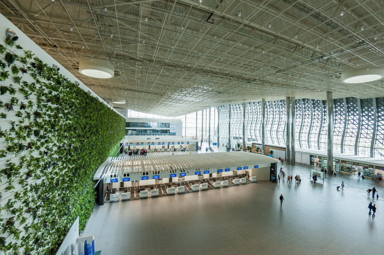
He is a person who can do such things, he’s got plenty of experience in this field. Being the chairman of the MCFO association, he organized the great MCFO Awards. Because it’s not enough just to grow your award ideology-wise – you also need to make sure that the market is ready to change with it, that the colleagues, clients, and technologists are ready to respond… I offered quite a lot of people to be in charge of the organization of this award, and I am very happy that Lavlish has agreed to it, being also instrumental in finding sponsors and other companies that one way or another have to do with our mission, such as the Ficus company that helped us build a giant green wall in the Simferopol airport – you cannot just water it from a hose; it has a rather complex watering and fertilizing system, like a real scientific development.

Simferopol International Airport
Copyright: Photograph © Yuri Yuganson


Another example is the tubs with wild grapevine in the business center in the Zemelny Lane – this is basically agronomist’s work, but they changed the entire surrounding environment of this industrial park. The task of interior design is pretty much the same: you always have to be one step ahead, you have to embrace the change. You must seriously stop wrapping everything in gold and stop doing all this fancy decoration work because it will get you nowhere. Because the world is different now. 

I cannot help reacting to the words “the world is different now”. Was your award affected in any way by the developments of recent months?

Of course it was. We planned to present our award on March 1, but then we realized that we just couldn’t handle meeting the press with our narrative, so we postponed it to the end of the month…

What am I concerned about the most? I really don’t want to lock up in my own shell again, miss valuable information, be behind the rest of the world, and search for every crumb of a fresh thought, the way it was in the 1980s and even in the 1990s… Being aware of the current trends and current issues is very different for an architect. And our new award is all about promoting new ideas. We don’t want to either backslide or get stalled. We want to move forward without losing access to information.

Well, today, with the Internet, getting information has become much easier…

What also matters is the number of buildings that you’ve seen with your own eyes, not just by seeing their pictures online but knowing them inside out, and for that you need to be able to freely move in and out of the country. We all know perfectly well how the points for magazine photo shoots are chosen – then you arrive on the spot and see that everything looks different. And then Photoshop is doing its thing too. I also want our experts to evaluate the interiors based upon real feelings, and not online pictures.

In addition, I see that you also accept videos…

We did this to be on the safe side. I really wanted international experts to be on the judging panel, we conducted negotiations still in winter, and we received preliminary agreements, and we are still conducting negotiations, hoping that it all will work out in the long run. Because architecture is ultimately about organizing the world. 

As for the videos, which will be provided in cases when visiting the building would not be feasible, we will shoot them in a manner as objective as possible, without any unnecessary embellishments.

How often are you planning to organize your award?

Interior design projects are completed pretty fast, and originally we planned on this award being an annual one. Now, however, considering the circumstances, we decided that it would be wiser to conduct it every two years. Some of the construction projects are frozen now, and we will not be able to consider some of the interesting projects as implemented ones, so they will have to wait until the next award is held.

My next question is about the nominations. As I see, most of them are typological ones, you also have a “Reconstruction”. Is this comparison entirely correct? Aren’t these things in different leagues?

No, there is no contradiction here. We decided to allow ourselves to widen the boundaries and proceed from the material. According to our rules, one project can be submitted in several nominations, and then the organizers and experts will decide where it would be the most appropriate. Actually, we decide this when still in the stage of accepting the projects.

I understand why you do not consider corporate offices because this is a separate and a very big narrative. But why don’t you consider the innovative multifunctional coworking spaces?

I am convinced that coworking spaces are first of all business spaces. Things that are done in this area still belong with the business environment. Public interiors, on the other hand, are more about life and communication in general, more about how we as humans perceive this world and understand our values. And work is more about acceptance and obedience, about the routine and time-tested technology.

If somebody designs a coworking space that is based upon a new perception of life – they are entirely welcome! However, here is the thing: unusual coworking spaces are born as a rule as a function that complements some other prevalent function. Hence, when coworking is the main function of the space, it will hardly fit in with our nominations.

And my final question: we started from talking about “unnecessary fancy things”. Aren’t you in danger of rejecting aesthetically pleasing projects just for being beautiful?

If a great project is also aesthetically pleasing, this will not prevent it from high ranking. Any task will be considered from different sides, the judging panel will go straight to the bottom of things, and evaluate the interiors knowing how they are wired. The question that we want to ask is what this person wanted to say, and why he did it in this specific way. Probably this is where the mega-idea lies.

I must say that this is interesting for architects and investors alike. An experienced client is not just after beautiful things – this is like the first stage of development. Having enough of this game, everybody starts posing new tasks of a higher level, more interesting and more complex.

Even if you take a look at our interiors – those of them that were designed with a super-idea in mind, live longer. They don’t go out of style, and they develop gracefully, keeping the original idea intact even during remodeling.

When you know exactly what you are doing, the result is usually beautiful. Beauty is achieved by realization of new ideas, and they already speak the language of new aesthetics, making this world a better place. Beauty – but not pretty things – will save the world.

23 May 2022

Headlines now
The Golden Crown
The concept for a dental clinic in Yekaterinburg, developed by CNTR Studio, revolves around the idea of a “mouth full of gold”: pristine white porcelain stoneware walls are complemented by matte brass details. To avoid an overly literal interpretation, the architects focused on the building’s proportions, skillfully navigating between sunlight requirements and fire safety regulations.
Flexibility and Integration
Not long ago, we covered the project for the fourth phase of the ÁLIA residential complex, designed by APEX. Now, we’ve been shown different fence concepts they developed to enclose the complex’s private courtyards, incorporating a variety of public functions. We believe that the sheer fact that the complex’s architects were involved in such a detail as fencing speaks volumes.
A Step Forward
The HIDE residential complex represents a major milestone for ADM architects and their leaders Andrey Romanov and Ekaterina Kuznetsova in their quest for a fresh high-rise aesthetic – one that is flexible and layered, capable of bringing vibrancy to mass and silhouette while shaping form. Over recent years, this approach has become ADM’s “signature style”, with the golden HIDE tower playing a pivotal role in its evolution. Here, we delve into the project’s story, explore the details of the complex’s design, and uncover its core essence.
Gold in the Sands
A new office for a transcontinental company specializing in resource extraction and processing has opened in Dubai. Designed by T+T Architects, masters of creating spaces that are contemporary, diverse, flexible, and original, this project exemplifies their expertise. On the executive floor, a massive brass-clad partition dominates, while layered textures of compressed earth create a contextually resonant backdrop.
Layers and Levels of Flight
This project goes way back – Reserve Union won this architectural competition at the end of 2011, and the building was completed in 2018, so it’s practically “archival”. However, despite being relatively unknown, the building can hardly be considered “dated” and remains a prime example of architectural expression, particularly in the headquarters genre. And it’s especially fitting for an aviation company office. In some ways, it resembles the Aeroflot headquarters at Sheremetyevo but with its own unique identity, following the signature style of Vladimir Plotkin. In this article, we take an in-depth look at the United Aircraft Corporation (UAC) headquarters in the Moscow agglomeration town of Zhukovsky, supplemented by recent photographs from Alexey Naroditsky – a shoot that became only recently possible due to the fact that improvements were finally made in the surrounding area.
Light and Shadow
In this article, we delve into the architectural design of the “Chaika” house by DNK ag architects, which was recently completed in 2023 as part of the collection of signature designs at ZILArt. As is well-known, all the buildings in this complex follow a design code, yet each one is distinct. This particular building stands out not only for its whiteness and minimalism but also for the refined use of a limited number of techniques that, together, create what can confidently be called synergy.
Casus Novae
A master plan was developed for a large residential area with a name of “DNS City”, but now that its implementation began, the plan has been arbitrarily reformatted and replaced with something that, while similar on the surface, is actually quite different. This is not the first time such a thing happens, but it’s always frustrating. With permission from the author, we are sharing Maria Elkina’s post.
Treasure Hunting
The GAFA bureau, in collaboration with Tegola and Arkhitail, organized an expedition to the island of Kilpola in Karelia as part of Moskomarkhitektura’s “Open City” festival. There, amidst moss and rocks, the students sought answers to questions like: what is the sacred, where does it dwell, and what sustains it? Assisting the participants in this quest were landscape engineer Evgeny Levin, artist Nicholas Roerich, a moose, and the lack of cellular connection. Here’s how the story unfolded.
Depths of the Earth, Streams of Water
In the Malaya Okhta district, the Akzent building, designed by Stepan Liphart, was constructed. It follows a classic tripartite structure, yet it’s what you might call “hand-drawn”: each façade is unique in its form and details, some of which aren’t immediately noticeable. In this article, we explore the context and, together with the architect, delve into how the form was developed.
Fir Tree Dynamics
The “Airports of Region” holding is planning to build an airport in Karachay-Cherkessia, aiming to make the Arkhyz and Dombay resorts more accessible to travelers. The project that won in an invitation-only competition, submitted by Sergey Nikeshkin’s KPLN, blends natural imagery inspired by the shape of a conifer seed, open-air waiting spaces, majestic large trees, and a green roof elevated on needle-like columns. The result is both nature-inspired and WOW.
​A Brick Shell
In the process of designing a clubhouse situated among pine trees in a prestigious suburban area near Moscow, the architectural firm “A.Len” did the façade design part. The combination of different types of brick and masonry correlates with the volumetric and plastique solutions, further enhanced by the inclusion of wood-painted fragments and metal “glazing”.
Word Forms
ATRIUM architects love ambitious challenges, and for the firm’s thirtieth anniversary, they boldly play a game of words with an exhibition that dives deep into a self-created vocabulary. They immerse their projects – especially art installations – into this glossary, as if plunging into a current of their own. You feel as if you’re flowing through the veins of pure art, immersed in a universe of vertical cities, educational spaces – of which the architects are true masters – and the cultural codes of various locations. But what truly captivates is the bold statement that Vera Butko and Anton Nadtochy make, both through their work and this exhibition: architecture, above all, is art – the art of working with form and space.
Flexibility and Acuteness of Modernity
Luxurious, fluid, large “kokoshniks” and spiral barrel columns, as if made from colorful chewing gum: there seem to be no other mansion like this in Moscow, designed in the “Neo-Russian-Modern” style. And the “Teremok” on Malaya Kaluzhskaya, previously somewhat obscure, has “come alive with new colors” and gained visibility after its restoration for the office of the “architectural ecosystem” as the architects love to call themselves. It’s evident that Julius Borisov and the architects at UNK put their hearts into finding this new office and bringing it up to date. Let’s delve into the paradoxes of this mansion’s history and its plasticity. Spoiler: two versions of modernity meet here, both balancing on the razor’s edge of “what’s current”.
Yuri Vissarionov: “A modular house does not belong to the land”
It belongs to space, or to the air... It turns out that 3D printing is more effective when combined with a modular approach: the house is built in a workshop and then adapted to the site, including on uneven terrain. Yuri Vissarionov shares his latest experience in designing tourist complexes, both in central Russia and in the south. These include houseboats, homes printed from lightweight concrete using a 3D printer, and, of course, frame houses.
​Moscow’s First
“The quality of education largely depends on the quality of the educational environment”. This principle of the last decade has been realized by Sergey Skuratov in the project for the First Moscow Gymnasium on Rostovskaya Embankment in the Khamovniki district. The building seamlessly integrates into the complex urban landscape, responding both to the pedestrian flow of the city and the quiet alleyways. It skillfully takes advantage of the height differences and aligns with modern trends in educational space design. Let’s take a closer look.
Looking at the Water
The site of Villa Sonata stretches from the road to the water’s edge, offering its own shoreline, pier, and a picturesque river panorama. To reveal these sweeping views, Roman Leonidov “cut” the façade diagonally parallel to the river, thus getting two main axes for the house and, consequently, “two heads”. The internal core – two double-height spaces, a living room and a conservatory, with a “bridge” above them – makes the house both “transparent” and filled with light.
The White Wing
Well, it’s not exactly white. It’s more of a beige, white-stone structure that plays with the color of limestone – smoother surfaces are lighter, while rougher ones are darker. This wing unites various elements: it absorbs and interprets the surrounding themes. It responds to everything, yet maintains a cohesive expression – a challenging task! – while also incorporating recognizable features of its own, such as the dynamic cuts at the bottom, top, and middle.
Urban Dunes
The XSA Ramps team designed and built a three-part sports hub for a park in Rostov-on-Don, welcoming people of all ages and fitness levels. The skate plaza, pump track, and playground are all meticulously crafted with details that attract a diverse range of visitors. The technical execution of the shapes and slopes transforms this space into a kind of sculptural composition.
Proportional Growth
The project for the fourth phase of the ÁLIA residential area has been announced. The buildings are situated on an elongated plot – almost a “ray” that shoots out from the center of the area towards the river. Their layout reflects both a response to Moscow’s architectural preferences over the past 15 years, shifting “from blocks to towers”, and an interpretation of the neighboring business park designed by SOM. Additionally, the best apartments here are not located at the very top but closer to the middle, forming a glowing “waistline”.
The “Staircase” Building
In designing the “Details” residential complex in New Moscow, Rais Baishev spiced up the now-popular Moscow theme of a “courtyard” building with an idea drawn from the surrealist drawings by Maurits Escher. He envisioned the stepped silhouettes and descending slopes as a metaphysical mega-staircase, creating a key void within the courtyard that gave the project an internal “spine”. This concept is felt both in the building’s silhouette and on its façades.
Projection of the Quarter
No one doubted that the building that Vladimir Plotkin designed as part of the “Garden Quarters” would be the most modernist of all. And it turned out just that way: while adhering to the common design code, the building successfully combines brick and white stone, rhythmically responding to the neighboring building designed by Ostozhenka, yet tactfully and persistently making a few statements of its own. This includes the projection of the ideal urban development composition “14–9–6”, which can be found right next door, mathematical calculations, including those for various types of terraces (and perhaps the only reminder of the Soviet past of the Kauchuk rubber factory!), and the white “cross-stitch” pattern of the façade grid.
Domus Aurea
In this issue, we examine the “Tessinsky-1” house, designed by Sergey Skuratov and completed in 2023. Located in the middle of the Serebryanicheskaya Embankment district, at the intersection of its main streets, this house assumes a sort of “nodal” role: it not only responds to everything around it and preserves many memories of the former EMA factory within itself, but it weaves all this into a newly directed pattern, reconciling bright “gold” and dark-colored brick, largely with the help of the new, modern-yet-archaic Columba brick, which, come to think about it, is the most precious element here.
The Chimney of Nikola-Lenivets
In this issue, we are examining the “Obelisk House” designed by KATARSIS and built for the Arkhstoyanie 2023 festival. However, it was only finished later on, and this is why we are examining it now. It seems to us that after the “Obelisk House” appeared in Nikola-Lenivets, a dialogue and a few inner connections appeared between the temporary structures built here. These houses no longer look like “accidental neighbors”, more of which below.
​Periscope by the Bay
The jury awarded the second place in the competition for a public and cultural center in Petropavlovsk-Kamchatsky to the companies GORA (“Mountain”) and M4. In the consortium’s proposal, the building resembles a sperm whale with a calf swimming next to it or a periscope, whose lenses capture the most spectacular views from the surrounding landscape.
From Arcs to Dolmens
While working on the competition project for Petropavlovsk-Kamchatsky, ASADOV Architects prioritized the value of the natural and urban environment, aiming to preserve the balance of the location while minimizing the resemblance of the volume that they designed to a “traditional building”. The task was challenging, and the architects created three versions, one of which having been developed after the competition, where their main proposal took third place. However, the point of interest here is not the competition result but the continuity of creative thinking.
Hide and Seek
The ID Moskovskiy house, designed by Stepan Liphart in St. Petersburg, in the courtyards near Moskovskiy Avenue beyond the Obvodny Canal and recently completed, is notable for several reasons. Firstly, it has been realized with considerable accuracy, which is particularly significant as this is the first building where the architect was responsible not only for the facades but also for the layouts, allowing for better integration between the two. On the other hand, this building is interesting as an example of the “germination” of new architecture in the city: it draws on the best examples from the neighborhood and becomes an improved and developed sum of ideas found by the architect in the surrounding context.
The Big Twelve
Yesterday, the winners of the Moscow Mayor’s Architecture Award were announced and honored. Let’s take a look at what was awarded and, in some cases, even critique this esteemed award. After all, there is always room for improvement, right?
Above the Golden Horn
The residential complex “Philosophy” designed by T+T architects in Vladivostok, is one of the new projects in the “Golubinaya Pad” area, changing its development philosophy (pun intended) from single houses to a comprehensive approach. The buildings are organized along public streets, varying in height and format, with one house even executed in gallery typology, featuring a cantilever leaning on an art object.
Nuanced Alternative
How can you rhyme a square and space? Easily! But to do so, you need to rhyme everything you can possibly think of: weave everything together, like in a tensegrity structure, and find your own optics too. The new exhibition at GES-2 does just that, offering its visitor a new perspective on the history of art spanning 150 years, infused with the hope for endless multiplicity of worlds and art histories. Read on to see how this is achieved and how the exhibition design by Evgeny Ace contributes to it.
Blinds for Ice
An ice arena has been constructed in Domodedovo based on a project by Yuri Vissarionov Architects. To prevent the long façade, a technical requirement for winter sports facilities, from appearing monotonous, the architects proposed the use of suspended structures with multidirectional slats. This design protects the ice from direct sunlight while giving the wall texture and detail.