По-русски

A High-Rise Erector Set

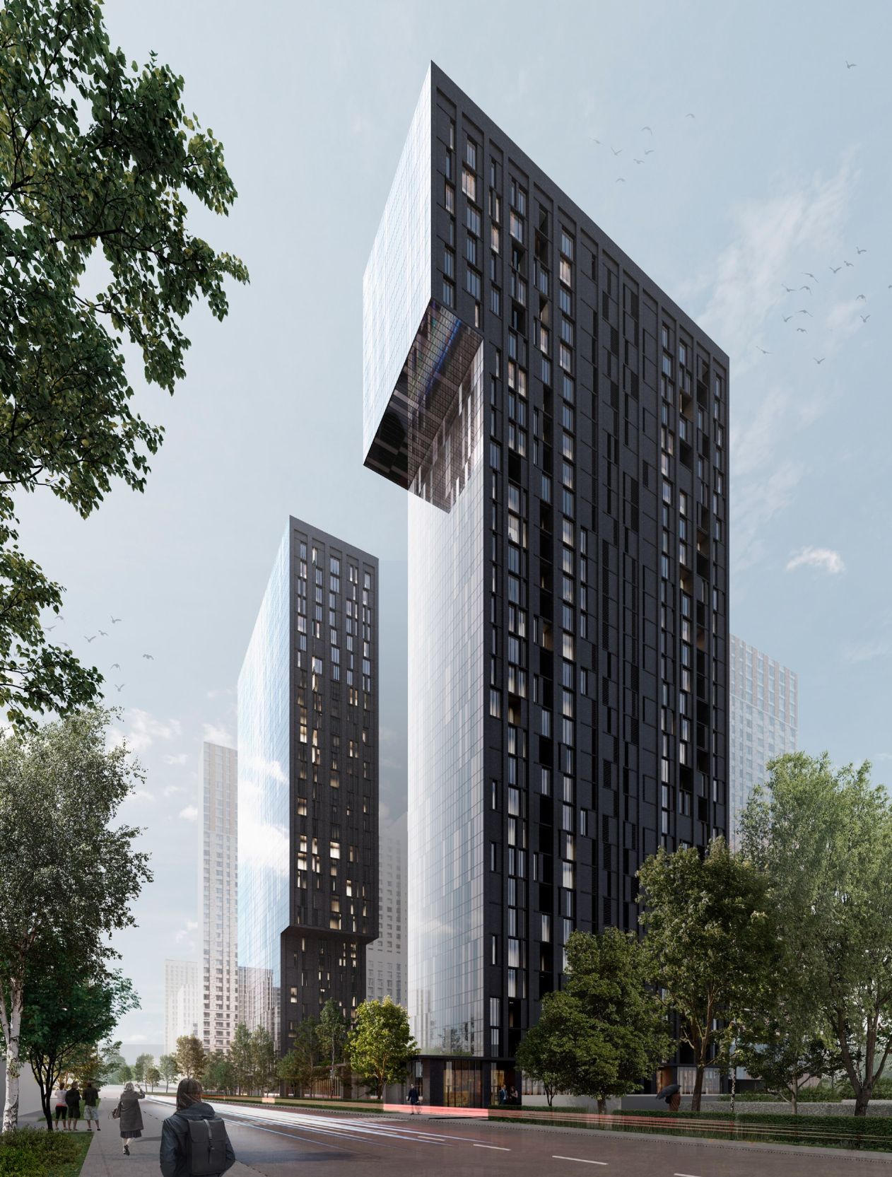
In this article, we are examining one of the projects submitted for a closed-door competition for a housing complex to be built in the north of Moscow. The KPLN architects proposed a simple volumetric pair of 100 meter high towers, united by a common sculptural design based on laconic contrast, yet dramatic at the same time. Another interesting thing is an oval yard that is “carved out” in the stylobate roof.

04 August 2022
mainImg
The project was prepared for a closed-door competition, conducted in 2021 for a land site in the north of Moscow. The land of the former industrial parks lying between the Dmitrovskoe Highway and the Northeast Chord is a spacious and convenient place for new construction; currently, it is being intensively developed with various housing projects. Across the street from the site in question, there is an already-complete large housing complex built by a well-established development company; nearby, there is yet another one, consisting of blocks of varying colors and heights. Today, the client is developing the neighboring site. The project that we are examining in this article did not win the competition; such projects are rather numerous in Moscow today, and we believe it will be interesting to cover them later on as well. At the architects’ request, the exact location of the site remains undisclosed.

The construction territory is not excessively large for the planned height: 1 hectare for two 100-meter towers. The height is justified by both significant density of the neighboring complexes and the remoteness from the city center. At the same time, the volumetric and spatial solution in this case is different from the ones implemented in the nearby housing complexes: in this case, the architects and the customer agreed on the format of towers on a stylobate, which has been popular in Moscow in recent years, naturally combining the volumetric features of three-dimensional construction with the technology of laconic, yet at the same time not devoid of texture, facades.

Ilmensky Level housing complex
Copyright: © KPLN


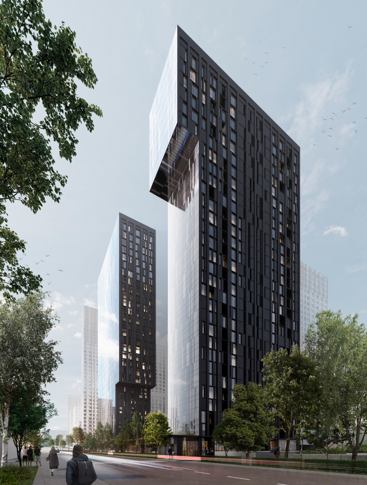
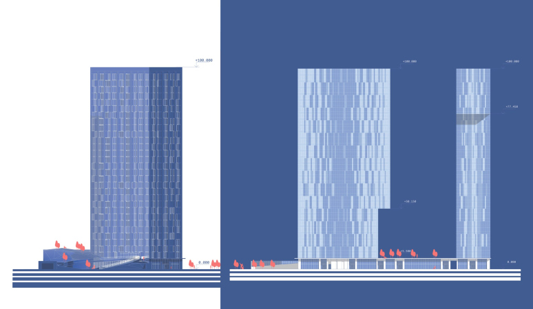
On the plan, the towers look elongated, and are nothing like a perfect square, which yields a small corridor running on either side of the elevator core. Their volumes are placed along the borders of the site at a 90-degree angle, and are fitted with cantilevered structures on one of the side ends: the “head” of the tower positioned crosswise “gazes” upon the street outside, the other one is positioned longitudinally, gazing south. This way, a dialogue appears, and at a first glance one may think that the cantilevers are identical, but then you realize that one of them is significantly higher, and you can imagine that these two volumes are matching pieces of one simple puzzle that you can turn round, put together – and they will fit perfectly. This is a very common and fail-proof technique for coming up with flashy and laconic solutions for large-scale forms.

Ilmensky Level housing complex
Copyright: © KPLN


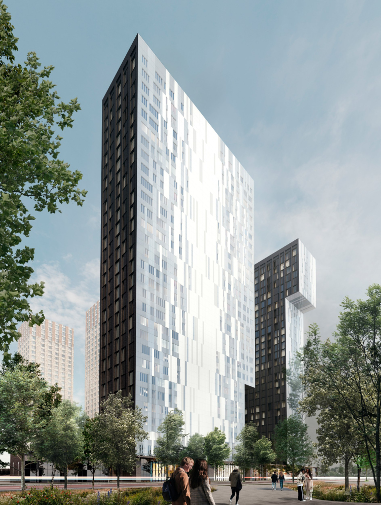
This “turning” game continues on the facades, albeit in a different way: the facades launch a narrative of their own because the street is overlooked by glass surfaces, and the sidewalls are executed in brick. Thus, it turns out that in one case glass is used on the sidewalls, and in the other on the longitudinal surface: as if the building’s redline was “sliced” with some hot wire so that the surface around the cut melted slightly.

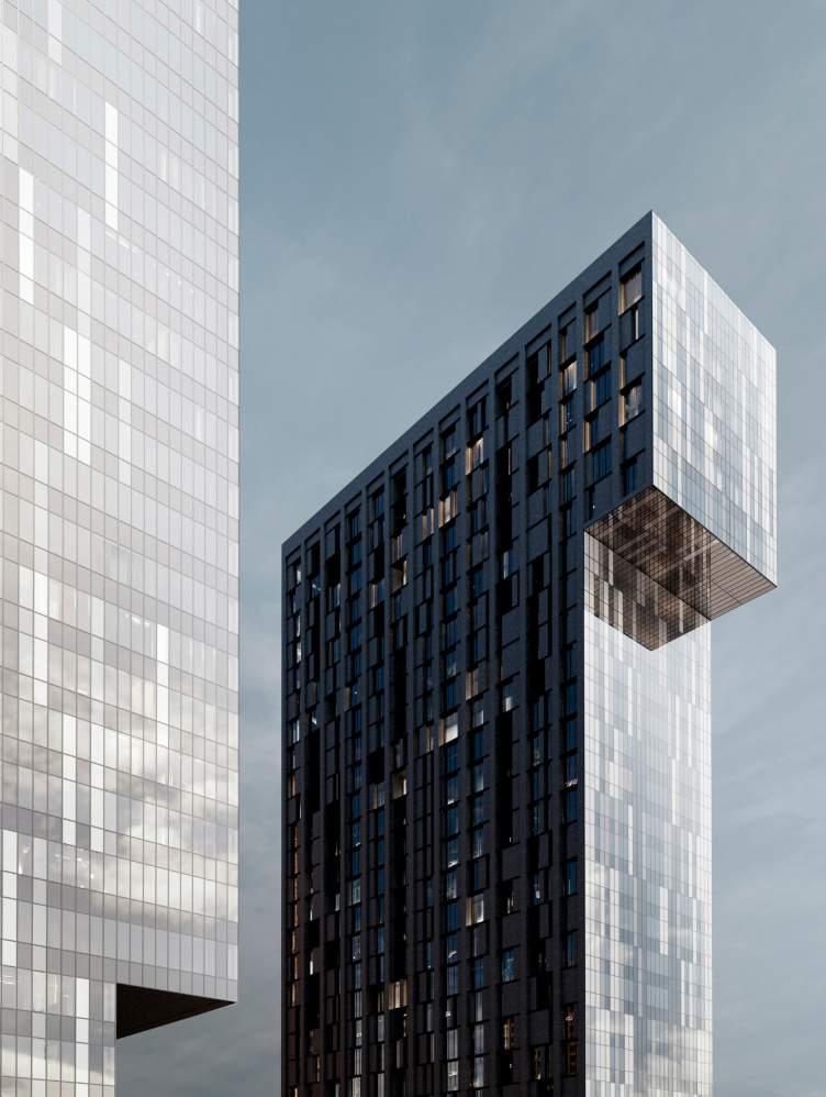
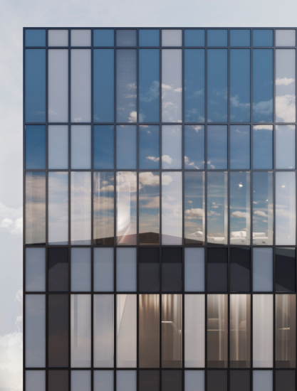
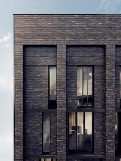
The regular and the tinted kinds of glass form one single surface; it is livened up by asymmetric pixel inserts of glass of a lighter shade, whose strokes unite each two floors. The brick is dark, and the facades made of it are interpreted as a textured grid of multiple piers, not devoid of the inherent classic character of American skyscrapers: a flat frieze band on top and vertical “blades” running the entire height of the building.

Ilmensky Level housing complex
Copyright: © KPLN


Inside this grid, the windows are separated by slim horizontals, also indulging in pixel asymmetry, rather lively, and – thanks to the recessed balconies – volumetric, akin to some kind of an ancient “cave” city. This way, two surfaces appear: one can see in them a contrast between black and white, earth and sky, yet at the same time rendered more subtle by the nuances of the transparency and the color of the glass, as well as the color and the texture of the brick facades. Furthermore, this pixelization of glass is something like a projection of the brick relief, which brings us back to the “slice” associations: one can easily imagine that the towers are “made” of a material with a certain uneven internal structure, which is rough and textured on the outer surface, but behaves differently on the polished section – retaining at the same time the general principles of construction. This is also one of the ways to endow this pair of buildings with internal integrity; in this case, it is combined with the material component and context – brick responds to the facades of neighboring complexes, while the glass sets a new theme.

  • zooming
    Ilmensky Level housing complex. Version 1
    Copyright: © KPLN
  • zooming
    Ilmensky Level housing complex. Version 1
    Copyright: © KPLN


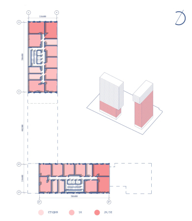
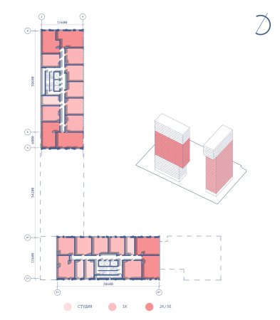
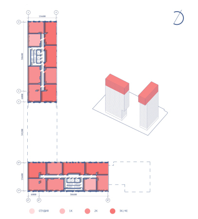
The apartment range of the complex correlates with its form making. As a matter of fact, it is the changes in the floor plans that determine the changes in the plastique of the volumes, and this organic combination is something that the architect Sergey Nikeshkin believes to be very important. One tower has in it two types of floor-by-floor plans, the other has three. In the floor plans of the upper floors, the apartments become larger, the share of studios shrinking. Each of the towers is equipped with just one vertical communication core, which spells a corridor system, but this does not affect the floor plans negatively – the complex refers to economy class, and the overwhelming majority of the residential units is constituted by studios and single-room apartments, which by definition are designed in lines, and the larger apartments are placed at the building’s sidewalls. The entrances of the two towers are see-through, and their lobbies are designed as a double-height space.

  • zooming
    1 / 7
    Ilmensky Level housing complex. Plan of the 1st floor
    Copyright: © KPLN
  • zooming
    2 / 7
    Ilmensky Level housing complex. A simplified plan, type 1
    Copyright: © KPLN
  • zooming
    3 / 7
    Ilmensky Level housing complex. A simplified plan, type 2
    Copyright: © KPLN
  • zooming
    4 / 7
    Ilmensky Level housing complex. A simplified plan, type 3
    Copyright: © KPLN
  • zooming
    5 / 7
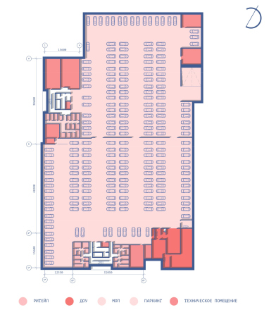
    Ilmensky Level housing complex. Plan of the parking garage
    Copyright: © KPLN
  • zooming
    6 / 7
    Ilmensky Level housing complex
    Copyright: © KPLN
  • zooming
    7 / 7
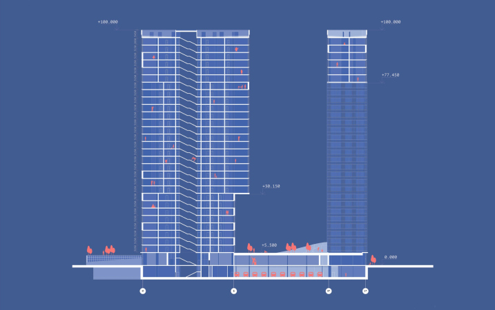
    Ilmensky Level housing complex. A section view
    Copyright: © KPLN


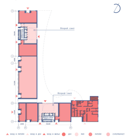
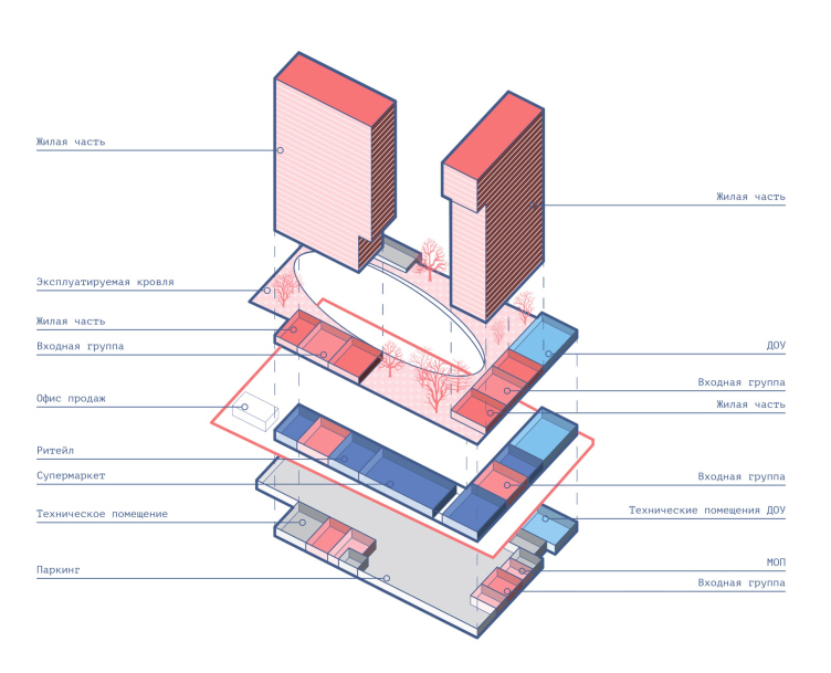
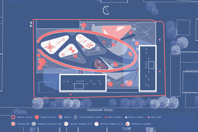
The towers rest on a stylobate that occupies the entire site almost on the redlines. The stylobate, in turn, organizes the courtyard and hosts a set of necessary functions – stores, a kindergarten, and other public places.

Ilmensky Level housing complex. The functional zoning
Copyright: © KPLN


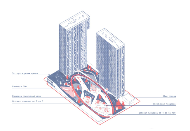
The oval yard on the stylobate’s roof refers to the images that are rather unusual for Moscow suburbs, for example, to squares of late Italian Renaissance – amongst the former industrial parks shooting off housing complexes, this technique looks unconventional and positive. The roof of the stylobate grows lower as we go deeper inside the block – the father away from the highway the quieter; in addition, its space is double-height, which enhances the privacy of some zones, making them look separate from the street outside, at the same time maintaining the visual contact with the city. This “distributed zoning”, generally valuable in high-rise projects, where the residents value not only their own apartments, but also a competently organized fragment of the city of their own – is a very interesting feature of this project.

  • zooming
    1 / 3
    Ilmensky Level housing complex. Axonometry
    Copyright: © KPLN
  • zooming
    2 / 3
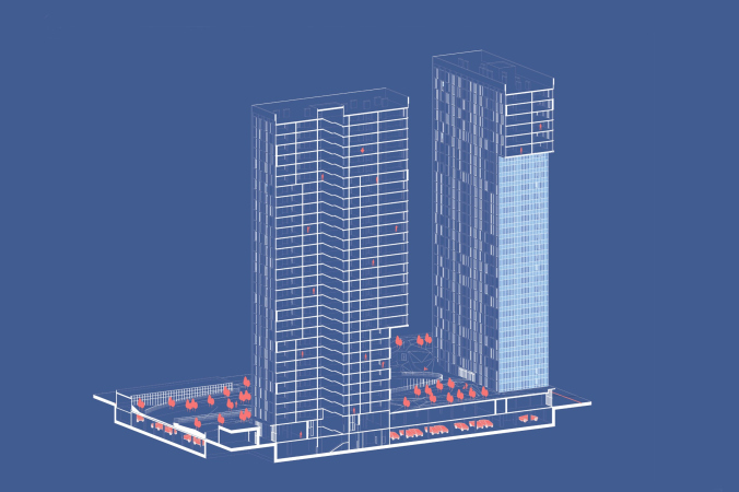
    Ilmensky Level housing complex. An axonometric section view
    Copyright: © KPLN
  • zooming
    3 / 3
    Ilmensky Level housing complex. The master plan
    Copyright: © KPLN


***

The contest, however, was won by this project. 


The Level Seligerskaya project can be seen on the website https://наш.дом.рф/

The authors of the final version according to the project declaration: Metropolis & Simple Project.

04 August 2022

Headlines now
The Golden Crown
The concept for a dental clinic in Yekaterinburg, developed by CNTR Studio, revolves around the idea of a “mouth full of gold”: pristine white porcelain stoneware walls are complemented by matte brass details. To avoid an overly literal interpretation, the architects focused on the building’s proportions, skillfully navigating between sunlight requirements and fire safety regulations.
Flexibility and Integration
Not long ago, we covered the project for the fourth phase of the ÁLIA residential complex, designed by APEX. Now, we’ve been shown different fence concepts they developed to enclose the complex’s private courtyards, incorporating a variety of public functions. We believe that the sheer fact that the complex’s architects were involved in such a detail as fencing speaks volumes.
A Step Forward
The HIDE residential complex represents a major milestone for ADM architects and their leaders Andrey Romanov and Ekaterina Kuznetsova in their quest for a fresh high-rise aesthetic – one that is flexible and layered, capable of bringing vibrancy to mass and silhouette while shaping form. Over recent years, this approach has become ADM’s “signature style”, with the golden HIDE tower playing a pivotal role in its evolution. Here, we delve into the project’s story, explore the details of the complex’s design, and uncover its core essence.
Gold in the Sands
A new office for a transcontinental company specializing in resource extraction and processing has opened in Dubai. Designed by T+T Architects, masters of creating spaces that are contemporary, diverse, flexible, and original, this project exemplifies their expertise. On the executive floor, a massive brass-clad partition dominates, while layered textures of compressed earth create a contextually resonant backdrop.
Layers and Levels of Flight
This project goes way back – Reserve Union won this architectural competition at the end of 2011, and the building was completed in 2018, so it’s practically “archival”. However, despite being relatively unknown, the building can hardly be considered “dated” and remains a prime example of architectural expression, particularly in the headquarters genre. And it’s especially fitting for an aviation company office. In some ways, it resembles the Aeroflot headquarters at Sheremetyevo but with its own unique identity, following the signature style of Vladimir Plotkin. In this article, we take an in-depth look at the United Aircraft Corporation (UAC) headquarters in the Moscow agglomeration town of Zhukovsky, supplemented by recent photographs from Alexey Naroditsky – a shoot that became only recently possible due to the fact that improvements were finally made in the surrounding area.
Light and Shadow
In this article, we delve into the architectural design of the “Chaika” house by DNK ag architects, which was recently completed in 2023 as part of the collection of signature designs at ZILArt. As is well-known, all the buildings in this complex follow a design code, yet each one is distinct. This particular building stands out not only for its whiteness and minimalism but also for the refined use of a limited number of techniques that, together, create what can confidently be called synergy.
Casus Novae
A master plan was developed for a large residential area with a name of “DNS City”, but now that its implementation began, the plan has been arbitrarily reformatted and replaced with something that, while similar on the surface, is actually quite different. This is not the first time such a thing happens, but it’s always frustrating. With permission from the author, we are sharing Maria Elkina’s post.
Treasure Hunting
The GAFA bureau, in collaboration with Tegola and Arkhitail, organized an expedition to the island of Kilpola in Karelia as part of Moskomarkhitektura’s “Open City” festival. There, amidst moss and rocks, the students sought answers to questions like: what is the sacred, where does it dwell, and what sustains it? Assisting the participants in this quest were landscape engineer Evgeny Levin, artist Nicholas Roerich, a moose, and the lack of cellular connection. Here’s how the story unfolded.
Depths of the Earth, Streams of Water
In the Malaya Okhta district, the Akzent building, designed by Stepan Liphart, was constructed. It follows a classic tripartite structure, yet it’s what you might call “hand-drawn”: each façade is unique in its form and details, some of which aren’t immediately noticeable. In this article, we explore the context and, together with the architect, delve into how the form was developed.
Fir Tree Dynamics
The “Airports of Region” holding is planning to build an airport in Karachay-Cherkessia, aiming to make the Arkhyz and Dombay resorts more accessible to travelers. The project that won in an invitation-only competition, submitted by Sergey Nikeshkin’s KPLN, blends natural imagery inspired by the shape of a conifer seed, open-air waiting spaces, majestic large trees, and a green roof elevated on needle-like columns. The result is both nature-inspired and WOW.
​A Brick Shell
In the process of designing a clubhouse situated among pine trees in a prestigious suburban area near Moscow, the architectural firm “A.Len” did the façade design part. The combination of different types of brick and masonry correlates with the volumetric and plastique solutions, further enhanced by the inclusion of wood-painted fragments and metal “glazing”.
Word Forms
ATRIUM architects love ambitious challenges, and for the firm’s thirtieth anniversary, they boldly play a game of words with an exhibition that dives deep into a self-created vocabulary. They immerse their projects – especially art installations – into this glossary, as if plunging into a current of their own. You feel as if you’re flowing through the veins of pure art, immersed in a universe of vertical cities, educational spaces – of which the architects are true masters – and the cultural codes of various locations. But what truly captivates is the bold statement that Vera Butko and Anton Nadtochy make, both through their work and this exhibition: architecture, above all, is art – the art of working with form and space.
Flexibility and Acuteness of Modernity
Luxurious, fluid, large “kokoshniks” and spiral barrel columns, as if made from colorful chewing gum: there seem to be no other mansion like this in Moscow, designed in the “Neo-Russian-Modern” style. And the “Teremok” on Malaya Kaluzhskaya, previously somewhat obscure, has “come alive with new colors” and gained visibility after its restoration for the office of the “architectural ecosystem” as the architects love to call themselves. It’s evident that Julius Borisov and the architects at UNK put their hearts into finding this new office and bringing it up to date. Let’s delve into the paradoxes of this mansion’s history and its plasticity. Spoiler: two versions of modernity meet here, both balancing on the razor’s edge of “what’s current”.
Yuri Vissarionov: “A modular house does not belong to the land”
It belongs to space, or to the air... It turns out that 3D printing is more effective when combined with a modular approach: the house is built in a workshop and then adapted to the site, including on uneven terrain. Yuri Vissarionov shares his latest experience in designing tourist complexes, both in central Russia and in the south. These include houseboats, homes printed from lightweight concrete using a 3D printer, and, of course, frame houses.
​Moscow’s First
“The quality of education largely depends on the quality of the educational environment”. This principle of the last decade has been realized by Sergey Skuratov in the project for the First Moscow Gymnasium on Rostovskaya Embankment in the Khamovniki district. The building seamlessly integrates into the complex urban landscape, responding both to the pedestrian flow of the city and the quiet alleyways. It skillfully takes advantage of the height differences and aligns with modern trends in educational space design. Let’s take a closer look.
Looking at the Water
The site of Villa Sonata stretches from the road to the water’s edge, offering its own shoreline, pier, and a picturesque river panorama. To reveal these sweeping views, Roman Leonidov “cut” the façade diagonally parallel to the river, thus getting two main axes for the house and, consequently, “two heads”. The internal core – two double-height spaces, a living room and a conservatory, with a “bridge” above them – makes the house both “transparent” and filled with light.
The White Wing
Well, it’s not exactly white. It’s more of a beige, white-stone structure that plays with the color of limestone – smoother surfaces are lighter, while rougher ones are darker. This wing unites various elements: it absorbs and interprets the surrounding themes. It responds to everything, yet maintains a cohesive expression – a challenging task! – while also incorporating recognizable features of its own, such as the dynamic cuts at the bottom, top, and middle.
Urban Dunes
The XSA Ramps team designed and built a three-part sports hub for a park in Rostov-on-Don, welcoming people of all ages and fitness levels. The skate plaza, pump track, and playground are all meticulously crafted with details that attract a diverse range of visitors. The technical execution of the shapes and slopes transforms this space into a kind of sculptural composition.
Proportional Growth
The project for the fourth phase of the ÁLIA residential area has been announced. The buildings are situated on an elongated plot – almost a “ray” that shoots out from the center of the area towards the river. Their layout reflects both a response to Moscow’s architectural preferences over the past 15 years, shifting “from blocks to towers”, and an interpretation of the neighboring business park designed by SOM. Additionally, the best apartments here are not located at the very top but closer to the middle, forming a glowing “waistline”.
The “Staircase” Building
In designing the “Details” residential complex in New Moscow, Rais Baishev spiced up the now-popular Moscow theme of a “courtyard” building with an idea drawn from the surrealist drawings by Maurits Escher. He envisioned the stepped silhouettes and descending slopes as a metaphysical mega-staircase, creating a key void within the courtyard that gave the project an internal “spine”. This concept is felt both in the building’s silhouette and on its façades.
Projection of the Quarter
No one doubted that the building that Vladimir Plotkin designed as part of the “Garden Quarters” would be the most modernist of all. And it turned out just that way: while adhering to the common design code, the building successfully combines brick and white stone, rhythmically responding to the neighboring building designed by Ostozhenka, yet tactfully and persistently making a few statements of its own. This includes the projection of the ideal urban development composition “14–9–6”, which can be found right next door, mathematical calculations, including those for various types of terraces (and perhaps the only reminder of the Soviet past of the Kauchuk rubber factory!), and the white “cross-stitch” pattern of the façade grid.
Domus Aurea
In this issue, we examine the “Tessinsky-1” house, designed by Sergey Skuratov and completed in 2023. Located in the middle of the Serebryanicheskaya Embankment district, at the intersection of its main streets, this house assumes a sort of “nodal” role: it not only responds to everything around it and preserves many memories of the former EMA factory within itself, but it weaves all this into a newly directed pattern, reconciling bright “gold” and dark-colored brick, largely with the help of the new, modern-yet-archaic Columba brick, which, come to think about it, is the most precious element here.
The Chimney of Nikola-Lenivets
In this issue, we are examining the “Obelisk House” designed by KATARSIS and built for the Arkhstoyanie 2023 festival. However, it was only finished later on, and this is why we are examining it now. It seems to us that after the “Obelisk House” appeared in Nikola-Lenivets, a dialogue and a few inner connections appeared between the temporary structures built here. These houses no longer look like “accidental neighbors”, more of which below.
​Periscope by the Bay
The jury awarded the second place in the competition for a public and cultural center in Petropavlovsk-Kamchatsky to the companies GORA (“Mountain”) and M4. In the consortium’s proposal, the building resembles a sperm whale with a calf swimming next to it or a periscope, whose lenses capture the most spectacular views from the surrounding landscape.
From Arcs to Dolmens
While working on the competition project for Petropavlovsk-Kamchatsky, ASADOV Architects prioritized the value of the natural and urban environment, aiming to preserve the balance of the location while minimizing the resemblance of the volume that they designed to a “traditional building”. The task was challenging, and the architects created three versions, one of which having been developed after the competition, where their main proposal took third place. However, the point of interest here is not the competition result but the continuity of creative thinking.
Hide and Seek
The ID Moskovskiy house, designed by Stepan Liphart in St. Petersburg, in the courtyards near Moskovskiy Avenue beyond the Obvodny Canal and recently completed, is notable for several reasons. Firstly, it has been realized with considerable accuracy, which is particularly significant as this is the first building where the architect was responsible not only for the facades but also for the layouts, allowing for better integration between the two. On the other hand, this building is interesting as an example of the “germination” of new architecture in the city: it draws on the best examples from the neighborhood and becomes an improved and developed sum of ideas found by the architect in the surrounding context.
The Big Twelve
Yesterday, the winners of the Moscow Mayor’s Architecture Award were announced and honored. Let’s take a look at what was awarded and, in some cases, even critique this esteemed award. After all, there is always room for improvement, right?
Above the Golden Horn
The residential complex “Philosophy” designed by T+T architects in Vladivostok, is one of the new projects in the “Golubinaya Pad” area, changing its development philosophy (pun intended) from single houses to a comprehensive approach. The buildings are organized along public streets, varying in height and format, with one house even executed in gallery typology, featuring a cantilever leaning on an art object.
Nuanced Alternative
How can you rhyme a square and space? Easily! But to do so, you need to rhyme everything you can possibly think of: weave everything together, like in a tensegrity structure, and find your own optics too. The new exhibition at GES-2 does just that, offering its visitor a new perspective on the history of art spanning 150 years, infused with the hope for endless multiplicity of worlds and art histories. Read on to see how this is achieved and how the exhibition design by Evgeny Ace contributes to it.
Blinds for Ice
An ice arena has been constructed in Domodedovo based on a project by Yuri Vissarionov Architects. To prevent the long façade, a technical requirement for winter sports facilities, from appearing monotonous, the architects proposed the use of suspended structures with multidirectional slats. This design protects the ice from direct sunlight while giving the wall texture and detail.