По-русски

​The Possibility of Flight

The project of the airport, which ASADOV Architects developed for the city of Tobolsk, and which won in the architectural competition, was not implemented. However, it is interesting as an example of designing an airport building of a very small scale, where the main challenge is the optimal organization of space and infrastructure without compromising the imagery component.

17 January 2022
Object
mainImg
Today, Tobolsk is a classic example of a provincial city, small and remote. Among the cities of a similar scale, Tobolsk, the ex-capital of Siberia, from which in the late 16th century Russia began systematic development thereof, is remarkable both for its history and monuments of architecture. Later on, however, the trade routes shifted southward; the city stopped growing, and now its population is a little under a hundred thousand people. Thus, it comes as no surprise that hitherto Tobolsk did not have an airport. Its construction was scheduled within the framework of the new program for developing the city’s infrastructure; an architectural competition was held for the airport project in 2020, it was won by ASADOV Architects. Alas, the building of the Tobolsk terminal, which was opened recently in September, was constructed in accordance with a different, slightly simpler, project. In this article, however, we are going to share about the project that won in the competition but was not implemented.

The Tobolsk airport, a project, 2020
Copyright: © ASADOV Architects


In the project by ASADOV Architects, a small building with a total area of 3,000 square meters comprised the terminal and the offices of the airport services. 

And the driving idea, from which the architects proceeded in their work on the airport’s imagery, was the value of the possibility of flight per se. Indeed, Tobolsk has always, or at least for quite a while, been connected with the center or the main transport arteries only indirectly. This is why the architects took as a basis an airplane as such, or one might even say, the idea of an airplane the way Plato envisaged it.

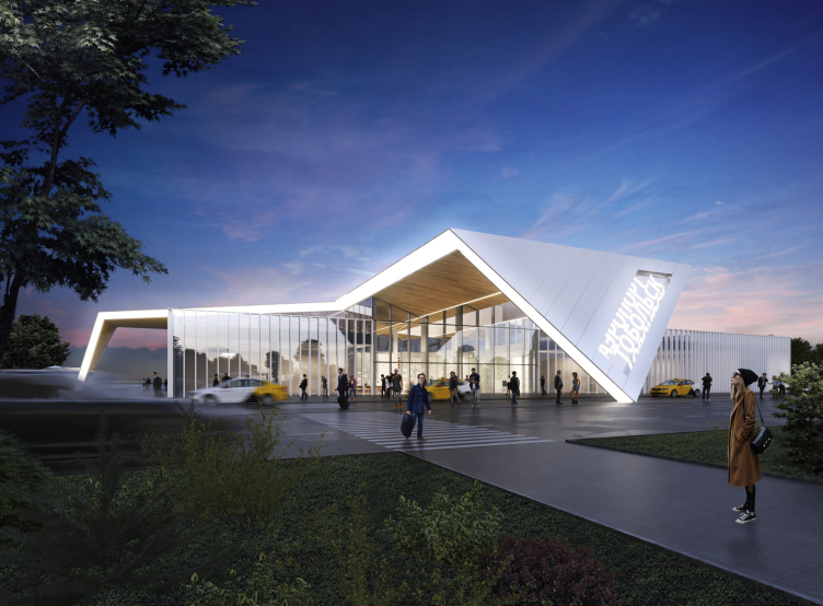
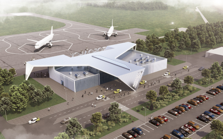
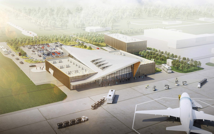
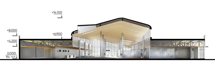
The graphic silhouette of an airliner was designed and drawn in such a way as to be clearly read both from a birds-eye view, as well as from the ground level. This construction was meant to enrich the basic rectangular volume of the terminal: to create height differences in the roof, thus highlighting the central zones in the interior, to form skylights, as well as to organize entrance groups – one from the side of the city, and one from the side of the airfield.

The Tobolsk airport, a project, 2020
Copyright: © ASADOV Architects


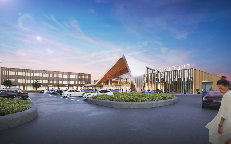
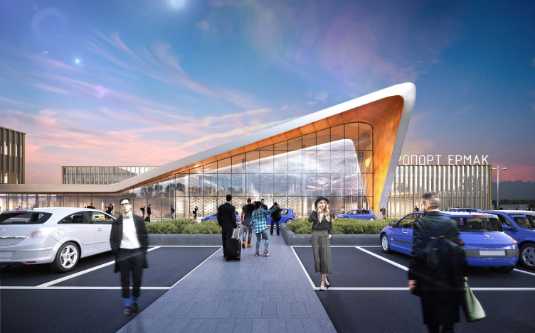
The Tobolsk airport. The original version, a view from the landside area
Copyright: © ASADOV Architects


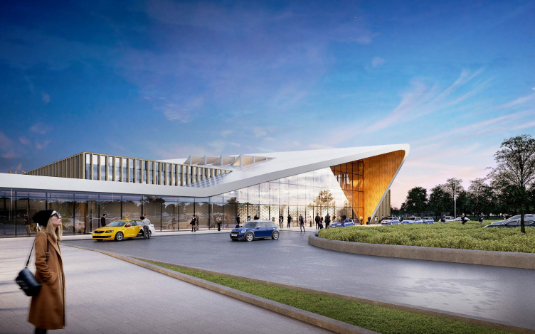
However, the client asked the architects to revise the project and come up with a simpler version. This is how a second version appeared, in which the architects came up with new imagery – pitched roofs, clad in wooden finish and bringing up associations with northern architecture or log houses that were abundant here when the city was just founded. Thus, the second version refers to the historical past of Tobolsk, and this associative series is much more complex than one may think when a log house was mentioned: the smooth curves of the ridges and pitches of the roof, and the prominent thickness of the roof coverage create an effect of a thick layer of snow that softens all the shapes and inevitably comes to mind as one main attributes of Siberia.

The Tobolsk airport. The original version, a birds-eye view
Copyright: © ASADOV Architects


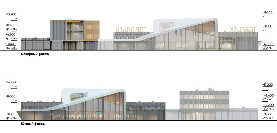
At the same time, this smoothness makes it possible to make a transition to the modern interpretation of the traditional pitched roof – the entire silvery roof is perceived as a parabolic surface that hovers above the weightless glass base. Its dynamic outline is telling the tale of moving upwards and gaining height. Another interesting fact is that technically the curvilinear roof was designed by the architects in an even more cost-effective way than the faceted shapes of the conditional airplane – the ridge of the roof is taking up the position of the diagonal, yet at the same time it is symmetrical, and therefore it will include metallic beams of just a handful of types and sizes, which will streamline the construction costs.

The Tobolsk airport. A view from the landside area
Copyright: © ASADOV Architects


The Tobolsk airport. A birds-eye view
Copyright: © ASADOV Architects


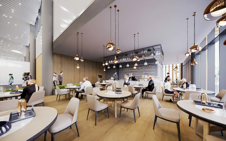
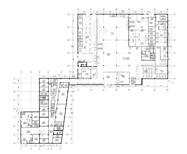
In the course of working on the project, the inner plan was also changing – after the “Regional Airports” company became the official operator of the Tobolsk airport, the floor plans became even more open, and merging of zones yielded more useful floor space. Such a thought-out floor plan is particularly important for an ultra-small airport. Everything is very compact here, all the modules are positioned on one level, but the terminal contains the full set of the zones that you would expect to see in an airport, including retail, cafes, and an executive lounge.

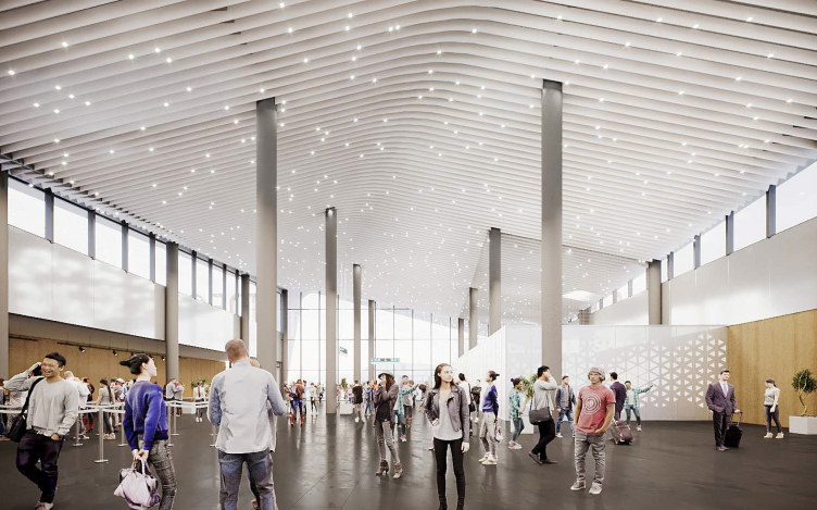
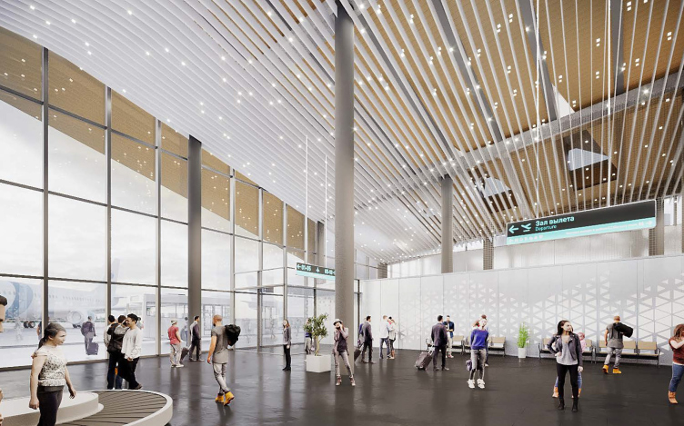
The interior design solution again refers to the images of Siberia as a harsh northern land – the decoration of the ceiling in its high part with light-colored lamellas imitates a cloudy sky; there are pinpoint lights shimmering between their facets, which create a theatrical effect of falling snow; the lower zones are decorated with warm wood, and by contrast they look particularly cozy.

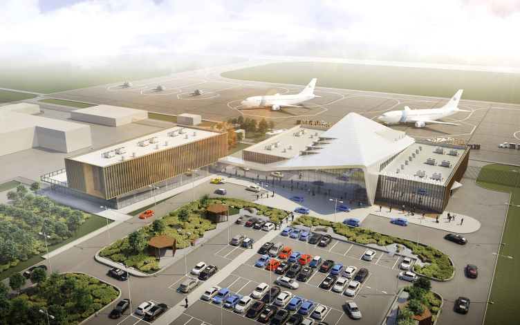
The Tobolsk airport. A birds-eye view
Copyright: © ASADOV Architects


The Tobolsk airport. The interior
Copyright: © ASADOV Architects


The Tobolsk airport. The interior
Copyright: © ASADOV Architects


The Tobolsk airport. The interior
Copyright: © ASADOV Architects


The elongated wing of the curvilinear roof connects the terminal to the office building of airport services, which, again, allows you to save up on the infrastructure – for example, the office coworkers may use the cafes in the terminal. However, the main advantage of combining the two buildings into a single complex is the design of the plaza in front of the terminal. Typologically, the “landside area” has been around for almost 150 years, and, as the architectural styles kept changing, it went through various ways of interpreting its space. And, while in major airports it is designed based solely on the technological and logistics approach, in this small-scale version, in the absence of several levels and the need for large capacity, it retains a few features of previous approaches and styles. In the ASADOV architects project, the plaza comprises several zones: the pedestrian space, the landscape section with greenery, the driveway, and the parking lot – everything sets a “human-friendly” scale instead of a “conveyor belt”. 

The Tobolsk airport. A cross section view
Copyright: © ASADOV Architects


Meanwhile, pursuing the path of cost optimization, the client company ultimately refrained from any architectural imagery and eventually built the airport in accordance with the most simplified project. And still, the appearance of an airport in Tobolsk as such is hard to overestimate. In the earlier versions of the project, one can see the name of the conqueror of Siberia, Ataman Ermak, but ultimately the airport was named after Simon Remezov – the Siberian map-maker, chronicler, icon painter and architect of the Tobolsk Kremlin. This versatile man fully deserves the name of the Siberian Leonardo, and acquaintance with his heritage is part of the cultural program for tourists visiting Tobolsk. Thanks to the airport, their number is expected to increase to seven million per year. However, the airport does not just improve transport links – it boosts the investment attractiveness of the city, and ultimately gives a powerful impetus to its development, which Tobolsk has been waiting for 300 years.
  • zooming
    The Tobolsk airport. The northern and southern facades
    Copyright: © ASADOV Architects
  • zooming
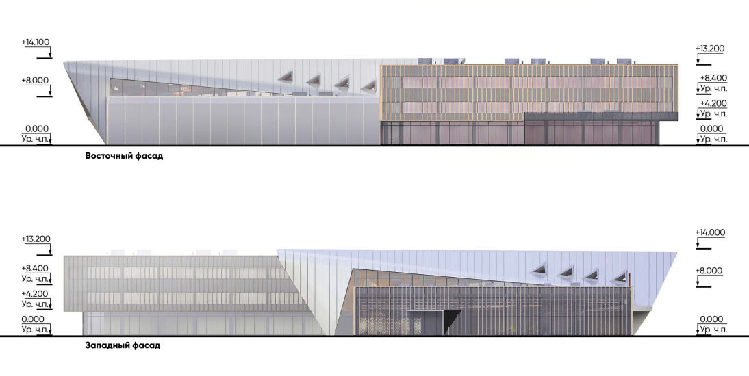
    The Tobolsk airport. The eastern and western facades
    Copyright: © ASADOV Architects
The Tobolsk airport. Plan of the terminal and the office building of airport services


17 January 2022

Headlines now
The Golden Crown
The concept for a dental clinic in Yekaterinburg, developed by CNTR Studio, revolves around the idea of a “mouth full of gold”: pristine white porcelain stoneware walls are complemented by matte brass details. To avoid an overly literal interpretation, the architects focused on the building’s proportions, skillfully navigating between sunlight requirements and fire safety regulations.
Flexibility and Integration
Not long ago, we covered the project for the fourth phase of the ÁLIA residential complex, designed by APEX. Now, we’ve been shown different fence concepts they developed to enclose the complex’s private courtyards, incorporating a variety of public functions. We believe that the sheer fact that the complex’s architects were involved in such a detail as fencing speaks volumes.
A Step Forward
The HIDE residential complex represents a major milestone for ADM architects and their leaders Andrey Romanov and Ekaterina Kuznetsova in their quest for a fresh high-rise aesthetic – one that is flexible and layered, capable of bringing vibrancy to mass and silhouette while shaping form. Over recent years, this approach has become ADM’s “signature style”, with the golden HIDE tower playing a pivotal role in its evolution. Here, we delve into the project’s story, explore the details of the complex’s design, and uncover its core essence.
Gold in the Sands
A new office for a transcontinental company specializing in resource extraction and processing has opened in Dubai. Designed by T+T Architects, masters of creating spaces that are contemporary, diverse, flexible, and original, this project exemplifies their expertise. On the executive floor, a massive brass-clad partition dominates, while layered textures of compressed earth create a contextually resonant backdrop.
Layers and Levels of Flight
This project goes way back – Reserve Union won this architectural competition at the end of 2011, and the building was completed in 2018, so it’s practically “archival”. However, despite being relatively unknown, the building can hardly be considered “dated” and remains a prime example of architectural expression, particularly in the headquarters genre. And it’s especially fitting for an aviation company office. In some ways, it resembles the Aeroflot headquarters at Sheremetyevo but with its own unique identity, following the signature style of Vladimir Plotkin. In this article, we take an in-depth look at the United Aircraft Corporation (UAC) headquarters in the Moscow agglomeration town of Zhukovsky, supplemented by recent photographs from Alexey Naroditsky – a shoot that became only recently possible due to the fact that improvements were finally made in the surrounding area.
Light and Shadow
In this article, we delve into the architectural design of the “Chaika” house by DNK ag architects, which was recently completed in 2023 as part of the collection of signature designs at ZILArt. As is well-known, all the buildings in this complex follow a design code, yet each one is distinct. This particular building stands out not only for its whiteness and minimalism but also for the refined use of a limited number of techniques that, together, create what can confidently be called synergy.
Casus Novae
A master plan was developed for a large residential area with a name of “DNS City”, but now that its implementation began, the plan has been arbitrarily reformatted and replaced with something that, while similar on the surface, is actually quite different. This is not the first time such a thing happens, but it’s always frustrating. With permission from the author, we are sharing Maria Elkina’s post.
Treasure Hunting
The GAFA bureau, in collaboration with Tegola and Arkhitail, organized an expedition to the island of Kilpola in Karelia as part of Moskomarkhitektura’s “Open City” festival. There, amidst moss and rocks, the students sought answers to questions like: what is the sacred, where does it dwell, and what sustains it? Assisting the participants in this quest were landscape engineer Evgeny Levin, artist Nicholas Roerich, a moose, and the lack of cellular connection. Here’s how the story unfolded.
Depths of the Earth, Streams of Water
In the Malaya Okhta district, the Akzent building, designed by Stepan Liphart, was constructed. It follows a classic tripartite structure, yet it’s what you might call “hand-drawn”: each façade is unique in its form and details, some of which aren’t immediately noticeable. In this article, we explore the context and, together with the architect, delve into how the form was developed.
Fir Tree Dynamics
The “Airports of Region” holding is planning to build an airport in Karachay-Cherkessia, aiming to make the Arkhyz and Dombay resorts more accessible to travelers. The project that won in an invitation-only competition, submitted by Sergey Nikeshkin’s KPLN, blends natural imagery inspired by the shape of a conifer seed, open-air waiting spaces, majestic large trees, and a green roof elevated on needle-like columns. The result is both nature-inspired and WOW.
​A Brick Shell
In the process of designing a clubhouse situated among pine trees in a prestigious suburban area near Moscow, the architectural firm “A.Len” did the façade design part. The combination of different types of brick and masonry correlates with the volumetric and plastique solutions, further enhanced by the inclusion of wood-painted fragments and metal “glazing”.
Word Forms
ATRIUM architects love ambitious challenges, and for the firm’s thirtieth anniversary, they boldly play a game of words with an exhibition that dives deep into a self-created vocabulary. They immerse their projects – especially art installations – into this glossary, as if plunging into a current of their own. You feel as if you’re flowing through the veins of pure art, immersed in a universe of vertical cities, educational spaces – of which the architects are true masters – and the cultural codes of various locations. But what truly captivates is the bold statement that Vera Butko and Anton Nadtochy make, both through their work and this exhibition: architecture, above all, is art – the art of working with form and space.
Flexibility and Acuteness of Modernity
Luxurious, fluid, large “kokoshniks” and spiral barrel columns, as if made from colorful chewing gum: there seem to be no other mansion like this in Moscow, designed in the “Neo-Russian-Modern” style. And the “Teremok” on Malaya Kaluzhskaya, previously somewhat obscure, has “come alive with new colors” and gained visibility after its restoration for the office of the “architectural ecosystem” as the architects love to call themselves. It’s evident that Julius Borisov and the architects at UNK put their hearts into finding this new office and bringing it up to date. Let’s delve into the paradoxes of this mansion’s history and its plasticity. Spoiler: two versions of modernity meet here, both balancing on the razor’s edge of “what’s current”.
Yuri Vissarionov: “A modular house does not belong to the land”
It belongs to space, or to the air... It turns out that 3D printing is more effective when combined with a modular approach: the house is built in a workshop and then adapted to the site, including on uneven terrain. Yuri Vissarionov shares his latest experience in designing tourist complexes, both in central Russia and in the south. These include houseboats, homes printed from lightweight concrete using a 3D printer, and, of course, frame houses.
​Moscow’s First
“The quality of education largely depends on the quality of the educational environment”. This principle of the last decade has been realized by Sergey Skuratov in the project for the First Moscow Gymnasium on Rostovskaya Embankment in the Khamovniki district. The building seamlessly integrates into the complex urban landscape, responding both to the pedestrian flow of the city and the quiet alleyways. It skillfully takes advantage of the height differences and aligns with modern trends in educational space design. Let’s take a closer look.
Looking at the Water
The site of Villa Sonata stretches from the road to the water’s edge, offering its own shoreline, pier, and a picturesque river panorama. To reveal these sweeping views, Roman Leonidov “cut” the façade diagonally parallel to the river, thus getting two main axes for the house and, consequently, “two heads”. The internal core – two double-height spaces, a living room and a conservatory, with a “bridge” above them – makes the house both “transparent” and filled with light.
The White Wing
Well, it’s not exactly white. It’s more of a beige, white-stone structure that plays with the color of limestone – smoother surfaces are lighter, while rougher ones are darker. This wing unites various elements: it absorbs and interprets the surrounding themes. It responds to everything, yet maintains a cohesive expression – a challenging task! – while also incorporating recognizable features of its own, such as the dynamic cuts at the bottom, top, and middle.
Urban Dunes
The XSA Ramps team designed and built a three-part sports hub for a park in Rostov-on-Don, welcoming people of all ages and fitness levels. The skate plaza, pump track, and playground are all meticulously crafted with details that attract a diverse range of visitors. The technical execution of the shapes and slopes transforms this space into a kind of sculptural composition.
Proportional Growth
The project for the fourth phase of the ÁLIA residential area has been announced. The buildings are situated on an elongated plot – almost a “ray” that shoots out from the center of the area towards the river. Their layout reflects both a response to Moscow’s architectural preferences over the past 15 years, shifting “from blocks to towers”, and an interpretation of the neighboring business park designed by SOM. Additionally, the best apartments here are not located at the very top but closer to the middle, forming a glowing “waistline”.
The “Staircase” Building
In designing the “Details” residential complex in New Moscow, Rais Baishev spiced up the now-popular Moscow theme of a “courtyard” building with an idea drawn from the surrealist drawings by Maurits Escher. He envisioned the stepped silhouettes and descending slopes as a metaphysical mega-staircase, creating a key void within the courtyard that gave the project an internal “spine”. This concept is felt both in the building’s silhouette and on its façades.
Projection of the Quarter
No one doubted that the building that Vladimir Plotkin designed as part of the “Garden Quarters” would be the most modernist of all. And it turned out just that way: while adhering to the common design code, the building successfully combines brick and white stone, rhythmically responding to the neighboring building designed by Ostozhenka, yet tactfully and persistently making a few statements of its own. This includes the projection of the ideal urban development composition “14–9–6”, which can be found right next door, mathematical calculations, including those for various types of terraces (and perhaps the only reminder of the Soviet past of the Kauchuk rubber factory!), and the white “cross-stitch” pattern of the façade grid.
Domus Aurea
In this issue, we examine the “Tessinsky-1” house, designed by Sergey Skuratov and completed in 2023. Located in the middle of the Serebryanicheskaya Embankment district, at the intersection of its main streets, this house assumes a sort of “nodal” role: it not only responds to everything around it and preserves many memories of the former EMA factory within itself, but it weaves all this into a newly directed pattern, reconciling bright “gold” and dark-colored brick, largely with the help of the new, modern-yet-archaic Columba brick, which, come to think about it, is the most precious element here.
The Chimney of Nikola-Lenivets
In this issue, we are examining the “Obelisk House” designed by KATARSIS and built for the Arkhstoyanie 2023 festival. However, it was only finished later on, and this is why we are examining it now. It seems to us that after the “Obelisk House” appeared in Nikola-Lenivets, a dialogue and a few inner connections appeared between the temporary structures built here. These houses no longer look like “accidental neighbors”, more of which below.
​Periscope by the Bay
The jury awarded the second place in the competition for a public and cultural center in Petropavlovsk-Kamchatsky to the companies GORA (“Mountain”) and M4. In the consortium’s proposal, the building resembles a sperm whale with a calf swimming next to it or a periscope, whose lenses capture the most spectacular views from the surrounding landscape.
From Arcs to Dolmens
While working on the competition project for Petropavlovsk-Kamchatsky, ASADOV Architects prioritized the value of the natural and urban environment, aiming to preserve the balance of the location while minimizing the resemblance of the volume that they designed to a “traditional building”. The task was challenging, and the architects created three versions, one of which having been developed after the competition, where their main proposal took third place. However, the point of interest here is not the competition result but the continuity of creative thinking.
Hide and Seek
The ID Moskovskiy house, designed by Stepan Liphart in St. Petersburg, in the courtyards near Moskovskiy Avenue beyond the Obvodny Canal and recently completed, is notable for several reasons. Firstly, it has been realized with considerable accuracy, which is particularly significant as this is the first building where the architect was responsible not only for the facades but also for the layouts, allowing for better integration between the two. On the other hand, this building is interesting as an example of the “germination” of new architecture in the city: it draws on the best examples from the neighborhood and becomes an improved and developed sum of ideas found by the architect in the surrounding context.
The Big Twelve
Yesterday, the winners of the Moscow Mayor’s Architecture Award were announced and honored. Let’s take a look at what was awarded and, in some cases, even critique this esteemed award. After all, there is always room for improvement, right?
Above the Golden Horn
The residential complex “Philosophy” designed by T+T architects in Vladivostok, is one of the new projects in the “Golubinaya Pad” area, changing its development philosophy (pun intended) from single houses to a comprehensive approach. The buildings are organized along public streets, varying in height and format, with one house even executed in gallery typology, featuring a cantilever leaning on an art object.
Nuanced Alternative
How can you rhyme a square and space? Easily! But to do so, you need to rhyme everything you can possibly think of: weave everything together, like in a tensegrity structure, and find your own optics too. The new exhibition at GES-2 does just that, offering its visitor a new perspective on the history of art spanning 150 years, infused with the hope for endless multiplicity of worlds and art histories. Read on to see how this is achieved and how the exhibition design by Evgeny Ace contributes to it.
Blinds for Ice
An ice arena has been constructed in Domodedovo based on a project by Yuri Vissarionov Architects. To prevent the long façade, a technical requirement for winter sports facilities, from appearing monotonous, the architects proposed the use of suspended structures with multidirectional slats. This design protects the ice from direct sunlight while giving the wall texture and detail.