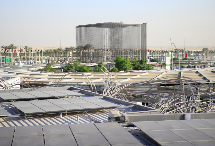
The current World Expo 2020 in Dubai, the first one held in an Arabian country, set a goal if not to surpass then to be on a level with the Shanghai expo in terms of all the key figures, which was almost achieved: the number of nations participating is 192 – not the biggest figure ever but precisely as many as was involved in the Shanghai exhibition. The area is slightly smaller but still big enough – 438 hectares. Considering the 2020 coronavirus pandemic, because of which the exhibition had to be postponed for a year (keeping the “key” number of 2020 in its name), such figures can also be considered a kind of record.
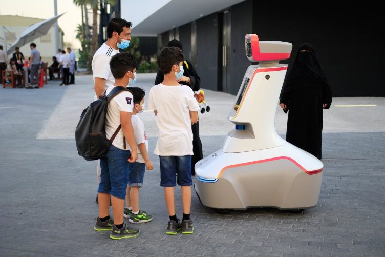
Robots provided by Terminus travel around the exhibition. What they are doing is unclear. When you address them they ask not to interfere and let them pass, hinting at some kind of security mission.
Copyright: Photograph : Archi.ru
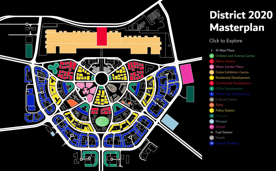
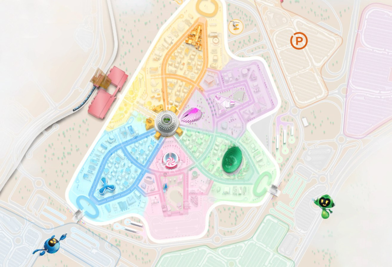
The fairgrounds are located within the city limits in its southern part, behind the industrial areas and next to the new airport. Unlike in Shanghai, the future of this district has been carefully planned: 80% of the exhibition infrastructure, including the high-profile pavilions, particularly the ones that are LEED- and Platinum-certified, will be preserved. Around them, housing complexes and mixed-use developments will be built, which will ultimately result in the appearance of a sustainable and environmentally friendly area called “District 2020” – the master plan for subsequent development is available here; below is the comparison of the plan and the nucleus that the exhibition currently occupies. You can see that around the “fan” semicircle, where now the parking lots are situated, at least two additional semicircles must appear, and the exhibition center next to the metro station must expand.
The prospects of turning it into an innovation district – a mini-city at the southern outskirts of Dubai – make the World Expo 2020 project, on the one hand, really sustainable (because all of the resources are spent on something permanent instead of temporary), and, on the other hand, make you want to take a closer look at its infrastructure, components, and history. All of these things, as is usually the case with large-scale developments, have a number of “layers”.
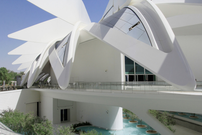
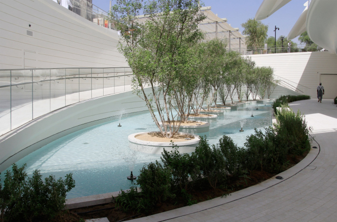
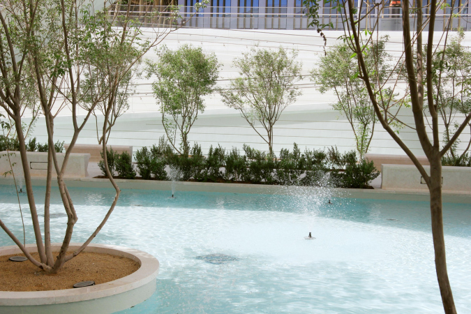
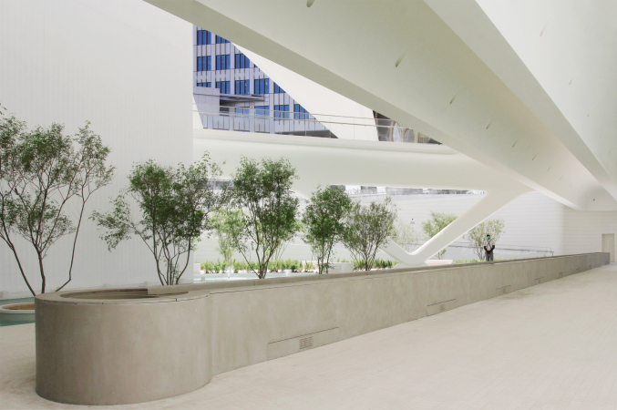
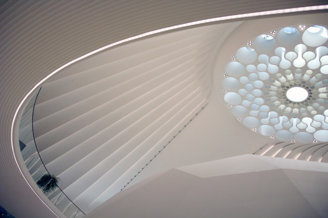
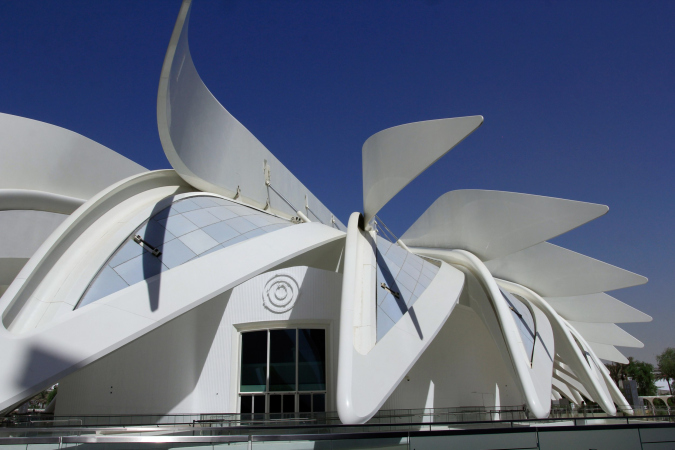
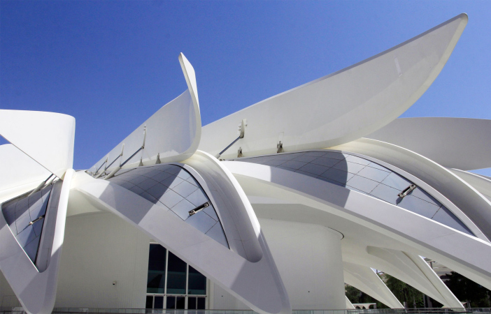
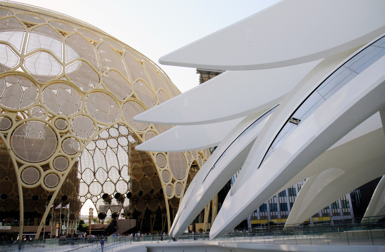
The most prominent layer – crème de la crème – are the projects by “star” architects. In this respect, the indisputable leader is the pavilion of the host nation, the UAE, designed by Santiago Calatrava: white, with a dome inside and a sunken-in multi-tier yard on the outside, covered with giant “wings” whose ends hover half a meter above the ground, forming a shady gallery around the building. The wings are inspired by the image of a local falcon “in flight”, their flaps are movable, they smoothly rise and fall from time to time, demonstrating either a “tousled” or a “combed” version of the building. After the Expo, the pavilion will become a cultural center.
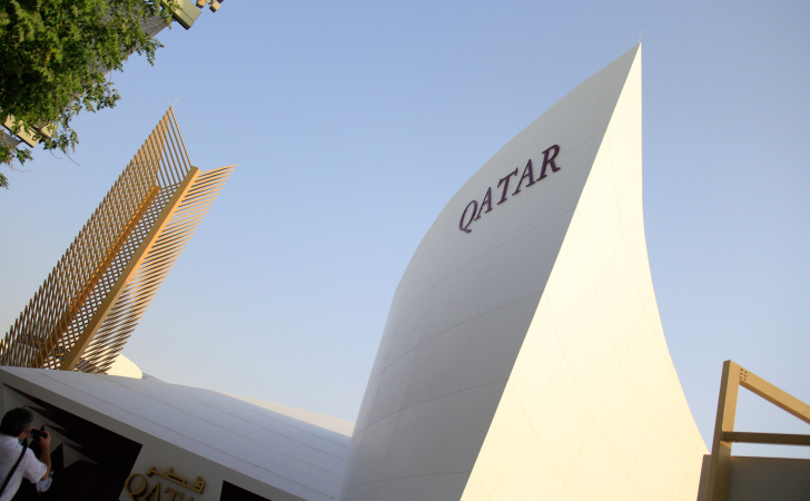
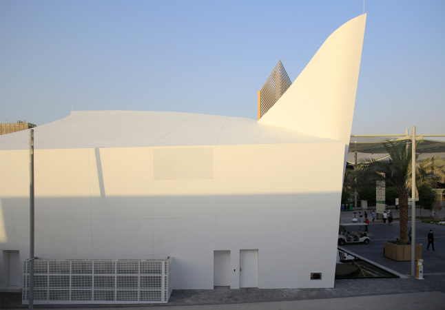
Calatrava designed yet another pavilion at the Expo, the one of the state of Qatar – small, looking like an elegant white sail, it is inspired by the image of a boat, the main means of transportation of fishermen and pirates who historically inhabited the peninsula.
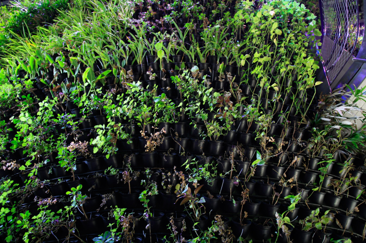
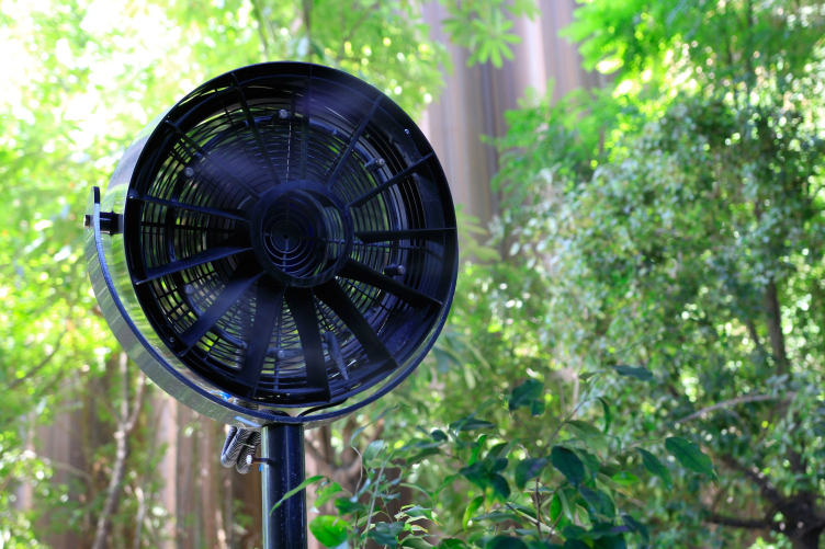
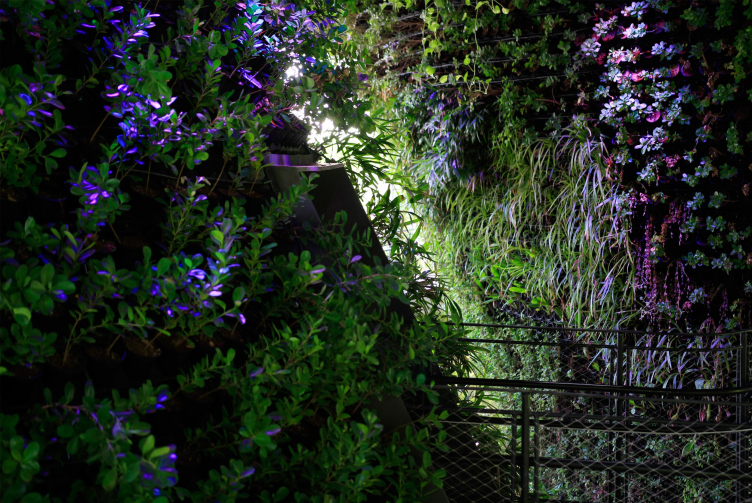
Another pavilion that probably deserves the “star” status is Singapore’s, designed by WOHA, locally based, but known worldwide. The pavilion completely consists of vertical greenery, surrounded by large trees symbolizing a rainforest. The visitors are offered to walk down the ramps, winding between three conical structures; there is a pond in front of the pavilion. There are steam guns here and there, but they are of little help – since there are no external walls, the surrounding climate of the desert is taking its toll, and some of the plants (not all of them, but just a few) dried up.
WOHA, the Singapore pavilion. World Expo 2020 in Dubai, 10.2021
Copyright: Photograph : Archi.ru
WOHA, the Singapore pavilion. World Expo 2020 in Dubai, 10.2021
Copyright: Photograph : Archi.ru
WOHA, the Singapore pavilion. World Expo 2020 in Dubai, 10.2021
Copyright: Photograph : Archi.ru
Other beautiful and attention-worthy pavilions in terms of architecture are those of Finland, Luxembourg, Great Britain, Bahrain, Brazil, Poland, Portugal, Germany, France, Belgium, Switzerland, Austria, Japan – we hope to review these interesting pavilions in the near future. The Russian Pavilion, designed by Sergei Tchoban, occupies a prominent place among them; it is planned that this pavilion, along with a few others, will be preserved after the Expo.
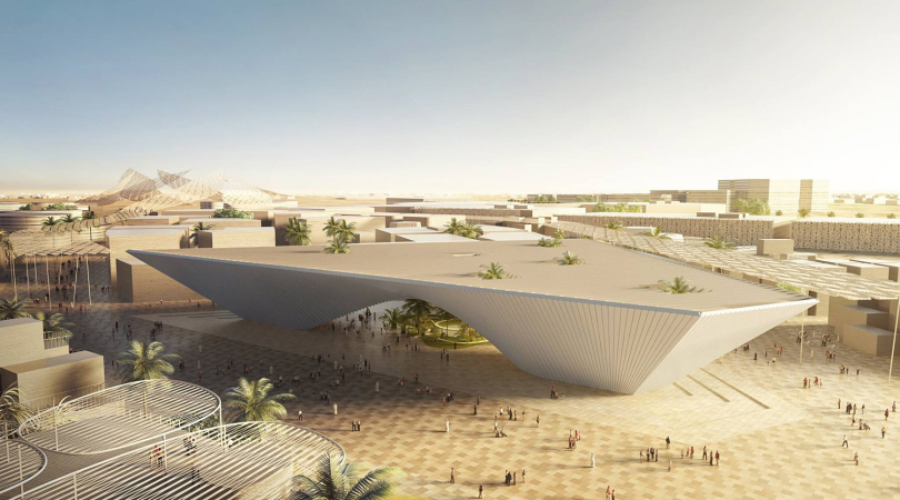
The motto of the exhibition is “Connecting Minds, Creating the Future”, and to explore this topic, the participants were offered three keywords or “subthemes”: mobility / sustainability / opportunity. And, in accordance with the master plan, developed by HOK, Populous, and Arup, the fairgrounds are divided into three subtheme “petals”, each of which ends in a large pavilion that does not belong either to a country or a corporation, but is meant to reveal one of the subthemes. Initially, in 2016, one giant pavilion from “star” architects was announced for each of the thematic zones: the theme of mobility was developed by Foster and Partners, Nicholas Grimshaw worked on sustainability, and the opportunity pavilion was designed by Bjarke Ingels. Out of three, two were left.
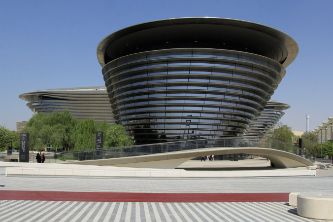
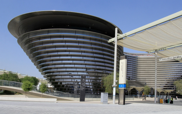
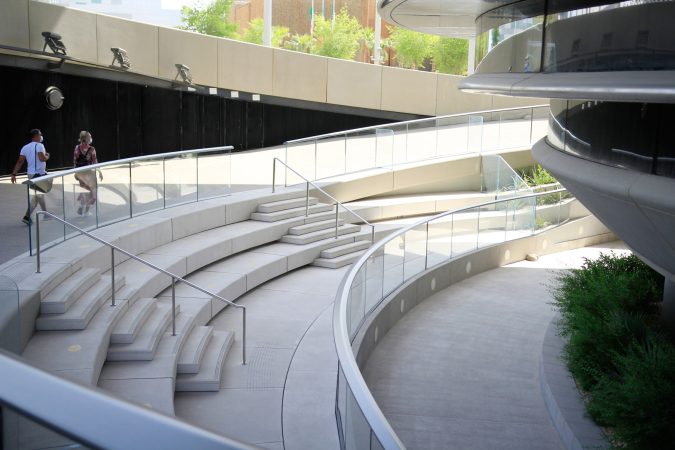
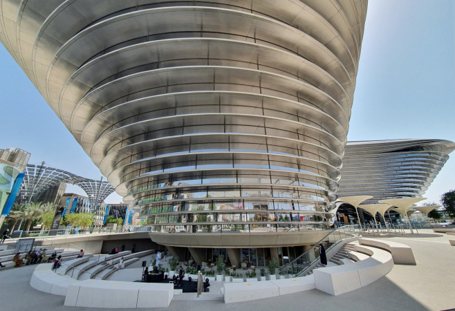
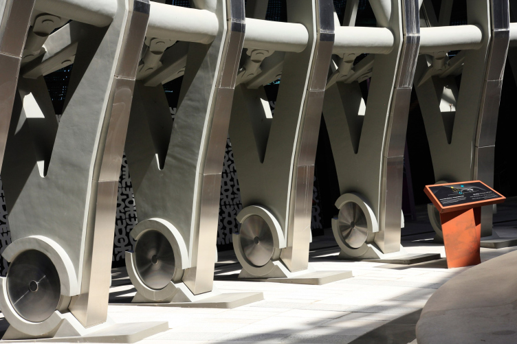
The Mobility pavilion (or “Alif”, which is the first letter of the Arabic alphabet), designed by Norman Foster, can arguably be considered the next “star” one, second only to Calatrava’s “white bird”. The giant trefoil expands from the bottom up with ledges of metal outriggers, which helps to form a shadow around, in particular, for a couple of amphitheaters. Another thing that attracts attention are the high-quality concrete elements at the basis of the building.
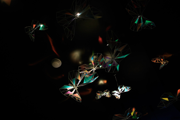
Unlike the Calatrava pavilion, which deserves to be seen because of its architecture alone, the exposition of the Mobility pavilion, devoted to the history of travel, starting from the great transmigration of people and ending in space exploration, is mesmerizing in itself: we are greeted by giant naturalistically executed heads of Arab travelers, then a projection on a giant ball in the central hall and a bright, rainbow-like, “journey to the future”, which consists of projects of cities proposed by children and a lot of iridescent butterflies at the end. The visitors are brought to the beginning of the exposition by an elevator platform located in the core of the trefoil and capable of lifting up to 160 people at a time.
Foster and Partners. The “Mobility” pavilion. World Expo 2020 in Dubai, 10.2021
Copyright: Photograph : Archi.ru
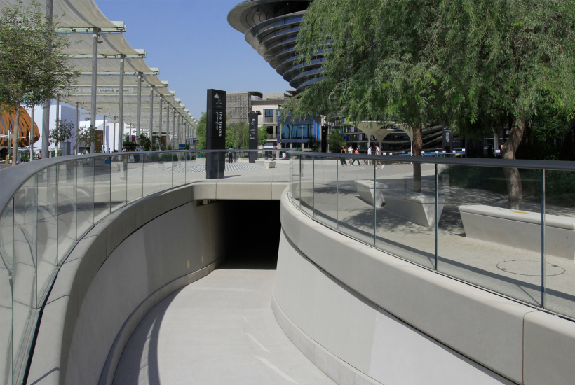
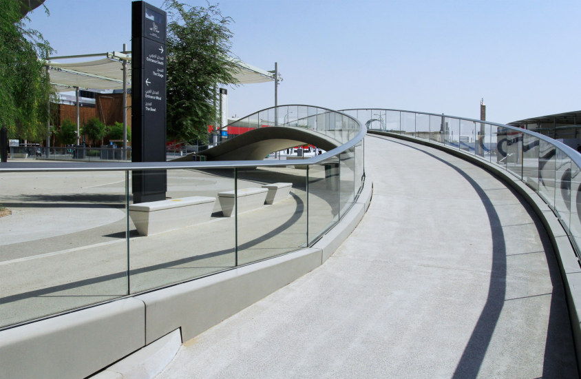
From the outside, the pavilion is surrounded by a bypass, partially buried in the ground, partially elevated on bridges – apparently, a 330-meter track was originally announced, on which the visitors would be able to observe state-of-the-art devices in action; but so far there are no devices detected on this road, it is also impossible to walk upon it, and the earlier announced “path” partially surrounding the Mobility pavilion remains a mystery.
It is expected that later on the building will be used as an office center.
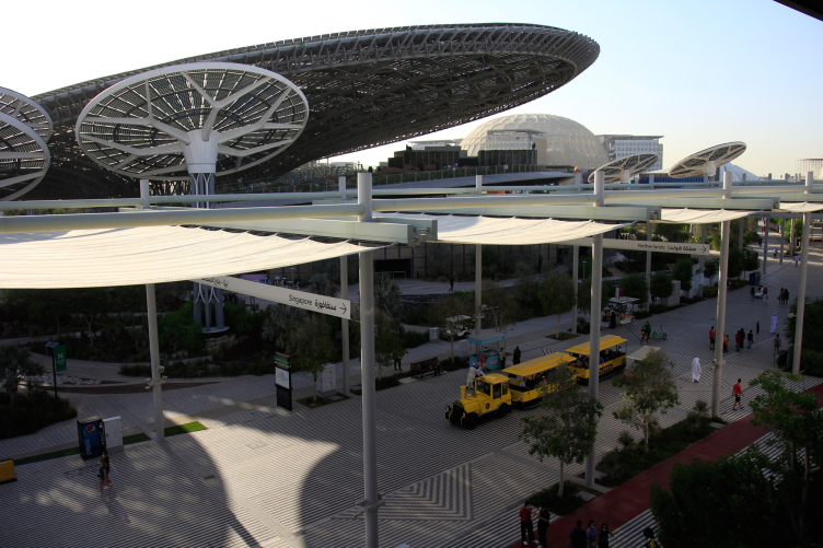
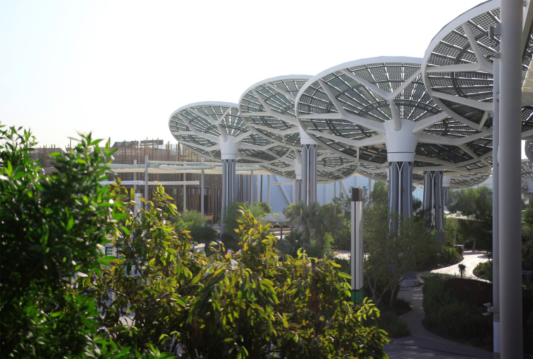
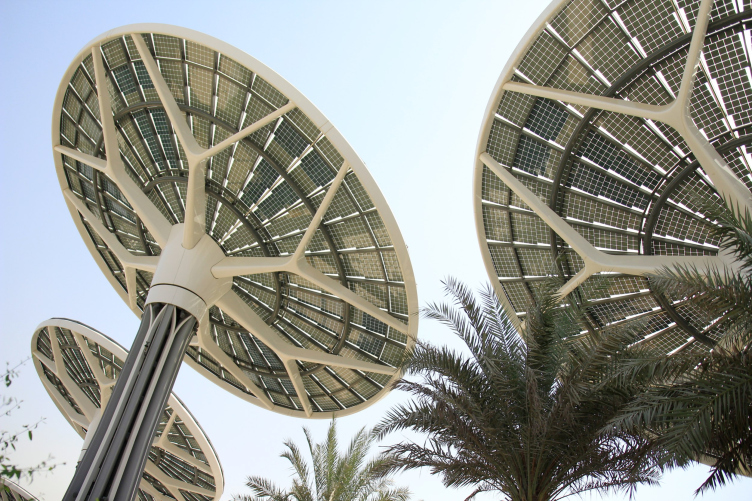
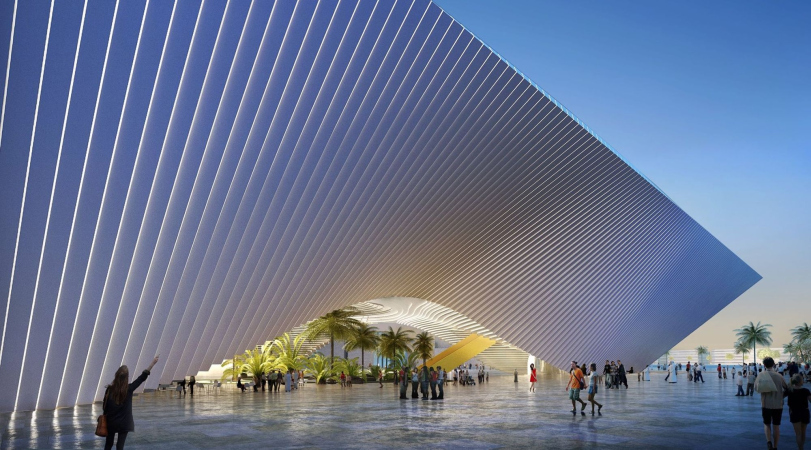
The main thematic pavilion of another petal – the “sustainability” one, also named Terra – was designed by Nicholas Grimshaw in the form of a giant tilted funnel surrounded by smaller “flowers”. All the structures collect solar energy, as well as rainwater and condensed water. The building has received a LEED certificate – it is “zero” in terms of energy consumption and emissions. The funnel covers the sunken-in courtyard with its shadow; a garden is laid out in the raised part above it – but due to the large size and winding paths, it takes painfully long to circle the building, getting up and down, and asking for directions – in this sense, the Mobility pavilion is positioned in a clearer and simpler way, although there are no gardens around it.
Nicholas Grimshaw, Terra/Sustainability Pavilion. View from the Singapore Pavilion. World Expo 2020 in Dubai, 10.2021
Copyright: Photograph : Archi.ru
Nicholas Grimshaw, Terra/Sustainability Pavilion. World Expo 2020 in Dubai, 10.2021
Copyright: Photograph : Archi.ru
Nicholas Grimshaw, Terra/Sustainability Pavilion. World Expo 2020 in Dubai, 10.2021
Copyright: Photograph : Archi.ru
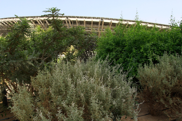
Nicholas Grimshaw, Terra/Sustainability Pavilion. The gardens around it. World Expo 2020 in Dubai, 10.2021
Copyright: Photograph : Archi.ru
The center of the large funnel comes to a symbolic deepened "well" in the interior – it has an installation on the topic of collecting condensate, with large drops on plastic leaves. However, this “well” collects water only symbolically: its top is covered with a transparent cloth, and it is this piece of cloth that accumulates water – which the attendants disperse with mops from time to time.
World Expo 2020 in Dubai, 10.2021
Copyright: Photograph : Archi.ru
World Expo 2020 in Dubai, 10.2021
Copyright: Photograph : Archi.ru
World Expo 2020 in Dubai, 10.2021
Copyright: Photograph : Archi.ru
The gigantic Sustainability pavilion, just as the metallic “umbrellas” around it, are seen from numerous angles on the exhibition territory – they palpably dominate in space, vividly demonstrating what powerful substructures and what a significant amount of metal are required in order to collect solar energy an rainwater and achieve the “zero emission” effect. Seeing this edifice, I recalled the flowers from the old Soviet cartoon “Secret of the Third Planet” – the ones that were used by the “bad guys” to record the cosmonauts on video.
It is planned that later on this building will host a children’s research center.
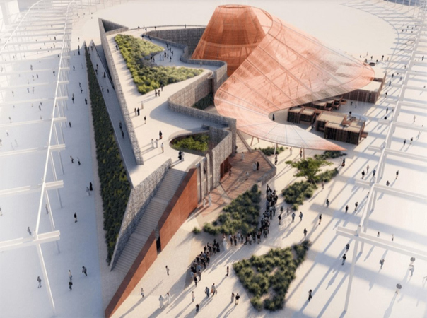
The story of the main building of the third “Opportunity” petal with a motto of “Mission possible” turned out to be far from simple. Initially, in 2015, the project of a triangular building with recessed portals and a green courtyard was developed by Bjarke Ingels and BIG. In 2018, the organizers abandoned it in favor of the Cox Architecture project, almost three times smaller in area (4,500 m2 in the Cox project vs 12,000 m2 in BIG).
This one, however, was later on replaced by a project submitted by AGi Architects, an architectural company, founded, as its website says, by Harvard professors, with offices in Madrid and Kuwait. The project is dated 2021 – in other words, apparently, it appeared right before the opening of the exhibition. The building is a frame lying around a spacious interior area, covered with metal structures clad in transparent fabric. This building is not marked on the master plan of the future city, which may have to do either with the complex history of this project or with the fact that it is not meant to be preserved – but then again, we could not find a definitive answer to the question about the future of this building.
AGi Architects, the “Opportunity” pavilion. World Expo 2020 in Dubai, 10.2021
Copyright: Photograph : Archi.ru
World Expo 2020 in Dubai, 10.2021
Copyright: Photograph : Archi.ru
A similar fate befell some elements of the HOK master plan – the one with which the UAE won the right to host the World Expo back in 2013. The trefoil structure did survive, immersed in the radial-and-circle plan of the semicircle of the future city, but the ropeway for moving around the exhibition and viewing it from up above, which was promised in 2013, remained on paper, being substituted by a system of shuttle busses cruising up and down the exhibition lanes.
The overview from the cable car has been partially compensated by the elevator designed by the famous Briton Asif Khan – it lifts the visitors to a height of 55 meters above the exhibition for 5 minutes for 30 dirhams. A small garden on the platform is formed by peltophorum trees, with leaves like acacia and yellow flowers, familiar to the local climate; in the lower part, there is an air-conditioned space for those who prefer to survey the surroundings with comfort.
Asif Khan also designed three openwork gates made of lightweight carbon fiber in front of the entrance to each of the petals – they are opened and closed in the morning and evening, and they stand a little apart, in the middle of the desert, because they meet those who approach from the side of the parking lots; but there are no gates on the subway side.
Asif Khan, carbon fiber gate. World Expo 2020 in Dubai, 10.2021
Copyright: Photograph : Archi.ru
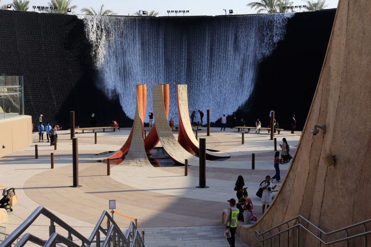
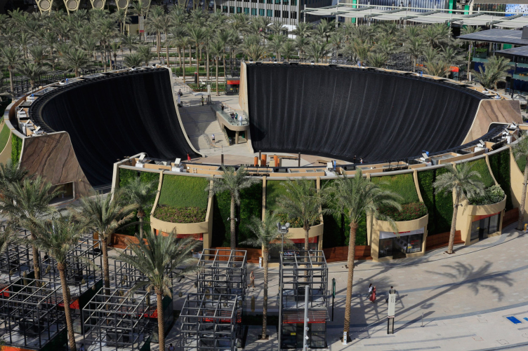
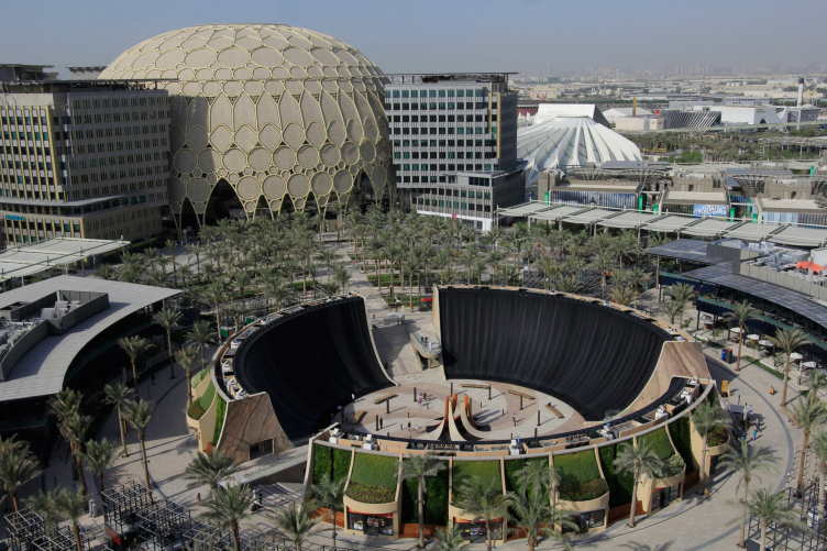
Next to the watchtower, there is a so-called Water Feature – a white funnel with waterfalls, designed and built by the California-based WET Design (they are the authors of the fountain in front of Burj Dubai, as well as the music for the “Game of Thrones” series) in collaboration with the architects of SWA Group, urbanists with eight offices, most of which are based in the USA, and one in the neighboring city of Sharjah. The circular square is surrounded by walls, over which water flows sometimes slowly and sometimes in torrents; the sculpture of petals in the center of the square produces steam. It is difficult to say whether this structure is of interest from the point of view of architecture because it looks more like a tourist attraction of some water park – but in the local climate, where many visitors are looking to relax, it looks more than appropriate.
World Expo 2020 in Dubai, 10.2021
Copyright: Photograph : Archi.ru
World Expo 2020 in Dubai, 10.2021
Copyright: Photograph : Archi.ru
World Expo 2020 in Dubai, 10.2021
Copyright: Photograph : Archi.ru
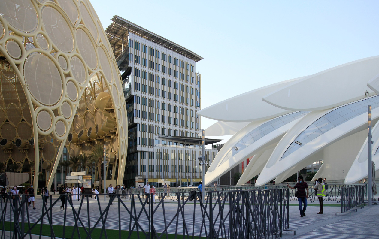
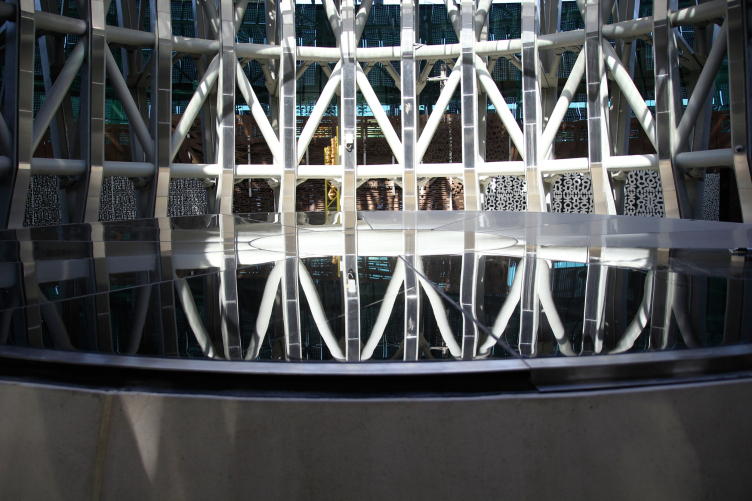
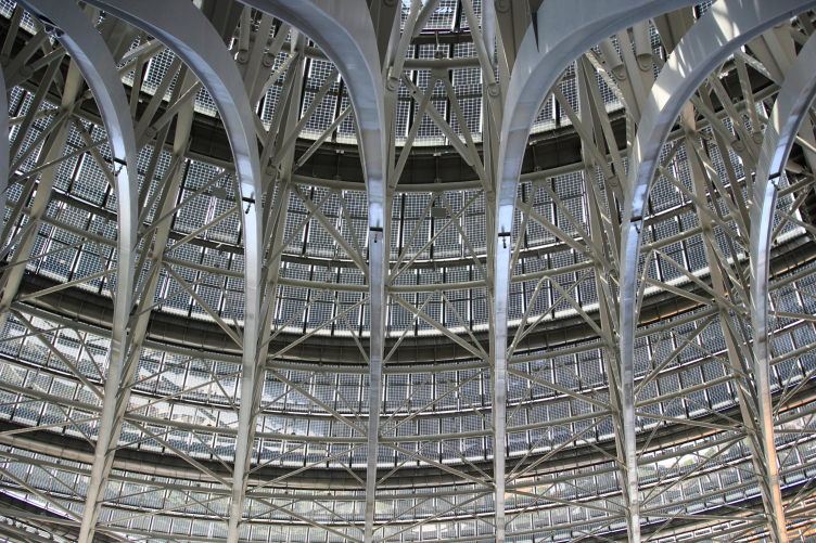
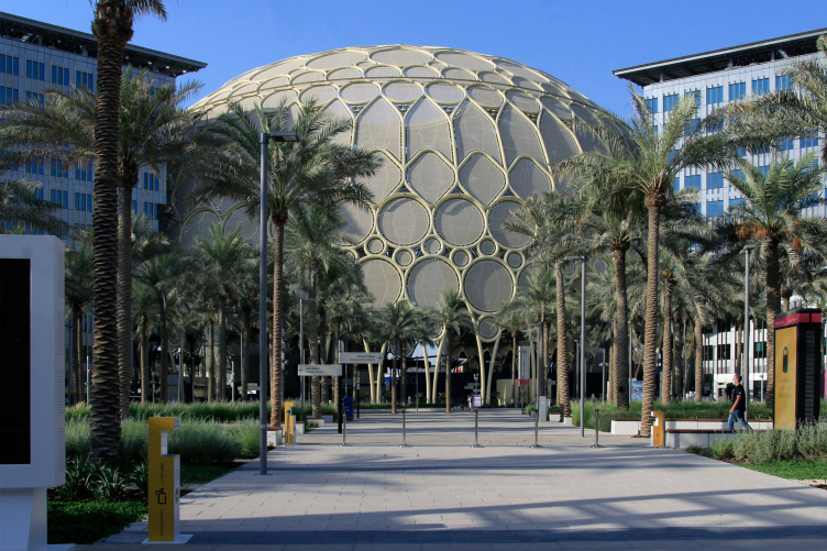
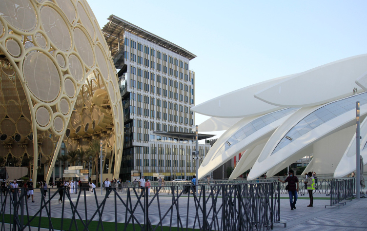
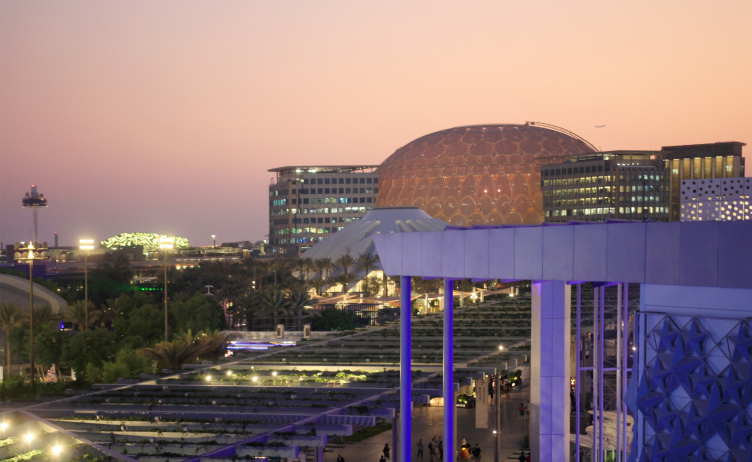
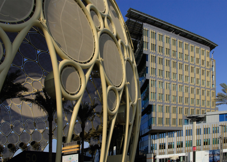
Particularly amazing is the central “dome” square, to which three planning petals converge. In the preliminary sketches, the awnings of the alleys converged to the center in flying white petals – the result was a massive metal dome Al Wasl, designed by the British architectural companies Adrian Smith + Gordon Gill Architecture – a unique, the world’s largest screen for 360° projection. Its diameter is 130 m, height 67.5 m, and the weight of the steel structures is 2.544 tons, compared with the weight of 25 blue whales. The authors liken the dome with the traditional design of the oriental bazaar.
The structure, however, looks heavyweight and more like an element of some sideshow amusement park than the center of the World Fair – its key function is indicated only by its gigantic size and non-trivial task, but aesthetically the dome can be rated as “C” at the most. It totally misses the lightness and the paradoxical nature of a mirage in the desert, which are demonstrated by the entrance structures designed by Asif Khan; however, probably, the portals will be taken apart later on, and the dome will remain. It presents a particularly striking contrast next to the white wings of the Santiago Calatrava pavilion.
World Expo 2020 in Dubai, 10.2021
Copyright: Photograph : Archi.ru
World Expo 2020 in Dubai, 10.2021
Copyright: Photograph : Archi.ru
World Expo 2020 in Dubai, 10.2021
Copyright: Photograph : Archi.ru
The buildings that surround the dome – 3 office ones and 2 hotels – step up really close to it, cramming up the surrounding space and forming a contour that looks like Hagia Sophia from the outside, which is quite authentic for the Occident, but still not really beautiful. In addition, their facades are as commonplace as can be – I must say, they were somewhat more interesting in the project; in general, there is a feeling that some not the most pretentious chunk of Dubai’s office buildings of previous years was simply “transplanted” into the center of the exhibition. I even went as far as to check whether these buildings were some kind of legacy of some housing complex that used to be here back in the day – but no, these buildings were constructed special for this expo, the territory is being developed now. This complex presents a different, very “local” layer of the exhibition, which blithely stands up next to the pavilions designed by “star” Europeans, both thematic and national representations, creating an explosive mix, in which, for example, the white “shell” of the Luxembourg pavilion finds itself on one futuristic pole, and the Ukrainian pavilion, on the other hand, supports a retro trend.
World Expo 2020 in Dubai, 10.2021
Copyright: Photograph : Archi.ru
World Expo 2020 in Dubai, 10.2021
Copyright: Photograph : Archi.ru
The pavilion of Ukraine. World Expo 2020 in Dubai, 10.2021
Copyright: Photograph : Archi.ru
Here, just as you would expect on an oriental bazaar, you may find a little something to everybody’s taste, but, thanks to the pile of the office buildings in the center of the territory, we begin to see that the multicolored fabric of this international exhibition, designed to produce a WOW-effect, masks a rather trivial development project, indifferent to aesthetic issues, and ready to distort any design solution for the sake of various external reasons: economic, organizational, or the good old “because I want it that way!” But then again, who says this is NOT our future? Probably, the future is not only for space programs, Mars exploration, water extraction from the air and networks of mini-satellites, but also for the tolerance of aesthetic solutions observed here, so multi-level and at the same time coexisting so peacefully and “normally” that it makes you hair stand up on end.
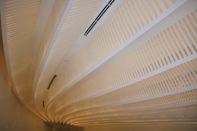
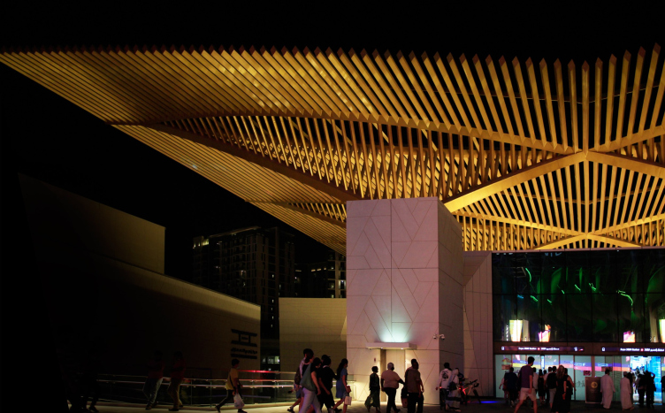
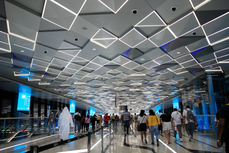
Special for Expo 2020 and as one of the arguments for holding the exhibition in Dubai, a new metro line was designed and built, branching off from the main “red line” running along the coast. Its length is 15 km; its task is, on the one hand, to serve the flow of Expo visitors, and on the other, to help the development projects in the territory extending from the coast and into the desert. The project is authored by the London-based architectural firm Weston Williamson+Partners. The way from the city to the Expo is indeed most convenient by metro, since the terminal station goes directly to the exhibition center and its entrance. Visually, however, the golden canopies proposed by the British architects look like they were designed pretty fast and loose: the silhouette with a spread of ribbed wings is seen from afar – my colleagues even suspected the authorship of Santiago Calatrava – yet when you come up close, the implementation seems rather clumsy: the ribs are too thick, the spread is not too great, and the paint is too yellow. Nothing is left of the originally planned “golden structures growing into the interiors”, and nothing is left from the intended winter gardens – even though the galleries of the metro station are wide and full of backlighting. Apparently, the most refined elements of the idea of 2016, which can be found here, were lost during the adaptation of the project.
The metro terminal. World Expo 2020 in Dubai, 10.2021
Copyright: Photograph : Archi.ru
The metro terminal. World Expo 2020 in Dubai, 10.2021
Copyright: Photograph : Archi.ru
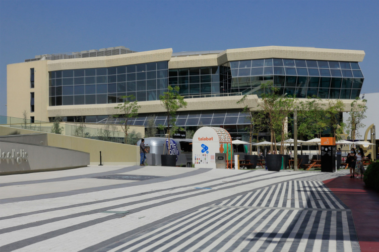
The less critical parts of the infrastructure look calmer and better. The visitor centers with grocery stores, toilets, and even shower cabins, very handy in the climate of Dubai, are simple, white, and light; it is unknown, however, whether or not they will be preserved.
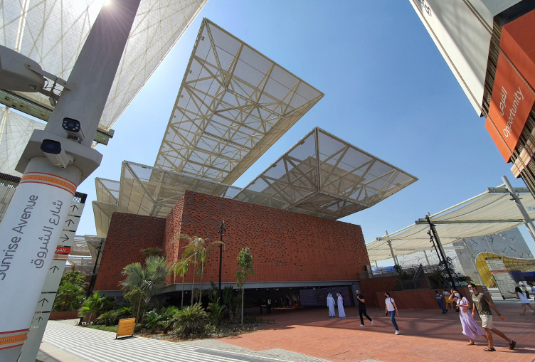
The standard buildings in the “petals”, however, will probably be preserved: the 4 to 6-story houses made of prefabricated panels with decorative screens – currently, they are designed to host the pavilions of the countries that cannot afford to implement an independent project of their own, this was made in order to reach the “record-breaking” number of participants – later on, the ones that are closer to the center will be turned into housing stock, and those that are farther away from the center will host various businesses.
World Expo 2020 in Dubai, 10.2021
Copyright: Photograph : Archi.ru
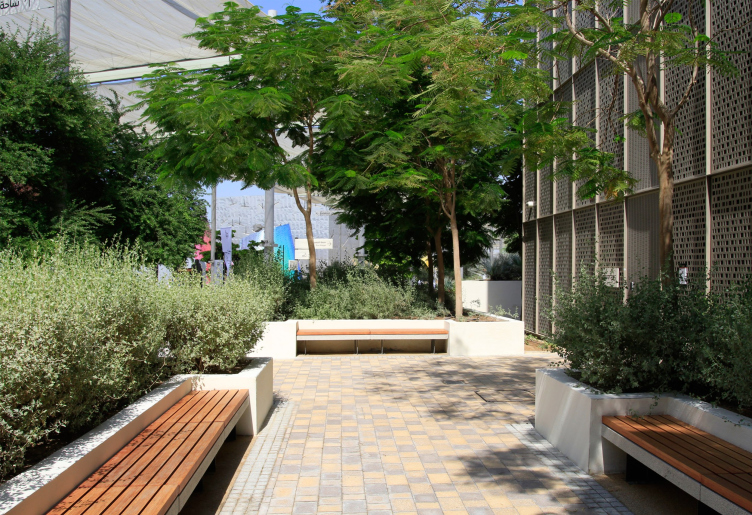
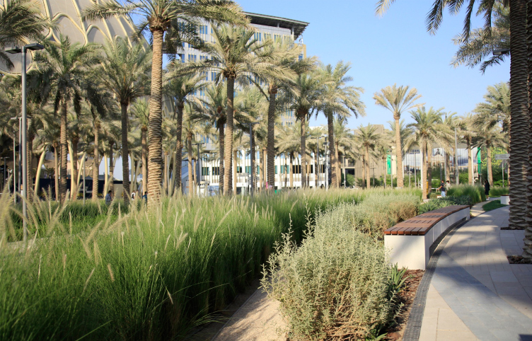
Landscaping is the best part here that raises no questions – a lot of money has been invested in it: a lot of greenery has appeared in the desert, including mature palm trees. There are several playgrounds and parks on the fairgrounds, inspired by the image of “wadi” rivers arising in the desert after heavy rains. The park was designed by the same company as the Water Feature – SWA Group.
World Expo 2020 in Dubai, 10.2021
Copyright: Photograph : Archi.ru
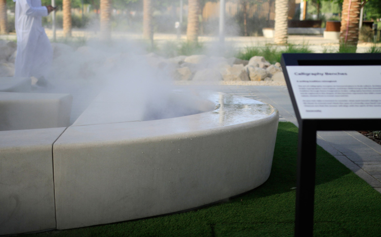
Yet another interesting project is the benches in the form of Arabic inscriptions denoting various good words, for example, “happiness” – they, just as the gate and the observation tower, were invented by Asif Khan together with the Arabic typographer Lara Captan. Some of them are fitted with steam generators. Fountains of drinking water are placed on the alleys, which is very appropriate; in some places there are “dry” fountains.
World Expo 2020 in Dubai, 10.2021
Copyright: Photograph : Archi.ru
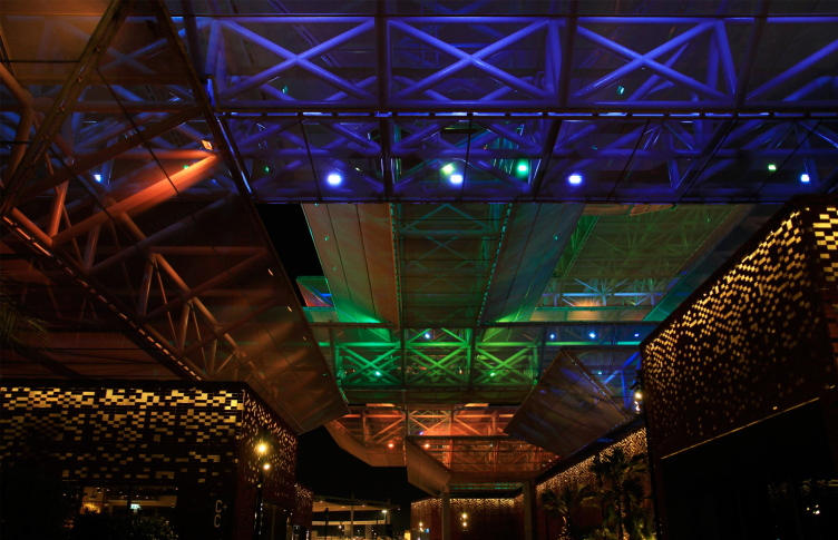
Otherwise, Expo 2020 is a great celebration. The pavilions glow on the inside by day and on the outside by night. It gets dark early; the peak of attendance is planned for the winter, when the evening time will take up almost half of the working time of the exhibition. The three planes of the Saudi Arabian pavilion, for example, have been turned into one large screen for media projection. Everything moves and shines. It entertains you, and does not impose tedious “reading” on you – but then again, studying a huge exhibition requires a lot of effort in any case.
World Expo 2020 in Dubai, 10.2021
Copyright: Photograph : Archi.ru
The numerous movie theaters and media screens create an absolutely enchanting impression – from all sides we are told how close is the fantastic future with universal equality and space flights for everyone, at the same time not alien to environmental responsibility. Your reason tells you how unrealistic this is, but your feelings say the opposite – in fact, Dubai itself is a territory of successful terraforming, turning the desert into blooming gardens, and Expo 2020 is a new, technically advanced example of all of these things, such as successful human impact on nature, as stated, with zero emissions and very sustainable – despite all the energy of the invasion, and despite the abundance of concrete, metal, and electricity. At some point, you buy into these flashing shows and really start believing that everything is possible: the progress, the sustainability, and the unity of opposites – you only need to calculate it right. In some ways, this is like a Luna Park that makes its visitors believe that they are already on the Moon, falling for the temptation of shining projections, not noticing how inappropriate the heavy metal dome is and how trivial the offices around it are.
Expo 2020 is open until March 31, 2022, the pavilions are open until 22:00, fairgrounds are open for visiting Sat-Wed until 0:00, Thu-Fri until 02:00.

