По-русски

​Lightness of Being

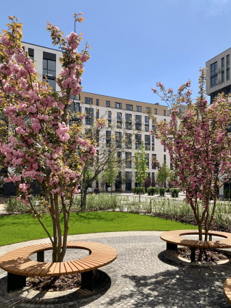
Blooming Sakura, a campfire party, kids splashing in a swimming pool – no, these are not pictures from a vacation, but everyday life going on in the yards of Kiev’s housing complex “Fayna Town”. In this issue, we are examining how the utopia designed by the architects is wired, and what they did to make it a reality.

04 November 2021
Object
mainImg
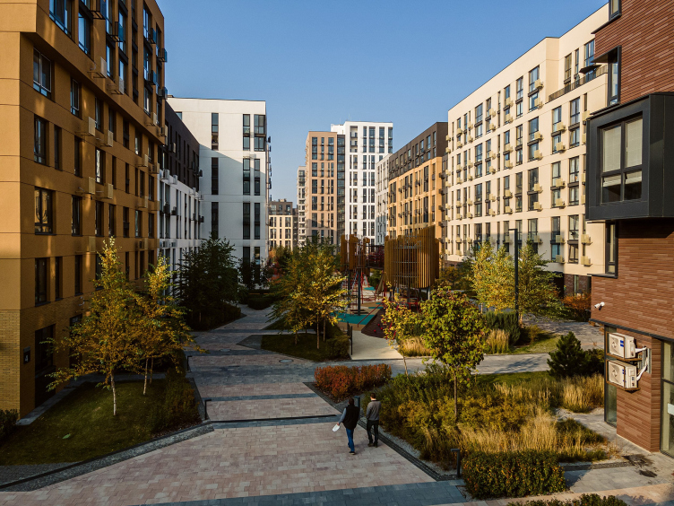
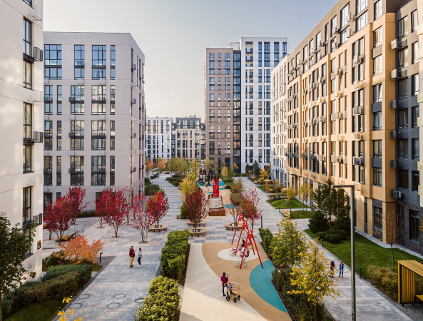
Examining the “Fayna Town” housing complex in any other way than as something phenomenal is impossible – so amazing is the very fact of its existence in the post-Soviet space. The architectural company Archimatika in collaboration with KAN Development creates, on a 40-hectare land site, an environment that literally defies imagination: only a quarter of the complex has been built but it already boasts more than a thousand reviews on Google Maps, dozens of reviews on YouTube, and countless Instagram geotags, particularly after the swimming pool, so relevant for the last hot summer, was opened. Despite the rather high cost, apartments are being sold out quickly, now only those that will be completed in 2024 are available. There is also recognition at the professional level – it can take a long time to list the awards, but it is enough to mention that the complex has been recognized as the best in Ukraine more than once.

Fayna Town complex, Stages 1-2, 2020
Copyright: Photograph © Taras Bespaly / provided by Archimatika


Archimatika is a company that is characterized by a value-centric approach and an ability to make the most of the available data: the projects here are created based on the natural needs of people, which are thoroughly researched, then clearly formulated, and then converted into individual floor plans, eventful streets, and memorable facades. For its housing projects, the company specially developed the PRO-standard – essentially, a recipe for a comfortable environment, which speaks for itself better than any advertising brochure. “Fayna Town” is exactly the case when all the ingredients for the complex recipe are there, and not a single “cooking stage” has been missed.

Fayna Town complex, Stages 1-2, 2020
Copyright: Photograph © Taras Bespaly / provided by Archimatika


This year, the fourth stage of the complex will be completed. The houses will be built together with infrastructure so as to make sure that people would not be living “on the construction site”, and could enjoy the promised benefits, so you can get an impression of the whole by studying one of its parts, which we are going to do now.

Fayna Town complex, Stages 1-2, 2020
Copyright: Photograph © Taras Bespaly / provided by Archimatika


The meanders of the city blocks

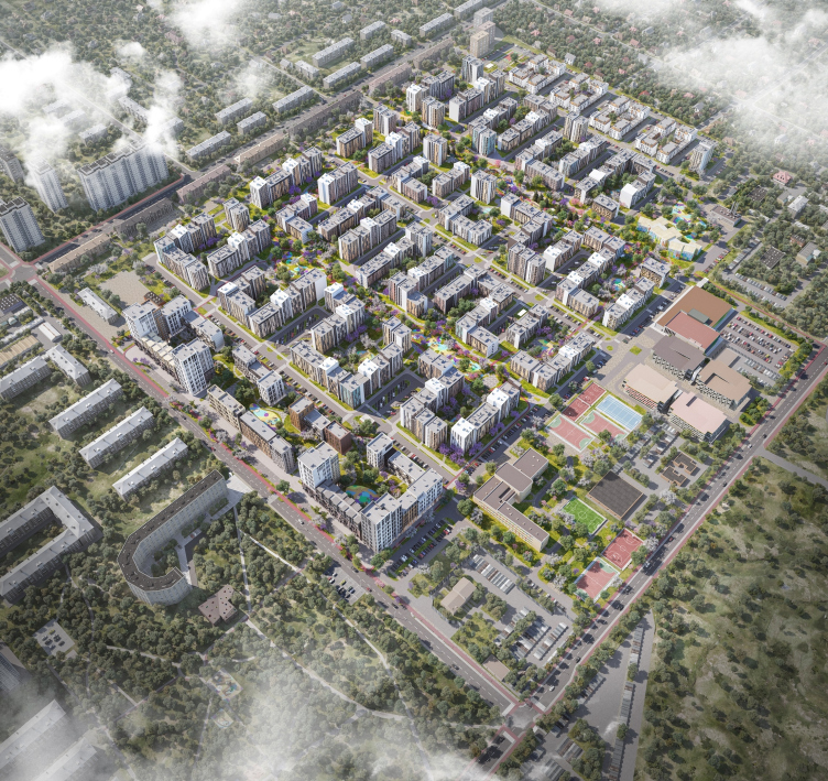
The construction of Fayna Town began in 2017 in Kiev’s district of Nivki, which was developed the most intensively in the 1950s and 60s – not really the city center but not a suburb either. The land site, demarcated by the Salutnaya, Akademika Tupoleva, Estonskaya, and Shcherbakovskogo streets, used to be occupied by greenhouses, expo pavilions, and a few small enterprises. The architects also discovered here an alley of half-a-century-old fir trees – it was preserved and included in the future promenade. Generally speaking, the architects received a convenient and extended rectangular site, not burdened by any historical context or any substantial limitations. The latter is perhaps the vicinity of the Antonov airplane repair plant – regular flights do not take place here, but the number of floors of the houses located on the glide path of the runway still had to be significantly reduced.

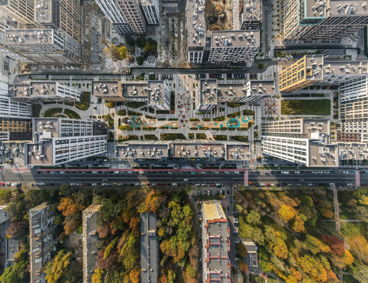
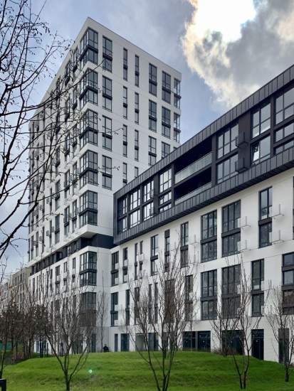
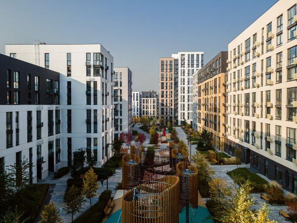
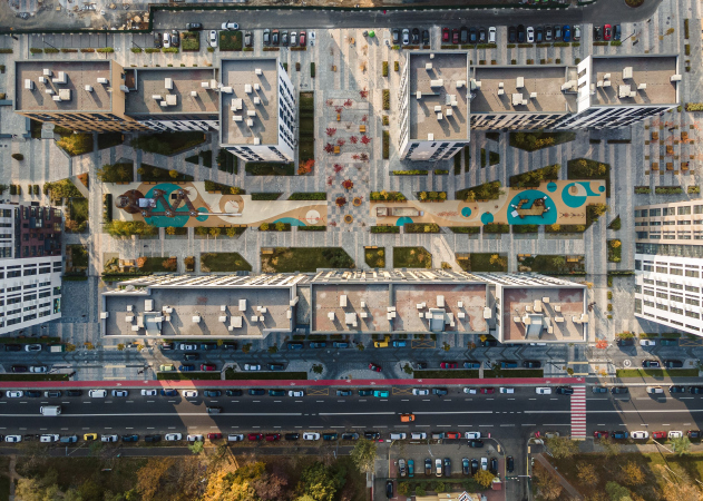
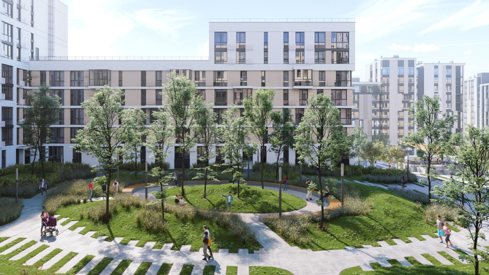
Totally, the complex will consist of 90 houses – they will form “snakes” of semi-open city blocks from 6 to 16 stories high. Between the “snakes”, there is a system of spaces of various degrees of privacy – from the “Smart Street” open to the city to residents-only inner promenades with a few types of quiet little yards. A significant part of the infrastructure – the swimming pools, the barbecue spot, and sports facilities – is situated on the side of the airfield; the school, the kindergarten, the shopping mall, and the multilevel parking lots are also situated here. Underground parking garages are also being constructed, but not underneath every unit.

“Fayna Town” housing complex
Copyright: © Archimatika


Houses with names

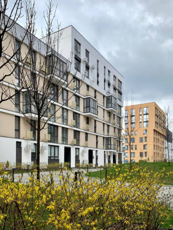
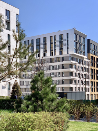
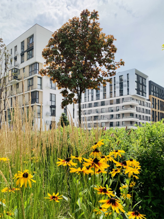
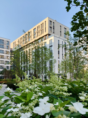
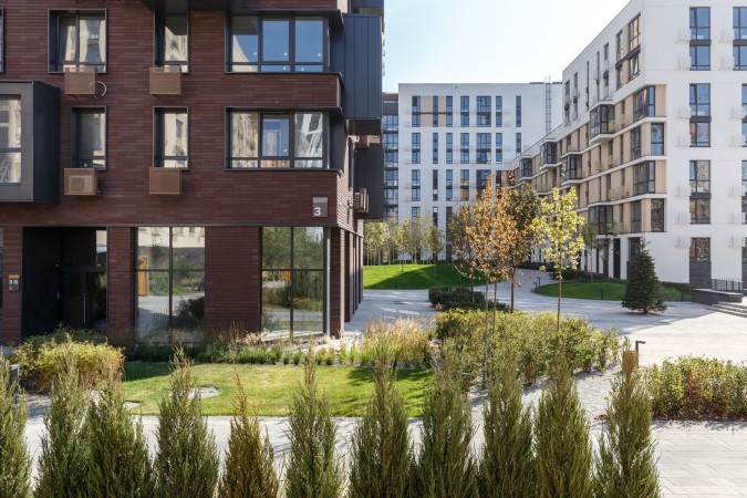
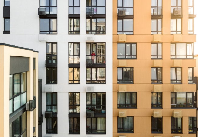
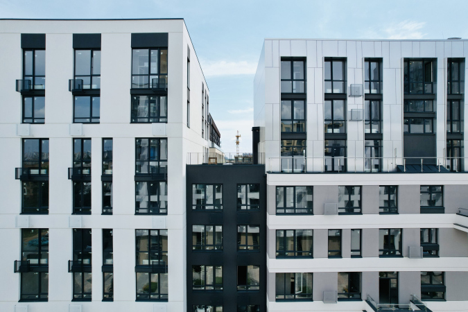
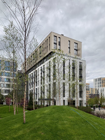
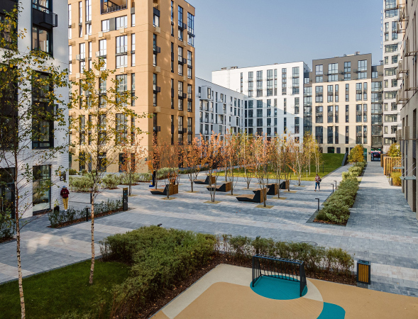
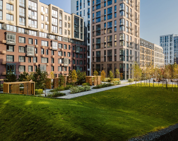
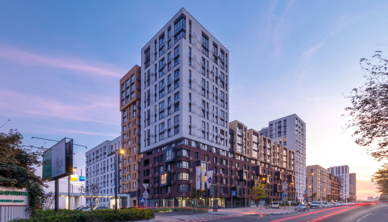
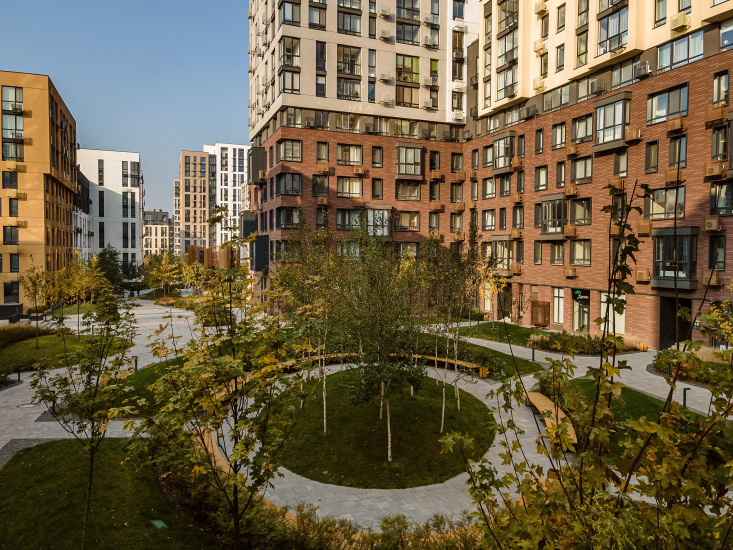
No two houses in Fayna Town are exactly alike, and, hence, all the blocks are also different. Each house is fractured into sections by using color, materials, patterns, windows, balconies, or plastique. This is how an even greater diversity is achieved, as well as an impression of human-friendly scale and parceled construction. As a result, navigation is simplified – it is easy to find not just your building, but even your own window; a sense of belonging is enhanced: the architects strive for such a degree of individuality that each house can receive a nickname from the residents – for example, “copperhead” or “green one”, etc. The differences in height within each block allow you not only to give a proper amount of ambient light to the apartments and reveal wide views from the windows, but also to get as many corner apartments as possible – the “coolest” ones, as Dmitry Vasiliev defines them.

At the same time, “motley” would be the last word to describe this place – all the houses are brought to the same “laconic” common denominator, but, on the other hand, not a single one of them is “rank-and-file” or even neutral – Archimatika does surprise you with the abundance of variations arising within one theme.

  • zooming
    1 / 5
    “Fayna Town” housing complex, 2019
    Copyright: Photograph © Alexander Angelovsky / provided by Archimatika
  • zooming
    2 / 5
    Fayna Town complex, Stages 3-4, 2021
    Copyright: Photograph © Vlad Baglay / provided by Archimatika
  • zooming
    3 / 5
    Fayna Town complex
  • zooming
    4 / 5
    Fayna Town complex
  • zooming
    5 / 5
    Fayna Town complex


The bottom floors, which people perceive on a level of their eyes, are clad in more tactile and finer materials – porcelain stoneware or Klinker brick. The higher up, the brighter and larger the forms become. Interestingly, the developer invited a separate team to work with each type of cladding material, each team specializing in their particular area of expertise.

  • zooming
    1 / 4
    “Fayna Town” housing complex, 2019
    Copyright: Photograph © Alexander Angelovsky / provided by Archimatika
  • zooming
    2 / 4
    Fayna Town complex, Stages 1-2, 2020
    Copyright: Photograph © Taras Bespaly / provided by Archimatika
  • zooming
    3 / 4
    Fayna Town complex, Stages 1-2, 2020
    Copyright: Photograph © Taras Bespaly / provided by Archimatika
  • zooming
    4 / 4
    Fayna Town complex, Stages 1-2, 2020
    Copyright: Photograph © Taras Bespaly / provided by Archimatika


The complex “map” of the facades adequately reflects the diversity of the floor plans – there are about 800 of them; 100% is made in accordance with the PRO-standard, which means making the most of each square meter and custom-designed floor plans fitting the way of life of different families: some apartments have a large dining room, in some the kitchens are really small, some have large walk-in closets, some have master bedrooms or large working areas. The architects believe that each apartment will ultimately find its owner who will not think of moving walls or coming up with unconventional ways of using corners.

It is expected that the architecture of the next stages will repeat the overall composition of the complex, but new solutions that will respond to the challenges of times will also be possible: for example, right now the architects are including the trend for open-air balconies and terraces of increased square footage into the project.

  • zooming
    Fayna Town complex, Stages 3-4, 2021
    Copyright: Photograph © Vlad Baglay / provided by Archimatika
  • zooming
    Fayna Town complex, Stages 3-4, 2021
    Copyright: Photograph © Vlad Baglay / provided by Archimatika


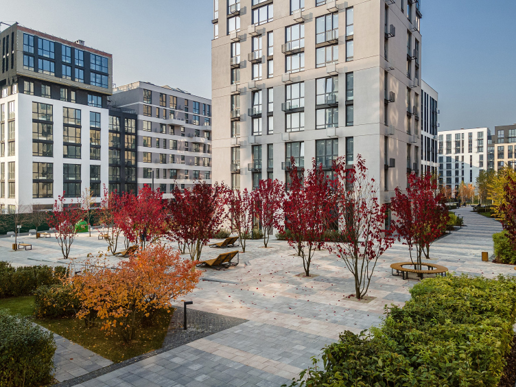
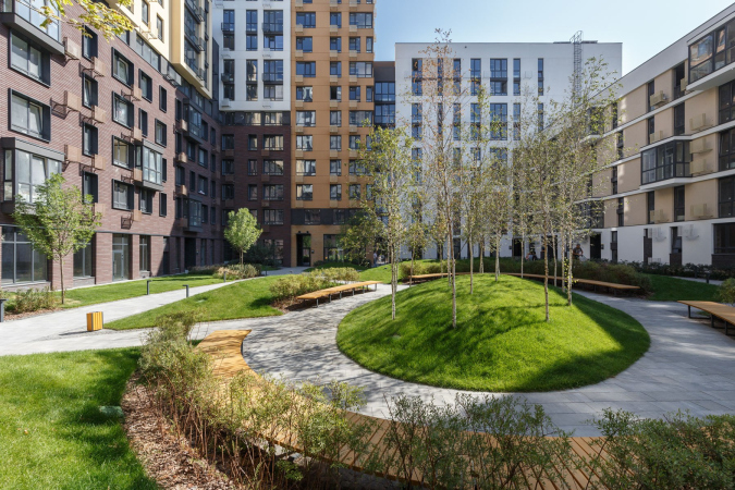
The main interesting feature of “Fayna Town” is probably that the facades, despite the fact that they are thoroughly thought-out and well-designed, do not catch your eye at once. What does catch your eye is the environment, still quite unusual by the standards of our realities, the kind that we usually describe as “European” or even localize the description to “Finnish”. 13 hectares out of the 40 that the complex consists of will be given to landscaping, more of which below.

The ties of the streets

Before launching this grand-scale project, KAN Development conducted a fair bit of research, the results of which showed that one of the unsatisfied needs of the megalopolis residents is communication. A significant part of the solutions of land improvement in Fayna Town is aimed at helping people meet more often, make new acquaintances, and spend more time usefully: together with their family or simply outdoors in general, being amongst people.

Fayna Town complex, Stages 1-2, 2020
Copyright: Photograph © Taras Bespaly / provided by Archimatika


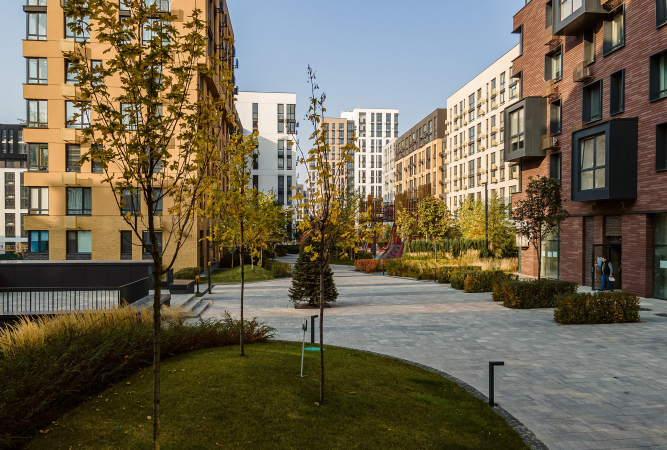
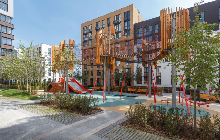
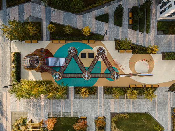
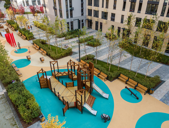
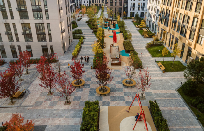
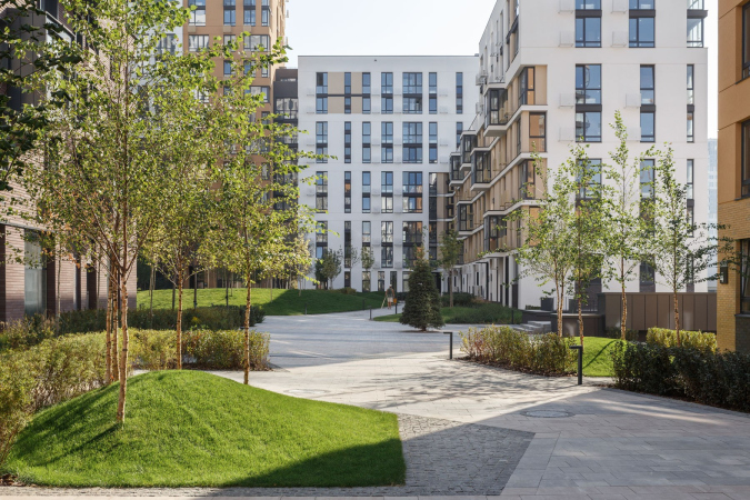
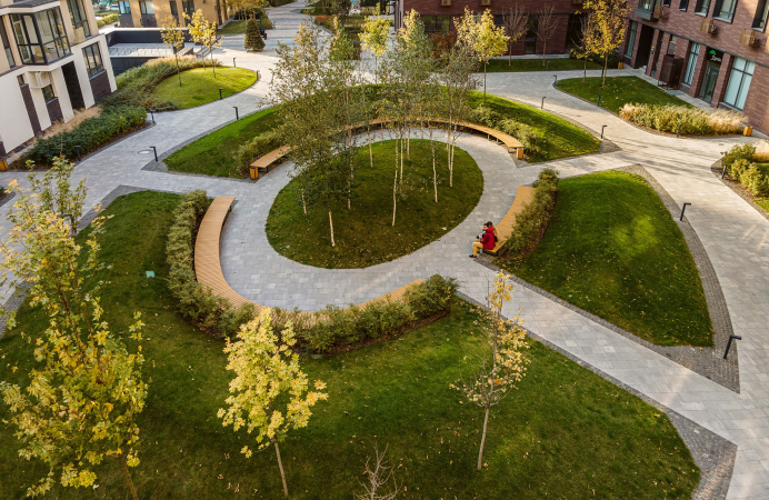
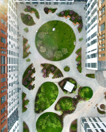
The central blocks are “belted” by a circular promenade more than 3 kilometers long, which sometimes gets narrower and sometimes wider, and, meeting streets with traffic, rises in a flyover – this is a totally vehicle-free space, where you can walk, cycle, and do full-fledged sports. The promenade helps to gather all the recreational areas between the houses into a single system, turning them into a park spread over the entire complex, which literally lures you to venture outdoors. Just like the houses, no two playgrounds or sports facilities are exactly alike – there is a rope park in one part of the complex, trampolines in another, so that every day you have a choice and a new walking route.

  • zooming
    1 / 5
    Fayna Town complex, 2019
    Copyright: Photograph © Alexander Angelovsky / provided by Archimatika
  • zooming
    2 / 5
    Fayna Town complex, Stages 1-2, 2020
    Copyright: Photograph © Taras Bespaly / provided by Archimatika
  • zooming
    3 / 5
    Fayna Town complex, Stages 1-2, 2020
    Copyright: Photograph © Taras Bespaly / provided by Archimatika
  • zooming
    4 / 5
    Fayna Town complex, Stages 1-2, 2020
    Copyright: Photograph © Taras Bespaly / provided by Archimatika
  • zooming
    5 / 5
    Fayna Town complex, Stages 1-2, 2020
    Copyright: Photograph © Taras Bespaly / provided by Archimatika


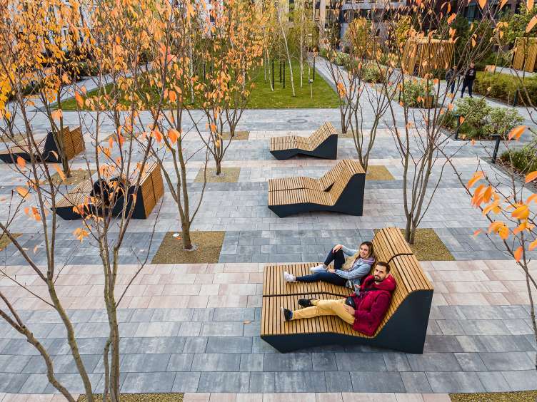
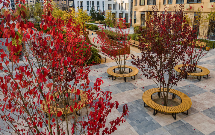
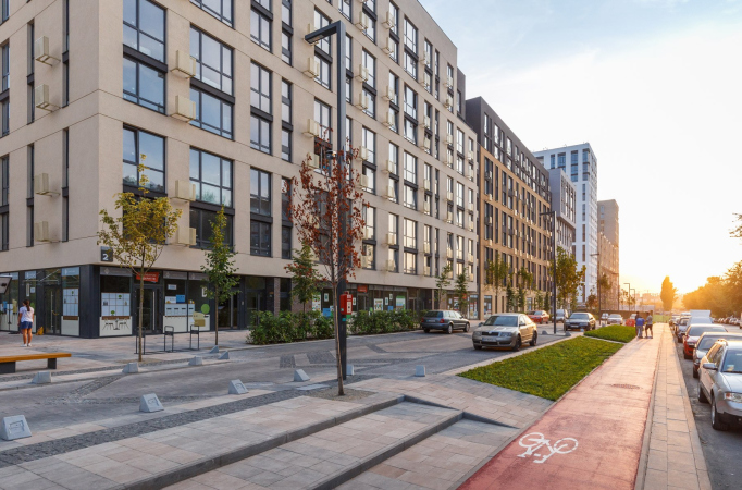
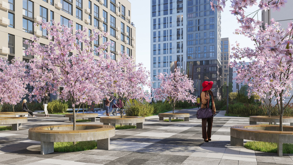
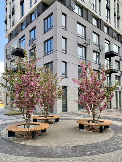
The architects gave as much attention to the neutral and transient zones. There are no “accidental” benches in Fayna Town – each one is placed based upon the view that it commands, each one is accompanied by a hedgerow, which gives you a feeling of protection, and you can always find a place in the shade. In the pedestrian barrier-free zones, there is no asphalt at all – instead, there are more than ten paving patterns, which allow to visually expand a narrow street, divide a square into sections, or just give some extra dynamics to surrounding space. The full-size bushes and trees, geo-plastique, perennial plants, backlighting, and minor architectural forms, just like carefully selected details of the interior, make the space feel cozy and domesticated.

  • zooming
    1 / 8
    Fayna Town complex, Stages 1-2, 2020
    Copyright: Photograph © Taras Bespaly / provided by Archimatika
  • zooming
    2 / 8
    Fayna Town complex, Stages 1-2, 2020
    Copyright: Photograph © Taras Bespaly / provided by Archimatika
  • zooming
    3 / 8
    Fayna Town complex, Stages 1-2, 2020
    Copyright: Photograph © Taras Bespaly / provided by Archimatika
  • zooming
    4 / 8
    Fayna Town complex, Stages 3-4, 2021
    Copyright: Photograph © Vlad Baglay / provided by Archimatika
  • zooming
    5 / 8
    Fayna Town complex, Stages 1-2, 2020
    Copyright: Photograph © Taras Bespaly / provided by Archimatika
  • zooming
    6 / 8
    Fayna Town complex, 2019
    Copyright: Photograph © Alexander Angelovsky / provided by Archimatika
  • zooming
    7 / 8
    Fayna Town complex, Stages 1-2, 2020
    Copyright: Photograph © Taras Bespaly / provided by Archimatika
  • zooming
    8 / 8
    Fayna Town complex
    Copyright: Photograph © Vlad Baglay / provided by Archimatika


Improvement with an asterisk

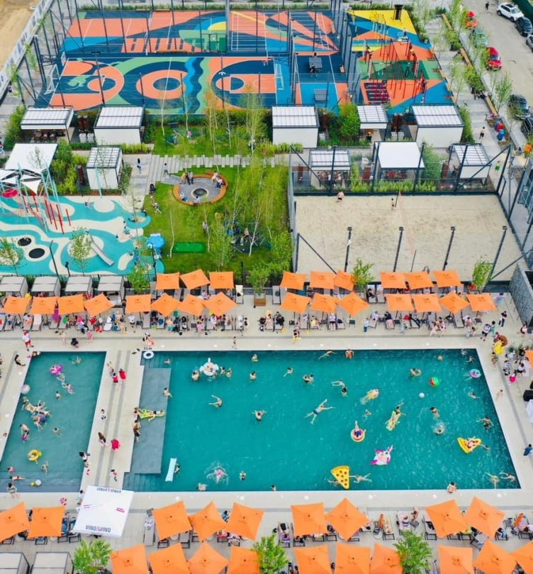
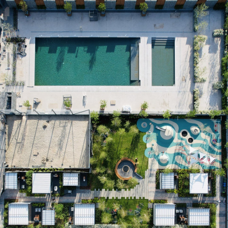
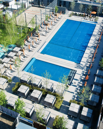
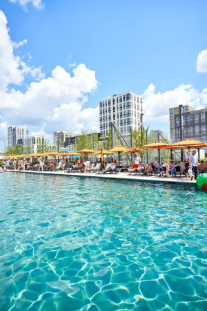
After the fourth stage of Fayna Town was opened, its photos began to look like seaside resort ones – people sunbathing on sun loungers, playing beach volleyball and meeting at barbecues. And, while vehicle-free yards can already be considered a norm, a swimming pool still feels like something from another life: the only analogue that comes to mind is Almetyevsk, but in that city the swimming pool caters for the entire city, and here it does for the complex.

Fayna Town complex, Stages 3-4, 2021
Copyright: Photograph courtesy by KAN Development


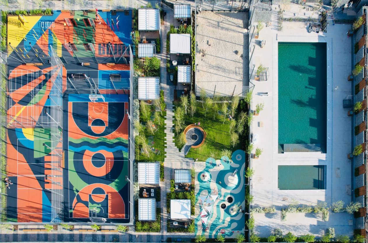
There are in fact two swimming pools – a 25-meter-long with a shallow end and a bar, and a safe children’s one. 150 sun loungers, bungalows, storage rooms and locker rooms make going for a swim a simple and enjoyable thing to do, which does not require any complex serious efforts in gathering, planning and other logistics. During the cold season, the pool is preserved.

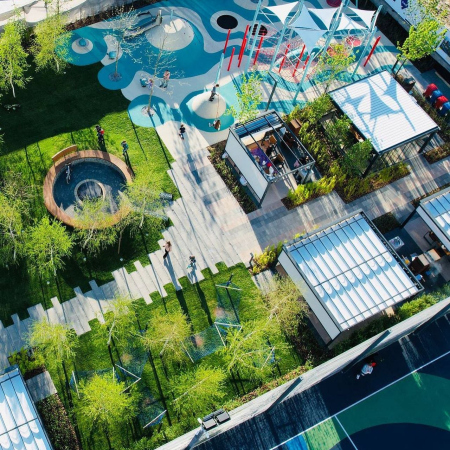
The picnic area, although it does not look as impressive as the swimming pool, is also capable of turning your tedious days into a holiday. The area includes zones for companies of different sizes – you can make a party for two, or invite your friends and have a grand old party; there is also a circular big lawn with a fireplace in the middle. The residents of Fine Town call this place their “summer kitchen” – there is no oven yet, but you can come and cook dinner. A playground is carefully arranged nearby – while the parents are having their boring conversations, the children are also having a good time.

The flashy sports area includes a tennis court, and volleyball, basketball, and football fields.

  • zooming
    1 / 5
    Fayna Town complex
    Copyright: Photograph © Vlad Baglay / provided by Archimatika
  • zooming
    2 / 5
    Fayna Town complex
    Copyright: Photograph © Vlad Baglay / provided by Archimatika
  • zooming
    3 / 5
    Fayna Town complex, Stages 3-4, 2021
    Copyright: Photograph © Vlad Baglay / provided by Archimatika
  • zooming
    4 / 5
    Fayna Town complex, Stages 3-4, 2021
    Copyright: Photograph © Vlad Baglay / provided by Archimatika
  • zooming
    5 / 5
    Fayna Town complex, Stages 3-4, 2021
    Copyright: Photograph courtesy by KAN Development


A little later near this cluster they will build a school for the A+ gymnasium, in which the architectural, design, and construction studies will be curated by the experts from KAN Development and Archimatika. Archimatika’s approach to designing schools is best characterized by the fact that one can get down from the second floor to the first by a spiral tube, which is a faster and more interesting alternative to a staircase and elevator, which are, of course, also there.

The Smart Street

Another novelty that appeared together with the first stage of Fayna Town in 2019 was Kiev’s first smart street. It duplicates a fragment of Salutnaya Street – the busiest one of those that delineate Fayna Town. This is the “city” part of the complex: the houses are higher, their skyline is more rhythmical, the facades are more austere, and the first floors display a string of cafes, shops, and local businesses.

The street becomes “smart” for a whole number of reasons, chief of them being charging stations for electric vehicles, slots for recharging gadgets, as well as lighting that adapts to the weather and the number of people on the street. Another convenient feature is that the street is fitted with smooth exits and a dedicated bicycle lane. Then come the subtleties of the urbanism art, extensively covered in blogs and even in some new textbooks – the thought-out paving, the height of the curbs or their total absence, grilles for the trees, wireless street lights, smart barriers, and many other new little features. Yet another attraction on the street is the dry fountain that marks the entrance to the complex.

Due to the fact that the territory of the complex is only for the residents and their guests, the smart street turns into a self-showcase, presented to the city.

What there is, was, and will be

In the case of Fine Town, you seem to start to believe that architects are indeed capable of changing reality – it seems that people will live here a little easier and more fun than they are used to, the usual picture of the world will change, and so will eventually people’s minds. But then again, some people are not as optimistic, and we decided to readdress their questions directly to the architects.

Archi.ru: The complex includes a total of 8339 apartments, which is a lot. Some people fear that when everyone settles in, there will be a traffic collapse, and the improvement infrastructure will be overloaded. Is it so?

Archimatika: Reconstruction of the main transport routes is planned and has already been partially completed in the area; there is also a highly developed system of urban transport, represented by a metro station nearby, a large number of buses and trolleybuses, and a system of shared electric transport, which is now actively developing in Kiev. In addition, the concept of the complex is designed to avoid a mass “exodus” of residents during the rush hours. There is the entire necessary infrastructure inside – cafes, restaurants, shops, a kindergarten, a school and all the functions that are necessary in order to help you stay within the complex. Local businesses are present at the first floors of the houses, which creates new jobs and reduces traffic. We moved away from the concept of a typical “sleeping area” and made it so that a comfortable and multifunctional environment for a fulfilling life was formed.

  • zooming
    1 / 3
    Fayna Town complex, Stages 1-2, 2020
    Copyright: Photograph © Taras Bespaly / provided by Archimatika
  • zooming
    2 / 3
    Fayna Town complex, 2019
    Copyright: Photograph © Alexander Angelovsky / provided by Archimatika
  • zooming
    3 / 3
    Fayna Town complex, 2019
    Copyright: Photograph © Alexander Angelovsky / provided by Archimatika


For the nonresidents of the complex, this area is inaccessible, which brings up a question – will they have to bypass the complex all the way along its perimeter, or will the territory of the complex will be ultimately open to the city?

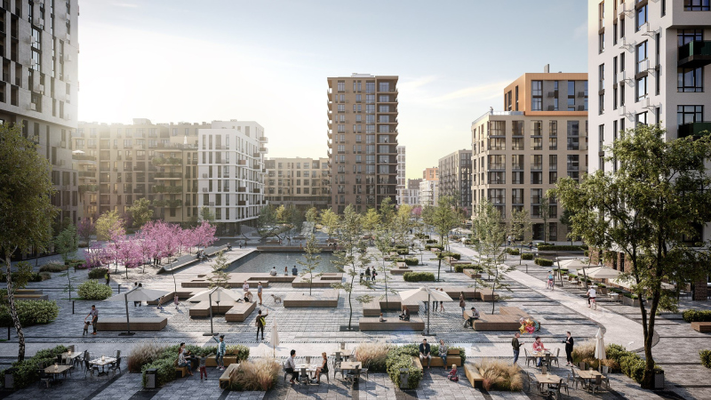
This territory has been for years occupied by a restricted-area facility, which has historically formed the traffic flows and the surrounding context. On the one side, there are privately owned cottages, whose owners do not want any migration from the new housing complex, and from the side of Akademika Tupoleva Street, there is also the restricted area of Antonov Airfield. The complex is situated in such a way that it does not cause anyone any inconvenience. We can say that we were lucky to get this place because making such a grand-scale project fit in with the surrounding context elsewhere would have been quite a chore.

  • zooming
    1 / 5
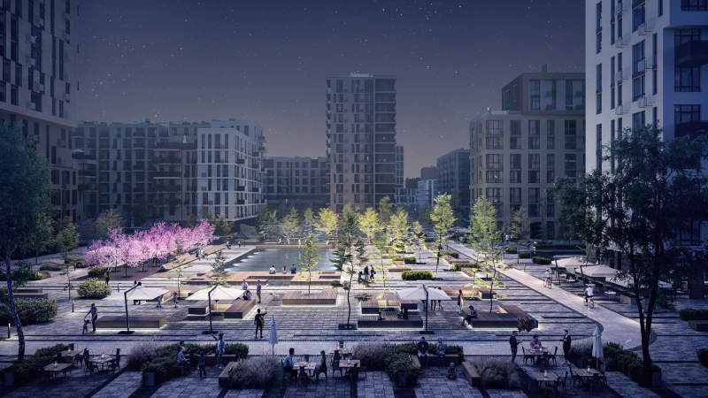
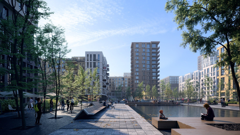
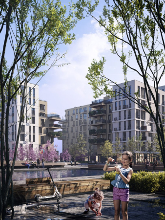
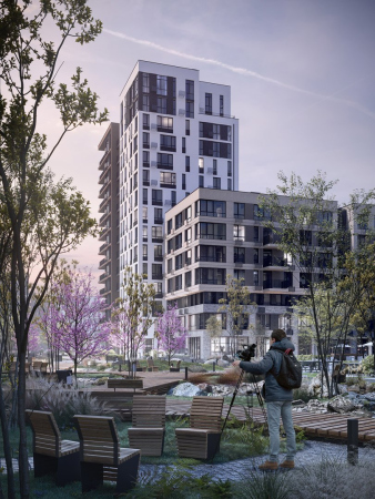
    The future stages of Fayna Town complex, a large plaza and an urban lake
    Copyright: © Archimatika
  • zooming
    2 / 5
    The future stages of Fayna Town complex, a large plaza and an urban lake
    Copyright: © Archimatika
  • zooming
    3 / 5
    The future stages of Fayna Town complex, a large plaza and an urban lake
    Copyright: © Archimatika
  • zooming
    4 / 5
    The future stages of Fayna Town complex, a large plaza and an urban lake
    Copyright: © Archimatika
  • zooming
    5 / 5
    The future stages of Fayna Town complex, a large plaza and an urban lake
    Copyright: © Archimatika


And finally – how were you able to pull something like that? What was the driving force – the developer, the will, the readiness of the city and the buyer?

The market was ready to accept such a format. This became totally obvious after our project “Comfort Town” was completed. The time has changed, new technologies and life formats appeared, but development remained the same. We were lucky to come across KAN Development, and we were able to do this and other great projects of ours, creating spaces with a high-quality environment where everyone will be comfortable. This is their victory, and ours too; this is the victory won by the city and the people that will live in Fayna Town. We believe that people appreciate what we did, and we also believe that thanks to such projects we will be able to change the opinion of other developers and show that we can still do this, boosting the demand for projects with a well-thought-out environment and architecture.

  • zooming
    "Fayna Town" housing complex. First stage of construction © ARKHIMATIKA
    Copyright: © Archimatika
  • zooming
    The implementation. Fayna Town complex, Stages 1-2, 2020
    Copyright: Photograph © Taras Bespaly / provided by Archimatika
  • zooming
    "Fayna Town" housing complex. First stage of construction © ARKHIMATIKA
    Copyright: © Archimatika
  • zooming
    A photograph. Fayna Town complex, Stages 3-4, 2021
    Copyright: Photograph © Vlad Baglay / provided by Archimatika


04 November 2021

Headlines now
The Golden Crown
The concept for a dental clinic in Yekaterinburg, developed by CNTR Studio, revolves around the idea of a “mouth full of gold”: pristine white porcelain stoneware walls are complemented by matte brass details. To avoid an overly literal interpretation, the architects focused on the building’s proportions, skillfully navigating between sunlight requirements and fire safety regulations.
Flexibility and Integration
Not long ago, we covered the project for the fourth phase of the ÁLIA residential complex, designed by APEX. Now, we’ve been shown different fence concepts they developed to enclose the complex’s private courtyards, incorporating a variety of public functions. We believe that the sheer fact that the complex’s architects were involved in such a detail as fencing speaks volumes.
A Step Forward
The HIDE residential complex represents a major milestone for ADM architects and their leaders Andrey Romanov and Ekaterina Kuznetsova in their quest for a fresh high-rise aesthetic – one that is flexible and layered, capable of bringing vibrancy to mass and silhouette while shaping form. Over recent years, this approach has become ADM’s “signature style”, with the golden HIDE tower playing a pivotal role in its evolution. Here, we delve into the project’s story, explore the details of the complex’s design, and uncover its core essence.
Gold in the Sands
A new office for a transcontinental company specializing in resource extraction and processing has opened in Dubai. Designed by T+T Architects, masters of creating spaces that are contemporary, diverse, flexible, and original, this project exemplifies their expertise. On the executive floor, a massive brass-clad partition dominates, while layered textures of compressed earth create a contextually resonant backdrop.
Layers and Levels of Flight
This project goes way back – Reserve Union won this architectural competition at the end of 2011, and the building was completed in 2018, so it’s practically “archival”. However, despite being relatively unknown, the building can hardly be considered “dated” and remains a prime example of architectural expression, particularly in the headquarters genre. And it’s especially fitting for an aviation company office. In some ways, it resembles the Aeroflot headquarters at Sheremetyevo but with its own unique identity, following the signature style of Vladimir Plotkin. In this article, we take an in-depth look at the United Aircraft Corporation (UAC) headquarters in the Moscow agglomeration town of Zhukovsky, supplemented by recent photographs from Alexey Naroditsky – a shoot that became only recently possible due to the fact that improvements were finally made in the surrounding area.
Light and Shadow
In this article, we delve into the architectural design of the “Chaika” house by DNK ag architects, which was recently completed in 2023 as part of the collection of signature designs at ZILArt. As is well-known, all the buildings in this complex follow a design code, yet each one is distinct. This particular building stands out not only for its whiteness and minimalism but also for the refined use of a limited number of techniques that, together, create what can confidently be called synergy.
Casus Novae
A master plan was developed for a large residential area with a name of “DNS City”, but now that its implementation began, the plan has been arbitrarily reformatted and replaced with something that, while similar on the surface, is actually quite different. This is not the first time such a thing happens, but it’s always frustrating. With permission from the author, we are sharing Maria Elkina’s post.
Treasure Hunting
The GAFA bureau, in collaboration with Tegola and Arkhitail, organized an expedition to the island of Kilpola in Karelia as part of Moskomarkhitektura’s “Open City” festival. There, amidst moss and rocks, the students sought answers to questions like: what is the sacred, where does it dwell, and what sustains it? Assisting the participants in this quest were landscape engineer Evgeny Levin, artist Nicholas Roerich, a moose, and the lack of cellular connection. Here’s how the story unfolded.
Depths of the Earth, Streams of Water
In the Malaya Okhta district, the Akzent building, designed by Stepan Liphart, was constructed. It follows a classic tripartite structure, yet it’s what you might call “hand-drawn”: each façade is unique in its form and details, some of which aren’t immediately noticeable. In this article, we explore the context and, together with the architect, delve into how the form was developed.
Fir Tree Dynamics
The “Airports of Region” holding is planning to build an airport in Karachay-Cherkessia, aiming to make the Arkhyz and Dombay resorts more accessible to travelers. The project that won in an invitation-only competition, submitted by Sergey Nikeshkin’s KPLN, blends natural imagery inspired by the shape of a conifer seed, open-air waiting spaces, majestic large trees, and a green roof elevated on needle-like columns. The result is both nature-inspired and WOW.
​A Brick Shell
In the process of designing a clubhouse situated among pine trees in a prestigious suburban area near Moscow, the architectural firm “A.Len” did the façade design part. The combination of different types of brick and masonry correlates with the volumetric and plastique solutions, further enhanced by the inclusion of wood-painted fragments and metal “glazing”.
Word Forms
ATRIUM architects love ambitious challenges, and for the firm’s thirtieth anniversary, they boldly play a game of words with an exhibition that dives deep into a self-created vocabulary. They immerse their projects – especially art installations – into this glossary, as if plunging into a current of their own. You feel as if you’re flowing through the veins of pure art, immersed in a universe of vertical cities, educational spaces – of which the architects are true masters – and the cultural codes of various locations. But what truly captivates is the bold statement that Vera Butko and Anton Nadtochy make, both through their work and this exhibition: architecture, above all, is art – the art of working with form and space.
Flexibility and Acuteness of Modernity
Luxurious, fluid, large “kokoshniks” and spiral barrel columns, as if made from colorful chewing gum: there seem to be no other mansion like this in Moscow, designed in the “Neo-Russian-Modern” style. And the “Teremok” on Malaya Kaluzhskaya, previously somewhat obscure, has “come alive with new colors” and gained visibility after its restoration for the office of the “architectural ecosystem” as the architects love to call themselves. It’s evident that Julius Borisov and the architects at UNK put their hearts into finding this new office and bringing it up to date. Let’s delve into the paradoxes of this mansion’s history and its plasticity. Spoiler: two versions of modernity meet here, both balancing on the razor’s edge of “what’s current”.
Yuri Vissarionov: “A modular house does not belong to the land”
It belongs to space, or to the air... It turns out that 3D printing is more effective when combined with a modular approach: the house is built in a workshop and then adapted to the site, including on uneven terrain. Yuri Vissarionov shares his latest experience in designing tourist complexes, both in central Russia and in the south. These include houseboats, homes printed from lightweight concrete using a 3D printer, and, of course, frame houses.
​Moscow’s First
“The quality of education largely depends on the quality of the educational environment”. This principle of the last decade has been realized by Sergey Skuratov in the project for the First Moscow Gymnasium on Rostovskaya Embankment in the Khamovniki district. The building seamlessly integrates into the complex urban landscape, responding both to the pedestrian flow of the city and the quiet alleyways. It skillfully takes advantage of the height differences and aligns with modern trends in educational space design. Let’s take a closer look.
Looking at the Water
The site of Villa Sonata stretches from the road to the water’s edge, offering its own shoreline, pier, and a picturesque river panorama. To reveal these sweeping views, Roman Leonidov “cut” the façade diagonally parallel to the river, thus getting two main axes for the house and, consequently, “two heads”. The internal core – two double-height spaces, a living room and a conservatory, with a “bridge” above them – makes the house both “transparent” and filled with light.
The White Wing
Well, it’s not exactly white. It’s more of a beige, white-stone structure that plays with the color of limestone – smoother surfaces are lighter, while rougher ones are darker. This wing unites various elements: it absorbs and interprets the surrounding themes. It responds to everything, yet maintains a cohesive expression – a challenging task! – while also incorporating recognizable features of its own, such as the dynamic cuts at the bottom, top, and middle.
Urban Dunes
The XSA Ramps team designed and built a three-part sports hub for a park in Rostov-on-Don, welcoming people of all ages and fitness levels. The skate plaza, pump track, and playground are all meticulously crafted with details that attract a diverse range of visitors. The technical execution of the shapes and slopes transforms this space into a kind of sculptural composition.
Proportional Growth
The project for the fourth phase of the ÁLIA residential area has been announced. The buildings are situated on an elongated plot – almost a “ray” that shoots out from the center of the area towards the river. Their layout reflects both a response to Moscow’s architectural preferences over the past 15 years, shifting “from blocks to towers”, and an interpretation of the neighboring business park designed by SOM. Additionally, the best apartments here are not located at the very top but closer to the middle, forming a glowing “waistline”.
The “Staircase” Building
In designing the “Details” residential complex in New Moscow, Rais Baishev spiced up the now-popular Moscow theme of a “courtyard” building with an idea drawn from the surrealist drawings by Maurits Escher. He envisioned the stepped silhouettes and descending slopes as a metaphysical mega-staircase, creating a key void within the courtyard that gave the project an internal “spine”. This concept is felt both in the building’s silhouette and on its façades.
Projection of the Quarter
No one doubted that the building that Vladimir Plotkin designed as part of the “Garden Quarters” would be the most modernist of all. And it turned out just that way: while adhering to the common design code, the building successfully combines brick and white stone, rhythmically responding to the neighboring building designed by Ostozhenka, yet tactfully and persistently making a few statements of its own. This includes the projection of the ideal urban development composition “14–9–6”, which can be found right next door, mathematical calculations, including those for various types of terraces (and perhaps the only reminder of the Soviet past of the Kauchuk rubber factory!), and the white “cross-stitch” pattern of the façade grid.
Domus Aurea
In this issue, we examine the “Tessinsky-1” house, designed by Sergey Skuratov and completed in 2023. Located in the middle of the Serebryanicheskaya Embankment district, at the intersection of its main streets, this house assumes a sort of “nodal” role: it not only responds to everything around it and preserves many memories of the former EMA factory within itself, but it weaves all this into a newly directed pattern, reconciling bright “gold” and dark-colored brick, largely with the help of the new, modern-yet-archaic Columba brick, which, come to think about it, is the most precious element here.
The Chimney of Nikola-Lenivets
In this issue, we are examining the “Obelisk House” designed by KATARSIS and built for the Arkhstoyanie 2023 festival. However, it was only finished later on, and this is why we are examining it now. It seems to us that after the “Obelisk House” appeared in Nikola-Lenivets, a dialogue and a few inner connections appeared between the temporary structures built here. These houses no longer look like “accidental neighbors”, more of which below.
​Periscope by the Bay
The jury awarded the second place in the competition for a public and cultural center in Petropavlovsk-Kamchatsky to the companies GORA (“Mountain”) and M4. In the consortium’s proposal, the building resembles a sperm whale with a calf swimming next to it or a periscope, whose lenses capture the most spectacular views from the surrounding landscape.
From Arcs to Dolmens
While working on the competition project for Petropavlovsk-Kamchatsky, ASADOV Architects prioritized the value of the natural and urban environment, aiming to preserve the balance of the location while minimizing the resemblance of the volume that they designed to a “traditional building”. The task was challenging, and the architects created three versions, one of which having been developed after the competition, where their main proposal took third place. However, the point of interest here is not the competition result but the continuity of creative thinking.
Hide and Seek
The ID Moskovskiy house, designed by Stepan Liphart in St. Petersburg, in the courtyards near Moskovskiy Avenue beyond the Obvodny Canal and recently completed, is notable for several reasons. Firstly, it has been realized with considerable accuracy, which is particularly significant as this is the first building where the architect was responsible not only for the facades but also for the layouts, allowing for better integration between the two. On the other hand, this building is interesting as an example of the “germination” of new architecture in the city: it draws on the best examples from the neighborhood and becomes an improved and developed sum of ideas found by the architect in the surrounding context.
The Big Twelve
Yesterday, the winners of the Moscow Mayor’s Architecture Award were announced and honored. Let’s take a look at what was awarded and, in some cases, even critique this esteemed award. After all, there is always room for improvement, right?
Above the Golden Horn
The residential complex “Philosophy” designed by T+T architects in Vladivostok, is one of the new projects in the “Golubinaya Pad” area, changing its development philosophy (pun intended) from single houses to a comprehensive approach. The buildings are organized along public streets, varying in height and format, with one house even executed in gallery typology, featuring a cantilever leaning on an art object.
Nuanced Alternative
How can you rhyme a square and space? Easily! But to do so, you need to rhyme everything you can possibly think of: weave everything together, like in a tensegrity structure, and find your own optics too. The new exhibition at GES-2 does just that, offering its visitor a new perspective on the history of art spanning 150 years, infused with the hope for endless multiplicity of worlds and art histories. Read on to see how this is achieved and how the exhibition design by Evgeny Ace contributes to it.
Blinds for Ice
An ice arena has been constructed in Domodedovo based on a project by Yuri Vissarionov Architects. To prevent the long façade, a technical requirement for winter sports facilities, from appearing monotonous, the architects proposed the use of suspended structures with multidirectional slats. This design protects the ice from direct sunlight while giving the wall texture and detail.