По-русски

​The Spiral Approach

The school building in the city of Nur-Sultan, designed by Vera Budko and Anton Nadtochiy from beginning to end – from concept to working documentation – became the embodiment of the architects’ method for creating a modern educational environment, which the ATRIUM architects have been developing for years. Its fundamentals include creating an inspiring environment that motivates you to create. This is why the new school received a shape of an ornamental golden spiral that symbolizes ascension to knowledge; on the inside, the building is a compound and multifunctional “city within a city” with multilevel atriums, amphitheaters, and varying routes.

16 August 2021
Object
mainImg
The building of the educational complex is being built in the southern part of the capital of Kazakhstan, the city of Nur-Sultan, formerly Astana, not far from the territory of the world EXPO 2017. The customer – the Nursultan Nazarbayev Foundation – interprets the complex as “one of the most modern educational sites in the city”, and the building was to meet the current requirements for educational facilities. It is not surprising that the Moscow-based architectural company ATRIUM, headed by Vera Butko and Anton Nadtochiy, was invited to design it: first, they have been successfully working on various projects in Kazakhstan for years, and second, for more than 15 years they have been designing modern educational spaces, combining the plastique and spatial architecture of buildings with functional programming based on their own research.

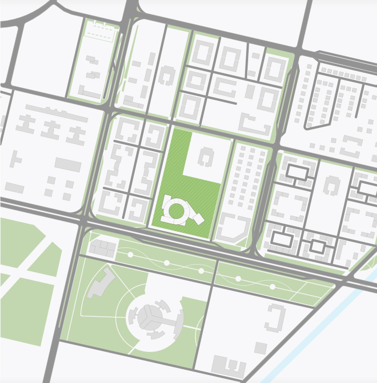
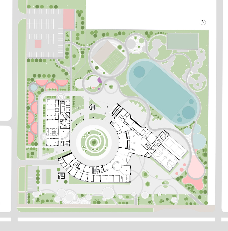
So! The educational complex is situated southwest of the EXPO center, in an actively developing area. The airport highway runs through this place; across from the site, there is a clinic that is part of the medical center of the Presidential Property Management Department. Interspersed with regularly planned cottage settlements, mid-rise residential complexes are being built – soon the city in this part, between the EXPO complex and the Nura-Ishim canal, will take its final shape and completely cease to resemble the outskirts. The area allocated to the school will, after a while, be surrounded by housing projects. The site is large enough – 6.25 hectares – and cannot complain about the lack of space.

The location plan. The educational complex in Nur_Sultan, a project, 2020
Copyright: © ATRIUM


Another wish expressed by the customers, in addition to the modern approach to the design of the complex, was to immerse its architecture in the tradition of Kazakhstan, which springs from the culture of the Turkic peoples in general. In addition, the building had to comply with the principles of the Vastu philosophy, the Hindu variety of the more famous Feng Shui, a doctrine tuned to the optimal organization of space for a correct and happy life. Orientation of entrances and exits to the cardinal points is based on the principles of Vastu, and, most importantly, the volume is designed in the shape of a spiral, symbolizing the ascent to knowledge.

The educational complex in Nur_Sultan, a project, 2020
Copyright: © ATRIUM


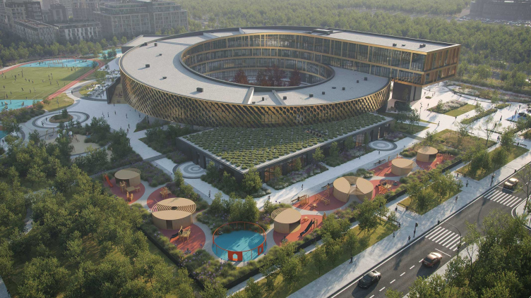
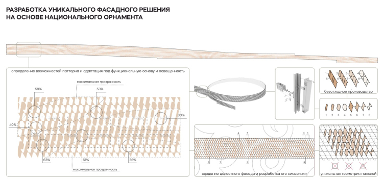
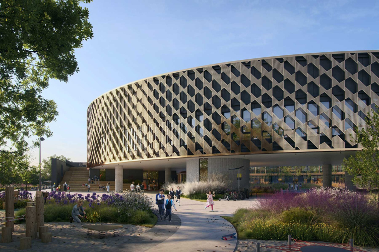
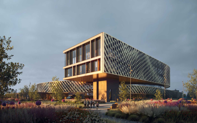
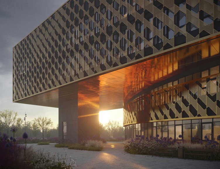
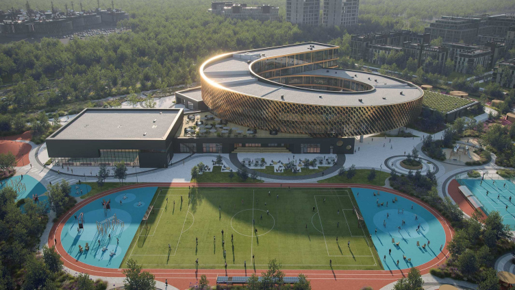
The spiral is “spun” clockwise around the yard, ending in a cantilevered structure on the level of the 3 and 4 floors – its head is “turned” westward, in the direction of EXPO and sunsets. On the whole, the building resembles a fibula, a hairpin buckle likely will those that are found in the steppe mounds: this similarity is emphasized by the golden shell of the facade, made up of eight types of perforated elements. According to Anton Nadtochiy, the design of the facade is parametrically planned, the pattern based on the Kazakh national ornament smoothly dissolves, providing school classes with adequate lighting and emergency exits. What we are seeing is not just a popular technique of ornamental perforation, but a smooth, smartly calculated combination of volumetric elements of several types that form an ornament.

Forming the pattern. The educational complex in Nur_Sultan, a project, 2020
Copyright: © ATRIUM


The educational complex in Nur_Sultan, a project, 2020
Copyright: © ATRIUM


At the same time, thanks to its “wrapping” properties, the shell emphasizes the unity of the round shape of the “ring” building, just as its Turkic identity – the circular volume is “enshrouded” into metallic decor. You can compare it to ripples on the water, and with the swinging of pendants in a traditional hat – this is how a modern generalized variation of a motif arises, devoid of trivial literalness. 

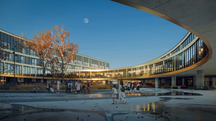
The spacious circular inner yard is not just a place for walking and informal communication, popular in modern school buildings: in this instance, it is also meant to give projection from the strong winds, characteristic for the local nature. The yard can be accessed from the central atrium, and from the complex as well. The facades of the yard are devoid of ornamentation, and essentially consist of panoramic glazing, golden interfloor bands, and slender asymmetric molds – this more transparent “inner” matter spills over to the facade of the cantilevered structure.

The educational complex in Nur_Sultan, a project, 2020
Copyright: © ATRIUM


The educational complex in Nur-Sultan, a project, 2020
Copyright: © ATRIUM


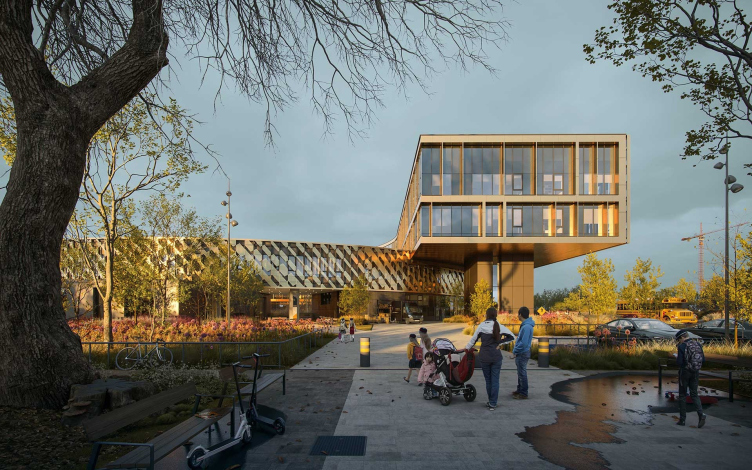
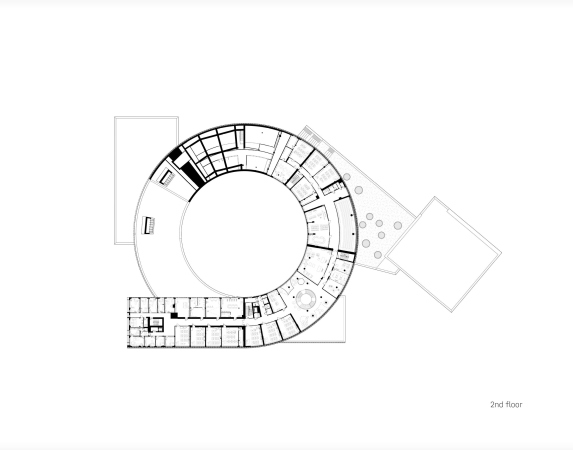
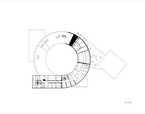
Despite the spiral shape of the volume and the metaphor of ascent, the floors are not sloping inside: the rise is provided by a smooth increase in floors from two to four – this is made in the cantilevered structure which will host an additional 1000 square meters of administrative premises related to the educational activities of the branch of the foundation that is building this school. This function is unusual in a school building, and the office area, although connected to the school space, has an independent entrance via a staircase and an elevator placed in the supporting column beneath the cantilever.

The educational complex in Nur_Sultan, a project, 2020
Copyright: © ATRIUM


The educational complex in Nur_Sultan, a project, 2020
Copyright: © ATRIUM


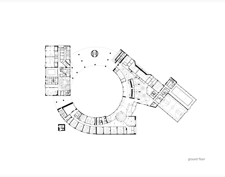
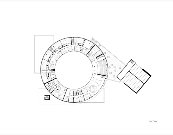
Virtually the entire first floor is transparent either visually, though the glass in the atrium zone, or physically – about a third of the volume is occupied by an open space of the “column” legs that allows you to freely move between the outer (fenced) school yard and the circular inner yard. Here, among the slender supports appears another round “leg” with an emergency staircase. 

In front of the main entrance, a plaza is formed, open to the city, and not surrounded by a traditional school fence – it is formed by the building of the sports complex on the right and a cafe with a public zone on the left. The security checkpoint is situated further down the line, and the parents will be able to wait for their children, talk to teachers, or even organize a parent meeting without having to order a security pass.

Plan of the 1st floor. The educational complex in Nur_Sultan, a project, 2020
Copyright: © ATRIUM


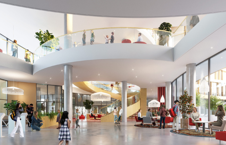
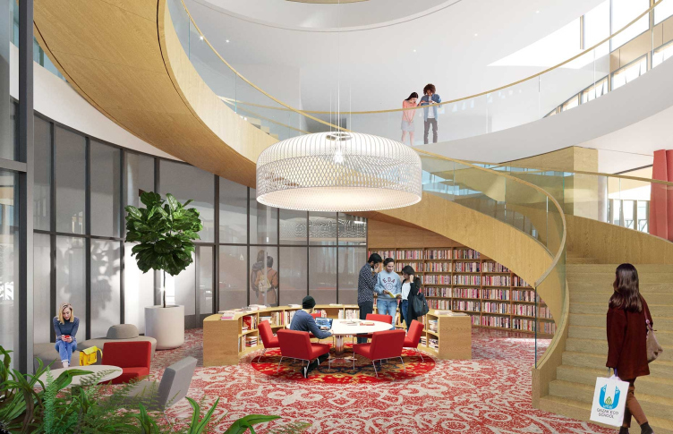
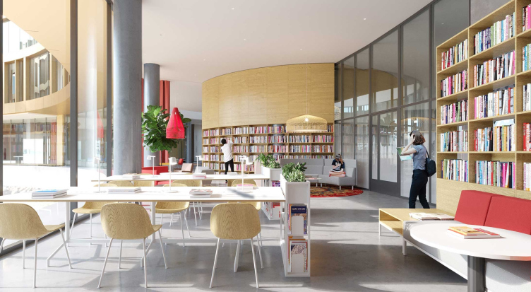
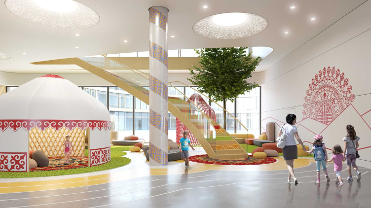
Some extra volumes – the sports complex, the cafe, and the kindergarten – adjoin the main spiral part. Such an approach to creating a volumetric composition of school buildings is currently considered to be one of the best because it allows you to achieve good insolation, as well as to make different parts of the building interconnected thanks to the public hub. The role of such a hub is played in this case by the lobby atrium, the adjoining halls, and the space of the auditorium. The atrium is double-height, visible through; arched balconies of the second tier are strung on round columns, which creates a rather energetic space, as if unfolding before our eyes. On the left, there is a wide spiral staircase, a characteristic modernist method of working with space, which makes it possible both to unite it, and to endow it with an acute spatial intrigue in one movement. In this case, the staircase unites all the four tiers with a library “grouped” around it. Its spiral picks up the main theme of the building, continuing and maintaining the spin. On the sides of the stairs, slots in the interfloor ceilings are grouped -,they echo the double-height atrium in the third and fourth tiers, picking up the baton of the floors’ transparency to the human eye and the ambient light.

The educational complex in Nur_Sultan, a project, 2020
Copyright: © ATRIUM


The educational complex in Nur_Sultan, a project, 2020
Copyright: © ATRIUM


The educational complex in Nur_Sultan, a project, 2020
Copyright: © ATRIUM


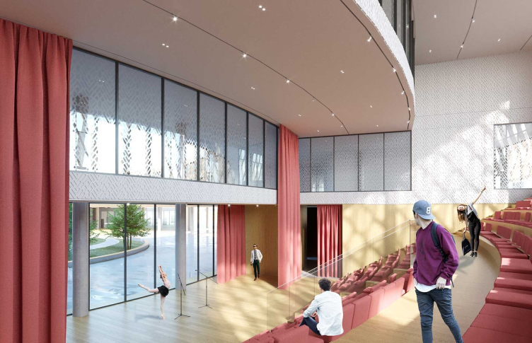
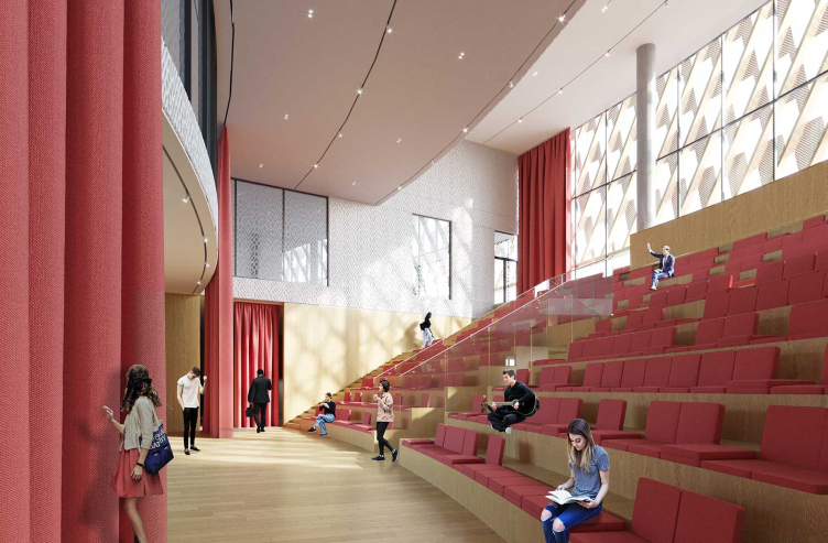
Right of the lobby, there is an amphitheater event hall with a stage next to a glass wall overlooking the yard. The panoramic windows, both down below, near the stage, and up above, behind the amphitheater’s back, provide an extra visual connection with the inner yard and the operated roof. However, these can be covered with a curtain, and, if necessary, the hall can be darkened, for example, for theater lights. 

The educational complex in Nur_Sultan, a project, 2020
Copyright: © ATRIUM


Just as the other interiors, the amphitheater features balanced and moderate ornaments – according to the architects, it became the result of working with many options, from minimalist to richly embellished ones. Here, for example, silk printing is rhymed with openwork shadows of the facade patterns.

The educational complex in Nur_Sultan, a project, 2020
Copyright: © ATRIUM


On regular days, when there are no performances or other school events, the hall, like the space of the library around the stairs, will serve as a recreation space. There is also the possibility of separating the stage, in which case it becomes a theater class, and the amphitheater remains a place of communication. It also serves as another transition point between the tiers inside the building. From the second tier, it will be possible to get to the operated roof in front of the sports complex, from where, turning to the left, in turn, you can go down the steps of another open amphitheater, into the courtyard, and to the stadium. Some of its steps are protected from the sun and rain, some are open, so it will even be possible to conduct outdoor events here. Another amphitheater with a tribune function is built into the building from the side of the stadium.

The educational complex in Nur_Sultan, a project, 2020
Copyright: © ATRIUM


The ground floor under the amphitheater and partly under the operated roof is also included in the system of public spaces – a winter garden is planned here. Thus, a whole “node” of interconnected spaces with flexible functionality and different emotional charge is grouped around the entrance atrium.

Our main task as architects is, first of all, to come up with an interesting space. We strive to create different types of spaces and group them together, avoiding dead ends in order to make sure that you can move in different ways: go down, go up, go outside or get inside. Therefore, we often use amphitheaters – they help to form more scenarios of movement through the building and more connections between levels, both visual and physical passages too. This makes it possible to navigate in optimal ways and at the same time works for a variety of perception, allows you to create intrigue, plasticity and inner complexity.


  • zooming
    1 / 4
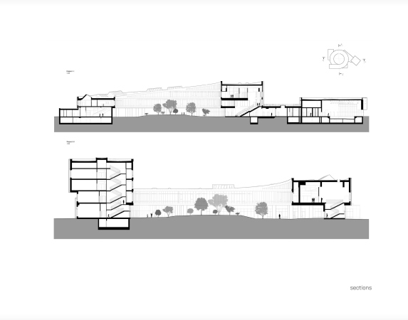
    Section views. The educational complex in Nur_Sultan, a project, 2020
    Copyright: © ATRIUM
  • zooming
    2 / 4
    Plan of the 2nd floor. The educational complex in Nur_Sultan, a project, 2020
    Copyright: © ATRIUM
  • zooming
    3 / 4
    Plan of the 3rd floor. The educational complex in Nur_Sultan, a project, 2020
    Copyright: © ATRIUM
  • zooming
    4 / 4
    Plan of the 4th floor. The educational complex in Nur_Sultan, a project, 2020
    Copyright: © ATRIUM


The rectangular volume of the kindergarten is cut into the corner of the main ring and, for obvious reasons, is relatively isolated, but inside it forms its own double-height atrium with a staircase of a smaller size; there is also a swimming pool. Part of the kindergarten is additionally illuminated with skylights to comply with the insolation standards adopted in Kazakhstan.

The educational complex in Nur_Sultan, a project, 2020
Copyright: © ATRIUM


The improvement of the territory was also developed by Atrium – it continues and develops the ideas that the architecture of the educational center is based upon. The surrounding territory includes two open air stadiums (major and minor), walking trails of the kindergarten, an overland parking lot, which is mandatory, and vegetation that represents various climatic zones of Kazakhstan. The landscape is subjugated to the pattern of many rings, again, national at its core, but at the same time very much in the creative style of ATRIUM. The spiral drawing of the paving plan of the courtyard marks the center of the “whirlpool” of the volume of the school building – like a solar sign.

The master plan. The educational complex in Nur_Sultan, a project, 2020
Copyright: © ATRIUM


***

“Kazakhstan has been going through a baby boom for some time; some families have from five to seven children, and the construction of school buildings became the main governmental priority” – Vera Budko and Anton Nadtochiy share. The architects have already developed for Kazakhstan a strategy for designing school buildings for 2500+ students with a possibility of reuse, which is taken as the basis during the construction of governmental schools. This Nazarbayev Foundation school is different from these projects with a customized approach and a high degree of detailing: in this instance, ATRIUM has worked on all of the stages of the project, from initial sketches to working documentation, including the interior and landscape design, which, as a rule, allows you to efficiently manage the construction process in its entirety – a serious argument in favor of the quality of implementation of the future building.

It seems that this grand-scale project has encompassed the architects’ experience in working with national theme and designing school buildings, which have long since become one of the favorite directions of their specialization and their typological research. We will remind you that in July this year the architects received the Moscow Mayor's Prize for the project of the school in the residential complex Symbol, and earlier they were awarded the same prize for the project of the Letovo school. A capacious memorable shape, a bold cantilevered structure, a sophisticated space with the possibility of multifunctional use and a recognizable modernist approach that skillfully absorbs traditional motives – all this adds up to an image of self-development in a broad sense, an ascent to success and personal growth through the development of space and form.

The project has already received all the mandatory approvals in Kazakhstan; the building is under construction, and is expected to take in the first students in September 2022.

16 August 2021

Headlines now
Gold in the Sands
A new office for a transcontinental company specializing in resource extraction and processing has opened in Dubai. Designed by T+T Architects, masters of creating spaces that are contemporary, diverse, flexible, and original, this project exemplifies their expertise. On the executive floor, a massive brass-clad partition dominates, while layered textures of compressed earth create a contextually resonant backdrop.
Layers and Levels of Flight
This project goes way back – Reserve Union won this architectural competition at the end of 2011, and the building was completed in 2018, so it’s practically “archival”. However, despite being relatively unknown, the building can hardly be considered “dated” and remains a prime example of architectural expression, particularly in the headquarters genre. And it’s especially fitting for an aviation company office. In some ways, it resembles the Aeroflot headquarters at Sheremetyevo but with its own unique identity, following the signature style of Vladimir Plotkin. In this article, we take an in-depth look at the United Aircraft Corporation (UAC) headquarters in the Moscow agglomeration town of Zhukovsky, supplemented by recent photographs from Alexey Naroditsky – a shoot that became only recently possible due to the fact that improvements were finally made in the surrounding area.
Light and Shadow
In this article, we delve into the architectural design of the “Chaika” house by DNK ag architects, which was recently completed in 2023 as part of the collection of signature designs at ZILArt. As is well-known, all the buildings in this complex follow a design code, yet each one is distinct. This particular building stands out not only for its whiteness and minimalism but also for the refined use of a limited number of techniques that, together, create what can confidently be called synergy.
Casus Novae
A master plan was developed for a large residential area with a name of “DNS City”, but now that its implementation began, the plan has been arbitrarily reformatted and replaced with something that, while similar on the surface, is actually quite different. This is not the first time such a thing happens, but it’s always frustrating. With permission from the author, we are sharing Maria Elkina’s post.
Treasure Hunting
The GAFA bureau, in collaboration with Tegola and Arkhitail, organized an expedition to the island of Kilpola in Karelia as part of Moskomarkhitektura’s “Open City” festival. There, amidst moss and rocks, the students sought answers to questions like: what is the sacred, where does it dwell, and what sustains it? Assisting the participants in this quest were landscape engineer Evgeny Levin, artist Nicholas Roerich, a moose, and the lack of cellular connection. Here’s how the story unfolded.
Depths of the Earth, Streams of Water
In the Malaya Okhta district, the Akzent building, designed by Stepan Liphart, was constructed. It follows a classic tripartite structure, yet it’s what you might call “hand-drawn”: each façade is unique in its form and details, some of which aren’t immediately noticeable. In this article, we explore the context and, together with the architect, delve into how the form was developed.
Fir Tree Dynamics
The “Airports of Region” holding is planning to build an airport in Karachay-Cherkessia, aiming to make the Arkhyz and Dombay resorts more accessible to travelers. The project that won in an invitation-only competition, submitted by Sergey Nikeshkin’s KPLN, blends natural imagery inspired by the shape of a conifer seed, open-air waiting spaces, majestic large trees, and a green roof elevated on needle-like columns. The result is both nature-inspired and WOW.
​A Brick Shell
In the process of designing a clubhouse situated among pine trees in a prestigious suburban area near Moscow, the architectural firm “A.Len” did the façade design part. The combination of different types of brick and masonry correlates with the volumetric and plastique solutions, further enhanced by the inclusion of wood-painted fragments and metal “glazing”.
Word Forms
ATRIUM architects love ambitious challenges, and for the firm’s thirtieth anniversary, they boldly play a game of words with an exhibition that dives deep into a self-created vocabulary. They immerse their projects – especially art installations – into this glossary, as if plunging into a current of their own. You feel as if you’re flowing through the veins of pure art, immersed in a universe of vertical cities, educational spaces – of which the architects are true masters – and the cultural codes of various locations. But what truly captivates is the bold statement that Vera Butko and Anton Nadtochy make, both through their work and this exhibition: architecture, above all, is art – the art of working with form and space.
Flexibility and Acuteness of Modernity
Luxurious, fluid, large “kokoshniks” and spiral barrel columns, as if made from colorful chewing gum: there seem to be no other mansion like this in Moscow, designed in the “Neo-Russian-Modern” style. And the “Teremok” on Malaya Kaluzhskaya, previously somewhat obscure, has “come alive with new colors” and gained visibility after its restoration for the office of the “architectural ecosystem” as the architects love to call themselves. It’s evident that Julius Borisov and the architects at UNK put their hearts into finding this new office and bringing it up to date. Let’s delve into the paradoxes of this mansion’s history and its plasticity. Spoiler: two versions of modernity meet here, both balancing on the razor’s edge of “what’s current”.
Yuri Vissarionov: “A modular house does not belong to the land”
It belongs to space, or to the air... It turns out that 3D printing is more effective when combined with a modular approach: the house is built in a workshop and then adapted to the site, including on uneven terrain. Yuri Vissarionov shares his latest experience in designing tourist complexes, both in central Russia and in the south. These include houseboats, homes printed from lightweight concrete using a 3D printer, and, of course, frame houses.
​Moscow’s First
“The quality of education largely depends on the quality of the educational environment”. This principle of the last decade has been realized by Sergey Skuratov in the project for the First Moscow Gymnasium on Rostovskaya Embankment in the Khamovniki district. The building seamlessly integrates into the complex urban landscape, responding both to the pedestrian flow of the city and the quiet alleyways. It skillfully takes advantage of the height differences and aligns with modern trends in educational space design. Let’s take a closer look.
Looking at the Water
The site of Villa Sonata stretches from the road to the water’s edge, offering its own shoreline, pier, and a picturesque river panorama. To reveal these sweeping views, Roman Leonidov “cut” the façade diagonally parallel to the river, thus getting two main axes for the house and, consequently, “two heads”. The internal core – two double-height spaces, a living room and a conservatory, with a “bridge” above them – makes the house both “transparent” and filled with light.
The White Wing
Well, it’s not exactly white. It’s more of a beige, white-stone structure that plays with the color of limestone – smoother surfaces are lighter, while rougher ones are darker. This wing unites various elements: it absorbs and interprets the surrounding themes. It responds to everything, yet maintains a cohesive expression – a challenging task! – while also incorporating recognizable features of its own, such as the dynamic cuts at the bottom, top, and middle.
Urban Dunes
The XSA Ramps team designed and built a three-part sports hub for a park in Rostov-on-Don, welcoming people of all ages and fitness levels. The skate plaza, pump track, and playground are all meticulously crafted with details that attract a diverse range of visitors. The technical execution of the shapes and slopes transforms this space into a kind of sculptural composition.
Proportional Growth
The project for the fourth phase of the ÁLIA residential area has been announced. The buildings are situated on an elongated plot – almost a “ray” that shoots out from the center of the area towards the river. Their layout reflects both a response to Moscow’s architectural preferences over the past 15 years, shifting “from blocks to towers”, and an interpretation of the neighboring business park designed by SOM. Additionally, the best apartments here are not located at the very top but closer to the middle, forming a glowing “waistline”.
The “Staircase” Building
In designing the “Details” residential complex in New Moscow, Rais Baishev spiced up the now-popular Moscow theme of a “courtyard” building with an idea drawn from the surrealist drawings by Maurits Escher. He envisioned the stepped silhouettes and descending slopes as a metaphysical mega-staircase, creating a key void within the courtyard that gave the project an internal “spine”. This concept is felt both in the building’s silhouette and on its façades.
Projection of the Quarter
No one doubted that the building that Vladimir Plotkin designed as part of the “Garden Quarters” would be the most modernist of all. And it turned out just that way: while adhering to the common design code, the building successfully combines brick and white stone, rhythmically responding to the neighboring building designed by Ostozhenka, yet tactfully and persistently making a few statements of its own. This includes the projection of the ideal urban development composition “14–9–6”, which can be found right next door, mathematical calculations, including those for various types of terraces (and perhaps the only reminder of the Soviet past of the Kauchuk rubber factory!), and the white “cross-stitch” pattern of the façade grid.
Domus Aurea
In this issue, we examine the “Tessinsky-1” house, designed by Sergey Skuratov and completed in 2023. Located in the middle of the Serebryanicheskaya Embankment district, at the intersection of its main streets, this house assumes a sort of “nodal” role: it not only responds to everything around it and preserves many memories of the former EMA factory within itself, but it weaves all this into a newly directed pattern, reconciling bright “gold” and dark-colored brick, largely with the help of the new, modern-yet-archaic Columba brick, which, come to think about it, is the most precious element here.
The Chimney of Nikola-Lenivets
In this issue, we are examining the “Obelisk House” designed by KATARSIS and built for the Arkhstoyanie 2023 festival. However, it was only finished later on, and this is why we are examining it now. It seems to us that after the “Obelisk House” appeared in Nikola-Lenivets, a dialogue and a few inner connections appeared between the temporary structures built here. These houses no longer look like “accidental neighbors”, more of which below.
​Periscope by the Bay
The jury awarded the second place in the competition for a public and cultural center in Petropavlovsk-Kamchatsky to the companies GORA (“Mountain”) and M4. In the consortium’s proposal, the building resembles a sperm whale with a calf swimming next to it or a periscope, whose lenses capture the most spectacular views from the surrounding landscape.
From Arcs to Dolmens
While working on the competition project for Petropavlovsk-Kamchatsky, ASADOV Architects prioritized the value of the natural and urban environment, aiming to preserve the balance of the location while minimizing the resemblance of the volume that they designed to a “traditional building”. The task was challenging, and the architects created three versions, one of which having been developed after the competition, where their main proposal took third place. However, the point of interest here is not the competition result but the continuity of creative thinking.
Hide and Seek
The ID Moskovskiy house, designed by Stepan Liphart in St. Petersburg, in the courtyards near Moskovskiy Avenue beyond the Obvodny Canal and recently completed, is notable for several reasons. Firstly, it has been realized with considerable accuracy, which is particularly significant as this is the first building where the architect was responsible not only for the facades but also for the layouts, allowing for better integration between the two. On the other hand, this building is interesting as an example of the “germination” of new architecture in the city: it draws on the best examples from the neighborhood and becomes an improved and developed sum of ideas found by the architect in the surrounding context.
The Big Twelve
Yesterday, the winners of the Moscow Mayor’s Architecture Award were announced and honored. Let’s take a look at what was awarded and, in some cases, even critique this esteemed award. After all, there is always room for improvement, right?
Above the Golden Horn
The residential complex “Philosophy” designed by T+T architects in Vladivostok, is one of the new projects in the “Golubinaya Pad” area, changing its development philosophy (pun intended) from single houses to a comprehensive approach. The buildings are organized along public streets, varying in height and format, with one house even executed in gallery typology, featuring a cantilever leaning on an art object.
Nuanced Alternative
How can you rhyme a square and space? Easily! But to do so, you need to rhyme everything you can possibly think of: weave everything together, like in a tensegrity structure, and find your own optics too. The new exhibition at GES-2 does just that, offering its visitor a new perspective on the history of art spanning 150 years, infused with the hope for endless multiplicity of worlds and art histories. Read on to see how this is achieved and how the exhibition design by Evgeny Ace contributes to it.
Blinds for Ice
An ice arena has been constructed in Domodedovo based on a project by Yuri Vissarionov Architects. To prevent the long façade, a technical requirement for winter sports facilities, from appearing monotonous, the architects proposed the use of suspended structures with multidirectional slats. This design protects the ice from direct sunlight while giving the wall texture and detail.
Frozen Magma
A competition for the creation of a public and cultural center was held in Petropavlovsk-Kamchatsky. Three architectural companies made it to the final, and we consider it important to share about the work of each. Let’s start with the winner – the consortium led by Wowhaus.
Campus within a Day
In this article, we talk about what the participants of Genplan Institute of Moscow’s hackathon were doing at the MosComArchitecture booth at the “ArchMoscow” exhibition. We also discuss who won the prize and why, and what can be done with the territory of a small university on the outskirts of Moscow.
Vertical Civilization
Genpro considered the development of the vertical city concept and made it the theme of their pavilion at the “ArchMoscow” exhibition.