По-русски

​Steamer at the Pier

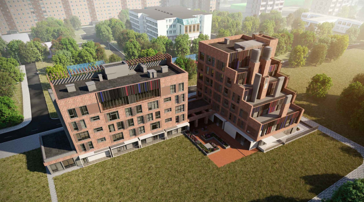
An apartment hotel that looks like a ship with wide decks has been designed for a land plot on a lake shore in Moscow’s South Tushino. This “steamer” house, overlooking the lake and the river port, does indeed look as if it were ready to sail away.

25 December 2020
Object
mainImg
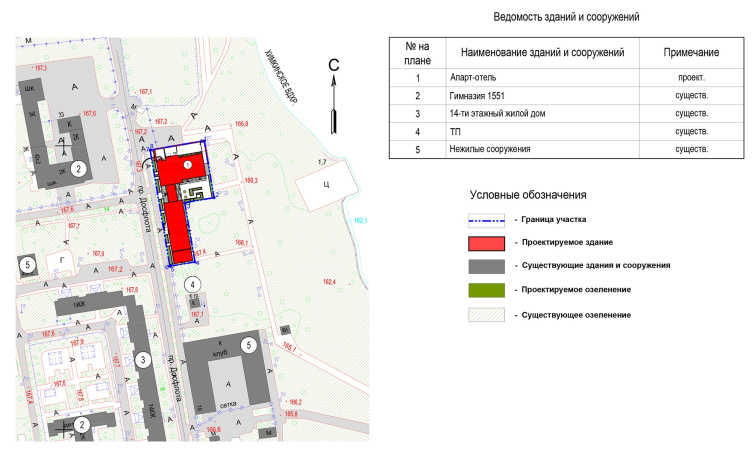
The apartment hotel will be built on the left bank of the Moscow Canal, alongside the Dosflot Drive. The land site is situated on the first line, with an access to the city beach, and is separated from the water only by a broad parkland strip. The L-shaped land site stretches along the bank. Formerly, it was occupied by a brick hotel building, long derelict, and now to be torn down.

The “Steamer” house
Copyright: © Mezonproekt


The surrounding context is of the “micro-district” kind: housing projects, two schools, and a kindergarten – all enshrouded in an abundance of deciduous trees. It is expected that all the construction will be done on the other side of the Dosflot Drive. The new house, however, will be least connected to it; what it will interact with is the Moscow Canal and opposite bank, upon which one can see the dominant-looking spire of the recently-renovated North River Port. From May to October, tens of cruise ships sail away from it – a mesmerizing sight. Probably, this what became the primary source of inspiration for the new project – a “ship” house.

The “Steamer” house. The simplified location plan
Copyright: © Mezonproekt


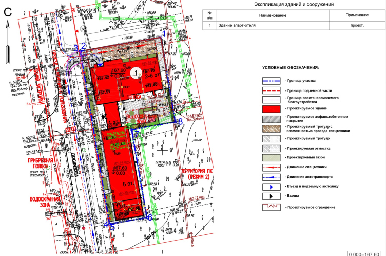
The project was developed by Mezonproekt at the commission of Capital Invest in 2017. One of the tasks that the architects set for themselves was to preserve the existing trees, tightly surrounding the site from all sides, but at the same time to maximize the view of the water and the opposite bank of the canal. Hence the clear and crisp composition that follows the outline of the land site and the house that stood here before. A small indent from the borders was made only from the side of the courtyard in order to organize a landscaped area in front of the entrance to the hotel lobby.

The “Steamer” house. Planning organization of the land plot
Copyright: © Mezonproekt


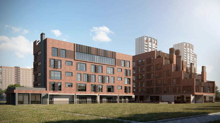
The complex consists of two individual buildings that stand perpendicular to one another and are connected by a single podium on the level of the first floor. As the leader of the company, Ilia Mashkov, shares, originally the architects considered the option that included a single building that traced the shape of the land site, but later on an idea appeared to divide the single whole into two independent sections in order to lighten up the visual perception. One building, elongated and five stories high, marks the boundary from the side of the Dosflot Drive, yet it overlooks the water area. It also creates the artistic and the conceptual image of the entire complex. 

The “Steamer” house
Copyright: © Mezonproekt


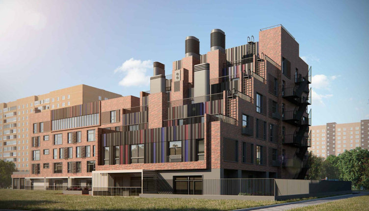
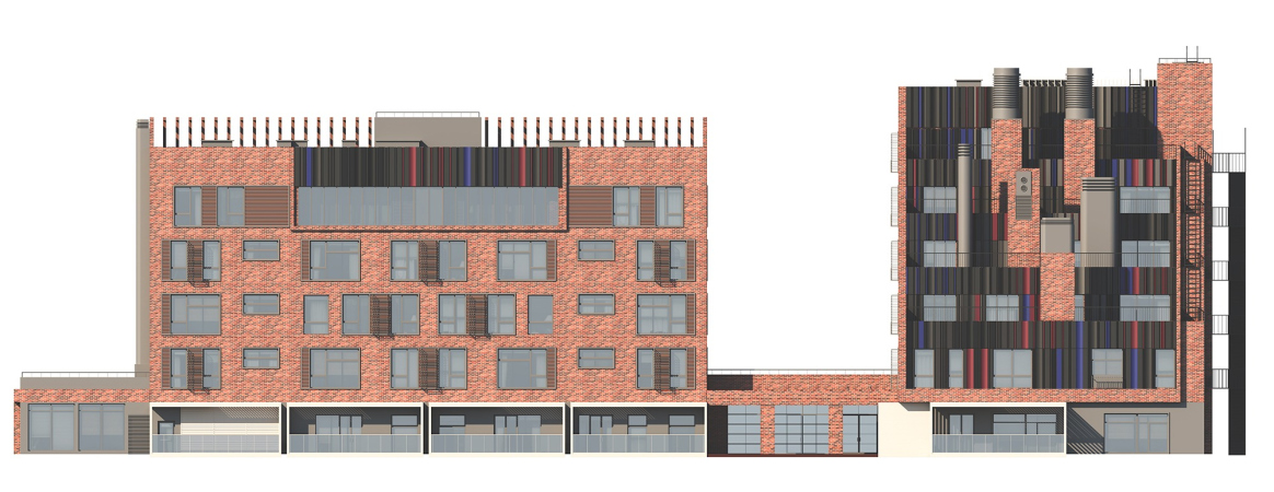
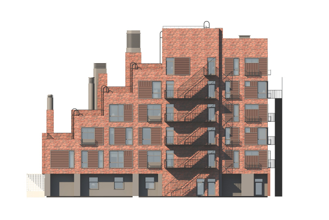
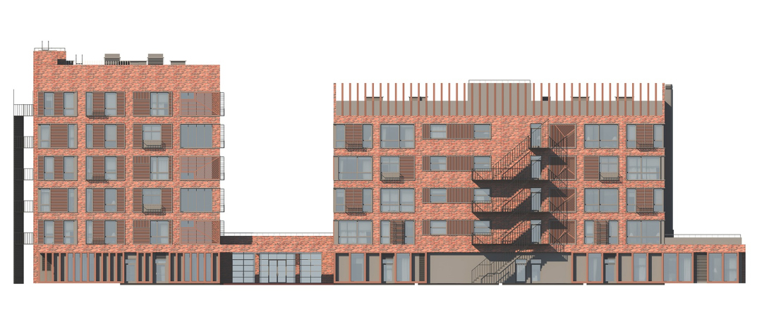
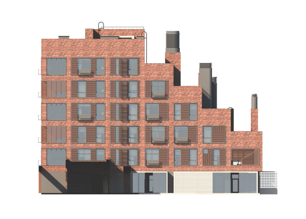
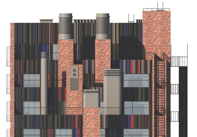
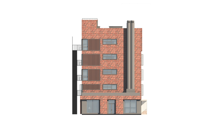
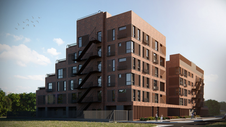
The outline of the complex – if we are to look at it en face – is rather simple, without a noticeable height difference, with a broad clearance between the two buildings. However, if we look at it at an angle, we will at once see a chamfers in the silhouette – the “decks” of the terraces, the masts, and the chimneys, the “ladders” of the staircases, which look as if sailors are about to climb them. The chimneys, large and tall, like on the very first steamers, are in fact the ventilation shafts; while commonly hidden in most projects, here they are accentuated as if ready to sport a “Jolly Roger”. The terraces, provided on every floor, are also quite functional – from them the guests of the hotel will be able to admire the sweeping views of the Khimki Lake.

  • zooming
    1 / 9
    The “Steamer” house
    Copyright: © Mezonproekt
  • zooming
    2 / 9
    The “Steamer” house
    Copyright: © Mezonproekt
  • zooming
    3 / 9
    The “Steamer” house
    Copyright: © Mezonproekt
  • zooming
    4 / 9
    The “Steamer” house.
    Copyright: © Mezonproekt
  • zooming
    5 / 9
    The “Steamer” house
    Copyright: © Mezonproekt
  • zooming
    6 / 9
    The “Steamer” house
    Copyright: © Mezonproekt
  • zooming
    7 / 9
    The “Steamer” house
    Copyright: © Mezonproekt
  • zooming
    8 / 9
    The “Steamer” house.
    Copyright: © Mezonproekt
  • zooming
    9 / 9
    The “Steamer” house
    Copyright: © Mezonproekt


Moreover, this is not quite a “ship” house in the sense of the modernist cliché – even though the chimneys of the ventilation system proceed from that idea – but in the sense that here the “ship” has been subjected to deconstruction: it can be a ship or it can be a pier. In any case, we do not see here any hint at an aerodynamic shape, stern and bow, or a feeling that the ship is about to sail: rather, the architects show us a set of elements of a steamboat, offering us to appreciate the somewhat brutal plastique of the deck terraces that look like shoreline sprouts of some wandering Titanic. But only in a fragment or a decoration, a claim for a discourse, and not direct likeness.

“The idea of a “steamer” house came about after we drew the terraces and the chimneys.
After that, we decided to enhance the emerging image, adding some recognizable element, and tried to make the pipes sculptural, making the terraces look like the decks of a sea vessel.”


Such a solution with broad stairs of the terraces ascending from the water to the shore is more characteristic of the southern resort architecture. However, even here, in the northwest of Moscow, due to the proximity of water and the picturesque surroundings it looks appropriate. One must say that the association with a seaside resort is fleeting, and is gone completely once you examine the facades in detail. The choice of materials, the proportions of the windows, and the height of the floors – everything refers to industrial architecture. Even the chimneys, which originally reminded us about the steamer, easily become part of the narrative about a factory of the early XX century.

The “Steamer” house
Copyright: © Mezonproekt


Connecting the two seemingly totally different narratives – the steamer and the factory – was something that the architects decided to do in order to “calm down” the facades and make them look more austere and reserved. “The first versions were more “ship-like” – Ilia Mashkov shares – with white buildings and colorful chimneys. Then we decided to depart from such direct interpretation towards the image of a factory. This is how the red brick, tall windows, and metallic decoration elements came about”.

The “Steamer” house
Copyright: © Mezonproekt


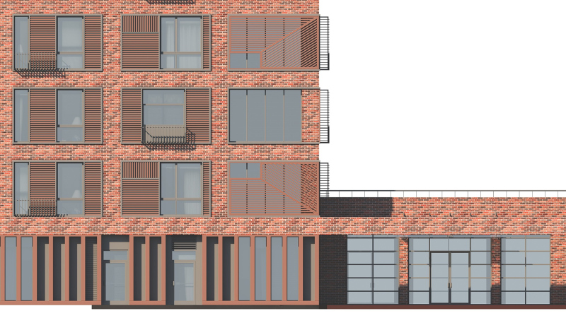
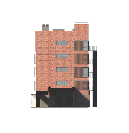
As for the main coating material, the architects chose ceramic tiles with a red-brick texture. Brick surfaces are combined with metallic ones. Metal was also used to make the grates of the air conditioning units, decorative panels near the windows, railings of the French balconies, the coating of the ventilation chimneys, as well as the emergency staircases, painted black and running on the facade. The latter technique makes you remember not just the Russian factories of the early XX century but also the residential blocks of New York, for which the steel fire escape stairs became one of the main characteristic features. Oh, and by the way, the brownstone walls and the large windows coupled with openwork stair spans are also the classic of New York architecture.

The “Steamer” house
Copyright: © Mezonproekt


While turning to recognizable and traditional images of the past, the house remembers to pay tribute to modern stylistic devices: hence the syncopated rhythm of the facade grid, which is created by the differently sized windows, and colored inserts from a profiled sheet. As for the latter, the authors form real artistic panels with it, boasting a rainbow of colors, from dark earthy to lavender. All this is spiced with plastique – volumetric and concave vertical panels give rise to an additional play of light and shadows. It looks as though this way the house responds to the sunset colors of the Khimki Lake, because only the facades overlooking the water have these inclusions. 

The “Steamer” house
Copyright: © Mezonproekt


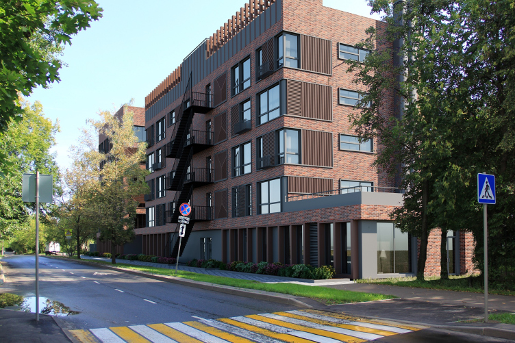
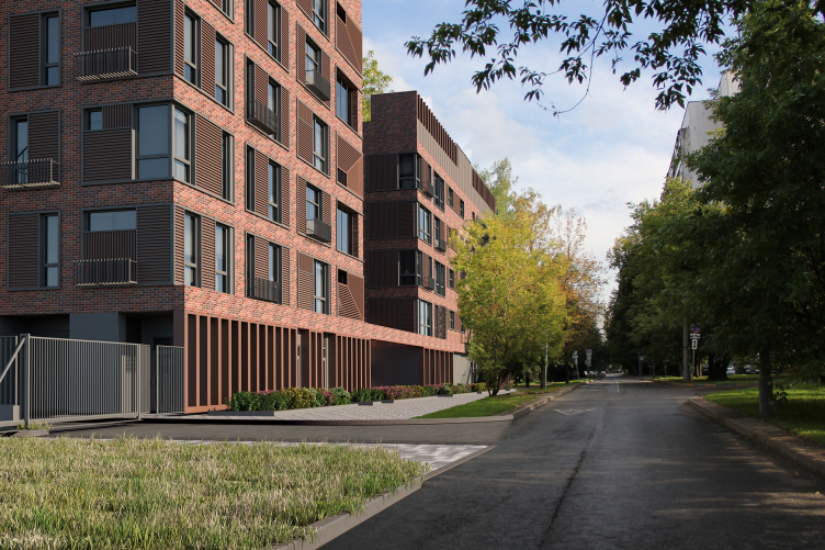
The Dosflot Drive is a quiet and green place; it follows the trajectory of the canal bend, and could easily pass for a path in the wilderness, if it weren’t for the asphalt pavement. The facade of the complex, calm and reserved plastique-wise, also overlooks this place. It maintains the character of the surroundings and matches the context in terms of its gradually lowering towards the water. The biggest highlight of the complex, when viewed from this angle, is the decorative metallic pergola on the roof, painted in the tone of the facade tiles. It is expected that in this part the roof will be an operated one. This landscaped zone with an awning will become yet another recreational place for the residents, which is relevant, considering the lack of yard space. 

The pergola top of the building is echoed by the stylobate part, designed in the same “lattice” style. The bottom floors will host a large lobby for the residents, offices, and cafes. The cafes will overlook the street with large stained glass windows, inviting the residents of the neighboring blocks to look in. There will be a green alley stretching along the entire street facade.

The “Steamer” house
Copyright: © Mezonproekt


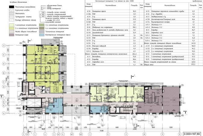
On the level of the yard and the river, on the first floor, there are apartments with glazed terraces framed light-colored slender frames.

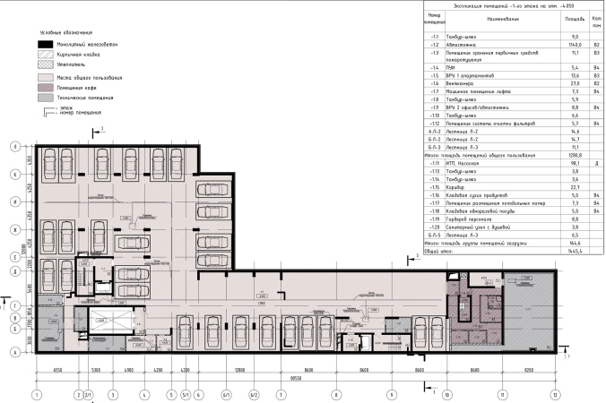
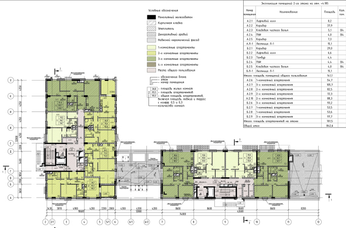
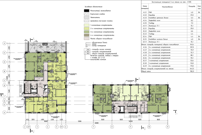
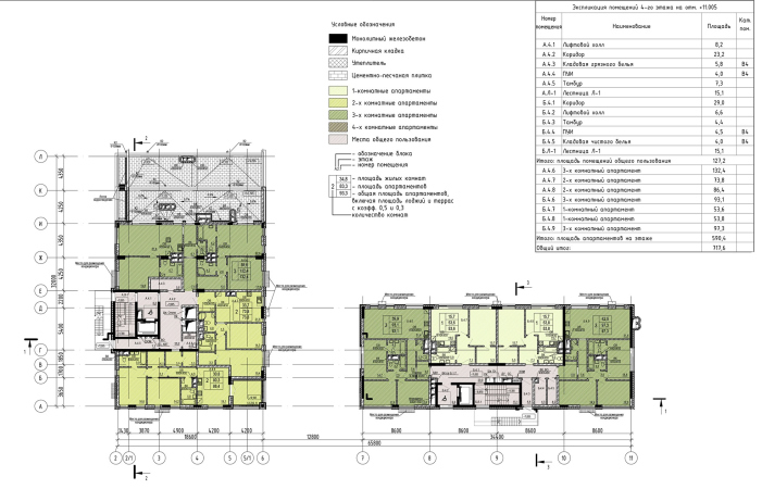
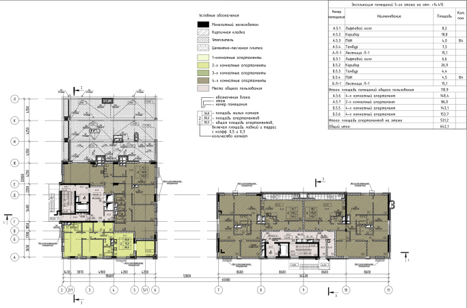
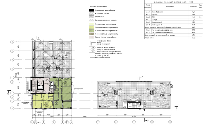
The building, with an overall area of about 6,000 square meters will offer apartments of various configurations and sizes – from single-room to four-room apartments. Each of the apartments will have a fully-fledged kitchen. The underground floor will be occupied by a 27-place parking garage.

  • zooming
    1 / 9
    The “Steamer” house. Plan of the -1st floor
    Copyright: © Mezonproekt
  • zooming
    2 / 9
    The “Steamer” house. Plan of the 1st floor
    Copyright: © Mezonproekt
  • zooming
    3 / 9
    The “Steamer” house. Plan of the 2nd floor
    Copyright: © Mezonproekt
  • zooming
    4 / 9
    The “Steamer” house. Plan of the 3rd floor
    Copyright: © Mezonproekt
  • zooming
    5 / 9
    The “Steamer” house. Plan of the 4th floor
    Copyright: © Mezonproekt
  • zooming
    6 / 9
    The “Steamer” house. Plan of the 5th floor
    Copyright: © Mezonproekt
  • zooming
    7 / 9
    The “Steamer” house. Plan of the 6th floor
    Copyright: © Mezonproekt
  • zooming
    8 / 9
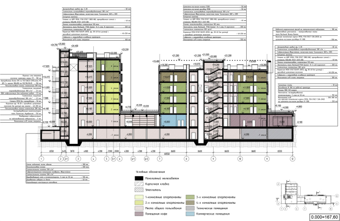
    The “Steamer” house. Section view 1-1
    Copyright: © Mezonproekt
  • zooming
    9 / 9
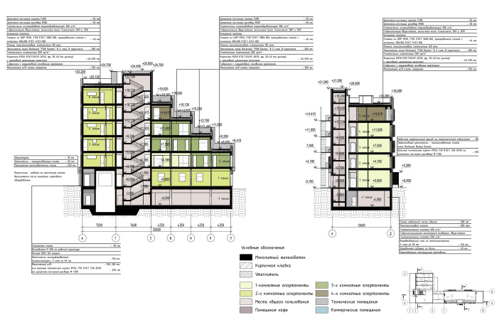
    The “Steamer” house. Section views 2-2 and 3-3
    Copyright: © Mezonproekt


In 2020, the apartment hotel project made the shortlist of the Moscow prize in the field of architecture and urban planning. Previously, it received the approval of the state examination and is now waiting to be implemented.

25 December 2020

Headlines now
The Golden Crown
The concept for a dental clinic in Yekaterinburg, developed by CNTR Studio, revolves around the idea of a “mouth full of gold”: pristine white porcelain stoneware walls are complemented by matte brass details. To avoid an overly literal interpretation, the architects focused on the building’s proportions, skillfully navigating between sunlight requirements and fire safety regulations.
Flexibility and Integration
Not long ago, we covered the project for the fourth phase of the ÁLIA residential complex, designed by APEX. Now, we’ve been shown different fence concepts they developed to enclose the complex’s private courtyards, incorporating a variety of public functions. We believe that the sheer fact that the complex’s architects were involved in such a detail as fencing speaks volumes.
A Step Forward
The HIDE residential complex represents a major milestone for ADM architects and their leaders Andrey Romanov and Ekaterina Kuznetsova in their quest for a fresh high-rise aesthetic – one that is flexible and layered, capable of bringing vibrancy to mass and silhouette while shaping form. Over recent years, this approach has become ADM’s “signature style”, with the golden HIDE tower playing a pivotal role in its evolution. Here, we delve into the project’s story, explore the details of the complex’s design, and uncover its core essence.
Gold in the Sands
A new office for a transcontinental company specializing in resource extraction and processing has opened in Dubai. Designed by T+T Architects, masters of creating spaces that are contemporary, diverse, flexible, and original, this project exemplifies their expertise. On the executive floor, a massive brass-clad partition dominates, while layered textures of compressed earth create a contextually resonant backdrop.
Layers and Levels of Flight
This project goes way back – Reserve Union won this architectural competition at the end of 2011, and the building was completed in 2018, so it’s practically “archival”. However, despite being relatively unknown, the building can hardly be considered “dated” and remains a prime example of architectural expression, particularly in the headquarters genre. And it’s especially fitting for an aviation company office. In some ways, it resembles the Aeroflot headquarters at Sheremetyevo but with its own unique identity, following the signature style of Vladimir Plotkin. In this article, we take an in-depth look at the United Aircraft Corporation (UAC) headquarters in the Moscow agglomeration town of Zhukovsky, supplemented by recent photographs from Alexey Naroditsky – a shoot that became only recently possible due to the fact that improvements were finally made in the surrounding area.
Light and Shadow
In this article, we delve into the architectural design of the “Chaika” house by DNK ag architects, which was recently completed in 2023 as part of the collection of signature designs at ZILArt. As is well-known, all the buildings in this complex follow a design code, yet each one is distinct. This particular building stands out not only for its whiteness and minimalism but also for the refined use of a limited number of techniques that, together, create what can confidently be called synergy.
Casus Novae
A master plan was developed for a large residential area with a name of “DNS City”, but now that its implementation began, the plan has been arbitrarily reformatted and replaced with something that, while similar on the surface, is actually quite different. This is not the first time such a thing happens, but it’s always frustrating. With permission from the author, we are sharing Maria Elkina’s post.
Treasure Hunting
The GAFA bureau, in collaboration with Tegola and Arkhitail, organized an expedition to the island of Kilpola in Karelia as part of Moskomarkhitektura’s “Open City” festival. There, amidst moss and rocks, the students sought answers to questions like: what is the sacred, where does it dwell, and what sustains it? Assisting the participants in this quest were landscape engineer Evgeny Levin, artist Nicholas Roerich, a moose, and the lack of cellular connection. Here’s how the story unfolded.
Depths of the Earth, Streams of Water
In the Malaya Okhta district, the Akzent building, designed by Stepan Liphart, was constructed. It follows a classic tripartite structure, yet it’s what you might call “hand-drawn”: each façade is unique in its form and details, some of which aren’t immediately noticeable. In this article, we explore the context and, together with the architect, delve into how the form was developed.
Fir Tree Dynamics
The “Airports of Region” holding is planning to build an airport in Karachay-Cherkessia, aiming to make the Arkhyz and Dombay resorts more accessible to travelers. The project that won in an invitation-only competition, submitted by Sergey Nikeshkin’s KPLN, blends natural imagery inspired by the shape of a conifer seed, open-air waiting spaces, majestic large trees, and a green roof elevated on needle-like columns. The result is both nature-inspired and WOW.
​A Brick Shell
In the process of designing a clubhouse situated among pine trees in a prestigious suburban area near Moscow, the architectural firm “A.Len” did the façade design part. The combination of different types of brick and masonry correlates with the volumetric and plastique solutions, further enhanced by the inclusion of wood-painted fragments and metal “glazing”.
Word Forms
ATRIUM architects love ambitious challenges, and for the firm’s thirtieth anniversary, they boldly play a game of words with an exhibition that dives deep into a self-created vocabulary. They immerse their projects – especially art installations – into this glossary, as if plunging into a current of their own. You feel as if you’re flowing through the veins of pure art, immersed in a universe of vertical cities, educational spaces – of which the architects are true masters – and the cultural codes of various locations. But what truly captivates is the bold statement that Vera Butko and Anton Nadtochy make, both through their work and this exhibition: architecture, above all, is art – the art of working with form and space.
Flexibility and Acuteness of Modernity
Luxurious, fluid, large “kokoshniks” and spiral barrel columns, as if made from colorful chewing gum: there seem to be no other mansion like this in Moscow, designed in the “Neo-Russian-Modern” style. And the “Teremok” on Malaya Kaluzhskaya, previously somewhat obscure, has “come alive with new colors” and gained visibility after its restoration for the office of the “architectural ecosystem” as the architects love to call themselves. It’s evident that Julius Borisov and the architects at UNK put their hearts into finding this new office and bringing it up to date. Let’s delve into the paradoxes of this mansion’s history and its plasticity. Spoiler: two versions of modernity meet here, both balancing on the razor’s edge of “what’s current”.
Yuri Vissarionov: “A modular house does not belong to the land”
It belongs to space, or to the air... It turns out that 3D printing is more effective when combined with a modular approach: the house is built in a workshop and then adapted to the site, including on uneven terrain. Yuri Vissarionov shares his latest experience in designing tourist complexes, both in central Russia and in the south. These include houseboats, homes printed from lightweight concrete using a 3D printer, and, of course, frame houses.
​Moscow’s First
“The quality of education largely depends on the quality of the educational environment”. This principle of the last decade has been realized by Sergey Skuratov in the project for the First Moscow Gymnasium on Rostovskaya Embankment in the Khamovniki district. The building seamlessly integrates into the complex urban landscape, responding both to the pedestrian flow of the city and the quiet alleyways. It skillfully takes advantage of the height differences and aligns with modern trends in educational space design. Let’s take a closer look.
Looking at the Water
The site of Villa Sonata stretches from the road to the water’s edge, offering its own shoreline, pier, and a picturesque river panorama. To reveal these sweeping views, Roman Leonidov “cut” the façade diagonally parallel to the river, thus getting two main axes for the house and, consequently, “two heads”. The internal core – two double-height spaces, a living room and a conservatory, with a “bridge” above them – makes the house both “transparent” and filled with light.
The White Wing
Well, it’s not exactly white. It’s more of a beige, white-stone structure that plays with the color of limestone – smoother surfaces are lighter, while rougher ones are darker. This wing unites various elements: it absorbs and interprets the surrounding themes. It responds to everything, yet maintains a cohesive expression – a challenging task! – while also incorporating recognizable features of its own, such as the dynamic cuts at the bottom, top, and middle.
Urban Dunes
The XSA Ramps team designed and built a three-part sports hub for a park in Rostov-on-Don, welcoming people of all ages and fitness levels. The skate plaza, pump track, and playground are all meticulously crafted with details that attract a diverse range of visitors. The technical execution of the shapes and slopes transforms this space into a kind of sculptural composition.
Proportional Growth
The project for the fourth phase of the ÁLIA residential area has been announced. The buildings are situated on an elongated plot – almost a “ray” that shoots out from the center of the area towards the river. Their layout reflects both a response to Moscow’s architectural preferences over the past 15 years, shifting “from blocks to towers”, and an interpretation of the neighboring business park designed by SOM. Additionally, the best apartments here are not located at the very top but closer to the middle, forming a glowing “waistline”.
The “Staircase” Building
In designing the “Details” residential complex in New Moscow, Rais Baishev spiced up the now-popular Moscow theme of a “courtyard” building with an idea drawn from the surrealist drawings by Maurits Escher. He envisioned the stepped silhouettes and descending slopes as a metaphysical mega-staircase, creating a key void within the courtyard that gave the project an internal “spine”. This concept is felt both in the building’s silhouette and on its façades.
Projection of the Quarter
No one doubted that the building that Vladimir Plotkin designed as part of the “Garden Quarters” would be the most modernist of all. And it turned out just that way: while adhering to the common design code, the building successfully combines brick and white stone, rhythmically responding to the neighboring building designed by Ostozhenka, yet tactfully and persistently making a few statements of its own. This includes the projection of the ideal urban development composition “14–9–6”, which can be found right next door, mathematical calculations, including those for various types of terraces (and perhaps the only reminder of the Soviet past of the Kauchuk rubber factory!), and the white “cross-stitch” pattern of the façade grid.
Domus Aurea
In this issue, we examine the “Tessinsky-1” house, designed by Sergey Skuratov and completed in 2023. Located in the middle of the Serebryanicheskaya Embankment district, at the intersection of its main streets, this house assumes a sort of “nodal” role: it not only responds to everything around it and preserves many memories of the former EMA factory within itself, but it weaves all this into a newly directed pattern, reconciling bright “gold” and dark-colored brick, largely with the help of the new, modern-yet-archaic Columba brick, which, come to think about it, is the most precious element here.
The Chimney of Nikola-Lenivets
In this issue, we are examining the “Obelisk House” designed by KATARSIS and built for the Arkhstoyanie 2023 festival. However, it was only finished later on, and this is why we are examining it now. It seems to us that after the “Obelisk House” appeared in Nikola-Lenivets, a dialogue and a few inner connections appeared between the temporary structures built here. These houses no longer look like “accidental neighbors”, more of which below.
​Periscope by the Bay
The jury awarded the second place in the competition for a public and cultural center in Petropavlovsk-Kamchatsky to the companies GORA (“Mountain”) and M4. In the consortium’s proposal, the building resembles a sperm whale with a calf swimming next to it or a periscope, whose lenses capture the most spectacular views from the surrounding landscape.
From Arcs to Dolmens
While working on the competition project for Petropavlovsk-Kamchatsky, ASADOV Architects prioritized the value of the natural and urban environment, aiming to preserve the balance of the location while minimizing the resemblance of the volume that they designed to a “traditional building”. The task was challenging, and the architects created three versions, one of which having been developed after the competition, where their main proposal took third place. However, the point of interest here is not the competition result but the continuity of creative thinking.
Hide and Seek
The ID Moskovskiy house, designed by Stepan Liphart in St. Petersburg, in the courtyards near Moskovskiy Avenue beyond the Obvodny Canal and recently completed, is notable for several reasons. Firstly, it has been realized with considerable accuracy, which is particularly significant as this is the first building where the architect was responsible not only for the facades but also for the layouts, allowing for better integration between the two. On the other hand, this building is interesting as an example of the “germination” of new architecture in the city: it draws on the best examples from the neighborhood and becomes an improved and developed sum of ideas found by the architect in the surrounding context.
The Big Twelve
Yesterday, the winners of the Moscow Mayor’s Architecture Award were announced and honored. Let’s take a look at what was awarded and, in some cases, even critique this esteemed award. After all, there is always room for improvement, right?
Above the Golden Horn
The residential complex “Philosophy” designed by T+T architects in Vladivostok, is one of the new projects in the “Golubinaya Pad” area, changing its development philosophy (pun intended) from single houses to a comprehensive approach. The buildings are organized along public streets, varying in height and format, with one house even executed in gallery typology, featuring a cantilever leaning on an art object.
Nuanced Alternative
How can you rhyme a square and space? Easily! But to do so, you need to rhyme everything you can possibly think of: weave everything together, like in a tensegrity structure, and find your own optics too. The new exhibition at GES-2 does just that, offering its visitor a new perspective on the history of art spanning 150 years, infused with the hope for endless multiplicity of worlds and art histories. Read on to see how this is achieved and how the exhibition design by Evgeny Ace contributes to it.
Blinds for Ice
An ice arena has been constructed in Domodedovo based on a project by Yuri Vissarionov Architects. To prevent the long façade, a technical requirement for winter sports facilities, from appearing monotonous, the architects proposed the use of suspended structures with multidirectional slats. This design protects the ice from direct sunlight while giving the wall texture and detail.