По-русски

​Dynamics of the Avenue

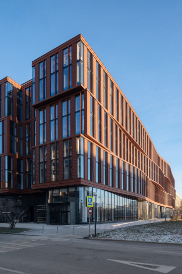
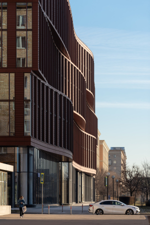
On Leningrad Avenue, not far away from the Sokol metro station, the construction of the A-Class business center Alcon II has been completed. ADM architects designed the main façade as three volumetric ribbons, as if the busy traffic of the avenue “shook” the matter sending large waves through it.

28 December 2020
Object
mainImg

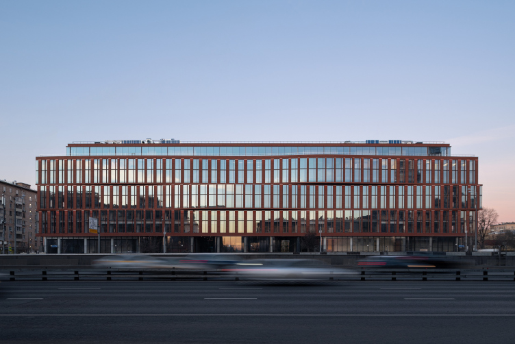
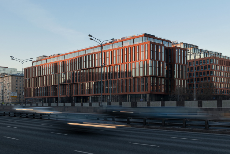
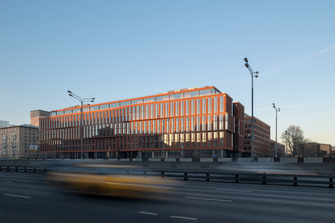
The building of the Alcon II business center, the construction of which was completed this fall by the Alcon Group, is stretched along Leningrad Avenue, a hundred meters from the Sokol metro station. If you drive from the center and out of the city, its façade will be on the right, shortly before the fork between Leningrad Avenue and Volokolamsk Highway: it is stretched lengthwise, and its façade consists of three large volumetric waves of a terra cotta hue.

  • zooming
    Alcon II business center on leningrad Avenue / ADM architects
    Copyright: Photograph © Yaroslav Lukyanchenko / provided by ADM architects
  • zooming
    Alcon II business center on leningrad Avenue / ADM architects
    Copyright: Photograph © Yaroslav Lukyanchenko / provided by ADM architects


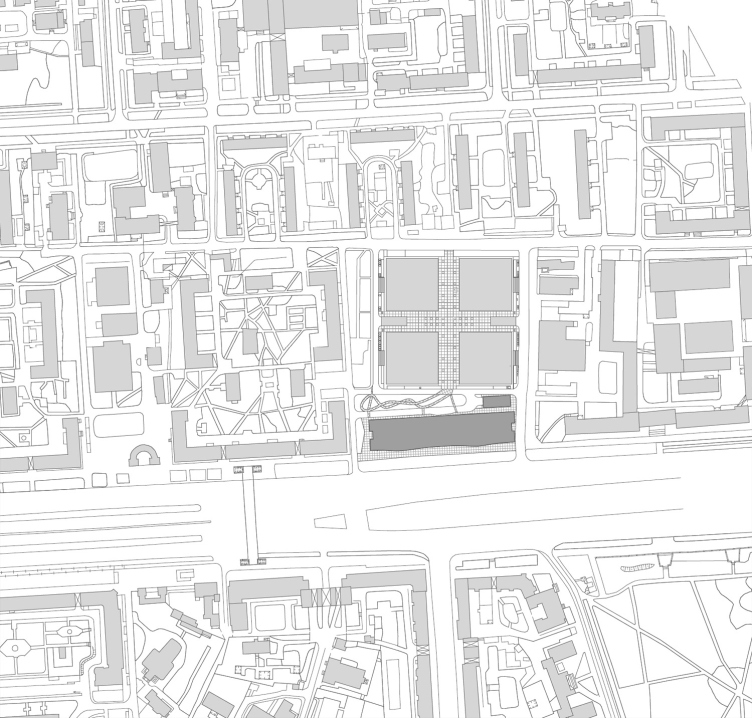
Alcon II is inscribed in the front of the red line of Leningrad Avenue, and thus represents the entire business center to the rest of the city. The other part of the business center, built earlier – Alcon I – is situated behind the new building in the depth of the land site and consists of four buildings of a square plan; the final stage of the project was also done by ADM architects. This is why, when the Alcon II was considered in 2013 at one of the first architectural councils, presided by Sergey Kuznetsov, Hans Stimmann, former chief architect of Berlin, who then was a member of the council, shared that he personally visited the already-completed Alcon I in order to study the situation, and that the resulting city space, designed by ADM, including the facades and the landscape park, was quite to his liking.

The location plan. Alcon II business center on leningrad Avenue
Copyright: © ADM


It must be noted that ADM architects started working on Alcon II even earlier than on Alcon I, specifically, in 2007 – back then the client, Alcon Group, invited the architects to think about the fate of the building that existed on the site, which was a rather heavy eight-story “beam” building of the late Soviet era. In 2007-2008, the architects proposed a few options (see one of them here) but the work did not advance any further. The architects were only able to get back to Alcon II in 2012. In 2013, the project successfully passed the architectural council, and by 2014 was finally developed. The construction work resumed in 2018, and has been completed now, in 2020.

The project was implemented exactly the way it was conceived and exactly the way it was approved by the Architectural Council in 2013. Me and my coauthor, Ekaterina Kuznetsova, we believe that the building made a very good match for the architectural context of Leningrad Avenue.

I have information that the demand for the premises in Alcon II is really high; one large company is moving its offices from older buildings of the business center to this new building.


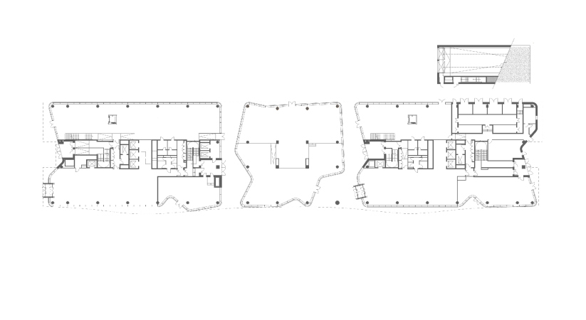
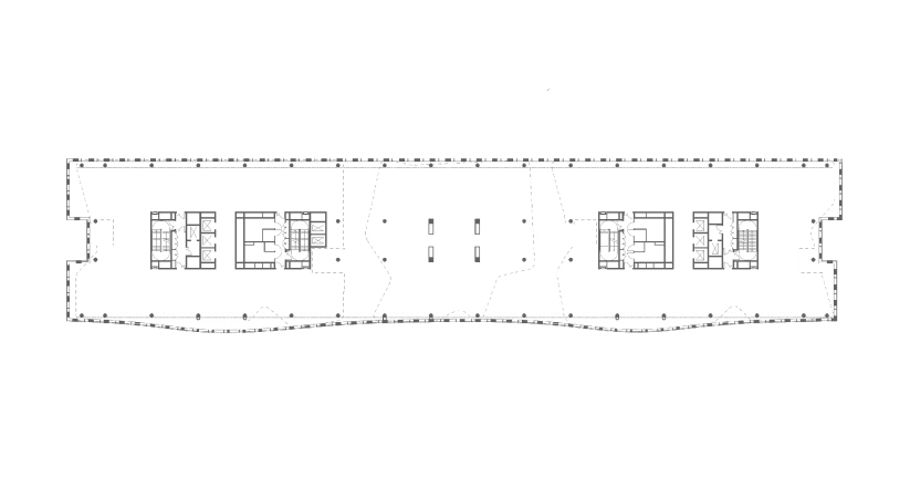
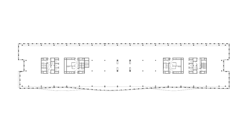
The new office center stretches along the avenue, occupying the spot of the former Soviet building and now hiding the stepped silhouettes of Alcon I buildings from the side of the avenue. Under the new building, there are 3 underground parking floors for 374 cars, and its first floor combines areas for cafes and shops with a lobby catering for two office blocks. The planning is flexible; the communication cores, just the way it should be in an imposing office building, are situated in the center of each of the blocks. The owner is planning to rent the premises out both by the floor, and in small lots. The architects proposed an unconventional solution for the central air conditioning system: the ventilation outlets face the rear façade and are concealed by glass; only dry cooling towers are installed on the roof (a similar solution was used in Alcon I).

  • zooming
    1 / 4
    Plan of the 1st floor. Alcon II business center on leningrad Avenue
    Copyright: © ADM
  • zooming
    2 / 4
    Plan of the 3rd floor. Alcon II business center on leningrad Avenue
    Copyright: © ADM
  • zooming
    3 / 4
    Plan of the 5th floor. Alcon II business center on leningrad Avenue
    Copyright: © ADM
  • zooming
    4 / 4
    Plan of the 7th floor. Alcon II business center on leningrad Avenue
    Copyright: © ADM


The top floor is fully made of glass with a very thin and sparse glazing pattern and a large margin from the edge. This margin makes spacious terraces – one can step out from the office for a breath of fresh air (the top floors of Alcon I also feature terraces because the client, Alcon Group, believes that terraces on the upper floors are one of important advantages for modern office buildings). The top floor, as Andrey Romanov aptly put it, is the “office penthouse”; the “clear” height from floor to ceiling here is 5m. But then again, the height of the other six floors is also large enough – 4.5m – which in combination with the windows reaching to the floor will let in a lot of natural light.

Alcon II business center on leningrad Avenue / ADM architects
Copyright: Photograph © Yaroslav Lukyanchenko / provided by ADM architects


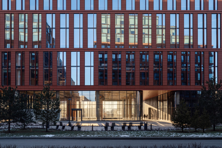
The height of the first floor is even greater – 7m. This is more than the average height in Moscow residential buildings being designed now (where the norm for the height of the first public floor is 5-6 m).

Alcon II business center on leningrad Avenue / ADM architects
Copyright: Photograph © Yaroslav Lukyanchenko / provided by ADM architects


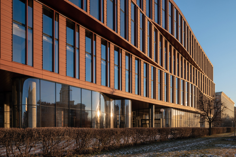
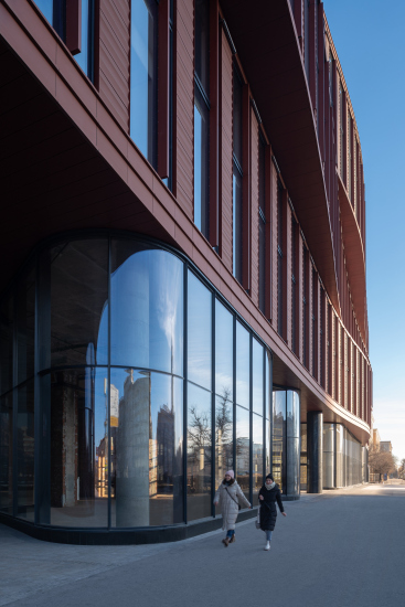
The tier of the public space – the lobby and the space of rentable infrastructure – is something that the architects designed in a particularly dramatic way. What rises above the sidewalk is just a small “straightening” band of the basement floor, no more than 10cm high, but further up, the whole 7 meters from floor to ceiling, there is tinted glass with an occasional barely visible seam. The volume of the building visually “hovers” above the ground, while the curves of the glass produce a “glamorous” high-gloss impression.

Volume-wise, the first tier of the building is divided not into two, but into three parts, which yields two passageways to the yard of Alcon I. In addition to commercial premises, the side blocks also feature lobbies, while the central block is slightly smaller in size – its contours are smooth and flowing, the space inside is free and transparent, and it only has the supports of the main framework. The pitch of the supports, white and with a round section, is 8 meters, usual for office buildings. In the first floor, these white columns are visible through the glass, further working towards creating the image of a “house on legs”, but at some places the architects are leaving the column exposed, like in the western arch of the passage, again emphasizing the ethereal character of the glass boundary.

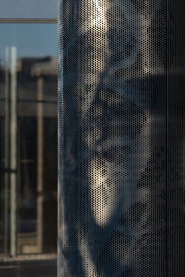
The side blocks echo the central one in terms of being just as flexible and streamlined, but in some places, for example, in the entrances to the building and in the arches, the glass is replaced by punctured metal with tree shadow patterns.

  • zooming
    Alcon II business center on leningrad Avenue / ADM architects
    Copyright: Photograph © Yaroslav Lukyanchenko / provided by ADM architects
  • zooming
    Alcon II business center on leningrad Avenue / ADM architects
    Copyright: Photograph © Yaroslav Lukyanchenko / provided by ADM architects


The first floor with its “boutique” façade, looking like a collection of precious stones, forms the first bright impression that the building, or the whole complex for that matter, produces on the pedestrian. This space is pretty, domesticated, and bright. As the owners of the complex report, a total of 80% of the premises have already been booked up.

Alcon II business center on leningrad Avenue / ADM architects
Copyright: Photograph © Yaroslav Lukyanchenko / provided by ADM architects


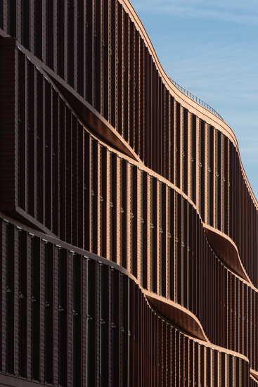
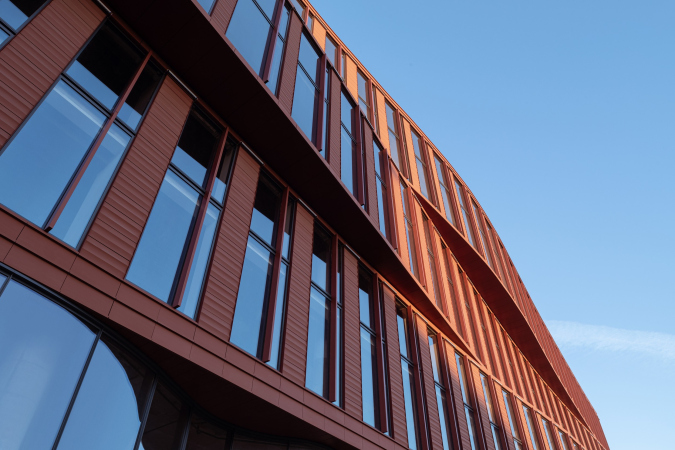
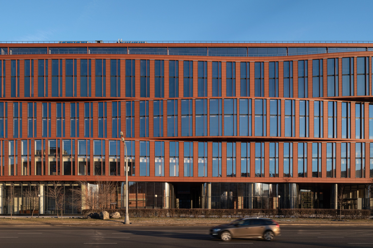
However, the architects paid most attention to the plastique of the main six floors, the most noticeable from the point of view of the city on the whole, and the most visible to the motorists driving down Leningrad Avenue. The ledges at the side ends make the silhouette look more slender. And the main façade overlooking the avenue is gathered into three bands each two stories high. The bands of the front third of the volume undulate in large smooth waves, creating a sculptural effect. In this form, one can see the techniques of the Late Renaissance, not to say Baroque: a façade being a volumetric entity that has “thickness”, which can be “bent”. The very new building itself becomes such a “baroque façade” – a sculptural signature statement, a continuation, completion, and the representative of the business center situated behind it.

Alcon II business center on leningrad Avenue / ADM architects
Copyright: Photograph © Yaroslav Lukyanchenko / provided by ADM architects


“Our idea was to make the building reflect the dynamics of moving along the avenue – Aleksey Romanov says – there are cars speeding by, they raise currents of air, and our façade helps you to feel this “aerodynamics” through the architecture of the building”.

  • zooming
    1 / 4
    Alcon II business center on leningrad Avenue / ADM architects
    Copyright: Photograph © Yaroslav Lukyanchenko / provided by ADM architects
  • zooming
    2 / 4
    Alcon II business center on leningrad Avenue / ADM architects
    Copyright: Photograph © Yaroslav Lukyanchenko / provided by ADM architects
  • zooming
    3 / 4
    Alcon II business center on leningrad Avenue / ADM architects
    Copyright: Photograph © Yaroslav Lukyanchenko / provided by ADM architects
  • zooming
    4 / 4
    Alcon II business center on leningrad Avenue
    Copyright: Photograph © Yaroslav Lukyanchenko / provided by ADM architectsCopyright: Photograph © Yaroslav Lukyanchenko / provided by ADM architects


The architect also explains that realizing the intersecting bands was quite a difficult task. The thing is that the cantilevered ledges of the bands had to be heat-insulated at top and bottom, at the same time maintaining the integrity of the horizontal lines – that is, not turning the bands into a kind of “pleated pattern”, but keeping up the feel of matter, slit horizontally and undulating in the currents of air. The architects solved the problem by insulating the top and bottom from the inside, drawing diagonal chamfers of insulation. The unit turned out to be quite sophisticated.


Just like in the preceding buildings of Alcon I, the ventilation facades of the new building are coated with ceramic tiles of rich terra cotta color, which ensures the integrity of the complex, and is to some extent resonant with the colors of the Leningrad Avenue, yet even more resonant with the colors of the towers, built nearby in the early 2000’s by Ostozhenka. One way or another, terra cotta is the trademark color of Alcon. However, in this new building, the proportions are initially more slender, and, in addition, they are accentuated by the dual vertical rhythm of the piers. The verticals alternate with thin stripes and smoothly change their width on the bands’ ledges, accentuating the form – as if the matter stretches, thinning out and becoming “more glass” on the ledges.

Besides, the relief of the terra cotta façade panels is different from Alcon I – it is slightly wavy and looks like some variation of the classical Dorian and Ionian architectural orders, “multiplied” in height. Yet, at the same time, the relief of the panels echoes the “wave idea” on the façade, and with the “agility” of the building’s plastique on the whole.

Thus, Alcon II business center turned out to be quite noticeable both from the architectural and town planning standpoint. One must admit that it is a great, highly contemporary, or even, as Andrey Romanov aptly put it, futuristic replacement of the old Soviet building, which did not belong on one of the main thoroughfares of the nation’s capital. Moreover, one must recognize in this day and age, when Moscow’s architectural design market is dominated by high-rise housing projects, a new office building in a high-profile location, low-rise in the overall context of the avenue, yet at the same time different in its plastique and eye-catching architecture, is definitely a phenomenon, which livens up the city, and which is worthy of attention.
28 December 2020

Headlines now
The Golden Crown
The concept for a dental clinic in Yekaterinburg, developed by CNTR Studio, revolves around the idea of a “mouth full of gold”: pristine white porcelain stoneware walls are complemented by matte brass details. To avoid an overly literal interpretation, the architects focused on the building’s proportions, skillfully navigating between sunlight requirements and fire safety regulations.
Flexibility and Integration
Not long ago, we covered the project for the fourth phase of the ÁLIA residential complex, designed by APEX. Now, we’ve been shown different fence concepts they developed to enclose the complex’s private courtyards, incorporating a variety of public functions. We believe that the sheer fact that the complex’s architects were involved in such a detail as fencing speaks volumes.
A Step Forward
The HIDE residential complex represents a major milestone for ADM architects and their leaders Andrey Romanov and Ekaterina Kuznetsova in their quest for a fresh high-rise aesthetic – one that is flexible and layered, capable of bringing vibrancy to mass and silhouette while shaping form. Over recent years, this approach has become ADM’s “signature style”, with the golden HIDE tower playing a pivotal role in its evolution. Here, we delve into the project’s story, explore the details of the complex’s design, and uncover its core essence.
Gold in the Sands
A new office for a transcontinental company specializing in resource extraction and processing has opened in Dubai. Designed by T+T Architects, masters of creating spaces that are contemporary, diverse, flexible, and original, this project exemplifies their expertise. On the executive floor, a massive brass-clad partition dominates, while layered textures of compressed earth create a contextually resonant backdrop.
Layers and Levels of Flight
This project goes way back – Reserve Union won this architectural competition at the end of 2011, and the building was completed in 2018, so it’s practically “archival”. However, despite being relatively unknown, the building can hardly be considered “dated” and remains a prime example of architectural expression, particularly in the headquarters genre. And it’s especially fitting for an aviation company office. In some ways, it resembles the Aeroflot headquarters at Sheremetyevo but with its own unique identity, following the signature style of Vladimir Plotkin. In this article, we take an in-depth look at the United Aircraft Corporation (UAC) headquarters in the Moscow agglomeration town of Zhukovsky, supplemented by recent photographs from Alexey Naroditsky – a shoot that became only recently possible due to the fact that improvements were finally made in the surrounding area.
Light and Shadow
In this article, we delve into the architectural design of the “Chaika” house by DNK ag architects, which was recently completed in 2023 as part of the collection of signature designs at ZILArt. As is well-known, all the buildings in this complex follow a design code, yet each one is distinct. This particular building stands out not only for its whiteness and minimalism but also for the refined use of a limited number of techniques that, together, create what can confidently be called synergy.
Casus Novae
A master plan was developed for a large residential area with a name of “DNS City”, but now that its implementation began, the plan has been arbitrarily reformatted and replaced with something that, while similar on the surface, is actually quite different. This is not the first time such a thing happens, but it’s always frustrating. With permission from the author, we are sharing Maria Elkina’s post.
Treasure Hunting
The GAFA bureau, in collaboration with Tegola and Arkhitail, organized an expedition to the island of Kilpola in Karelia as part of Moskomarkhitektura’s “Open City” festival. There, amidst moss and rocks, the students sought answers to questions like: what is the sacred, where does it dwell, and what sustains it? Assisting the participants in this quest were landscape engineer Evgeny Levin, artist Nicholas Roerich, a moose, and the lack of cellular connection. Here’s how the story unfolded.
Depths of the Earth, Streams of Water
In the Malaya Okhta district, the Akzent building, designed by Stepan Liphart, was constructed. It follows a classic tripartite structure, yet it’s what you might call “hand-drawn”: each façade is unique in its form and details, some of which aren’t immediately noticeable. In this article, we explore the context and, together with the architect, delve into how the form was developed.
Fir Tree Dynamics
The “Airports of Region” holding is planning to build an airport in Karachay-Cherkessia, aiming to make the Arkhyz and Dombay resorts more accessible to travelers. The project that won in an invitation-only competition, submitted by Sergey Nikeshkin’s KPLN, blends natural imagery inspired by the shape of a conifer seed, open-air waiting spaces, majestic large trees, and a green roof elevated on needle-like columns. The result is both nature-inspired and WOW.
​A Brick Shell
In the process of designing a clubhouse situated among pine trees in a prestigious suburban area near Moscow, the architectural firm “A.Len” did the façade design part. The combination of different types of brick and masonry correlates with the volumetric and plastique solutions, further enhanced by the inclusion of wood-painted fragments and metal “glazing”.
Word Forms
ATRIUM architects love ambitious challenges, and for the firm’s thirtieth anniversary, they boldly play a game of words with an exhibition that dives deep into a self-created vocabulary. They immerse their projects – especially art installations – into this glossary, as if plunging into a current of their own. You feel as if you’re flowing through the veins of pure art, immersed in a universe of vertical cities, educational spaces – of which the architects are true masters – and the cultural codes of various locations. But what truly captivates is the bold statement that Vera Butko and Anton Nadtochy make, both through their work and this exhibition: architecture, above all, is art – the art of working with form and space.
Flexibility and Acuteness of Modernity
Luxurious, fluid, large “kokoshniks” and spiral barrel columns, as if made from colorful chewing gum: there seem to be no other mansion like this in Moscow, designed in the “Neo-Russian-Modern” style. And the “Teremok” on Malaya Kaluzhskaya, previously somewhat obscure, has “come alive with new colors” and gained visibility after its restoration for the office of the “architectural ecosystem” as the architects love to call themselves. It’s evident that Julius Borisov and the architects at UNK put their hearts into finding this new office and bringing it up to date. Let’s delve into the paradoxes of this mansion’s history and its plasticity. Spoiler: two versions of modernity meet here, both balancing on the razor’s edge of “what’s current”.
Yuri Vissarionov: “A modular house does not belong to the land”
It belongs to space, or to the air... It turns out that 3D printing is more effective when combined with a modular approach: the house is built in a workshop and then adapted to the site, including on uneven terrain. Yuri Vissarionov shares his latest experience in designing tourist complexes, both in central Russia and in the south. These include houseboats, homes printed from lightweight concrete using a 3D printer, and, of course, frame houses.
​Moscow’s First
“The quality of education largely depends on the quality of the educational environment”. This principle of the last decade has been realized by Sergey Skuratov in the project for the First Moscow Gymnasium on Rostovskaya Embankment in the Khamovniki district. The building seamlessly integrates into the complex urban landscape, responding both to the pedestrian flow of the city and the quiet alleyways. It skillfully takes advantage of the height differences and aligns with modern trends in educational space design. Let’s take a closer look.
Looking at the Water
The site of Villa Sonata stretches from the road to the water’s edge, offering its own shoreline, pier, and a picturesque river panorama. To reveal these sweeping views, Roman Leonidov “cut” the façade diagonally parallel to the river, thus getting two main axes for the house and, consequently, “two heads”. The internal core – two double-height spaces, a living room and a conservatory, with a “bridge” above them – makes the house both “transparent” and filled with light.
The White Wing
Well, it’s not exactly white. It’s more of a beige, white-stone structure that plays with the color of limestone – smoother surfaces are lighter, while rougher ones are darker. This wing unites various elements: it absorbs and interprets the surrounding themes. It responds to everything, yet maintains a cohesive expression – a challenging task! – while also incorporating recognizable features of its own, such as the dynamic cuts at the bottom, top, and middle.
Urban Dunes
The XSA Ramps team designed and built a three-part sports hub for a park in Rostov-on-Don, welcoming people of all ages and fitness levels. The skate plaza, pump track, and playground are all meticulously crafted with details that attract a diverse range of visitors. The technical execution of the shapes and slopes transforms this space into a kind of sculptural composition.
Proportional Growth
The project for the fourth phase of the ÁLIA residential area has been announced. The buildings are situated on an elongated plot – almost a “ray” that shoots out from the center of the area towards the river. Their layout reflects both a response to Moscow’s architectural preferences over the past 15 years, shifting “from blocks to towers”, and an interpretation of the neighboring business park designed by SOM. Additionally, the best apartments here are not located at the very top but closer to the middle, forming a glowing “waistline”.
The “Staircase” Building
In designing the “Details” residential complex in New Moscow, Rais Baishev spiced up the now-popular Moscow theme of a “courtyard” building with an idea drawn from the surrealist drawings by Maurits Escher. He envisioned the stepped silhouettes and descending slopes as a metaphysical mega-staircase, creating a key void within the courtyard that gave the project an internal “spine”. This concept is felt both in the building’s silhouette and on its façades.
Projection of the Quarter
No one doubted that the building that Vladimir Plotkin designed as part of the “Garden Quarters” would be the most modernist of all. And it turned out just that way: while adhering to the common design code, the building successfully combines brick and white stone, rhythmically responding to the neighboring building designed by Ostozhenka, yet tactfully and persistently making a few statements of its own. This includes the projection of the ideal urban development composition “14–9–6”, which can be found right next door, mathematical calculations, including those for various types of terraces (and perhaps the only reminder of the Soviet past of the Kauchuk rubber factory!), and the white “cross-stitch” pattern of the façade grid.
Domus Aurea
In this issue, we examine the “Tessinsky-1” house, designed by Sergey Skuratov and completed in 2023. Located in the middle of the Serebryanicheskaya Embankment district, at the intersection of its main streets, this house assumes a sort of “nodal” role: it not only responds to everything around it and preserves many memories of the former EMA factory within itself, but it weaves all this into a newly directed pattern, reconciling bright “gold” and dark-colored brick, largely with the help of the new, modern-yet-archaic Columba brick, which, come to think about it, is the most precious element here.
The Chimney of Nikola-Lenivets
In this issue, we are examining the “Obelisk House” designed by KATARSIS and built for the Arkhstoyanie 2023 festival. However, it was only finished later on, and this is why we are examining it now. It seems to us that after the “Obelisk House” appeared in Nikola-Lenivets, a dialogue and a few inner connections appeared between the temporary structures built here. These houses no longer look like “accidental neighbors”, more of which below.
​Periscope by the Bay
The jury awarded the second place in the competition for a public and cultural center in Petropavlovsk-Kamchatsky to the companies GORA (“Mountain”) and M4. In the consortium’s proposal, the building resembles a sperm whale with a calf swimming next to it or a periscope, whose lenses capture the most spectacular views from the surrounding landscape.
From Arcs to Dolmens
While working on the competition project for Petropavlovsk-Kamchatsky, ASADOV Architects prioritized the value of the natural and urban environment, aiming to preserve the balance of the location while minimizing the resemblance of the volume that they designed to a “traditional building”. The task was challenging, and the architects created three versions, one of which having been developed after the competition, where their main proposal took third place. However, the point of interest here is not the competition result but the continuity of creative thinking.
Hide and Seek
The ID Moskovskiy house, designed by Stepan Liphart in St. Petersburg, in the courtyards near Moskovskiy Avenue beyond the Obvodny Canal and recently completed, is notable for several reasons. Firstly, it has been realized with considerable accuracy, which is particularly significant as this is the first building where the architect was responsible not only for the facades but also for the layouts, allowing for better integration between the two. On the other hand, this building is interesting as an example of the “germination” of new architecture in the city: it draws on the best examples from the neighborhood and becomes an improved and developed sum of ideas found by the architect in the surrounding context.
The Big Twelve
Yesterday, the winners of the Moscow Mayor’s Architecture Award were announced and honored. Let’s take a look at what was awarded and, in some cases, even critique this esteemed award. After all, there is always room for improvement, right?
Above the Golden Horn
The residential complex “Philosophy” designed by T+T architects in Vladivostok, is one of the new projects in the “Golubinaya Pad” area, changing its development philosophy (pun intended) from single houses to a comprehensive approach. The buildings are organized along public streets, varying in height and format, with one house even executed in gallery typology, featuring a cantilever leaning on an art object.
Nuanced Alternative
How can you rhyme a square and space? Easily! But to do so, you need to rhyme everything you can possibly think of: weave everything together, like in a tensegrity structure, and find your own optics too. The new exhibition at GES-2 does just that, offering its visitor a new perspective on the history of art spanning 150 years, infused with the hope for endless multiplicity of worlds and art histories. Read on to see how this is achieved and how the exhibition design by Evgeny Ace contributes to it.
Blinds for Ice
An ice arena has been constructed in Domodedovo based on a project by Yuri Vissarionov Architects. To prevent the long façade, a technical requirement for winter sports facilities, from appearing monotonous, the architects proposed the use of suspended structures with multidirectional slats. This design protects the ice from direct sunlight while giving the wall texture and detail.