По-русски

​The Contact

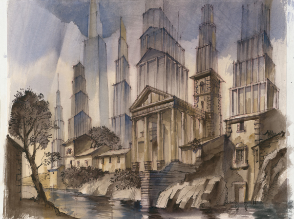
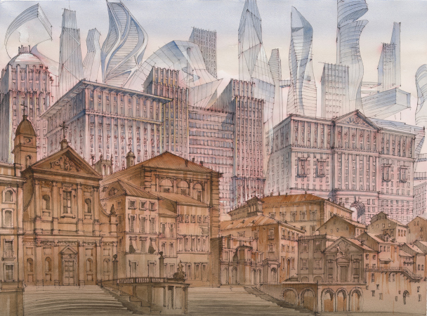
The Istituto Centrale per la Grafica in Rome presents Sergei Tchoban’s exhibition “Imprint of the future. Destiny of Piranesi’s City”. The exhibition includes four etchings, based on Roman architectural views of the XVIII century complemented by futuristic insertions, as well as a lot of drawings that investigate the same topic, at times quite expressively. The exhibition poses questions, but does not seem to give any answers. Since going to Rome is pretty problematic now, let’s at least examine the pictures.

15 October 2020
News
mainImg
The Central Institute for Graphics is situated on via della Stamperia, i.e. “Typographic Street”, next to the Trevi Fountain Square, 3 minutes’ walk from Corso, right across from the Roman Academy of St. Luke. It is quite a cozy tourist place that has a pleasant atmosphere of this classical city, built largely in the XVII and XVIII centuries, but on the remains of the times of Octavian August. Thus, it comes as no surprise that the place for the exhibition of Sergei Tchoban, timed to coincide with the 300th anniversary of Piranesi, was found in this location. The exhibition is co-organized by the Central Institute for Graphics and the Museum for Architectural Drawing in Berlin (Tchoban Foundation).

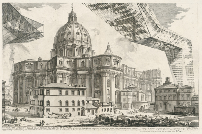
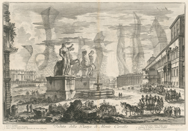
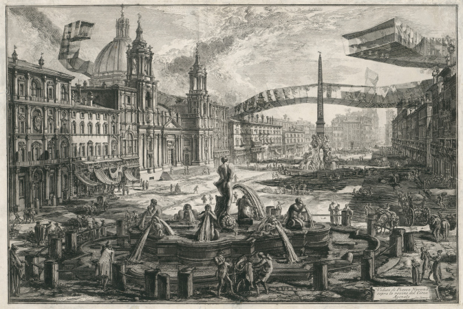
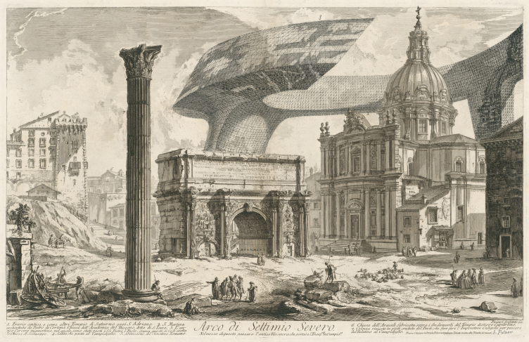
The central core of the exhibition is presented by four Piranesi etchings from Sergey Tchoban’s collection: the exact copies of a Roman landscape, depicted in the end of the XVIII century, are complemented by modern buildings, rather futuristic-looking. The etching boards were executed by the architect Ioann Zelenin on the basis of ideas and sketches by Sergei Tchoban. Reportedly, the modern buildings were inscribed directly into the original imprints from the collection, and later on transferred onto the copper boards, which, in turn, provided the “hybrid” imprints for the exhibition.

  • zooming
    1 / 3
    The Imprint of the Future. Architectural fantasy inspired by Piranesi etching "Veduta dell esterno della Gran Basilica di S. Pietro in Vaticano"
    Copyright: The etching was made by Ioann Zelenin by Sergey Tchoban′s drawing
  • zooming
    2 / 3
    The Imprint of the Future. Architectural fantasy inspired by Piranesi etching “Veduta della Piazza di Monte Cavallo”
    Copyright: The etching was made by Ioann Zelenin by Sergey Tchoban′s drawing
  • zooming
    3 / 3
    The Imprint of the Future. Architectural fantasy inspired by Piranesi etching “Veduta della Piazza Navona sopra le rovine del Circo Agonale”
    Copyright: The etching was made by Ioann Zelenin by Sergey Tchoban′s drawing


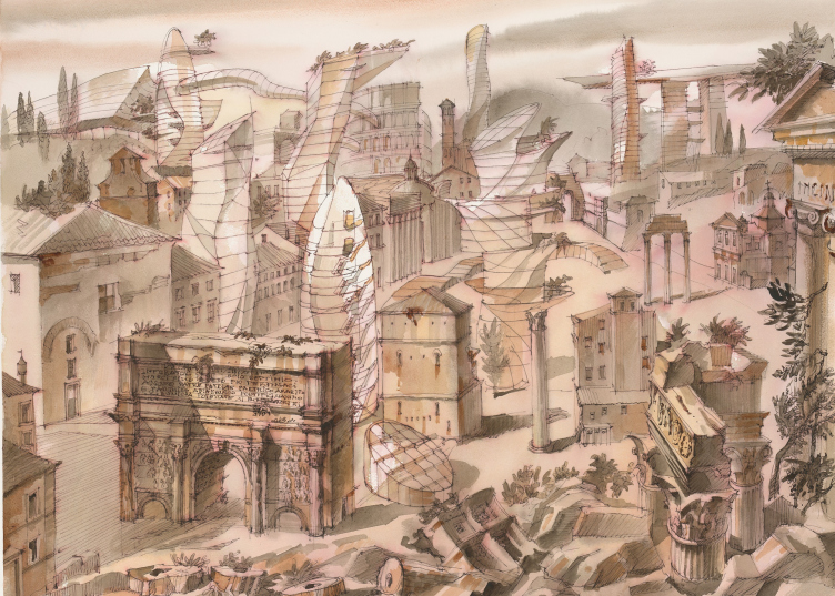
All of the four cityscapes: Piazza Navona, Quirinal Hill, the Arch of Septimius Severus at the northwest end of the Roman Forum, and St. Peter’s Cathedral are the classic architectural views by Piranesi. These buildings have glass forms inscribed into them; in two cases, they look like long overpasses and giant cantilevers; there is a semblance of the Moscow City towering from behind the Quirinal Hill, yet with more complex shapes than usual, while the Arch of Septimius Severus is overshadowed by a cross between a skyscraper and a sightseeing platform.

These four images, which depict Rome of the XVIII century in the etchings of the famous master – as much classicist as he was a romantic, one of the most heart-felt, and, hence, one of the most famous artists who portrayed architectural views – clash with the forecast forms of the cities of the future, assumingly, of the XXI century, modernist or neo-modernist, but in any case consisting of glass and defying the laws of gravity, and form the core of the exhibition, its central hall number two.

The hall is called “Imprint of the Future”, because the architectural views by Piranesi, which show us the city of the past, the antique and baroque one, literally have some sci-fi constructions imprinted into them – as if the author of these “collage etchings” is telling us that, although these constructions are not there yet, they are quite likely to appear at some point in time, making the buildings of the times of the Roman emperors clash with the modernist fantasies of our day and age within the space of the etching board.

The Imprint of the Future. Architectural fantasy inspired by Piranesi etching “Arco di Settimio Severo”
Copyright: The etching was made by Ioann Zelenin by Sergey Tchoban′s drawing


In addition to the “core hall”, the exhibition also has hall number one, which displays “pure” city views without any sci-fi insertions: modernist cities of the XX century, classic European towns, and Saint Petersburg, the home city of Sergey Tchoban. The principles of a traditional city are explained as we move along the exposition: it is a combination of centerpieces and background construction, arranged both vertically, in accordance with the “basement-middle-top” principle (the top always being lighter and more slender), the prevalence of the bearing wall (windows area under 40%), the material nature of the walls, and the décor. The same exposition explains that the city of the XX century breaks away from these principles: “the architects have an urge to design iconic “sculpture” buildings, whose sizes and shapes would be contrastive with the historical environment, this contrast radically changing the hitherto stable city fabric”. In this article, Sergey Tchoban commented on his attitude towards the “overprotective” town planning policy of today’s Saint Petersburg.

The third and final hall displays a multitude of drawings that develop this theme, started in the “altered” Piranesi etchings, namely, that of coexisting constructions of different times within the space of one historical city, which get ahead of the modern technology-inspired fantasies. Some of the drawings precede the “Piranesi etchings” in terms of time of their creation; some are actually sketches, and some – one can see that – were drawn specifically for this exhibition. All the three halls come together to form a graphic statement, complemented by verbal explanatory notes, authored by Anna Martovitskaya, one of the curators of the exhibition.

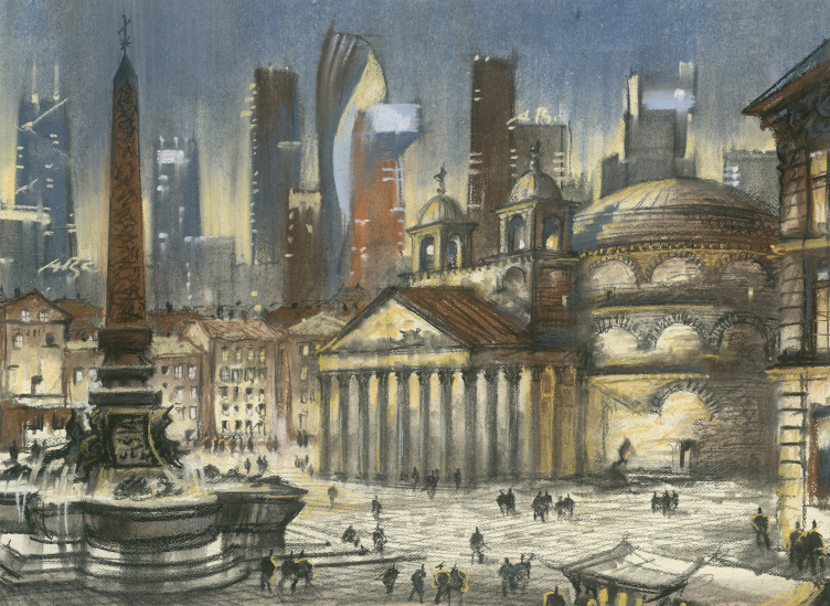
The Imprint of the Future. Architectural fantasy inspired by Piranesi etching “Veduta della Piazza della Rotonda”
Copyright: © Sergey Tchoban


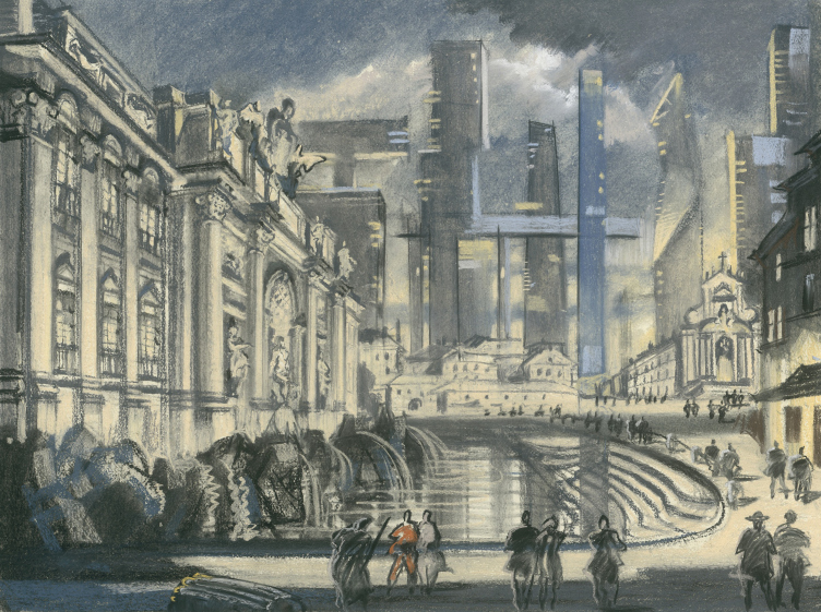
The Imprint of the Future. Architectural fantasy inspired by Piranesi etching “The Trevi Fountain”
Copyright: © Sergey Tchoban


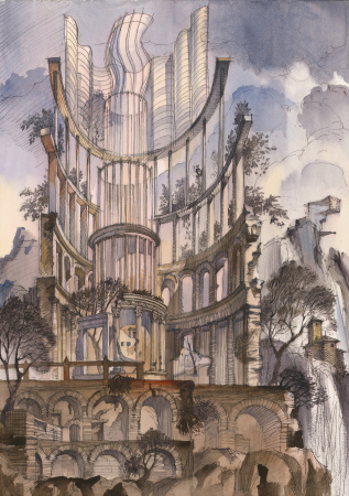
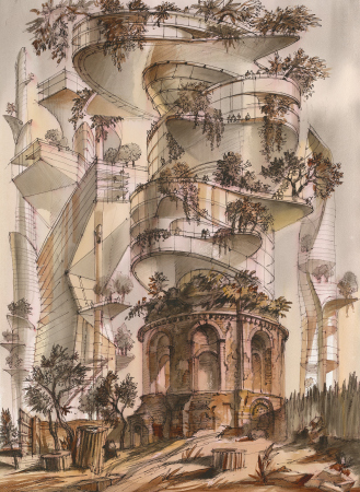
The compositions can be conditionally divided into the following groups: recognizable views of the historical city with skyscrapers in the background, fantasy views of historical architecture that grows in modern tiers – the higher it grows, the more “modern” and the more bolder it becomes, yet still staying within the overall logic of the historical city, described in the comments to the exhibition; “phases” of the city, where one architectural layer is replacing another, skyscrapers of “Chicago” type, and the glass “City”. It looks as though the author of all these drawings examines different types of interaction between the old and the new, tasting them and drawing comparative historical parallels.

  • zooming
    1 / 4
    The Imprint of the Future. Architectural fantasy inspired by Piranesi etching “Altra veduta del tempio della Sibilla in Tivoli”
    Copyright: © Sergey Tchoban
  • zooming
    2 / 4
    The Imprint of the Future. Architectural fantasy inspired by Piranesi etching "Veduta del Tempio, detto della Tosse"
    Copyright: © Sergey Tchoban
  • zooming
    3 / 4
    The Imprint of the Future. Architectural fantasy inspired by Piranesi etching “Veduta del Tempio di Ercole nella Citt di Cora”
    Copyright: © Sergey Tchoban
  • zooming
    4 / 4
    The Imprint of the Future. Architectural fantasy inspired by Piranesi etching “Veduta del Porto di Ripetta”
    Copyright: © Sergey Tchoban


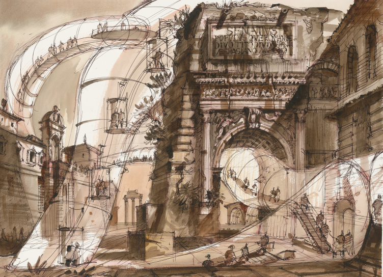
At times, in addition to the associations with the downtown areas of different cities, a reminder appears about the already committed architectural invasions, such as the fact that near the Arch of Septimius Severus at the northwest end of the Roman Forum now “shoots up” a tower that looks line London’s “Cucumber” by Lord Norman Foster, which presents a textbook example of a contrast between the old and the new.

The Imprint of the Future. Architectural fantasy inspired by Piranesi etching “Veduta di Campo Vaccino”
Copyright: © Sergey Tchoban


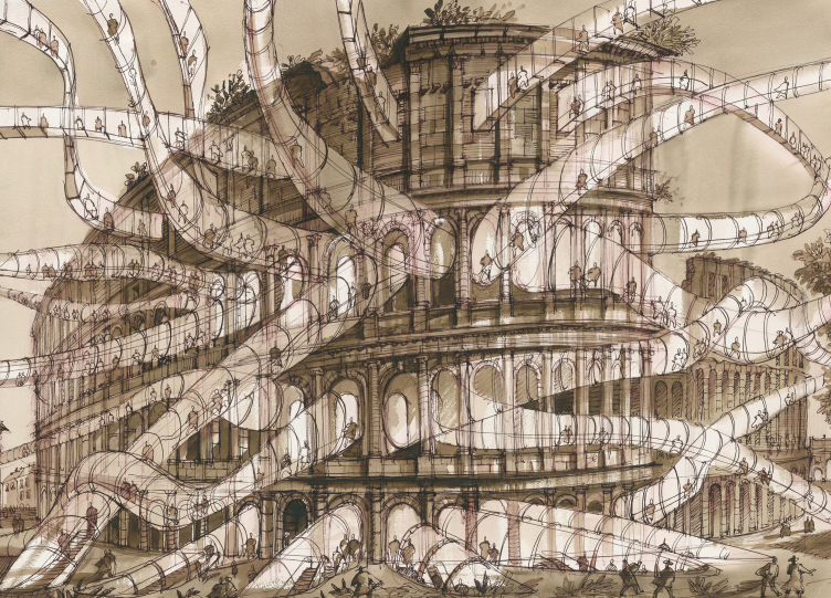
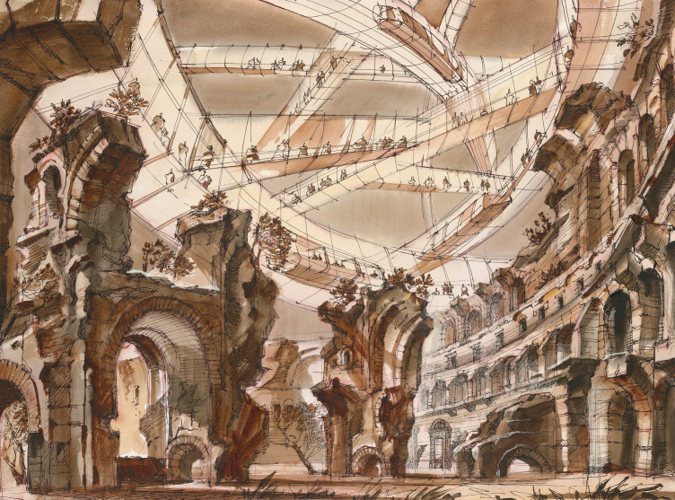
And, finally, like the climax of this search – a city laced with glass tentacles. Detached from historical buildings, the broken lines and volumes gradually become “bolder”, take on curved and winding shapes, and repeatedly pass through the buildings. Particularly bright, or maybe, sarcastic, looks the drawing of the Coliseum.

The Imprint of the Future. Architectural fantasy inspired by Piranesi etching "Veduta dell′Anfiteatro Flavio, detto il Colosseo"
Copyright: © Sergey Tchoban


On the whole, it is rather obvious that this theme of contrastive crossing, exaggerated difference and blatant opposition between the modern and historical architectures, or, even more, the old and the new city, which Sergey Tchoban has been interested in for years, has been taken to a whole new conceptual level in the Roman exhibition.

First, the imprints of the “ruined” Piranesi etchings are in itself enough to present an experience akin to laboratory modeling. The futuristic buildings are not just placed in the context of this historical city in its more-than-200-year-old state (the Arch of Septimius Severus has not been dug out yet), but also the material of execution, characteristic for the XVIII century: copper etching. Had it been a render on a computer screen, where the panorama of today’s Rome had a couple of skyscrapers and cantilevers inscribed into it, this would have been just a case of Visual Landscape Analysis, only on a hypothetical topic. In this case, however, the objects are placed not into modern Rome, but in its older version, and, in addition, they are executed in Piranesi’s technique. “The Imprint of the Future'' puts one in the mind of a sci-fi novel or movie, where the characters find themselves in the past, and the consequences of their activity start showing in old photographs and newspapers, which are accessible in our days – these characters may have made a positive or a negative difference, but the important thing is that they did make it, and left a footprint. Here, by and large, we are also dealing with mystification, as if we are looking at evidence of a time machine. The difference is that the time machine hoax is disclosed in advance, and these pictures refer to time the same way that an icon – according to Uspensky – refers to space: in an icon, God is looking at us from beyond, and here the future is watching the past, trying to get reflected in in it, like it would in a mirror.

Such “working with time” echoes the creative activity of Piranesi himself: he also studied the Ancient Rome, etching the floor plans of famous buildings that he recreated (and it must be said that in Piranesi’s engravings, the city sometimes looks more interesting than it does now – it has many buildings with petal plans, all lace-like). Piranesi recreated Ancient Rome, from candle sticks to planning structures, to giant vaulted spaces, that is, turned the present to the past, or broadcast the past into the present. Sergey Tchoban, on the other hand, is experimenting with the future, trying to forecast the vines that can grow from the seeds that we are now sowing. They cut through the ground and penetrate windows, hang with a luminous net over the ruins, and explore the spaces inside.

The Imprint of the Future. Architectural fantasy inspired by Piranesi etching “Veduta dell′Arco di Tito”
Copyright: © Sergey Tchoban


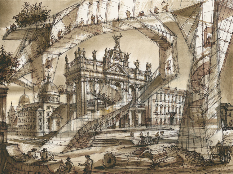
The Imprint of the Future. Architectural fantasy inspired by Piranesi etching "Veduta della Basilica di S. Giovanni Laterano"
Copyright: © Sergey Tchoban


The Imprint of the Future. Architectural fantasy inspired by Piranesi etching "Rovine del Sisto, o sia della gran sala delle Terme Antoniniane"
Copyright: © Sergey Tchoban


Most importantly, however, they watch. There is stuffage all over the place. In the XVIII century, this was common practice, just like it was in the architectural graphics of the XX century too: the drawing is accompanied by human figures that make it possible to understand the scale (not be confused with the practice of avoiding having people in architectural photographs). As a result, we see among the ruins pastoral peasants wearing hats and sitting down on the remains of the columns; sometimes these are people in cocked hats and frock coats giving orders to servants – a clear echo of the XVIII century. And above them, in glass tubes and cantilevers, equipped with elevators and escalators, move the modern-age observers, and they are even drawn in a slightly different way – like a modernist and not neo-classic stuffage; the human figures approach the “televisions” of the cantilevers, watching from inside of them. The result looks slightly like a museum, again, of a pretty sci-fi kind, some fairytale park – two different worlds that cross in space, remaining isolated from each other: the tourists are watching “the pictures of the past” – a narrative, which is also used in many books and movies. But then again, to be more exact, I must note that the “tourists” in glass volumes are to be seen all over the place, while the peasants appear, probably, as a consequence of development of the author’s views from drawing to drawing, or, even maybe as a consequence of his turning to Piranesi.

Here appears yet another parallel from the field of lyrical science fiction. The historical city is watched not only by the people in glass tubes but also by the tubes and cantilevers themselves, their facial expressions being probably even more interesting than those of the people – the curious snail’s eyes, energetic, but generally rather friendly. As compared to Le Corbusier’s “radiant city” that replaced all preexisting structures with its repetitive houses, and to Iona Friedman’s “spatial city” that hovered above the old buildings on slender columns (preserving the old buildings, albeit in a slightly cool and aloof manner of “overhanging”) – this relationship between the city of the past and the city of the future is quite peculiar here. So much so that the latter does not even look like a city but rather like a museum locked in an airtight space. Meaning – these people may live someplace else, in some city like Plan Voisin, or maybe on the moon, only occasionally coming down here to watch this old city. One way or another, these glass intrusions, which first appeared in the drawings by Sergey Tchoban in the form of a background of dissonant towers, look as though they were “searching for connection”.

Another thing that comes to mind is the Soviet cartoon movie “The Contact” (1978) directed by Vladimir Tarasov, with a screenplay by Alexander Kostinsky; in this cartoon, as we remember, an alien tried to establish a contact with an earthling artist, and everything eventually did work out.

Peculiar is the fact that in this cartoon “attempts at contact” occur first through observation, photographing, and then through the reincarnation of the alien: he turns into a pair of boots, then into an easel, but the contact only occurs when he assumes the appearance of the artist.

The graphics by Sergey Tchoban also looks as if it were making repeated attempts at contact, and one can see that the attempts of the new architecture to become like the old one appear only in one series of drawings, least numerous. Generally, on the other hand, the interaction is based rather on the aggressive contact, at the same time stopping short at the first stage of observation (and, possibly, photographing things). We will note here, that the artist (the “object” of the contact in the cartoon) also changes his attitude from being scared to being indifferent; here, in the etchings, the old city is mostly indifferent. But then again, on the other hand, one can easily imagine that this city is reacting to what’s going on with different degrees of ruins, which can indeed be interpreted as fright.

One can hardly say that these observations give plenty of hope for a successful contact. The sheer fact that people in these spaces are fully isolated (by time, perhaps?) does not inspire any particular optimism. What is still more important, however, is, probably, the fact that the possibility of contact is not entirely ruled out, and even still more importantly, there is no “doomed sarcasm”, even though at times, one can indeed sense the smell of it. However, the exhibition is rather posing questions and searching for answers than is offering ready-made recipes.

“… if we are to consider the European city to be a quite definite centuries-old system of interrelation between empty and build spaces, low-rise and high-rise elements of constructions, as well as their silhouettes and surfaces, then how are we to address it today? What conditions for peaceful coexistence of the old and the new are we to provide for it?” The explanatory notes also contain words to the effect that the calls to recreate a European city are hardly feasible nowadays.

Furthermore, the drawings are beautiful – beautiful enough to give us reason to state (even if reserving a possibility of some “Itinerantly” critical component) that the “us and them” rhetoric, so characteristic of our contemporaries and countrymen, is not to be found here. Rather, this is a new statement on the subject. And, in my opinion, it is slightly different from the message contained in the “30:70” book. Some of the contrastive compositions exhibited here have already figured as illustrations to this book. The exhibition, on the one hand, yet again highlights the controversy described in it, but, on the other hand, demonstrates that the matter is even still more complex, bringing to light the conflict between modern and historical architectures. While the book had a recommendation: if you want to get a nice city, then in addition to neutral prefab houses and flashy landmarks, you also need to build something calm and neatly decorated, capable of arresting one’s gaze – the exhibition seems to state that such a compromise is just impossible. Modern architecture is simply incapable of following the logic of an old European city. Either this statement is polemical, calling on modern architecture to change its ways (which is hardly possible, judging from the explications). Or the recommendations gave way to posing questions, which is basically what art is all about, if we are to consider it to be one of the methods of analyzing reality.

15 October 2020

Headlines now
The Golden Crown
The concept for a dental clinic in Yekaterinburg, developed by CNTR Studio, revolves around the idea of a “mouth full of gold”: pristine white porcelain stoneware walls are complemented by matte brass details. To avoid an overly literal interpretation, the architects focused on the building’s proportions, skillfully navigating between sunlight requirements and fire safety regulations.
Flexibility and Integration
Not long ago, we covered the project for the fourth phase of the ÁLIA residential complex, designed by APEX. Now, we’ve been shown different fence concepts they developed to enclose the complex’s private courtyards, incorporating a variety of public functions. We believe that the sheer fact that the complex’s architects were involved in such a detail as fencing speaks volumes.
A Step Forward
The HIDE residential complex represents a major milestone for ADM architects and their leaders Andrey Romanov and Ekaterina Kuznetsova in their quest for a fresh high-rise aesthetic – one that is flexible and layered, capable of bringing vibrancy to mass and silhouette while shaping form. Over recent years, this approach has become ADM’s “signature style”, with the golden HIDE tower playing a pivotal role in its evolution. Here, we delve into the project’s story, explore the details of the complex’s design, and uncover its core essence.
Gold in the Sands
A new office for a transcontinental company specializing in resource extraction and processing has opened in Dubai. Designed by T+T Architects, masters of creating spaces that are contemporary, diverse, flexible, and original, this project exemplifies their expertise. On the executive floor, a massive brass-clad partition dominates, while layered textures of compressed earth create a contextually resonant backdrop.
Layers and Levels of Flight
This project goes way back – Reserve Union won this architectural competition at the end of 2011, and the building was completed in 2018, so it’s practically “archival”. However, despite being relatively unknown, the building can hardly be considered “dated” and remains a prime example of architectural expression, particularly in the headquarters genre. And it’s especially fitting for an aviation company office. In some ways, it resembles the Aeroflot headquarters at Sheremetyevo but with its own unique identity, following the signature style of Vladimir Plotkin. In this article, we take an in-depth look at the United Aircraft Corporation (UAC) headquarters in the Moscow agglomeration town of Zhukovsky, supplemented by recent photographs from Alexey Naroditsky – a shoot that became only recently possible due to the fact that improvements were finally made in the surrounding area.
Light and Shadow
In this article, we delve into the architectural design of the “Chaika” house by DNK ag architects, which was recently completed in 2023 as part of the collection of signature designs at ZILArt. As is well-known, all the buildings in this complex follow a design code, yet each one is distinct. This particular building stands out not only for its whiteness and minimalism but also for the refined use of a limited number of techniques that, together, create what can confidently be called synergy.
Casus Novae
A master plan was developed for a large residential area with a name of “DNS City”, but now that its implementation began, the plan has been arbitrarily reformatted and replaced with something that, while similar on the surface, is actually quite different. This is not the first time such a thing happens, but it’s always frustrating. With permission from the author, we are sharing Maria Elkina’s post.
Treasure Hunting
The GAFA bureau, in collaboration with Tegola and Arkhitail, organized an expedition to the island of Kilpola in Karelia as part of Moskomarkhitektura’s “Open City” festival. There, amidst moss and rocks, the students sought answers to questions like: what is the sacred, where does it dwell, and what sustains it? Assisting the participants in this quest were landscape engineer Evgeny Levin, artist Nicholas Roerich, a moose, and the lack of cellular connection. Here’s how the story unfolded.
Depths of the Earth, Streams of Water
In the Malaya Okhta district, the Akzent building, designed by Stepan Liphart, was constructed. It follows a classic tripartite structure, yet it’s what you might call “hand-drawn”: each façade is unique in its form and details, some of which aren’t immediately noticeable. In this article, we explore the context and, together with the architect, delve into how the form was developed.
Fir Tree Dynamics
The “Airports of Region” holding is planning to build an airport in Karachay-Cherkessia, aiming to make the Arkhyz and Dombay resorts more accessible to travelers. The project that won in an invitation-only competition, submitted by Sergey Nikeshkin’s KPLN, blends natural imagery inspired by the shape of a conifer seed, open-air waiting spaces, majestic large trees, and a green roof elevated on needle-like columns. The result is both nature-inspired and WOW.
​A Brick Shell
In the process of designing a clubhouse situated among pine trees in a prestigious suburban area near Moscow, the architectural firm “A.Len” did the façade design part. The combination of different types of brick and masonry correlates with the volumetric and plastique solutions, further enhanced by the inclusion of wood-painted fragments and metal “glazing”.
Word Forms
ATRIUM architects love ambitious challenges, and for the firm’s thirtieth anniversary, they boldly play a game of words with an exhibition that dives deep into a self-created vocabulary. They immerse their projects – especially art installations – into this glossary, as if plunging into a current of their own. You feel as if you’re flowing through the veins of pure art, immersed in a universe of vertical cities, educational spaces – of which the architects are true masters – and the cultural codes of various locations. But what truly captivates is the bold statement that Vera Butko and Anton Nadtochy make, both through their work and this exhibition: architecture, above all, is art – the art of working with form and space.
Flexibility and Acuteness of Modernity
Luxurious, fluid, large “kokoshniks” and spiral barrel columns, as if made from colorful chewing gum: there seem to be no other mansion like this in Moscow, designed in the “Neo-Russian-Modern” style. And the “Teremok” on Malaya Kaluzhskaya, previously somewhat obscure, has “come alive with new colors” and gained visibility after its restoration for the office of the “architectural ecosystem” as the architects love to call themselves. It’s evident that Julius Borisov and the architects at UNK put their hearts into finding this new office and bringing it up to date. Let’s delve into the paradoxes of this mansion’s history and its plasticity. Spoiler: two versions of modernity meet here, both balancing on the razor’s edge of “what’s current”.
Yuri Vissarionov: “A modular house does not belong to the land”
It belongs to space, or to the air... It turns out that 3D printing is more effective when combined with a modular approach: the house is built in a workshop and then adapted to the site, including on uneven terrain. Yuri Vissarionov shares his latest experience in designing tourist complexes, both in central Russia and in the south. These include houseboats, homes printed from lightweight concrete using a 3D printer, and, of course, frame houses.
​Moscow’s First
“The quality of education largely depends on the quality of the educational environment”. This principle of the last decade has been realized by Sergey Skuratov in the project for the First Moscow Gymnasium on Rostovskaya Embankment in the Khamovniki district. The building seamlessly integrates into the complex urban landscape, responding both to the pedestrian flow of the city and the quiet alleyways. It skillfully takes advantage of the height differences and aligns with modern trends in educational space design. Let’s take a closer look.
Looking at the Water
The site of Villa Sonata stretches from the road to the water’s edge, offering its own shoreline, pier, and a picturesque river panorama. To reveal these sweeping views, Roman Leonidov “cut” the façade diagonally parallel to the river, thus getting two main axes for the house and, consequently, “two heads”. The internal core – two double-height spaces, a living room and a conservatory, with a “bridge” above them – makes the house both “transparent” and filled with light.
The White Wing
Well, it’s not exactly white. It’s more of a beige, white-stone structure that plays with the color of limestone – smoother surfaces are lighter, while rougher ones are darker. This wing unites various elements: it absorbs and interprets the surrounding themes. It responds to everything, yet maintains a cohesive expression – a challenging task! – while also incorporating recognizable features of its own, such as the dynamic cuts at the bottom, top, and middle.
Urban Dunes
The XSA Ramps team designed and built a three-part sports hub for a park in Rostov-on-Don, welcoming people of all ages and fitness levels. The skate plaza, pump track, and playground are all meticulously crafted with details that attract a diverse range of visitors. The technical execution of the shapes and slopes transforms this space into a kind of sculptural composition.
Proportional Growth
The project for the fourth phase of the ÁLIA residential area has been announced. The buildings are situated on an elongated plot – almost a “ray” that shoots out from the center of the area towards the river. Their layout reflects both a response to Moscow’s architectural preferences over the past 15 years, shifting “from blocks to towers”, and an interpretation of the neighboring business park designed by SOM. Additionally, the best apartments here are not located at the very top but closer to the middle, forming a glowing “waistline”.
The “Staircase” Building
In designing the “Details” residential complex in New Moscow, Rais Baishev spiced up the now-popular Moscow theme of a “courtyard” building with an idea drawn from the surrealist drawings by Maurits Escher. He envisioned the stepped silhouettes and descending slopes as a metaphysical mega-staircase, creating a key void within the courtyard that gave the project an internal “spine”. This concept is felt both in the building’s silhouette and on its façades.
Projection of the Quarter
No one doubted that the building that Vladimir Plotkin designed as part of the “Garden Quarters” would be the most modernist of all. And it turned out just that way: while adhering to the common design code, the building successfully combines brick and white stone, rhythmically responding to the neighboring building designed by Ostozhenka, yet tactfully and persistently making a few statements of its own. This includes the projection of the ideal urban development composition “14–9–6”, which can be found right next door, mathematical calculations, including those for various types of terraces (and perhaps the only reminder of the Soviet past of the Kauchuk rubber factory!), and the white “cross-stitch” pattern of the façade grid.
Domus Aurea
In this issue, we examine the “Tessinsky-1” house, designed by Sergey Skuratov and completed in 2023. Located in the middle of the Serebryanicheskaya Embankment district, at the intersection of its main streets, this house assumes a sort of “nodal” role: it not only responds to everything around it and preserves many memories of the former EMA factory within itself, but it weaves all this into a newly directed pattern, reconciling bright “gold” and dark-colored brick, largely with the help of the new, modern-yet-archaic Columba brick, which, come to think about it, is the most precious element here.
The Chimney of Nikola-Lenivets
In this issue, we are examining the “Obelisk House” designed by KATARSIS and built for the Arkhstoyanie 2023 festival. However, it was only finished later on, and this is why we are examining it now. It seems to us that after the “Obelisk House” appeared in Nikola-Lenivets, a dialogue and a few inner connections appeared between the temporary structures built here. These houses no longer look like “accidental neighbors”, more of which below.
​Periscope by the Bay
The jury awarded the second place in the competition for a public and cultural center in Petropavlovsk-Kamchatsky to the companies GORA (“Mountain”) and M4. In the consortium’s proposal, the building resembles a sperm whale with a calf swimming next to it or a periscope, whose lenses capture the most spectacular views from the surrounding landscape.
From Arcs to Dolmens
While working on the competition project for Petropavlovsk-Kamchatsky, ASADOV Architects prioritized the value of the natural and urban environment, aiming to preserve the balance of the location while minimizing the resemblance of the volume that they designed to a “traditional building”. The task was challenging, and the architects created three versions, one of which having been developed after the competition, where their main proposal took third place. However, the point of interest here is not the competition result but the continuity of creative thinking.
Hide and Seek
The ID Moskovskiy house, designed by Stepan Liphart in St. Petersburg, in the courtyards near Moskovskiy Avenue beyond the Obvodny Canal and recently completed, is notable for several reasons. Firstly, it has been realized with considerable accuracy, which is particularly significant as this is the first building where the architect was responsible not only for the facades but also for the layouts, allowing for better integration between the two. On the other hand, this building is interesting as an example of the “germination” of new architecture in the city: it draws on the best examples from the neighborhood and becomes an improved and developed sum of ideas found by the architect in the surrounding context.
The Big Twelve
Yesterday, the winners of the Moscow Mayor’s Architecture Award were announced and honored. Let’s take a look at what was awarded and, in some cases, even critique this esteemed award. After all, there is always room for improvement, right?
Above the Golden Horn
The residential complex “Philosophy” designed by T+T architects in Vladivostok, is one of the new projects in the “Golubinaya Pad” area, changing its development philosophy (pun intended) from single houses to a comprehensive approach. The buildings are organized along public streets, varying in height and format, with one house even executed in gallery typology, featuring a cantilever leaning on an art object.
Nuanced Alternative
How can you rhyme a square and space? Easily! But to do so, you need to rhyme everything you can possibly think of: weave everything together, like in a tensegrity structure, and find your own optics too. The new exhibition at GES-2 does just that, offering its visitor a new perspective on the history of art spanning 150 years, infused with the hope for endless multiplicity of worlds and art histories. Read on to see how this is achieved and how the exhibition design by Evgeny Ace contributes to it.
Blinds for Ice
An ice arena has been constructed in Domodedovo based on a project by Yuri Vissarionov Architects. To prevent the long façade, a technical requirement for winter sports facilities, from appearing monotonous, the architects proposed the use of suspended structures with multidirectional slats. This design protects the ice from direct sunlight while giving the wall texture and detail.