По-русски

​Balance of Infill Development

Anatoly Stolyarchuk Architectural Studio is designing a house that inadvertently prevails over the surrounding buildings, yet still tries to peacefully coexist with the surrounding environment, taking it to a next level.

30 March 2020
Object
mainImg
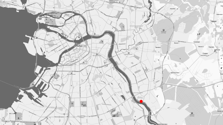
The housing project will be built in Sosnovka district, near the Utkina Creek – the latter is probably familiar to a lot of Russian people thanks to a Boris Grebenshchikov song, which indirectly describes this place as a problem area. As one can easily guess, this place used to be a pine forest, a large portion of which actually survived – the territory of Alexander Chernov’s dacha, handed over to “Radio Center #3” – and turned as a consequence into a restricted area.

The district, where the construction site is situated, opens up on the Oktyabrskaya Embankment – this is the former settlement “Svet Rabochim” (“Light to the Workers”), which was essentially a housing project of the State District Power Plant “Krasniy Oktyabr” (“Red October”), consisting of “German” three-story houses built in the 1920-1930’s, “Khrushchev” houses, and slightly taller “Stalin” buildings.

The housing complex on the Oktyabrskaya Embankment
Copyright: © Anatoly Stolyarchuk Architectural Studio


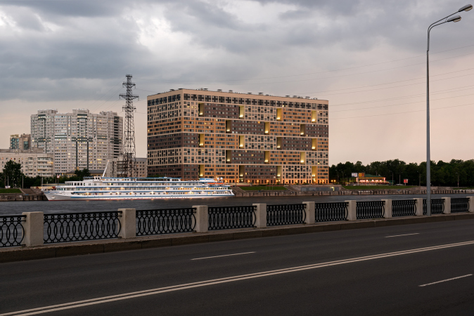
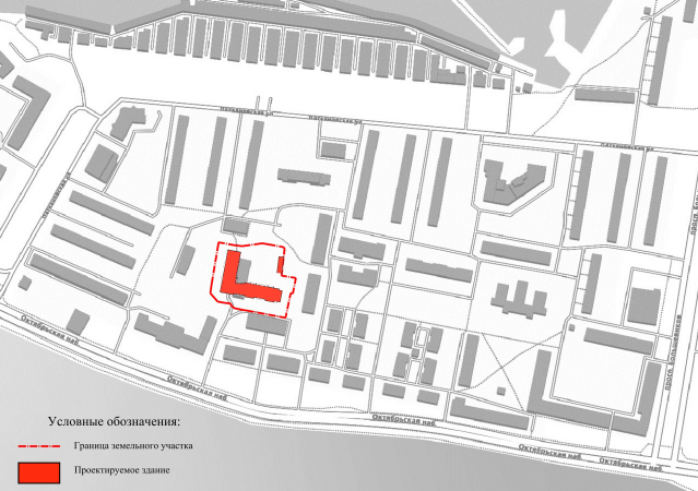
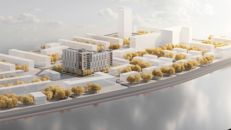
In this part of the city, the right bank of the Neva River, unlike the left one, filled with residential complexes of megalithic proportions, keeps so far human-friendly scale, and little green streets and yards, not overcrowded with cars. However, this area is also growing denser by degrees. For example, in 2007, a 25-story house was wedged into the city block in question; a little closer to the embankment, the housing complex Veren is being built, designed by Studio 44. As for the house designed by Anatoly Stolyarchuk, it is situated on the third line from the embankment, in the very center of the “little town”. And this location actually presented the main designing challenges.

  • zooming
    1 / 3
    Multifunctional housing project “Megalit”. Construction, 2016
    Copyright: © Eugene Gerasimov and Partners
  • zooming
    2 / 3
    The left bank of the Neva River. The housing complex on the Oktyabrskaya Embankment
    Copyright: © Anatoly Stolyarchuk Architectural Studio
  • zooming
    3 / 3
    The housing complex on the Oktyabrskaya Embankment
    Copyright: © Anatoly Stolyarchuk Architectural Studio


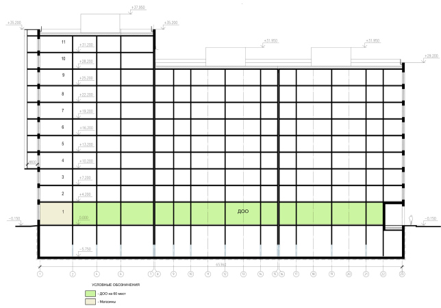
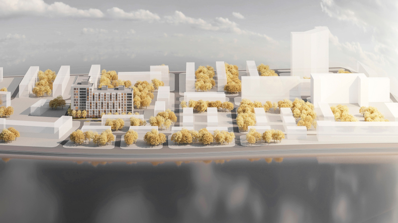
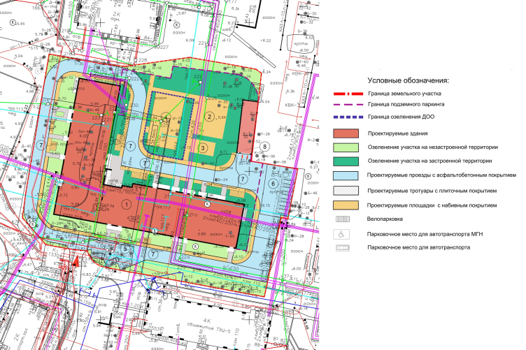
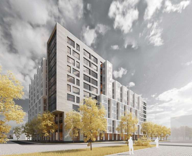
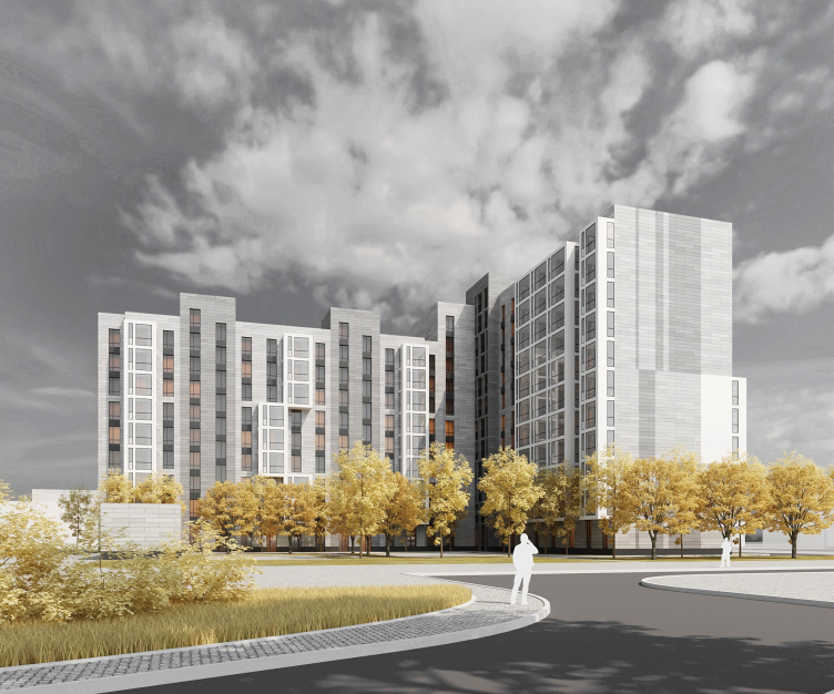
First of all, the house steps back, yet it will still be quite a highlight, because it is going to be about two or three times higher than the surrounding buildings. Its configuration is the only possible solution under the technical and economic performance conditions and insolation requirements. Two of its sections are turned in the direction of the embankment, and yet another one goes into the depth of the block; together, they form an L-shaped plan that makes it possible to avoid overshadowing the apartments of the neighboring houses. But then again, such positioning corresponds to the latitudinal orientation of the entire area. On a small land plot, the architects were able to place a little yard with playgrounds, and a kindergarten for two groups of children – it occupies the whole first floor of the unit that has windows gazing south — an entrance pavilion for driving into the underground parking garage, and everything else that was included into building code – driveways, setbacks, parking lots, etc.

The housing complex on the Oktyabrskaya Embankment
Copyright: © Anatoly Stolyarchuk Architectural Studio

We are covering this in such great detail because working with land plots that look like an unsolvable equation, became one of the trademark specialties of Anatoly Stolyarchuk Architectural Studio. A similar situation was there with the house on the Prilukskaya Street, a residential complex on the Sofiyskaya Street, and many others. As a rule, the company delivers a pure form, looking at which one does not even suspect what it took to “stretch” this multistory house on a small land plot amidst preexisting environment.

The housing complex on the Oktyabrskaya Embankment
Copyright: © Anatoly Stolyarchuk Architectural Studio

The facade solutions, again, are of the company’s trademark kind – they respond to the context and balance it off with rhythm and proportions, without verbatim quotes or imitations, speaking in the language of modern architecture.

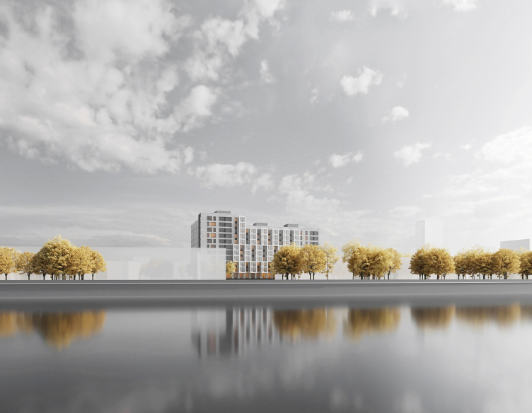
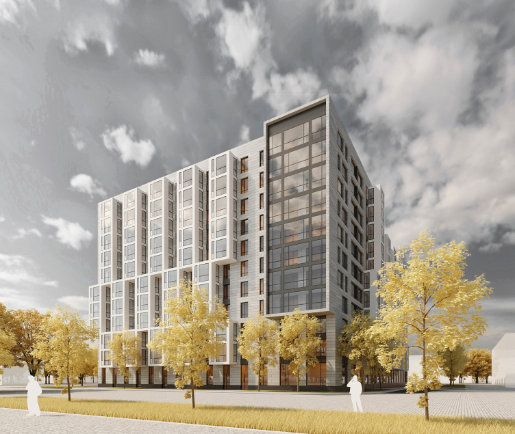
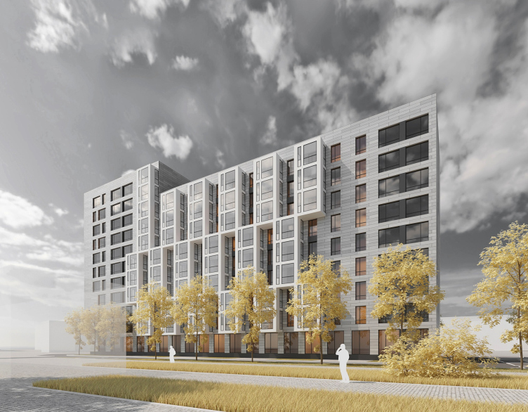
The architects treat the L-shaped volume of the building as a two-layer one: it has a “basis” of the neutral gray tone, walls, covered with tiles of horizontal proportions in two tones, lighter and darker – and the light matter of the glazed stanzas, which consist of white frames and glass. The “basis” behaves in an extremely neutral way, only on the spatial pivot of the corner appears a large modernist cantilever with a “television” stained glass facade that, nonetheless, takes on the role of the house’s main highlight: this way, the house gazes past the river and in the direction of the center of the city.

The housing complex on the Oktyabrskaya Embankment
Copyright: © Anatoly Stolyarchuk Architectural Studio

There is no actual entrance underneath the cantilever, only the side wall of the kindergarten, so this solution is not so much functional as an “image” and “plastique” one, yet still essential in this particular case: it accentuates the corner, specifically for those who drive down the embankment. The “television” stained glass facade is composed of glazed recessed balconies, the same kind that forms the strokes of the large horizontals left and right of the facade that stretches along the embankment.

The housing complex on the Oktyabrskaya Embankment
Copyright: © Anatoly Stolyarchuk Architectural Studio

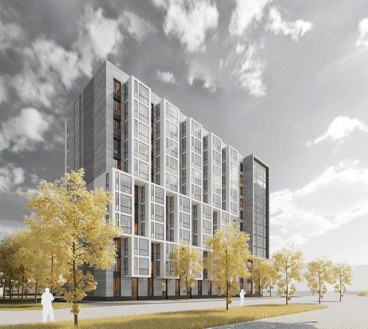
White recessed balconies also appear in the center, on the elongated facades of the slabs; they are grouped into vertical blocks of threes and fives, and are arranged in a staggered order: this way, the architects, on the one hand, avoid the proverbial “thermometer” effect created by vertical groups of glazed recessed balconies, and, on the other hand, give the facade some expressive plastique of ledges and recessions, which produces a regular play of light and shade, at the same time providing each of the apartments with a full amount of insolation, 6 square meters per apartment on average.

The housing complex on the Oktyabrskaya Embankment
Copyright: © Anatoly Stolyarchuk Architectural Studio

In the yard, where the verticals of the utility lines are plainly seen, the rhythm is more reserved, yet new themes appear – for example, fine mesh of white cells, and the composite character of the building is felt more strongly.

The housing complex on the Oktyabrskaya Embankment
Copyright: © Anatoly Stolyarchuk Architectural Studio

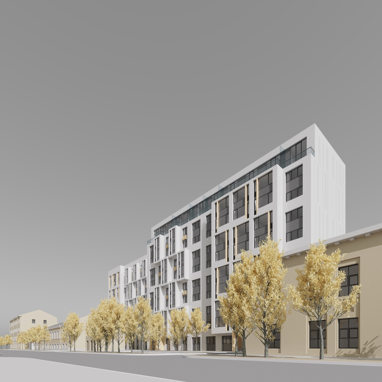
It must be noted that the staggered compositions of recessed balconies become the signature technique of Anatoly Stolyarchuk’s; this is not the first time he works with this theme, and each of his solutions is a little bit different. For example, in the hotel on the Veteranov Avenue, the checkered pattern of the glazed recessed balconies is much denser, but it is diluted by backlights and brass finish. In the house on the Prilukskaya Street, the recessed balconies are accentuated by slim verticals.

The housing complex on the Oktyabrskaya Embankment
Copyright: © Anatoly Stolyarchuk Architectural Studio

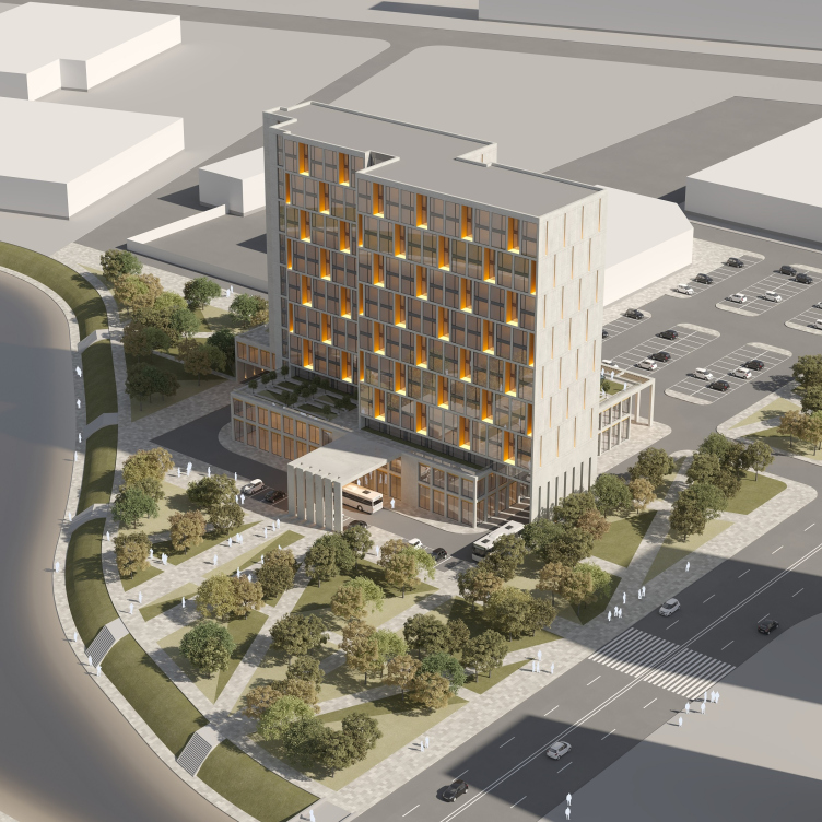
3-star mixed-use hotel complex
Copyright: © ​Anatoly Stolyarchuk Architectural Studio


On the Oktyabrskaya, the balconies have almost a perfectly cubical shape, and are prominently articulated. In addition, the varying height of the stacks allows the house to better respond to the surrounding buildings, “imbibing” their typology.

The housing project on the Prilukskaya Street
Copyright: © Anatoly Stolyarchuk Architectural Studio


Anatoly Stolyarchuk believes that modernizing the old panoramas is inevitable; this process cannot be stopped. And this process also yields certain benefits: the access roads are going to be overhauled, the nearby territory will be organized, and, as was already said, a new kindergarten will appear. There is almost no doubt that this house of a higher class will give this area some extra momentum for development, as well as will set of the already existing high-rises. 

A couple of years back, infill development as a positive factor was talked about by the Saint Petersburg office of MLA+: according to estimates, about 77 million dollars’ worth of apartments can be built within the “body” of the city. If this potential is to be used, Saint Petersburg can stay within its boundaries for another ten years. This infill development thing, must be, of course, organized in a smart way: the architects must carefully select and match the new functions, making sure that they correspond to the construction norms and the surrounding context. And in this particular instance we are seeing a fine example of such humane work: a considerate to its context, and doubtlessly well-balanced house, whose height is not much of a drawback, really.
The housing complex on the Oktyabrskaya Embankment
Copyright: © Anatoly Stolyarchuk Architectural Studio
  • zooming
    1 / 9
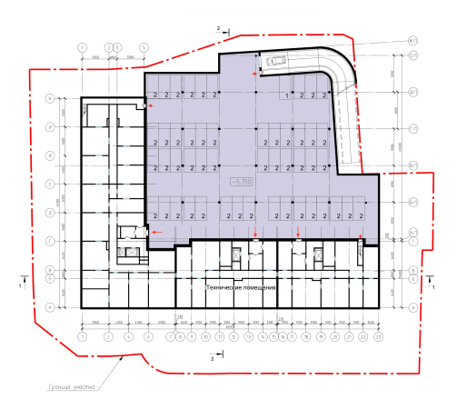
    Plan of the parking lot. The housing complex on the Oktyabrskaya Embankment
    Copyright: © Anatoly Stolyarchuk Architectural Studio
  • zooming
    2 / 9
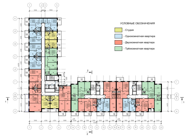
    Plan of the 1st floor. The housing complex on the Oktyabrskaya Embankment
    Copyright: © Anatoly Stolyarchuk Architectural Studio
  • zooming
    3 / 9
    Plan of the 2nd floor. The housing complex on the Oktyabrskaya Embankment
    Copyright: © Anatoly Stolyarchuk Architectural Studio
  • zooming
    4 / 9
    Plan of the 3rd floor. The housing complex on the Oktyabrskaya Embankment
    Copyright: © Anatoly Stolyarchuk Architectural Studio
  • zooming
    5 / 9
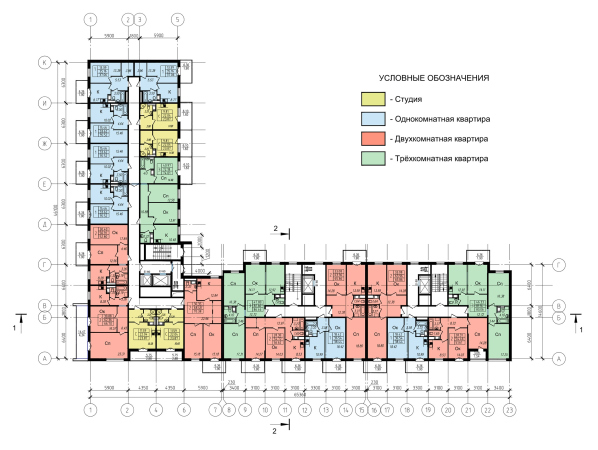
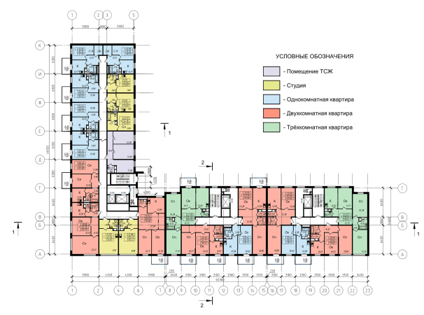
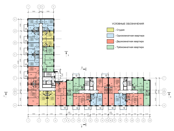
    Plans of the 4th, 5th, and 6th floors. The housing complex on the Oktyabrskaya Embankment
    Copyright: © Anatoly Stolyarchuk Architectural Studio
  • zooming
    6 / 9
    Plans of the 7th, 8th, and 9th floors. The housing complex on the Oktyabrskaya Embankment
    Copyright: © Anatoly Stolyarchuk Architectural Studio
  • zooming
    7 / 9
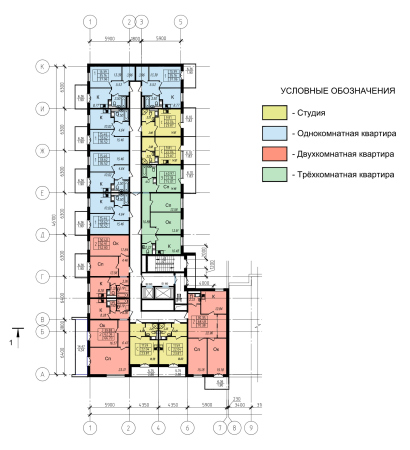
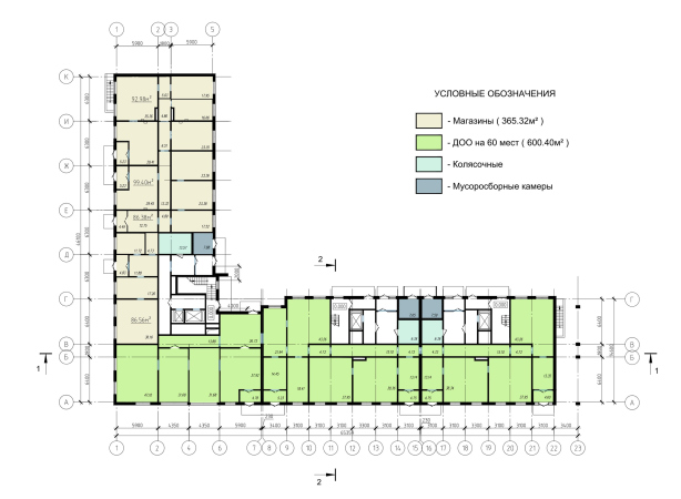
    Plan of the 10th floor. The housing complex on the Oktyabrskaya Embankment
    Copyright: © Anatoly Stolyarchuk Architectural Studio
  • zooming
    8 / 9
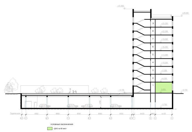
    Section view #1. The housing complex on the Oktyabrskaya Embankment
    Copyright: © Anatoly Stolyarchuk Architectural Studio
  • zooming
    9 / 9
    Section view #2. The housing complex on the Oktyabrskaya Embankment
    Copyright: © Anatoly Stolyarchuk Architectural Studio

30 March 2020

Headlines now
The Golden Crown
The concept for a dental clinic in Yekaterinburg, developed by CNTR Studio, revolves around the idea of a “mouth full of gold”: pristine white porcelain stoneware walls are complemented by matte brass details. To avoid an overly literal interpretation, the architects focused on the building’s proportions, skillfully navigating between sunlight requirements and fire safety regulations.
Flexibility and Integration
Not long ago, we covered the project for the fourth phase of the ÁLIA residential complex, designed by APEX. Now, we’ve been shown different fence concepts they developed to enclose the complex’s private courtyards, incorporating a variety of public functions. We believe that the sheer fact that the complex’s architects were involved in such a detail as fencing speaks volumes.
A Step Forward
The HIDE residential complex represents a major milestone for ADM architects and their leaders Andrey Romanov and Ekaterina Kuznetsova in their quest for a fresh high-rise aesthetic – one that is flexible and layered, capable of bringing vibrancy to mass and silhouette while shaping form. Over recent years, this approach has become ADM’s “signature style”, with the golden HIDE tower playing a pivotal role in its evolution. Here, we delve into the project’s story, explore the details of the complex’s design, and uncover its core essence.
Gold in the Sands
A new office for a transcontinental company specializing in resource extraction and processing has opened in Dubai. Designed by T+T Architects, masters of creating spaces that are contemporary, diverse, flexible, and original, this project exemplifies their expertise. On the executive floor, a massive brass-clad partition dominates, while layered textures of compressed earth create a contextually resonant backdrop.
Layers and Levels of Flight
This project goes way back – Reserve Union won this architectural competition at the end of 2011, and the building was completed in 2018, so it’s practically “archival”. However, despite being relatively unknown, the building can hardly be considered “dated” and remains a prime example of architectural expression, particularly in the headquarters genre. And it’s especially fitting for an aviation company office. In some ways, it resembles the Aeroflot headquarters at Sheremetyevo but with its own unique identity, following the signature style of Vladimir Plotkin. In this article, we take an in-depth look at the United Aircraft Corporation (UAC) headquarters in the Moscow agglomeration town of Zhukovsky, supplemented by recent photographs from Alexey Naroditsky – a shoot that became only recently possible due to the fact that improvements were finally made in the surrounding area.
Light and Shadow
In this article, we delve into the architectural design of the “Chaika” house by DNK ag architects, which was recently completed in 2023 as part of the collection of signature designs at ZILArt. As is well-known, all the buildings in this complex follow a design code, yet each one is distinct. This particular building stands out not only for its whiteness and minimalism but also for the refined use of a limited number of techniques that, together, create what can confidently be called synergy.
Casus Novae
A master plan was developed for a large residential area with a name of “DNS City”, but now that its implementation began, the plan has been arbitrarily reformatted and replaced with something that, while similar on the surface, is actually quite different. This is not the first time such a thing happens, but it’s always frustrating. With permission from the author, we are sharing Maria Elkina’s post.
Treasure Hunting
The GAFA bureau, in collaboration with Tegola and Arkhitail, organized an expedition to the island of Kilpola in Karelia as part of Moskomarkhitektura’s “Open City” festival. There, amidst moss and rocks, the students sought answers to questions like: what is the sacred, where does it dwell, and what sustains it? Assisting the participants in this quest were landscape engineer Evgeny Levin, artist Nicholas Roerich, a moose, and the lack of cellular connection. Here’s how the story unfolded.
Depths of the Earth, Streams of Water
In the Malaya Okhta district, the Akzent building, designed by Stepan Liphart, was constructed. It follows a classic tripartite structure, yet it’s what you might call “hand-drawn”: each façade is unique in its form and details, some of which aren’t immediately noticeable. In this article, we explore the context and, together with the architect, delve into how the form was developed.
Fir Tree Dynamics
The “Airports of Region” holding is planning to build an airport in Karachay-Cherkessia, aiming to make the Arkhyz and Dombay resorts more accessible to travelers. The project that won in an invitation-only competition, submitted by Sergey Nikeshkin’s KPLN, blends natural imagery inspired by the shape of a conifer seed, open-air waiting spaces, majestic large trees, and a green roof elevated on needle-like columns. The result is both nature-inspired and WOW.
​A Brick Shell
In the process of designing a clubhouse situated among pine trees in a prestigious suburban area near Moscow, the architectural firm “A.Len” did the façade design part. The combination of different types of brick and masonry correlates with the volumetric and plastique solutions, further enhanced by the inclusion of wood-painted fragments and metal “glazing”.
Word Forms
ATRIUM architects love ambitious challenges, and for the firm’s thirtieth anniversary, they boldly play a game of words with an exhibition that dives deep into a self-created vocabulary. They immerse their projects – especially art installations – into this glossary, as if plunging into a current of their own. You feel as if you’re flowing through the veins of pure art, immersed in a universe of vertical cities, educational spaces – of which the architects are true masters – and the cultural codes of various locations. But what truly captivates is the bold statement that Vera Butko and Anton Nadtochy make, both through their work and this exhibition: architecture, above all, is art – the art of working with form and space.
Flexibility and Acuteness of Modernity
Luxurious, fluid, large “kokoshniks” and spiral barrel columns, as if made from colorful chewing gum: there seem to be no other mansion like this in Moscow, designed in the “Neo-Russian-Modern” style. And the “Teremok” on Malaya Kaluzhskaya, previously somewhat obscure, has “come alive with new colors” and gained visibility after its restoration for the office of the “architectural ecosystem” as the architects love to call themselves. It’s evident that Julius Borisov and the architects at UNK put their hearts into finding this new office and bringing it up to date. Let’s delve into the paradoxes of this mansion’s history and its plasticity. Spoiler: two versions of modernity meet here, both balancing on the razor’s edge of “what’s current”.
Yuri Vissarionov: “A modular house does not belong to the land”
It belongs to space, or to the air... It turns out that 3D printing is more effective when combined with a modular approach: the house is built in a workshop and then adapted to the site, including on uneven terrain. Yuri Vissarionov shares his latest experience in designing tourist complexes, both in central Russia and in the south. These include houseboats, homes printed from lightweight concrete using a 3D printer, and, of course, frame houses.
​Moscow’s First
“The quality of education largely depends on the quality of the educational environment”. This principle of the last decade has been realized by Sergey Skuratov in the project for the First Moscow Gymnasium on Rostovskaya Embankment in the Khamovniki district. The building seamlessly integrates into the complex urban landscape, responding both to the pedestrian flow of the city and the quiet alleyways. It skillfully takes advantage of the height differences and aligns with modern trends in educational space design. Let’s take a closer look.
Looking at the Water
The site of Villa Sonata stretches from the road to the water’s edge, offering its own shoreline, pier, and a picturesque river panorama. To reveal these sweeping views, Roman Leonidov “cut” the façade diagonally parallel to the river, thus getting two main axes for the house and, consequently, “two heads”. The internal core – two double-height spaces, a living room and a conservatory, with a “bridge” above them – makes the house both “transparent” and filled with light.
The White Wing
Well, it’s not exactly white. It’s more of a beige, white-stone structure that plays with the color of limestone – smoother surfaces are lighter, while rougher ones are darker. This wing unites various elements: it absorbs and interprets the surrounding themes. It responds to everything, yet maintains a cohesive expression – a challenging task! – while also incorporating recognizable features of its own, such as the dynamic cuts at the bottom, top, and middle.
Urban Dunes
The XSA Ramps team designed and built a three-part sports hub for a park in Rostov-on-Don, welcoming people of all ages and fitness levels. The skate plaza, pump track, and playground are all meticulously crafted with details that attract a diverse range of visitors. The technical execution of the shapes and slopes transforms this space into a kind of sculptural composition.
Proportional Growth
The project for the fourth phase of the ÁLIA residential area has been announced. The buildings are situated on an elongated plot – almost a “ray” that shoots out from the center of the area towards the river. Their layout reflects both a response to Moscow’s architectural preferences over the past 15 years, shifting “from blocks to towers”, and an interpretation of the neighboring business park designed by SOM. Additionally, the best apartments here are not located at the very top but closer to the middle, forming a glowing “waistline”.
The “Staircase” Building
In designing the “Details” residential complex in New Moscow, Rais Baishev spiced up the now-popular Moscow theme of a “courtyard” building with an idea drawn from the surrealist drawings by Maurits Escher. He envisioned the stepped silhouettes and descending slopes as a metaphysical mega-staircase, creating a key void within the courtyard that gave the project an internal “spine”. This concept is felt both in the building’s silhouette and on its façades.
Projection of the Quarter
No one doubted that the building that Vladimir Plotkin designed as part of the “Garden Quarters” would be the most modernist of all. And it turned out just that way: while adhering to the common design code, the building successfully combines brick and white stone, rhythmically responding to the neighboring building designed by Ostozhenka, yet tactfully and persistently making a few statements of its own. This includes the projection of the ideal urban development composition “14–9–6”, which can be found right next door, mathematical calculations, including those for various types of terraces (and perhaps the only reminder of the Soviet past of the Kauchuk rubber factory!), and the white “cross-stitch” pattern of the façade grid.
Domus Aurea
In this issue, we examine the “Tessinsky-1” house, designed by Sergey Skuratov and completed in 2023. Located in the middle of the Serebryanicheskaya Embankment district, at the intersection of its main streets, this house assumes a sort of “nodal” role: it not only responds to everything around it and preserves many memories of the former EMA factory within itself, but it weaves all this into a newly directed pattern, reconciling bright “gold” and dark-colored brick, largely with the help of the new, modern-yet-archaic Columba brick, which, come to think about it, is the most precious element here.
The Chimney of Nikola-Lenivets
In this issue, we are examining the “Obelisk House” designed by KATARSIS and built for the Arkhstoyanie 2023 festival. However, it was only finished later on, and this is why we are examining it now. It seems to us that after the “Obelisk House” appeared in Nikola-Lenivets, a dialogue and a few inner connections appeared between the temporary structures built here. These houses no longer look like “accidental neighbors”, more of which below.
​Periscope by the Bay
The jury awarded the second place in the competition for a public and cultural center in Petropavlovsk-Kamchatsky to the companies GORA (“Mountain”) and M4. In the consortium’s proposal, the building resembles a sperm whale with a calf swimming next to it or a periscope, whose lenses capture the most spectacular views from the surrounding landscape.
From Arcs to Dolmens
While working on the competition project for Petropavlovsk-Kamchatsky, ASADOV Architects prioritized the value of the natural and urban environment, aiming to preserve the balance of the location while minimizing the resemblance of the volume that they designed to a “traditional building”. The task was challenging, and the architects created three versions, one of which having been developed after the competition, where their main proposal took third place. However, the point of interest here is not the competition result but the continuity of creative thinking.
Hide and Seek
The ID Moskovskiy house, designed by Stepan Liphart in St. Petersburg, in the courtyards near Moskovskiy Avenue beyond the Obvodny Canal and recently completed, is notable for several reasons. Firstly, it has been realized with considerable accuracy, which is particularly significant as this is the first building where the architect was responsible not only for the facades but also for the layouts, allowing for better integration between the two. On the other hand, this building is interesting as an example of the “germination” of new architecture in the city: it draws on the best examples from the neighborhood and becomes an improved and developed sum of ideas found by the architect in the surrounding context.
The Big Twelve
Yesterday, the winners of the Moscow Mayor’s Architecture Award were announced and honored. Let’s take a look at what was awarded and, in some cases, even critique this esteemed award. After all, there is always room for improvement, right?
Above the Golden Horn
The residential complex “Philosophy” designed by T+T architects in Vladivostok, is one of the new projects in the “Golubinaya Pad” area, changing its development philosophy (pun intended) from single houses to a comprehensive approach. The buildings are organized along public streets, varying in height and format, with one house even executed in gallery typology, featuring a cantilever leaning on an art object.
Nuanced Alternative
How can you rhyme a square and space? Easily! But to do so, you need to rhyme everything you can possibly think of: weave everything together, like in a tensegrity structure, and find your own optics too. The new exhibition at GES-2 does just that, offering its visitor a new perspective on the history of art spanning 150 years, infused with the hope for endless multiplicity of worlds and art histories. Read on to see how this is achieved and how the exhibition design by Evgeny Ace contributes to it.
Blinds for Ice
An ice arena has been constructed in Domodedovo based on a project by Yuri Vissarionov Architects. To prevent the long façade, a technical requirement for winter sports facilities, from appearing monotonous, the architects proposed the use of suspended structures with multidirectional slats. This design protects the ice from direct sunlight while giving the wall texture and detail.