По-русски

​Honey and Copper

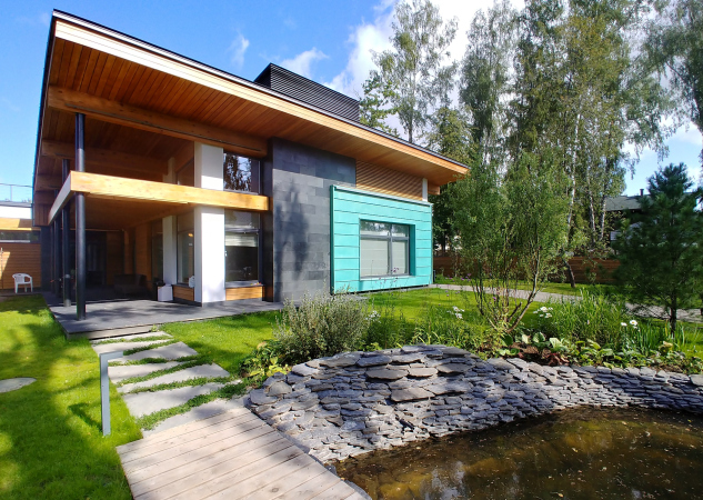
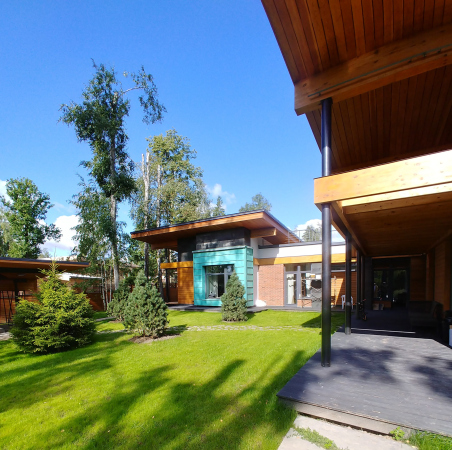
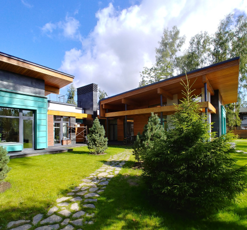
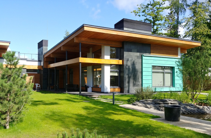
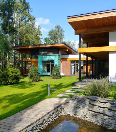
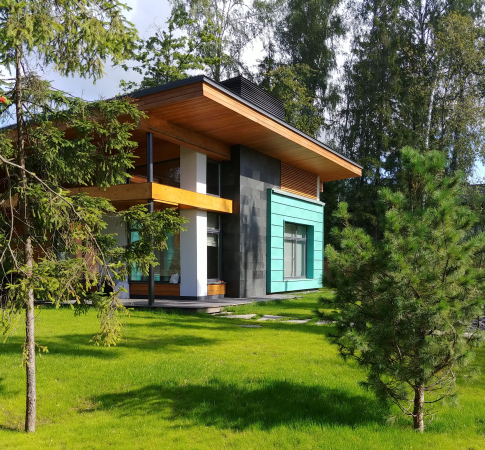
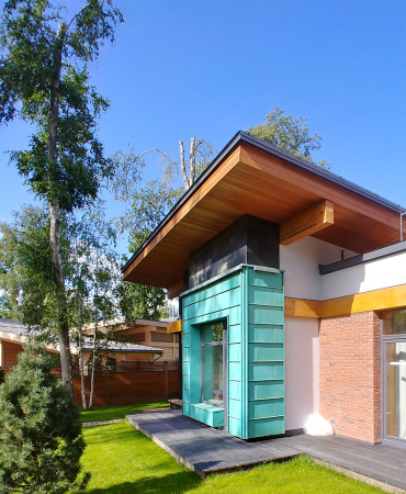
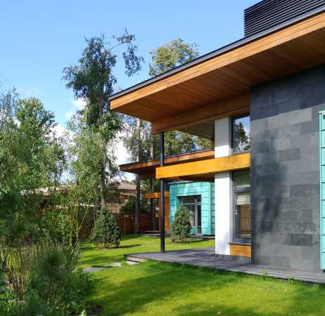
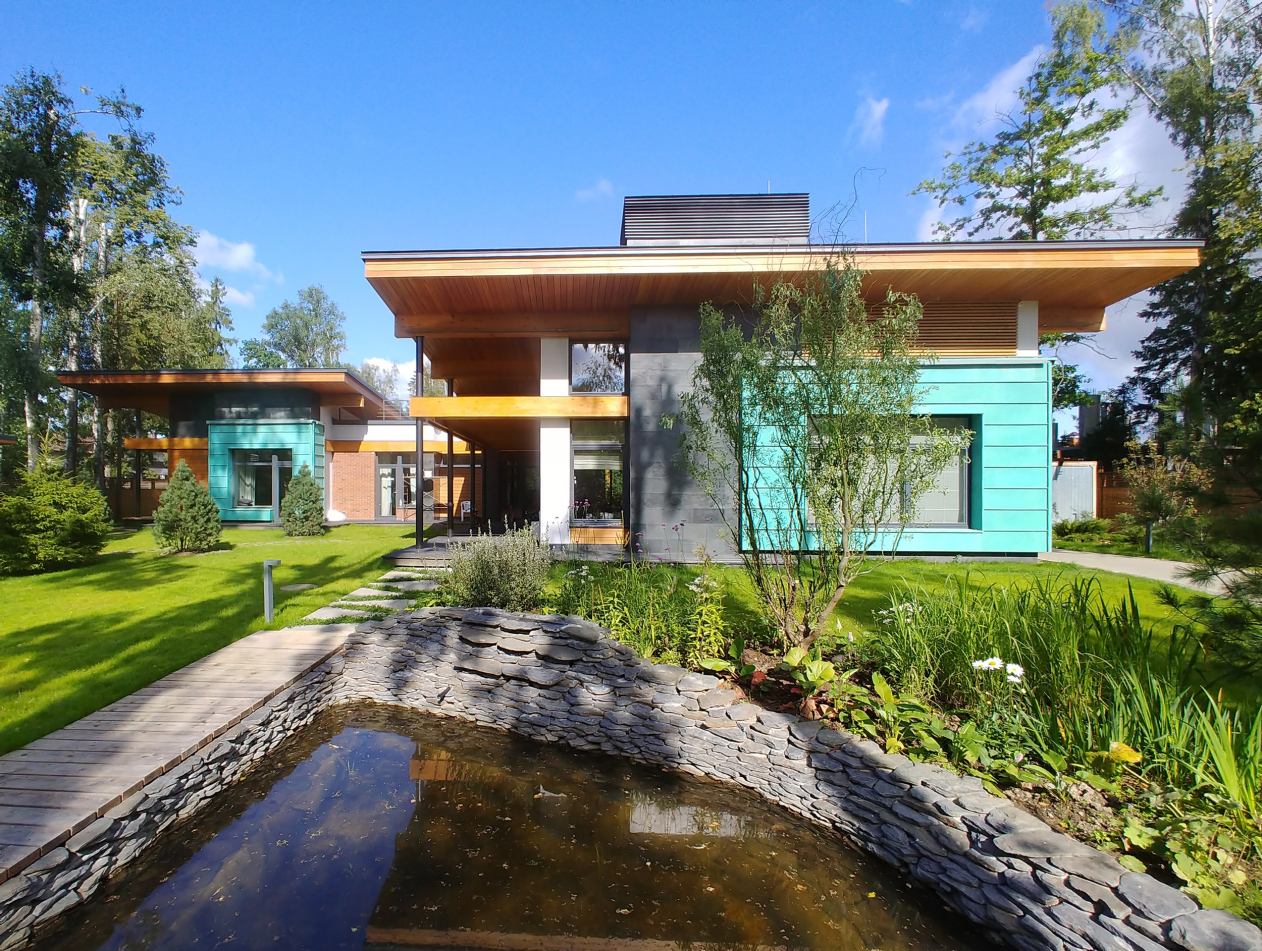
In the Moscow area, the architect Roman Leonidov designed the “Cool House” residence, very much in the spirit of Frank Lloyd Wright, spreading it parallel to the ground, and accentuating the horizontal lines in it. The color composition is based on juxtaposition of warm wood of a honey hue and cold copper blue.

18 February 2020
News
mainImg
The name Cool House is not connected with the cold color of copper in any way; it’s just that the first word is part of the client’s surname. Belonging to the family of a top manager of a large company, the house is situated in the Near-Moscow area, meaning, one can easily travel to work or to school from it, and therefore, use it as the place of permanent residence. The house was in construction for 4 years. It is surrounded by a domesticated settlement, neatly landscaped, and without tall fences; therefore, it was possible to turn the grand facades towards the road. The house is a single story one. A while ago, staircases were quite popular, but now they fell out of fashion; besides, climbing up and down the stairs all the time is not really convenient, and, if the size of the land site and the budget permit, it is much more convenient to move around horizontally. Thus, the volumes of the house sprawl out horizontally, very much in the spirit of a “house in the prairies”, rising in height wherever necessary and getting a double height.

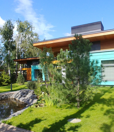
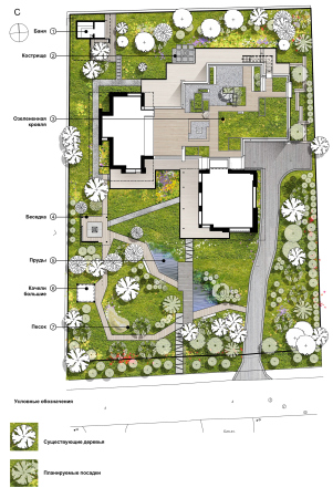
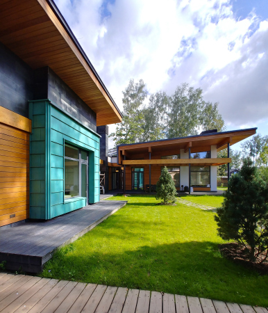
The house is placed on the land plot in very ingenious way. On the plan, it looks like a cross of an irregular shape, dividing the garden into four unequal areas. In the largest area (bottom left corner of the plan), there a grand lawn on the uneven terrain, with a picturesque pond surrounded by trees, a gazebo, a swing, and other pleasant things of such kind. There is something scenic about this lawn. The glass doors of the main rooms of the house exit here: the living room, the master’s bedroom, and the children’s rooms, from which the residents can appear very much like actors on stage.

  • zooming
    1 / 3
    Cool House
    Copyright: Photograph © Roman Leonidov
  • zooming
    2 / 3
    Cool House
    Copyright: Photograph © Roman Leonidov
  • zooming
    3 / 3
    Cool House
    Copyright: Photograph © Roman Leonidov


The second area (upper left corner) is essentially a quieter secret garden for family recreation, with a secluded terrace, to where one can exit from the spa or two baths (one inside the house, the other outside. The house becomes a natural border between different parts of the garden – and one must admit that it’s a very effective way to make sure that one’s gaze does not gets stopped by a fence all the time, which otherwise would have been inevitable on a 23 hundred square meter land plot. This way, however, pieces of a garden appear, many of which have panoramic glazing. Meaning – instead of a fence, one can watch life in the house behind the glass, as if one were inside an atrium.

  • zooming
    1 / 4
    Cool House
    Copyright: Photograph © Roman Leonidov
  • zooming
    2 / 4
    Cool House
    Copyright: Photograph © Roman Leonidov
  • zooming
    3 / 4
    Cool House
    Copyright: Photograph © Roman Leonidov
  • zooming
    4 / 4
    The landscaping plan. Cool House
    Copyright: © Studio of Roman Leonidov


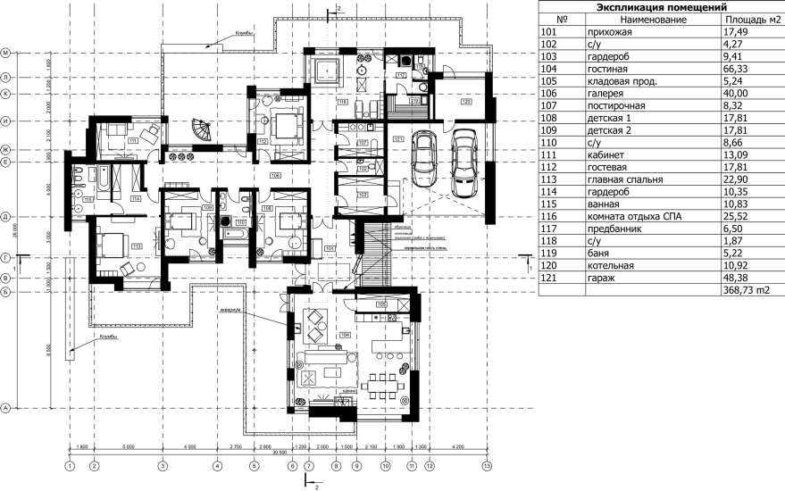
The cross-shaped form of the house also allowed the architects to make a designated car entrance on the right side of the plot. The entrance driveway comes up against a garage, joined by a boiler house and other maintenance rooms with individual entrances. This is also the place where the main entrance to the house is situated.

  • zooming
    Cool House
    Copyright: Photograph © Roman Leonidov
  • zooming
    Plan. Cool House
    Copyright: Photograph © Roman Leonidov


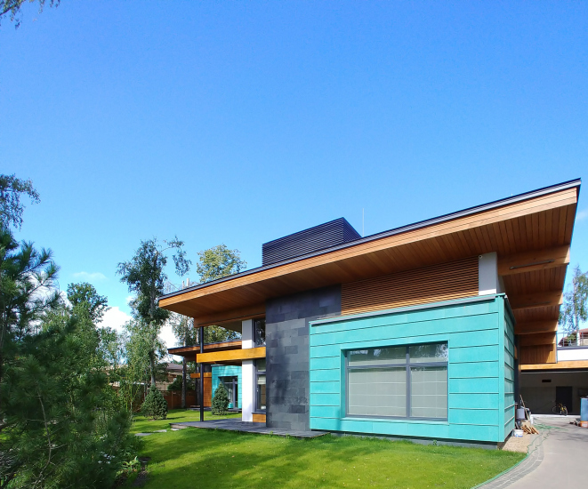
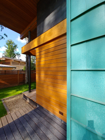
The grand part of the house consists of three blocks: the public, the children’s, and the parents’ ones. The recreation area with a guest room next to it is situated in the depth of the house. People who come or drive in are met by a tall public block with a single-slope “canopy” roof, which houses a large space that is both a living room, a dining room, a fireplace room, and a kitchen. On the facade, one can see the main motif that gave the image to the whole house: the warm honey-colored wood, set against turquoise patinated copper. The accentuated horizontals of the roof and the reinforcement beam are offset by white verticals of the corner and the slate-black chimney of the fireplace. The extra beam was introduced in order to reinforce the horizontals, which would make the composition tripartite. This “tripartite” principle is something that Roman Leonidov deems imperative for a private residence.

  • zooming
    1 / 3
    Cool House
    Copyright: Photograph © Roman Leonidov
  • zooming
    2 / 3
    Cool House
    Copyright: Photograph © Roman Leonidov
  • zooming
    3 / 3
    Cool House
    Copyright: Photograph © Roman Leonidov


A similar “honey and copper”, image yet on a smaller scale, marks the facade of the parents’ block: the same patinated copper and warm pinewood, the same horizontals, and the same upward sweep of the canopy roof. Also, in that remotest corner, in the most protected part of the house, one will find the master’s bedroom with a bath and the master’s study. 

At this point, I will allow myself a sociological digression. In his book “Pattern Language”, iconic for architects, Christopher Alexander writes that, in order to avoid quarrels, each of the spouses must have a private place of their own, plus a room for the two of them, plus the space for the entire family. In Russian homes, however, there is usually only one study – the man’s. Boudoirs are few and far between. But where does the mistress of the house has to work and recreate? Of course, this is question is not addressed to the architect, but, rather, to our gender reality.

As for the appearance of copper in the design project, Roman Leonidov explained it like this: “When we were discussing this project with the client, he indicated that the house was to be bright, joyful, and warm. And this meant that you needed a contrast, a cold accent. The honey hue of the pinewood looks all the warmer against the backdrop of cold patinated copper. In addition, copper is a great material to flank the building.”

  • zooming
    1 / 3
    Cool House
    Copyright: Photograph © Roman Leonidov
  • zooming
    2 / 3
    Cool House
    Copyright: Photograph © Roman Leonidov
  • zooming
    3 / 3
    Cool House
    Copyright: Photograph © Roman Leonidov


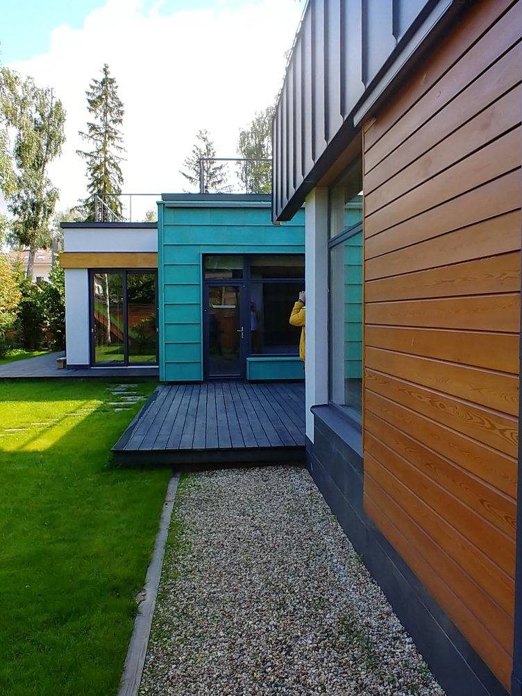
The public and the parents’ parts of the house are connected by a lower unit with the children’s rooms. Thematically, it is less dramatic than the copper facades, and it looks like a transition between the two larger units. Here, at the client’s request, the architect introduced brick – the fifth material (and the fifth color), which the architect himself deems excessive, at the same time admitting that it does add to the tactile feel of the house.

In the architectural form of Cool House, one can see a musical principle: the exposition of the main theme – “honey and copper” – is given in the main public building, then the middle part, the children’s room, is given in different materials, then the reprise is given in the parents’ block. Yet another place where the “honey and copper” theme sounds is the guest room, whose doors open to the minor garden at the back of the house.

Cool House
Copyright: Photograph © Roman Leonidov


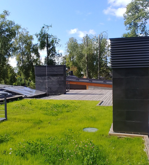
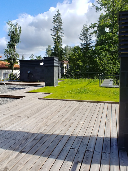
There are many terraces in the house. The building is surrounded by a boardwalk that gradually turns into a terrace under an awning near the living room, and a spacious terrace behind the house. And on the flat roof of the children’s part, the recreation area, and on the roof of the garage, there is yet another terrace, half wooden, half grass – in fact, yet another lawn commanding beautiful views of the surroundings.

  • zooming
    Cool House
    Copyright: Photograph © Roman Leonidov
  • zooming
    Cool House
    Copyright: Photograph © Roman Leonidov


In the volumetric composition, horizontals are highlighted. One of them runs in a yellow stripe over all of the facades, binding together the the public, children’s, and the parents’ units. Roman Leonidov regards horizontals as a necessary and natural condition of a private residence. The spirit of Frank Lloyd Wright, although without direct quoting, is felt quite strongly, and Roman Leonidov often says that “we all have been wounded by Wright.” Both in his early and late periods, the great American architect would avoid designing archetypal housing with prominent gable roofs, eyes of the windows and mouths of the doors; what he did was arrange the parallels of the roofs, windows, and podiums in respect to the ground, replacing the anthropomorphic with the landscape-related. Similarly, Roman Leonidov, in spite of all the variety of his projects, stays true to the horizontal approach when it comes to designing private residences.

18 February 2020

Headlines now
Flexibility and Integration
Not long ago, we covered the project for the fourth phase of the ÁLIA residential complex, designed by APEX. Now, we’ve been shown different fence concepts they developed to enclose the complex’s private courtyards, incorporating a variety of public functions. We believe that the sheer fact that the complex’s architects were involved in such a detail as fencing speaks volumes.
A Step Forward
The HIDE residential complex represents a major milestone for ADM architects and their leaders Andrey Romanov and Ekaterina Kuznetsova in their quest for a fresh high-rise aesthetic – one that is flexible and layered, capable of bringing vibrancy to mass and silhouette while shaping form. Over recent years, this approach has become ADM’s “signature style”, with the golden HIDE tower playing a pivotal role in its evolution. Here, we delve into the project’s story, explore the details of the complex’s design, and uncover its core essence.
Gold in the Sands
A new office for a transcontinental company specializing in resource extraction and processing has opened in Dubai. Designed by T+T Architects, masters of creating spaces that are contemporary, diverse, flexible, and original, this project exemplifies their expertise. On the executive floor, a massive brass-clad partition dominates, while layered textures of compressed earth create a contextually resonant backdrop.
Layers and Levels of Flight
This project goes way back – Reserve Union won this architectural competition at the end of 2011, and the building was completed in 2018, so it’s practically “archival”. However, despite being relatively unknown, the building can hardly be considered “dated” and remains a prime example of architectural expression, particularly in the headquarters genre. And it’s especially fitting for an aviation company office. In some ways, it resembles the Aeroflot headquarters at Sheremetyevo but with its own unique identity, following the signature style of Vladimir Plotkin. In this article, we take an in-depth look at the United Aircraft Corporation (UAC) headquarters in the Moscow agglomeration town of Zhukovsky, supplemented by recent photographs from Alexey Naroditsky – a shoot that became only recently possible due to the fact that improvements were finally made in the surrounding area.
Light and Shadow
In this article, we delve into the architectural design of the “Chaika” house by DNK ag architects, which was recently completed in 2023 as part of the collection of signature designs at ZILArt. As is well-known, all the buildings in this complex follow a design code, yet each one is distinct. This particular building stands out not only for its whiteness and minimalism but also for the refined use of a limited number of techniques that, together, create what can confidently be called synergy.
Casus Novae
A master plan was developed for a large residential area with a name of “DNS City”, but now that its implementation began, the plan has been arbitrarily reformatted and replaced with something that, while similar on the surface, is actually quite different. This is not the first time such a thing happens, but it’s always frustrating. With permission from the author, we are sharing Maria Elkina’s post.
Treasure Hunting
The GAFA bureau, in collaboration with Tegola and Arkhitail, organized an expedition to the island of Kilpola in Karelia as part of Moskomarkhitektura’s “Open City” festival. There, amidst moss and rocks, the students sought answers to questions like: what is the sacred, where does it dwell, and what sustains it? Assisting the participants in this quest were landscape engineer Evgeny Levin, artist Nicholas Roerich, a moose, and the lack of cellular connection. Here’s how the story unfolded.
Depths of the Earth, Streams of Water
In the Malaya Okhta district, the Akzent building, designed by Stepan Liphart, was constructed. It follows a classic tripartite structure, yet it’s what you might call “hand-drawn”: each façade is unique in its form and details, some of which aren’t immediately noticeable. In this article, we explore the context and, together with the architect, delve into how the form was developed.
Fir Tree Dynamics
The “Airports of Region” holding is planning to build an airport in Karachay-Cherkessia, aiming to make the Arkhyz and Dombay resorts more accessible to travelers. The project that won in an invitation-only competition, submitted by Sergey Nikeshkin’s KPLN, blends natural imagery inspired by the shape of a conifer seed, open-air waiting spaces, majestic large trees, and a green roof elevated on needle-like columns. The result is both nature-inspired and WOW.
​A Brick Shell
In the process of designing a clubhouse situated among pine trees in a prestigious suburban area near Moscow, the architectural firm “A.Len” did the façade design part. The combination of different types of brick and masonry correlates with the volumetric and plastique solutions, further enhanced by the inclusion of wood-painted fragments and metal “glazing”.
Word Forms
ATRIUM architects love ambitious challenges, and for the firm’s thirtieth anniversary, they boldly play a game of words with an exhibition that dives deep into a self-created vocabulary. They immerse their projects – especially art installations – into this glossary, as if plunging into a current of their own. You feel as if you’re flowing through the veins of pure art, immersed in a universe of vertical cities, educational spaces – of which the architects are true masters – and the cultural codes of various locations. But what truly captivates is the bold statement that Vera Butko and Anton Nadtochy make, both through their work and this exhibition: architecture, above all, is art – the art of working with form and space.
Flexibility and Acuteness of Modernity
Luxurious, fluid, large “kokoshniks” and spiral barrel columns, as if made from colorful chewing gum: there seem to be no other mansion like this in Moscow, designed in the “Neo-Russian-Modern” style. And the “Teremok” on Malaya Kaluzhskaya, previously somewhat obscure, has “come alive with new colors” and gained visibility after its restoration for the office of the “architectural ecosystem” as the architects love to call themselves. It’s evident that Julius Borisov and the architects at UNK put their hearts into finding this new office and bringing it up to date. Let’s delve into the paradoxes of this mansion’s history and its plasticity. Spoiler: two versions of modernity meet here, both balancing on the razor’s edge of “what’s current”.
Yuri Vissarionov: “A modular house does not belong to the land”
It belongs to space, or to the air... It turns out that 3D printing is more effective when combined with a modular approach: the house is built in a workshop and then adapted to the site, including on uneven terrain. Yuri Vissarionov shares his latest experience in designing tourist complexes, both in central Russia and in the south. These include houseboats, homes printed from lightweight concrete using a 3D printer, and, of course, frame houses.
​Moscow’s First
“The quality of education largely depends on the quality of the educational environment”. This principle of the last decade has been realized by Sergey Skuratov in the project for the First Moscow Gymnasium on Rostovskaya Embankment in the Khamovniki district. The building seamlessly integrates into the complex urban landscape, responding both to the pedestrian flow of the city and the quiet alleyways. It skillfully takes advantage of the height differences and aligns with modern trends in educational space design. Let’s take a closer look.
Looking at the Water
The site of Villa Sonata stretches from the road to the water’s edge, offering its own shoreline, pier, and a picturesque river panorama. To reveal these sweeping views, Roman Leonidov “cut” the façade diagonally parallel to the river, thus getting two main axes for the house and, consequently, “two heads”. The internal core – two double-height spaces, a living room and a conservatory, with a “bridge” above them – makes the house both “transparent” and filled with light.
The White Wing
Well, it’s not exactly white. It’s more of a beige, white-stone structure that plays with the color of limestone – smoother surfaces are lighter, while rougher ones are darker. This wing unites various elements: it absorbs and interprets the surrounding themes. It responds to everything, yet maintains a cohesive expression – a challenging task! – while also incorporating recognizable features of its own, such as the dynamic cuts at the bottom, top, and middle.
Urban Dunes
The XSA Ramps team designed and built a three-part sports hub for a park in Rostov-on-Don, welcoming people of all ages and fitness levels. The skate plaza, pump track, and playground are all meticulously crafted with details that attract a diverse range of visitors. The technical execution of the shapes and slopes transforms this space into a kind of sculptural composition.
Proportional Growth
The project for the fourth phase of the ÁLIA residential area has been announced. The buildings are situated on an elongated plot – almost a “ray” that shoots out from the center of the area towards the river. Their layout reflects both a response to Moscow’s architectural preferences over the past 15 years, shifting “from blocks to towers”, and an interpretation of the neighboring business park designed by SOM. Additionally, the best apartments here are not located at the very top but closer to the middle, forming a glowing “waistline”.
The “Staircase” Building
In designing the “Details” residential complex in New Moscow, Rais Baishev spiced up the now-popular Moscow theme of a “courtyard” building with an idea drawn from the surrealist drawings by Maurits Escher. He envisioned the stepped silhouettes and descending slopes as a metaphysical mega-staircase, creating a key void within the courtyard that gave the project an internal “spine”. This concept is felt both in the building’s silhouette and on its façades.
Projection of the Quarter
No one doubted that the building that Vladimir Plotkin designed as part of the “Garden Quarters” would be the most modernist of all. And it turned out just that way: while adhering to the common design code, the building successfully combines brick and white stone, rhythmically responding to the neighboring building designed by Ostozhenka, yet tactfully and persistently making a few statements of its own. This includes the projection of the ideal urban development composition “14–9–6”, which can be found right next door, mathematical calculations, including those for various types of terraces (and perhaps the only reminder of the Soviet past of the Kauchuk rubber factory!), and the white “cross-stitch” pattern of the façade grid.
Domus Aurea
In this issue, we examine the “Tessinsky-1” house, designed by Sergey Skuratov and completed in 2023. Located in the middle of the Serebryanicheskaya Embankment district, at the intersection of its main streets, this house assumes a sort of “nodal” role: it not only responds to everything around it and preserves many memories of the former EMA factory within itself, but it weaves all this into a newly directed pattern, reconciling bright “gold” and dark-colored brick, largely with the help of the new, modern-yet-archaic Columba brick, which, come to think about it, is the most precious element here.
The Chimney of Nikola-Lenivets
In this issue, we are examining the “Obelisk House” designed by KATARSIS and built for the Arkhstoyanie 2023 festival. However, it was only finished later on, and this is why we are examining it now. It seems to us that after the “Obelisk House” appeared in Nikola-Lenivets, a dialogue and a few inner connections appeared between the temporary structures built here. These houses no longer look like “accidental neighbors”, more of which below.
​Periscope by the Bay
The jury awarded the second place in the competition for a public and cultural center in Petropavlovsk-Kamchatsky to the companies GORA (“Mountain”) and M4. In the consortium’s proposal, the building resembles a sperm whale with a calf swimming next to it or a periscope, whose lenses capture the most spectacular views from the surrounding landscape.
From Arcs to Dolmens
While working on the competition project for Petropavlovsk-Kamchatsky, ASADOV Architects prioritized the value of the natural and urban environment, aiming to preserve the balance of the location while minimizing the resemblance of the volume that they designed to a “traditional building”. The task was challenging, and the architects created three versions, one of which having been developed after the competition, where their main proposal took third place. However, the point of interest here is not the competition result but the continuity of creative thinking.
Hide and Seek
The ID Moskovskiy house, designed by Stepan Liphart in St. Petersburg, in the courtyards near Moskovskiy Avenue beyond the Obvodny Canal and recently completed, is notable for several reasons. Firstly, it has been realized with considerable accuracy, which is particularly significant as this is the first building where the architect was responsible not only for the facades but also for the layouts, allowing for better integration between the two. On the other hand, this building is interesting as an example of the “germination” of new architecture in the city: it draws on the best examples from the neighborhood and becomes an improved and developed sum of ideas found by the architect in the surrounding context.
The Big Twelve
Yesterday, the winners of the Moscow Mayor’s Architecture Award were announced and honored. Let’s take a look at what was awarded and, in some cases, even critique this esteemed award. After all, there is always room for improvement, right?
Above the Golden Horn
The residential complex “Philosophy” designed by T+T architects in Vladivostok, is one of the new projects in the “Golubinaya Pad” area, changing its development philosophy (pun intended) from single houses to a comprehensive approach. The buildings are organized along public streets, varying in height and format, with one house even executed in gallery typology, featuring a cantilever leaning on an art object.
Nuanced Alternative
How can you rhyme a square and space? Easily! But to do so, you need to rhyme everything you can possibly think of: weave everything together, like in a tensegrity structure, and find your own optics too. The new exhibition at GES-2 does just that, offering its visitor a new perspective on the history of art spanning 150 years, infused with the hope for endless multiplicity of worlds and art histories. Read on to see how this is achieved and how the exhibition design by Evgeny Ace contributes to it.
Blinds for Ice
An ice arena has been constructed in Domodedovo based on a project by Yuri Vissarionov Architects. To prevent the long façade, a technical requirement for winter sports facilities, from appearing monotonous, the architects proposed the use of suspended structures with multidirectional slats. This design protects the ice from direct sunlight while giving the wall texture and detail.
Frozen Magma
A competition for the creation of a public and cultural center was held in Petropavlovsk-Kamchatsky. Three architectural companies made it to the final, and we consider it important to share about the work of each. Let’s start with the winner – the consortium led by Wowhaus.