По-русски

​The Ring on the Saisara Lake

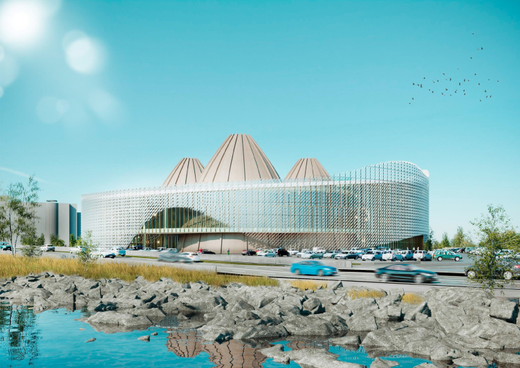
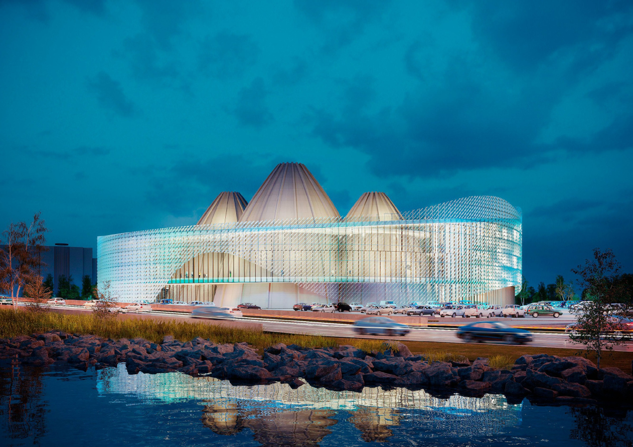
The building of the Philharmonic Hall and the Theater of Yakut Epos, standing on the shore of the sacred lake, is inscribed into an epic circle and contains three volumes, reminiscent of the traditional national housing. The roof is akin to the Alaas – a Yakut village standing around a lake. In spite of its rich conceptual agenda, the project remains volumetrically abstract, and keeps up a light form, making the most of its transparency, multiple layers, and reflections.

27 January 2020
Object
mainImg
The project of the building that unites the State Philharmonic Hall of Yakutia and the Arctic Center of Epos and Fine Arts was commissioned to Reserve Union by the republic administration a little less than a year ago, in the end of February 2019. One of its prime movers and the heart and soul of the project is Andrey Borisov, the former C.E.O of the Sakha theater, the former C.E.O of the Olonkho theater, named after the Yakut epos, the former minister of culture and spiritual development of the republic in 1990-2014, and now a State Councilor.

By May 2019, the first versions of the concept were ready; in summer, a second version was discussed, and, finally, in mid-October, the project got an architectural and urban planning image, which made it possible to publish relatively extensive information about it. Nevertheless, the project is still being developed and updated, and the architects are promising to show a more detailed version later on.

International Center of Epics of Eurasian peoples in Yakutsk
Copyright: © Creative Union ‘Reserve’

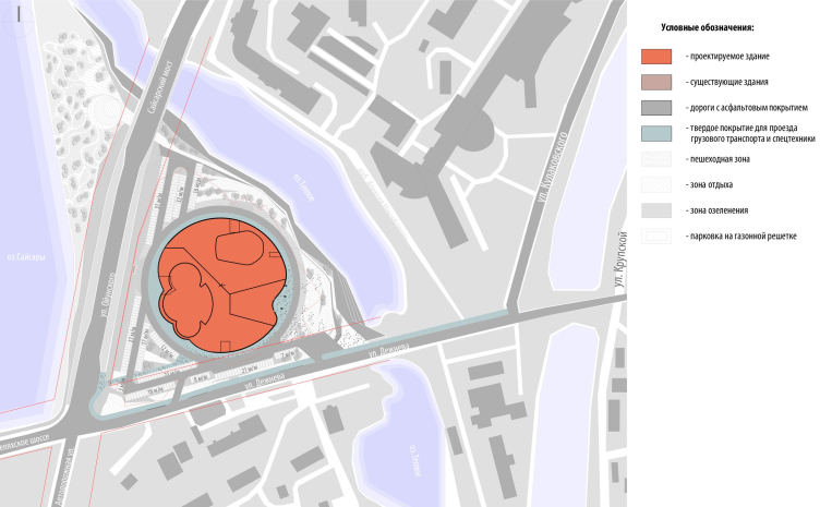
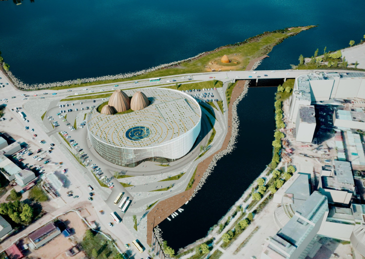
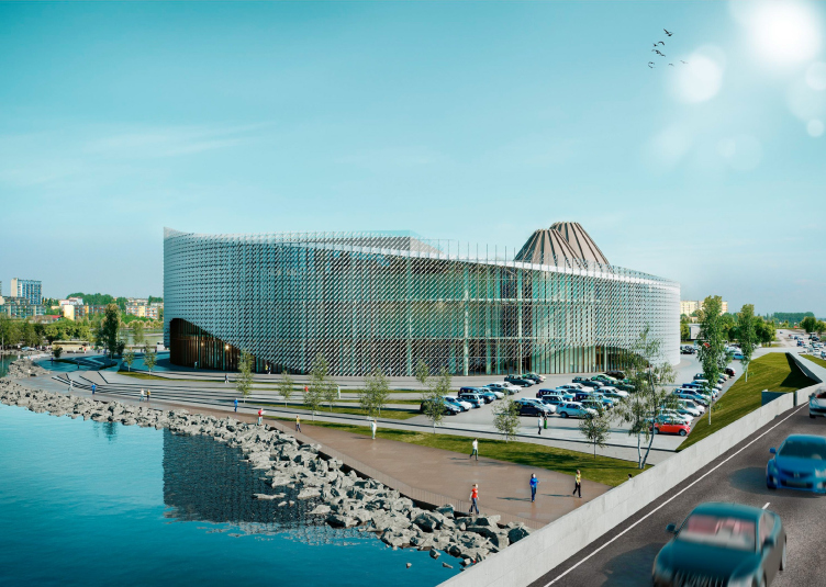
The complex is situated in the southern part of Yakutsk, not far away from the city center, on the shore of the legendary Saisara Lake. The lake is considered to be sacred; the cape, where the Philharmonic Hall and the Arctic Center are about to be built, up until the 1990’s, was the place where Ysyhakh, the main national festivity, took place; in 2014, they also planned to build here a complex named “Zemlya Olonkho” – but back then they considered a much larger territory of 47 hectares. Today, the building occupies 2.2 hectares in the triangle between the Oikunskogo Street leading to the city center, the Dezhneva Street, and a sprout of the lake.

Location plan. International Center of Epics of Eurasian peoples in Yakutsk
Copyright: © Creative Union ‘Reserve’


The plan is based on a circle – a perfect shape that has an extremely important meaning in the Yakut mythology: the circle is the sun, the floor plan of a hut built around a fire, and the symbol of the yearly cycle – and it is not by chance that when Reserve Union took part in the competition for landscaping the Lenin Square in Yakutsk last summer, the main shape of the project was also a circle, the traditional protective charm with lots of superordinate ring openings.

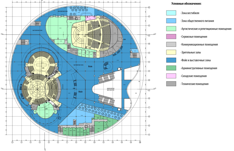
There are two main parts inscribed into the circle of the plan – the philharmonic hall and the theater of Yakut Epos, with a common entrance zone, yet separate foyers, which allows them to function independently. Due to the fact that because of permafrost underground construction is not feasible, the mechanical rooms underneath the stages could not be deepened, and all of the spectator halls had to be elevated rather high up – 6.6 meters above the ground level – there are two broad staircases, flanked by escalators, leading upwards from the entrance zone and the reception area with the ticket offices.

  • zooming
    1 / 10
    Section view 1-1 along the Theater halls. International Center of Epics of Eurasian peoples in Yakutsk
    Copyright: © Creative Union ‘Reserve’
  • zooming
    2 / 10
    Section view 3-3, longitudinal. International Center of Epics of Eurasian peoples in Yakutsk
    Copyright: © Creative Union ‘Reserve’
  • zooming
    3 / 10
    Section view 2-2 along the Philharmonic Hall. International Center of Epics of Eurasian peoples in Yakutsk
    Copyright: © Creative Union ‘Reserve’
  • zooming
    4 / 10
    Plan of the 1st floor at the elevation +0.000. International Center of Epics of Eurasian peoples in Yakutsk
    Copyright: © Creative Union ‘Reserve’
  • zooming
    5 / 10
    Plan of the 4th floor at the elevation +9.900. International Center of Epics of Eurasian peoples in Yakutsk
    Copyright: © Creative Union ‘Reserve’
  • zooming
    6 / 10
    Plan of the 2nd floor at the elevation +3.300. International Center of Epics of Eurasian peoples in Yakutsk
    Copyright: © Creative Union ‘Reserve’
  • zooming
    7 / 10
    Plan of the 5th floor at the elevation +13.200. International Center of Epics of Eurasian peoples in Yakutsk
    Copyright: © Creative Union ‘Reserve’
  • zooming
    8 / 10
    Plan of the 6th floor at the elevation +16.500. International Center of Epics of Eurasian peoples in Yakutsk
    Copyright: © Creative Union ‘Reserve’
  • zooming
    9 / 10
    Plan of the 7th floor at the elevation +19.800. International Center of Epics of Eurasian peoples in Yakutsk
    Copyright: © Creative Union ‘Reserve’
  • zooming
    10 / 10
    Master plan (simplified). International Center of Epics of Eurasian peoples in Yakutsk
    Copyright: © Creative Union ‘Reserve’


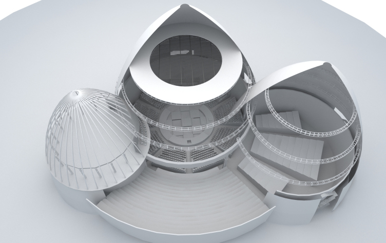
The Center of Arctic Epos consists of three pavilions, whose shape is inspired by the traditional Yakut summer house – Uras. The pavilions are interconnected, two of them including stage spaces with spectator seats arranged in a circular order, the third one being a rehearsal studio. The central and the biggest pavilion of the Olonkho theater is united with the drama theater Sakha, which occupies the eastern sector of the circle: here, the spectator seats continue higher and further. The spaces can be divided and merged with the help of mobile partitions.

Plan of the 3rd floor at the elevation +6.600. International Center of Epics of Eurasian peoples in Yakutsk
Copyright: © Creative Union ‘Reserve’


One of the schemes for positioning the halls of the Olonkho and Sakha theaters. International Center of Epics of Eurasian peoples in Yakutsk
Copyright: © Creative Union ‘Reserve’


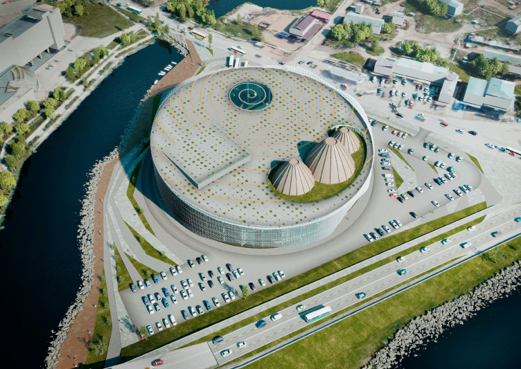
The roof is designed as an operated one; there will be festivals organized upon it; the circular skylight, which lightens the entrance zone by day, symbolizes the lake, while the whole roof is likened to Alaas – a giant meadow amidst the Taiga, the result of melted permafrost with a peat lake in the middle and arable land around it; historically, alaases were the basic units of Yakut agriculture and settlement. By the way, the glacier lake, also circular, as a rule, and the circular meadow with tasty grass for the horses – explain to a large extent the meaning of the circle for the Yakut culture and mythology.

International Center of Epics of Eurasian peoples in Yakutsk
Copyright: © Creative Union ‘Reserve’


Here, on the roof of the philharmonic hall and the theater, the lake is just tiny, and the “uras” huts are larger, yet the picture is still recognizable: one can see the “lake”, the “meadow”, and the hipped roofs, and the picture becomes part of the scenario of the entire building. It may seem as if a perfect cylinder were cut out from the permafrost – with some space-age laser, for example – and was pushed up from the ground, so the village ended up on the roof, while the chthonic forces that supported it turned into the power of theater and music; gods, and especially shamans in many cultures travel towards the underground fire, while in this specific instance it turns out that it was taken out from the earth and laid as the basis of, let’s say, performative creativity.

International Center of Epics of Eurasian peoples in Yakutsk
Copyright: © Creative Union ‘Reserve’


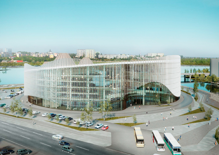
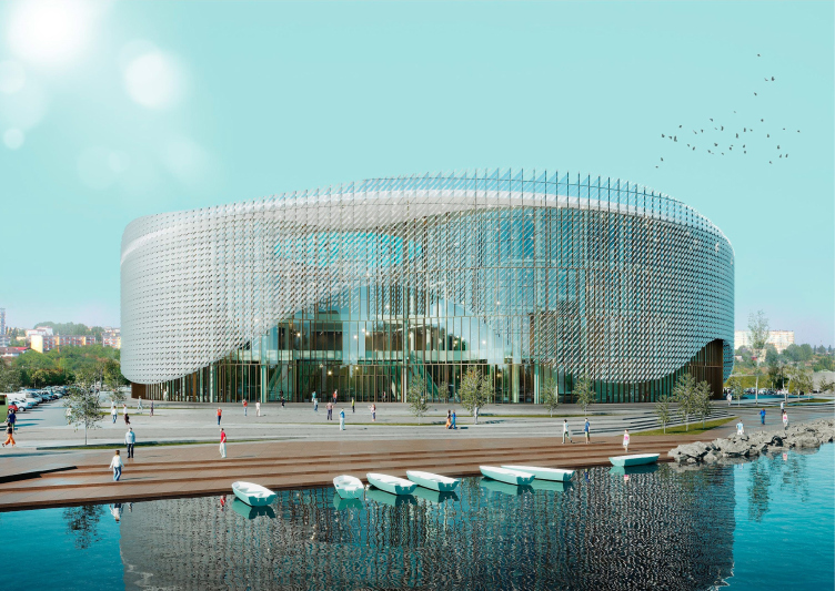
The cylindrical volume of the complex rises slightly eastward, where the entrance is situated, oriented, in full accordance with the cultural patterns of the Yakut epos, towards the sunrise. The facades are double bound: on the inside, the walls are made of glass, which is meant to ensure plenty of light in the foyer and the lobby; on the outside, the walls are covered with a mounted casing. Down below, its contour rises in large waves that look like arches – everything works together to create a hovering effect, responding to the theme of water, at the same time strengthening the “iceberg” effect – the likeness to the fragment of permafrost cut out from the soil. The building is icy and iridescent; the glass in its basement looks like pure ice that trapped the outlines of the floors and pillars, clearly discernible from the outside.

International Center of Epics of Eurasian peoples in Yakutsk
Copyright: © Creative Union ‘Reserve’


The entrance is made deeper by a smooth parabola – a volumetric wave that recedes before the small plaza. The outlines of this plastique depression behind the screen of the outside casing look like yet another linear wave, kicking into play, based on the gauze semi-transparency and visual permeability of the building. We will note here that the outside casing does not bend at the same time, “holding” the diameter; the waves are pretty geometric, the shape is large, yet at the same time delicate and pure, all of the analogies and parallels staying within the confines of the abstract, and not indulging into any literal interpretations.

International Center of Epics of Eurasian peoples in Yakutsk
Copyright: © Creative Union ‘Reserve’


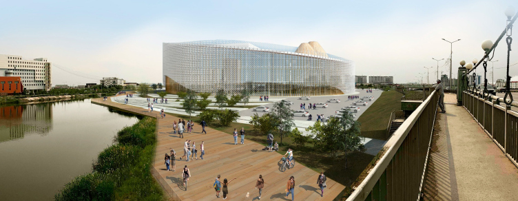
There will be a broad wooden boardwalk running along the shoreline, and a small venue for open air events. At some point, the architects were considering the construction of a full-fledged stage next to the water, yet later on they refrained from that idea.

International Center of Epics of Eurasian peoples in Yakutsk
Copyright: © Creative Union ‘Reserve’


In the first May version, the structural and ethereal character of the solution – the glass cylinder with a wavy ribbon cast over it, hovering in the air – could be read ever more clearly: the casing was composed of white vertical lamellas that formed clear and transparent strokes, reflected in the curves of the glass surface, resonating with the lines of the framework of the glass walls with a rhythm of pillars inside. All of this served to create a “mirage” image, and, to a certain extent, “dematerialized” the building, setting at the same time the appropriate tone of the graphic discipline and completion. The bands were rather large to be seen from a distance, yet still thin enough to hold the volume together. This version also provided for a thin cornice line on top, marking the edge of the roof.

  • zooming
    1 / 4
    International Center of Epics of Eurasian peoples in Yakutsk, Version 1, 05.2019
    Copyright: © Creative Union ‘Reserve’
  • zooming
    2 / 4
    International Center of Epics of Eurasian peoples in Yakutsk, Version 1, 05.2019
    Copyright: © Creative Union ‘Reserve’
  • zooming
    3 / 4
    International Center of Epics of Eurasian peoples in Yakutsk, Version 1, 05.2019
    Copyright: © Creative Union ‘Reserve’
  • zooming
    4 / 4
    International Center of Epics of Eurasian peoples in Yakutsk, Version 1, 05.2019
    Copyright: © Creative Union ‘Reserve’


Also, in the first version, the mutual positioning of the spectator halls in respect to one another was different: the group of theaters was lined up in one row right of the entrance, the philharmonic hall was on the left; the two modules were separated by the ravine of the atrium, elongated and overlooking the sacred lake with its end opposite from the entrance. As a result, the lobby was getting more ambient light from above and could claim a more important role of the indoor plaza, something like a covered public space between the theater and concert halls.

  • zooming
    1 / 3
    International Center of Epics of Eurasian peoples in Yakutsk, Version 1, 05.2019
    Copyright: © Creative Union ‘Reserve’
  • zooming
    2 / 3
    International Center of Epics of Eurasian peoples in Yakutsk, Version 1, 05.2019
    Copyright: © Creative Union ‘Reserve’
  • zooming
    3 / 3
    International Center of Epics of Eurasian peoples in Yakutsk, Version 1, 05.2019
    Copyright: © Creative Union ‘Reserve’


However, one of Andrey Borisov’s requirements was about creating a panorama of all the three uras pavilions from the side of the lake, and the theater was moved from the north over to the west, the arrangement of the elements inside the circle changing, and the plan getting a configuration looking like an hourglass: one trapezoid part from the entrance is narrowing, the other, closer to the lake, is widening.

The facade with vertical lamellas was also another point of concern of the client’s – due to the fact that nearby, eight hundred meters away from the philharmonic hall, the building of the complex “Russia, My History” was built, whose facades also sport light-colored verticals, even if differently constructed. Then the client had a desire to include in the project, in addition to the already-employed imagery, rather rich as it is, a reference to the Lena Pillars, the most magnificent natural monument in the Sakha Republic. This is how two more versions of the project came about: one with an opaque golden pattern resembling, albeit remotely, the famous rocks, like a pixel picture, the other – with a media screen, which would broadcast the images of this natural sight, along with billboards and live broadcasts. 

  • zooming
    1 / 3
    International Center of Epics of Eurasian peoples in Yakutsk, Version 2, 06.2019
    Copyright: © Creative Union ‘Reserve’
  • zooming
    2 / 3
    International Center of Epics of Eurasian peoples in Yakutsk, Version 2, 06.2019
    Copyright: © Creative Union ‘Reserve’
  • zooming
    3 / 3
    International Center of Epics of Eurasian peoples in Yakutsk, Version 2, 06.2019
    Copyright: © Creative Union ‘Reserve’


In fall, the “orange” version with the Lena Pillars was replaced by a lighter one – now the outside screen of the facade consists of aluminum ovals, mounted diagonally on the grilled octahedral structure, which makes it possible to mount the outside surface at a rather large distance from the glass of the main volume.

  • zooming
    1 / 5
    The facade solution formed on the volumetric shaft system with a rectangular module. International Center of Epics of Eurasian peoples in Yakutsk
    Copyright: © Creative Union ‘Reserve’
  • zooming
    2 / 5
    The facade solution formed on the volumetric shaft system with a triangular module. International Center of Epics of Eurasian peoples in Yakutsk
    Copyright: © Creative Union ‘Reserve’
  • zooming
    3 / 5
    A fragment of the facade (a volumetric shaft system with a triangular module). International Center of Epics of Eurasian peoples in Yakutsk
    Copyright: © Creative Union ‘Reserve’
  • zooming
    4 / 5
    A fragment of the facade. The perspective view (a volumetric shaft system with a rectangular module). International Center of Epics of Eurasian peoples in Yakutsk
    Copyright: © Creative Union ‘Reserve’
  • zooming
    5 / 5
    A fragment of the facade. The perspective view (a volumetric shaft system with a rectangular module). International Center of Epics of Eurasian peoples in Yakutsk
    Copyright: © Creative Union ‘Reserve’


The resulting structure must show glitter, yet not like in the first version, where it looked like ice with organized streaks, but rather like snow or cloud. And transparent, too: from the side of the lake one can clearly see the imposing, slightly bent, buildings of the theater, belted by a glass floor and something like a scarf or a necklace rising up towards the east. The picture is half traditional, half cosmic.

International Center of Epics of Eurasian peoples in Yakutsk
Copyright: © Creative Union ‘Reserve’


International Center of Epics of Eurasian peoples in Yakutsk
Copyright: © Creative Union ‘Reserve’


27 January 2020

Headlines now
The Golden Crown
The concept for a dental clinic in Yekaterinburg, developed by CNTR Studio, revolves around the idea of a “mouth full of gold”: pristine white porcelain stoneware walls are complemented by matte brass details. To avoid an overly literal interpretation, the architects focused on the building’s proportions, skillfully navigating between sunlight requirements and fire safety regulations.
Flexibility and Integration
Not long ago, we covered the project for the fourth phase of the ÁLIA residential complex, designed by APEX. Now, we’ve been shown different fence concepts they developed to enclose the complex’s private courtyards, incorporating a variety of public functions. We believe that the sheer fact that the complex’s architects were involved in such a detail as fencing speaks volumes.
A Step Forward
The HIDE residential complex represents a major milestone for ADM architects and their leaders Andrey Romanov and Ekaterina Kuznetsova in their quest for a fresh high-rise aesthetic – one that is flexible and layered, capable of bringing vibrancy to mass and silhouette while shaping form. Over recent years, this approach has become ADM’s “signature style”, with the golden HIDE tower playing a pivotal role in its evolution. Here, we delve into the project’s story, explore the details of the complex’s design, and uncover its core essence.
Gold in the Sands
A new office for a transcontinental company specializing in resource extraction and processing has opened in Dubai. Designed by T+T Architects, masters of creating spaces that are contemporary, diverse, flexible, and original, this project exemplifies their expertise. On the executive floor, a massive brass-clad partition dominates, while layered textures of compressed earth create a contextually resonant backdrop.
Layers and Levels of Flight
This project goes way back – Reserve Union won this architectural competition at the end of 2011, and the building was completed in 2018, so it’s practically “archival”. However, despite being relatively unknown, the building can hardly be considered “dated” and remains a prime example of architectural expression, particularly in the headquarters genre. And it’s especially fitting for an aviation company office. In some ways, it resembles the Aeroflot headquarters at Sheremetyevo but with its own unique identity, following the signature style of Vladimir Plotkin. In this article, we take an in-depth look at the United Aircraft Corporation (UAC) headquarters in the Moscow agglomeration town of Zhukovsky, supplemented by recent photographs from Alexey Naroditsky – a shoot that became only recently possible due to the fact that improvements were finally made in the surrounding area.
Light and Shadow
In this article, we delve into the architectural design of the “Chaika” house by DNK ag architects, which was recently completed in 2023 as part of the collection of signature designs at ZILArt. As is well-known, all the buildings in this complex follow a design code, yet each one is distinct. This particular building stands out not only for its whiteness and minimalism but also for the refined use of a limited number of techniques that, together, create what can confidently be called synergy.
Casus Novae
A master plan was developed for a large residential area with a name of “DNS City”, but now that its implementation began, the plan has been arbitrarily reformatted and replaced with something that, while similar on the surface, is actually quite different. This is not the first time such a thing happens, but it’s always frustrating. With permission from the author, we are sharing Maria Elkina’s post.
Treasure Hunting
The GAFA bureau, in collaboration with Tegola and Arkhitail, organized an expedition to the island of Kilpola in Karelia as part of Moskomarkhitektura’s “Open City” festival. There, amidst moss and rocks, the students sought answers to questions like: what is the sacred, where does it dwell, and what sustains it? Assisting the participants in this quest were landscape engineer Evgeny Levin, artist Nicholas Roerich, a moose, and the lack of cellular connection. Here’s how the story unfolded.
Depths of the Earth, Streams of Water
In the Malaya Okhta district, the Akzent building, designed by Stepan Liphart, was constructed. It follows a classic tripartite structure, yet it’s what you might call “hand-drawn”: each façade is unique in its form and details, some of which aren’t immediately noticeable. In this article, we explore the context and, together with the architect, delve into how the form was developed.
Fir Tree Dynamics
The “Airports of Region” holding is planning to build an airport in Karachay-Cherkessia, aiming to make the Arkhyz and Dombay resorts more accessible to travelers. The project that won in an invitation-only competition, submitted by Sergey Nikeshkin’s KPLN, blends natural imagery inspired by the shape of a conifer seed, open-air waiting spaces, majestic large trees, and a green roof elevated on needle-like columns. The result is both nature-inspired and WOW.
​A Brick Shell
In the process of designing a clubhouse situated among pine trees in a prestigious suburban area near Moscow, the architectural firm “A.Len” did the façade design part. The combination of different types of brick and masonry correlates with the volumetric and plastique solutions, further enhanced by the inclusion of wood-painted fragments and metal “glazing”.
Word Forms
ATRIUM architects love ambitious challenges, and for the firm’s thirtieth anniversary, they boldly play a game of words with an exhibition that dives deep into a self-created vocabulary. They immerse their projects – especially art installations – into this glossary, as if plunging into a current of their own. You feel as if you’re flowing through the veins of pure art, immersed in a universe of vertical cities, educational spaces – of which the architects are true masters – and the cultural codes of various locations. But what truly captivates is the bold statement that Vera Butko and Anton Nadtochy make, both through their work and this exhibition: architecture, above all, is art – the art of working with form and space.
Flexibility and Acuteness of Modernity
Luxurious, fluid, large “kokoshniks” and spiral barrel columns, as if made from colorful chewing gum: there seem to be no other mansion like this in Moscow, designed in the “Neo-Russian-Modern” style. And the “Teremok” on Malaya Kaluzhskaya, previously somewhat obscure, has “come alive with new colors” and gained visibility after its restoration for the office of the “architectural ecosystem” as the architects love to call themselves. It’s evident that Julius Borisov and the architects at UNK put their hearts into finding this new office and bringing it up to date. Let’s delve into the paradoxes of this mansion’s history and its plasticity. Spoiler: two versions of modernity meet here, both balancing on the razor’s edge of “what’s current”.
Yuri Vissarionov: “A modular house does not belong to the land”
It belongs to space, or to the air... It turns out that 3D printing is more effective when combined with a modular approach: the house is built in a workshop and then adapted to the site, including on uneven terrain. Yuri Vissarionov shares his latest experience in designing tourist complexes, both in central Russia and in the south. These include houseboats, homes printed from lightweight concrete using a 3D printer, and, of course, frame houses.
​Moscow’s First
“The quality of education largely depends on the quality of the educational environment”. This principle of the last decade has been realized by Sergey Skuratov in the project for the First Moscow Gymnasium on Rostovskaya Embankment in the Khamovniki district. The building seamlessly integrates into the complex urban landscape, responding both to the pedestrian flow of the city and the quiet alleyways. It skillfully takes advantage of the height differences and aligns with modern trends in educational space design. Let’s take a closer look.
Looking at the Water
The site of Villa Sonata stretches from the road to the water’s edge, offering its own shoreline, pier, and a picturesque river panorama. To reveal these sweeping views, Roman Leonidov “cut” the façade diagonally parallel to the river, thus getting two main axes for the house and, consequently, “two heads”. The internal core – two double-height spaces, a living room and a conservatory, with a “bridge” above them – makes the house both “transparent” and filled with light.
The White Wing
Well, it’s not exactly white. It’s more of a beige, white-stone structure that plays with the color of limestone – smoother surfaces are lighter, while rougher ones are darker. This wing unites various elements: it absorbs and interprets the surrounding themes. It responds to everything, yet maintains a cohesive expression – a challenging task! – while also incorporating recognizable features of its own, such as the dynamic cuts at the bottom, top, and middle.
Urban Dunes
The XSA Ramps team designed and built a three-part sports hub for a park in Rostov-on-Don, welcoming people of all ages and fitness levels. The skate plaza, pump track, and playground are all meticulously crafted with details that attract a diverse range of visitors. The technical execution of the shapes and slopes transforms this space into a kind of sculptural composition.
Proportional Growth
The project for the fourth phase of the ÁLIA residential area has been announced. The buildings are situated on an elongated plot – almost a “ray” that shoots out from the center of the area towards the river. Their layout reflects both a response to Moscow’s architectural preferences over the past 15 years, shifting “from blocks to towers”, and an interpretation of the neighboring business park designed by SOM. Additionally, the best apartments here are not located at the very top but closer to the middle, forming a glowing “waistline”.
The “Staircase” Building
In designing the “Details” residential complex in New Moscow, Rais Baishev spiced up the now-popular Moscow theme of a “courtyard” building with an idea drawn from the surrealist drawings by Maurits Escher. He envisioned the stepped silhouettes and descending slopes as a metaphysical mega-staircase, creating a key void within the courtyard that gave the project an internal “spine”. This concept is felt both in the building’s silhouette and on its façades.
Projection of the Quarter
No one doubted that the building that Vladimir Plotkin designed as part of the “Garden Quarters” would be the most modernist of all. And it turned out just that way: while adhering to the common design code, the building successfully combines brick and white stone, rhythmically responding to the neighboring building designed by Ostozhenka, yet tactfully and persistently making a few statements of its own. This includes the projection of the ideal urban development composition “14–9–6”, which can be found right next door, mathematical calculations, including those for various types of terraces (and perhaps the only reminder of the Soviet past of the Kauchuk rubber factory!), and the white “cross-stitch” pattern of the façade grid.
Domus Aurea
In this issue, we examine the “Tessinsky-1” house, designed by Sergey Skuratov and completed in 2023. Located in the middle of the Serebryanicheskaya Embankment district, at the intersection of its main streets, this house assumes a sort of “nodal” role: it not only responds to everything around it and preserves many memories of the former EMA factory within itself, but it weaves all this into a newly directed pattern, reconciling bright “gold” and dark-colored brick, largely with the help of the new, modern-yet-archaic Columba brick, which, come to think about it, is the most precious element here.
The Chimney of Nikola-Lenivets
In this issue, we are examining the “Obelisk House” designed by KATARSIS and built for the Arkhstoyanie 2023 festival. However, it was only finished later on, and this is why we are examining it now. It seems to us that after the “Obelisk House” appeared in Nikola-Lenivets, a dialogue and a few inner connections appeared between the temporary structures built here. These houses no longer look like “accidental neighbors”, more of which below.
​Periscope by the Bay
The jury awarded the second place in the competition for a public and cultural center in Petropavlovsk-Kamchatsky to the companies GORA (“Mountain”) and M4. In the consortium’s proposal, the building resembles a sperm whale with a calf swimming next to it or a periscope, whose lenses capture the most spectacular views from the surrounding landscape.
From Arcs to Dolmens
While working on the competition project for Petropavlovsk-Kamchatsky, ASADOV Architects prioritized the value of the natural and urban environment, aiming to preserve the balance of the location while minimizing the resemblance of the volume that they designed to a “traditional building”. The task was challenging, and the architects created three versions, one of which having been developed after the competition, where their main proposal took third place. However, the point of interest here is not the competition result but the continuity of creative thinking.
Hide and Seek
The ID Moskovskiy house, designed by Stepan Liphart in St. Petersburg, in the courtyards near Moskovskiy Avenue beyond the Obvodny Canal and recently completed, is notable for several reasons. Firstly, it has been realized with considerable accuracy, which is particularly significant as this is the first building where the architect was responsible not only for the facades but also for the layouts, allowing for better integration between the two. On the other hand, this building is interesting as an example of the “germination” of new architecture in the city: it draws on the best examples from the neighborhood and becomes an improved and developed sum of ideas found by the architect in the surrounding context.
The Big Twelve
Yesterday, the winners of the Moscow Mayor’s Architecture Award were announced and honored. Let’s take a look at what was awarded and, in some cases, even critique this esteemed award. After all, there is always room for improvement, right?
Above the Golden Horn
The residential complex “Philosophy” designed by T+T architects in Vladivostok, is one of the new projects in the “Golubinaya Pad” area, changing its development philosophy (pun intended) from single houses to a comprehensive approach. The buildings are organized along public streets, varying in height and format, with one house even executed in gallery typology, featuring a cantilever leaning on an art object.
Nuanced Alternative
How can you rhyme a square and space? Easily! But to do so, you need to rhyme everything you can possibly think of: weave everything together, like in a tensegrity structure, and find your own optics too. The new exhibition at GES-2 does just that, offering its visitor a new perspective on the history of art spanning 150 years, infused with the hope for endless multiplicity of worlds and art histories. Read on to see how this is achieved and how the exhibition design by Evgeny Ace contributes to it.
Blinds for Ice
An ice arena has been constructed in Domodedovo based on a project by Yuri Vissarionov Architects. To prevent the long façade, a technical requirement for winter sports facilities, from appearing monotonous, the architects proposed the use of suspended structures with multidirectional slats. This design protects the ice from direct sunlight while giving the wall texture and detail.