По-русски

​Architectural Laboratory

A-Len has developed and patented the “Perfect Apartments” program, which totally eliminates “bad” apartment layouts. In this article, we are sharing how this program came around, what it is about, who can benefit from it, and how.

11 December 2020
Overview
mainImg
Point of growth

Saint Petersburg’s A-Len Architectural Bureau has a division, whose name is not exactly habitual: the architectural laboratory. This division was formed in 2009 in response to the economic crisis, which significantly reduced the pace of construction and the number of contracts. The leader of the company Sergey Oreshkin decided to use the idle period to reflect on the experience accumulated over the recent decades, find new approaches to architectural design, and come up with the workload for the large staff that he did not want to dismiss. Since only housing construction was doing relatively well, the company focused specifically on this field.
This is how the program called “A.Len Perfect Apartments” came around – a knowledge base of apartment layouts that the company has been using as the basis for all of the housing projects that it designs since 2012.

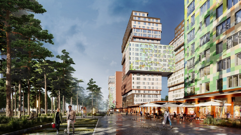
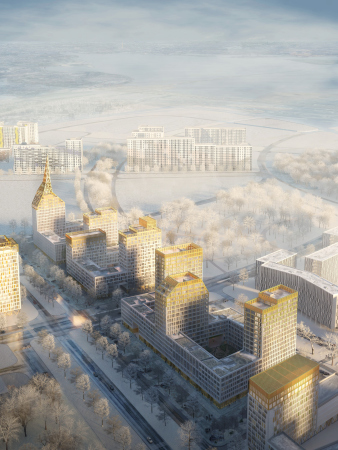
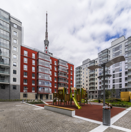
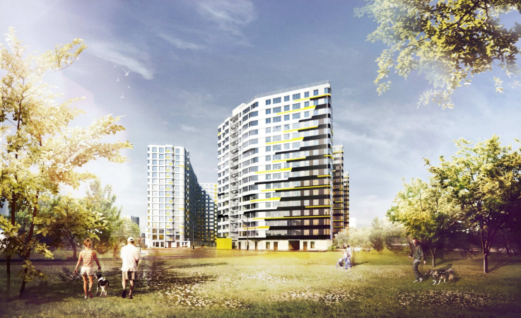
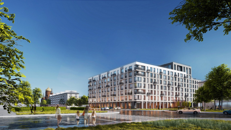
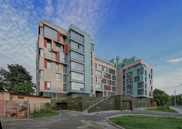
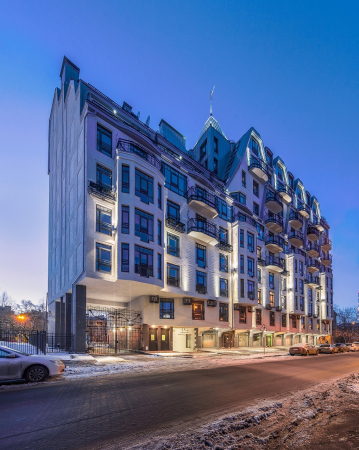
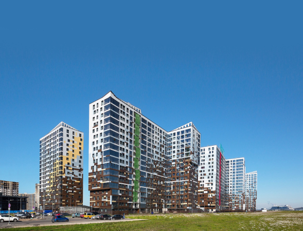
“The perfect apartments” are to be found in high-end projects, such as the housing complex “Golden City” on the wash-up land of the Vasilievsky Island, and in the regions – for example, in the housing complex “Bunin”, where the layouts could be easily adjusted to fit a sophisticated stair-like structure. The program can be adapted to various classes of housing: standard, comfort, and business, as well as to mixed typologies – a vivid example here is the “Prospect Mira” compound in Ekaterinburg.

In Soviet times, such developments were provided by design research institutes; today, these things are done by large development holdings. Architectural offices, however, rarely attempt to tackle such large-scale tasks.

  • zooming
    1 / 8
    “Bunin” housing complex
    Copyright: © “Perfect Apartments” A-Len
  • zooming
    2 / 8
    Golden City housing complex
    Copyright: © KCAP+Orange Architects & A-Len
  • zooming
    3 / 8
    Skandi Klubb housing complex
    Copyright: © A-Len & Semren & Mansson
  • zooming
    4 / 8
    “Dom na Lvovskoi” housing complex
    Copyright: © A-Len
  • zooming
    5 / 8
    The “Printsip” house on the Dvinskaya Street
    Copyright: © “Perfect Apartments” A-Len
  • zooming
    6 / 8
    “Lazurit” House
    Copyright: © A-Len
  • zooming
    7 / 8
    YIT house on the Chapaeva Street
    Copyright: © “Perfect Apartments” A-Len
  • zooming
    8 / 8
    "Me, Romantic" housing complex
    Copyright: © “Perfect Apartments” A-Len


The program is based on a study of typologies of Soviet, modern Russian, and foreign housing, as well as the company’s experience of working with the marketing and sales departments of modern developers, as well as on error analysis.

Sergey Oreshkin notes that the source of all issues with modern apartment layouts is the absence of in-depth scientific research, for which the architectural companies have no resources, while the government is studiously ignoring the problem.

Using the example of such a simple indicator as the width of the building, which affects the depth of the apartment (counting from the window), and its square footage, one can easily trace how the planning solutions have evolved, regardless of the class of the housing construction.

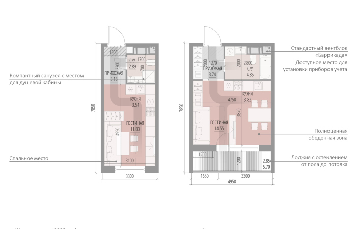
When the economy was on the rise and decisions were made too quickly, the width of residential buildings could reach 27 meters – and this, considering the fact that the sunlight penetrates at best 6-6.5 meters. Besides excessively long or L-shaped dark rooms, such houses feature giant anterooms, closets, and bathrooms, for which the buyer pays exactly the same price as for a square meter of a sunlit kitchen.

  • zooming
    1 / 4
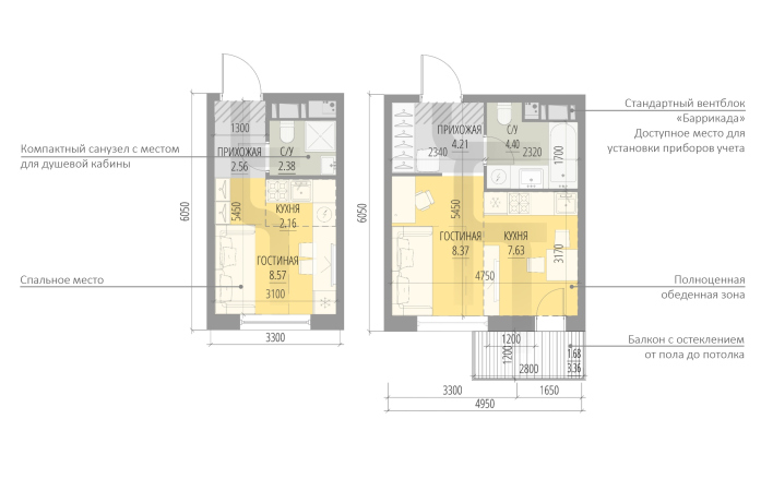
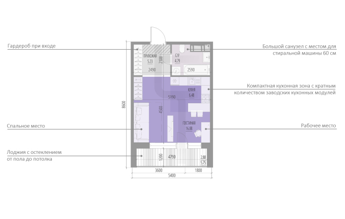
    Class “STANDARD”, a studio, S=15,67 square meters, S=26,29 square meters
    Copyright: © “Perfect Apartments” A-Len
  • zooming
    2 / 4
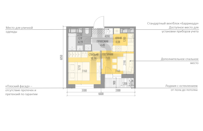
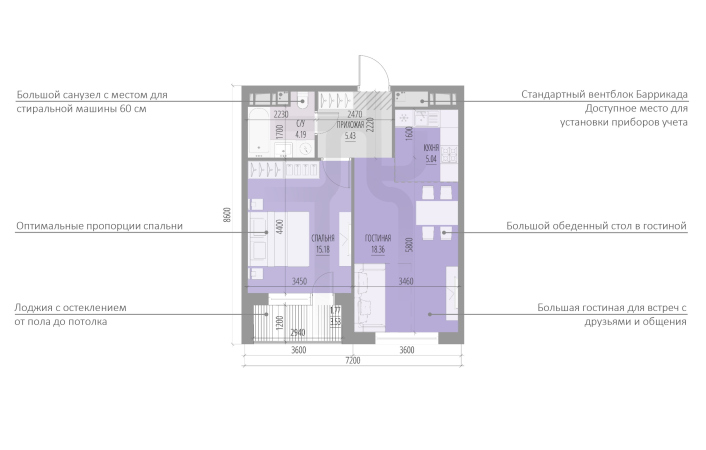
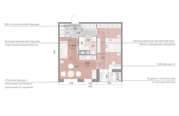
    Class “STANDARD”, 1K, S=31.16 square meters
    Copyright: © “Perfect Apartments” A-Len
  • zooming
    3 / 4
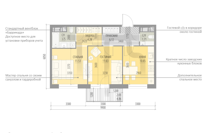
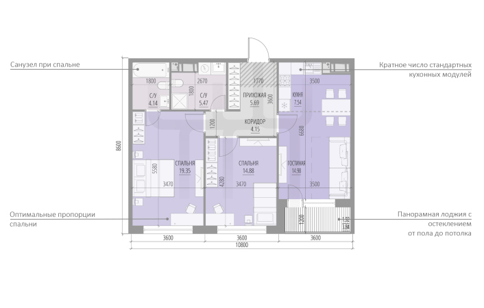
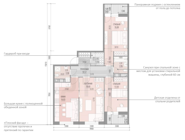
    Class “STANDARD”, 2K, S=51.93 square meters
    Copyright: © “Perfect Apartments” A-Len
  • zooming
    4 / 4
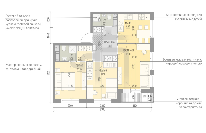
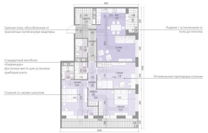
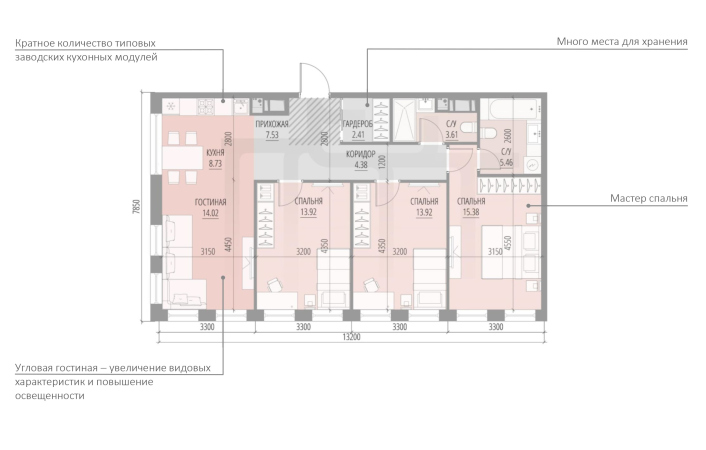
    Class “STANDARD”, 3K, S=66.31 square meters
    Copyright: © “Perfect Apartments” A-Len


As for the town planning techniques, the apartment layouts were strongly influenced by the spreading of the so-called “perimeter construction groups”, based on the idea of an isolated yard, similar to “well” yards of Saint Petersburg, only on a quite different scale. Such houses had too many apartments located in the inner corners, where it was virtually impossible to isolate neighboring apartments from one another, and the problems with echo and sound penetration turned out to be considerable.

In such corner apartments, the inner wall was longer than the outer one; there was one less window, and, hence, there was a lot less natural light. A healthy alternative would be a not-too-wide section, room proportions close to a perfect square, and the efficiency of every square meter.

Andrey Ponomarev The leader of the development division of Pervostroitel

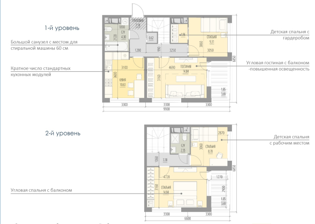
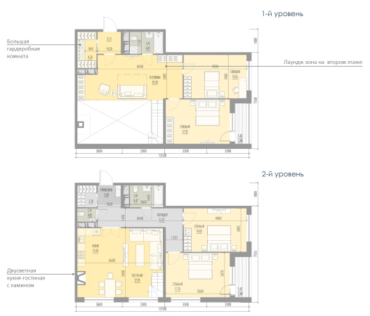
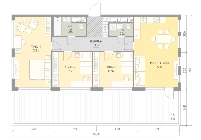
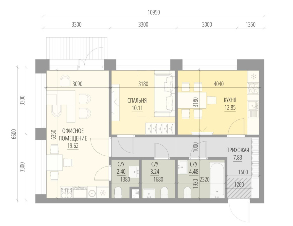
The core of the apartment range in the “Prospect Mira” compound consists of two- and three-room apartments, rather popular with the buyers. Single-room apartments do not sell that well, but, probably, this has to do with their relatively expensive price tag. The apartments of an unusual format – for example, double-height ones, have almost been sold out, and it was them that aroused a lot of interest for the project as part of the general marketing campaign. We had a lot of requests for them. According to our observations, what is the most popular with our clients are the most functional layouts – with master bedrooms, two or more bathrooms, kitchen-living room, and storage space.

The apartments offered by A-Len are diverse and balanced enough to meet the needs of the audience. The apartments of larger formats have unique advantages: double height, panoramic glazing, and master bedrooms. These unique solutions are what makes us different from the competition and gives more possibilities to our clients.


  • zooming
    1 / 4
    A double-level apartment, 4К, S= 81.80 square meters
    Copyright: © “Perfect Apartments” A-Len
  • zooming
    2 / 4
    A double-level apartment with a fireplace, 5Е, S=166,98 square meters
    Copyright: © “Perfect Apartments” A-Len
  • zooming
    3 / 4
    An apartment with a terrace, 4Е, S=143,86 square meters
    Copyright: © “Perfect Apartments” A-Len
  • zooming
    4 / 4
    An office apartment 1К, S=60,53 square meters
    Copyright: © “Perfect Apartments” A-Len


How the program works

The knowledge base already includes more than 5,000 successful layouts, which are grouped into four major categories: business, comfort, economy, and special-type apartments, which are not wide-spread on the market yet. The latter include such things as two-level apartments, duplexes, corner, side-end apartments, and office apartments. The business-class apartments are characterized by a wider pitch of the axis grid, bigger area, and diversity of functional zones.

The base can be used as a constructor set: the architects developed for each class of apartments room modules with the optimum area and furniture arrangement. By using them, it is possible to transform individual apartments, as well as whole floors.

Александр Андрианов, первый вице-президент Glorax Development

The residential complex Golden City, which is being built by Glorax Development on the first shoreline of the Gulf of Finland, implements several interesting planning solutions at once. The top floors have in them apartments with private terraces; in addition, the complex features two-level apartments, all of which command beautiful gulf views. Some of the buildings have solutions with a window in the bathroom or in the hall – this widens the circle for design ideas when decorating such apartments, and such property in business-class housing complexes is highly valued by the buyers. Another feature of our perfect apartments in Golden City is panoramic windows that fill the rooms with natural light and allow you to zone the space, creating dedicated spaces for relaxation, work, play, and more.


  • zooming
    1 / 4
    Class “BUSINESS”, a studio, S=36.25 square meters
    Copyright: © “Perfect Apartments” A-Len
  • zooming
    2 / 4
    Class “BUSINESS”, 2E, S=49.97 square meters
    Copyright: © “Perfect Apartments” A-Len
  • zooming
    3 / 4
    Class “BUSINESS”, 3E, S=78.13 square meters
    Copyright: © “Perfect Apartments” A-Len
  • zooming
    4 / 4
    Class “BUSINESS”, 4E, S=121.34 square meters
    Copyright: © “Perfect Apartments” A-Len


Each layout has its own identification card, understandable for both the developer and the buyer. This card displays the number of rooms, the type of suitable household, the useful floor space, and the total area of the apartment. Also, the company developed evaluation coefficients that show just how effectively the apartment floor space is used.

Coefficient K1 shows the ratio of the sum total of the areas of residential rooms, the kitchen, and the living room, to the overall area of the apartment. It accurately indicates errors in the design methodology with a significant increase in the area of corridors and other auxiliary rooms. The optimum coefficient is 0.6-0.75

Coefficient K2 is the ratio between the overall area of the apartment to the overall area of the outside façade wall, which reflects the natural insolation of the apartment. The optimum coefficient is 2.1-2.35

Today, the architects of our company start their work not from a sketch or a master plan, but from taking the program, previously getting from the client a package of different tasks, one of them being the range of apartments.

This program helped us to significantly streamline the architect-developer relationship: the client, as a rule, at once accepts the layouts that we propose, which gives us an opportunity to safely work on the facades. The painfully inefficient procedure that consists of getting endless approvals from the sales department that knows very little about ergonomics, has now become pleasantly routine. When an architect works under pressure, he is very likely to deliver poor results. Today, we and developer are on the same page – they know what we are doing and they profit from getting no problem apartments. This ideology helps us sell.


  • zooming
    1 / 4
    Class “COMFORT”, a studio, S=21.41 square meters, S=29,82 square meters
    Copyright: © “Perfect Apartments” A-Len
  • zooming
    2 / 4
    Class “COMFORT”, 2E, S=53.72 square meters
    Copyright: © “Perfect Apartments” A-Len
  • zooming
    3 / 4
    Class “COMFORT”, 3K, S=93.63 square meters
    Copyright: © “Perfect Apartments” A-Len
  • zooming
    4 / 4
    Class “COMFORT”, 4E, S=89.37 square meters
    Copyright: © “Perfect Apartments” A-Len


Integration and development

The A-Len Architectural Laboratory also has other branches: Brickwork (dedicated to restoring the old techniques of laying bricks), the color laboratory, architectural marketing, and animated graphics. So far, the “Perfect Apartments” are only compatible with the Architectural Tool Kit software, because the typology of the apartments can be significantly widened by using various façade systems, and because each solution – be that a window reaching to the floor or a French balcony – entails the necessity of solving engineering and constructive tasks. In 2018, the program was patented, but it is constantly improved, and, possibly, will be automated in the future.

11 December 2020

Headlines now
The Golden Crown
The concept for a dental clinic in Yekaterinburg, developed by CNTR Studio, revolves around the idea of a “mouth full of gold”: pristine white porcelain stoneware walls are complemented by matte brass details. To avoid an overly literal interpretation, the architects focused on the building’s proportions, skillfully navigating between sunlight requirements and fire safety regulations.
Flexibility and Integration
Not long ago, we covered the project for the fourth phase of the ÁLIA residential complex, designed by APEX. Now, we’ve been shown different fence concepts they developed to enclose the complex’s private courtyards, incorporating a variety of public functions. We believe that the sheer fact that the complex’s architects were involved in such a detail as fencing speaks volumes.
A Step Forward
The HIDE residential complex represents a major milestone for ADM architects and their leaders Andrey Romanov and Ekaterina Kuznetsova in their quest for a fresh high-rise aesthetic – one that is flexible and layered, capable of bringing vibrancy to mass and silhouette while shaping form. Over recent years, this approach has become ADM’s “signature style”, with the golden HIDE tower playing a pivotal role in its evolution. Here, we delve into the project’s story, explore the details of the complex’s design, and uncover its core essence.
Gold in the Sands
A new office for a transcontinental company specializing in resource extraction and processing has opened in Dubai. Designed by T+T Architects, masters of creating spaces that are contemporary, diverse, flexible, and original, this project exemplifies their expertise. On the executive floor, a massive brass-clad partition dominates, while layered textures of compressed earth create a contextually resonant backdrop.
Layers and Levels of Flight
This project goes way back – Reserve Union won this architectural competition at the end of 2011, and the building was completed in 2018, so it’s practically “archival”. However, despite being relatively unknown, the building can hardly be considered “dated” and remains a prime example of architectural expression, particularly in the headquarters genre. And it’s especially fitting for an aviation company office. In some ways, it resembles the Aeroflot headquarters at Sheremetyevo but with its own unique identity, following the signature style of Vladimir Plotkin. In this article, we take an in-depth look at the United Aircraft Corporation (UAC) headquarters in the Moscow agglomeration town of Zhukovsky, supplemented by recent photographs from Alexey Naroditsky – a shoot that became only recently possible due to the fact that improvements were finally made in the surrounding area.
Light and Shadow
In this article, we delve into the architectural design of the “Chaika” house by DNK ag architects, which was recently completed in 2023 as part of the collection of signature designs at ZILArt. As is well-known, all the buildings in this complex follow a design code, yet each one is distinct. This particular building stands out not only for its whiteness and minimalism but also for the refined use of a limited number of techniques that, together, create what can confidently be called synergy.
Casus Novae
A master plan was developed for a large residential area with a name of “DNS City”, but now that its implementation began, the plan has been arbitrarily reformatted and replaced with something that, while similar on the surface, is actually quite different. This is not the first time such a thing happens, but it’s always frustrating. With permission from the author, we are sharing Maria Elkina’s post.
Treasure Hunting
The GAFA bureau, in collaboration with Tegola and Arkhitail, organized an expedition to the island of Kilpola in Karelia as part of Moskomarkhitektura’s “Open City” festival. There, amidst moss and rocks, the students sought answers to questions like: what is the sacred, where does it dwell, and what sustains it? Assisting the participants in this quest were landscape engineer Evgeny Levin, artist Nicholas Roerich, a moose, and the lack of cellular connection. Here’s how the story unfolded.
Depths of the Earth, Streams of Water
In the Malaya Okhta district, the Akzent building, designed by Stepan Liphart, was constructed. It follows a classic tripartite structure, yet it’s what you might call “hand-drawn”: each façade is unique in its form and details, some of which aren’t immediately noticeable. In this article, we explore the context and, together with the architect, delve into how the form was developed.
Fir Tree Dynamics
The “Airports of Region” holding is planning to build an airport in Karachay-Cherkessia, aiming to make the Arkhyz and Dombay resorts more accessible to travelers. The project that won in an invitation-only competition, submitted by Sergey Nikeshkin’s KPLN, blends natural imagery inspired by the shape of a conifer seed, open-air waiting spaces, majestic large trees, and a green roof elevated on needle-like columns. The result is both nature-inspired and WOW.
​A Brick Shell
In the process of designing a clubhouse situated among pine trees in a prestigious suburban area near Moscow, the architectural firm “A.Len” did the façade design part. The combination of different types of brick and masonry correlates with the volumetric and plastique solutions, further enhanced by the inclusion of wood-painted fragments and metal “glazing”.
Word Forms
ATRIUM architects love ambitious challenges, and for the firm’s thirtieth anniversary, they boldly play a game of words with an exhibition that dives deep into a self-created vocabulary. They immerse their projects – especially art installations – into this glossary, as if plunging into a current of their own. You feel as if you’re flowing through the veins of pure art, immersed in a universe of vertical cities, educational spaces – of which the architects are true masters – and the cultural codes of various locations. But what truly captivates is the bold statement that Vera Butko and Anton Nadtochy make, both through their work and this exhibition: architecture, above all, is art – the art of working with form and space.
Flexibility and Acuteness of Modernity
Luxurious, fluid, large “kokoshniks” and spiral barrel columns, as if made from colorful chewing gum: there seem to be no other mansion like this in Moscow, designed in the “Neo-Russian-Modern” style. And the “Teremok” on Malaya Kaluzhskaya, previously somewhat obscure, has “come alive with new colors” and gained visibility after its restoration for the office of the “architectural ecosystem” as the architects love to call themselves. It’s evident that Julius Borisov and the architects at UNK put their hearts into finding this new office and bringing it up to date. Let’s delve into the paradoxes of this mansion’s history and its plasticity. Spoiler: two versions of modernity meet here, both balancing on the razor’s edge of “what’s current”.
Yuri Vissarionov: “A modular house does not belong to the land”
It belongs to space, or to the air... It turns out that 3D printing is more effective when combined with a modular approach: the house is built in a workshop and then adapted to the site, including on uneven terrain. Yuri Vissarionov shares his latest experience in designing tourist complexes, both in central Russia and in the south. These include houseboats, homes printed from lightweight concrete using a 3D printer, and, of course, frame houses.
​Moscow’s First
“The quality of education largely depends on the quality of the educational environment”. This principle of the last decade has been realized by Sergey Skuratov in the project for the First Moscow Gymnasium on Rostovskaya Embankment in the Khamovniki district. The building seamlessly integrates into the complex urban landscape, responding both to the pedestrian flow of the city and the quiet alleyways. It skillfully takes advantage of the height differences and aligns with modern trends in educational space design. Let’s take a closer look.
Looking at the Water
The site of Villa Sonata stretches from the road to the water’s edge, offering its own shoreline, pier, and a picturesque river panorama. To reveal these sweeping views, Roman Leonidov “cut” the façade diagonally parallel to the river, thus getting two main axes for the house and, consequently, “two heads”. The internal core – two double-height spaces, a living room and a conservatory, with a “bridge” above them – makes the house both “transparent” and filled with light.
The White Wing
Well, it’s not exactly white. It’s more of a beige, white-stone structure that plays with the color of limestone – smoother surfaces are lighter, while rougher ones are darker. This wing unites various elements: it absorbs and interprets the surrounding themes. It responds to everything, yet maintains a cohesive expression – a challenging task! – while also incorporating recognizable features of its own, such as the dynamic cuts at the bottom, top, and middle.
Urban Dunes
The XSA Ramps team designed and built a three-part sports hub for a park in Rostov-on-Don, welcoming people of all ages and fitness levels. The skate plaza, pump track, and playground are all meticulously crafted with details that attract a diverse range of visitors. The technical execution of the shapes and slopes transforms this space into a kind of sculptural composition.
Proportional Growth
The project for the fourth phase of the ÁLIA residential area has been announced. The buildings are situated on an elongated plot – almost a “ray” that shoots out from the center of the area towards the river. Their layout reflects both a response to Moscow’s architectural preferences over the past 15 years, shifting “from blocks to towers”, and an interpretation of the neighboring business park designed by SOM. Additionally, the best apartments here are not located at the very top but closer to the middle, forming a glowing “waistline”.
The “Staircase” Building
In designing the “Details” residential complex in New Moscow, Rais Baishev spiced up the now-popular Moscow theme of a “courtyard” building with an idea drawn from the surrealist drawings by Maurits Escher. He envisioned the stepped silhouettes and descending slopes as a metaphysical mega-staircase, creating a key void within the courtyard that gave the project an internal “spine”. This concept is felt both in the building’s silhouette and on its façades.
Projection of the Quarter
No one doubted that the building that Vladimir Plotkin designed as part of the “Garden Quarters” would be the most modernist of all. And it turned out just that way: while adhering to the common design code, the building successfully combines brick and white stone, rhythmically responding to the neighboring building designed by Ostozhenka, yet tactfully and persistently making a few statements of its own. This includes the projection of the ideal urban development composition “14–9–6”, which can be found right next door, mathematical calculations, including those for various types of terraces (and perhaps the only reminder of the Soviet past of the Kauchuk rubber factory!), and the white “cross-stitch” pattern of the façade grid.
Domus Aurea
In this issue, we examine the “Tessinsky-1” house, designed by Sergey Skuratov and completed in 2023. Located in the middle of the Serebryanicheskaya Embankment district, at the intersection of its main streets, this house assumes a sort of “nodal” role: it not only responds to everything around it and preserves many memories of the former EMA factory within itself, but it weaves all this into a newly directed pattern, reconciling bright “gold” and dark-colored brick, largely with the help of the new, modern-yet-archaic Columba brick, which, come to think about it, is the most precious element here.
The Chimney of Nikola-Lenivets
In this issue, we are examining the “Obelisk House” designed by KATARSIS and built for the Arkhstoyanie 2023 festival. However, it was only finished later on, and this is why we are examining it now. It seems to us that after the “Obelisk House” appeared in Nikola-Lenivets, a dialogue and a few inner connections appeared between the temporary structures built here. These houses no longer look like “accidental neighbors”, more of which below.
​Periscope by the Bay
The jury awarded the second place in the competition for a public and cultural center in Petropavlovsk-Kamchatsky to the companies GORA (“Mountain”) and M4. In the consortium’s proposal, the building resembles a sperm whale with a calf swimming next to it or a periscope, whose lenses capture the most spectacular views from the surrounding landscape.
From Arcs to Dolmens
While working on the competition project for Petropavlovsk-Kamchatsky, ASADOV Architects prioritized the value of the natural and urban environment, aiming to preserve the balance of the location while minimizing the resemblance of the volume that they designed to a “traditional building”. The task was challenging, and the architects created three versions, one of which having been developed after the competition, where their main proposal took third place. However, the point of interest here is not the competition result but the continuity of creative thinking.
Hide and Seek
The ID Moskovskiy house, designed by Stepan Liphart in St. Petersburg, in the courtyards near Moskovskiy Avenue beyond the Obvodny Canal and recently completed, is notable for several reasons. Firstly, it has been realized with considerable accuracy, which is particularly significant as this is the first building where the architect was responsible not only for the facades but also for the layouts, allowing for better integration between the two. On the other hand, this building is interesting as an example of the “germination” of new architecture in the city: it draws on the best examples from the neighborhood and becomes an improved and developed sum of ideas found by the architect in the surrounding context.
The Big Twelve
Yesterday, the winners of the Moscow Mayor’s Architecture Award were announced and honored. Let’s take a look at what was awarded and, in some cases, even critique this esteemed award. After all, there is always room for improvement, right?
Above the Golden Horn
The residential complex “Philosophy” designed by T+T architects in Vladivostok, is one of the new projects in the “Golubinaya Pad” area, changing its development philosophy (pun intended) from single houses to a comprehensive approach. The buildings are organized along public streets, varying in height and format, with one house even executed in gallery typology, featuring a cantilever leaning on an art object.
Nuanced Alternative
How can you rhyme a square and space? Easily! But to do so, you need to rhyme everything you can possibly think of: weave everything together, like in a tensegrity structure, and find your own optics too. The new exhibition at GES-2 does just that, offering its visitor a new perspective on the history of art spanning 150 years, infused with the hope for endless multiplicity of worlds and art histories. Read on to see how this is achieved and how the exhibition design by Evgeny Ace contributes to it.
Blinds for Ice
An ice arena has been constructed in Domodedovo based on a project by Yuri Vissarionov Architects. To prevent the long façade, a technical requirement for winter sports facilities, from appearing monotonous, the architects proposed the use of suspended structures with multidirectional slats. This design protects the ice from direct sunlight while giving the wall texture and detail.