This is the first time that the Moscow school of architecture has been represented in Venice. You have played a special part in this school…
You know, I wanted to turn down the invitation to take part, but was dissuaded by Aleksey Dobashin, a client of our firm, byuro Ostozhenka.
Why turn it down?
I don’t like collective events. And then: you’re exhibiting Russian architecture and opposing it to foreign architects working in Russia. Can you tell me: is there such a thing as, say, French architecture? I don’t think so. There is simply Jean Nouvel, Christian de Potzamparc, and others. The national architectures have, I think, ceased to exist: they have all broken up into individuals. The division into ours and not-ours could only take place in Russia. This division could and does exist; it’s an opposition that is very relevant at the moment. The market which is being invaded by foreigners is my market. But it seems to me that this opposition of us/not-us is a sign of a kind of provincialism, weakness. We ought to be above this and not notice and not even try to oppose ourselves to them as a national school.
The 20 architects who make up the elite in Moscow today share certain general principles. It’s probably difficult to identify the individual style of each of them, but the characteristics of a single school are immediately apparent. And it’s especially interesting to hear from you that there’s no such school, given that you are essentially its head.
And how would you define this school?
Contextualist Modernism. Additionally, this school has a number of special features, which are very Russian. Respect for historical context – not monuments, but ordinary buildings – and respect for modern foreign architecture. A tendency to look for rules which have to be obeyed. Architects of the Moscow contextualist school are not fond of creative gesture in itself; such gesture must always be motivated by something – and not just by function, but by the genius loci or some non-existent memories. The architect says, “I ought to do this” and not, “I want to do this.” At the same time, there is a relative lack of determination by pragmatic considerations. So “I ought to follow the local morphotype’”is always stronger than “I ought to squeeze out so many square metres.” A high value placed on restraint, politeness of behaviour, and the ability to be inconspicuous. All in all, this is, to a certain extent, an architectural expression of the programme of the late-Soviet intelligentsia.
Parts of this are probably true. We really do try to work not because we may have had a sudden idea which has shaped our design but because there is a kind of determination. But, you know, as far as I’m concerned, this is a general characteristic of our generation. Because I grew up in an environment where everyone was more or less determined in one way or another. There were certain anomalies – eccentrics, visionaries, – but if you adopted that kind of position, you were immediately marginalized. For all that I strove to leave that behind, I still feel, I suppose, the attraction of determinism. But that’s not a school of architecture, it’s a school of life, I would say.
But still, it has been embodied in architecture.
Yes, perhaps it has been embodied in some way. How interesting is this from the point of view of providing a contrast with foreign architecture?
Well, the Moscow school of architecture has some attractive features.
Yes, there are even Russophile fans in the West. They’re fond of developing countries – Z imbabwe, for example. And us too.
It seems to me that the contextualist approach is not Zimbabwe, at any rate. Let’s get back to our theme. Do you acknowledge yourself as author of this approach?
No – well, of course, I’m not the author. I can tell you the story of my career. When I was 14, my brother – who was about to enter VGIK [the Russian National Institute of Cinematography] to study cameramanship – introduced me to a photographer. This was the end of the 1950s, and his Christian name was Yurik; I don’t remember his surname. It was February, the end of winter, a wonderful time of year with snow and sunshine, and he took my brother and me to see some amazing places. The objective was to show my brother some natural locations. We visited Krutitskoe podvor’e, the Simonov Monastery, and Novospassky. At the end of the 50s this was where Moscow ended; there was no continuation of the embankment; it was not at all an urban setting. Then we visited Donskoy Monastery with its bas-reliefs from the Church of Christ the Saviour. This was the kind of thing that no one in Moscow was interested in, with the exception of rare eccentrics such as this photographer. And I was fascinated. Then at college I had several exotic friends. In our circle it was considered the done thing to like courtyards that could be used as through passages: we competed with each other as to who knew more and who could get to a given destination by the strangest routes. This was a special kind of urban subculture. And then I became a friend of Aleksey Gutnov, who is considered to be the author of the contextualist approach. In the 1960s he was working on cities of the future. This was the age of the NER [New Settlement Element] project; but then the ‘time machine’ suddenly broke down. This happened sometime at the beginning of the 1970s. Until then everyone had been interested in the future, but now the past was suddenly in fashion. We continued to go through the motions of thinking about the future, but somehow decided that we should retreat into the past, study it in more depth… And two years later, it suddenly transpired that we were no longer sketching cities of the future but strange things in historical Moscow. This was interesting purely from the artistic point of view. For the contrast involved: the old urban flesh with new forms imposed on it. By the mid 1980s, when ulitsa Arbat in Moscow had already been turned into a pedestrian street, this became a locus communis. Subsequently we all became members of Pamyat’ [a society whose Russian name means ‘Memory’]. It’s amazing really how everyone started to turn in this direction, although at the end of the 1960s it had seemed a heresy. People who had shouted “We’ll destroy this old rubbish without losing any more time!” now became the main lovers of the past. In Russia, though, it’s the done thing sincerely and enthusiastically to follow the main line, however much the latter winds from side to side – and not only in architecture. You can see the same thing happening at the present moment.
So it was several people around Gutnov who adopted and invented this change of direction.
Yes. Several people. As I see it, apart from Gutnov, there were Sergey Telyatnikov, Andrey Bokov, and Andrey Baburov. As for Gutnov himself, he was their intellectual leader. He was the first to voice the principal ideas.
You said you were interested in the contrast between old urban tissue and new implantations. So the basis was an artistic, plastic image – an opposition between two temporal textures. A purely plastic image. I understand, of course, just how majestic is the figure of Gutnov; he’s a genius of urban planning. But when you read him, you can’t help having the feeling that he doesn’t very much care how things look. Structures, flows, hubs, framework, tissue, plasma – these are all metaphors for particular interior processes which can take a variety of external forms. But you’re talking specifically about plastic shape.
Yes. I’ll go further still: Gutnov was not artistically talented. He was a leader, he had intuition, and he declared this to be the main direction in which to look. He could have been a leader in whatever field he chose. In politics or science. We were lucky it was architecture he chose.
But in the case of what was created in the 1990s, in the Ostozhenka district of Moscow, it was this plasticism that was important.
I suppose so. It’s always the case that, to begin with, you get a statement of the essence of an idea; then this idea is clarified; and then it is vulgarized and becomes something rather repellent.
Wait a moment. You’re taking things too fast. Let’s talk some more about the essence of this approach – we’ll get on to its vulgarization later. After all, your Ostozhenka lay on the path from the declaration of this idea to its vulgarization.
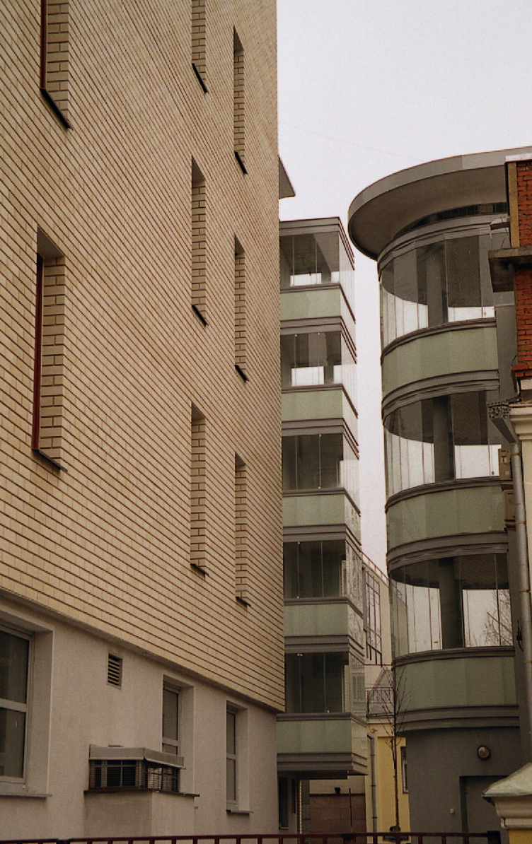
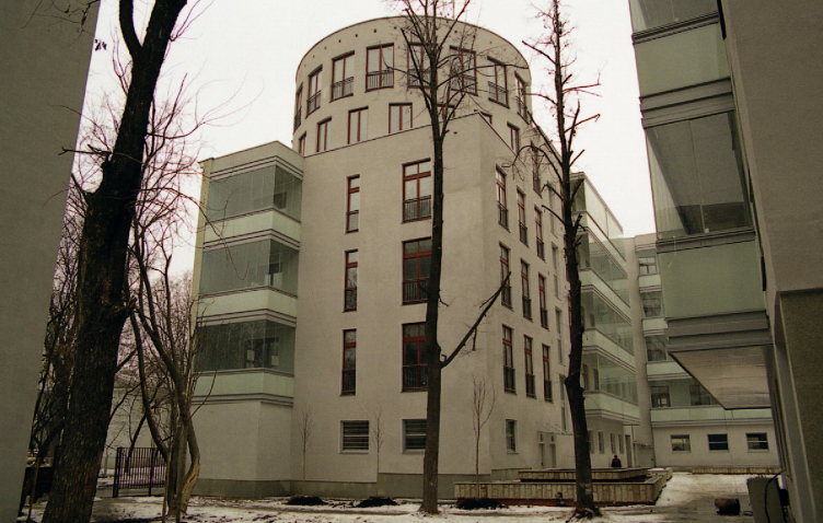
No, you can’t say that, that’s completely wrong. I’m categorically against this formulation: I never created Ostozhenka. What did we do? At the end of the 80s we formulated certain rules as to how to behave in this district. Simple rules such as ‘When entering, wipe your feet. Wash your hands before eating.’ And these rules were sufficient to introduce an element of reason into the development of the area – even if they were only observed a third of the time, at best. And the district of Ostozhenka became a ‘showcase for the achievements of Russian capitalism’. But no more than this. But the idea that this was conceived by Skokan or byuro Ostozenka is not even a myth; it’s nonsense.
I spend my whole time trying to say that the translation of ideas into real architectural forms is a complex process. Old tissue and new architecture are incommensurable with one another. But you’ve found a way of combining them.
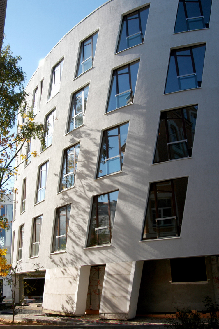
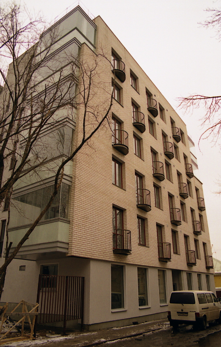
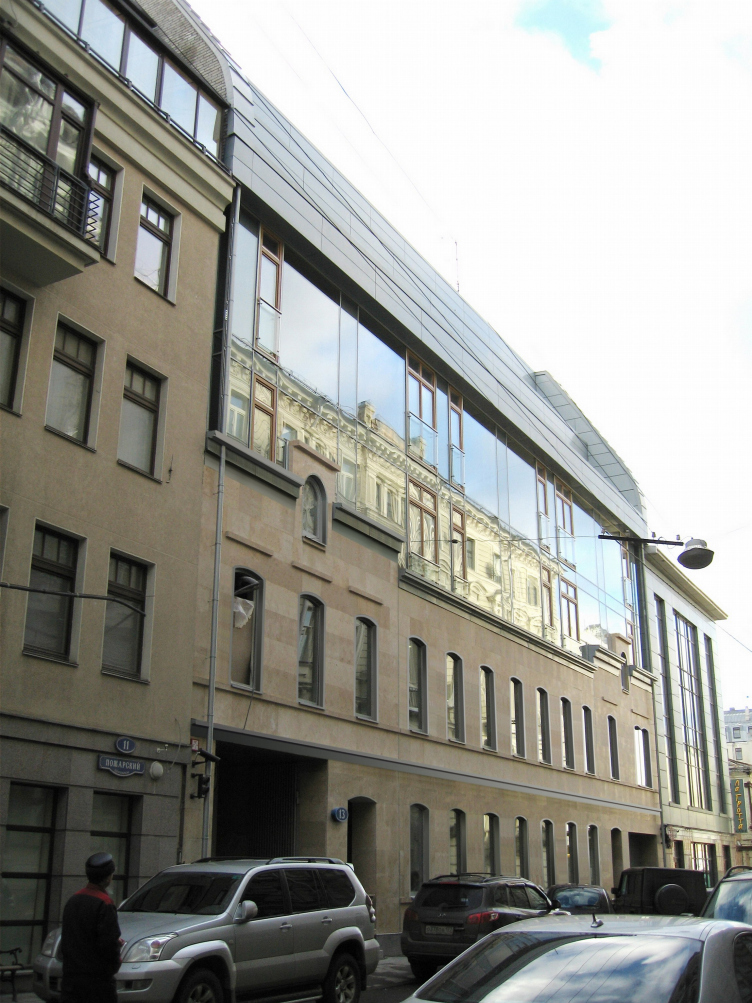
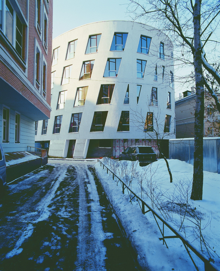
We looked for a way. We worked on the premise that the historical environment is valuable because it consists of many layers. This is a given. The development plan for Ostozhenka which we produced at the end of the 1980s is based on restoration of all the historical boundaries of the land plots. At the time we were laughed at: “You’re not seriously proposing to restore the old plots?” That wasn’t what we were proposing, but for us the original parcelling was a kind of spatial dimensionality, a local grid. This is the main thing that we did. Then it emerged that if you draw a plan that picks up these incidental, but already existent contours, this line – then everything can be made to fit. You get a grid, something like scaled paper – but only for the plot in question. It would be possible to draw whatever you like on this grid. If your brief is to design housing, then you use one set of lines; if it’s for a pedestrian zone, then you use another set. But whatever lines you take, you always pick up what has already existed.
And this was your method. A method which can be learned, repeated, and which is the distinctive content of contextualist Modernism. There’s nothing incidental here: each line follows a trace made by the past.
There’s another aspect. This is a fine illustration of the thesis of the transformation of quantity into quality. When Constructivist buildings began to appear in this archaic Moscow in the 1920s – think of Velikovsky’s Gostorg on Myasnitskaya or Corbusier’s Tsentrosoyuz, – this was wonderful. Because, given such a large mass of old buildings, this made for a keenly felt contrast. But gradually the urban tissue in which all this was being inserted wore thin. And at a certain moment it suddenly transpired that a critical point had been reached. One day, comparatively recently, I was approached with a request to design a building on the site of a health centre which had burnt down, at the beginning of Ostozhenka. I refused because I realized that I have no wish to see any modern architecture in this location. Not by me, nor by Skuratov – not by anyone; and designing old-style architecture is not for me. Before our very eyes the city’s flesh has become extenuated; nothing is left. It’s strange, even. Here’s what I think: from the point of view of good architecture there are things that you cannot do – stylization or Classicism, for instance. But on the other hand, the city’s flesh is already so dilapidated that modern forms evoke only revulsion. The context can no longer take it. Or has already been unable to take it. In Moscow so much has happened that talk of context seems too late; there’s already nothing to talk about. What context!
You sound very disappointed. A school has been created, and you’re crossing it out.
It’s my honest opinion. I can’t say I like anything on Ostozhenka – whether designed by us or anyone else. Recently, we made a film. Andrey Gozak and I attached cameras to our heads and walked the entire length of Ostozhenka. It’s a ghetto. There are no people – just security guards in black suits with wires in their ears – that’s all you can see. Wealthy people buy real estate simply to make a profitable investment. They hire security, but don’t actually live there. This is not a city, but a variation on a system of bank safes where money is protected from inflation. So what’s the point of all this architecture, then? Instead of a district with its own face, own distinctive character, and own life, we have nothing. Vacancy of the most expensive kind. You know I have two people inside me. One was born more than 60 years ago in Moscow, on Tverskoy bul’var. The other is an architect who works in today’s Moscow. And I’m often unable to agree with myself. As an ordinary resident of the city, I don’t like what’s going on. I don’t like any of it – that’s what! This is almost a dangerous condition to be in. As an architect, there are things I take pleasure in, but from the point of view of urban life, what’s happening today is a catastrophe. The city is disappearing. And I don’t want to talk about architectural problems when we have this kind of urban life as a background. So we’ve destroyed life, but, on the other hand, have learned how to timber more or less evenly and put pebbles in the right place. These are incommensurable things.
But these two things are not so directly connected.
I don’t know. The essence of the contextualist approach used to be that there is more context than architecture. Context is life, the social life of the city. Without it contextual architecture is by definition incomplete. It’s not architectural monuments that we wanted to create – for them to stand vacant and inspire architectural critics. We were trying to create a space in which to live, and as a result everything has died. But in that case what’s the point of my talking about architecture? Why do I work?
Very well. We’ll consider the contextualist approach to be finished.
It hasn’t finished. It has been transformed into the ideology of the architectural bureaucracy, into a system of planning approvals, and is currently exploited as a basis for corruption. When we conceived all this, it would have been difficult to foresee such a turn of events.
But one way or another, the contextualist approach was the last big idea in our architecture. What now?
Instead of the contextualist approach? I suppose you could say that a kind of individualization is taking place. There’s no single common tendency. As for me, I will continue doing what I’ve always done. Personally, in whatever situation I’m in, I need reference points. I have to grab hold of something, set some ranging points, establish the dimensionality of the space, the configuration of that in which I am to create. But others will not need this. Some people carry a system of the world with them the whole time; they fetch it out from their heads and start creating. There are such happy people, but I’m not one of them. But in the old days this was the way people worked, the method which people used as an initial impulse, whereas now it is, well, a consequence of my psychic state. That’s individualization for you.
But this leads to loneliness. And incidentally the time when the contextualist approach was developed, Gutnov’s group – this was an intellectually acute context. Are you currently aware of a certain thinning of the intellectual atmosphere?
Oh, yes, of course. The atmosphere of the early 1970s, when we were postgraduate students at the Institute of Theory and History of Architecture – Andrey Bokov, Vladimir Yudintsev, and I – it was a real club! There was Vyacheslav Glazychev, Andrey Baburov, Gutnov would drop in, there were the Slavophiles, Mikhail Kudryavtsev and Gennady Mokeev – all this was stewing in the same pot and, of course, it was great. I don’t know, maybe my pessimism is a matter of age. But on the other hand, we really don’t have any intellectual centres any more. Not the Academy of Architecture, nor the Union of Architecture – they don’t fulfil this role. At that time it was the practice for people to work for something else as well. In addition to their daily job, they had other work. This, incidentally, is a practice you still find in the West. Say, I recently gave a lecture in Bolzano. It’s a tiny town, only 100,000 residents, but it has its own architecture from the time of fascism. It’s very interesting. And there I got to know a local architect, Oswald Zoeggeler. He’s almost my age, maybe a little older. And he’s published a huge monograph on this architecture. Or, say, Paul Shemetov, whom I once met regularly. He wrote a monograph on industrial architecture in Paris – in addition to his main work on urban planning. Why did they do this? Why did we do this at that time? I don’t know. Because Aleksandr Skokan there was this feeling that you had to do something extra. And now it’s gone Well, what I can say? Intellectually, there’s no one I interact with today. There’s no one around me in the profession. It’s a pit.
What would you like to build?
I would like to design buildings for other situations. Not for the city, where everything is very subjective, but for natural surroundings. In the mountains, for instance. I like mountains; I feel euphoria there. I think I know how you should build in the mountains. You need horizontals. In general, I want to attain, well, harmony, if you like. If I were to build in the mountains, I’d want to make sure that it didn’t offend anyone’s gaze. For me the word ‘appropriateness’ is very important, and I would like to be appropriate in these surroundings.
Are you designing anything for Sochi? For the Olympics?
No, I decided not to take part. In Sochi they’ve got it all wrong; nothing good will come of it. I don’t want to take part.


