a partnership with Terence Farrell in London. In 1980, Grimshaw established his own firm, which is internationally renown for structural, industrial and technical experimentation, and its emphasis on structure, space, skin and intricate detailing. Today Grimshaw & Partners has offices employing over 200 architects in London, New York and Melbourne. The
practice is known internationally for its grand and elegant projects: the Waterloo Train Station in London, the Zurich Airport
expansion, the National Space Centre in Leicester, the British Pavilion at World’s EXPO ‘92 in Seville, and the Museum of
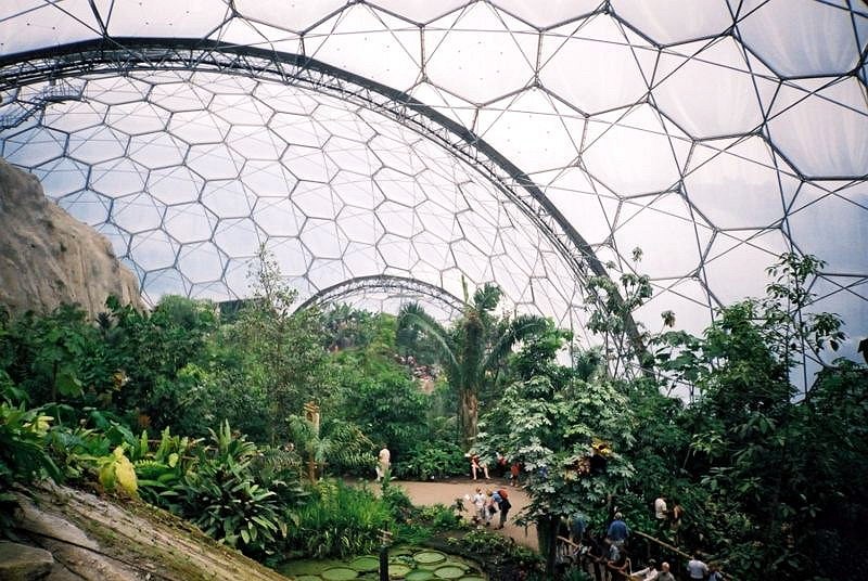
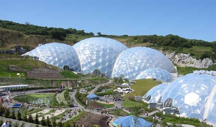
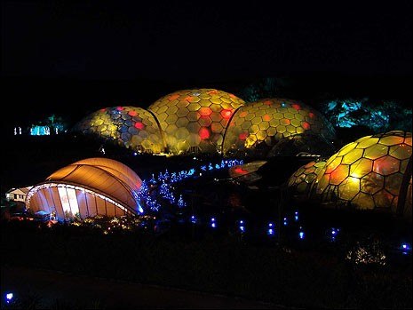
Steel in Monterrey, Mexico. Grimsahw’s famous Eden Project in Cornwall, England, is based on the segmented geometry of Buckminster Fuller’s geodesic dome to permit a great flexibility of separately controlled microclimates for variety of
plants. In 2002, the architect was knighted for his professional achievements and since 2004 he has served as the president of the Royal Academy of Arts.
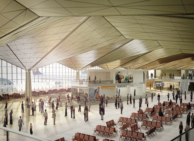
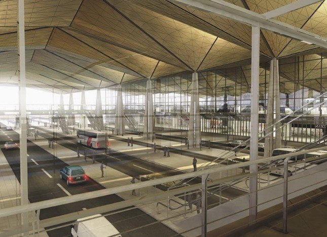
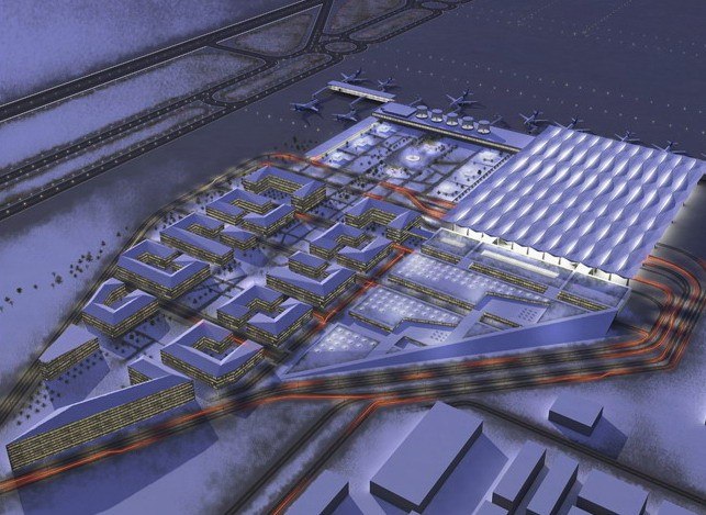
In 2007, Sir Grimshaw won the international competition to design a new Pulkovo Airport in St. Petersburg, Russia. The design is based on an intriguing concept – the city of islands with check-in, security and departure zones pulled apart
by wide openings reminiscent of water canals of St. Petersburg. These zones are to be connected by a multitude of bridges over baggage claim and arrivals areas below. The roof design is based on a system of 18m bays, which are supported by central stems and act as large hoppers, collecting rain or snow. The folds are based on small faceted fragments of Russian onion domes, but abstracted on a grand scale into a hovering inverted landscape tinted in noble gold.
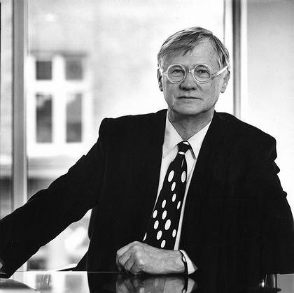
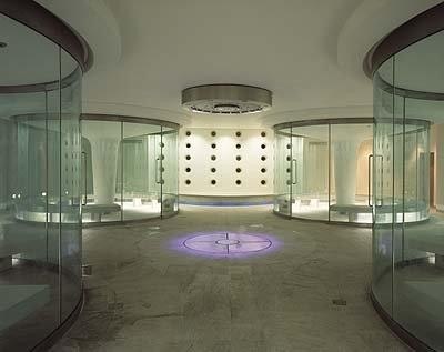
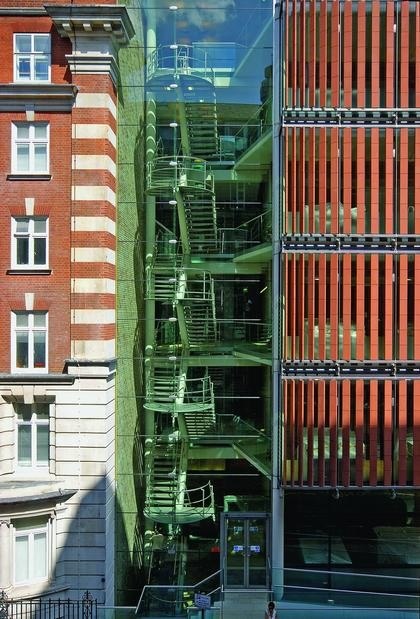
I met with Sir Nicholas Grimshaw in his futuristic looking office in London. To get inside his aquarium-like office one needs to cross a glass bridge, then sign the attendance journal, clip a fancy visitor’s pass and wait in an arched pad that features
dozens of multicolor interactive mood lighting pieces.
Before coming to London, I visited your office in New York where you are working on a number of projects in North America. One of the projects is a new outdoor concert arena for a city park in Brighton-Beach, Brooklyn, which is the main center of the Russian Diaspora. This park has become a major venue for Russian pop culture stars who often give free public performances there. So in a way, it is your first project for Russian community.
Yes, you are right and it will soon be ready for construction. We were selected through the City of New York Department of Design and Construction initiative called the Design Excellence Program. Our scheme was chosen out of eight proposals by local architects. The idea there is to morph the stage and seating areas into a manmade landscape and (with the use of the most advanced audio technology) to minimize the noise impact on the neighborhood. We also try to increase the use of the park’s new integrated playgrounds and walkways.
Let’s talk about your winning competition project for the Pulkovo Airport in St. Petersburg. Your main competitor was SOM. What do you think was the key advantage of your proposal?
I think the fact that we are a European firm and that we have done a lot of work in Europe played a big role. After all, St. Petersburg is kind of the face of Russia talking to Europe, is it not? The whole city was built as a sort of catalyst for communicating with Europe. So our proposal wasn’t just about solving practical issues but also positioned to project a very emotional statement.
Your architecture grows from an understanding of the process of a particular program. How was your idea for Pulkovo Airport developed?
Initially, most of the criticism was about not taking into consideration the local climate and the particular character of the city. So, in our final scheme we tried to bring such elements across through the tiny hints of gold that the very low sun picks up in the domes and spires across the beautiful skyline of this wonderful city. I think the main criticism of SOM was that their airport could have been built anywhere. Also, I suppose, the British are very romantic about the snow, which does not fall here often. We tend to see it as something very beautiful, but I realized that in St. Petersburg it might be viewed as something very oppressive, especially at a place like the airport. So, in a functional situation, you don’t want to see the snow
at all. That’s why my idea was to make the roofs inward flawing, like a trough. We expressed it as a series of interlocking
troughs so that the snow would get collected there and act as a good insulator and then melt and drain inside the building.
Also, I think the key thing at airports is the passenger flow. You want to have a sense of purpose and knowing where you are and be able to orient yourself. The other thing is to have a sense of joy, uplift and excitement of arrival and departure.
I think this project celebrates structure in a very unusual way compared to your other projects—through surfaces, joints,
alignments and the ways in which structure is hidden rather than exposed. Were any of these things determined by your personal observations while visiting St. Petersburg and did Russian architecture have any influence on your work or education?
I visited the city twice during the competition and went back there again recently for another meeting. I have also been to nearby places like Stockholm and Helsinki a number of times so I know the latitude there. As far as architecture, to me
a strong influence was the craftsmanship of traditional timber construction and detailing. Also, I always admired Berthold
Lubetkin, a Russian émigré architect who pioneered modernist design in Britain in the 1930s.
What are some of the lessons that you learned from other cities that you would like to bring to Russia?
Climate is a major generator for our design decisions and every city is different. For example, we just finished a train station in Melbourne. Its roof is entirely designed for local climatic conditions. It is clad in metal and shaped like sand dunes. The idea there is that the wind comes from all directions to extract the fumes up from the station through regularly spaced openings. So it is a completely different concept from St. Petersburg.
It sounds like engineering reasoning is what really drives your architecture.
But the fascinating thing is that you get your aesthetic appeal to shape buildings for factual reasons.
Why do you think international architects should build in Russia?
I think young architects in Russia need to try to find new ground after the chill of the concrete period that dominated there for so many years.
I think the period you are referring to has dominated all over the world, no?
Yes, you are quite right, but not to the extreme it did in Russia. We built quite a few of those concrete towers in Britain as well and they are being demolished now.
You don’t think some of them are worth of preserving?
Very few because they were not designed with people in mind. Most were designed for economy and mass production and
climate-wise they are pretty big disasters because of a lack of insulation and so on. I have visited many of such buildings in
East Berlin. You could laterally put your fist in the cracks between the panels. It is interesting that some of these buildings
were taken apart and the panels were used for forming roads. I think what we architects from abroad could do for Russia is to act as a catalyst just by simply putting forward ideas and talking about the principals on which we design. It is interesting to see how the emerging architects in Russia will start to react.. If we can demonstrate the right kind of architecture it can make quite a big difference.
You inherited an interest in engineering from two of your great-grandfathers – one was responsible for overseeing the installation of Dublin’s drainage and sanitation system, while the other built dams in Egypt. Can you talk about your family and who introduced you to architecture?
One of my great-grandfathers lived in Alexandria where he spent almost his entire life. He designed and built dams and irrigation systems. His son, my grandfather, grew up in Egypt, then moved to Ireland and was killed during World War
One at a young age. My father was born in Ireland and worked as an aircraft engineer and my mother was an artist. So you can say that this architect is a combination of an engineer and an artist. My grandmother was a very good portrait painter. My older sister is a well-known photographer and my younger sister is an artist. So I always had an interest in art. But a critical time for me was when I went to a local architect’s office at the age of 17 and realized that what they were doing felt right. Also my brother-in-law had a teaching job at the University of Edinburgh. He introduced me to a professor of architecture there. That young man said to me – “Why don’t you try architecture?” And the moment I walked into design studio I felt happy. So I followed his advice. It was a very traditional school. We did a lot of shadow and life drawings,
calligraphy, perspectives, scale models and we concentrated a lot on structures. We were also encouraged to use local
materials in our projects, such as pine and slate, and we had to draw construction details at full scale.
How influential was Buckminster Fuller’s work for you? Did you collaborate with him on any projects?
I knew him through my older sister, the photographer. He came to London for a series of lectures in 1967. He was famous
for talking for many hours non-stop. Once he gave a kind of a lecture marathon at the London School of Economics. People would come and go, have meals, come back and he would still be talking. He was the most extraordinary, charismatic speaker. He came to see my very first realized project. After the visit, we went to a local restaurant for a meal and then after a little while he said: “I have to sleep now”. So he put his arms around his head and went to sleep. He remained motionless forabout 15 minutes and then we continued the conversation. Fuller’s work was enormously influential from every angle, particularly from a philosophical point of view. He had a very strong feeling about recourse. He used to call people the ‘haves’ and the ‘have-nots’ and his life’s work was to distribute some of the wealth from the “haves’ to the ‘have-nots’. He had an enormous capacity for looking at the world as a whole and he predicted many concerns about energy conservation and issues of sustainability.
What was your first project, the one that you showed to Fuller?
It was a freestanding tower of bathrooms built behind the converted International Students Club hostel for 175 students in
Sussex Gardens near Paddington Station. At the tower’s core there was a spinal steel structure from which the bathroom
units and the ramp were cantilevered. The structure also housed pipework and ventilation bunking. There were 18 full
bathrooms, 12 showers and 12 lavatory and washbasin units. Fuller was a pioneer in that field and he saw it as the core for mass housing.
I am staying in a hotel in Sussex Gardens. Is this tower still around?
Sadly, no. The hostel was eventually converted into a hotel with individual bathrooms in each of the rooms.
It is such an intriguing project. How did you find such a perfect client?
My uncle used to work for the organization that invested money in converting these derelict houses into hostels. The houses
were damaged during the Second World War and were unoccupied for over 20 years. So they were bought very cheaply and my uncle said that he has a nephew who just graduated from architecture college and he would be able to help to chose some colors or something. They didn’t realize how badly these buildings were damaged and it turned out to be a very big project. The office was still tiny – just myself, Terry Farrell and a couple of helpers. You see, at a young age you don’t worry whether you could do something or not – you just do it. And it is a great feeling.
I guess, after this project you could do anything. What was your next project?
This project taught me everything. Our contractor had very little experience and I had to organize 36 subcontractors by
myself so I learned a lot of practical things very quickly. The next project was the block of flats near Regency Park. It was
co-ownership housing for artists, architects and photographers. It was built at a time when the government encouraged these types of coops and they would fund the project. So I found the people who were interested in that kind of living and became the architect for it. When it was built I moved with my family to the penthouse. It was a great experience, but of course, whenever the lifts broke down, everybody would come to complain and blame the architect.
How do you manage to combine the work in the office and being the president of the Royal Academy of Arts? What was your involvement in planning and arranging the “From Russia” exhibit?
I’m in my fourth year of being the president, which means I was elected four times by the fellows of the Academy. I devote two days a week entirely to the Academy and the rest of the time, I am here, working on architectural projects. Of course, I was very involved with the exhibition’s organization, especially with madam Antonova, the famous director of the Pushkin Museum. There was a lot of tension after Russia withdrew permission for the loan of the masterpieces for the exhibition fearing legal actions to claim ownership of some of the paintings by the descendants of Sergei Shchukin, one of the original collectors. Permission was eventually granted after “maximum possible assurances” were given by the British government to protect art from seizure. It is the most wonderful exhibition at the Academy in many years with 120 paintings by Renoir, Cézanne, Van Gogh, Gauguin, Matisse, Kandinsky, Tatlin and Malevich. Last week on the last day of the show, after it was already closed to the public I went for the last round with my wife. It was just wonderful. It was fascinating to see all of these works together and follow how French art effected Russian artists. Did you have a chance to see it?
Yes, also on the very last day and also together with my wife, but with huge crowds of people between us. So it was a different experience, but quite wonderful.
I love art and I also love music. Another thing I do is a Norfolk Music Festival where I own a house. It is in its fourth year now.
How did you start it?
My musician friends came up with the idea and asked me to sponsor it. Every year I buy all the empty seats and now we have them less and less. We had some very nice quartets, octets and solo pianists and they take place in a couple of beautiful local churches. The festival runs for a week and it attracts hundreds of people.
Are you planning to build the concert arena for this festival?
Yes, I imagine it will be in wood, like an upside-down boat.
Your architecture is about structure, order, details and flexibility. What else is important and what architectural qualities are you trying to express?
I think the main thing for me is the people’s flow. I suppose some architects will design space for the sake of space. For example, when people look at David Chiperfied’s heroic spaces they say, you know ‘what a wonderful space’ or whatever. I work in the reverse. I think the space should be shaped by what is happening – the flow of people, expression of interior spaces,differentiation between inside and outside skin instead of doing a piece of sculpture, which people may or may not like.
You once described the sculpturally expressionistic architecture of Frank Gehry as scaffolding that holds the outside skin and the inside skin but not a structure as such. Do you think buildings, whenever possible, should honestly display the way they are put together?
This is true: in his work there is no particular relationship between the inside skin and the outside skin. But it wasn’t his intention. He would be the first to say – I don’t give a damn how the skin is held up. I want this shape to be like that – because he works like a sculptor. And he is doing wonderful and amazing buildings. So I don’t think you have to express structure. But I think ideally, people should be able to understand how the structure works.
You have written that your buildings must be able to shed their skin. Could you elaborate on what you mean?
I believe that one day buildings will be able to grow organic transparent skin, like dragonfly’s wings. But the structure
would remain and the skin would breathe, endlessly renew itself, change opacity, transparency and the level of insulation,
and adapt to different temperatures just like an animal’s skin and fur. You will see in the future that buildings will be less like art and more organic like plants.
Are you all about the latest technology in your daily life – meaning – do you like getting the latest car or gadgets like
watches or cell phones?
Not at all. But I do have Toyota Prius, which is a hybrid car. It is a very clever car in the way it shares energy between the breaks, the lights and the air-conditioning. Every time you put your foot on the breaks, it generates electricity. I also find the touch screen of my iPhone quite fascinating. But I am not a big fan of computers and I still like to sketch by hand.
So if I ask you to draw something for me what would it be?
I’d make a drawing of Pulkovo Airport hoppers with the folded roof and how it was developed from its original basic form to what it has become today.
Grimshaw Architects Office in London
57 Clerkenwell Road, Islington
April 21, 2008
Nicholas Grimshaw 46 47

