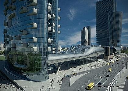
Zaha Hadid is the most explosive and exciting phenomena that happened to contemporary architecture. Her unrestrained imagination has been consistently pushing the boundaries of architecture, urban design and theory with bold and daring architectural ideas and projects, which for years were rejected as unbuildable fantasies. Until recent years, she was able to realize only a handful of small scale projects. The coveted Pritzker Prize in 2004 was awarded to her primarily for paper projects as a sign of hope that her fantastic visions would get materialized.
In 2006, at her solo retrospective show, which celebrated 30 years of Hadid’s career at the Guggenheim, New York, the visitors were greeted not just by fantasies of wild imagination but multimedia hardproven documentations of real buildings being built all over the world and on grand urban scales. Zaha Hadid is forcefully and confidently through her own bureau’s projects and projects of an army of inspired followers, reestablishing the experimental, organic, fluid and boundless architecture into the mainstream reality. Her realized projects include the ontemporary Arts Centers in Cincinnati and Rome, Ski Jump in Innsbruck, BMW Central Building in Leipzig and Phaeno Science Center in Wolfsburg in Germany. In addition to the above, there is a long list of projects under construction, such as a bridge in Abu Dhabi, Dubai Opera House and Aquatic Center in London, which will be Hadid’s first large project in the city where she heads her practice for the last 28 years.
Born in Baghdad in 1950, Hadid was educated by Catholic nuns in Baghdad and in a school in Switzerland. She studied mathematics at the American University of Beirut (1968–1971). Hadid describes that time as “a very optimistic moment in the Arab world in the ‘60s. We believed in modernization, westernization, industrialization... My father was a very important politician, one of the leaders of the Iraqi Democratic Party and the Minister of Finance and Industry. He was very concerned about housing projects. We were all educated with that premise and background, and always believed in progress and the education of women.”
Hadid graduated from the Architectural Association in London (1972–1977) and joined the founders of OMA (Office of Metropolitan) Rem Koolhaas and Elia Zenghelis in London as a partner. In 1980 she established her own firm. The architect has lectured across Europe and America and is currently a professor at the University of Applied Arts in Vienna. In April, I visited Hadid’s office at 10 Bowling Green Lane in Clerkenwell in east London. It is situated in a former Victorian school building and is made up of nine separate studios with unusually high ceiling. Currently there are 250 people working there (this number more than doubled in the last couple of years). Our têteà-tête interview was canceled time after time in New York, London and then in New York again due to Zaha’s frantic and often altered travel schedule. She had to go to the Middle East, then to Poland, then to Italy and then to a dozen of other places. We settled on conducting this interview through e-mails.
You have several projects in Russia, including a house, an office complex and a residential tower in Moscow. How did you get these commissions?
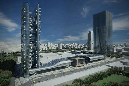
Our office became involved in these projects due to a surge within the Russian construction industry apparently caused by a new economy and a renewed interest in engaging with international architectural discourse. Most of the projects are commissions won through international architectural competitions; others are a result of the personal interest of our clients. We have found a strong willingness to experiment and a capability to take risk to realize extraordinary projects, which ischaracteristic of Russian clients in general.
Could you talk about the ideas that generated your house design in Moscow?
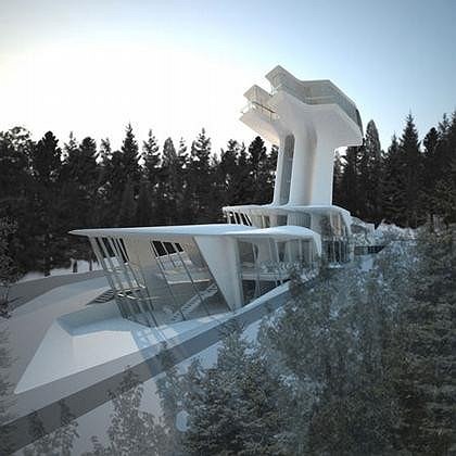
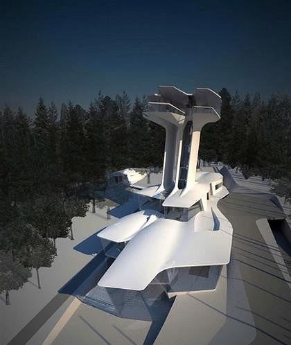
My early work was inspired by Russian Constructivism (Malevich’s Tektonik, London, 1976–1977) and it was the point of departure for my own original formal exploration. My work has become more fluid and organic since. The Capital Hill villa combines the raw gestural power of my early work with the organic refinement of my latest work.
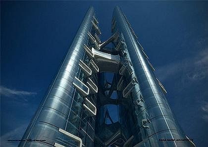
The building consists of two main forms. The lower form emerges from the naturally sloped landscape inside a beautiful conifer and birch tree forest, which covers the entire site and the wide residential area in the periphery of Moscow. This form assimilates the existing land configuration and occupies it by introducing artificial terraces. The external topography is pulled inside the building, articulated and released back into the natural surroundings. This two-way process dissolves the differentiation between interior and exterior and creates the initial notion of flow, which is then translated into the vertical and towards the second form above. As the spatial antithesis, the upper form is floating above the undulated green ocean of the 22m tall trees, it creates a place to enjoy the infinite vistas and sun at any point of its journey along the sky. The connection between these two forms is a vertical structure realized as an elongated vertical blend.
Transparent connections to the outside allow the occupier to experience the ascent up from within the dense forest, a journey from the snug darkness of the forest turning into openness and light above.
What kind of a house did you grow up in?
Baghdad had a very wonderful garden city suburb with lots of modernist houses, and we had a very nice house from the thirties with funky fifties furniture. The house is still there. I remember when I was seven I went with my parents to Beirut to see some new furniture they had ordered for our home. My father Mohammad Hadid was a forwardlooking man with cosmopolitan interests and in those days, Baghdad was undergoing a Modernist influence; the architects Frank Lloyd Wright and Gio Ponti both designed buildings there. I can still remember going to the furniture maker’s studio and seeing our new furniture. The style was angular and modernist, finished in the chartreuse colour, and for my room there was an asymmetric mirror. I was thrilled by the mirror and it started my love of asymmetry. When we got home, I reorganized my room. It went from being a little girl’s room to a teenager’s. My cousin liked what I had done and asked me to do hers, then my aunt asked me to design her bedroom, and so it started. But it was my parents who gave me the confidence to do these things.
Where do you live in London?
I live in Clerkenwell in east London. I’ve had an office there for over 20 years in an old Victorian school building, and have taken over more of the building as the office has expanded. About two years ago, I moved closer to the office as my old flat suffered water damage whilst I was traveling and I had to move out quickly. My current home is not a space designed by our office – although one of the benefits of this new space is that it is much larger than my old home, and can house some of my work.
You often go to Moscow. Tell me about that experience.
Working in Russia is as challenging as in any other part of the international architectural landscape. In the case of,Russia and particularly Moscow, the challenge is met with an epicentre of an idiosyncratic and longstanding tradition of architecture and of architectural innovation. Yet, there is another aspect, specifically for the villa project one unique characteristic is the interaction with raw nature – especially in wintertime. Extreme winters with heavy snow are becoming more and more rare in the world today. However, in Russia these winters still exist – with two meters deep snow and temperatures as low as minus 30 degrees.
What are the unique qualities of Moscow that you would want to express in your architecture?
The scale of the city is incredible. Moscow is one of the most spectacular cities in the world. The scale is double or triple the size of any other. If you go up to the Lenin Hills, you can see those seven Stalinist skyscrapers which were based on towers in the Kremlin, but on a much larger scale. Nowadays they are tearing many things down - they just don’t get it. It is an established fact that my work took its first inspiration from the early Russian avant-garde, in particular, the work of Kazimir Malevich. The spirit of adventure to embrace the new and the incredible belief in the power of invention attracted me to the Russian avant-garde. Malevich was a pioneer of abstraction and a pioneer in directly linking abstract art with architecture via his seminal “tectonics”. The tectonics are compositions in dynamic equilibrium that strictly adhere to the principle of orthogonality and they are composed of cubic volumes with adjoining surfaces, thus excluding interpenetration. These “cubist” restrictions characterized most of the modern architectural work in Moscow. Leonidov’s 1927 project for the Lenin Institute was 50 years ahead of its time and his 1934 competition entry for the Soviet Ministry of Industry – a composition of different towers placed upon an urban podium - remains an inspiration for metropolitan architecture today. What is most refreshing about these projects is the way they were embedded within an intense discourse promoted by exhibitions, academic institutions and public competitions.
These projects – in all their experimental radicality – had a real social meaning and political substance.One of the tasks I set for myself was the continuation of the unfinished project of modernism, in the experimental spirit of the early avant-gardes – radicalizing some of its compositional techniques like fragmentation and layering. You wanted to become an architect since a very young age.
What influenced your fascination with architecture and why did you first go to study mathematics?
Before coming to London, I studied mathematics at the American University in Beirut, where I became interested in geometry. I am fascinated by the mix of the logic and the abstract. The work of Malevich and Kandinsky brings these together and injects the idea of motion and energy into architecture, giving a feeling of flow and movement in space.
Did you go to the Architectural Association because of London or did you go to London because of the AA?
I came to London from Beirut specifically to study at the AA. My brother had told me it was the best place to study architecture. It was a fantastic moment at the AA at that time. Alvin Boyarsky, Chairman of the AA between1971–1990, created a legacy of globalism at the school. His visionary leadership allowed the AA to become the world’s first truly international school of architecture, acting as a catalyst for the ideas of students from around the world. I am glad I was there at that time.
What was the AA experience like?
There was a feeling of being antiarchitecture at the AA then. The rise of post-modernism, historicism and rationalism served as an antidote to ideas of modernity as we knew it in the early part of the 20th century. So it was very refreshing to find alternatives that had some precedence, like the Russian avantgarde. Naïvely, as you’re a student, you think you’re discovering things for the first time. It was very exciting. The whole experiment of the AA is to make you lost and confused for three years, and then in the fourth year assume you’ve been trained enough to choose what you want to pursue and who you want to teach you. The first year was insane, the second year was slightly calmer but still confused, in the third year, things were slightly more in shape, and in the fourth year, it all comes together. I was never sure what I should be doing. Rem always teased me, saying that if he didn’t understand what I’d done then he’d take the project away from me. It was a shock for me when I actually understood what they were trying to do. There was a shift at the AA at that time – from the metaphysical to developing so-called projective realities. It was a very important moment and Alvin Boyarsky fully supported it. We had no idea what we were chasing, or what it would lead to, but we knew that it had a productive reality. You said that your architecture is about experimenting and testing of what is possible.
Could you explain how your work is progressing over time?
The ambition was always to create fluid spaces and experiences on all levels. Also, I was fragmentary because of all the breaking of, not only the rules, but also what we inherited from modernity and from the historic cities. The layering of process became more complex. For the last five years, I’ve really tried hard to achieve both complexity and fluidity. Goals always change. With the work maturing, there has been an accumulation of points of reference internal to the oeuvre so that the work develops and diversifies out of its own internal resources. I know from my own experience that if certain things had never been unraveled, never dug into or researched, the discoveries would never have happened. So this pursuit is valid, and even when you know you’ve uncovered something, there’s always more to discover.
This response is consistent with the opinion of Patrik Schumacher, Hadid’s partner. In 2006 in New York in the presence of Zaha he told me the following:
We’ve been working within a certain paradigm for so many years. We continue to push in the same direction. So of course, there is a progression and we are getting better. We are developing virtuosity by refining and perfecting our techniques, sensitivities and ideas.
I am rather more interested in how their projects fit a particular condition and going back to the interview questions I remind Zaha her own words: “We work globally but would like to refrain from speculating about the influence of local national experiences. Any such speculation can only serve to distract from the issues of the current metropolitan condition.” What conditions are important for you and what makes your architecture specific to a particular site or city?
We are always interested in expanding our repertoire and doing different things in different contexts - but there are some principles, which we always adhere to. And one of them is attempt to embed an object into context with a whole series of articulate relationships - trying to draw out features from the context so that in the end there is a sense of “embedded-ness”, and “fit-ness” into the context. A project design can change as the research of the site reveals things. An ideal situation is very rare. We’ve learned to apply new techniques to urbanism. As we’ve done in our buildings, where elements fit together to form a continuum. We’ve applied this to whole cities. We can develop a whole field of buildings, each one different, but logically connected to the next – creating an organic, continually changing, field of buildings. Three or four types of buildings that are highly correlated. We see an order, a logical and lawful differentiation of buildings that has the elegance of coherence. We look a lot at nature’s systems when we try to create environments. It is hard to explain, it is hard to understand. One has to see it.
There is a fascinating oil painting Grand Buildings, London from 1985. Could you explain how a typical site condition usually feeds your imagination in creating such paintings? Then, how a painting like this informs and reimagines the real site for a real intervention?
One concrete result of my fascination with Malevich in particular was that I took up painting as a design tool. This medium became my first domain of spatial invention. I felt limited by the poverty of the traditional system of drawing in architecture and was searching for new means of representation. It provided me with the tool for intense experimentation in both form and movement that led to our radical approach to developing a new language for architecture. I enjoy painting, and it was always a critique of what was currently available to us at the time as designers. I mean everything was done through plan and section. So the paintings really came because I thought the projections required a degree of distortion and defamation at the time, but eventually it affected the work itself, of course. The work became much more malleable because the origin of the work was also about over layering – like an historical layering - when you layer things over each other - some things come up.
Pondering about what Zaha had to say one needs to admit that her words surely poses a prophetic power – to understand this one needs to see it.

