По-русски

Curves of the Dunes

The apartment complex built in the city of Sestroretsk boasts curvilinear forms and highly developed infrastructure, which makes it possible to describe this place as a “health park” or a dacha of a new type.

14 November 2019
Object
mainImg
Firm:
A-Len
AMM
Object:
“Light World Inside” health park
Russia, Sestoreck

2015 / 2018

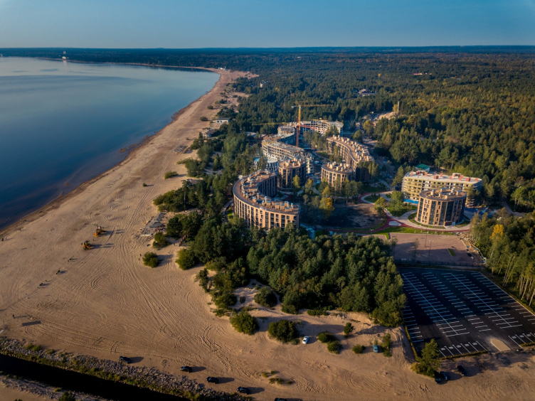
The coastline part of Saint Petersburg’s Kurortny district looks very much like Latvia’s Jurmala: a cold bay, a wide sand beach 50 kilometers long, and dunes alternating with pine groves. Once upon a time this place was buried under a glacier, and then it was the bottom of the Littorina sea, which left behind it this hilly terrain with small rivers, lakes, and moraines. It never ceases to amaze people how, after only a half-hour’s drive or local train ride away from the granite city you find yourself in such strikingly different seaside resort environment.

The area consists of dachas, health resorts, new and old, villa communities of different class, the “large” houses only to be found in Sestroretsk, a town with a population a little over 40 thousand people. And here is situated the apartment complex “Svetly Mir VNUTRI” (“Light World INSIDE”), marketed by Seven Suns developers as a health park.

The land site is really a fairy tale – a little outside the city, the former territory of the “Dunes” health center, a lot of trees, the first seaside line, the most beautiful sand beach in Saint Petersburg, “Laskovy”, is just a walking distance away; moving in the other direction, one will see the terrain cure facilities of the Kurort station. Yet another sight is Saint Petersburg’s one and only nudist beach that spontaneously appeared here a few years ago on a land spot behind the Malaya Sestra River.

Health park “Svetly Mir VNUTRI”
Copyright: © AMM
Health park “Svetly Mir VNUTRI”
Copyright: © AMM


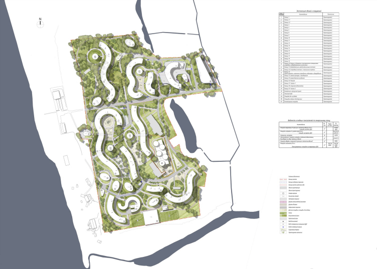
Sergey Oreshkin, whose architectural company prepared the master plan of the future complex, shares that the “underbelly” of the dunes, which slowly but surely gains an impressive height of 30 meters, forms a special microclimate, whose healing effect is further enhanced by the pine trees that back in the day were planted here specifically for the health center. It would have been impossible to refrain from such competitive advantages, and, therefore, the master plan was chiefly based on three factors, three “genii loci”: the dunes, the trees, and the bay views.

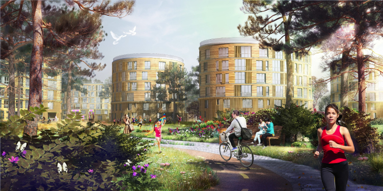
On the topographic footage, the architects circled the “islets” with valuable trees – squatting pines, elms, oaks, and firs – which allowed them to mark the buildable areas, predominantly on the north slopes of the dunes, where they placed the buildings, making their shapes fit in with the curves of the terrain. Then the architects began to turn the houses around in order to ensure that they command as many as possible of the bay views. The gaps between some of the buildings are filled by elliptical villas of a higher class; there are fewer apartments in them. The winding houses of the first line also serve as the wind screen for the inside territories.

Totally, the complex consists of 19 houses 5-6 stories high, which does not exceed the height of the pines – from the beach side, the complex is not exactly invisible, yet it peeks out from behind the trees in a very delicate way, chiefly thanks to its decoration materials: the ceramics of the add-on facade imitates the texture of a pine board.

Health park “Svetly Mir VNUTRI”. Project, 2015. Master plan
Copyright: © A-Len


The complex boasts outstanding infrastructure: in addition to the habitual cafes and a kindergarten, it will include a healthy food store, a health clinic, a sports complex with a swimming pool, baths, a kite and windsurfing school, tennis courts, and even an institute for spiritual practices.

All of the roofs are operated, which cost the architects some certain effort, because they had to solve the issues of safe and comfortable operation. The boardwalks, pebbles, and the deck chairs all serve to create a seaside resort atmosphere – one can sunbathe here, do yoga, admire the stars and sunsets, as well as watch multicolored kites.

The developer wanted to create here conditions necessary for a certain lifestyle, very much of the countryside or health resort type: in the morning, there is a morning exercise session going on upon one of the roofs; then people go to have breakfast, then they can go cycling in the summertime or skiing in winter. In other words, healthy lifestyle all year round.

  • zooming
    1 / 8
    Health park “Svetly Mir VNUTRI”
    Copyright: © AMM
  • zooming
    2 / 8
    Health park “Svetly Mir VNUTRI”
    Copyright: © AMM
  • zooming
    3 / 8
    Health park “Svetly Mir VNUTRI”
    Copyright: © AMM
  • zooming
    4 / 8
    Health park “Svetly Mir VNUTRI”
    Copyright: © AMM
  • zooming
    5 / 8
    Health park “Svetly Mir VNUTRI”
    Copyright: © AMM
  • zooming
    6 / 8
    Health park “Svetly Mir VNUTRI”
    Copyright: © AMM
  • zooming
    7 / 8
    Health park “Svetly Mir VNUTRI”
    Copyright: © AMM
  • zooming
    8 / 8
    Health park “Svetly Mir VNUTRI”
    Copyright: © AMM


Designing the trails, playgrounds, and sports fields, the architects tried to turn the inner space of the complex into a landscaped park: the pine trees now complement the lawns with hydrangeas, barberries, and spindle woods. The children’s houses, gazebos, and other small architectural forms are all custom-designed in a single style. The motorists will have to leave their cars in the parking lot made at the entrance to the complex. “Svetly Mir Vnutri” has already scored a few professional awards for its landscaping project.

It is expected that the apartments ranging from 20 to 80 square meters will be used as vacation rentals or weekend homes: you enjoy the benefits of the countryside life, while the management company handles the lovely task of trimming the lawns. The picture is completed by barbecue places, where one can make a picnic in any weather; possibly, the complex will also include public greenhouses and vegetable gardens.

  • zooming
    1 / 4
    Health park “Svetly Mir VNUTRI”
    Copyright: © AMM
  • zooming
    2 / 4
    Health park “Svetly Mir VNUTRI”
    Copyright: © AMM
  • zooming
    3 / 4
    Health park “Svetly Mir VNUTRI”
    Copyright: © AMM
  • zooming
    4 / 4
    Health park “Svetly Mir VNUTRI”
    Copyright: © AMM


The project was executed by AMM-Project headed by Yuri Mityurev on the basis of the master plan developed by A-Len. The layout was kept fully intact; what was changed was only the inside layouts of the apartments and the facade designs: the latter became flatter and more “Scandinavian”.

The initially proposed cellular structure of the buildings was smoothed out because of the wind load; the white ceramic tiles got replaced with wood-imitating ones. As for the apartment layouts, these were changed mostly due to the economic considerations: while A-Len followed the contours of the buildings and made the rooms of trapezoid shape, AMM proposed an orthogonal structure of the apartments, all of the complex curves going into the stanzas, which is simpler and less expensive.

  • zooming
    1 / 4
    Health park “Svetly Mir VNUTRI”. Project, 2015
    Copyright: © A-Len
  • zooming
    2 / 4
    Health park “Svetly Mir VNUTRI”. Project, 2015
    Copyright: © A-Len
  • zooming
    3 / 4
    Health park “Svetly Mir VNUTRI”. Project, 2015
    Copyright: © A-Len
  • zooming
    4 / 4
    Health park “Svetly Mir VNUTRI”. Project, 2015
    Copyright: © A-Len


Svetly Mir VNUTRI is a rare case for Saint Petersburg: an interesting silhouette, almost wooden material, lush vegetation, diverse public spaces. One cannot call this complex perfectly contextual because, among other things, it does not say anything at all about the former “Dunes” health resort, and, due to its sheer scale, its influence on the surrounding scenery is quite significant. On the other hand, the architects and the developer are addressing the aesthetics of the neighboring countries lying just beyond the gulf; preserve the trees, and, especially, the atmosphere. Well, maybe not the atmosphere of a Saint Petersburg dacha – because its true style is a prohibitively expensive luxury nowadays – but for sure the atmosphere of a vacation rental, at which you’d love to spend a weekend or two.
  • zooming
    1 / 4
    Health park “Svetly Mir VNUTRI”
    Copyright: © AMM
  • zooming
    2 / 4
    Health park “Svetly Mir VNUTRI”
    Copyright: © AMM
  • zooming
    3 / 4
    Health park “Svetly Mir VNUTRI”
    Copyright: © AMM
  • zooming
    4 / 4
    Health park “Svetly Mir VNUTRI”
    Copyright: © AMM


Firm:
A-Len
AMM
Object:
“Light World Inside” health park
Russia, Sestoreck

2015 / 2018

14 November 2019

Headlines now
The Golden Crown
The concept for a dental clinic in Yekaterinburg, developed by CNTR Studio, revolves around the idea of a “mouth full of gold”: pristine white porcelain stoneware walls are complemented by matte brass details. To avoid an overly literal interpretation, the architects focused on the building’s proportions, skillfully navigating between sunlight requirements and fire safety regulations.
Flexibility and Integration
Not long ago, we covered the project for the fourth phase of the ÁLIA residential complex, designed by APEX. Now, we’ve been shown different fence concepts they developed to enclose the complex’s private courtyards, incorporating a variety of public functions. We believe that the sheer fact that the complex’s architects were involved in such a detail as fencing speaks volumes.
A Step Forward
The HIDE residential complex represents a major milestone for ADM architects and their leaders Andrey Romanov and Ekaterina Kuznetsova in their quest for a fresh high-rise aesthetic – one that is flexible and layered, capable of bringing vibrancy to mass and silhouette while shaping form. Over recent years, this approach has become ADM’s “signature style”, with the golden HIDE tower playing a pivotal role in its evolution. Here, we delve into the project’s story, explore the details of the complex’s design, and uncover its core essence.
Gold in the Sands
A new office for a transcontinental company specializing in resource extraction and processing has opened in Dubai. Designed by T+T Architects, masters of creating spaces that are contemporary, diverse, flexible, and original, this project exemplifies their expertise. On the executive floor, a massive brass-clad partition dominates, while layered textures of compressed earth create a contextually resonant backdrop.
Layers and Levels of Flight
This project goes way back – Reserve Union won this architectural competition at the end of 2011, and the building was completed in 2018, so it’s practically “archival”. However, despite being relatively unknown, the building can hardly be considered “dated” and remains a prime example of architectural expression, particularly in the headquarters genre. And it’s especially fitting for an aviation company office. In some ways, it resembles the Aeroflot headquarters at Sheremetyevo but with its own unique identity, following the signature style of Vladimir Plotkin. In this article, we take an in-depth look at the United Aircraft Corporation (UAC) headquarters in the Moscow agglomeration town of Zhukovsky, supplemented by recent photographs from Alexey Naroditsky – a shoot that became only recently possible due to the fact that improvements were finally made in the surrounding area.
Light and Shadow
In this article, we delve into the architectural design of the “Chaika” house by DNK ag architects, which was recently completed in 2023 as part of the collection of signature designs at ZILArt. As is well-known, all the buildings in this complex follow a design code, yet each one is distinct. This particular building stands out not only for its whiteness and minimalism but also for the refined use of a limited number of techniques that, together, create what can confidently be called synergy.
Casus Novae
A master plan was developed for a large residential area with a name of “DNS City”, but now that its implementation began, the plan has been arbitrarily reformatted and replaced with something that, while similar on the surface, is actually quite different. This is not the first time such a thing happens, but it’s always frustrating. With permission from the author, we are sharing Maria Elkina’s post.
Treasure Hunting
The GAFA bureau, in collaboration with Tegola and Arkhitail, organized an expedition to the island of Kilpola in Karelia as part of Moskomarkhitektura’s “Open City” festival. There, amidst moss and rocks, the students sought answers to questions like: what is the sacred, where does it dwell, and what sustains it? Assisting the participants in this quest were landscape engineer Evgeny Levin, artist Nicholas Roerich, a moose, and the lack of cellular connection. Here’s how the story unfolded.
Depths of the Earth, Streams of Water
In the Malaya Okhta district, the Akzent building, designed by Stepan Liphart, was constructed. It follows a classic tripartite structure, yet it’s what you might call “hand-drawn”: each façade is unique in its form and details, some of which aren’t immediately noticeable. In this article, we explore the context and, together with the architect, delve into how the form was developed.
Fir Tree Dynamics
The “Airports of Region” holding is planning to build an airport in Karachay-Cherkessia, aiming to make the Arkhyz and Dombay resorts more accessible to travelers. The project that won in an invitation-only competition, submitted by Sergey Nikeshkin’s KPLN, blends natural imagery inspired by the shape of a conifer seed, open-air waiting spaces, majestic large trees, and a green roof elevated on needle-like columns. The result is both nature-inspired and WOW.
​A Brick Shell
In the process of designing a clubhouse situated among pine trees in a prestigious suburban area near Moscow, the architectural firm “A.Len” did the façade design part. The combination of different types of brick and masonry correlates with the volumetric and plastique solutions, further enhanced by the inclusion of wood-painted fragments and metal “glazing”.
Word Forms
ATRIUM architects love ambitious challenges, and for the firm’s thirtieth anniversary, they boldly play a game of words with an exhibition that dives deep into a self-created vocabulary. They immerse their projects – especially art installations – into this glossary, as if plunging into a current of their own. You feel as if you’re flowing through the veins of pure art, immersed in a universe of vertical cities, educational spaces – of which the architects are true masters – and the cultural codes of various locations. But what truly captivates is the bold statement that Vera Butko and Anton Nadtochy make, both through their work and this exhibition: architecture, above all, is art – the art of working with form and space.
Flexibility and Acuteness of Modernity
Luxurious, fluid, large “kokoshniks” and spiral barrel columns, as if made from colorful chewing gum: there seem to be no other mansion like this in Moscow, designed in the “Neo-Russian-Modern” style. And the “Teremok” on Malaya Kaluzhskaya, previously somewhat obscure, has “come alive with new colors” and gained visibility after its restoration for the office of the “architectural ecosystem” as the architects love to call themselves. It’s evident that Julius Borisov and the architects at UNK put their hearts into finding this new office and bringing it up to date. Let’s delve into the paradoxes of this mansion’s history and its plasticity. Spoiler: two versions of modernity meet here, both balancing on the razor’s edge of “what’s current”.
Yuri Vissarionov: “A modular house does not belong to the land”
It belongs to space, or to the air... It turns out that 3D printing is more effective when combined with a modular approach: the house is built in a workshop and then adapted to the site, including on uneven terrain. Yuri Vissarionov shares his latest experience in designing tourist complexes, both in central Russia and in the south. These include houseboats, homes printed from lightweight concrete using a 3D printer, and, of course, frame houses.
​Moscow’s First
“The quality of education largely depends on the quality of the educational environment”. This principle of the last decade has been realized by Sergey Skuratov in the project for the First Moscow Gymnasium on Rostovskaya Embankment in the Khamovniki district. The building seamlessly integrates into the complex urban landscape, responding both to the pedestrian flow of the city and the quiet alleyways. It skillfully takes advantage of the height differences and aligns with modern trends in educational space design. Let’s take a closer look.
Looking at the Water
The site of Villa Sonata stretches from the road to the water’s edge, offering its own shoreline, pier, and a picturesque river panorama. To reveal these sweeping views, Roman Leonidov “cut” the façade diagonally parallel to the river, thus getting two main axes for the house and, consequently, “two heads”. The internal core – two double-height spaces, a living room and a conservatory, with a “bridge” above them – makes the house both “transparent” and filled with light.
The White Wing
Well, it’s not exactly white. It’s more of a beige, white-stone structure that plays with the color of limestone – smoother surfaces are lighter, while rougher ones are darker. This wing unites various elements: it absorbs and interprets the surrounding themes. It responds to everything, yet maintains a cohesive expression – a challenging task! – while also incorporating recognizable features of its own, such as the dynamic cuts at the bottom, top, and middle.
Urban Dunes
The XSA Ramps team designed and built a three-part sports hub for a park in Rostov-on-Don, welcoming people of all ages and fitness levels. The skate plaza, pump track, and playground are all meticulously crafted with details that attract a diverse range of visitors. The technical execution of the shapes and slopes transforms this space into a kind of sculptural composition.
Proportional Growth
The project for the fourth phase of the ÁLIA residential area has been announced. The buildings are situated on an elongated plot – almost a “ray” that shoots out from the center of the area towards the river. Their layout reflects both a response to Moscow’s architectural preferences over the past 15 years, shifting “from blocks to towers”, and an interpretation of the neighboring business park designed by SOM. Additionally, the best apartments here are not located at the very top but closer to the middle, forming a glowing “waistline”.
The “Staircase” Building
In designing the “Details” residential complex in New Moscow, Rais Baishev spiced up the now-popular Moscow theme of a “courtyard” building with an idea drawn from the surrealist drawings by Maurits Escher. He envisioned the stepped silhouettes and descending slopes as a metaphysical mega-staircase, creating a key void within the courtyard that gave the project an internal “spine”. This concept is felt both in the building’s silhouette and on its façades.
Projection of the Quarter
No one doubted that the building that Vladimir Plotkin designed as part of the “Garden Quarters” would be the most modernist of all. And it turned out just that way: while adhering to the common design code, the building successfully combines brick and white stone, rhythmically responding to the neighboring building designed by Ostozhenka, yet tactfully and persistently making a few statements of its own. This includes the projection of the ideal urban development composition “14–9–6”, which can be found right next door, mathematical calculations, including those for various types of terraces (and perhaps the only reminder of the Soviet past of the Kauchuk rubber factory!), and the white “cross-stitch” pattern of the façade grid.
Domus Aurea
In this issue, we examine the “Tessinsky-1” house, designed by Sergey Skuratov and completed in 2023. Located in the middle of the Serebryanicheskaya Embankment district, at the intersection of its main streets, this house assumes a sort of “nodal” role: it not only responds to everything around it and preserves many memories of the former EMA factory within itself, but it weaves all this into a newly directed pattern, reconciling bright “gold” and dark-colored brick, largely with the help of the new, modern-yet-archaic Columba brick, which, come to think about it, is the most precious element here.
The Chimney of Nikola-Lenivets
In this issue, we are examining the “Obelisk House” designed by KATARSIS and built for the Arkhstoyanie 2023 festival. However, it was only finished later on, and this is why we are examining it now. It seems to us that after the “Obelisk House” appeared in Nikola-Lenivets, a dialogue and a few inner connections appeared between the temporary structures built here. These houses no longer look like “accidental neighbors”, more of which below.
​Periscope by the Bay
The jury awarded the second place in the competition for a public and cultural center in Petropavlovsk-Kamchatsky to the companies GORA (“Mountain”) and M4. In the consortium’s proposal, the building resembles a sperm whale with a calf swimming next to it or a periscope, whose lenses capture the most spectacular views from the surrounding landscape.
From Arcs to Dolmens
While working on the competition project for Petropavlovsk-Kamchatsky, ASADOV Architects prioritized the value of the natural and urban environment, aiming to preserve the balance of the location while minimizing the resemblance of the volume that they designed to a “traditional building”. The task was challenging, and the architects created three versions, one of which having been developed after the competition, where their main proposal took third place. However, the point of interest here is not the competition result but the continuity of creative thinking.
Hide and Seek
The ID Moskovskiy house, designed by Stepan Liphart in St. Petersburg, in the courtyards near Moskovskiy Avenue beyond the Obvodny Canal and recently completed, is notable for several reasons. Firstly, it has been realized with considerable accuracy, which is particularly significant as this is the first building where the architect was responsible not only for the facades but also for the layouts, allowing for better integration between the two. On the other hand, this building is interesting as an example of the “germination” of new architecture in the city: it draws on the best examples from the neighborhood and becomes an improved and developed sum of ideas found by the architect in the surrounding context.
The Big Twelve
Yesterday, the winners of the Moscow Mayor’s Architecture Award were announced and honored. Let’s take a look at what was awarded and, in some cases, even critique this esteemed award. After all, there is always room for improvement, right?
Above the Golden Horn
The residential complex “Philosophy” designed by T+T architects in Vladivostok, is one of the new projects in the “Golubinaya Pad” area, changing its development philosophy (pun intended) from single houses to a comprehensive approach. The buildings are organized along public streets, varying in height and format, with one house even executed in gallery typology, featuring a cantilever leaning on an art object.
Nuanced Alternative
How can you rhyme a square and space? Easily! But to do so, you need to rhyme everything you can possibly think of: weave everything together, like in a tensegrity structure, and find your own optics too. The new exhibition at GES-2 does just that, offering its visitor a new perspective on the history of art spanning 150 years, infused with the hope for endless multiplicity of worlds and art histories. Read on to see how this is achieved and how the exhibition design by Evgeny Ace contributes to it.
Blinds for Ice
An ice arena has been constructed in Domodedovo based on a project by Yuri Vissarionov Architects. To prevent the long façade, a technical requirement for winter sports facilities, from appearing monotonous, the architects proposed the use of suspended structures with multidirectional slats. This design protects the ice from direct sunlight while giving the wall texture and detail.