In general, a great deal has been done. On the site of the capital of the first socialist state in the world we now have a capitalist megalopolis. This has serious implications for infrastructure. A city with a population of 15 million is, in terms of scale, essentially a modern version of a fair-sized state. Of course, many problems have arisen as a result. But any kind of modernization produces problems.
Let’s talk about these problems. I’ll try to list them. There’s a social problem: Moscow housing has become a financial instrument, but the housing problem has not been solved. There’s a transport problem: Moscow’s traffic jams are a constant headache. There’s a heritage problem: old Moscow has vanished, replaced with architectural dummies. Then there are problems with electricity and ecology. Am I not right?
I won’t argue with you. Yes, Moscow is a city with many problems. As for solutions… You have to understand that we’ve modernized in special circumstances. We’ve been through a difficult period when we’ve had to involve investors in solving our urban problems. The city just didn’t have the money itself. Moscow had to attract money – it had to nurture, teach, attract, and provide conditions for growth. The special circumstances were that 30% of new housing in each project was allocated to the city and 70% went to the investor. Essentially, every urban problem – whether traffic or electricity – was tackled by burdening the investor, and this in turn produced new problems. For instance, a road is built at the expense of the shopping centre which stands on it. The road is built, but then the load on it multiplies many times.
We will take the view that this period is already over. Currently, we – not me, but the Government of Moscow – have a policy whereby up to half of any construction going on should be municipal projects. This doesn’t mean that all this will be social housing for pensioners – I’m afraid not. It’s just that the city will act as investor, build the houses, and sell them at a commercial rate.
In what way is this better?
In theory, this is easier to control. In actual fact, the city has no need to build as much as we’ve been building. There’s no need to over-infill a district, to kowtow to the interests of business. The city’s commercial behaviour should be less predatory and more oriented on maintaining a balance in the city. But I should be honest: as yet, this is only a declaration of policy. It’s a policy that has been built into the new master plan for Moscow, but this is only the beginning of the process.
And in general, urban planning is a slow thing. Decisions that are taken today will become noticeable in five years’ time at the earliest. And for the moment we shall be looking at what was conceived – designed and given planning permission – five to ten years ago. So for the next five years things will only get worse. Currently, we have a great many problems that will soon turn into an avalanche. You have to understand that a city is always formed through reconstruction and restoration – not of particular buildings, but of the whole city. My experience in reconstruction has given me at least some sort of understanding of Moscow’s city planning. It never happens that you finish reconstructing a city and it simply stands still. A city is always broken and always needs mending. Problems are not an extraordinary situation for a city; they are the norm.
But are there ideas for how to withstand this avalanche of problems?
We’re going to zealously preserve areas of vegetation. Oppose attempts to build on them. There must be changes in workplaces; we have to switch to cleaner forms of manufacturing. It’s not necessary for everyone to work at a factory… We have to try to bring workplaces closer to where people live. In general, these are all well-known measures. It’s the same as with transport: you can think up all kinds of concepts, but in general elementary observation of the existing rules – the parking rules, for example – gives good results. In most areas the existing rules are not bad, and in some cases they’re actually very good. There’s a lot of point in trying to observe them better than at present.
These seem to me to be mainly issues of social behaviour – on the part of the authorities, business, and residents. But are there ideas that relate strictly to urban development? The most recent paradigm to have shaped the development of Moscow is the contextual approach. What is going to take its place?
As a matter of curiosity, what do you have against the contextual approach? You don’t like Ostozhenka, for example.
From the point of architecture, there’s a lot that’s interesting there. From the point of view of urban planning, Ostozhenka is an enormous bank safe encompassing an entire district and containing square metres instead of money. The idea was to create an environment for living in, but there’s no life in the neighbourhood; no one lives there. Only security guards.
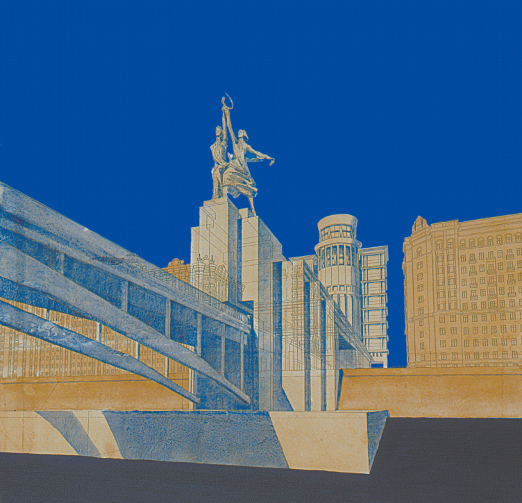
In 1984 I worked in the architectural studio of Andrey Vladimirovich Ganeshin, where we were involved in contextual reconstruction of the city centre. I still have drawings from those days – it was a time when everyone drew. I was involved in work on Zayauz’e, Petrovka, Sretenko. At that time it was possible to create pedestrian zones, to create a city for the people who live there. But all this has died. Pedestrian zones are impossible when you have continuous fences cutting each lot off from the city. The problem with Ostozhenka is that it was conceived as a city for residents, but functions as a city for property. In this sense, the context is dying.
In general, we have missed too many opportunities. The Soviet city was truly designed for the good of its residents. It had streets, courtyards, public buildings. We wanted to create boulevards in the interiors of street blocks and make the ground-floor spaces accessible to the city. I leave out the fact that these streets were designed for demonstrations to pass through, although this was certainly a factor. But in the 1990s we even encouraged developers to build on land which the Soviet town-planners had set aside for public purposes. And this has closed off opportunities for development for the next 100 years. Essentially, we are no longer able to go back to planning the city for human beings.
Is there a new paradigm that is capable of doing something with the city?
In the West today the new paradigm is the eco city, with ecology being understood in a broad sense – not just as reductions in exhaust emissions, although this too, of course, is important, but as the principle of maximum economy of resources. This ideology sees people as creatures who spend useful resources and cause their habitat to deteriorate. This means that ideally people should keep their activities to a minimum. They should work where they live. And their consumption should take place within easy walking distance. There should be no expenditure of resources on transport. Everything should be done by Internet. But then social activity will also be minimal and in my opinion this is a dead end: this means the death of the city. Although perhaps I’m old-fashioned and am unable to live properly in the Internet.
And in Russia what ideas are there?
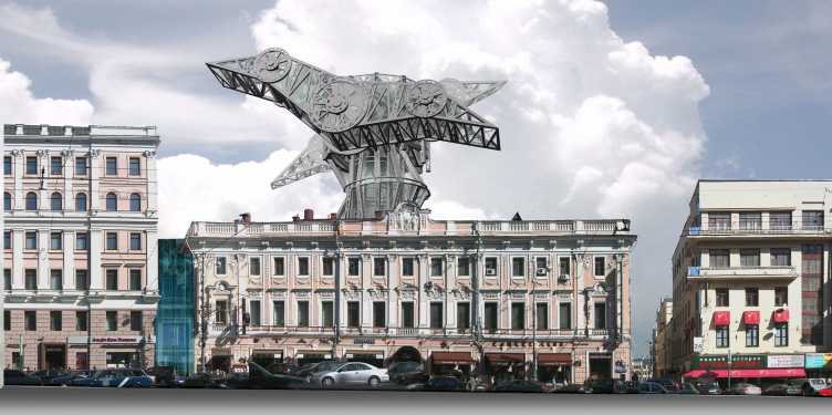
In general, as I see it, new strategies for developing a city are always paper architecture. Strategy is always paper architecture. Someone draws something and there’s your strategy. It might be completely unrealizable ideas that are naïve, impractical, and senseless at first sight. What’s important is the initial thought. This is followed by a long process of making the idea workable; this can take 20 years. But I should say that right now I don’t see any such thought. At all. Russia today has no conceptual architecture or, at any rate, it is very inconspicuous.
You take part in decisions concerning planning permission at the Moscow Architecture Committee, so you see most projects that appear in Moscow. And you mean to say that there are no new ideas?
You have to picture this process. It’s not very creative. To continue on the subject of paper architecture, in the 1980s our country had the ‘paper’ architects, who in a certain sense began to realize themselves during the post-perestroika period. Actually, it wasn’t always literally they – and not always literally their ideas – that found realization, but if we mean stadial processes, then we see the following picture: an explosion of ideas in the 1980s followed by their realization in the 1990s. I said that this period was in a certain respect an unhappy one for the city, but this does not mean that it was unhappy for architects. Certain architects were able to benefit because non-standard ideas were in demand. And now Moscow architecture is developing further. Everything is becoming more rigid, precise, uniform. This is not good or bad; it’s just the way things are. As art which is responsible for very large amounts of money, architecture naturally strives for order and predictability. Moscow Committee of Architecture is a machine that gives planning permission to three or four buildings per minute. When the individual planning authorities have no specific comments to make, it’s all over instantly. This flow encourages the average. It’s no place for extraordinary ideas, it’s a machine for manufacturing ordinariness. Don’t expect to catch any new concepts here; they just don’t breed in this river.
Someone – let’s call him Aleksey Miller – was driving through St Petersburg with his eyes on the horizon when suddenly he realized how wonderful a single skyscraper would look here: it would subordinate the entire city to itself. That was how the Okhta Centre project [for a 300-metre-high tower] came into being. Someone else – let’s call him Shalva Chigirinsky – was driving over Krymsky Bridge [in Moscow] when suddenly he realized that if the Central House of the Artist were to be demolished and the Crystal Orange, the dream of Yelena Baturina, were to be built, it would look just great. I’m not talking right now of the quality of these projects; what’s important is something else. Do you not think that given the absence of ideas on the part of architects, it’s business that shapes the agenda in urban planning? It’s business that does the dreaming, that finds a location for this dream, and finds the resources and means for realizing it.
Nice stories, but they’re not true. In Moscow, at any rate, it all happened a little differently. In Moscow there are very sites left for building on. All these locations are serious assets, so they are well known and clearly classified. We know roughly what can be built on them. And what happens next is that various business approach the Mayor and try to convince him that they are the ones who will do the best job of developing these assets. Theoretically, ‘best’ means most profitable for the city. But in practice, it all depends. Then we give the developers specifications for the site and begin working with them. In the process, it transpires that they are not happy with these specifications – because if the function, density, or height can be changed, they can get a much better return on their money. They go to the Mayor and start accusing the urban planners of non-professionalism. And we accuse them of greed and neglect of the city’s interests. Theoretically, we are the law and ought to get the upper hand, but in practice they are money – so there can be differing results. What’s always the same is the conflict of interests. So that’s how the agenda is formed.
So the Crystal Orange is not going to be built?
Theoretically, it’s impossible under any circumstances.
You’ve sketched an exceptionally unhappy picture. Excuse me for saying so, but I have the feeling that it’s not you who’s giving this interview. We got to know each other ten years ago and I know you as an exceedingly ironic person. You remember how we met?
I remember very well: on the ‘Manilovsky project’. Together with the Mitki group of artists, we held a utopian tea party in the Toko Bank Tower.
The idea was that at the time you called the architecture of Moscow a realization of the dreams of Manilov, the character in Gogol’s Dead Souls. We gathered in the Toko Bank Tower to drink tea and talk about the fate of Moscow’s urban planning from the point of view of Manilov. Manilov’s estate included an underground passage, a bridge over a pond – on the bridge there were traders (under the Moscow way of thinking they should probably have been co-investors in the bridge), – a Temple of Solitary Reflection, and so on.
I recall this with pleasure. It was this – and then working with the Mitki on Gostiny dvor – that marked the beginning of a new life for me. Lev Melikhov introduced me to photography, which I’m still very keen on and which I then took up professionally. All in all, this was a direction in life which really did partly shape my involvement with Moscow.
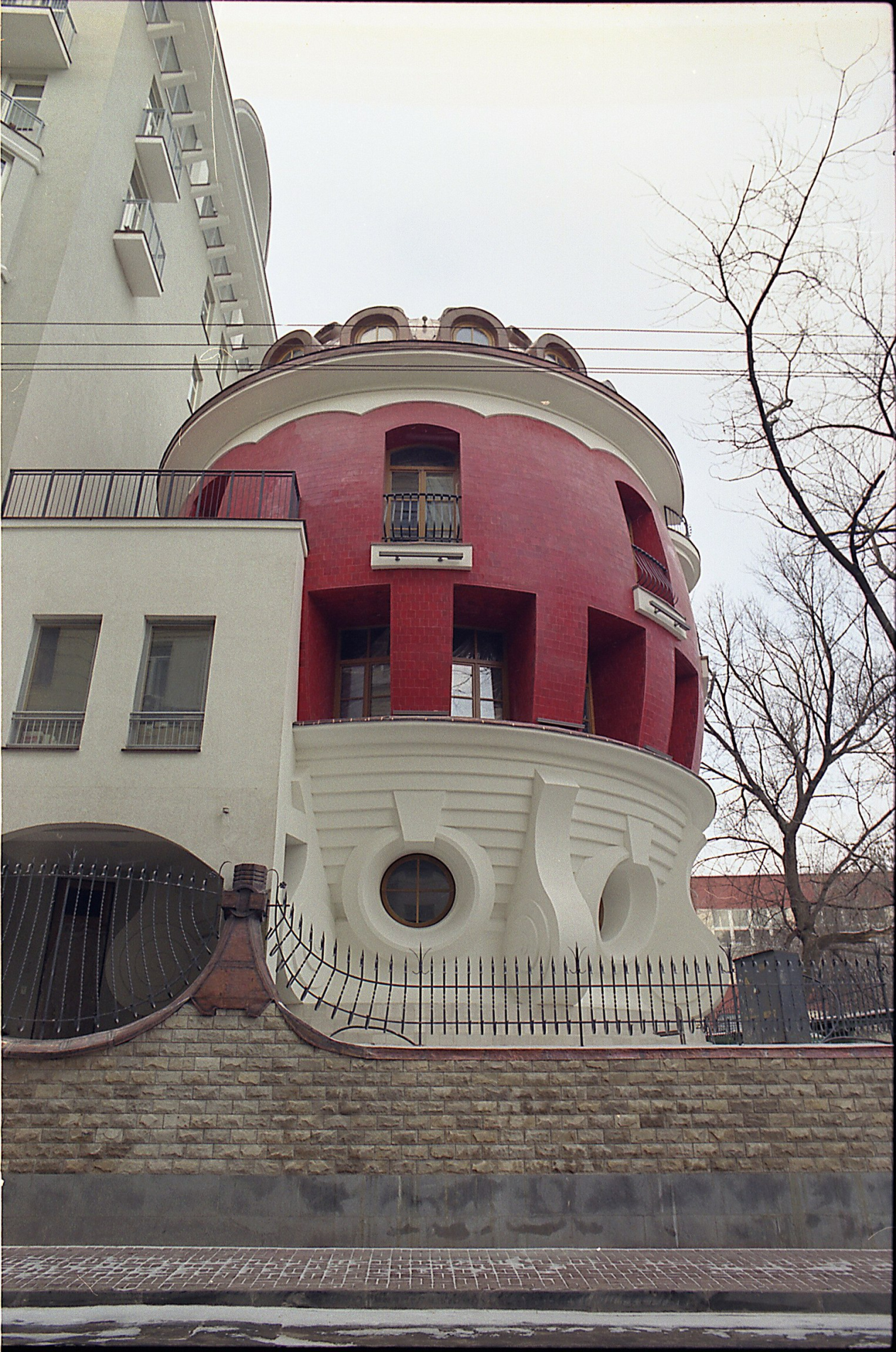
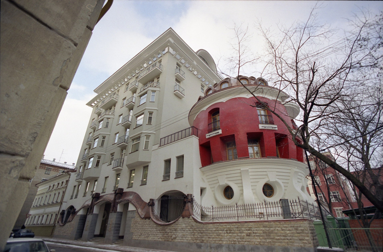
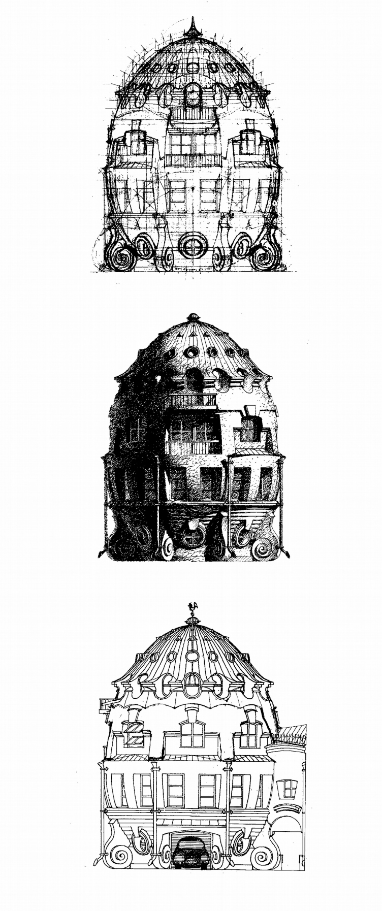
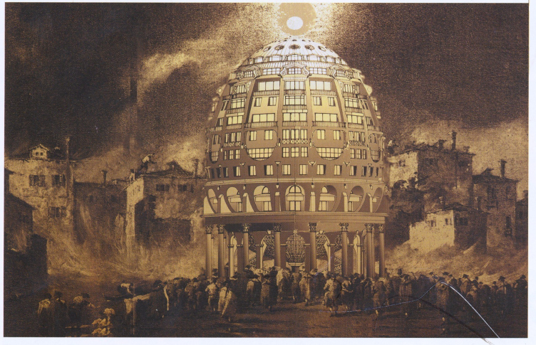
When your egg house and Patriarch house – buildings that caught the public imagination – appeared, it occurred to me that this was a continuation of the same line. They are buildings with a very noticeable irony. A combination of dream and naivety with a keen interest in history. Manilov, I think, would have been very taken by them. You remember, he had children called Alkid and Femistoklyus. Egg and Patriarch.
Irony is one of the aspects of architecture, but architecture, alas, is never reducible to this. Architecture is something in which people or the state invest stupid amounts of money. Such people are not inclined to joke. This is the kind of money which those who actually create this architecture will never have. But there is still room for manoeuvre. And the deeper the architecture, the more aspects and levels of various kinds it should have. Also possible is a plane of irony, history, subconscious meanings, and dreams. From my point of view, a building’s image is more interesting if this is present. This can touch people, and can irritate them too. People may take a strong dislike to something they see. And then, even on leaving the country, they may be unable to forget a particular building. This means that the architecture has a special quality. When people – not necessarily specialists – look at a building and cannot immediately decide what to feel about it, but see a wide range of different things, this is interesting. It creates a multi-level structure.
But such an approach is hardly possible in your current work.
At the time we were euphoric because certain things had become possible. Now planning permission for such designs would never be given. The Manilov project is pure dreaming. It could have been realized in certain buildings in Moscow, but would now be impossible.
You would not build the egg house now?
Well, you’d have to use a tank to get permission to build half an eggshell.
And this is why you’ve abandoned ‘pure dreaming’ for bureaucratic urban planning?
I told you in all honesty how the planning-approvals machine works. Three to four projects a minute. It’s a conveyor for manufacturing standard items. Here it’s very important who has the power to stop the conveyor. To get a non-standard project passed. Who has the right to act outside the system. Today you’d have to be Foster or Zaha Hadid to build the egg house.
So dreaming is something that only foreigners are allowed to do?
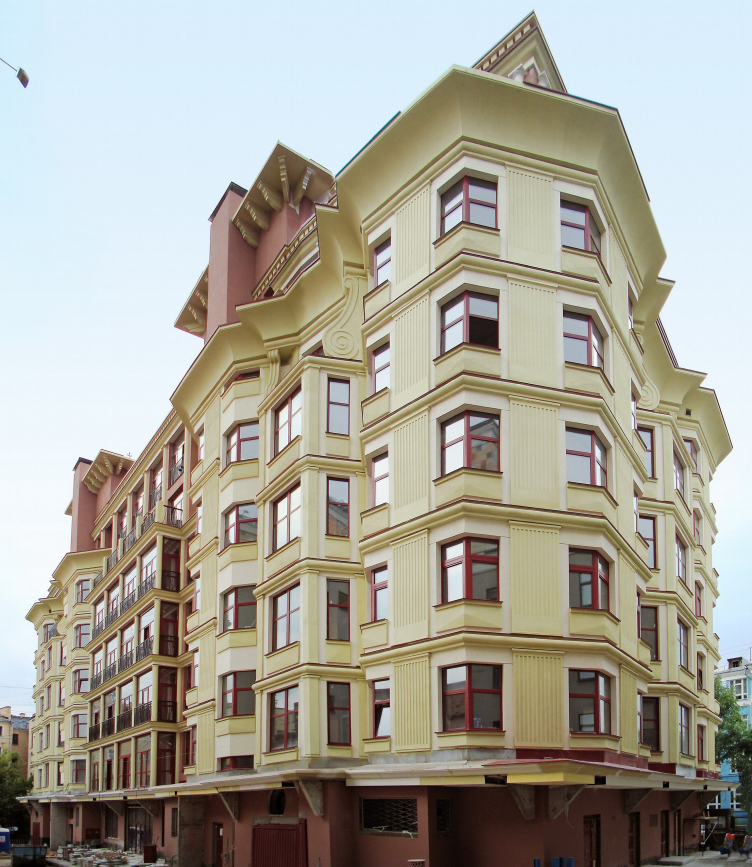
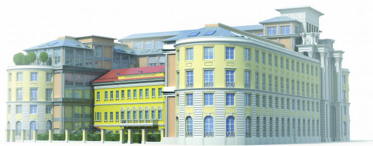
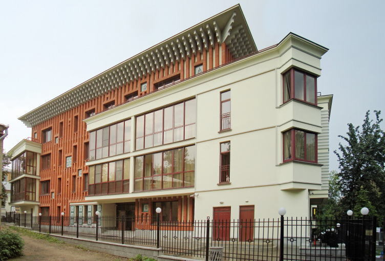
Everyone’s allowed to dream. But tickets to realize your dream are now sold only at the window for foreigners. However, as was always the case [in the Soviet Union] with these ticket-windows, Russians can get served there too if they have the right administrative support. And that’s roughly what I do. I understand only too well that without my current administrative position I would be unable to realize designs such as the house in Khlynovsky tupik which we’re currently just finishing building.
And this is why you’ve become a planner?
No, not just for this reason, of course. Urban planning is interesting in itself. But the opportunities which it opens up genuinely give me great pleasure. I love my studio, I like the chance to talk to people directly. I like discussing projects, talking them through, drawing them, seeing how all this springs into life. I like architecture as art, and in art there should always be something unmediated, something that comes directly from the author. You know, Matisse did his decoupages – compositions made from cut-up coloured paper – but he coloured the paper himself. This is technologically inefficient, it doesn’t fit on the conveyor. So you have to create special conditions in order for this to happen. And I’ve created them.

