По-русски

Architecture of Evanescence

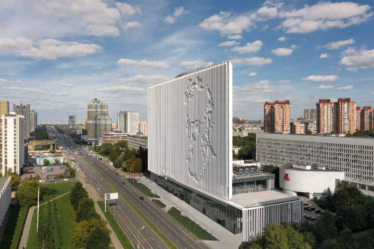
On the Vernadskogo Avenue, next to the metro station, appeared a high-rise landmark that transformed the entire area: designed by UNK Project, the “Academic” business center uncovered, in the form of its architecture, the meanings of the local place names.

23 January 2020
Object
mainImg
The new gravity center of this area appeared next to the “Prospect Vernadskogo” metro station, on the land site abandoned still in the 1990’s, which lay derelict for a long time: the three stories of an incomplete building behind the fence two steps away from the metro station created a depressive zone and caused justified concern of the local residents. This spatial hole was not exactly aesthetically pleasing to motorists either: while driving down the avenue from the city center they saw that the rhythmic pattern formed by the towers designed by Evgeny Rozanov (the project of 1975 included three towers, their construction being still incomplete) gave way to monotonous rank-and-file buildings which were definitely at odds with the status of this area.

At the same time, according to the client’s request who conducted a closed-door competition for the project of the business center, this place was to get a high-rise building with a rather impressive technical and economic performance. The obvious solution would have been to create an elongated parallelepiped, a giant trunk that would occupy the entire construction blueprint. However the architects of UNK Project came up with a more elegant solution that allowed them to meet the client’s requirements, at the same time keeping the optimum balance with the surroundings: the 14 story lens rises from a four-story plinth.

“Academic” business center on the Vernadskogo Avenue
Copyright: Photograph © Denis Zaitsev / UNK project


Considering the necessity of creating a true landmark here, the architects saw their task as designing a building that would fit in as tactfully as possible with the surrounding modernist context. Among other things, from the east side of the construction site, stands the Tsentrsoyuz i Minvostokstroy building (the project of 1968, under the supervision of Evgeny Stamo, construction of 1986) – a long slab with a characteristic entrance group of a curvilinear shape.

“Academic” business center on the Vernadskogo Avenue
Copyright: Photograph © Denis Zaitsev / UNK project


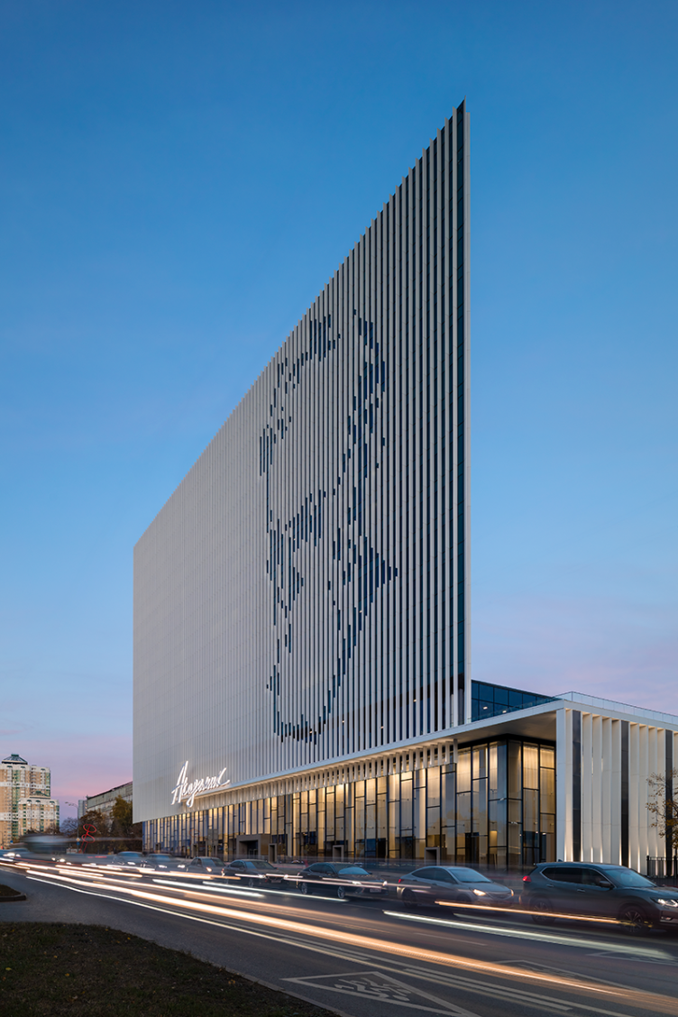
The form that the architects found for this building as well as the decoration of its façade with the lamellae, makes the volume visually lighter; in spite of its sculptural nature and in spite of its grand size, it becomes a dynamic object that changes continuously as perceived by pedestrians and motorists. Interesting is the fact that the façade lamellae, while giving and ethereal look to the visual appearance of the building, also help to bring out the conceptual meaning of the place: they display the portrait of the Russian scientist whose name is borne by the metro station and the avenue.

“Academic” business center on the Vernadskogo Avenue
Copyright: Photograph © Dmitry Chebanenko / UNK project


And, indeed, when still in the construction stage, when the construction site was surrounded with fences, the area got a new landmark that was attracting people’s attention not only with its shape, but also evoking people’s curiosity – whose portrait is gradually appearing on the facade? – still at that time the place became a true gravity center.

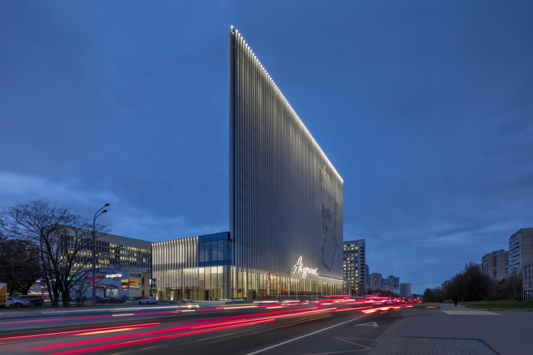
Today, after completing the landscaping project of the surrounding area, and after the opening of a pedestrian route, the bright-red spectacles sculpture, standing next to the sidewalk, and the backlight of the facades, noticeable even by daylight, enhanced that effect, marking the fact that the building belongs to this place, this city, and its people.

“Academic” business center on the Vernadskogo Avenue
Copyright: Photograph © Dmitry Chebanenko / UNK project


Avoiding a verbatim use of the architectural vocabulary of the 1970-80’s, UNK Project created a modern thing, yet strikingly resonant with the surrounding late-Soviet modernism: the sculptural shape, the color and plastique solutions of the facades – everything puts one in the mind of the best samples of modernism, yet without the dusty layer of nostalgia.

“Academic” business center on the Vernadskogo Avenue
Copyright: Photograph © Dmitry Chebanenko / UNK project


From an incomplete building to the lens idea

The story of creating the project of the business center and its realization is unique by the standards of today. At one of the architectural panel discussions that took place in spring this year, the chief architect of UNK Project, Yuliy Borisov, while sharing about the project of the business center “Academic”, the construction of which was all but completed at the moment, noted that its design stage took two years. This remark, seemingly insignificant, caused a fair amount of jealousy in many of his fellow colleagues, because in the realities of today, the design process, having hardly started, begins to run parallel to the construction. Possibly, one day this “parallel design” will become the usual practice, yet now it causes a lot of concern, as it can hardly be conducive to great results.

Furthermore, the project renders (see the publication of the project) differ very little from the photographs of the complete business center, and this considering the fact that the project is anything but standard – both technically and configuration-wise.

The first problem was the foundation that was laid within the framework of implementing the predecessor project. There is a metro line running underneath it. There was also a discussion about dismantling the foundation, different engineers and designers proposing different solutions. Already at that stage, the client got involved in the discussion, demonstrating his willingness to cooperate with the architects.

“Academic” business center on the Vernadskogo Avenue
Copyright: © UNK project


“Academic” business center on the Vernadskogo Avenue. Section view
Copyright: © UNK project


“The client did not hurry us up giving us an opportunity to work through all the details while still in the design stage and prevent possible construction problems. The mockups that we created in the process came in very handy for motivated explanations that sped up the decision making process – Yuliy Borisov notes – This referred both to the construction and the decoration details”.

For example, in order to avoid the necessity of using beams, which would have inevitably complicated the process of routing the engineering lines and noise insulation in the subsequent decoration of the office, the architects used the unique, by Moscow standards technology of concrete pouring into a large-span shell: inside the monolith concrete, they first placed the void-forming plastic balls, or the “blockouts”, that looked very much like footballs.

Vernadsky’s Face

Nowadays we, while going down the street, rarely wonder where it got its name from. And in Moscow this loss of connection between the place and its name is felt particularly acutely. And, while pretty much everyone understands just why the Red Square is “red”, the abundance of surnames in this city’s toponymy has long since stopped evoking in people any interest for the historical personalities, in whose honor these streets and squares were named. Probably, hardly anyone will remember why the Vernadskogo Avenue was named that way, yet with the introduction of the business center “Academic”, or, rather, the portrait of the Russian scientist on its facade, the very meaning of the place has changed, as well as the perception of the name of the avenue and the area around the metro station.

The architecture of this building, which looks as if it’s about to dissolve in the space, yet at the same time materializing the identity of the place, curiously rhymes the ideas of Vladimir Vernadsky himself, who foresaw the information society and who was developing the ideas of anthroposphere, the shell of our planet, created by human mind.

“Academic” business center on the Vernadskogo Avenue
Copyright: Photograph © Dmitry Chebanenko / UNK project


The technical solution for the scientist’s portrait – trimming in certain places the facade lamellae, widely used in modern architecture – required from the architects long calculations abs using several 3D modeling software applications. The architects took into account not only views from various vantage points but also the lighting options, to make sure that the image supports the rhythm of the building itself, and “works” with the neighboring buildings as well.

Another example of homage to modernism is the main sign of the business center: the name “Academic” is written in one flourish: according to the legend that is sometimes heard in the architectural studio, its author is Yuliy Borisov himself who wrote the name of the project on a piece of paper in order to have a calligrapher draw it properly, but the client asked to leave the flourish as it was. The sign is also beautifully backlit at night.

“Academic” business center on the Vernadskogo Avenue
Copyright: Photograph © Dmitry Chebanenko / UNK project


The architects took the edge off the modernist “seriousness” of the building by installing a sculpture in its immediate vicinity – the academician’s glasses were placed on the red line of the avenue; they can also be regarded as part of the landscaping project.

“Academic” business center on the Vernadskogo Avenue
Copyright: Photograph © Dmitry Chebanenko / UNK project


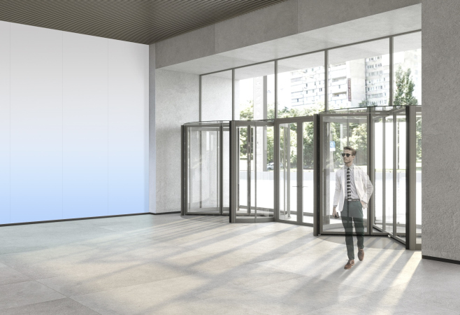
The human-friendly scale of the building for the pedestrians is also created at the expense of the glass facades of the 4-story rectangular plinth, upon which the architects placed a 14-story lens. Thanks to the large shop windows, the building is closely connected to the city space, and soon there will be shops, cafes, and entrance lobbies here.

Inside of “Academic”

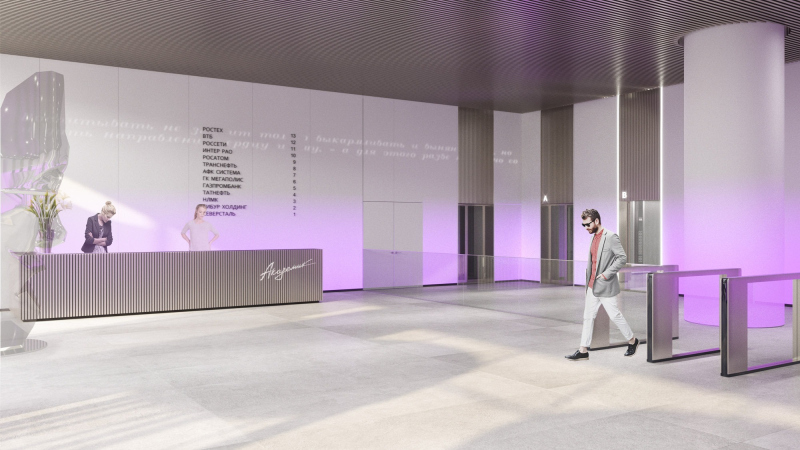
The interiors of the building are also connected to the “academic” theme. “While the image of the building was quick to come – the sketch was created within one day – the interiors of the entrance zones and the public spaces took a lot more working time; we had to choose from several different options because we wanted to find a simple and self-explanatory solution, connected with the facades” – Yuliy Borisov comments on the search.

The first thing that catches the eye when you come into the building are the three gigantic sculptural armchairs, executed in the shape of the head of Vladimir Vernadsky, each two and a half meters tall. Thus, everyone who gets inside “Academic” can have an opportunity to be inside the professor’s head. The armchairs are executed from stainless steel.

“Academic” business center on the Vernadskogo Avenue
Copyright: © UNK project


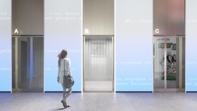
Considering the interior from the point of view of ideology and philosophy, the architects also proposed to decorate it with the scientist’s quotes that are not only projected to the wall but are also whispered on the intercom in the public zones.

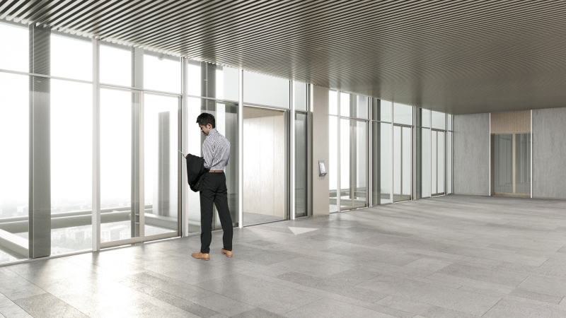
By the way, the public zones on the floors are separated from the elevator lobbies with glass, which makes it possible to enjoy 360-degree panoramic views from the elevators. This original solution – the glass partitions that were to correspond to the fire safety standards – turned out to be quite expensive, but the architects were able to convince the client not to save up on visual effects and do everything in accordance with the project.

  • zooming
    1 / 5
    Copyright: © UNK project
  • zooming
    2 / 5
    Copyright: © UNK project
  • zooming
    3 / 5
    Copyright: © UNK project
  • zooming
    4 / 5
  • zooming
    5 / 5


23 January 2020

Headlines now
The Golden Crown
The concept for a dental clinic in Yekaterinburg, developed by CNTR Studio, revolves around the idea of a “mouth full of gold”: pristine white porcelain stoneware walls are complemented by matte brass details. To avoid an overly literal interpretation, the architects focused on the building’s proportions, skillfully navigating between sunlight requirements and fire safety regulations.
Flexibility and Integration
Not long ago, we covered the project for the fourth phase of the ÁLIA residential complex, designed by APEX. Now, we’ve been shown different fence concepts they developed to enclose the complex’s private courtyards, incorporating a variety of public functions. We believe that the sheer fact that the complex’s architects were involved in such a detail as fencing speaks volumes.
A Step Forward
The HIDE residential complex represents a major milestone for ADM architects and their leaders Andrey Romanov and Ekaterina Kuznetsova in their quest for a fresh high-rise aesthetic – one that is flexible and layered, capable of bringing vibrancy to mass and silhouette while shaping form. Over recent years, this approach has become ADM’s “signature style”, with the golden HIDE tower playing a pivotal role in its evolution. Here, we delve into the project’s story, explore the details of the complex’s design, and uncover its core essence.
Gold in the Sands
A new office for a transcontinental company specializing in resource extraction and processing has opened in Dubai. Designed by T+T Architects, masters of creating spaces that are contemporary, diverse, flexible, and original, this project exemplifies their expertise. On the executive floor, a massive brass-clad partition dominates, while layered textures of compressed earth create a contextually resonant backdrop.
Layers and Levels of Flight
This project goes way back – Reserve Union won this architectural competition at the end of 2011, and the building was completed in 2018, so it’s practically “archival”. However, despite being relatively unknown, the building can hardly be considered “dated” and remains a prime example of architectural expression, particularly in the headquarters genre. And it’s especially fitting for an aviation company office. In some ways, it resembles the Aeroflot headquarters at Sheremetyevo but with its own unique identity, following the signature style of Vladimir Plotkin. In this article, we take an in-depth look at the United Aircraft Corporation (UAC) headquarters in the Moscow agglomeration town of Zhukovsky, supplemented by recent photographs from Alexey Naroditsky – a shoot that became only recently possible due to the fact that improvements were finally made in the surrounding area.
Light and Shadow
In this article, we delve into the architectural design of the “Chaika” house by DNK ag architects, which was recently completed in 2023 as part of the collection of signature designs at ZILArt. As is well-known, all the buildings in this complex follow a design code, yet each one is distinct. This particular building stands out not only for its whiteness and minimalism but also for the refined use of a limited number of techniques that, together, create what can confidently be called synergy.
Casus Novae
A master plan was developed for a large residential area with a name of “DNS City”, but now that its implementation began, the plan has been arbitrarily reformatted and replaced with something that, while similar on the surface, is actually quite different. This is not the first time such a thing happens, but it’s always frustrating. With permission from the author, we are sharing Maria Elkina’s post.
Treasure Hunting
The GAFA bureau, in collaboration with Tegola and Arkhitail, organized an expedition to the island of Kilpola in Karelia as part of Moskomarkhitektura’s “Open City” festival. There, amidst moss and rocks, the students sought answers to questions like: what is the sacred, where does it dwell, and what sustains it? Assisting the participants in this quest were landscape engineer Evgeny Levin, artist Nicholas Roerich, a moose, and the lack of cellular connection. Here’s how the story unfolded.
Depths of the Earth, Streams of Water
In the Malaya Okhta district, the Akzent building, designed by Stepan Liphart, was constructed. It follows a classic tripartite structure, yet it’s what you might call “hand-drawn”: each façade is unique in its form and details, some of which aren’t immediately noticeable. In this article, we explore the context and, together with the architect, delve into how the form was developed.
Fir Tree Dynamics
The “Airports of Region” holding is planning to build an airport in Karachay-Cherkessia, aiming to make the Arkhyz and Dombay resorts more accessible to travelers. The project that won in an invitation-only competition, submitted by Sergey Nikeshkin’s KPLN, blends natural imagery inspired by the shape of a conifer seed, open-air waiting spaces, majestic large trees, and a green roof elevated on needle-like columns. The result is both nature-inspired and WOW.
​A Brick Shell
In the process of designing a clubhouse situated among pine trees in a prestigious suburban area near Moscow, the architectural firm “A.Len” did the façade design part. The combination of different types of brick and masonry correlates with the volumetric and plastique solutions, further enhanced by the inclusion of wood-painted fragments and metal “glazing”.
Word Forms
ATRIUM architects love ambitious challenges, and for the firm’s thirtieth anniversary, they boldly play a game of words with an exhibition that dives deep into a self-created vocabulary. They immerse their projects – especially art installations – into this glossary, as if plunging into a current of their own. You feel as if you’re flowing through the veins of pure art, immersed in a universe of vertical cities, educational spaces – of which the architects are true masters – and the cultural codes of various locations. But what truly captivates is the bold statement that Vera Butko and Anton Nadtochy make, both through their work and this exhibition: architecture, above all, is art – the art of working with form and space.
Flexibility and Acuteness of Modernity
Luxurious, fluid, large “kokoshniks” and spiral barrel columns, as if made from colorful chewing gum: there seem to be no other mansion like this in Moscow, designed in the “Neo-Russian-Modern” style. And the “Teremok” on Malaya Kaluzhskaya, previously somewhat obscure, has “come alive with new colors” and gained visibility after its restoration for the office of the “architectural ecosystem” as the architects love to call themselves. It’s evident that Julius Borisov and the architects at UNK put their hearts into finding this new office and bringing it up to date. Let’s delve into the paradoxes of this mansion’s history and its plasticity. Spoiler: two versions of modernity meet here, both balancing on the razor’s edge of “what’s current”.
Yuri Vissarionov: “A modular house does not belong to the land”
It belongs to space, or to the air... It turns out that 3D printing is more effective when combined with a modular approach: the house is built in a workshop and then adapted to the site, including on uneven terrain. Yuri Vissarionov shares his latest experience in designing tourist complexes, both in central Russia and in the south. These include houseboats, homes printed from lightweight concrete using a 3D printer, and, of course, frame houses.
​Moscow’s First
“The quality of education largely depends on the quality of the educational environment”. This principle of the last decade has been realized by Sergey Skuratov in the project for the First Moscow Gymnasium on Rostovskaya Embankment in the Khamovniki district. The building seamlessly integrates into the complex urban landscape, responding both to the pedestrian flow of the city and the quiet alleyways. It skillfully takes advantage of the height differences and aligns with modern trends in educational space design. Let’s take a closer look.
Looking at the Water
The site of Villa Sonata stretches from the road to the water’s edge, offering its own shoreline, pier, and a picturesque river panorama. To reveal these sweeping views, Roman Leonidov “cut” the façade diagonally parallel to the river, thus getting two main axes for the house and, consequently, “two heads”. The internal core – two double-height spaces, a living room and a conservatory, with a “bridge” above them – makes the house both “transparent” and filled with light.
The White Wing
Well, it’s not exactly white. It’s more of a beige, white-stone structure that plays with the color of limestone – smoother surfaces are lighter, while rougher ones are darker. This wing unites various elements: it absorbs and interprets the surrounding themes. It responds to everything, yet maintains a cohesive expression – a challenging task! – while also incorporating recognizable features of its own, such as the dynamic cuts at the bottom, top, and middle.
Urban Dunes
The XSA Ramps team designed and built a three-part sports hub for a park in Rostov-on-Don, welcoming people of all ages and fitness levels. The skate plaza, pump track, and playground are all meticulously crafted with details that attract a diverse range of visitors. The technical execution of the shapes and slopes transforms this space into a kind of sculptural composition.
Proportional Growth
The project for the fourth phase of the ÁLIA residential area has been announced. The buildings are situated on an elongated plot – almost a “ray” that shoots out from the center of the area towards the river. Their layout reflects both a response to Moscow’s architectural preferences over the past 15 years, shifting “from blocks to towers”, and an interpretation of the neighboring business park designed by SOM. Additionally, the best apartments here are not located at the very top but closer to the middle, forming a glowing “waistline”.
The “Staircase” Building
In designing the “Details” residential complex in New Moscow, Rais Baishev spiced up the now-popular Moscow theme of a “courtyard” building with an idea drawn from the surrealist drawings by Maurits Escher. He envisioned the stepped silhouettes and descending slopes as a metaphysical mega-staircase, creating a key void within the courtyard that gave the project an internal “spine”. This concept is felt both in the building’s silhouette and on its façades.
Projection of the Quarter
No one doubted that the building that Vladimir Plotkin designed as part of the “Garden Quarters” would be the most modernist of all. And it turned out just that way: while adhering to the common design code, the building successfully combines brick and white stone, rhythmically responding to the neighboring building designed by Ostozhenka, yet tactfully and persistently making a few statements of its own. This includes the projection of the ideal urban development composition “14–9–6”, which can be found right next door, mathematical calculations, including those for various types of terraces (and perhaps the only reminder of the Soviet past of the Kauchuk rubber factory!), and the white “cross-stitch” pattern of the façade grid.
Domus Aurea
In this issue, we examine the “Tessinsky-1” house, designed by Sergey Skuratov and completed in 2023. Located in the middle of the Serebryanicheskaya Embankment district, at the intersection of its main streets, this house assumes a sort of “nodal” role: it not only responds to everything around it and preserves many memories of the former EMA factory within itself, but it weaves all this into a newly directed pattern, reconciling bright “gold” and dark-colored brick, largely with the help of the new, modern-yet-archaic Columba brick, which, come to think about it, is the most precious element here.
The Chimney of Nikola-Lenivets
In this issue, we are examining the “Obelisk House” designed by KATARSIS and built for the Arkhstoyanie 2023 festival. However, it was only finished later on, and this is why we are examining it now. It seems to us that after the “Obelisk House” appeared in Nikola-Lenivets, a dialogue and a few inner connections appeared between the temporary structures built here. These houses no longer look like “accidental neighbors”, more of which below.
​Periscope by the Bay
The jury awarded the second place in the competition for a public and cultural center in Petropavlovsk-Kamchatsky to the companies GORA (“Mountain”) and M4. In the consortium’s proposal, the building resembles a sperm whale with a calf swimming next to it or a periscope, whose lenses capture the most spectacular views from the surrounding landscape.
From Arcs to Dolmens
While working on the competition project for Petropavlovsk-Kamchatsky, ASADOV Architects prioritized the value of the natural and urban environment, aiming to preserve the balance of the location while minimizing the resemblance of the volume that they designed to a “traditional building”. The task was challenging, and the architects created three versions, one of which having been developed after the competition, where their main proposal took third place. However, the point of interest here is not the competition result but the continuity of creative thinking.
Hide and Seek
The ID Moskovskiy house, designed by Stepan Liphart in St. Petersburg, in the courtyards near Moskovskiy Avenue beyond the Obvodny Canal and recently completed, is notable for several reasons. Firstly, it has been realized with considerable accuracy, which is particularly significant as this is the first building where the architect was responsible not only for the facades but also for the layouts, allowing for better integration between the two. On the other hand, this building is interesting as an example of the “germination” of new architecture in the city: it draws on the best examples from the neighborhood and becomes an improved and developed sum of ideas found by the architect in the surrounding context.
The Big Twelve
Yesterday, the winners of the Moscow Mayor’s Architecture Award were announced and honored. Let’s take a look at what was awarded and, in some cases, even critique this esteemed award. After all, there is always room for improvement, right?
Above the Golden Horn
The residential complex “Philosophy” designed by T+T architects in Vladivostok, is one of the new projects in the “Golubinaya Pad” area, changing its development philosophy (pun intended) from single houses to a comprehensive approach. The buildings are organized along public streets, varying in height and format, with one house even executed in gallery typology, featuring a cantilever leaning on an art object.
Nuanced Alternative
How can you rhyme a square and space? Easily! But to do so, you need to rhyme everything you can possibly think of: weave everything together, like in a tensegrity structure, and find your own optics too. The new exhibition at GES-2 does just that, offering its visitor a new perspective on the history of art spanning 150 years, infused with the hope for endless multiplicity of worlds and art histories. Read on to see how this is achieved and how the exhibition design by Evgeny Ace contributes to it.
Blinds for Ice
An ice arena has been constructed in Domodedovo based on a project by Yuri Vissarionov Architects. To prevent the long façade, a technical requirement for winter sports facilities, from appearing monotonous, the architects proposed the use of suspended structures with multidirectional slats. This design protects the ice from direct sunlight while giving the wall texture and detail.