По-русски

​Andrei and Nikita Asadov: “We wanted to be as objective as possible”

An interview with the initiators and ideologists of the project “Russian Architecture. The Modern Era” about the principles of shortlisting, architecture as an art object, and plans for the future.

27 May 2019
Interview
mainImg

The ideologists of the project “Russian Architecture. The Modern Era”, Andrey and Nikita Asadov believe that modern Russian architecture has passed yet another historical milestone and deserves not only to sum up the results but also to discuss plans for the future. We spoke to the two architects about the topic of the exhibition, about its three formats, and about the significance of this project both for the professional community and for anyone else who might be interested.

Archi.ru:
30 years is a serious figure for the modern history. How did you come round to the idea of organizing this exhibition?

Andrey Asadov: In the spring of 1989, there were four architectural offices organized under the aegis of the Union of Architects of Russia, including the one that was headed by Alexander Rafailovich Asadov, our father. We realized that this was a whole layer of history, which is 30 years old this year, and we decided to sum up some of the achievements and trace back the chronology of the modern history of Russian architecture in general.

Nikita Asadov: It was important for us to study this piece of history and understand what happened at which moment in time, and what was valuable about it, in order to make sure we don’t miss anything out, to keep it up, and pass it on to our successors. Also, the biggest question: what is the place of architecture in the general historical context? How can we use the accumulated potential, multiply, and independently formulate the vector that it would be interesting to develop in the future?

Andrey Asadov: Over the last 30 years, Russian architecture has been through a whole evolutionary process that has to do directly with the development of this country. Our team, which also includes Elena Petukhova and Julia Shishalova, singled out the main stages of this evolution and studied this interaction. The exhibition is based on a grand-scale research thanks to which we were able to put together quite an objective picture.

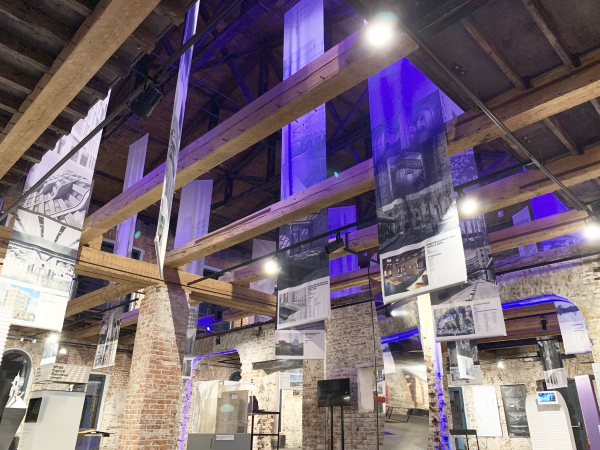
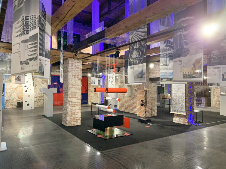
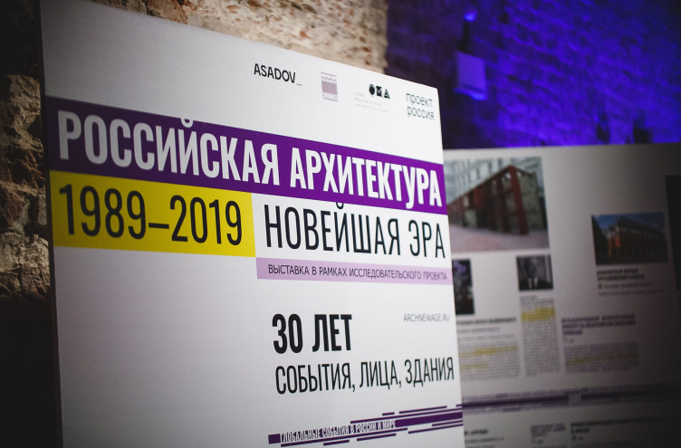
The exhibition “Russian Architecture. The Modern Era” in the Schusev State Museum of Architecture
Copyright: © ARCHNEWAGE
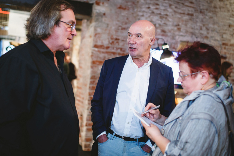
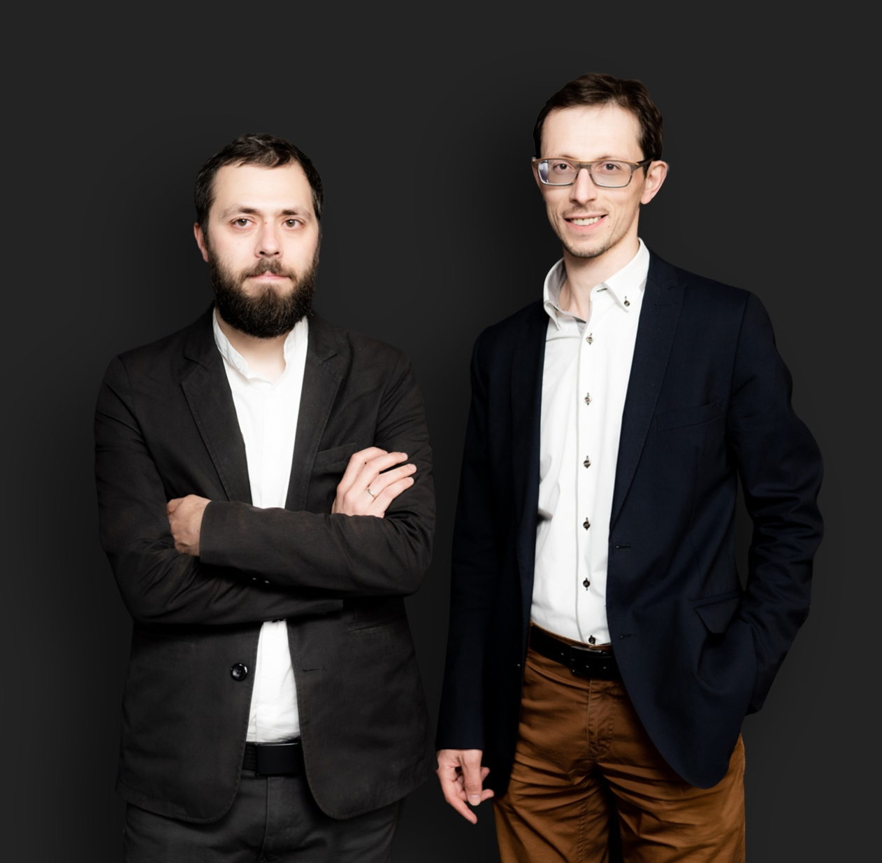
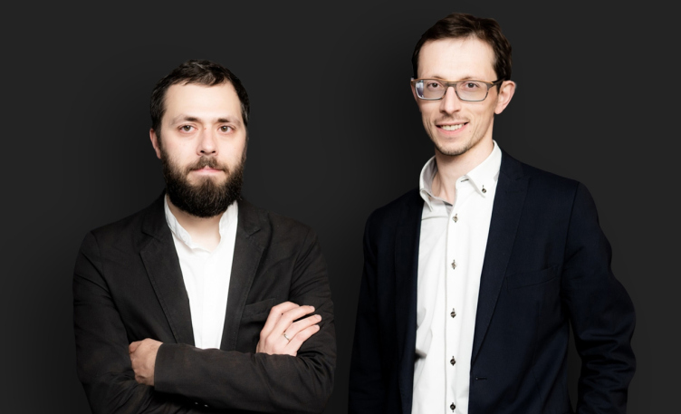
Nikita and Andrey Asadov
Copyright: © ARCHNEWAGE


How was this research organized technically?

Andrey Asadov: We prepared and sent out feedback forms to almost 300 experts: architects, literary critics, journalists – everybody who might be linked to our profession in one way or another. We asked them to name the brightest architectural highlights, personalities, and the most interesting projects. The respondents could either tick the boxes from the list that we offered or suggest their own events and/or projects, and most of our respondents made a use of this opportunity. Thanks to this option, many important events got into the focus of our research, including regional ones. Then we counted the number of votes for these or those milestones of out architectural chronicle and formed the final list of events and projects.

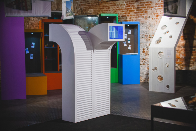
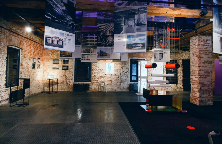
The collection of designer art objects. The exhibition “Russian Architecture. The Modern Era” in the Schusev State Museum of Architecture
Copyright: © ARCHNEWAGE

Did you make any personal preferences in shortlisting the projects for this exhibition? Or what we see at the exhibition was solely defined by this final ranking?

Andrey Asadov: What is exhibited is the pool of projects that scored the greatest number points out of all the projects mentioned in the research.

Nikita Asadov: The only freedom that we left for the architects was freedom to propose this or that project for the exhibition out of the number of the buildings that did not become the leaders of the poll. This way, the exhibition features the results of a, let's say, double ranking – based on the number of votes in the research and based on how important they were for their authors.

OK, you did not make any personal preferences in shortlisting the participants of the exhibition in order to get as objective a picture as possible. Are there any events or projects that you would like to mention now, subjectively?

Andrey Asadov: Of course, a greater impression is made by fresh projects, while the earlier ones are perceived not as acutely – but they all are milestones in our architectural history. For example, some of the shortlisted exhibitors are represented by their earlier projects. However, this does not mean that those projects were the best ones they ever did – it’s just that for this specific exhibition a project was chosen that influenced the development of architecture in that specific moment in time, and is particularly important for its author.

We tried to make this cross section as objective as possible, it was interesting to see how the architects themselves evaluate the achievements of their fellow colleagues. At the same time, we are genuinely happy that one of our projects also got shortlisted for the top-30.

Did you make this architectural and historical statistics only in reference to Moscow or in reference to Russian regions as well?

Nikita Asadov: In terms of personalities, we did not limit ourselves with Moscow and Saint Petersburg – we gave the experts an opportunity to cover the entire country. Based in that, the big picture was formed.

Andrey Asadov: And our team decided to show the results of this research in three formats at once.

Such as?

Andrey Asadov: The first format is an exhibition that will be open until the 16th of June in the Schusev State Museum of Architecture

Nikita Asadov: This exhibition will popularize as much as possible the very research project; this is why the choice of venue was so important for us. The architecture museum was the perfect place because it was designed not only for the professional community alone but for the general public as well.

  • zooming
    1 / 4
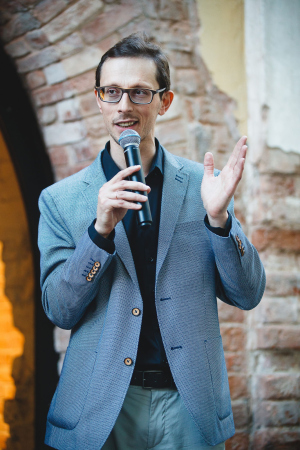
    The inauguration of the exhibition “Russian Architecture. The Modern Era” in the Schusev State Museum of Architecture. The presentation by the curator of the exhibition Andrey Asadov
    Copyright: © ARCHNEWAGE
  • zooming
    2 / 4
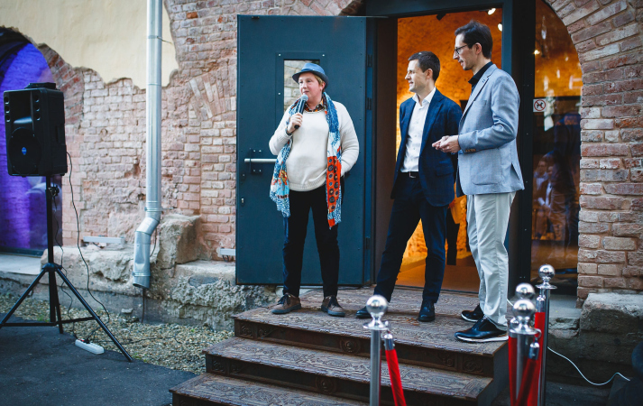
    The inauguration of the exhibition “Russian Architecture. The Modern Era” in the Schusev State Museum of Architecture. The presentation by the director of the museum Elizaveta Likhacheva
    Copyright: © ARCHNEWAGE
  • zooming
    3 / 4
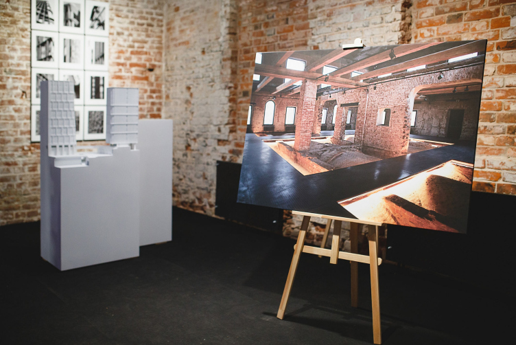
    The exhibition “Russian Architecture. The Modern Era” in the Schusev State Museum of Architecture
    Copyright: © ARCHNEWAGE
  • zooming
    4 / 4
    The exhibition “Russian Architecture. The Modern Era” in the Schusev State Museum of Architecture
    Copyright: © ARCHNEWAGE

Andrey Asadov: Toward the end of the exhibition, we will present a book that was created by a separate team headed by Julia Shishalova with the support of Moscow City Architecture Committee and the website of Archcouncil of Moscow. Fragments of this book will be presented in the format of a timeline showing general historical events and architectural events. Yet another format is the website that was developed by the great team called Likesisters. In addition to the timeline, it shows a unique collection of video interviews with the participants of the project.

Nikita Asadov: And still another important part of the exhibition is the discussion program. This is a more “alive” interactive format, where you can talk to the authors of the research, as well as with the authors of the works showcased at the exhibition. You can listen, think, and ask questions. And this is the most comprehensive and vivid representation of the exhibition as an event, within the framework of which will be lived this historical fragment, and the attitude will be formed as to where we are headed next.

  • zooming
    1 / 6
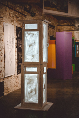
    The collection of designer art objects. Installation inspired by the “Pavilion of Vodka Ceremonies” by Alexander Brodsky. The exhibition “Russian Architecture. The Modern Era” in the Schusev State Museum of Architecture
    Copyright: © ARCHNEWAGE
  • zooming
    2 / 6
    The collection of designer art objects. The exhibition “Russian Architecture. The Modern Era” in the Schusev State Museum of Architecture
    Copyright: © ARCHNEWAGE
  • zooming
    3 / 6
    The collection of designer art objects. Installation inspired by the “House by the Sea”. Evgeny Gerasimov, “Evgeny Gerasimov and Partners” and Sergey Tchoban, “NPS Tchoban Voss”. The exhibition “Russian Architecture. The Mode
    Copyright: © ARCHNEWAGE
  • zooming
    4 / 6
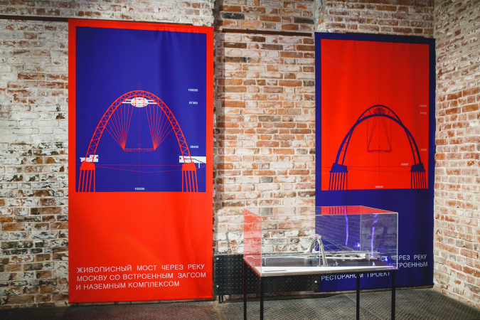
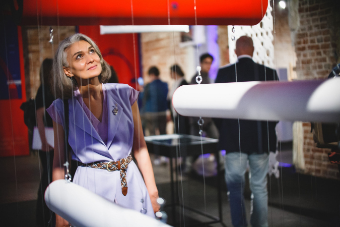
    The collection of designer art objects. Installation inspired by “Picturesque Bridge”. N.Shumakov, Metrogiprotrans. The exhibition “Russian Architecture. The Modern Era” in the Schusev State Museum of Architecture
    Copyright: © ARCHNEWAGE
  • zooming
    5 / 6
    The collection of designer art objects. Installation inspired by the “White Horse” mixed-purpose development. ABD Architects together with Wojciechowski Architekci (Poland). The exhibition “Russian Architecture. The Modern Era” in the Schusev St
    Copyright: © ARCHNEWAGE
  • zooming
    6 / 6
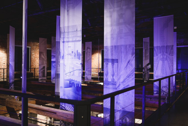
    The exhibition “Russian Architecture. The Modern Era” in the Schusev State Museum of Architecture
    Copyright: © ARCHNEWAGE

What do you think is the meaning and the usefulness of such projects for the architectural community? How can the professionals benefit from your research work?

Andrey Asadov: The way I see it, it is always worthwhile analyzing your past in order to have a better understanding of what you have achieved and where exactly you are going.

Nikita Asadov: To me, it was interesting to see this rather compressed selection. While, speaking until 1990, there is a whole number of selections from different periods, from avant-garde to paper architecture, trying to make a similar selection from this new era fragment from the history of Russian architecture was a pretty exciting thing to do. Trying to figure out, among other things, how you go about forming such selections making sure that they are as objective as possible. I think that this material will be in demand in the future because we have been able to keep up its objectivity, and this is why I think it was particularly valuable.

The collection of designer art objects. The exhibition “Russian Architecture. The Modern Era” in the Schusev State Museum of Architecture
Copyright: © ARCHNEWAGE

The Museum of Architecture, which is hosting your exhibition, has a rather large traffic of tourists and people who only recently became interested in architecture. Does your exhibition address this type of visitor in any way?

Nikita Asadov: This is a great opportunity to make out, within one place and within a rather short space of time, just what modern architecture is all about, what new things appeared over the last three decades, and what achievements are the most attention-worthy and valuable from the professionals' point of view. 

Andrey Asadov: Architecture is considered to be the mother of all arts, but over the last few decades the very perception of architecture has been grossly devaluated – it turned into some unwelcome addition to the construction industry. To us, it is very important to make sure that modern architecture is perceived not only as part of the history of this country, but also as an independent art in its own right.

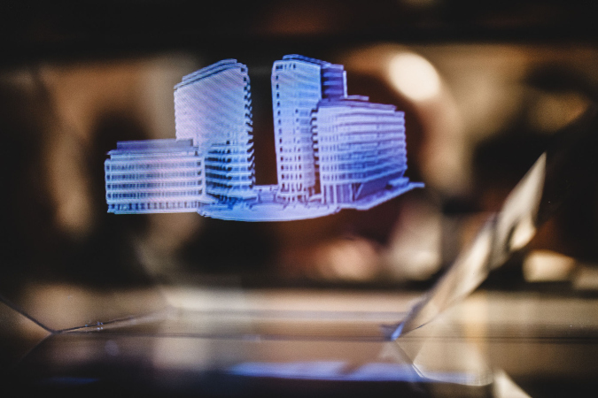
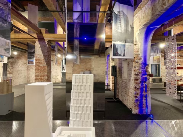
This is why, all the professional rankings aside, we tried to make our exhibition as vivid and as popular possible. And this is why we asked the authors of the shortlisted projects to present their buildings as art objects that illustrate the main idea of the building. I think that this is the most attractive part of the exposition – something mysterious, volumetric, and sometimes even with audio and video effects. I hope that such a format will be interesting to a large circle of public.

The inauguration of the exhibition “Russian Architecture. The Modern Era” in the Schusev State Museum of Architecture. The architects Mikhail Filippov, Andrey Bokov, and Tatiana Shavina, the reviewer of “Construction Business” news agency
Copyright: © ARCHNEWAGE


The exhibition will be open for a month. Will there be any continuation of this project after the exhibition?

Andrey Asadov: We hope that after the exhibition is over, the project will live on to set the basis for the future analysis to be done in the course of the next decade. Due to the fact that the preparation time for our project was limited, our team did not ask all of the expert it could have, but this project is modular, particularly its online version. It can be easily augmented with stories from the past and the future.

Also, we want to organize an exhibition tour of the project in the regions, in each of which it could be augmented by the regional collection of the best local buildings and their history. It is very important to attach the entire country and not limit ourselves with just Moscow. Time will show how well we will be able to implement that idea but there is already some interest from the Ministry of Culture and the Museum of Architecture!
The collection of designer art objects. Installation inspired by the "Wings/Ruins" Narine Tyutcheva, Rozhdestvekka Architects. The exhibition “Russian Architecture. The Modern Era” in the Schusev State Museum of Architecture
Copyright: © ARCHNEWAGE
The exhibition “Russian Architecture. The Modern Era” in the Schusev State Museum of Architecture
Copyright: © ARCHNEWAGE

27 May 2019

Headlines now
The Golden Crown
The concept for a dental clinic in Yekaterinburg, developed by CNTR Studio, revolves around the idea of a “mouth full of gold”: pristine white porcelain stoneware walls are complemented by matte brass details. To avoid an overly literal interpretation, the architects focused on the building’s proportions, skillfully navigating between sunlight requirements and fire safety regulations.
Flexibility and Integration
Not long ago, we covered the project for the fourth phase of the ÁLIA residential complex, designed by APEX. Now, we’ve been shown different fence concepts they developed to enclose the complex’s private courtyards, incorporating a variety of public functions. We believe that the sheer fact that the complex’s architects were involved in such a detail as fencing speaks volumes.
A Step Forward
The HIDE residential complex represents a major milestone for ADM architects and their leaders Andrey Romanov and Ekaterina Kuznetsova in their quest for a fresh high-rise aesthetic – one that is flexible and layered, capable of bringing vibrancy to mass and silhouette while shaping form. Over recent years, this approach has become ADM’s “signature style”, with the golden HIDE tower playing a pivotal role in its evolution. Here, we delve into the project’s story, explore the details of the complex’s design, and uncover its core essence.
Gold in the Sands
A new office for a transcontinental company specializing in resource extraction and processing has opened in Dubai. Designed by T+T Architects, masters of creating spaces that are contemporary, diverse, flexible, and original, this project exemplifies their expertise. On the executive floor, a massive brass-clad partition dominates, while layered textures of compressed earth create a contextually resonant backdrop.
Layers and Levels of Flight
This project goes way back – Reserve Union won this architectural competition at the end of 2011, and the building was completed in 2018, so it’s practically “archival”. However, despite being relatively unknown, the building can hardly be considered “dated” and remains a prime example of architectural expression, particularly in the headquarters genre. And it’s especially fitting for an aviation company office. In some ways, it resembles the Aeroflot headquarters at Sheremetyevo but with its own unique identity, following the signature style of Vladimir Plotkin. In this article, we take an in-depth look at the United Aircraft Corporation (UAC) headquarters in the Moscow agglomeration town of Zhukovsky, supplemented by recent photographs from Alexey Naroditsky – a shoot that became only recently possible due to the fact that improvements were finally made in the surrounding area.
Light and Shadow
In this article, we delve into the architectural design of the “Chaika” house by DNK ag architects, which was recently completed in 2023 as part of the collection of signature designs at ZILArt. As is well-known, all the buildings in this complex follow a design code, yet each one is distinct. This particular building stands out not only for its whiteness and minimalism but also for the refined use of a limited number of techniques that, together, create what can confidently be called synergy.
Casus Novae
A master plan was developed for a large residential area with a name of “DNS City”, but now that its implementation began, the plan has been arbitrarily reformatted and replaced with something that, while similar on the surface, is actually quite different. This is not the first time such a thing happens, but it’s always frustrating. With permission from the author, we are sharing Maria Elkina’s post.
Treasure Hunting
The GAFA bureau, in collaboration with Tegola and Arkhitail, organized an expedition to the island of Kilpola in Karelia as part of Moskomarkhitektura’s “Open City” festival. There, amidst moss and rocks, the students sought answers to questions like: what is the sacred, where does it dwell, and what sustains it? Assisting the participants in this quest were landscape engineer Evgeny Levin, artist Nicholas Roerich, a moose, and the lack of cellular connection. Here’s how the story unfolded.
Depths of the Earth, Streams of Water
In the Malaya Okhta district, the Akzent building, designed by Stepan Liphart, was constructed. It follows a classic tripartite structure, yet it’s what you might call “hand-drawn”: each façade is unique in its form and details, some of which aren’t immediately noticeable. In this article, we explore the context and, together with the architect, delve into how the form was developed.
Fir Tree Dynamics
The “Airports of Region” holding is planning to build an airport in Karachay-Cherkessia, aiming to make the Arkhyz and Dombay resorts more accessible to travelers. The project that won in an invitation-only competition, submitted by Sergey Nikeshkin’s KPLN, blends natural imagery inspired by the shape of a conifer seed, open-air waiting spaces, majestic large trees, and a green roof elevated on needle-like columns. The result is both nature-inspired and WOW.
​A Brick Shell
In the process of designing a clubhouse situated among pine trees in a prestigious suburban area near Moscow, the architectural firm “A.Len” did the façade design part. The combination of different types of brick and masonry correlates with the volumetric and plastique solutions, further enhanced by the inclusion of wood-painted fragments and metal “glazing”.
Word Forms
ATRIUM architects love ambitious challenges, and for the firm’s thirtieth anniversary, they boldly play a game of words with an exhibition that dives deep into a self-created vocabulary. They immerse their projects – especially art installations – into this glossary, as if plunging into a current of their own. You feel as if you’re flowing through the veins of pure art, immersed in a universe of vertical cities, educational spaces – of which the architects are true masters – and the cultural codes of various locations. But what truly captivates is the bold statement that Vera Butko and Anton Nadtochy make, both through their work and this exhibition: architecture, above all, is art – the art of working with form and space.
Flexibility and Acuteness of Modernity
Luxurious, fluid, large “kokoshniks” and spiral barrel columns, as if made from colorful chewing gum: there seem to be no other mansion like this in Moscow, designed in the “Neo-Russian-Modern” style. And the “Teremok” on Malaya Kaluzhskaya, previously somewhat obscure, has “come alive with new colors” and gained visibility after its restoration for the office of the “architectural ecosystem” as the architects love to call themselves. It’s evident that Julius Borisov and the architects at UNK put their hearts into finding this new office and bringing it up to date. Let’s delve into the paradoxes of this mansion’s history and its plasticity. Spoiler: two versions of modernity meet here, both balancing on the razor’s edge of “what’s current”.
Yuri Vissarionov: “A modular house does not belong to the land”
It belongs to space, or to the air... It turns out that 3D printing is more effective when combined with a modular approach: the house is built in a workshop and then adapted to the site, including on uneven terrain. Yuri Vissarionov shares his latest experience in designing tourist complexes, both in central Russia and in the south. These include houseboats, homes printed from lightweight concrete using a 3D printer, and, of course, frame houses.
​Moscow’s First
“The quality of education largely depends on the quality of the educational environment”. This principle of the last decade has been realized by Sergey Skuratov in the project for the First Moscow Gymnasium on Rostovskaya Embankment in the Khamovniki district. The building seamlessly integrates into the complex urban landscape, responding both to the pedestrian flow of the city and the quiet alleyways. It skillfully takes advantage of the height differences and aligns with modern trends in educational space design. Let’s take a closer look.
Looking at the Water
The site of Villa Sonata stretches from the road to the water’s edge, offering its own shoreline, pier, and a picturesque river panorama. To reveal these sweeping views, Roman Leonidov “cut” the façade diagonally parallel to the river, thus getting two main axes for the house and, consequently, “two heads”. The internal core – two double-height spaces, a living room and a conservatory, with a “bridge” above them – makes the house both “transparent” and filled with light.
The White Wing
Well, it’s not exactly white. It’s more of a beige, white-stone structure that plays with the color of limestone – smoother surfaces are lighter, while rougher ones are darker. This wing unites various elements: it absorbs and interprets the surrounding themes. It responds to everything, yet maintains a cohesive expression – a challenging task! – while also incorporating recognizable features of its own, such as the dynamic cuts at the bottom, top, and middle.
Urban Dunes
The XSA Ramps team designed and built a three-part sports hub for a park in Rostov-on-Don, welcoming people of all ages and fitness levels. The skate plaza, pump track, and playground are all meticulously crafted with details that attract a diverse range of visitors. The technical execution of the shapes and slopes transforms this space into a kind of sculptural composition.
Proportional Growth
The project for the fourth phase of the ÁLIA residential area has been announced. The buildings are situated on an elongated plot – almost a “ray” that shoots out from the center of the area towards the river. Their layout reflects both a response to Moscow’s architectural preferences over the past 15 years, shifting “from blocks to towers”, and an interpretation of the neighboring business park designed by SOM. Additionally, the best apartments here are not located at the very top but closer to the middle, forming a glowing “waistline”.
The “Staircase” Building
In designing the “Details” residential complex in New Moscow, Rais Baishev spiced up the now-popular Moscow theme of a “courtyard” building with an idea drawn from the surrealist drawings by Maurits Escher. He envisioned the stepped silhouettes and descending slopes as a metaphysical mega-staircase, creating a key void within the courtyard that gave the project an internal “spine”. This concept is felt both in the building’s silhouette and on its façades.
Projection of the Quarter
No one doubted that the building that Vladimir Plotkin designed as part of the “Garden Quarters” would be the most modernist of all. And it turned out just that way: while adhering to the common design code, the building successfully combines brick and white stone, rhythmically responding to the neighboring building designed by Ostozhenka, yet tactfully and persistently making a few statements of its own. This includes the projection of the ideal urban development composition “14–9–6”, which can be found right next door, mathematical calculations, including those for various types of terraces (and perhaps the only reminder of the Soviet past of the Kauchuk rubber factory!), and the white “cross-stitch” pattern of the façade grid.
Domus Aurea
In this issue, we examine the “Tessinsky-1” house, designed by Sergey Skuratov and completed in 2023. Located in the middle of the Serebryanicheskaya Embankment district, at the intersection of its main streets, this house assumes a sort of “nodal” role: it not only responds to everything around it and preserves many memories of the former EMA factory within itself, but it weaves all this into a newly directed pattern, reconciling bright “gold” and dark-colored brick, largely with the help of the new, modern-yet-archaic Columba brick, which, come to think about it, is the most precious element here.
The Chimney of Nikola-Lenivets
In this issue, we are examining the “Obelisk House” designed by KATARSIS and built for the Arkhstoyanie 2023 festival. However, it was only finished later on, and this is why we are examining it now. It seems to us that after the “Obelisk House” appeared in Nikola-Lenivets, a dialogue and a few inner connections appeared between the temporary structures built here. These houses no longer look like “accidental neighbors”, more of which below.
​Periscope by the Bay
The jury awarded the second place in the competition for a public and cultural center in Petropavlovsk-Kamchatsky to the companies GORA (“Mountain”) and M4. In the consortium’s proposal, the building resembles a sperm whale with a calf swimming next to it or a periscope, whose lenses capture the most spectacular views from the surrounding landscape.
From Arcs to Dolmens
While working on the competition project for Petropavlovsk-Kamchatsky, ASADOV Architects prioritized the value of the natural and urban environment, aiming to preserve the balance of the location while minimizing the resemblance of the volume that they designed to a “traditional building”. The task was challenging, and the architects created three versions, one of which having been developed after the competition, where their main proposal took third place. However, the point of interest here is not the competition result but the continuity of creative thinking.
Hide and Seek
The ID Moskovskiy house, designed by Stepan Liphart in St. Petersburg, in the courtyards near Moskovskiy Avenue beyond the Obvodny Canal and recently completed, is notable for several reasons. Firstly, it has been realized with considerable accuracy, which is particularly significant as this is the first building where the architect was responsible not only for the facades but also for the layouts, allowing for better integration between the two. On the other hand, this building is interesting as an example of the “germination” of new architecture in the city: it draws on the best examples from the neighborhood and becomes an improved and developed sum of ideas found by the architect in the surrounding context.
The Big Twelve
Yesterday, the winners of the Moscow Mayor’s Architecture Award were announced and honored. Let’s take a look at what was awarded and, in some cases, even critique this esteemed award. After all, there is always room for improvement, right?
Above the Golden Horn
The residential complex “Philosophy” designed by T+T architects in Vladivostok, is one of the new projects in the “Golubinaya Pad” area, changing its development philosophy (pun intended) from single houses to a comprehensive approach. The buildings are organized along public streets, varying in height and format, with one house even executed in gallery typology, featuring a cantilever leaning on an art object.
Nuanced Alternative
How can you rhyme a square and space? Easily! But to do so, you need to rhyme everything you can possibly think of: weave everything together, like in a tensegrity structure, and find your own optics too. The new exhibition at GES-2 does just that, offering its visitor a new perspective on the history of art spanning 150 years, infused with the hope for endless multiplicity of worlds and art histories. Read on to see how this is achieved and how the exhibition design by Evgeny Ace contributes to it.
Blinds for Ice
An ice arena has been constructed in Domodedovo based on a project by Yuri Vissarionov Architects. To prevent the long façade, a technical requirement for winter sports facilities, from appearing monotonous, the architects proposed the use of suspended structures with multidirectional slats. This design protects the ice from direct sunlight while giving the wall texture and detail.