По-русски

Enter Varangian

A new project that is now being built next to the Chernyakhovsk cognac distillery falls in with the method proposed by TOTEMENT / PAPER in its project of the Cognac Museum, and continues its narrative. Meet and greet a new character in the compelling distillery saga.

14 May 2019
Object
mainImg

At the outskirts of Chernyakhovsk, behind a railroad line, stands the cognac brewery “Alliance 1892”. A while ago, TOTEMENT / PAPER built on its territory the building of the Repository Cognac Museum combined with cask storage – the complex is not really large but it presents a carefully staged architectural dialogue: it could be interpreted as a sculpture, had it not been for the sophisticated route that runs inside of it, designed to consequently develop the visitor’s impressions. The building won a few international awards, chief of them being getting shortlisted for selection ICONIC AWARDS 2018 and for the International Architecture Award for 2018 (Chicago Athenaum); it also passed the first qualifying round of WAF2018 and was showcased in Berlin.

Distillery; view from the Cognac Museum
Copyright: © TOTEMENT/PAPER
Distillery; view from the Cognac Museum
Copyright: © TOTEMENT/PAPER


Now the land site that neighbors on the cognac brewery will host a whisky distillery. East of the cognac brewery, they are building a distillery, which is to become Russia’s first production facility of this kind; in addition, the distillery will operate on domestic raw material, processing barley and alcohol and turning them into a noble scotch drink that some spirits connoisseurs denounce as being nothing but moonlight, and some, on the other hand, have a big respect for, especially anglomaniacs, and there are lots of such people out there nowadays.

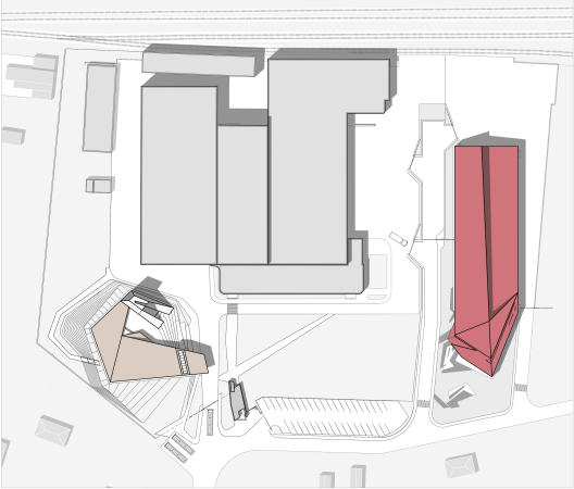
The commission to design and build the whisky distillery was again landed by Levon Airapetov and Valeria Preobrazhenskaya who demonstrated lots of professional perfectionism in the cognac brewery project. As for the architects, who have long since become quite at home with the specifics of the territory, they saw in this new task a necessity to both continue the already existing architectural ensemble, at the same time showing the differences between the buildings and addressing the specifics of the new drink and new production process. We will also note here that there are plans for building a whisky storage facility, in which the whisky will be stored in special oak casks for three years and one day at least. The storage facility has not been designed yet but it is already known that the area of the museum is 1 115 square meters, of the distillery’s 4 500 square meters, and the single-tier storage building will occupy some 16 000 square meters – the volumes are on the rise. Still more remote plans include landscaping the territory; now it is very tidy as it is – the trails are neat, the grass is trimmed, and everything looks well cared for in the European style, just like a modern production facility should look like, but the hand of a landscape designer has not yet touched it.

  • zooming
    1 / 5
    Distillery
    Copyright: © TOTEMENT/PAPER
  • zooming
    2 / 5
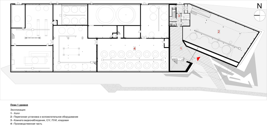
    Distillery; plan, 1st tier
    Copyright: © TOTEMENT/PAPER
  • zooming
    3 / 5
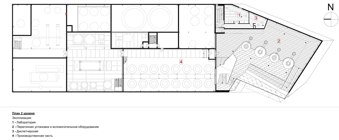
    Distillery; plan, 2nd tier
    Copyright: © TOTEMENT/PAPER
  • zooming
    4 / 5
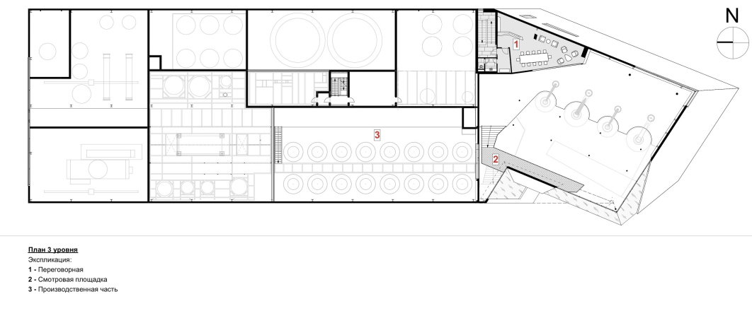
    Distillery; plan, 3rd tier
    Copyright: © TOTEMENT/PAPER
  • zooming
    5 / 5
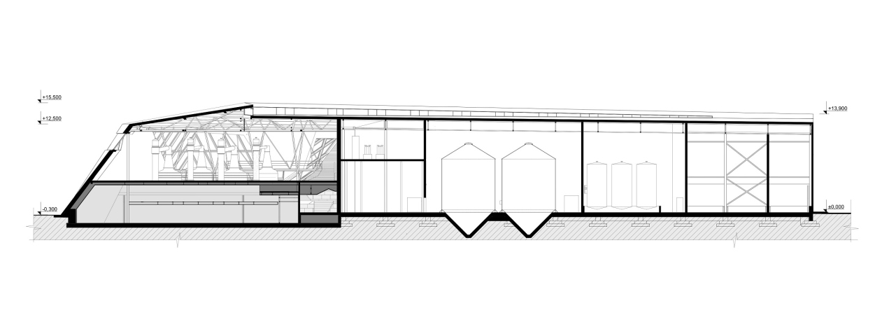
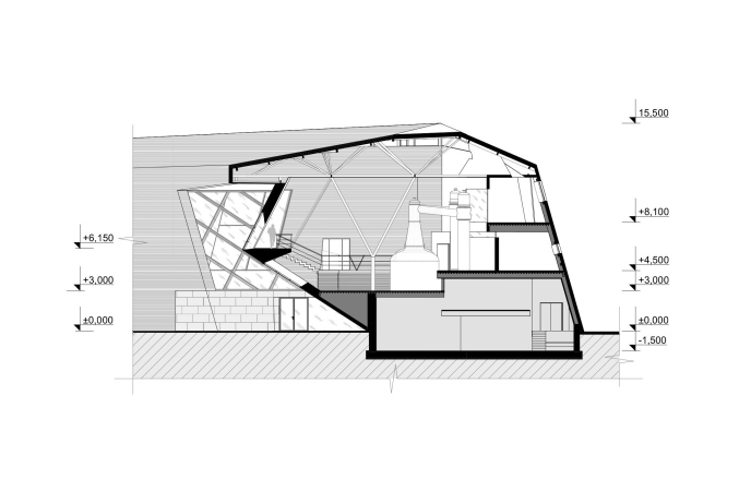
    Distillery; section view
    Copyright: © TOTEMENT/PAPER


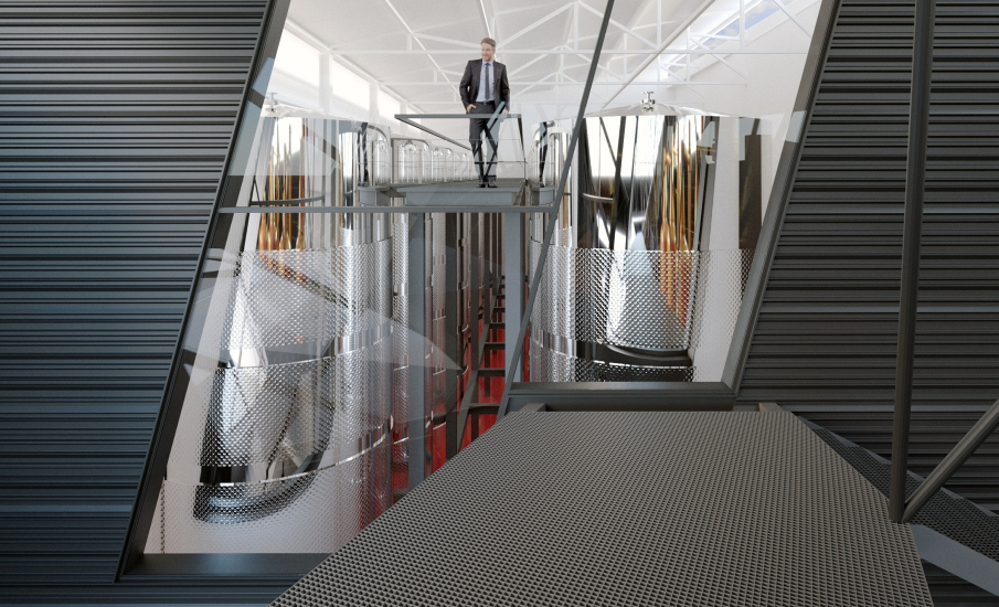
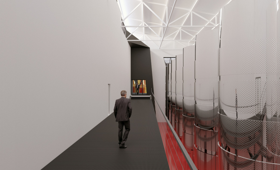
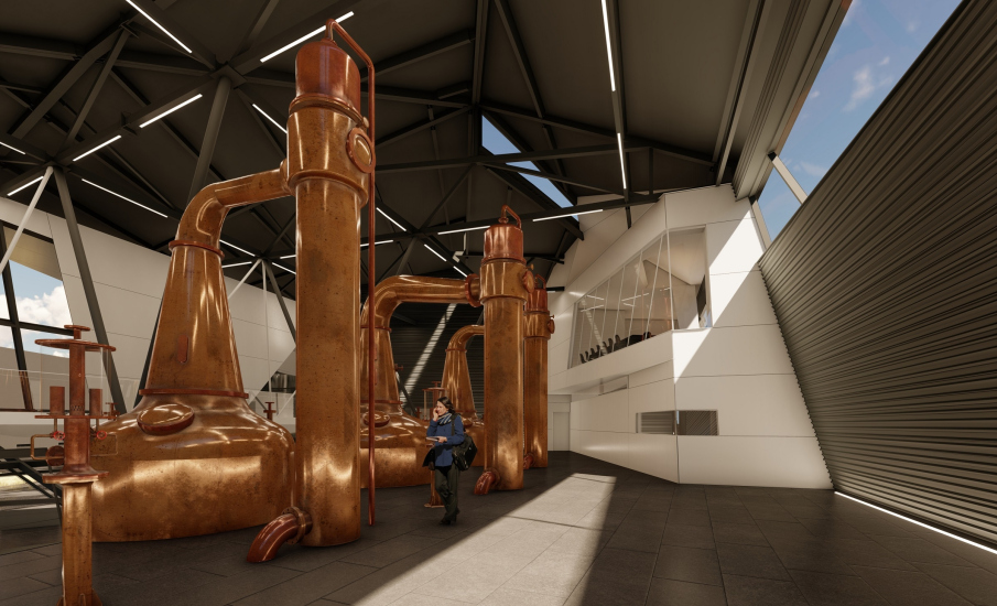
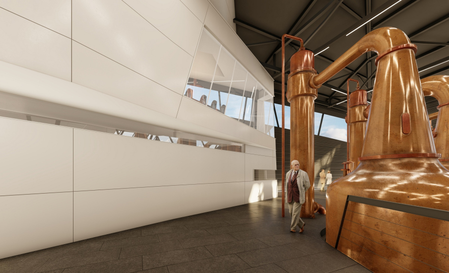
So! The main difference between the whisky distillery and the Cognac Museum is that its larger part is devoted to production and is only accessible to authorized personnel, essentially one or two people on duty who are supposed to control the automatic equipment, and get and assess the raw material. The production part is situated in an elongated metallic hangar that hosts bowls for various stages of fermentation, with footbridges running between them; everything is metallic white, and every little detail is taken care of: the architects are sharing that out of all the versions that were proposed by the Italian machine setters, with other things being equal, the client would inevitably opt for the most aesthetically pleasing one. But this part is totally closed-door.

  • zooming
    Distillery; the insides of the production facilities
    Copyright: © TOTEMENT/PAPER
  • zooming
    Distillery; the insides of the production facilities
    Copyright: © TOTEMENT/PAPER


Another limited-access place will be the lobby of the building, and this is also the place that most of the designers’ efforts were focused upon. The TOTEMENT / PAPER architects interpreted this part as a “head” of sorts – which is clearly readable because this “head”, glowing in the dark, crowns a rectangular “body”, and even makes half a turn in the direction of the Cognac Museum, building up emotional ties with the earlier-built edifice. “Back there [in the Cognac Museum] the two figures look as if they are involved in a dialogue, and, possibly, some curious sort of architectural dance appears there – Levon Airapetov explains – And here a stranger comes around, some sort of a wild Highlander, rough and brutal. He came here by boat with his Celtic axe, his body all covered with tattoos, and he is sort of taking stock of the surroundings”.

  • zooming
    1 / 4
    Distillery
    Copyright: © TOTEMENT/PAPER
  • zooming
    2 / 4
    Distillery
    Copyright: © TOTEMENT/PAPER
  • zooming
    3 / 4
    Distillery
    Copyright: © TOTEMENT/PAPER
  • zooming
    4 / 4
    Distillery
    Copyright: © TOTEMENT/PAPER


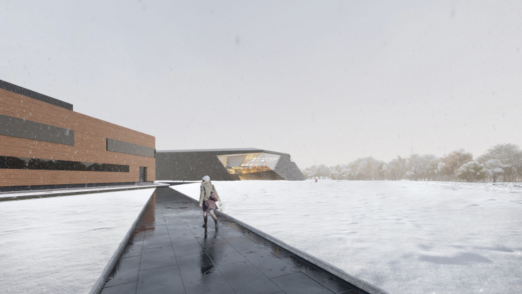
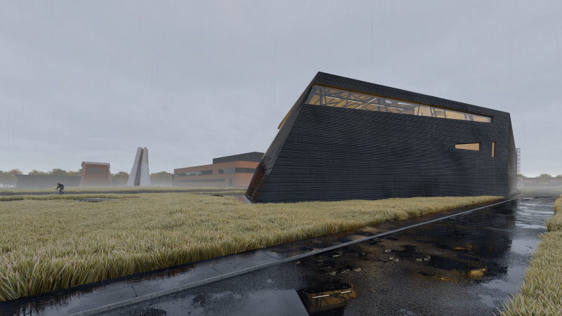
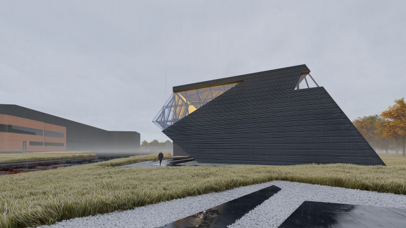
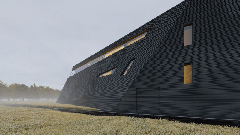
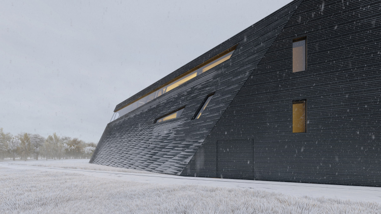
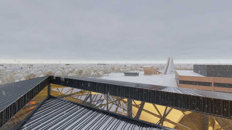
Indeed, the effect of a “stranger coming here by boat” is quite strong, even in spite of the fact that the building is firmly rooted in the ground – it is enough to take a look at its triangular “nose” pointed southward and looking like a cross between a modern submarine and an Ancient Greek triera. As for the elongated body of the building itself, it looks like a figure clad in some sort of hide, the likeness being enhanced by the black color and ribbed structure of the horizontal bands, upon which, as the architects are vividly demonstrating, snow will look great come winter.

Distillery; winter view
Copyright: © TOTEMENT/PAPER


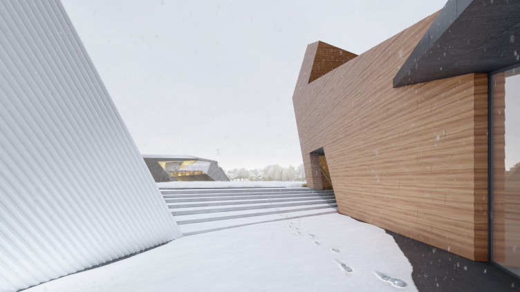
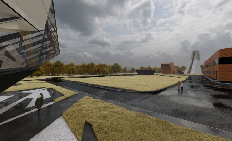
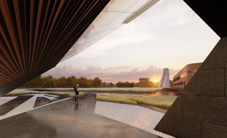
Peculiar is the fact that the Scottish associations are given in this rough and brutal form, and not through the habitual kilt – but through a conditional highlander. Or “The Highlander”. The black and white tattoos, quite abstract, are also included in the paving pattern in front of the entrance, which is reflected in the glass – in the building’s “face”, and in the combination of black and white.

Distillery; view from the Cognac Museum entrance
Copyright: © TOTEMENT/PAPER


The Scotch check pattern is also present here but one has to look real hard to see it because it is hidden in the intertwining lines of the stained glass windows and does not meet the eye at all – you need the author’s clue to see it. This, of course, was the right way to go about it: who needs such straightforward associations? Yet at the same time the building definitely has a lot of soul to it, looking like a figure arrested in midair, as Levon Airapetov explains, “it must be like the body of an animal ready to make a leap. It is tense, full of attention, ready for action, and anything but relaxed”.

Video presentation of the project:


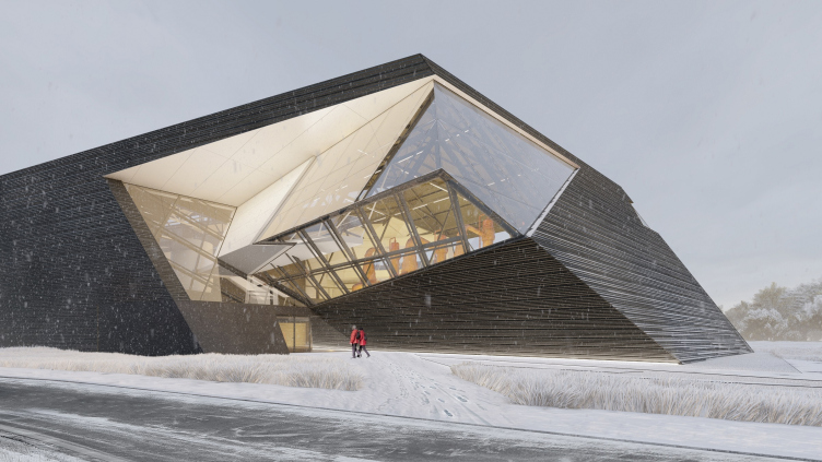
To me, this head, turned sideways, looks more like an inclusion of mountain crystal in a rock. Faceted and polished, glittering in the morning under the ray of sunlight that gets inside through a long slit in the eastern wall, and then moves inside during the day, like in a Roman pantheon, casting slanted light on various parts of the interior. At night and in the wintertime, it is lit by electric light.

Distillery; the entrance group
Copyright: © TOTEMENT/PAPER


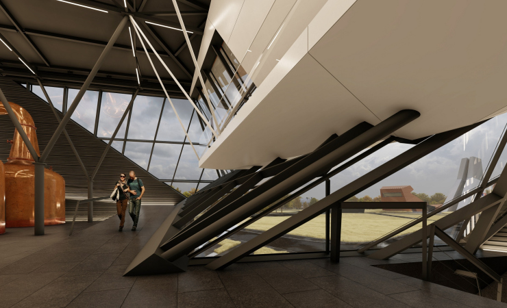
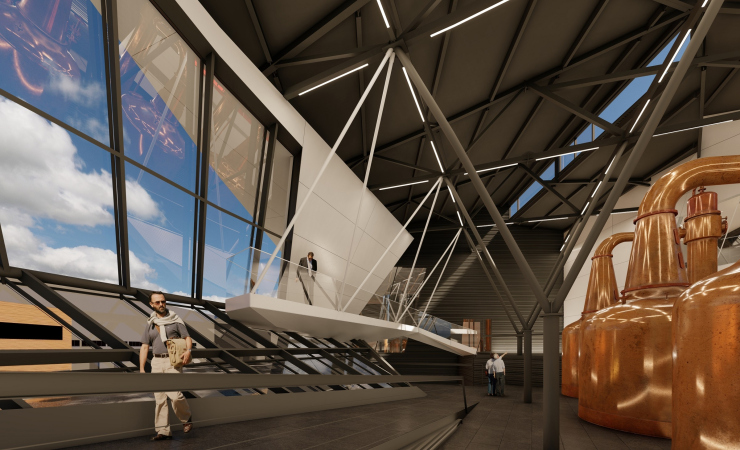
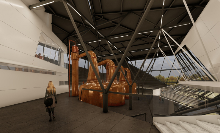
The light accentuates the preciousness of the Crystal and everything that it has inside of it, all the more so because here, behind the glass, the most valuable parts of the production process will be located – the “cubes”, in which the whisky will spend the final stage of its distillation before being poured into oak casks and stored in them for three years. In accordance with the technology standards, the cubes must be unalloyed copper and have a rather weird shape; they look like tubs and samovars on Jean-Baptiste-Siméon Chardin still life paintings, golden red, and all round. Their shape is clearly at odds with the faceted slender black and white “frame”, creating an impression that these are treasures trapped in some sort of precious crystal. One of the most popular techniques of modern architecture that consists in creating volumetric showcases that highlight the beauty of the exhibit inside is quite appropriate in this specific instance.

  • zooming
    Distillery
    Copyright: © TOTEMENT/PAPER
  • zooming
    Distillery
    Copyright: © TOTEMENT/PAPER


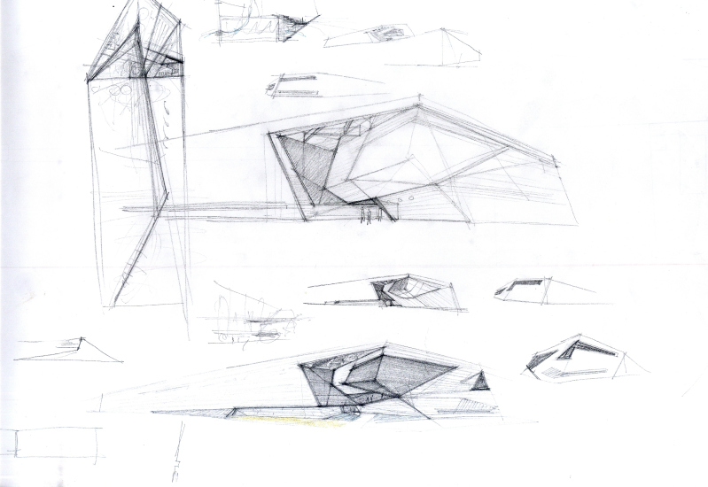
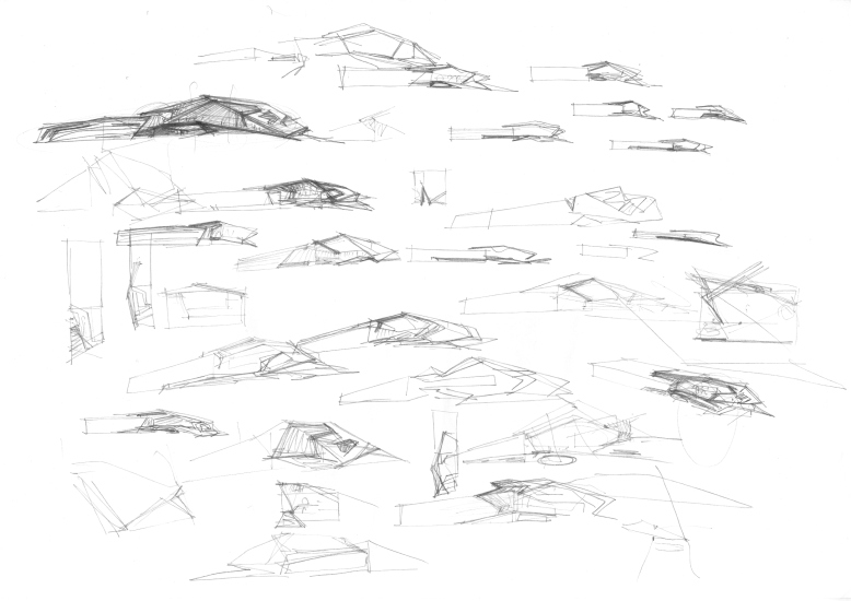
The shape search passed through a multitude of options for the “showcases” – rectangular, round (in the shape of a glass), and others: 


I must admit that the final version is better because it has some intrigue about it: one can see what’s inside but not the whole of it.

“The shape of the “head” and its turning angle is conditioned by the proximity of the Cognac Museum and the function of the building – Valeria Preobrazhenskaya explains – The Cognac Museum has a storage facility in it, which we don’t have here. This is why we made this cutaway in the volume, like it has an imprint of the cognac storage facility standing across from it. The buildings sort of became part of one and the same volumetric jigsaw puzzle – although there is a distance between them, they are still connected with the resonance of shape”. Yet another technique of forming almost a “secret tie” between the volumes within the ensemble is part of the code that determines the form and motivates differences and similarities inside of it.

  • zooming
    Distillery; the sketches, the shape search
    Copyright: © TOTEMENT/PAPER
  • zooming
    Distillery; sketches, search for shape
    Copyright: © TOTEMENT/PAPER


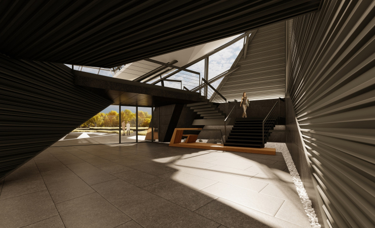
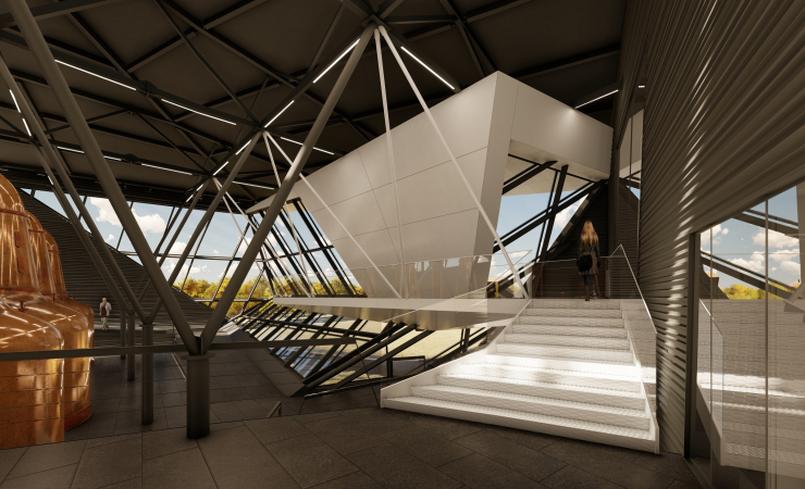
On the one hand, this can pass unnoticed. On the other hand, if you pay attention, you will see a visible dent in the volume of the “head” – an imprint of the Cognac Museum. But initially it still seems that the crystal lobby has either been chipped away or turned on a pivot – which, essentially, gives it some resemblance to a human head that is taking stock of the surroundings. As a result, above the entrance appears a steep slope running down to the ground: there are metal and glass hanging over the incoming visitors at an acute angle. There is also a glass ledge (which also looks a little bit like a bird’s beak) that has a black ramp inside of it, treading on which one can look through the glass beneath one’s feet. Higher up, in the ledge of the “beak”, there is a white balcony – the best possible vantage point to admire the Cognac Museum. Thus, the parts of the ensemble also “exchange glances” with one another, in this instance literally, exchanging the visitors’ glances. From the inside, the balcony is supported by white metallic wire ropes, while the black ceiling, dissected by white strokes of lamps, is supported by black branching pillars (currently, the architects are struggling to make them as slender and as exquisite as possible). In addition, the metallic grille of the ceiling is not masked in any way, the inside walls decorated in the same way as the outside ones: they are covered with horizontal bands of corrugated metal – all of this is meant to highlight the unity of the inside and the outside, leaving not a single chance to relaxed comfort that is generally expected from interior design. In this instance, the atmosphere of the inside is probably as tense as it is on the outside, one moment short of sparks flowing. Such a space is not alien to a wow-effect; in its own way, it holds its own with the Cognac Museum with its sophisticated routes and an “upshot” from ground to the sky.

  • zooming
    1 / 7
    Distillery
    Copyright: © TOTEMENT/PAPER
  • zooming
    2 / 7
    Distillery
    Copyright: © TOTEMENT/PAPER
  • zooming
    3 / 7
    Distillery
    Copyright: © TOTEMENT/PAPER
  • zooming
    4 / 7
    Distillery
    Copyright: © TOTEMENT/PAPER
  • zooming
    5 / 7
    Distillery
    Copyright: © TOTEMENT/PAPER
  • zooming
    6 / 7
    Distillery; the sightseeing platform on the roof of the entrance group
    Copyright: © TOTEMENT/PAPER
  • zooming
    7 / 7
    Distillery
    Copyright: © TOTEMENT/PAPER


The graphic play of black and white planes and lines in space is truly mesmerizing, all the more so because they intersect at such different angles, and in motion their perception will be constantly changing, making us feel the space emotionally, live it through. Which is, basically, quite understandable because we are inside the “head” of the distillery, a curious “town in the snuff-box”, a place that is only accessible to a few chosen ones – so it must look unusual and justify the expectations springing from its inaccessible status. But then again, as was already said, the entrance lobby is at the same time the presentation part of the building, to which, for example, business partners can be invited in the future. So it is not for nothing that in the corner we see a white volume of the meeting room.


Of course, there is no doubt that the distillery could have actually been built as an aluminum hangar, a simple “box”. Still, however, wine, in the broad sense of the word, not to use the official term “alcoholic beverages”, is definitely a cult in its own right, and part of this cult consists of lots of distilleries, breweries, and other related buildings of designer architecture. This topic is so romanticized that now breweries (and a distillery will fit in here just as nicely) are akin to public buildings or museums; there are even guided tours of them. The project by Airapetov / Preobrazhenskaya is exactly of this kind, it is something that must be shown; it is like high-quality exciting packaging that is capable of adding extra charisma to the production that is about to be launched – like a really good label can convey the essence of wine. Well, or whisky, for that matter. 

14 May 2019

Headlines now
The Golden Crown
The concept for a dental clinic in Yekaterinburg, developed by CNTR Studio, revolves around the idea of a “mouth full of gold”: pristine white porcelain stoneware walls are complemented by matte brass details. To avoid an overly literal interpretation, the architects focused on the building’s proportions, skillfully navigating between sunlight requirements and fire safety regulations.
Flexibility and Integration
Not long ago, we covered the project for the fourth phase of the ÁLIA residential complex, designed by APEX. Now, we’ve been shown different fence concepts they developed to enclose the complex’s private courtyards, incorporating a variety of public functions. We believe that the sheer fact that the complex’s architects were involved in such a detail as fencing speaks volumes.
A Step Forward
The HIDE residential complex represents a major milestone for ADM architects and their leaders Andrey Romanov and Ekaterina Kuznetsova in their quest for a fresh high-rise aesthetic – one that is flexible and layered, capable of bringing vibrancy to mass and silhouette while shaping form. Over recent years, this approach has become ADM’s “signature style”, with the golden HIDE tower playing a pivotal role in its evolution. Here, we delve into the project’s story, explore the details of the complex’s design, and uncover its core essence.
Gold in the Sands
A new office for a transcontinental company specializing in resource extraction and processing has opened in Dubai. Designed by T+T Architects, masters of creating spaces that are contemporary, diverse, flexible, and original, this project exemplifies their expertise. On the executive floor, a massive brass-clad partition dominates, while layered textures of compressed earth create a contextually resonant backdrop.
Layers and Levels of Flight
This project goes way back – Reserve Union won this architectural competition at the end of 2011, and the building was completed in 2018, so it’s practically “archival”. However, despite being relatively unknown, the building can hardly be considered “dated” and remains a prime example of architectural expression, particularly in the headquarters genre. And it’s especially fitting for an aviation company office. In some ways, it resembles the Aeroflot headquarters at Sheremetyevo but with its own unique identity, following the signature style of Vladimir Plotkin. In this article, we take an in-depth look at the United Aircraft Corporation (UAC) headquarters in the Moscow agglomeration town of Zhukovsky, supplemented by recent photographs from Alexey Naroditsky – a shoot that became only recently possible due to the fact that improvements were finally made in the surrounding area.
Light and Shadow
In this article, we delve into the architectural design of the “Chaika” house by DNK ag architects, which was recently completed in 2023 as part of the collection of signature designs at ZILArt. As is well-known, all the buildings in this complex follow a design code, yet each one is distinct. This particular building stands out not only for its whiteness and minimalism but also for the refined use of a limited number of techniques that, together, create what can confidently be called synergy.
Casus Novae
A master plan was developed for a large residential area with a name of “DNS City”, but now that its implementation began, the plan has been arbitrarily reformatted and replaced with something that, while similar on the surface, is actually quite different. This is not the first time such a thing happens, but it’s always frustrating. With permission from the author, we are sharing Maria Elkina’s post.
Treasure Hunting
The GAFA bureau, in collaboration with Tegola and Arkhitail, organized an expedition to the island of Kilpola in Karelia as part of Moskomarkhitektura’s “Open City” festival. There, amidst moss and rocks, the students sought answers to questions like: what is the sacred, where does it dwell, and what sustains it? Assisting the participants in this quest were landscape engineer Evgeny Levin, artist Nicholas Roerich, a moose, and the lack of cellular connection. Here’s how the story unfolded.
Depths of the Earth, Streams of Water
In the Malaya Okhta district, the Akzent building, designed by Stepan Liphart, was constructed. It follows a classic tripartite structure, yet it’s what you might call “hand-drawn”: each façade is unique in its form and details, some of which aren’t immediately noticeable. In this article, we explore the context and, together with the architect, delve into how the form was developed.
Fir Tree Dynamics
The “Airports of Region” holding is planning to build an airport in Karachay-Cherkessia, aiming to make the Arkhyz and Dombay resorts more accessible to travelers. The project that won in an invitation-only competition, submitted by Sergey Nikeshkin’s KPLN, blends natural imagery inspired by the shape of a conifer seed, open-air waiting spaces, majestic large trees, and a green roof elevated on needle-like columns. The result is both nature-inspired and WOW.
​A Brick Shell
In the process of designing a clubhouse situated among pine trees in a prestigious suburban area near Moscow, the architectural firm “A.Len” did the façade design part. The combination of different types of brick and masonry correlates with the volumetric and plastique solutions, further enhanced by the inclusion of wood-painted fragments and metal “glazing”.
Word Forms
ATRIUM architects love ambitious challenges, and for the firm’s thirtieth anniversary, they boldly play a game of words with an exhibition that dives deep into a self-created vocabulary. They immerse their projects – especially art installations – into this glossary, as if plunging into a current of their own. You feel as if you’re flowing through the veins of pure art, immersed in a universe of vertical cities, educational spaces – of which the architects are true masters – and the cultural codes of various locations. But what truly captivates is the bold statement that Vera Butko and Anton Nadtochy make, both through their work and this exhibition: architecture, above all, is art – the art of working with form and space.
Flexibility and Acuteness of Modernity
Luxurious, fluid, large “kokoshniks” and spiral barrel columns, as if made from colorful chewing gum: there seem to be no other mansion like this in Moscow, designed in the “Neo-Russian-Modern” style. And the “Teremok” on Malaya Kaluzhskaya, previously somewhat obscure, has “come alive with new colors” and gained visibility after its restoration for the office of the “architectural ecosystem” as the architects love to call themselves. It’s evident that Julius Borisov and the architects at UNK put their hearts into finding this new office and bringing it up to date. Let’s delve into the paradoxes of this mansion’s history and its plasticity. Spoiler: two versions of modernity meet here, both balancing on the razor’s edge of “what’s current”.
Yuri Vissarionov: “A modular house does not belong to the land”
It belongs to space, or to the air... It turns out that 3D printing is more effective when combined with a modular approach: the house is built in a workshop and then adapted to the site, including on uneven terrain. Yuri Vissarionov shares his latest experience in designing tourist complexes, both in central Russia and in the south. These include houseboats, homes printed from lightweight concrete using a 3D printer, and, of course, frame houses.
​Moscow’s First
“The quality of education largely depends on the quality of the educational environment”. This principle of the last decade has been realized by Sergey Skuratov in the project for the First Moscow Gymnasium on Rostovskaya Embankment in the Khamovniki district. The building seamlessly integrates into the complex urban landscape, responding both to the pedestrian flow of the city and the quiet alleyways. It skillfully takes advantage of the height differences and aligns with modern trends in educational space design. Let’s take a closer look.
Looking at the Water
The site of Villa Sonata stretches from the road to the water’s edge, offering its own shoreline, pier, and a picturesque river panorama. To reveal these sweeping views, Roman Leonidov “cut” the façade diagonally parallel to the river, thus getting two main axes for the house and, consequently, “two heads”. The internal core – two double-height spaces, a living room and a conservatory, with a “bridge” above them – makes the house both “transparent” and filled with light.
The White Wing
Well, it’s not exactly white. It’s more of a beige, white-stone structure that plays with the color of limestone – smoother surfaces are lighter, while rougher ones are darker. This wing unites various elements: it absorbs and interprets the surrounding themes. It responds to everything, yet maintains a cohesive expression – a challenging task! – while also incorporating recognizable features of its own, such as the dynamic cuts at the bottom, top, and middle.
Urban Dunes
The XSA Ramps team designed and built a three-part sports hub for a park in Rostov-on-Don, welcoming people of all ages and fitness levels. The skate plaza, pump track, and playground are all meticulously crafted with details that attract a diverse range of visitors. The technical execution of the shapes and slopes transforms this space into a kind of sculptural composition.
Proportional Growth
The project for the fourth phase of the ÁLIA residential area has been announced. The buildings are situated on an elongated plot – almost a “ray” that shoots out from the center of the area towards the river. Their layout reflects both a response to Moscow’s architectural preferences over the past 15 years, shifting “from blocks to towers”, and an interpretation of the neighboring business park designed by SOM. Additionally, the best apartments here are not located at the very top but closer to the middle, forming a glowing “waistline”.
The “Staircase” Building
In designing the “Details” residential complex in New Moscow, Rais Baishev spiced up the now-popular Moscow theme of a “courtyard” building with an idea drawn from the surrealist drawings by Maurits Escher. He envisioned the stepped silhouettes and descending slopes as a metaphysical mega-staircase, creating a key void within the courtyard that gave the project an internal “spine”. This concept is felt both in the building’s silhouette and on its façades.
Projection of the Quarter
No one doubted that the building that Vladimir Plotkin designed as part of the “Garden Quarters” would be the most modernist of all. And it turned out just that way: while adhering to the common design code, the building successfully combines brick and white stone, rhythmically responding to the neighboring building designed by Ostozhenka, yet tactfully and persistently making a few statements of its own. This includes the projection of the ideal urban development composition “14–9–6”, which can be found right next door, mathematical calculations, including those for various types of terraces (and perhaps the only reminder of the Soviet past of the Kauchuk rubber factory!), and the white “cross-stitch” pattern of the façade grid.
Domus Aurea
In this issue, we examine the “Tessinsky-1” house, designed by Sergey Skuratov and completed in 2023. Located in the middle of the Serebryanicheskaya Embankment district, at the intersection of its main streets, this house assumes a sort of “nodal” role: it not only responds to everything around it and preserves many memories of the former EMA factory within itself, but it weaves all this into a newly directed pattern, reconciling bright “gold” and dark-colored brick, largely with the help of the new, modern-yet-archaic Columba brick, which, come to think about it, is the most precious element here.
The Chimney of Nikola-Lenivets
In this issue, we are examining the “Obelisk House” designed by KATARSIS and built for the Arkhstoyanie 2023 festival. However, it was only finished later on, and this is why we are examining it now. It seems to us that after the “Obelisk House” appeared in Nikola-Lenivets, a dialogue and a few inner connections appeared between the temporary structures built here. These houses no longer look like “accidental neighbors”, more of which below.
​Periscope by the Bay
The jury awarded the second place in the competition for a public and cultural center in Petropavlovsk-Kamchatsky to the companies GORA (“Mountain”) and M4. In the consortium’s proposal, the building resembles a sperm whale with a calf swimming next to it or a periscope, whose lenses capture the most spectacular views from the surrounding landscape.
From Arcs to Dolmens
While working on the competition project for Petropavlovsk-Kamchatsky, ASADOV Architects prioritized the value of the natural and urban environment, aiming to preserve the balance of the location while minimizing the resemblance of the volume that they designed to a “traditional building”. The task was challenging, and the architects created three versions, one of which having been developed after the competition, where their main proposal took third place. However, the point of interest here is not the competition result but the continuity of creative thinking.
Hide and Seek
The ID Moskovskiy house, designed by Stepan Liphart in St. Petersburg, in the courtyards near Moskovskiy Avenue beyond the Obvodny Canal and recently completed, is notable for several reasons. Firstly, it has been realized with considerable accuracy, which is particularly significant as this is the first building where the architect was responsible not only for the facades but also for the layouts, allowing for better integration between the two. On the other hand, this building is interesting as an example of the “germination” of new architecture in the city: it draws on the best examples from the neighborhood and becomes an improved and developed sum of ideas found by the architect in the surrounding context.
The Big Twelve
Yesterday, the winners of the Moscow Mayor’s Architecture Award were announced and honored. Let’s take a look at what was awarded and, in some cases, even critique this esteemed award. After all, there is always room for improvement, right?
Above the Golden Horn
The residential complex “Philosophy” designed by T+T architects in Vladivostok, is one of the new projects in the “Golubinaya Pad” area, changing its development philosophy (pun intended) from single houses to a comprehensive approach. The buildings are organized along public streets, varying in height and format, with one house even executed in gallery typology, featuring a cantilever leaning on an art object.
Nuanced Alternative
How can you rhyme a square and space? Easily! But to do so, you need to rhyme everything you can possibly think of: weave everything together, like in a tensegrity structure, and find your own optics too. The new exhibition at GES-2 does just that, offering its visitor a new perspective on the history of art spanning 150 years, infused with the hope for endless multiplicity of worlds and art histories. Read on to see how this is achieved and how the exhibition design by Evgeny Ace contributes to it.
Blinds for Ice
An ice arena has been constructed in Domodedovo based on a project by Yuri Vissarionov Architects. To prevent the long façade, a technical requirement for winter sports facilities, from appearing monotonous, the architects proposed the use of suspended structures with multidirectional slats. This design protects the ice from direct sunlight while giving the wall texture and detail.