По-русски

​Part of the Urban Kaleidoscope

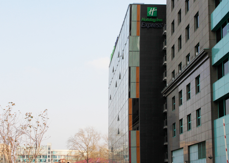
This is how you can best describe the hotel building on the Dubininskaya Street. Its architecture is anything but conspicuous – one could even say that it’s making a parade of its unpretentiousness. Upon closer examination, however, interesting details begin to come up.

21 June 2019
Object
mainImg

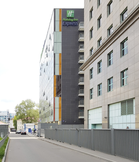
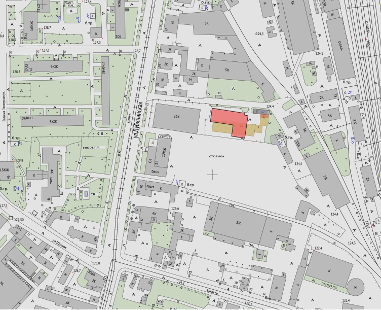
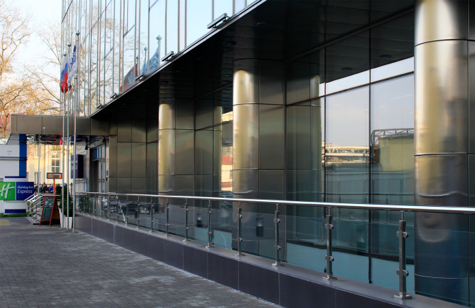
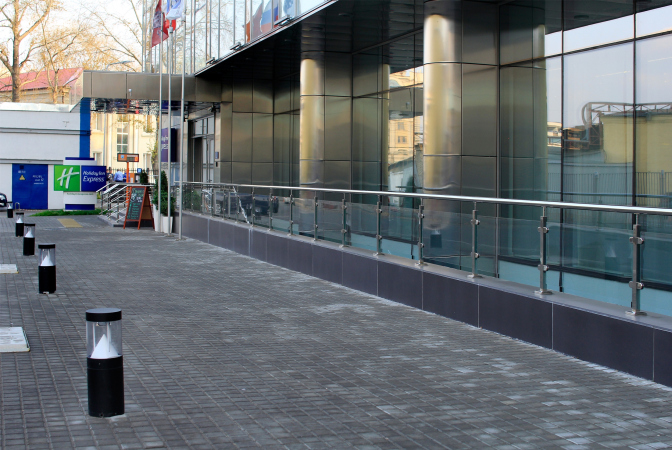
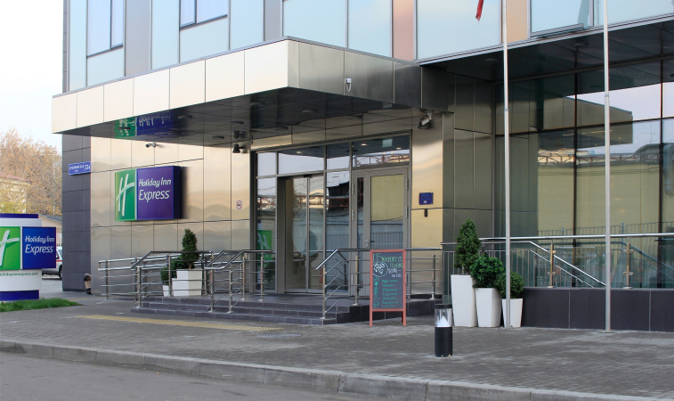
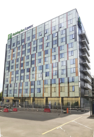
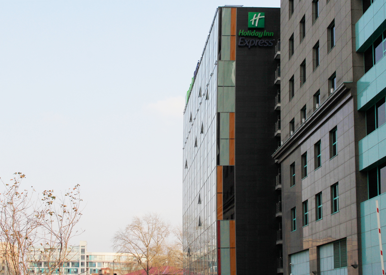
The building of Holiday Inn Express Hotel opened on Moscow’s Dubininskaya Street in the fall of 2017. The three-star hotel belongs to the budget line of the famous brand, which focuses on offering “limited services at a reasonable price”. This is exactly the kind of hotel that you could open in the depth of one of the parts of the Paveletskaya industrial park, a place that has been reconstructed for years. The hotel is situated on the edge of the former territory of Cold Storage Facility #3, hiding behind the 20-floor tower of the Rosneft office, which literally divided in two the 12-story prefab residential building and a couple of two-story Moscow tenements that miraculously survived here from days past. The surroundings are pretty diverse, and the territory is not yet quite organized, the old warehouses alternating with yawning gaps, obviously waiting to be “developed”. Meanwhile, this place is but a ten minutes’ walk away from the Paveletsky Railway Station, the metro station bearing the same name, and the Garden Ring too, which basically means that if you switch to a trot you will reach all these places in five minutes, which, in turn, means that this location is extremely convenient.

  • zooming
    Holiday Inn Express Hotel on the Dubininskaya Street, Moscow
    Copyright: Photograph © Julia Tarabarina, Archi.ru
  • zooming
    Holiday Inn Express Hotel on the Dubininskaya Street, Moscow
    Copyright: Photograph © Ginzburg Architects
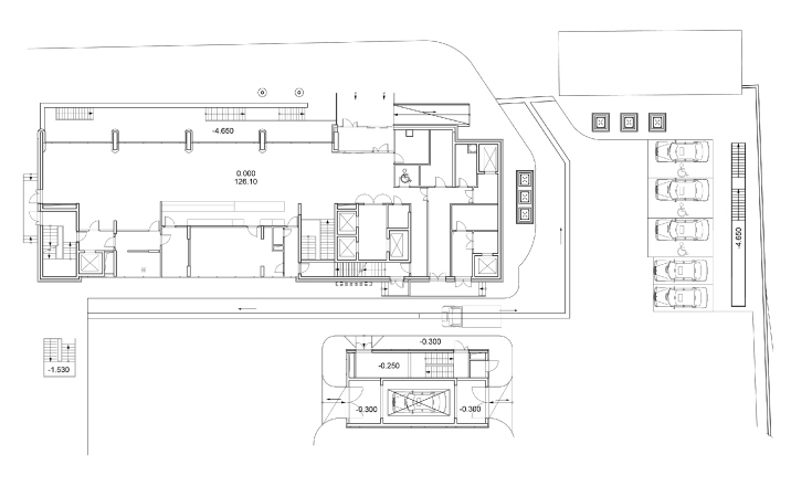
Holiday Inn Express Hotel on the Dubininskaya Street, Moscow. Location plan
Copyright: Photograph © Ginzburg Architects


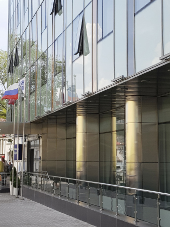
What makes this architectural project different in this specific case and considering the diversity of its surroundings (most of which are still in construction) is its unpretentiousness. Here’s what I mean. Oftentimes, 3D visualizations drawn by the architects show glass-and-concrete giants that look as if they were kind of beautifully “dissolving” in the sky. Later on, however, when these projects are actually built, it turns out that they do not dissolve anywhere – the fact that has long since been noticed by the city preservation activists. Here, on the other hand, what we see is what we get: the hotel building is barely visible, delicately glittering against the sky. It is literally dissolved in the architectural context. At the same time, finding it is not hard at all, even for a fatigued traveler, which is also a considerable competitive advantage for a hotel. As for the passers-by, not interested in bed&breakfast, this building passes completely unnoticed. Completely. This quite a unique case by Moscow standards, this approach is something that most architects only dream about, and here they were able to do it. To do what, exactly? To keep within the limits of urban planning decency in a diverse environment.

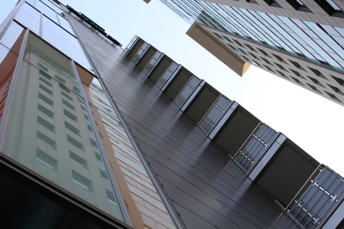
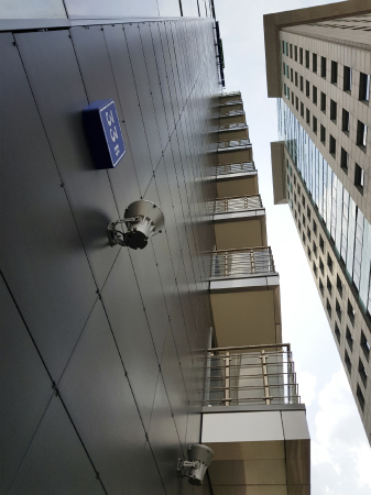
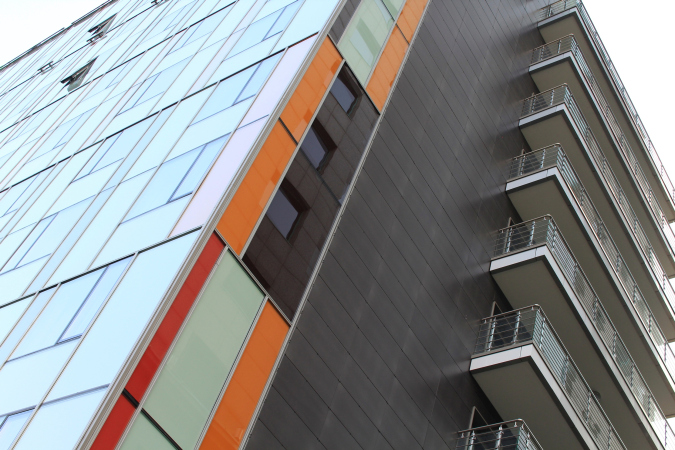
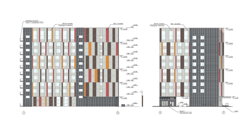
To do the project justice, let’s admit that the proximity of the Rosneft office made the architect’ task somewhat easier: its nobly brown volume is the first thing that meets the eye, drawing people’s attention away from everything else. However, the new hotel has also been able to engage in a dialogue with this “person of consequence” – the newcomer not just hid behind its back but stood up as an embryo of a new street. Even more than an embryo – there is indeed a street here, and, if they develop it slightly into the depth, they will get a chunk of fully-fledged urban space. One small step has already been made. The hotel also responds to its neighbor: one of its façades, which comes the closest to the wall of the office building, bears a staircase and common-use balconies, whose presence is dictated by the fire safety rules but, on the other hand, one can use them to have a smoke up there.

  • zooming
    1 / 3
    Holiday Inn Express Hotel on the Dubininskaya Street, Moscow
    Copyright: Photograph © Julia Tarabarina, Archi.ru
  • zooming
    2 / 3
    Holiday Inn Express Hotel on the Dubininskaya Street, Moscow
    Copyright: Photograph © Julia Tarabarina, Archi.ru
  • zooming
    3 / 3
    Holiday Inn Express Hotel on the Dubininskaya Street, Moscow
    Copyright: Photograph © Ginzburg Architects


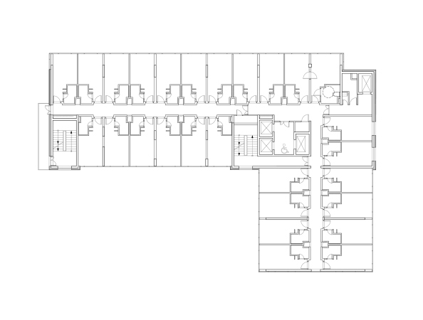
Incidentally, there are two staircases here, the other one situated in the poorly lit corner of the L-shaped building and combined with the elevator block; yet another freight elevator runs on the outer corner – it is convenient for loading and unloading the material needs of the hotel.

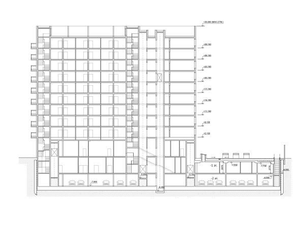
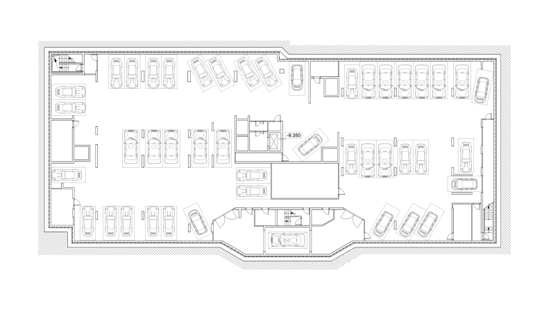
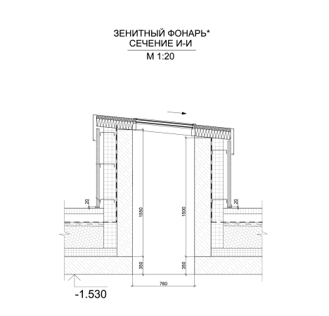
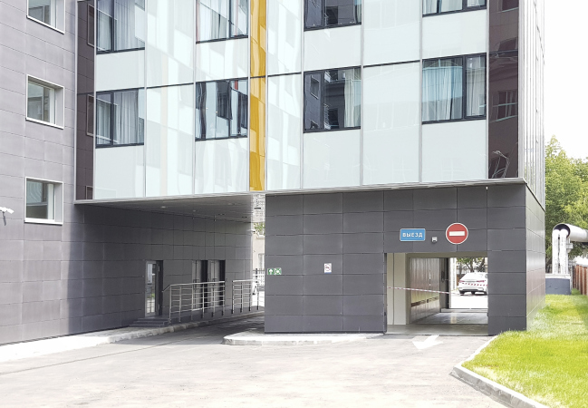
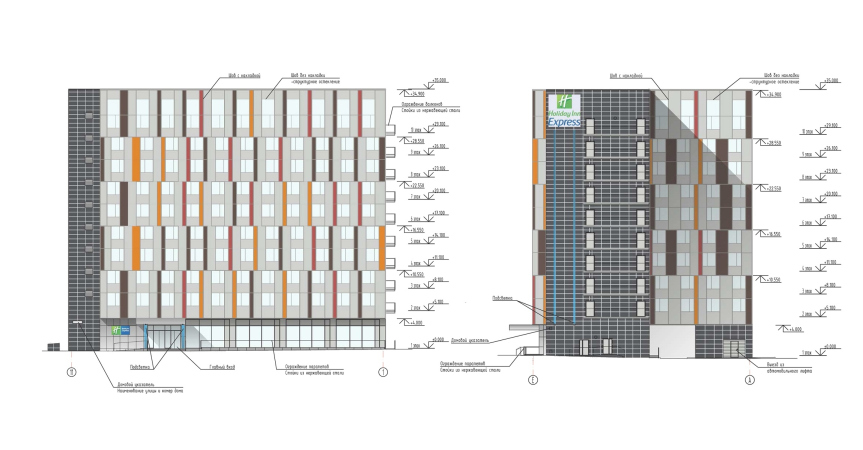
The main floors of the hotel are standard, three meters high. The bottom floor of the lobby is quite tall – 5 meters high. Beneath it, there are two tiers that are just as high, one semi-underground, intended for commercial use, and the other meant to be an underground parking garage (hopefully, equipped with an elevator). The underground floors continue eastward, into the depth of the land site, forming a paved yard/podium. It was planned to light the entire top floor with rooflights (this solution doesn’t seem to have been implemented? I’m seeing the paved section buy I’m not seeing any rooflights. The reason for such a decision? Building up was prohibited here?)

  • zooming
    1 / 6
    Holiday Inn Express Hotel on the Dubininskaya Street, Moscow
    Copyright: Photograph © Ginzburg Architects
  • zooming
    2 / 6
    Holiday Inn Express Hotel on the Dubininskaya Street, Moscow
    Copyright: Photograph © Ginzburg Architects
  • zooming
    3 / 6
    Holiday Inn Express Hotel on the Dubininskaya Street, Moscow
    Copyright: Photograph © Julia Tarabarina, Archi.ru
  • zooming
    4 / 6
    Holiday Inn Express Hotel on the Dubininskaya Street, Moscow
    Copyright: Photograph © Ginzburg Architects
  • zooming
    5 / 6
    Holiday Inn Express Hotel on the Dubininskaya Street, Moscow
    Copyright: Photograph © Ginzburg Architects
  • zooming
    6 / 6
    Holiday Inn Express Hotel on the Dubininskaya Street, Moscow
    Copyright: Photograph © Ginzburg Architects


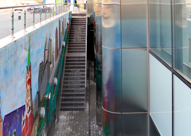
One of the most interesting solutions of the project is the semi-underground floor. The ambient light gets here through a deep areaway on the street side. One can get down by the two-flight staircase running parallel to the façade (19 stairs), and the metallic semi-columns of the first floor also continue here: the space before the main façade also takes on an intrigue and a volumetric character. It is livened up by the naive graffiti on the wall and life-affirming quotes on the stairs; you can have a different attitude towards such “adornment” but in any case such things are a sure sign that the city life is already going on here.

  • zooming
    1 / 5
    Holiday Inn Express Hotel on the Dubininskaya Street, Moscow
    Copyright: Photograph © Ginzburg Architects
  • zooming
    2 / 5
    Holiday Inn Express Hotel on the Dubininskaya Street, Moscow
    Copyright: Photograph © Julia Tarabarina, Archi.ru
  • zooming
    3 / 5
    Holiday Inn Express Hotel on the Dubininskaya Street, Moscow
    Copyright: Photograph © Julia Tarabarina, Archi.ru
  • zooming
    4 / 5
    Copyright: Photograph © Ginzburg Architects
    Copyright: Photograph © Ginzburg Architects
  • zooming
    5 / 5
    Holiday Inn Express Hotel on the Dubininskaya Street, Moscow
    Copyright: Photograph © Julia Tarabarina, Archi.ru


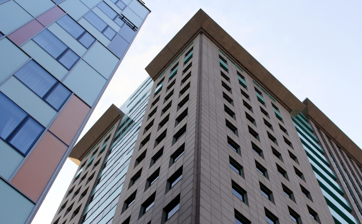
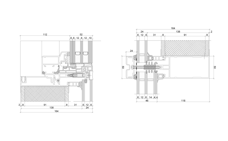
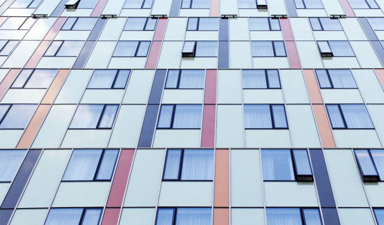
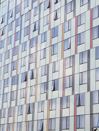
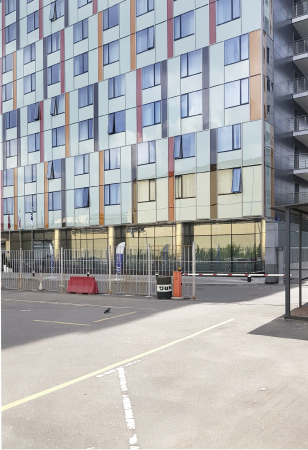
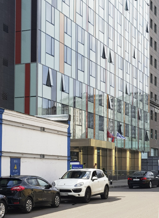
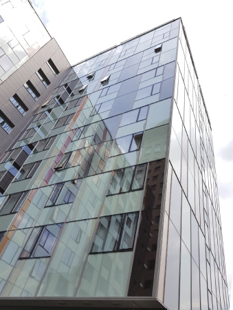
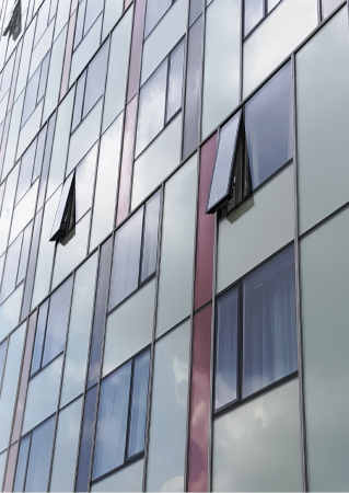
On the flat glass façade, the windows are surrounded by panels of autumn colors: the light tone of faded skies, orange, terra-cotta, and dark-gray stripes. The façade uses the mosaic screen technique that was introduced in Moscow fifteen years ago by the Ostozhenka Architects, a very convenient way to turn a flat façade – given the fact that you do not have the budget to show the depth of the window jambs – into a glittering pattern that reacts to the surroundings, at the same time having a color and a character of its own. But then again, here the composition is simpler because it is defined by the tasks and the modern trends of pristine façade grids. The colored bands unite the floors in pairs, their width and colors alternating. In addition, in a couple of floors the windows are shifted by one iteration, and, if you look a little harder, it will seem as if the façade is slightly turning left and right. The surface is also livened up by the operable transoms of the hotel windows that look like the keys of some sci-fi musical instrument pressed in a random order. One of the tasks of this composition of transparent spots on the façade – to cover up the square proportions of the windows and the large width between them – has been fulfilled: one will have to look real hard to tell between the windows and the walls – everything bleeds into crosses of lines and soft spots of color.

  • zooming
    1 / 11
    Holiday Inn Express Hotel on the Dubininskaya Street, Moscow
    Copyright: Photograph © Julia Tarabarina, Archi.ru
  • zooming
    2 / 11
    Holiday Inn Express Hotel on the Dubininskaya Street, Moscow
    Copyright: Photograph © Julia Tarabarina, Archi.ru
  • zooming
    3 / 11
    Holiday Inn Express Hotel on the Dubininskaya Street, Moscow
    Copyright: Photograph © Ginzburg Architects
  • zooming
    4 / 11
    Holiday Inn Express Hotel on the Dubininskaya Street, Moscow
    Copyright: Photograph © Ginzburg Architects
  • zooming
    5 / 11
    Holiday Inn Express Hotel on the Dubininskaya Street, Moscow
    Copyright: Photograph © Ginzburg Architects
  • zooming
    6 / 11
    Holiday Inn Express Hotel on the Dubininskaya Street, Moscow
    Copyright: Photograph © Ginzburg Architects
  • zooming
    7 / 11
    Holiday Inn Express Hotel on the Dubininskaya Street, Moscow
    Copyright: Photograph © Ginzburg Architects
  • zooming
    8 / 11
    Holiday Inn Express Hotel on the Dubininskaya Street, Moscow
    Copyright: Photograph © Ginzburg Architects
  • zooming
    9 / 11
    Copyright: Photograph © Ginzburg Architects
    Copyright: Photograph © Ginzburg Architects
  • zooming
    10 / 11
    Holiday Inn Express Hotel on the Dubininskaya Street, Moscow
    Copyright: Photograph © Ginzburg Architects
  • zooming
    11 / 11
    Holiday Inn Express Hotel on the Dubininskaya Street, Moscow
    Copyright: Photograph © Ginzburg Architects


This building is anything but a bold architectural statement, making which was neither in the budget nor in the intended class of this hotel anyway. At the same time, it definitely has some reserved and decent modesty about it, which is important because making a bold statement is something that pretty much everyone wants to do, while making a sober evaluation of one’s task and designing a building that would make the right background is not the most rewarding job in the world but it needs to be done, and it needs to be done a lot. At the same time, standing next to this building, we feel as if we find ourselves in a developed and thoroughly thought out urban space. One feels like dismantling the black fence before the Rosneft office – then a real street will appear here, people will no longer have to cling to the wall, or, what’s worse, step down on the traffic lanes. One should think that sooner or later this is bound to happen and a small embryo of urban space that appeared here thanks to the efforts of Aleksey Ginzburg Architects, will grow and develop. Because this is the way it was meant to be.

21 June 2019

Headlines now
The Golden Crown
The concept for a dental clinic in Yekaterinburg, developed by CNTR Studio, revolves around the idea of a “mouth full of gold”: pristine white porcelain stoneware walls are complemented by matte brass details. To avoid an overly literal interpretation, the architects focused on the building’s proportions, skillfully navigating between sunlight requirements and fire safety regulations.
Flexibility and Integration
Not long ago, we covered the project for the fourth phase of the ÁLIA residential complex, designed by APEX. Now, we’ve been shown different fence concepts they developed to enclose the complex’s private courtyards, incorporating a variety of public functions. We believe that the sheer fact that the complex’s architects were involved in such a detail as fencing speaks volumes.
A Step Forward
The HIDE residential complex represents a major milestone for ADM architects and their leaders Andrey Romanov and Ekaterina Kuznetsova in their quest for a fresh high-rise aesthetic – one that is flexible and layered, capable of bringing vibrancy to mass and silhouette while shaping form. Over recent years, this approach has become ADM’s “signature style”, with the golden HIDE tower playing a pivotal role in its evolution. Here, we delve into the project’s story, explore the details of the complex’s design, and uncover its core essence.
Gold in the Sands
A new office for a transcontinental company specializing in resource extraction and processing has opened in Dubai. Designed by T+T Architects, masters of creating spaces that are contemporary, diverse, flexible, and original, this project exemplifies their expertise. On the executive floor, a massive brass-clad partition dominates, while layered textures of compressed earth create a contextually resonant backdrop.
Layers and Levels of Flight
This project goes way back – Reserve Union won this architectural competition at the end of 2011, and the building was completed in 2018, so it’s practically “archival”. However, despite being relatively unknown, the building can hardly be considered “dated” and remains a prime example of architectural expression, particularly in the headquarters genre. And it’s especially fitting for an aviation company office. In some ways, it resembles the Aeroflot headquarters at Sheremetyevo but with its own unique identity, following the signature style of Vladimir Plotkin. In this article, we take an in-depth look at the United Aircraft Corporation (UAC) headquarters in the Moscow agglomeration town of Zhukovsky, supplemented by recent photographs from Alexey Naroditsky – a shoot that became only recently possible due to the fact that improvements were finally made in the surrounding area.
Light and Shadow
In this article, we delve into the architectural design of the “Chaika” house by DNK ag architects, which was recently completed in 2023 as part of the collection of signature designs at ZILArt. As is well-known, all the buildings in this complex follow a design code, yet each one is distinct. This particular building stands out not only for its whiteness and minimalism but also for the refined use of a limited number of techniques that, together, create what can confidently be called synergy.
Casus Novae
A master plan was developed for a large residential area with a name of “DNS City”, but now that its implementation began, the plan has been arbitrarily reformatted and replaced with something that, while similar on the surface, is actually quite different. This is not the first time such a thing happens, but it’s always frustrating. With permission from the author, we are sharing Maria Elkina’s post.
Treasure Hunting
The GAFA bureau, in collaboration with Tegola and Arkhitail, organized an expedition to the island of Kilpola in Karelia as part of Moskomarkhitektura’s “Open City” festival. There, amidst moss and rocks, the students sought answers to questions like: what is the sacred, where does it dwell, and what sustains it? Assisting the participants in this quest were landscape engineer Evgeny Levin, artist Nicholas Roerich, a moose, and the lack of cellular connection. Here’s how the story unfolded.
Depths of the Earth, Streams of Water
In the Malaya Okhta district, the Akzent building, designed by Stepan Liphart, was constructed. It follows a classic tripartite structure, yet it’s what you might call “hand-drawn”: each façade is unique in its form and details, some of which aren’t immediately noticeable. In this article, we explore the context and, together with the architect, delve into how the form was developed.
Fir Tree Dynamics
The “Airports of Region” holding is planning to build an airport in Karachay-Cherkessia, aiming to make the Arkhyz and Dombay resorts more accessible to travelers. The project that won in an invitation-only competition, submitted by Sergey Nikeshkin’s KPLN, blends natural imagery inspired by the shape of a conifer seed, open-air waiting spaces, majestic large trees, and a green roof elevated on needle-like columns. The result is both nature-inspired and WOW.
​A Brick Shell
In the process of designing a clubhouse situated among pine trees in a prestigious suburban area near Moscow, the architectural firm “A.Len” did the façade design part. The combination of different types of brick and masonry correlates with the volumetric and plastique solutions, further enhanced by the inclusion of wood-painted fragments and metal “glazing”.
Word Forms
ATRIUM architects love ambitious challenges, and for the firm’s thirtieth anniversary, they boldly play a game of words with an exhibition that dives deep into a self-created vocabulary. They immerse their projects – especially art installations – into this glossary, as if plunging into a current of their own. You feel as if you’re flowing through the veins of pure art, immersed in a universe of vertical cities, educational spaces – of which the architects are true masters – and the cultural codes of various locations. But what truly captivates is the bold statement that Vera Butko and Anton Nadtochy make, both through their work and this exhibition: architecture, above all, is art – the art of working with form and space.
Flexibility and Acuteness of Modernity
Luxurious, fluid, large “kokoshniks” and spiral barrel columns, as if made from colorful chewing gum: there seem to be no other mansion like this in Moscow, designed in the “Neo-Russian-Modern” style. And the “Teremok” on Malaya Kaluzhskaya, previously somewhat obscure, has “come alive with new colors” and gained visibility after its restoration for the office of the “architectural ecosystem” as the architects love to call themselves. It’s evident that Julius Borisov and the architects at UNK put their hearts into finding this new office and bringing it up to date. Let’s delve into the paradoxes of this mansion’s history and its plasticity. Spoiler: two versions of modernity meet here, both balancing on the razor’s edge of “what’s current”.
Yuri Vissarionov: “A modular house does not belong to the land”
It belongs to space, or to the air... It turns out that 3D printing is more effective when combined with a modular approach: the house is built in a workshop and then adapted to the site, including on uneven terrain. Yuri Vissarionov shares his latest experience in designing tourist complexes, both in central Russia and in the south. These include houseboats, homes printed from lightweight concrete using a 3D printer, and, of course, frame houses.
​Moscow’s First
“The quality of education largely depends on the quality of the educational environment”. This principle of the last decade has been realized by Sergey Skuratov in the project for the First Moscow Gymnasium on Rostovskaya Embankment in the Khamovniki district. The building seamlessly integrates into the complex urban landscape, responding both to the pedestrian flow of the city and the quiet alleyways. It skillfully takes advantage of the height differences and aligns with modern trends in educational space design. Let’s take a closer look.
Looking at the Water
The site of Villa Sonata stretches from the road to the water’s edge, offering its own shoreline, pier, and a picturesque river panorama. To reveal these sweeping views, Roman Leonidov “cut” the façade diagonally parallel to the river, thus getting two main axes for the house and, consequently, “two heads”. The internal core – two double-height spaces, a living room and a conservatory, with a “bridge” above them – makes the house both “transparent” and filled with light.
The White Wing
Well, it’s not exactly white. It’s more of a beige, white-stone structure that plays with the color of limestone – smoother surfaces are lighter, while rougher ones are darker. This wing unites various elements: it absorbs and interprets the surrounding themes. It responds to everything, yet maintains a cohesive expression – a challenging task! – while also incorporating recognizable features of its own, such as the dynamic cuts at the bottom, top, and middle.
Urban Dunes
The XSA Ramps team designed and built a three-part sports hub for a park in Rostov-on-Don, welcoming people of all ages and fitness levels. The skate plaza, pump track, and playground are all meticulously crafted with details that attract a diverse range of visitors. The technical execution of the shapes and slopes transforms this space into a kind of sculptural composition.
Proportional Growth
The project for the fourth phase of the ÁLIA residential area has been announced. The buildings are situated on an elongated plot – almost a “ray” that shoots out from the center of the area towards the river. Their layout reflects both a response to Moscow’s architectural preferences over the past 15 years, shifting “from blocks to towers”, and an interpretation of the neighboring business park designed by SOM. Additionally, the best apartments here are not located at the very top but closer to the middle, forming a glowing “waistline”.
The “Staircase” Building
In designing the “Details” residential complex in New Moscow, Rais Baishev spiced up the now-popular Moscow theme of a “courtyard” building with an idea drawn from the surrealist drawings by Maurits Escher. He envisioned the stepped silhouettes and descending slopes as a metaphysical mega-staircase, creating a key void within the courtyard that gave the project an internal “spine”. This concept is felt both in the building’s silhouette and on its façades.
Projection of the Quarter
No one doubted that the building that Vladimir Plotkin designed as part of the “Garden Quarters” would be the most modernist of all. And it turned out just that way: while adhering to the common design code, the building successfully combines brick and white stone, rhythmically responding to the neighboring building designed by Ostozhenka, yet tactfully and persistently making a few statements of its own. This includes the projection of the ideal urban development composition “14–9–6”, which can be found right next door, mathematical calculations, including those for various types of terraces (and perhaps the only reminder of the Soviet past of the Kauchuk rubber factory!), and the white “cross-stitch” pattern of the façade grid.
Domus Aurea
In this issue, we examine the “Tessinsky-1” house, designed by Sergey Skuratov and completed in 2023. Located in the middle of the Serebryanicheskaya Embankment district, at the intersection of its main streets, this house assumes a sort of “nodal” role: it not only responds to everything around it and preserves many memories of the former EMA factory within itself, but it weaves all this into a newly directed pattern, reconciling bright “gold” and dark-colored brick, largely with the help of the new, modern-yet-archaic Columba brick, which, come to think about it, is the most precious element here.
The Chimney of Nikola-Lenivets
In this issue, we are examining the “Obelisk House” designed by KATARSIS and built for the Arkhstoyanie 2023 festival. However, it was only finished later on, and this is why we are examining it now. It seems to us that after the “Obelisk House” appeared in Nikola-Lenivets, a dialogue and a few inner connections appeared between the temporary structures built here. These houses no longer look like “accidental neighbors”, more of which below.
​Periscope by the Bay
The jury awarded the second place in the competition for a public and cultural center in Petropavlovsk-Kamchatsky to the companies GORA (“Mountain”) and M4. In the consortium’s proposal, the building resembles a sperm whale with a calf swimming next to it or a periscope, whose lenses capture the most spectacular views from the surrounding landscape.
From Arcs to Dolmens
While working on the competition project for Petropavlovsk-Kamchatsky, ASADOV Architects prioritized the value of the natural and urban environment, aiming to preserve the balance of the location while minimizing the resemblance of the volume that they designed to a “traditional building”. The task was challenging, and the architects created three versions, one of which having been developed after the competition, where their main proposal took third place. However, the point of interest here is not the competition result but the continuity of creative thinking.
Hide and Seek
The ID Moskovskiy house, designed by Stepan Liphart in St. Petersburg, in the courtyards near Moskovskiy Avenue beyond the Obvodny Canal and recently completed, is notable for several reasons. Firstly, it has been realized with considerable accuracy, which is particularly significant as this is the first building where the architect was responsible not only for the facades but also for the layouts, allowing for better integration between the two. On the other hand, this building is interesting as an example of the “germination” of new architecture in the city: it draws on the best examples from the neighborhood and becomes an improved and developed sum of ideas found by the architect in the surrounding context.
The Big Twelve
Yesterday, the winners of the Moscow Mayor’s Architecture Award were announced and honored. Let’s take a look at what was awarded and, in some cases, even critique this esteemed award. After all, there is always room for improvement, right?
Above the Golden Horn
The residential complex “Philosophy” designed by T+T architects in Vladivostok, is one of the new projects in the “Golubinaya Pad” area, changing its development philosophy (pun intended) from single houses to a comprehensive approach. The buildings are organized along public streets, varying in height and format, with one house even executed in gallery typology, featuring a cantilever leaning on an art object.
Nuanced Alternative
How can you rhyme a square and space? Easily! But to do so, you need to rhyme everything you can possibly think of: weave everything together, like in a tensegrity structure, and find your own optics too. The new exhibition at GES-2 does just that, offering its visitor a new perspective on the history of art spanning 150 years, infused with the hope for endless multiplicity of worlds and art histories. Read on to see how this is achieved and how the exhibition design by Evgeny Ace contributes to it.
Blinds for Ice
An ice arena has been constructed in Domodedovo based on a project by Yuri Vissarionov Architects. To prevent the long façade, a technical requirement for winter sports facilities, from appearing monotonous, the architects proposed the use of suspended structures with multidirectional slats. This design protects the ice from direct sunlight while giving the wall texture and detail.