По-русски

Architecture of Health

The authors of the first building of the Medical Cluster that opened in September 2018 in Skolkovo research center, Asadov Bureau and the company Transumed, came up with unconventional solutions for the healthcare facilities, proposing a new typology of architecture of health.

25 December 2018
Object
Technology
mainImg
What can and must the architecture of healthcare facilities look like in the XXI century? In this country, this topic still does not get the attention that it deserves, most of the arising challenges still being answered by using purely decorative techniques. However, the situation is taking a turn for the better, and not least thanks to the effort of Asadov Bureau that got in 2011 “Crystal Daedalus” prize for its project of the Center for Pediatric Hematology, and was shortlisted this year by WAF for its project of the first building of the International Medical Cluster in Skolkovo research center, in whose project the architects set for themselves a task of defeating the stereotype and implement the idea of architecture that heals.

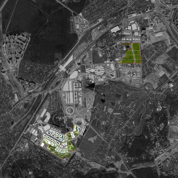
Within the framework of International Medical Cluster program there were significant portions of land allotted for the construction of medical facilities in zones D1 and D4 with a total area of 57 hectares, upon which it is planned to build no fewer than 15 hospitals and clinics specializing in oncology, cardiology, orthopedics, traumatic surgery, and neurology, designed to admit up to 300 thousand patients a year, as well as research and education centers and apartments for the patients and doctors.

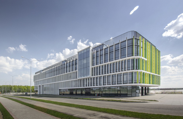
International Medical Cluster in Skolkovo. The Diagnostic Unit. Photograph © Asadov Bureau, construction, 2018


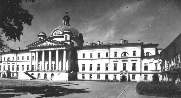
The historical building of the City Clinic #1 named after Nikolai Pirogov, Photo courtesy by Asadov Bureau


zooming
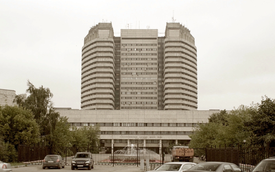
The building of “N. N. Blokhin National Medical Research Centre of oncology” of the Health Ministry of Russia on the Kashirskoe Highway. Photo courtesy by Asadov Bureau


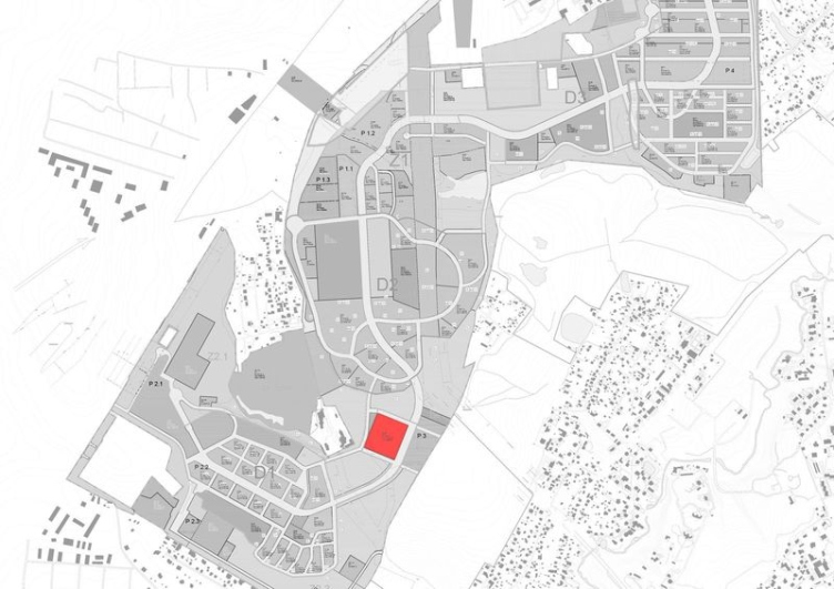
The master plan of District D1 had to be revised with consideration to the requirements that are generally set for healthcare facilities and the related infrastructure. This task was promptly done by a project team consisting of Transumed and Asadov Bureau who landed the contract for designing the first facility of the International Medical Cluster program – the diagnostic clinic and, at the same time, the presentation center of the future cluster. The consultant for correcting the master plan was the Boston Consulting Group (BCG), which also curated the development of the International Medical Cluster program.

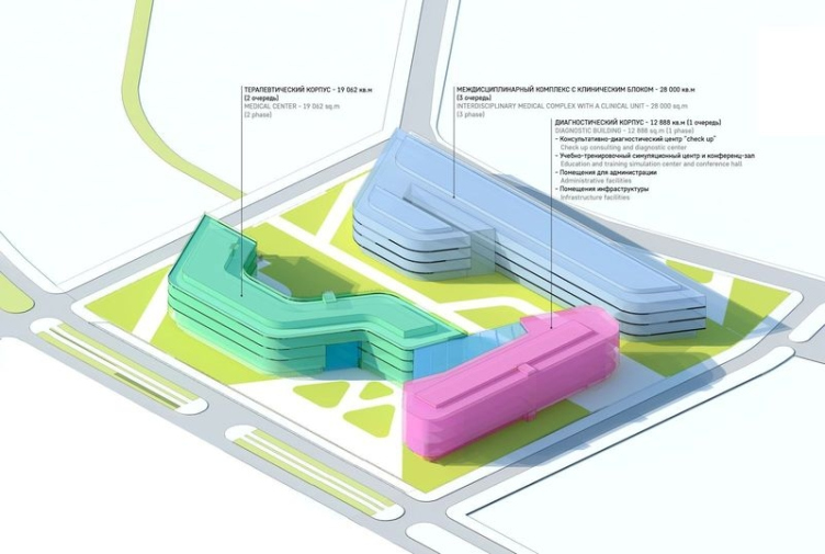
The project team paid most of its attention to the first stage of the cluster construction located at an important town-planning point – not far away from Checkpoint 3, one of the main driving entrances to the grounds of “Skolkovo” research center. A block of three buildings – a compact diagnostic unit, a therapeutic unit with a z-shaped floor plan, and an interdisciplinary unit that looks like an asymmetric catamaran – occupies an almost perfect square 2.82 hectare land site. The first two units are connected by a common entrance zone with an atrium, the third one standing slightly farther away from them, on the farther boundary of the land site.

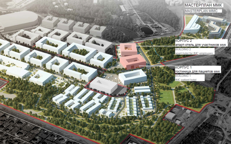
International Medical Cluster in Skolkovo. The master plan with the indication of territories rented by the Government of Moscow for placing the IMC projects. Image courtesy by Asadov Bureau


International Medical Cluster in Skolkovo. The location of the block of the first stage on the Skolkovo master plan. Image courtesy by Asadov Bureau


International Medical Cluster in Skolkovo. The revised master plan with of District D-1 with IMC projects. Image courtesy by Asadov Bureau


Initially, it was planned that the first and the second units would be built simultaneously but the government of Moscow only allotted funds for the first one, for which in 2016 a co-investor was chosen, as well as the operator – the famous Jerusalem hospital Hadassah, which invested about $40 million into supplying the equipment, organizing educational activities, and covering the operative costs. Therefore, the architects had to provide for a temporary “stopper” in the part of the atrium which is to join the second unit later on.

The pilot project of the International Medical Cluster was to be designed and built in a record-breaking time. Meeting all the rigorous deadlines and requirements of the global operator was a task that could only be handled by a well-coordinated team, which presented itself in the form of a tandem of Transumed GmbH Medizintechnik and Asadov Bureau. The principles of working and the distribution of functions are explained by Irina Aleksandrova, the manager of Transumed GmbH Medizintechnik (Germany): “Our company offers the entire range of services in design, construction and supplying medical equipment to modern clinics. Together with Asadov architectural bureau, we developed a project of diagnostic clinic for the International Medical Cluster foundation and the international operator “Hadassah” (Israel). Transumed was responsible for the overall management and coordination of work of Russian and foreign members, architectural, engineering and technological solutions meeting the standards of Skolkovo Research Center, as well as for the working documents and the interior design of the medical facilities, while the team of Andrey Asadov was responsible for adjusting the master plan, the volumetric and façade design solutions, and: the interior design of the atrium and the foyer of the conference hall”.

International Medical Cluster in Skolkovo. The Diagnostic Unit © Asadov Bureau


zooming
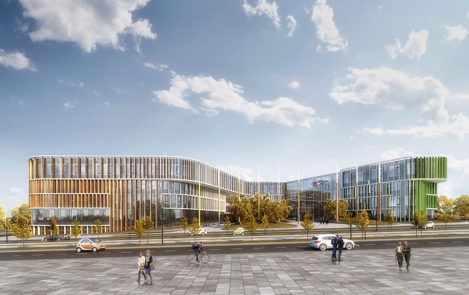
International Medical Cluster in Skolkovo. Visualization of the unit of the first stage. © Asadov Bureau


International Medical Cluster in Skolkovo. The unit of the first stage. © Asadov Bureau


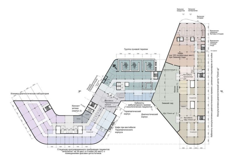
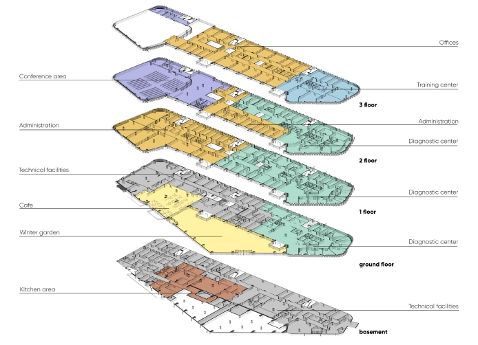
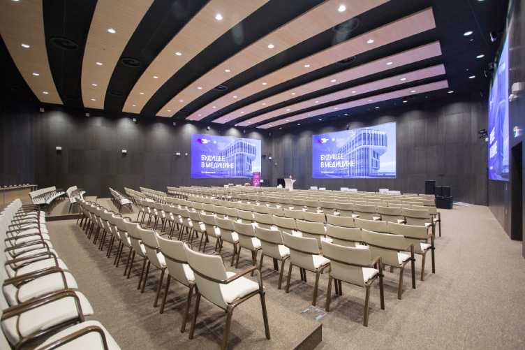
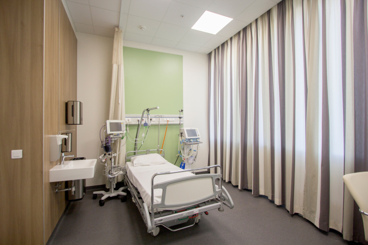
According to the brief, the first diagnostic unit was to include five groups of premises. The first was a multifunctional space at the entrance that included a reception, a waiting lounge, a café, and a winter garden. The second was the diagnostic center “check-up” with the doctors’ rooms and an in-patient facility, which occupied three floors right of the atrium. Left of the atrium, there are offices and a conference zone on the third floor, with a separate lobby and a conference hall. Above the diagnostic block, on the fourth floor, there is an education and training facility with classrooms equipped with everything that is necessary for educating doctors and nurses, including distant training. The last group is mechanical and maintenance rooms, which are grouped in the basement and in some of the first floor where they do not get in the way of distributing the visitor flows. Thanks to the clear zoning, the architects were able to arrange all the units in a compact way, without exceeding the 15-meter height limits (4 floors) set by the Skolkovo design code.

According to Andrey Asadov, “the key task for us as architects was to try and create the image of a clinic of the future that is not at all ominous or oppressive but is a healer itself. It must by default put you into a positive mood, lower the level of stress caused by fear and pain and speed up the recovery process. Everything must work toward that end: the light, the air, the presence of natural environment, the lightness, the atmosphere and so on – everything that will increase the attractiveness of the future center, and, therefore, will foster the preventive care about the health of its visitors. Developing the architectural and interior design solutions, we tried to observe the following five key principles – innovative image, energy efficiency and sustainability of the engineering solutions, multifunctional and comfortable. And we did not even expect that our efforts would bring about such a strong positive effect”.

International Medical Cluster in Skolkovo. The Diagnostic Unit. Photograph © Asadov Bureau, construction, 2018


zooming
International Medical Cluster in Skolkovo. The Diagnostic Unit. Plans of the main floors © Asadov Bureau, construction, 2018


International Medical Cluster in Skolkovo. The Diagnostic Unit. Photograph © Asadov Bureau, construction, 2018

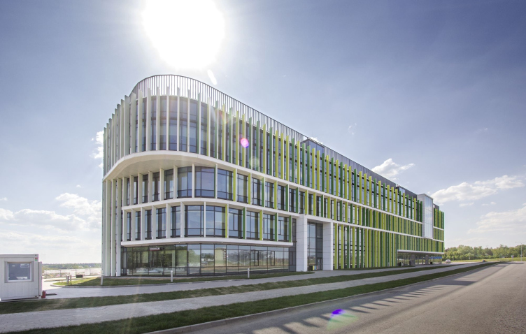
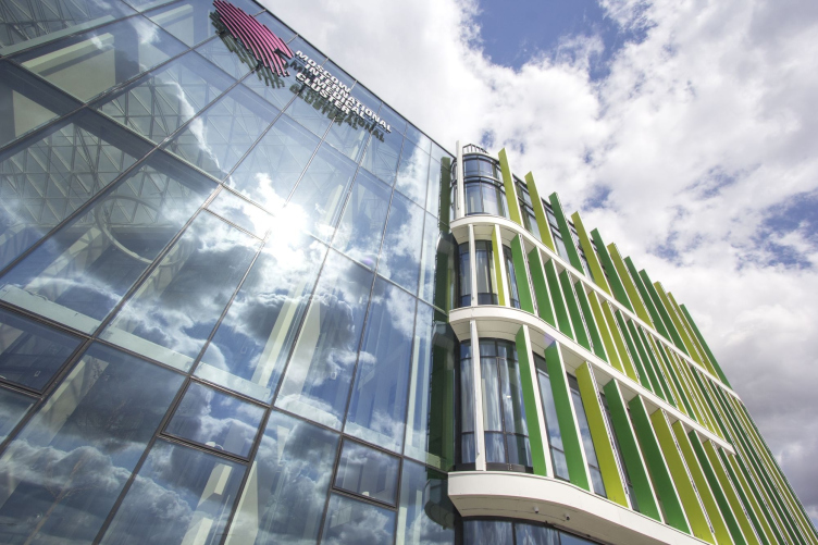
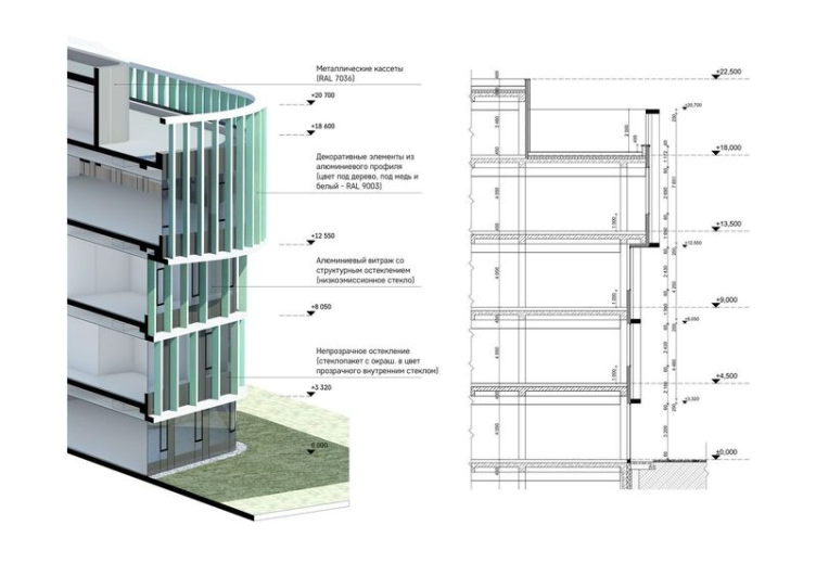
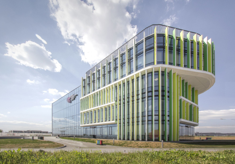
The façades are essentially a lightweight system of stained glass windows with energy saving glass with high heat insulating performance. On the outside, the stained glass windows are partially covered by a structure of vertical metallic lamellae installed at an angle to the façade surface, following its numerous curves. From the side of the building, all the lamellae are painted white, and on the outside – one of the two shades of green selected with a consideration for the visitors’ visual comfort. Thanks to this double-sided painting idea, the building, when viewed from different angles, creates a “chameleon” effect on its façade.

The frequency of the lamellae is varying, which makes it resemble the rhythm of a cardiogram. The lamellae stand the most densely on the north façade, while the south façade, in the center of which the main entrance to the clinic is situated, leading to the multi-height atrium, is left one hundred percent glass in order to let in more sunlight.
The horizontal belts and the vertical green-and-white lamellae form a volumetric structure that makes the laconic volume of the clinic look more dramatic thanks to the rounded corners that slightly resemble modern high-tech gadgets. Capitalizing on this idea, Asadov Bureau, generally known for its adherence to daring volumetric shapes, could not resist the temptation of pulling a striking constructive stunt – a five-meter-long cantilevered structure with a rounded corner on the last floor that accentuate the key view of the building that opens up from the highway.

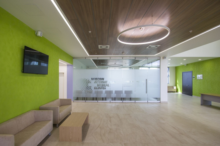
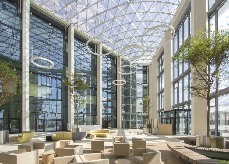
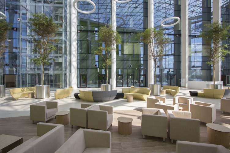
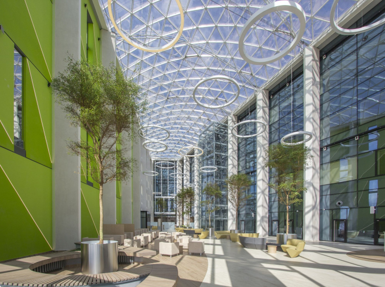
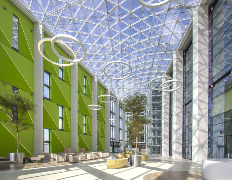
The spacious atrium – more like a covered square – is used as a reception area of the diagnostic clinic, a lobby of the conference hall, an exhibition space, as well as a venue for public events. The functional and planning freedom is provided by bearing concrete pylons placed along the perimeter of the hall that take the load of the translucent roof.

International Medical Cluster in Skolkovo. The Diagnostic Unit. The conference hall. Photograph © Asadov Bureau, construction, 2018


International Medical Cluster in Skolkovo. The Diagnostic Unit. The interior of a ward. Photograph © Asadov Bureau, construction, 2018


International Medical Cluster in Skolkovo. The Diagnostic Unit. Photograph © Asadov Bureau, construction, 2018

Originally, the architects and designers wanted to cover the atrium with a system of several skylights or use pneumatic shock absorbers but the example of Zaryadye Park with its “gridshell” prompted a better solution. The authors got in touch with the manufacturer of that structure, the Russian company “Supporting Systems” and were pleased to find out that the space frame system was lighter and cost approximately the same as the traditional joist ceiling. The shell was calculated on a computer with the use of the principles of parametric design and with consideration for the construction regulations referring to slope angles; in this specific instance, the elevation of the shell anointed to mere three meters.

The sustainability was achieved through active use of natural decoration materials, as well as planing greenery in the atrium space. The architects, together with the experts from SK “Atrium” and the landscaping designer Igor Safiullin treated it as an intermediate zone between time outside and the inside space. The landscaping elements got a continuation inside the atrium, the only boundary between them being the stained glass window. The trees planted next to the building echo the huge trees in tubs inside of it.

International Medical Cluster in Skolkovo. The Diagnostic Unit. Photograph © Asadov Bureau, construction, 2018

International Medical Cluster in Skolkovo. The Diagnostic Unit. The facade system © Asadov Bureau, construction, 2018


International Medical Cluster in Skolkovo. The Diagnostic and thw Therapeutic Units. Photograph © Asadov Bureau, construction, 2018


In September, the clinic opened and started functioning as a diagnostic and educational center. Parallel to that, they launched the design of the second stage and are completing the procedure for choosing the operator of the third unit. In both cases, the project development will be done by other teams that have an experience of working with western clinics; but then again, all of the ensuing solutions will be one way or another based on the preset standard – the new standard for medical facilities with quite a different atmosphere and architecture that answers the trends of today, as well as the new principles of working with the visitors.

International Medical Cluster in Skolkovo. The Diagnostic Unit. Photograph © Asadov Bureau, construction, 2018

International Medical Cluster in Skolkovo. The Diagnostic and thw Therapeutic Units. Photograph © Asadov Bureau, construction, 2018


International Medical Cluster in Skolkovo. The Diagnostic Unit. Photograph © Asadov Bureau, construction, 2018
 

25 December 2018

Headlines now
The Golden Crown
The concept for a dental clinic in Yekaterinburg, developed by CNTR Studio, revolves around the idea of a “mouth full of gold”: pristine white porcelain stoneware walls are complemented by matte brass details. To avoid an overly literal interpretation, the architects focused on the building’s proportions, skillfully navigating between sunlight requirements and fire safety regulations.
Flexibility and Integration
Not long ago, we covered the project for the fourth phase of the ÁLIA residential complex, designed by APEX. Now, we’ve been shown different fence concepts they developed to enclose the complex’s private courtyards, incorporating a variety of public functions. We believe that the sheer fact that the complex’s architects were involved in such a detail as fencing speaks volumes.
A Step Forward
The HIDE residential complex represents a major milestone for ADM architects and their leaders Andrey Romanov and Ekaterina Kuznetsova in their quest for a fresh high-rise aesthetic – one that is flexible and layered, capable of bringing vibrancy to mass and silhouette while shaping form. Over recent years, this approach has become ADM’s “signature style”, with the golden HIDE tower playing a pivotal role in its evolution. Here, we delve into the project’s story, explore the details of the complex’s design, and uncover its core essence.
Gold in the Sands
A new office for a transcontinental company specializing in resource extraction and processing has opened in Dubai. Designed by T+T Architects, masters of creating spaces that are contemporary, diverse, flexible, and original, this project exemplifies their expertise. On the executive floor, a massive brass-clad partition dominates, while layered textures of compressed earth create a contextually resonant backdrop.
Layers and Levels of Flight
This project goes way back – Reserve Union won this architectural competition at the end of 2011, and the building was completed in 2018, so it’s practically “archival”. However, despite being relatively unknown, the building can hardly be considered “dated” and remains a prime example of architectural expression, particularly in the headquarters genre. And it’s especially fitting for an aviation company office. In some ways, it resembles the Aeroflot headquarters at Sheremetyevo but with its own unique identity, following the signature style of Vladimir Plotkin. In this article, we take an in-depth look at the United Aircraft Corporation (UAC) headquarters in the Moscow agglomeration town of Zhukovsky, supplemented by recent photographs from Alexey Naroditsky – a shoot that became only recently possible due to the fact that improvements were finally made in the surrounding area.
Light and Shadow
In this article, we delve into the architectural design of the “Chaika” house by DNK ag architects, which was recently completed in 2023 as part of the collection of signature designs at ZILArt. As is well-known, all the buildings in this complex follow a design code, yet each one is distinct. This particular building stands out not only for its whiteness and minimalism but also for the refined use of a limited number of techniques that, together, create what can confidently be called synergy.
Casus Novae
A master plan was developed for a large residential area with a name of “DNS City”, but now that its implementation began, the plan has been arbitrarily reformatted and replaced with something that, while similar on the surface, is actually quite different. This is not the first time such a thing happens, but it’s always frustrating. With permission from the author, we are sharing Maria Elkina’s post.
Treasure Hunting
The GAFA bureau, in collaboration with Tegola and Arkhitail, organized an expedition to the island of Kilpola in Karelia as part of Moskomarkhitektura’s “Open City” festival. There, amidst moss and rocks, the students sought answers to questions like: what is the sacred, where does it dwell, and what sustains it? Assisting the participants in this quest were landscape engineer Evgeny Levin, artist Nicholas Roerich, a moose, and the lack of cellular connection. Here’s how the story unfolded.
Depths of the Earth, Streams of Water
In the Malaya Okhta district, the Akzent building, designed by Stepan Liphart, was constructed. It follows a classic tripartite structure, yet it’s what you might call “hand-drawn”: each façade is unique in its form and details, some of which aren’t immediately noticeable. In this article, we explore the context and, together with the architect, delve into how the form was developed.
Fir Tree Dynamics
The “Airports of Region” holding is planning to build an airport in Karachay-Cherkessia, aiming to make the Arkhyz and Dombay resorts more accessible to travelers. The project that won in an invitation-only competition, submitted by Sergey Nikeshkin’s KPLN, blends natural imagery inspired by the shape of a conifer seed, open-air waiting spaces, majestic large trees, and a green roof elevated on needle-like columns. The result is both nature-inspired and WOW.
​A Brick Shell
In the process of designing a clubhouse situated among pine trees in a prestigious suburban area near Moscow, the architectural firm “A.Len” did the façade design part. The combination of different types of brick and masonry correlates with the volumetric and plastique solutions, further enhanced by the inclusion of wood-painted fragments and metal “glazing”.
Word Forms
ATRIUM architects love ambitious challenges, and for the firm’s thirtieth anniversary, they boldly play a game of words with an exhibition that dives deep into a self-created vocabulary. They immerse their projects – especially art installations – into this glossary, as if plunging into a current of their own. You feel as if you’re flowing through the veins of pure art, immersed in a universe of vertical cities, educational spaces – of which the architects are true masters – and the cultural codes of various locations. But what truly captivates is the bold statement that Vera Butko and Anton Nadtochy make, both through their work and this exhibition: architecture, above all, is art – the art of working with form and space.
Flexibility and Acuteness of Modernity
Luxurious, fluid, large “kokoshniks” and spiral barrel columns, as if made from colorful chewing gum: there seem to be no other mansion like this in Moscow, designed in the “Neo-Russian-Modern” style. And the “Teremok” on Malaya Kaluzhskaya, previously somewhat obscure, has “come alive with new colors” and gained visibility after its restoration for the office of the “architectural ecosystem” as the architects love to call themselves. It’s evident that Julius Borisov and the architects at UNK put their hearts into finding this new office and bringing it up to date. Let’s delve into the paradoxes of this mansion’s history and its plasticity. Spoiler: two versions of modernity meet here, both balancing on the razor’s edge of “what’s current”.
Yuri Vissarionov: “A modular house does not belong to the land”
It belongs to space, or to the air... It turns out that 3D printing is more effective when combined with a modular approach: the house is built in a workshop and then adapted to the site, including on uneven terrain. Yuri Vissarionov shares his latest experience in designing tourist complexes, both in central Russia and in the south. These include houseboats, homes printed from lightweight concrete using a 3D printer, and, of course, frame houses.
​Moscow’s First
“The quality of education largely depends on the quality of the educational environment”. This principle of the last decade has been realized by Sergey Skuratov in the project for the First Moscow Gymnasium on Rostovskaya Embankment in the Khamovniki district. The building seamlessly integrates into the complex urban landscape, responding both to the pedestrian flow of the city and the quiet alleyways. It skillfully takes advantage of the height differences and aligns with modern trends in educational space design. Let’s take a closer look.
Looking at the Water
The site of Villa Sonata stretches from the road to the water’s edge, offering its own shoreline, pier, and a picturesque river panorama. To reveal these sweeping views, Roman Leonidov “cut” the façade diagonally parallel to the river, thus getting two main axes for the house and, consequently, “two heads”. The internal core – two double-height spaces, a living room and a conservatory, with a “bridge” above them – makes the house both “transparent” and filled with light.
The White Wing
Well, it’s not exactly white. It’s more of a beige, white-stone structure that plays with the color of limestone – smoother surfaces are lighter, while rougher ones are darker. This wing unites various elements: it absorbs and interprets the surrounding themes. It responds to everything, yet maintains a cohesive expression – a challenging task! – while also incorporating recognizable features of its own, such as the dynamic cuts at the bottom, top, and middle.
Urban Dunes
The XSA Ramps team designed and built a three-part sports hub for a park in Rostov-on-Don, welcoming people of all ages and fitness levels. The skate plaza, pump track, and playground are all meticulously crafted with details that attract a diverse range of visitors. The technical execution of the shapes and slopes transforms this space into a kind of sculptural composition.
Proportional Growth
The project for the fourth phase of the ÁLIA residential area has been announced. The buildings are situated on an elongated plot – almost a “ray” that shoots out from the center of the area towards the river. Their layout reflects both a response to Moscow’s architectural preferences over the past 15 years, shifting “from blocks to towers”, and an interpretation of the neighboring business park designed by SOM. Additionally, the best apartments here are not located at the very top but closer to the middle, forming a glowing “waistline”.
The “Staircase” Building
In designing the “Details” residential complex in New Moscow, Rais Baishev spiced up the now-popular Moscow theme of a “courtyard” building with an idea drawn from the surrealist drawings by Maurits Escher. He envisioned the stepped silhouettes and descending slopes as a metaphysical mega-staircase, creating a key void within the courtyard that gave the project an internal “spine”. This concept is felt both in the building’s silhouette and on its façades.
Projection of the Quarter
No one doubted that the building that Vladimir Plotkin designed as part of the “Garden Quarters” would be the most modernist of all. And it turned out just that way: while adhering to the common design code, the building successfully combines brick and white stone, rhythmically responding to the neighboring building designed by Ostozhenka, yet tactfully and persistently making a few statements of its own. This includes the projection of the ideal urban development composition “14–9–6”, which can be found right next door, mathematical calculations, including those for various types of terraces (and perhaps the only reminder of the Soviet past of the Kauchuk rubber factory!), and the white “cross-stitch” pattern of the façade grid.
Domus Aurea
In this issue, we examine the “Tessinsky-1” house, designed by Sergey Skuratov and completed in 2023. Located in the middle of the Serebryanicheskaya Embankment district, at the intersection of its main streets, this house assumes a sort of “nodal” role: it not only responds to everything around it and preserves many memories of the former EMA factory within itself, but it weaves all this into a newly directed pattern, reconciling bright “gold” and dark-colored brick, largely with the help of the new, modern-yet-archaic Columba brick, which, come to think about it, is the most precious element here.
The Chimney of Nikola-Lenivets
In this issue, we are examining the “Obelisk House” designed by KATARSIS and built for the Arkhstoyanie 2023 festival. However, it was only finished later on, and this is why we are examining it now. It seems to us that after the “Obelisk House” appeared in Nikola-Lenivets, a dialogue and a few inner connections appeared between the temporary structures built here. These houses no longer look like “accidental neighbors”, more of which below.
​Periscope by the Bay
The jury awarded the second place in the competition for a public and cultural center in Petropavlovsk-Kamchatsky to the companies GORA (“Mountain”) and M4. In the consortium’s proposal, the building resembles a sperm whale with a calf swimming next to it or a periscope, whose lenses capture the most spectacular views from the surrounding landscape.
From Arcs to Dolmens
While working on the competition project for Petropavlovsk-Kamchatsky, ASADOV Architects prioritized the value of the natural and urban environment, aiming to preserve the balance of the location while minimizing the resemblance of the volume that they designed to a “traditional building”. The task was challenging, and the architects created three versions, one of which having been developed after the competition, where their main proposal took third place. However, the point of interest here is not the competition result but the continuity of creative thinking.
Hide and Seek
The ID Moskovskiy house, designed by Stepan Liphart in St. Petersburg, in the courtyards near Moskovskiy Avenue beyond the Obvodny Canal and recently completed, is notable for several reasons. Firstly, it has been realized with considerable accuracy, which is particularly significant as this is the first building where the architect was responsible not only for the facades but also for the layouts, allowing for better integration between the two. On the other hand, this building is interesting as an example of the “germination” of new architecture in the city: it draws on the best examples from the neighborhood and becomes an improved and developed sum of ideas found by the architect in the surrounding context.
The Big Twelve
Yesterday, the winners of the Moscow Mayor’s Architecture Award were announced and honored. Let’s take a look at what was awarded and, in some cases, even critique this esteemed award. After all, there is always room for improvement, right?
Above the Golden Horn
The residential complex “Philosophy” designed by T+T architects in Vladivostok, is one of the new projects in the “Golubinaya Pad” area, changing its development philosophy (pun intended) from single houses to a comprehensive approach. The buildings are organized along public streets, varying in height and format, with one house even executed in gallery typology, featuring a cantilever leaning on an art object.
Nuanced Alternative
How can you rhyme a square and space? Easily! But to do so, you need to rhyme everything you can possibly think of: weave everything together, like in a tensegrity structure, and find your own optics too. The new exhibition at GES-2 does just that, offering its visitor a new perspective on the history of art spanning 150 years, infused with the hope for endless multiplicity of worlds and art histories. Read on to see how this is achieved and how the exhibition design by Evgeny Ace contributes to it.
Blinds for Ice
An ice arena has been constructed in Domodedovo based on a project by Yuri Vissarionov Architects. To prevent the long façade, a technical requirement for winter sports facilities, from appearing monotonous, the architects proposed the use of suspended structures with multidirectional slats. This design protects the ice from direct sunlight while giving the wall texture and detail.