По-русски

​A Nest of Gentlefolk of the XXI Century

Built by ADM on Moscow’s Sparrow Hills, the new residential complex, although totally up-to-date, shows nobility in its every detail, being a rightful heir to the legacy of this legendary part of Moscow.

19 December 2018
Object
mainImg

Running between two rivers and two streets – Kosygina Street and Berezhkovskaya Embankment – the Vorobyevskoe Highway continues the tradition of these parts: back in the day, this land hosted manors of the nobility, and still later on, during the soviet period, the houses of academicians and prominent scientists. Today, this place is extremely popular among those who seek a cozy shelter offering a respectable kind of countryside life essentially in the very heart of one of the world’s busiest megalopolises. On the one side, you are surrounded by greenery and water, and, on the other side, you can admire the main “postcard” views of Moscow, which were once admired by Napoleon and Bulgakov’s Voland.

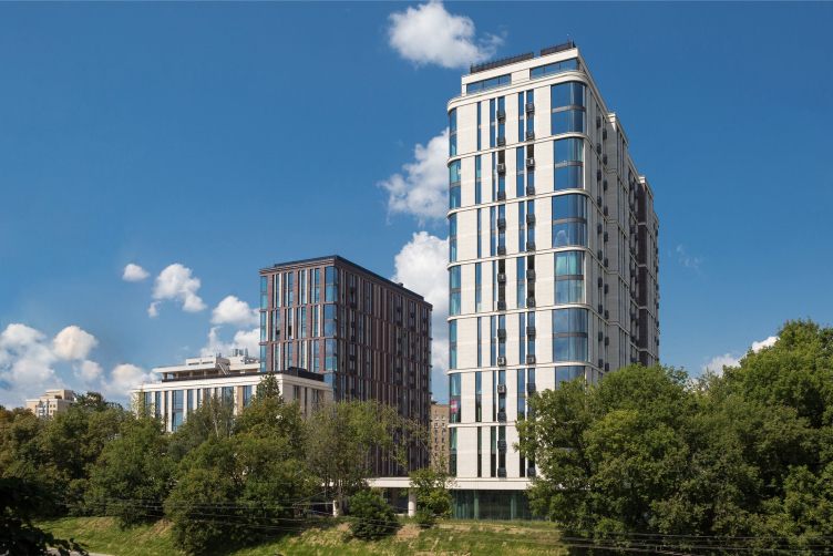
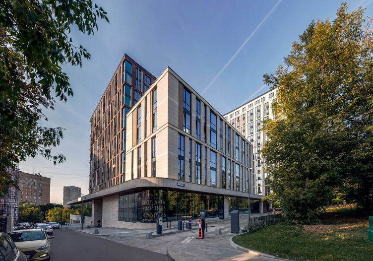
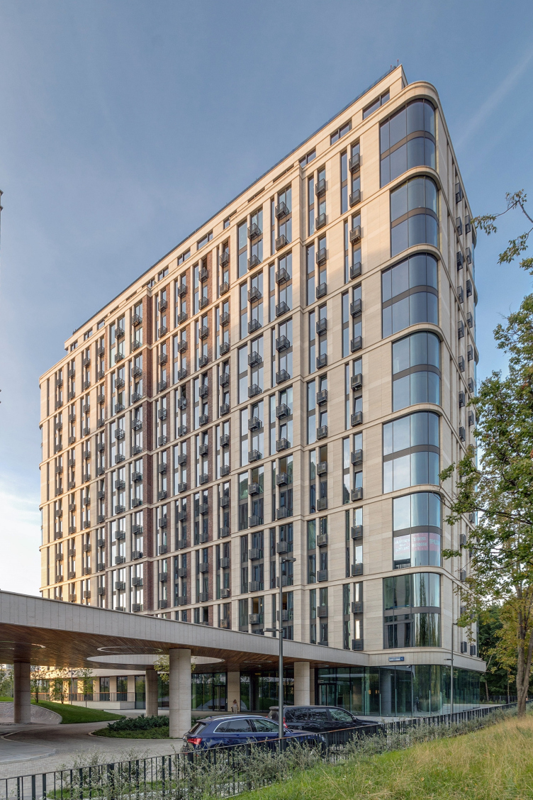
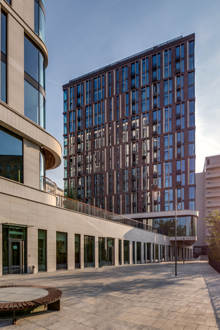
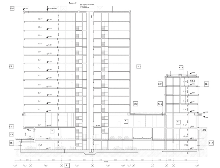
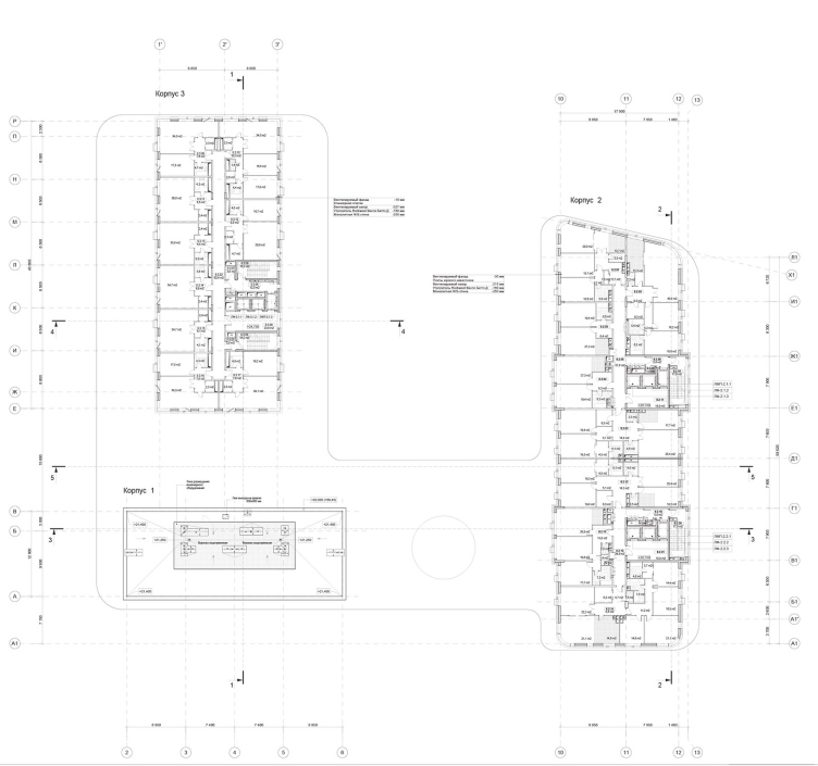
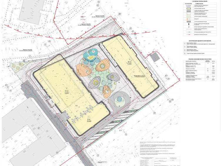
The peculiarity of the land site where the residential complex “Vorobyev Dom” was built, apart from its being situated on the very borderline of the nature reserve and the go-down to the Setun River, is the fact that legally there were two land sites, and uniting them would have hindered the project significantly. To a certain extent, this defined the composition of the complex: the land site of a smaller size of 0.06-hectare got the most compact unit out of three, five stories high, while the 0.8-hectare land site got two more residential buildings, one with flats, the other with apartments, 13 and 16 stories high respectively. Joining these three buildings with a transparent podium gave the contours of the green plateau of the yard and opened it up to the woodland and the river, turning the whole complex to them.

"Vorobyev Dom" residential complex. Photograph © ADM


"Vorobyev Dom" residential complex. Photograph © ADM


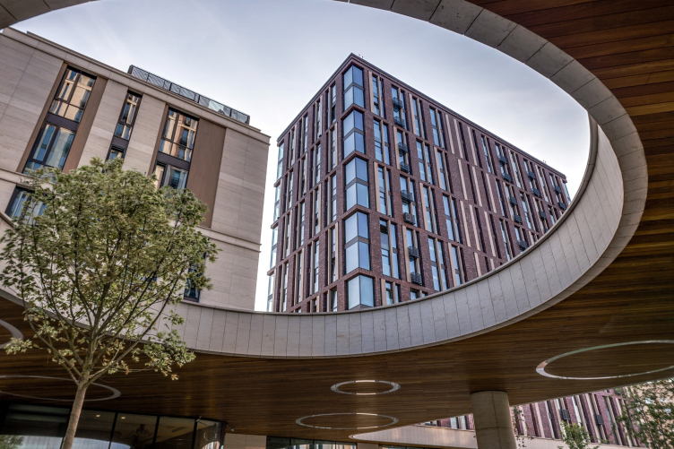
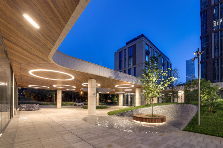
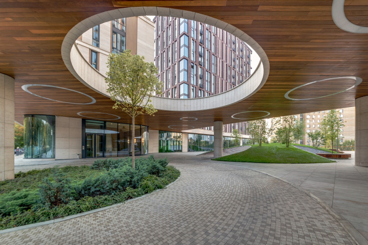
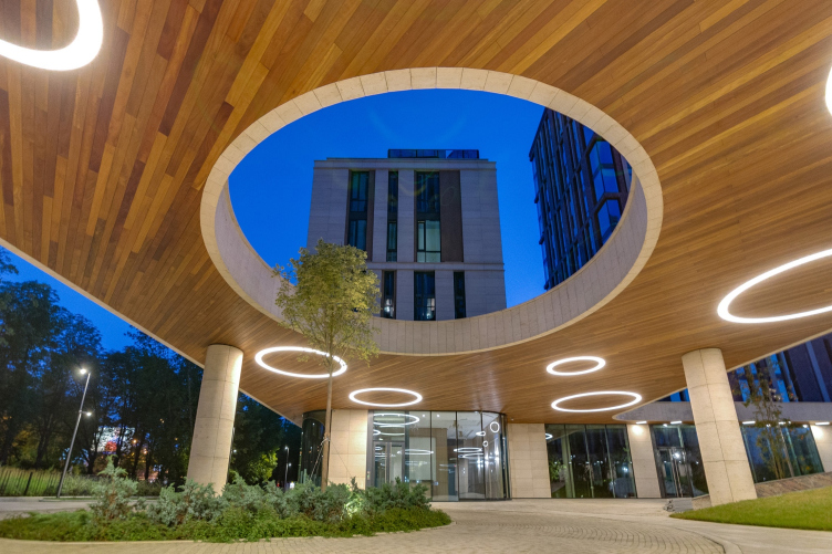
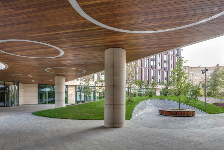
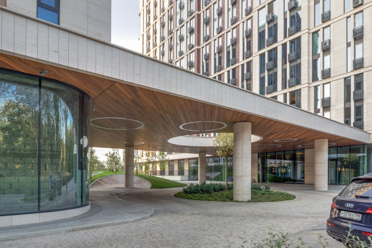
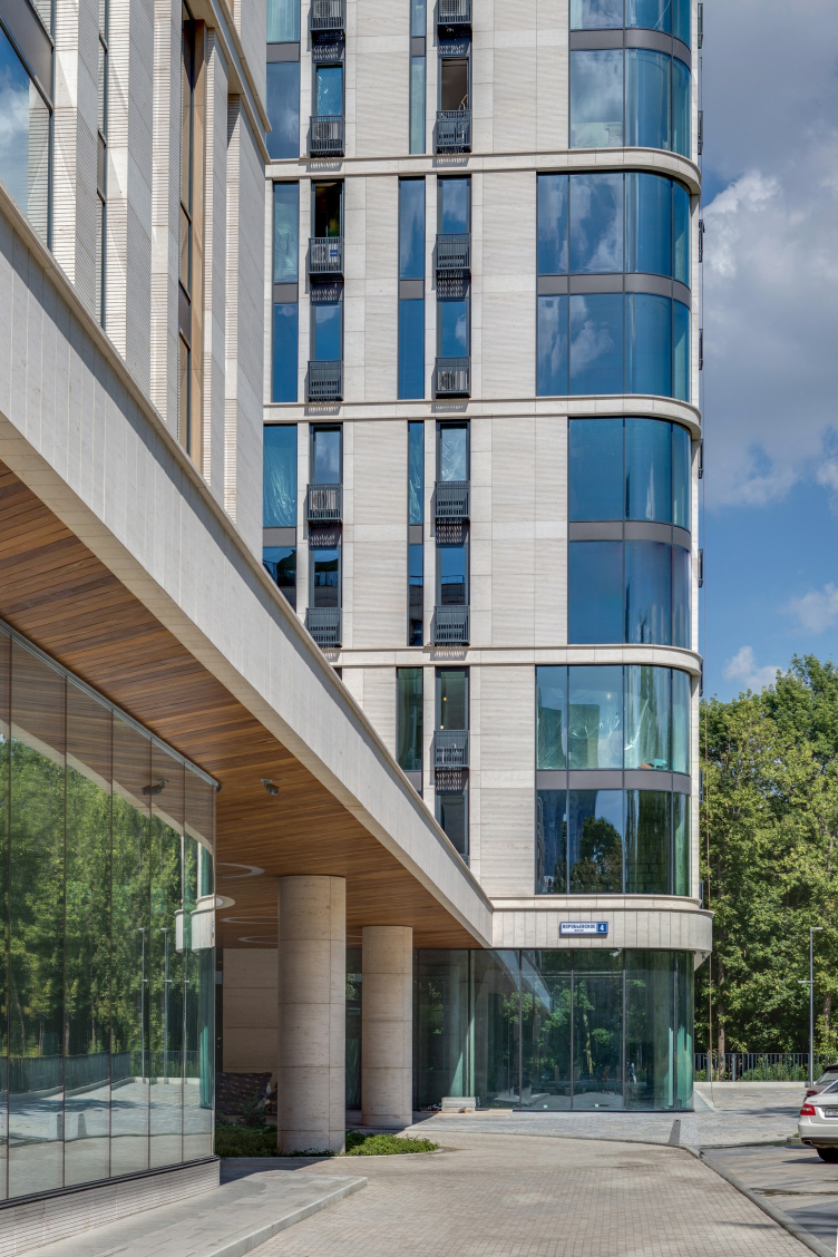
In addition, the idea to cover the human-proportionate level of the complex with the marquee of the podium allowed the architects to make a far more impressive turnaround of the project – taking it from the level of another rank-and-file housing project to the level of a residential complex marked by nobility and aristocratic exquisiteness. The latter are to be seen in the proportions of the structure and in the arrangement of the propylaea; in the wood sheathing on the inner side – where its texture catches the eye and literally wraps one into warmth; in the perfectly circular windows that “cut through” this sheathing and turn out to be sometimes spotlights and sometimes frames for trees; and in the very configuration of the marquee and the design of the driving access to the buildings: the cantilevered structure follows the contours of the roundabout that the hallways of all the three buildings go out to, and together they form a grand entrance, the kind you see in expensive hotels. The driver comes around, the passenger alights, and off the car goes – it drives either totally away or to the two-level underground parking garage. There is an overland parking lot as well but it is a very compact and payable one, devised for a short stay only – like near the mentioned hotels or airport terminals.

"Vorobyev Dom" residential complex. Photograph © ADM


"Vorobyev Dom" residential complex. Photograph © ADM


"Vorobyev Dom" residential complex. Photograph © ADM


"Vorobyev Dom" residential complex. Photograph © ADM


"Vorobyev Dom" residential complex. Photograph © ADM


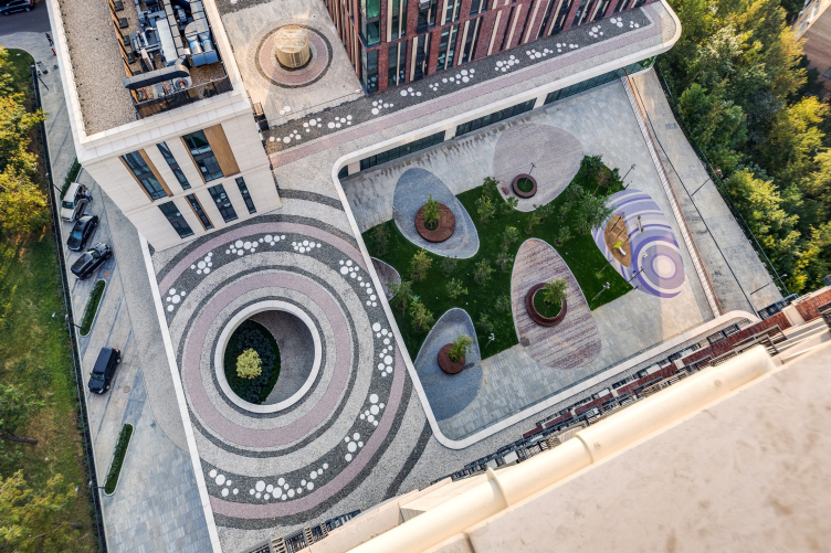
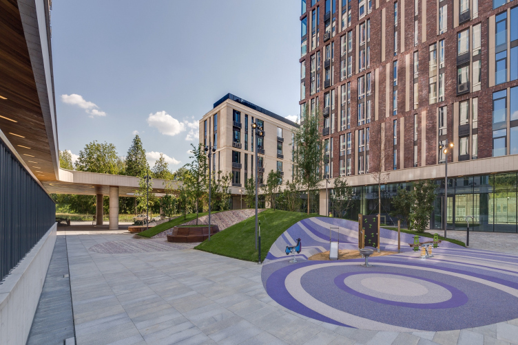
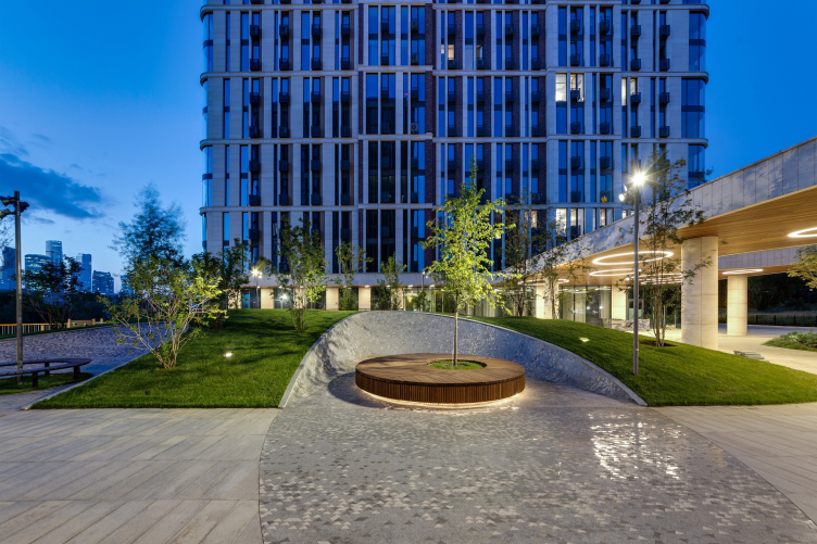
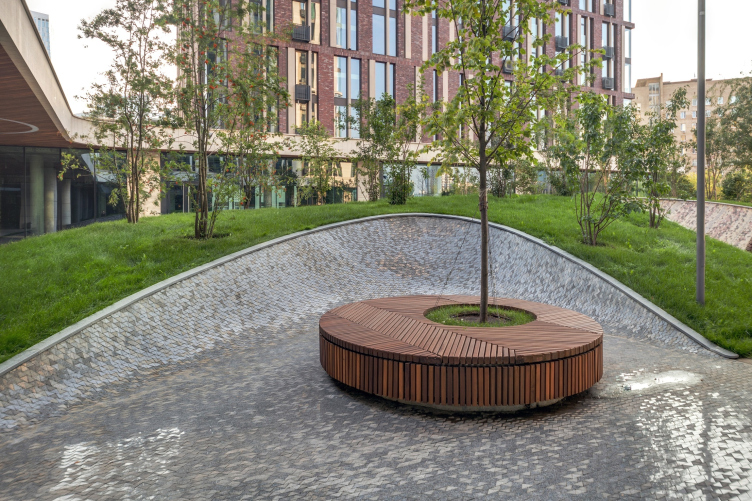
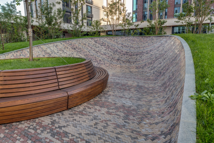
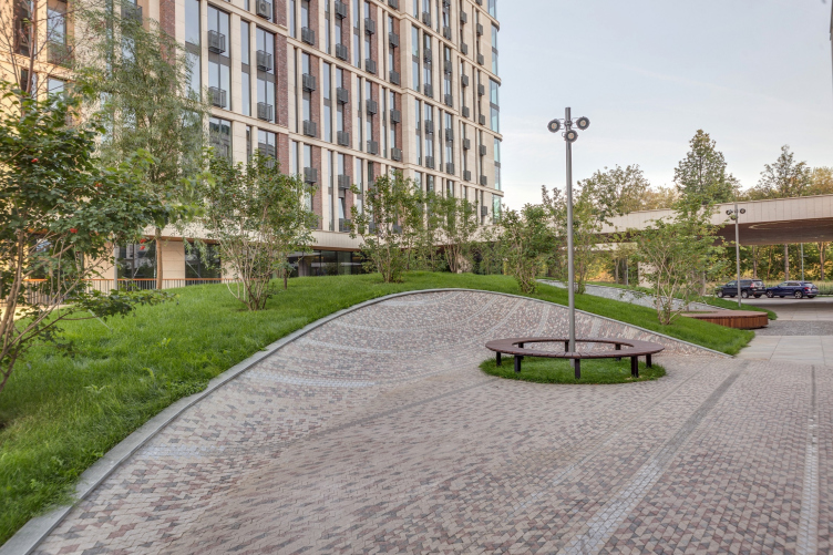
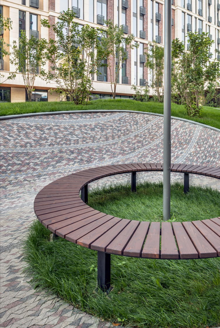
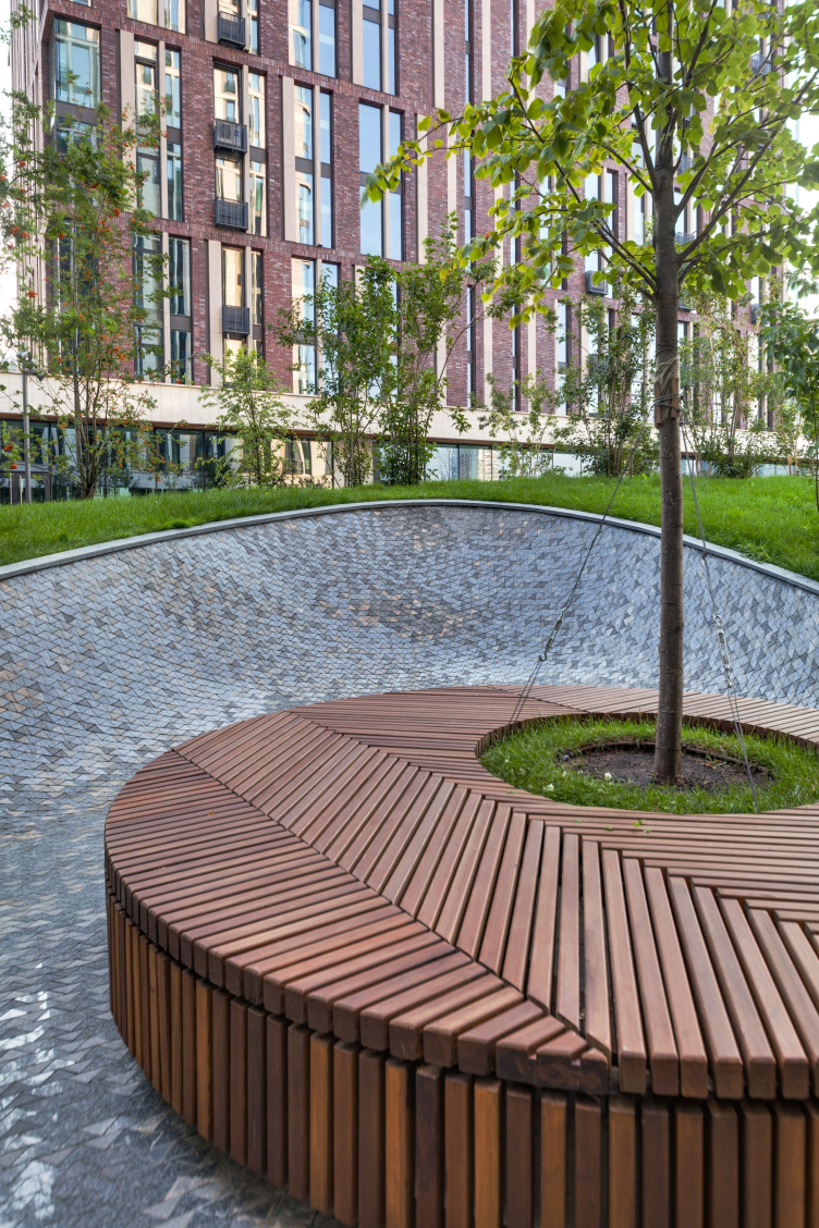
Therefore, the yard is designed as being completely vehicle-free – although small in size, it is surprisingly versatile. The architects even deliberately recreated relief drops characteristic for the local terrain and planted trees on the hills, while in the recessions that, when viewed from above, look like giant boulders (the authors jokingly called them “the balls”) and are paved with granite mosaic of painstakingly selected colors (yet another minute detail that, nonetheless, surely indicates class and nobility), they made zones for active and meditative recreation, including circular wooden benches, tubs for the trees and the lawn, and a playground of the same streamlined shape as the other recessions with a practical rubber coverage.

"Vorobyev Dom" residential complex. Photograph © ADM


"Vorobyev Dom" residential complex. Photograph © ADM


"Vorobyev Dom" residential complex. Photograph © ADM


"Vorobyev Dom" residential complex. Photograph © ADM


"Vorobyev Dom" residential complex. Photograph © ADM


"Vorobyev Dom" residential complex. Photograph © ADM


"Vorobyev Dom" residential complex. Photograph © ADM


"Vorobyev Dom" residential complex. Photograph © ADM


"Vorobyev Dom" residential complex. Photograph © ADM


The yard is also the place, to which comes out the platform, raised on a podium, with a balustrade and yet another marquee, which gives four apartments on the ground floor of the 16-story high building a whole new quality: they have patios of their own, upon which they can make dacha-style tea parties. The rest of the premises on the ground floor are non-residential: lobbies, management offices, and a children’s center in one of the buildings. And, if we are to look at the complex from the woodland and the Setun River, we will see an array of stores that look as if they had grown into the hill – and one will hardly guess that the architects designed the façade of the underground parking garage in this way. 

"Vorobyev Dom" residential complex. Photograph © ADM


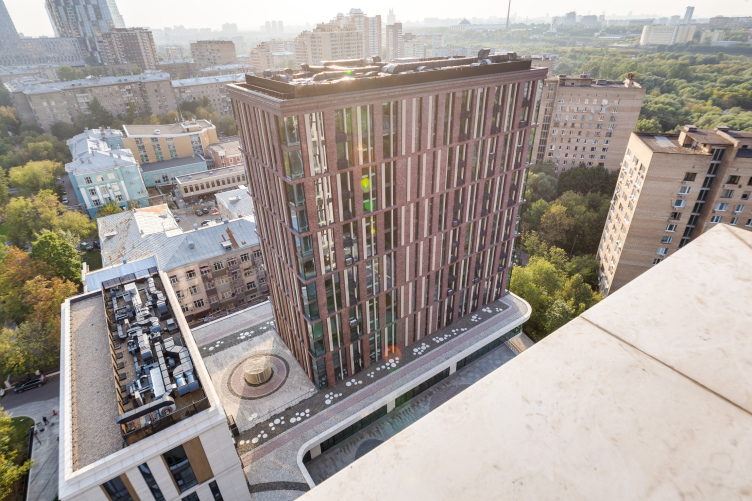
Generally speaking, depending on one’s angle of vision, new and new layers come up. Again, if we are to look from up above (which is quite natural, come right down to it, for most of the residents of the complex, isn’t it?) that the roof of the podium – although the architects weren’t ultimately able to make it completely green the way they originally intended – became an organic part of the landscaping solutions and is marked by the characteristic mosaic “belts”.

"Vorobyev Dom" residential complex. Photograph © ADM


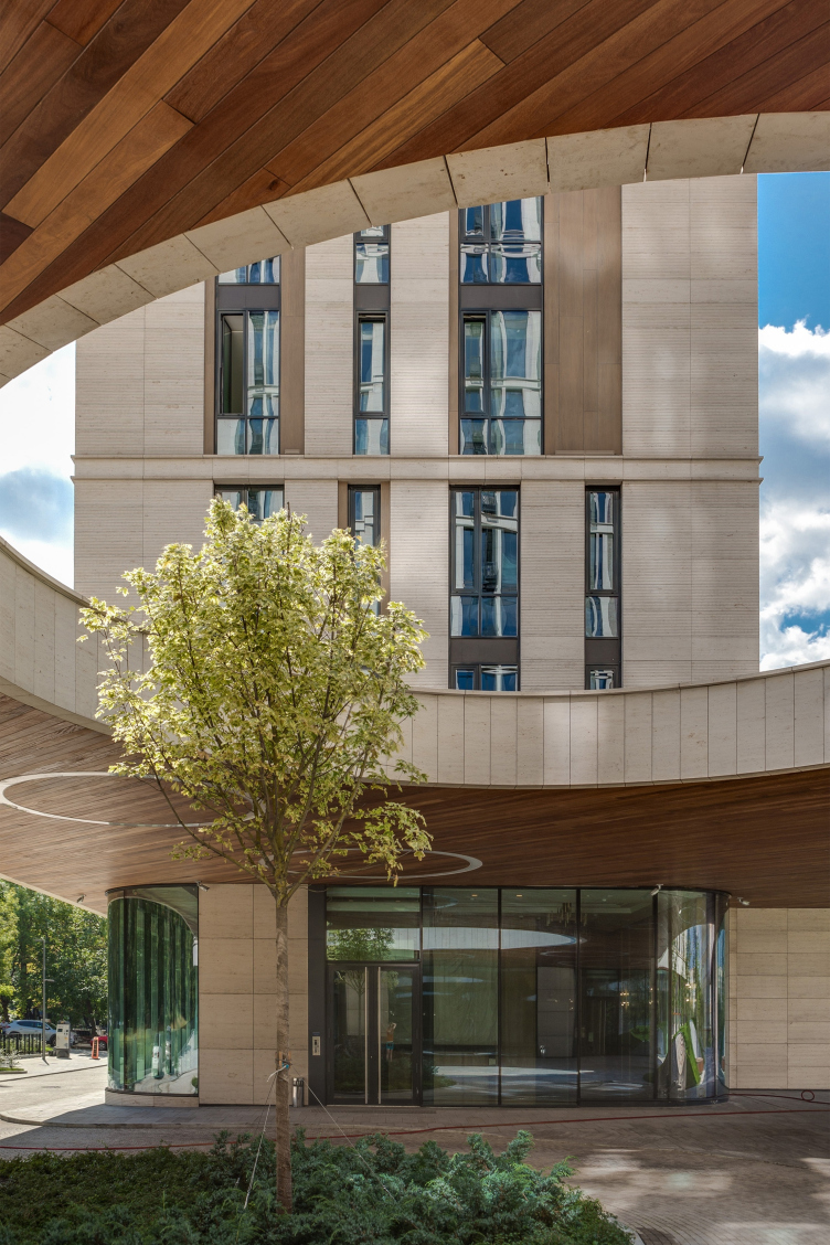
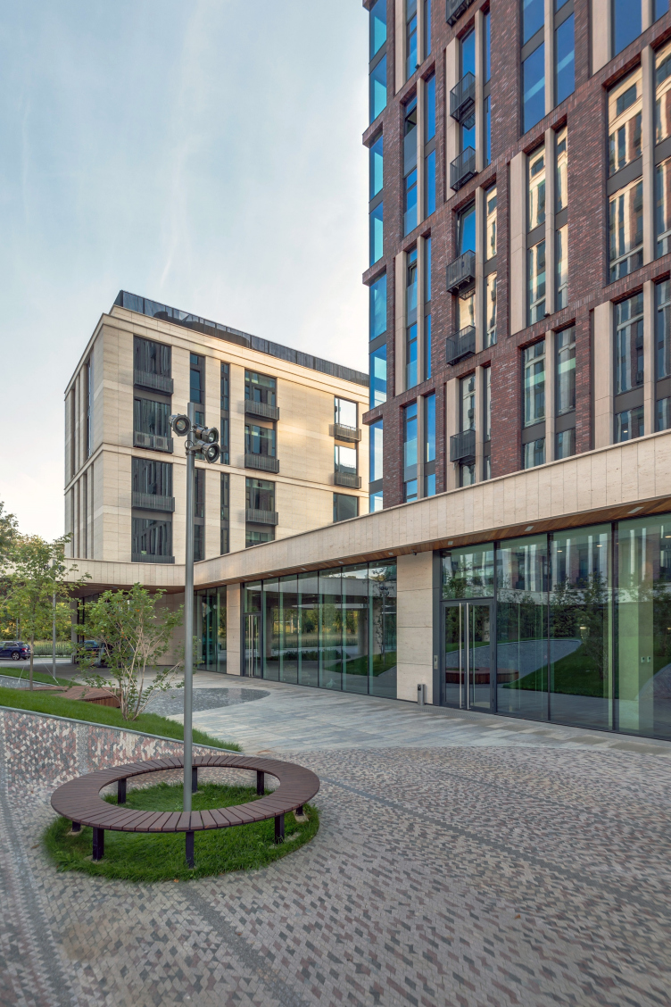
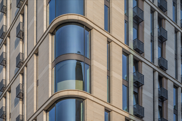
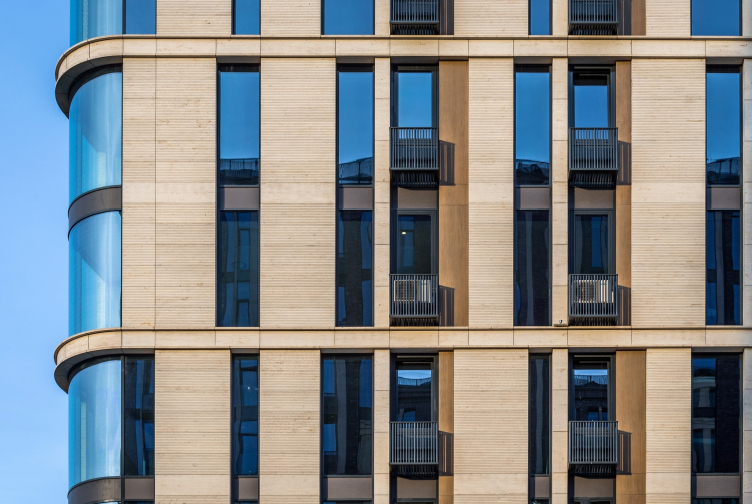
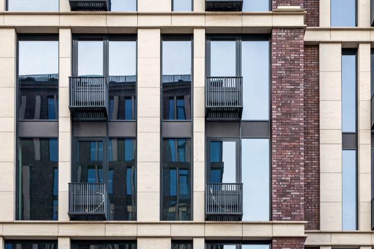
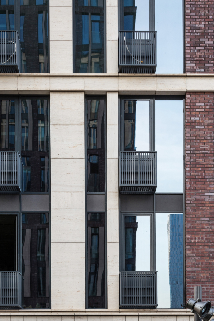
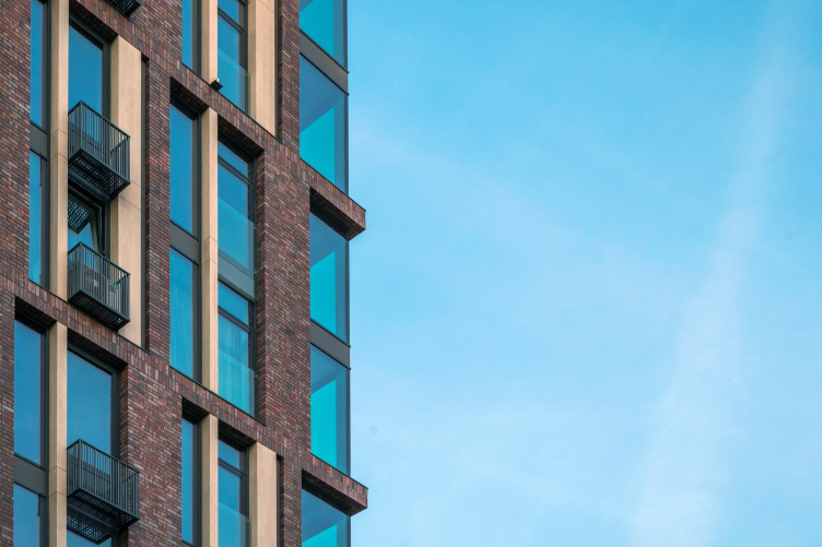
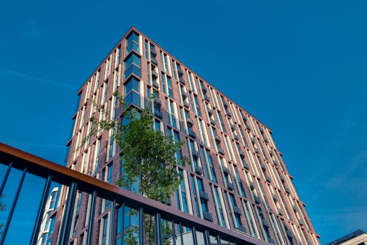
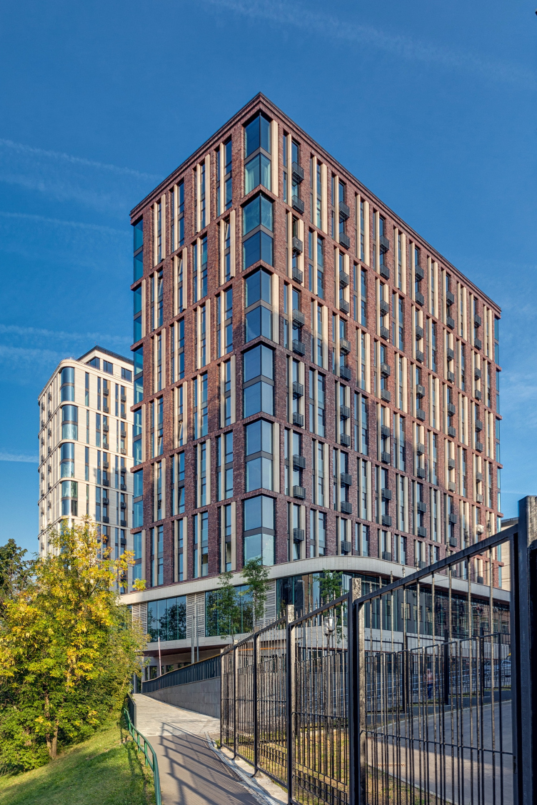
Now we are making a 90-degree turn and put our gaze on the façades: if the architects took such a great pain selecting the tones of the granite paving we can only imagine how much effort was invested in the façades. The materials, just as they should be, are exclusively noble and, to some extent, of the signature “Moscow” kind: white stone, red brick, wood (rather, thin ceramic panels that imitate it). But then again, the list of painstakingly chosen materials could be fairly augmented by glass. For example, at the corners of the 16-story building, from where the best views open up, the glass parts are curvilinear and moulded, which yields full-fledged panoramic windows. And, again, these are framed at the top and bottom by stone belts: in order to achieve that, the stone was sawn circle-wise. In combination with the cornice that crowns the residential floors, the image of this house gets something about it that makes it imperceptibly related to the monumental architecture of the buildings standing along the Kosygina Street.

"Vorobyev Dom" residential complex. Photograph © ADM


"Vorobyev Dom" residential complex. Photograph © ADM


"Vorobyev Dom" residential complex. Photograph © ADM


"Vorobyev Dom" residential complex. Photograph © ADM


"Vorobyev Dom" residential complex. Photograph © ADM


In the building of a smaller height, where the stone is liberally diluted with brick, the corner glass is also of a sophisticated kind - not bent, but without any lintels, so that nothing would stop the view.

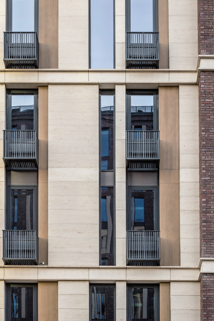
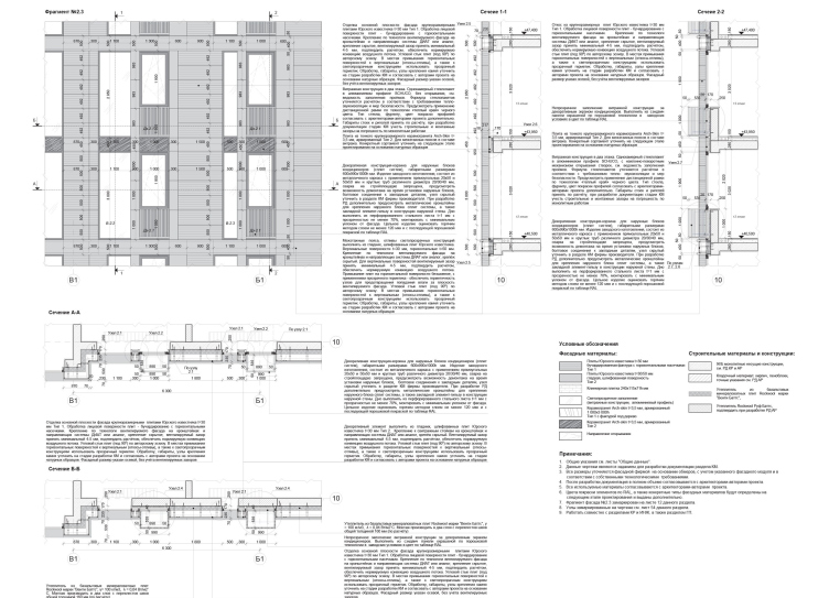
The most interesting thing, however, is how these elements made of different materials combine with one another. It would not be an overstatement to call ADM geniuses of façade design: somehow they always manage to make the façade surface just as interesting and diverse as, seemingly, only a landscape of some super-up-to-date park can be (although, speaking on that particular subject, we can see that ADM were still able to make a mini model of it within the space of a regular yard). The staggered rhythm of brick and glazed surfaces, surprise inserts of alternative materials, recessions and screens for the air conditioning units, corrugated surface of the stone – all of this sophisticated (yet still looking quite natural) multilayered structure again puts you in the mind of, on the other hand, a “nest” made with love and care, and, on the other hand, about something that has been formed for years, imbibing the signs and traits of the previous generations.

"Vorobyev Dom" residential complex. Photograph © ADM


"Vorobyev Dom" residential complex. Photograph © ADM


"Vorobyev Dom" residential complex. Photograph © ADM


"Vorobyev Dom" residential complex. Photograph © ADM


"Vorobyev Dom" residential complex. Photograph © ADM


"Vorobyev Dom" residential complex. Photograph © ADM


So, the advertising slogan of the complex “See the Best” is equally applicable to its architecture. Because this a veritable feast for one’s eyes – quite comparable, in terms of breathtaking views, with the iconic panoramas of Moscow that these windows command.
"Vorobyev Dom" residential complex © ADM


19 December 2018

Headlines now
The Golden Crown
The concept for a dental clinic in Yekaterinburg, developed by CNTR Studio, revolves around the idea of a “mouth full of gold”: pristine white porcelain stoneware walls are complemented by matte brass details. To avoid an overly literal interpretation, the architects focused on the building’s proportions, skillfully navigating between sunlight requirements and fire safety regulations.
Flexibility and Integration
Not long ago, we covered the project for the fourth phase of the ÁLIA residential complex, designed by APEX. Now, we’ve been shown different fence concepts they developed to enclose the complex’s private courtyards, incorporating a variety of public functions. We believe that the sheer fact that the complex’s architects were involved in such a detail as fencing speaks volumes.
A Step Forward
The HIDE residential complex represents a major milestone for ADM architects and their leaders Andrey Romanov and Ekaterina Kuznetsova in their quest for a fresh high-rise aesthetic – one that is flexible and layered, capable of bringing vibrancy to mass and silhouette while shaping form. Over recent years, this approach has become ADM’s “signature style”, with the golden HIDE tower playing a pivotal role in its evolution. Here, we delve into the project’s story, explore the details of the complex’s design, and uncover its core essence.
Gold in the Sands
A new office for a transcontinental company specializing in resource extraction and processing has opened in Dubai. Designed by T+T Architects, masters of creating spaces that are contemporary, diverse, flexible, and original, this project exemplifies their expertise. On the executive floor, a massive brass-clad partition dominates, while layered textures of compressed earth create a contextually resonant backdrop.
Layers and Levels of Flight
This project goes way back – Reserve Union won this architectural competition at the end of 2011, and the building was completed in 2018, so it’s practically “archival”. However, despite being relatively unknown, the building can hardly be considered “dated” and remains a prime example of architectural expression, particularly in the headquarters genre. And it’s especially fitting for an aviation company office. In some ways, it resembles the Aeroflot headquarters at Sheremetyevo but with its own unique identity, following the signature style of Vladimir Plotkin. In this article, we take an in-depth look at the United Aircraft Corporation (UAC) headquarters in the Moscow agglomeration town of Zhukovsky, supplemented by recent photographs from Alexey Naroditsky – a shoot that became only recently possible due to the fact that improvements were finally made in the surrounding area.
Light and Shadow
In this article, we delve into the architectural design of the “Chaika” house by DNK ag architects, which was recently completed in 2023 as part of the collection of signature designs at ZILArt. As is well-known, all the buildings in this complex follow a design code, yet each one is distinct. This particular building stands out not only for its whiteness and minimalism but also for the refined use of a limited number of techniques that, together, create what can confidently be called synergy.
Casus Novae
A master plan was developed for a large residential area with a name of “DNS City”, but now that its implementation began, the plan has been arbitrarily reformatted and replaced with something that, while similar on the surface, is actually quite different. This is not the first time such a thing happens, but it’s always frustrating. With permission from the author, we are sharing Maria Elkina’s post.
Treasure Hunting
The GAFA bureau, in collaboration with Tegola and Arkhitail, organized an expedition to the island of Kilpola in Karelia as part of Moskomarkhitektura’s “Open City” festival. There, amidst moss and rocks, the students sought answers to questions like: what is the sacred, where does it dwell, and what sustains it? Assisting the participants in this quest were landscape engineer Evgeny Levin, artist Nicholas Roerich, a moose, and the lack of cellular connection. Here’s how the story unfolded.
Depths of the Earth, Streams of Water
In the Malaya Okhta district, the Akzent building, designed by Stepan Liphart, was constructed. It follows a classic tripartite structure, yet it’s what you might call “hand-drawn”: each façade is unique in its form and details, some of which aren’t immediately noticeable. In this article, we explore the context and, together with the architect, delve into how the form was developed.
Fir Tree Dynamics
The “Airports of Region” holding is planning to build an airport in Karachay-Cherkessia, aiming to make the Arkhyz and Dombay resorts more accessible to travelers. The project that won in an invitation-only competition, submitted by Sergey Nikeshkin’s KPLN, blends natural imagery inspired by the shape of a conifer seed, open-air waiting spaces, majestic large trees, and a green roof elevated on needle-like columns. The result is both nature-inspired and WOW.
​A Brick Shell
In the process of designing a clubhouse situated among pine trees in a prestigious suburban area near Moscow, the architectural firm “A.Len” did the façade design part. The combination of different types of brick and masonry correlates with the volumetric and plastique solutions, further enhanced by the inclusion of wood-painted fragments and metal “glazing”.
Word Forms
ATRIUM architects love ambitious challenges, and for the firm’s thirtieth anniversary, they boldly play a game of words with an exhibition that dives deep into a self-created vocabulary. They immerse their projects – especially art installations – into this glossary, as if plunging into a current of their own. You feel as if you’re flowing through the veins of pure art, immersed in a universe of vertical cities, educational spaces – of which the architects are true masters – and the cultural codes of various locations. But what truly captivates is the bold statement that Vera Butko and Anton Nadtochy make, both through their work and this exhibition: architecture, above all, is art – the art of working with form and space.
Flexibility and Acuteness of Modernity
Luxurious, fluid, large “kokoshniks” and spiral barrel columns, as if made from colorful chewing gum: there seem to be no other mansion like this in Moscow, designed in the “Neo-Russian-Modern” style. And the “Teremok” on Malaya Kaluzhskaya, previously somewhat obscure, has “come alive with new colors” and gained visibility after its restoration for the office of the “architectural ecosystem” as the architects love to call themselves. It’s evident that Julius Borisov and the architects at UNK put their hearts into finding this new office and bringing it up to date. Let’s delve into the paradoxes of this mansion’s history and its plasticity. Spoiler: two versions of modernity meet here, both balancing on the razor’s edge of “what’s current”.
Yuri Vissarionov: “A modular house does not belong to the land”
It belongs to space, or to the air... It turns out that 3D printing is more effective when combined with a modular approach: the house is built in a workshop and then adapted to the site, including on uneven terrain. Yuri Vissarionov shares his latest experience in designing tourist complexes, both in central Russia and in the south. These include houseboats, homes printed from lightweight concrete using a 3D printer, and, of course, frame houses.
​Moscow’s First
“The quality of education largely depends on the quality of the educational environment”. This principle of the last decade has been realized by Sergey Skuratov in the project for the First Moscow Gymnasium on Rostovskaya Embankment in the Khamovniki district. The building seamlessly integrates into the complex urban landscape, responding both to the pedestrian flow of the city and the quiet alleyways. It skillfully takes advantage of the height differences and aligns with modern trends in educational space design. Let’s take a closer look.
Looking at the Water
The site of Villa Sonata stretches from the road to the water’s edge, offering its own shoreline, pier, and a picturesque river panorama. To reveal these sweeping views, Roman Leonidov “cut” the façade diagonally parallel to the river, thus getting two main axes for the house and, consequently, “two heads”. The internal core – two double-height spaces, a living room and a conservatory, with a “bridge” above them – makes the house both “transparent” and filled with light.
The White Wing
Well, it’s not exactly white. It’s more of a beige, white-stone structure that plays with the color of limestone – smoother surfaces are lighter, while rougher ones are darker. This wing unites various elements: it absorbs and interprets the surrounding themes. It responds to everything, yet maintains a cohesive expression – a challenging task! – while also incorporating recognizable features of its own, such as the dynamic cuts at the bottom, top, and middle.
Urban Dunes
The XSA Ramps team designed and built a three-part sports hub for a park in Rostov-on-Don, welcoming people of all ages and fitness levels. The skate plaza, pump track, and playground are all meticulously crafted with details that attract a diverse range of visitors. The technical execution of the shapes and slopes transforms this space into a kind of sculptural composition.
Proportional Growth
The project for the fourth phase of the ÁLIA residential area has been announced. The buildings are situated on an elongated plot – almost a “ray” that shoots out from the center of the area towards the river. Their layout reflects both a response to Moscow’s architectural preferences over the past 15 years, shifting “from blocks to towers”, and an interpretation of the neighboring business park designed by SOM. Additionally, the best apartments here are not located at the very top but closer to the middle, forming a glowing “waistline”.
The “Staircase” Building
In designing the “Details” residential complex in New Moscow, Rais Baishev spiced up the now-popular Moscow theme of a “courtyard” building with an idea drawn from the surrealist drawings by Maurits Escher. He envisioned the stepped silhouettes and descending slopes as a metaphysical mega-staircase, creating a key void within the courtyard that gave the project an internal “spine”. This concept is felt both in the building’s silhouette and on its façades.
Projection of the Quarter
No one doubted that the building that Vladimir Plotkin designed as part of the “Garden Quarters” would be the most modernist of all. And it turned out just that way: while adhering to the common design code, the building successfully combines brick and white stone, rhythmically responding to the neighboring building designed by Ostozhenka, yet tactfully and persistently making a few statements of its own. This includes the projection of the ideal urban development composition “14–9–6”, which can be found right next door, mathematical calculations, including those for various types of terraces (and perhaps the only reminder of the Soviet past of the Kauchuk rubber factory!), and the white “cross-stitch” pattern of the façade grid.
Domus Aurea
In this issue, we examine the “Tessinsky-1” house, designed by Sergey Skuratov and completed in 2023. Located in the middle of the Serebryanicheskaya Embankment district, at the intersection of its main streets, this house assumes a sort of “nodal” role: it not only responds to everything around it and preserves many memories of the former EMA factory within itself, but it weaves all this into a newly directed pattern, reconciling bright “gold” and dark-colored brick, largely with the help of the new, modern-yet-archaic Columba brick, which, come to think about it, is the most precious element here.
The Chimney of Nikola-Lenivets
In this issue, we are examining the “Obelisk House” designed by KATARSIS and built for the Arkhstoyanie 2023 festival. However, it was only finished later on, and this is why we are examining it now. It seems to us that after the “Obelisk House” appeared in Nikola-Lenivets, a dialogue and a few inner connections appeared between the temporary structures built here. These houses no longer look like “accidental neighbors”, more of which below.
​Periscope by the Bay
The jury awarded the second place in the competition for a public and cultural center in Petropavlovsk-Kamchatsky to the companies GORA (“Mountain”) and M4. In the consortium’s proposal, the building resembles a sperm whale with a calf swimming next to it or a periscope, whose lenses capture the most spectacular views from the surrounding landscape.
From Arcs to Dolmens
While working on the competition project for Petropavlovsk-Kamchatsky, ASADOV Architects prioritized the value of the natural and urban environment, aiming to preserve the balance of the location while minimizing the resemblance of the volume that they designed to a “traditional building”. The task was challenging, and the architects created three versions, one of which having been developed after the competition, where their main proposal took third place. However, the point of interest here is not the competition result but the continuity of creative thinking.
Hide and Seek
The ID Moskovskiy house, designed by Stepan Liphart in St. Petersburg, in the courtyards near Moskovskiy Avenue beyond the Obvodny Canal and recently completed, is notable for several reasons. Firstly, it has been realized with considerable accuracy, which is particularly significant as this is the first building where the architect was responsible not only for the facades but also for the layouts, allowing for better integration between the two. On the other hand, this building is interesting as an example of the “germination” of new architecture in the city: it draws on the best examples from the neighborhood and becomes an improved and developed sum of ideas found by the architect in the surrounding context.
The Big Twelve
Yesterday, the winners of the Moscow Mayor’s Architecture Award were announced and honored. Let’s take a look at what was awarded and, in some cases, even critique this esteemed award. After all, there is always room for improvement, right?
Above the Golden Horn
The residential complex “Philosophy” designed by T+T architects in Vladivostok, is one of the new projects in the “Golubinaya Pad” area, changing its development philosophy (pun intended) from single houses to a comprehensive approach. The buildings are organized along public streets, varying in height and format, with one house even executed in gallery typology, featuring a cantilever leaning on an art object.
Nuanced Alternative
How can you rhyme a square and space? Easily! But to do so, you need to rhyme everything you can possibly think of: weave everything together, like in a tensegrity structure, and find your own optics too. The new exhibition at GES-2 does just that, offering its visitor a new perspective on the history of art spanning 150 years, infused with the hope for endless multiplicity of worlds and art histories. Read on to see how this is achieved and how the exhibition design by Evgeny Ace contributes to it.
Blinds for Ice
An ice arena has been constructed in Domodedovo based on a project by Yuri Vissarionov Architects. To prevent the long façade, a technical requirement for winter sports facilities, from appearing monotonous, the architects proposed the use of suspended structures with multidirectional slats. This design protects the ice from direct sunlight while giving the wall texture and detail.