По-русски

​A Home for the Perfect Client

Designing “P-house” on the Dmitrovskoye Highway, the architects of “Fourth Dimension” embellished the small-house genre with a few themes of big architecture. The client and builder granted the authors Vsevolod Medvedev and Mikhail Kanunnikov absolute freedom of action and implemented their plan to the maximum quality.

11 December 2018
Object
mainImg

This is rarely the case when a client trusts the architect one hundred percent and does not try to turn the construction of the house into a form of psychotherapy. But “Fourth Dimension” was lucky. “The customer himself is a very good builder –Mikhail Kanunnikov says – We discussed the layout and defined the general direction. We were told that the house should be simple in shape, orthogonal, of high-quality materials, with brick veneer. As an example, the client cited the brick factory “Stanislavsky”. After which the customer withdrew”.

P-House countryside residence © Fourth Dimension


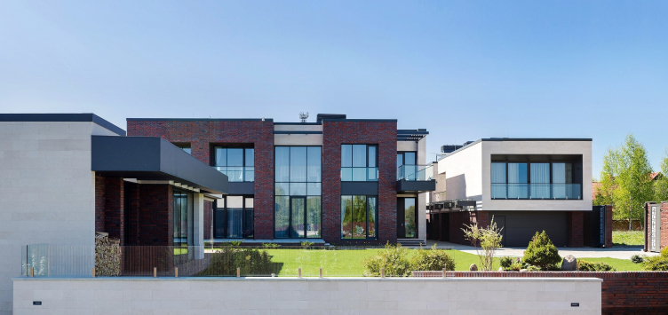
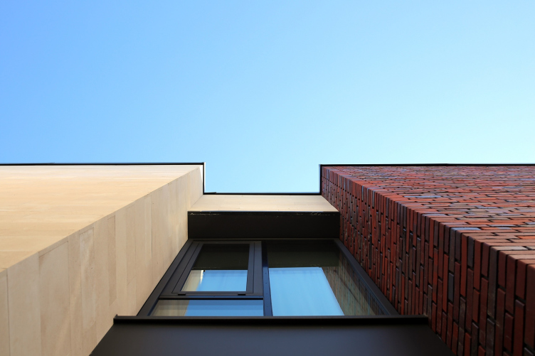
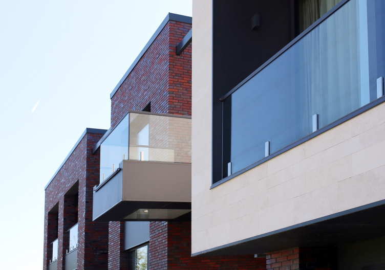
The house turned out to be strict, orthogonal, but far from simple. The Mix Stanislavsky, consisting of eight types of bricks of different colors and shapes, among which there was even a curvilinear shape, was taken as a sample for wall facing. The architects offered their mix of German Klinker bricks. They also employed a special type of brickwork: the brick is suspended and stitched – the owner of the house himself took an active part in perfecting this technology and achieved a high quality of craft. The same quality is read throughout the whole house: in the glass fences of balconies and terraces, metal structures, stone cladding, furniture and other equipment custom-designed by architects.

P-House countryside residence © Fourth Dimension


P-House countryside residence © Fourth Dimension


P-House countryside residence © Fourth Dimension


P-House countryside residence © Fourth Dimension


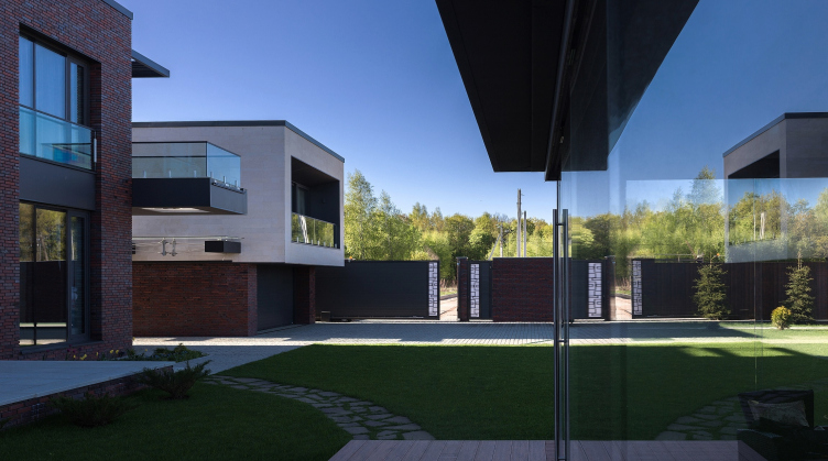
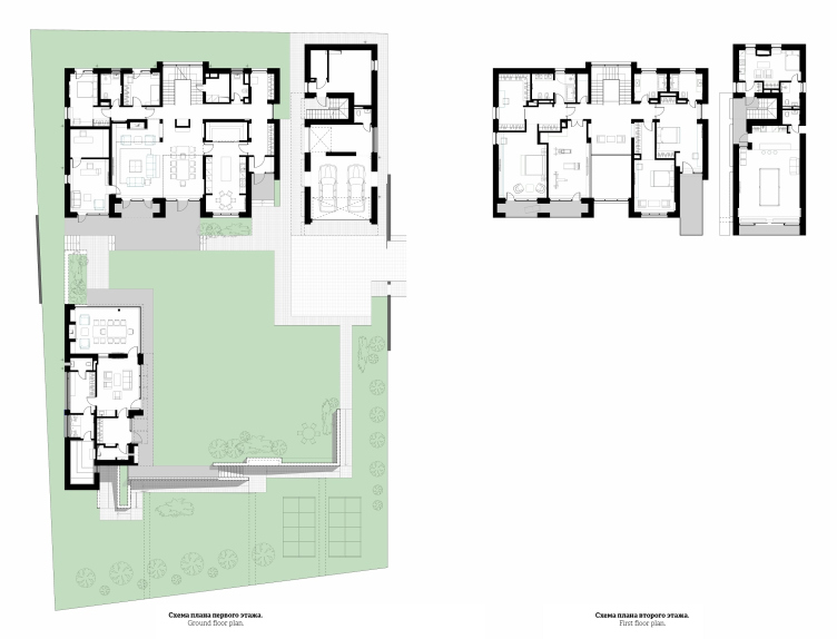
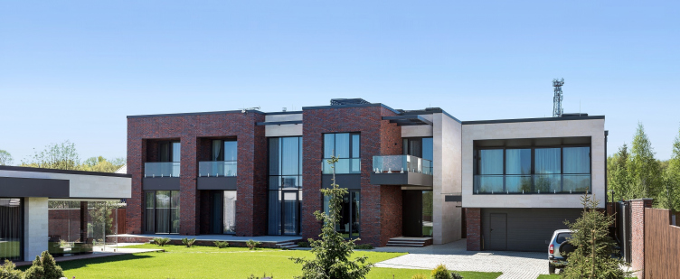
The house is intended for permanent residence of three generations of the family. The land is located near the village of Slavino, founded by the renowned eye surgeon Fedorov, near the ski slope on Dmitrovka, where the authors would ski and snowboard during their college years. The plot is sloping towards a ravine, a stream flowing below. The house essentially consists of three parts – the main building, the guard house with a garage on the first floor, and a bath. On the master plan, the buildings form an “L”, creating a natural boundary for a courtyard. The main building stands at the top, on the western edge of the site, the recreational part with a bathhouse hangs over the stream, with magnificent views that one can admire from the height of the slope. The upper part of the yard is a lawn designed for outdoor activities, the lower part is a vegetable garden for the older folks.

P-House countryside residence © Fourth Dimension


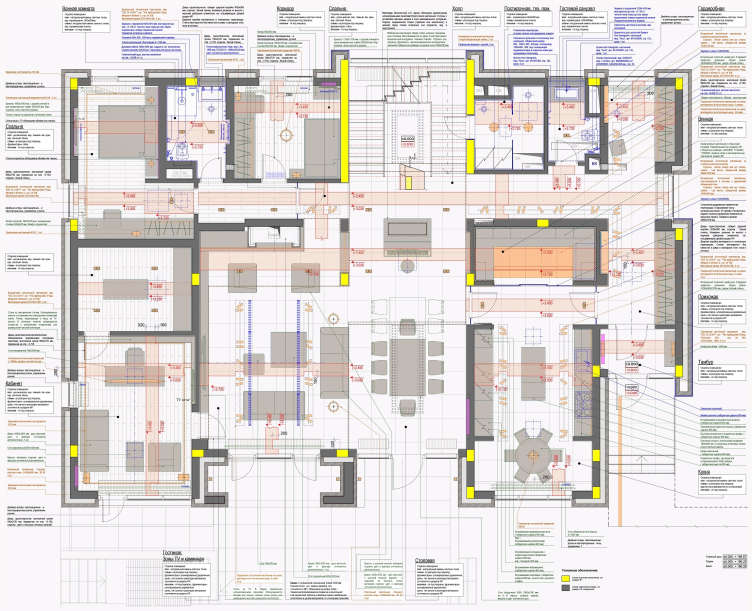
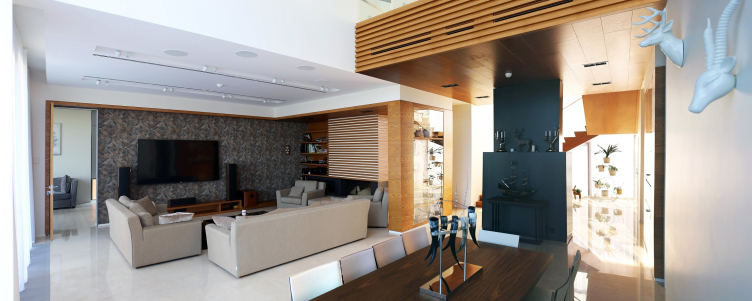
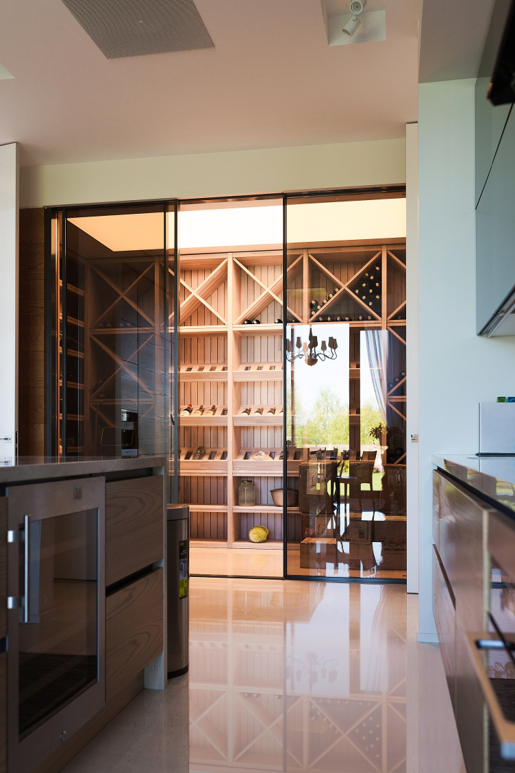
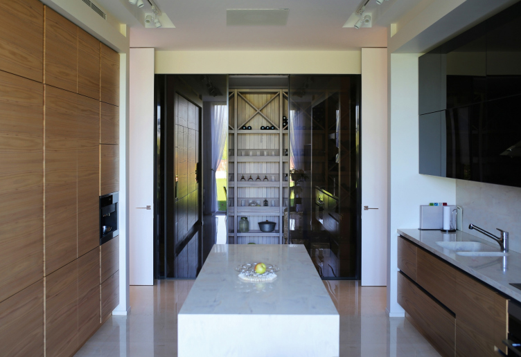
The layout of the main house is built as a suite of rooms located along the courtyard and having exits to it. There is a front kitchen with a wine room, a double-height dining room, a fireplace and an office. A corridor separates the front suite from the older generation and guest bedrooms; access to the bedroom part can be blocked if it is necessary for someone to relax. The corridor ends on two sides with windows, i.e., the house gets light from north to south here. The central double-height dining room with a huge stained glass window overlooks the courtyard, and there a staircase with a window across from it. Thus, the sunlight “pierces” the house crosswise: from north to south and from west to east. Another west-east light axis is located opposite the glass entrance, on the right side of the house, that is, the entrance is “to the light”. So the spaces do not just flow into each other – a whole dedicated “light” scenario has been written here.

P-House countryside residence © Fourth Dimension


P-House countryside residence © Fourth Dimension


P-House countryside residence © Fourth Dimension


P-House countryside residence © Fourth Dimension


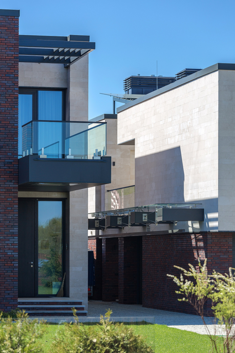
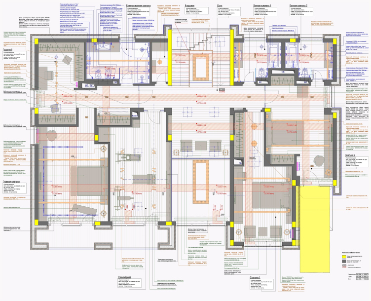
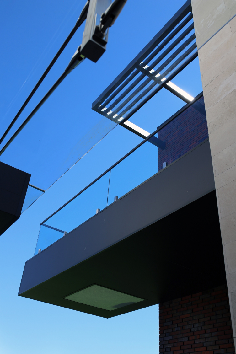
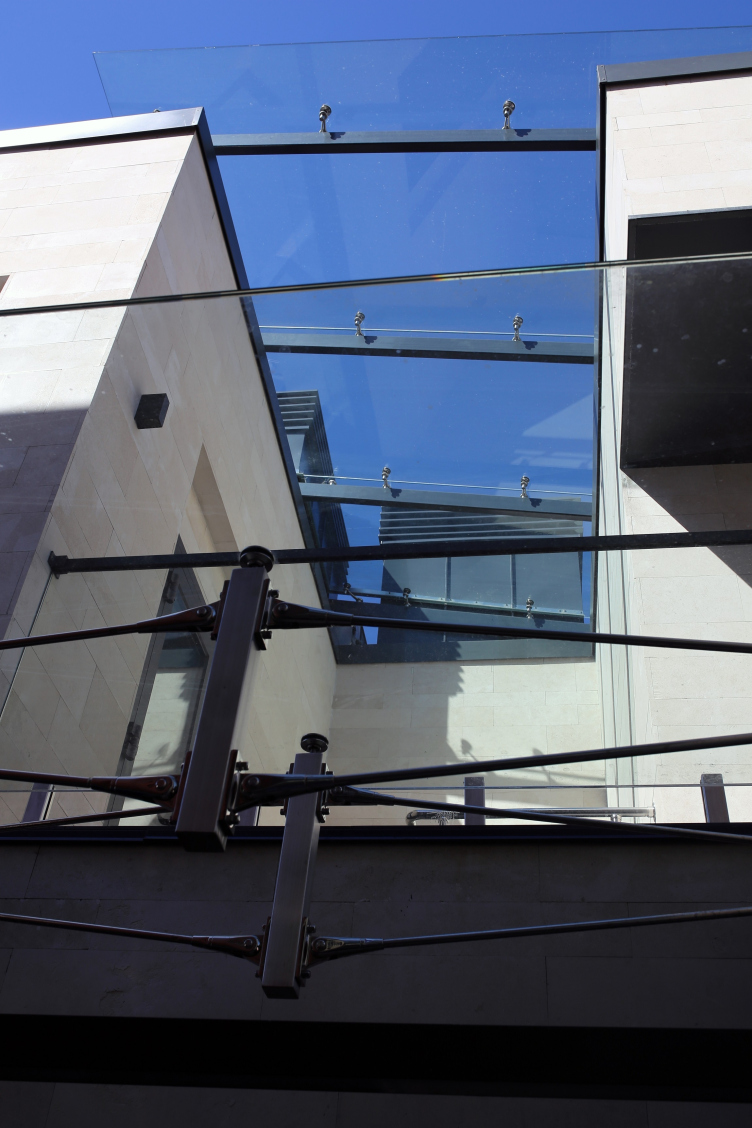
On the second floor there are master and children’s bedrooms, a master’s office, a gym, opening onto a double-height living room with a balcony. All the bedrooms are facing the courtyard with their windows to the floor and stanzas with glass fencing. And from one of the bedrooms you can go to a cantilevered balcony, which hangs over the main entrance suspended on cables. The cantilevered structure with a glass enclosure and a glass canopy is a very dramatic element in the composition of the house. In addition to underlining the entrance, it is an energetic gesture, an exclamation mark: not for the sake of function, but for the sake of aesthetics. There is a glass rectangle in the floor of the balcony. Again, not only to let in the light, but also for adrenaline: walking on the glass is invigorating.

P-House countryside residence © Fourth Dimension


P-House countryside residence © Fourth Dimension


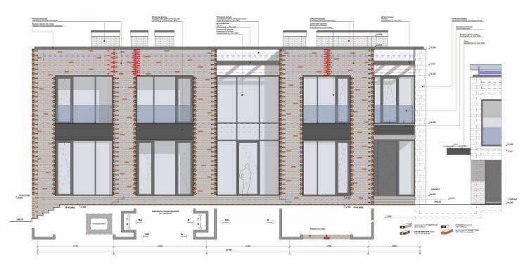
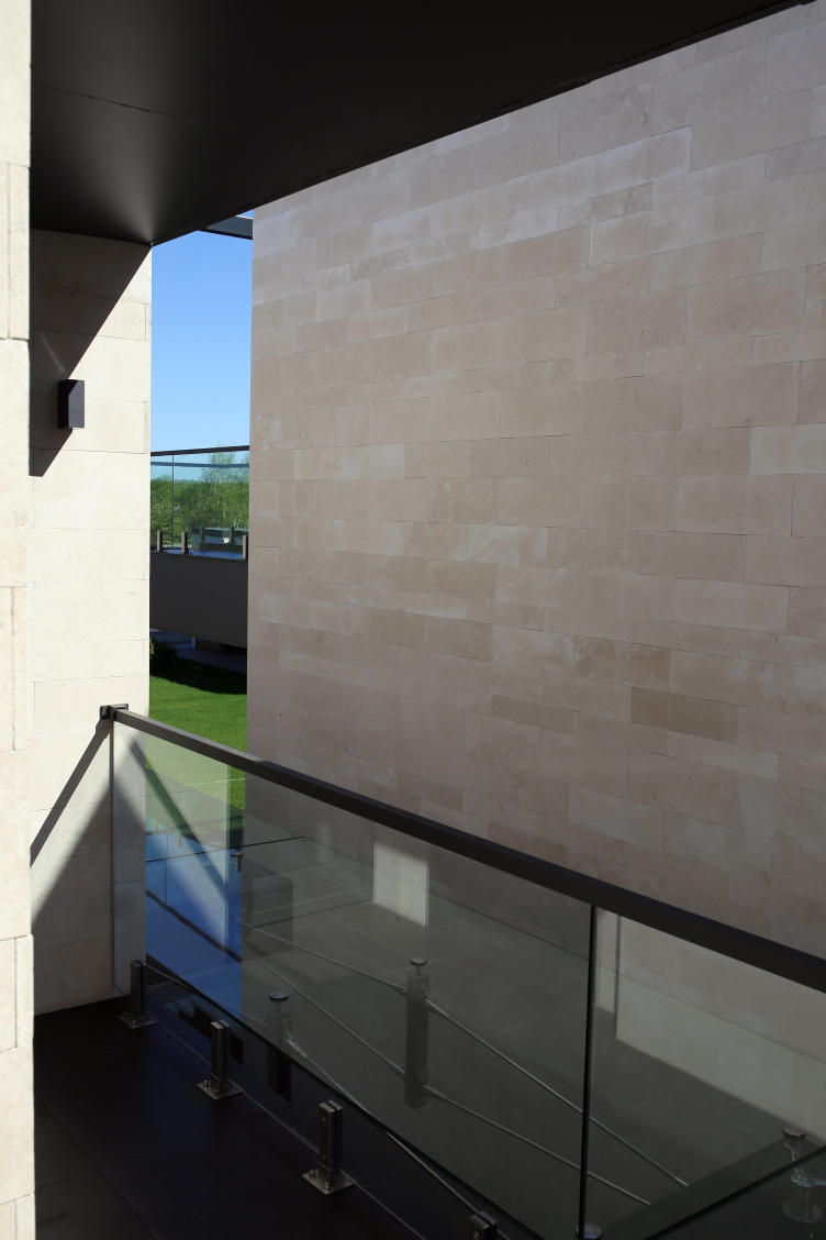
In general, the composition of the house is quite curious. Despite the orthogonality and seeming simplicity, the house turned out to be very rich plastically, multilayered and even dramatic. Due to the selected building materials – dark brick, light limestone and ferrous metal, as well as glass, which is more likely to be responsible for dematerialization, for “pauses”, there are feelings of contrasting and mutual penetration of red and white volumes. This “war of red and white” creates a special intrigue. The surface itself is also interesting. The main courtyard facade reflects the internal structure, it has brick “projections” and glass gaps, the division corresponding to the rooms. The projections, in turn, are deepened with stanza balconies trimmed with black metal, as well as a black metal balcony-accent above the entrance.

P-House countryside residence © Fourth Dimension


P-House countryside residence © Fourth Dimension


P-House countryside residence © Fourth Dimension


P-House countryside residence © Fourth Dimension


P-House countryside residence © Fourth Dimension


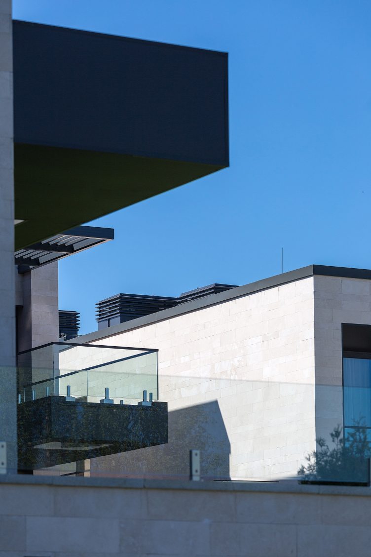
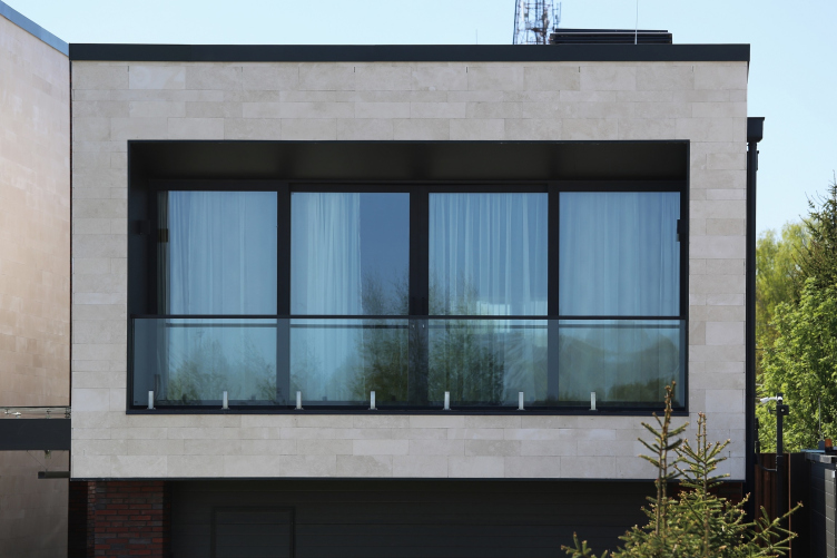
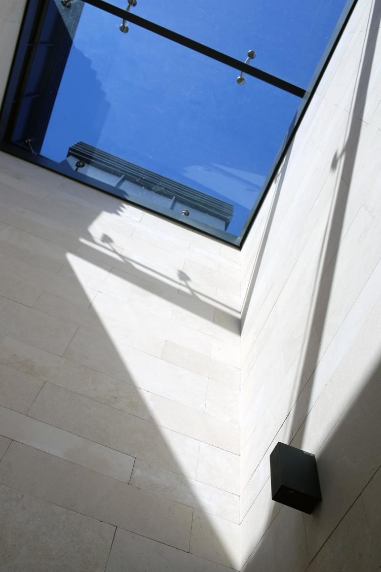
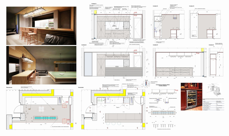
To the right of the main building there is a guard house (of a slightly smaller height) lined with limestone. This is a conditional name because most of the second floor is essentially a billiard room with a bar and a balcony. It is facing the garden, just like the other rooms of the owners of the house, and the security room looks outward in accordance with its function. The space between the main building and the guard house is a kind of architectural feast for one’s eyes; it is complex, the authors admire the dialectic of mass and space, heavy and light, material and transparent, and flawless connection of different units. There is a feeling that the temperament of architects does not fit into the scale of a country house, and the same plastic themes could just as well be developed in a larger form.

P-House countryside residence © Fourth Dimension


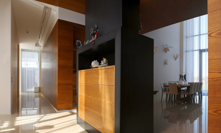
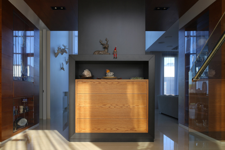
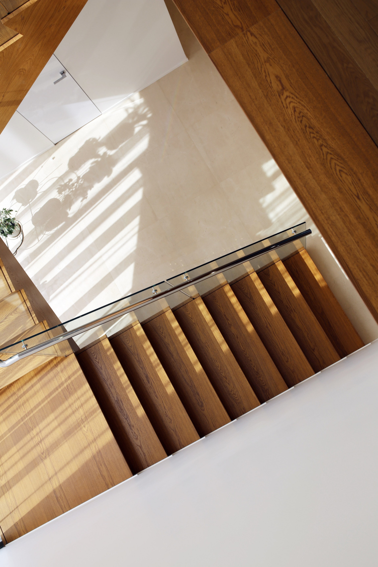
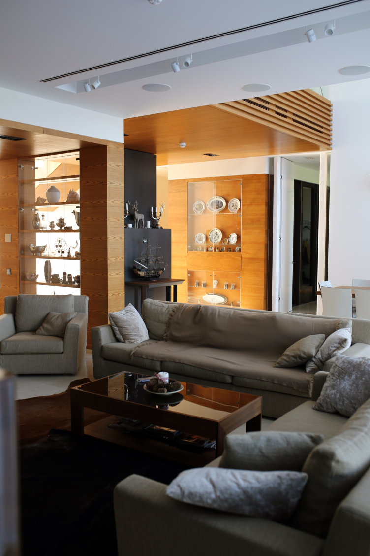
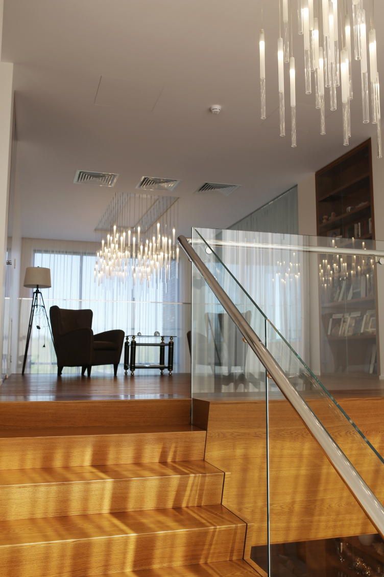
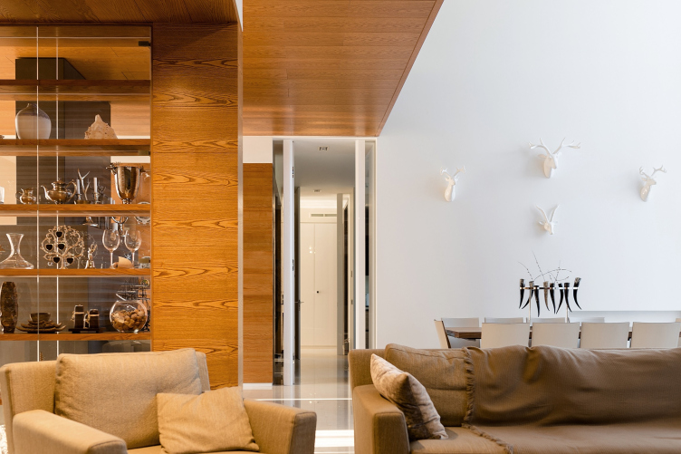
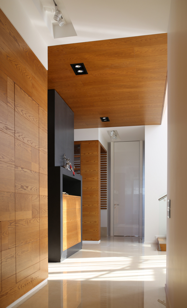
In the sauna house, besides the sauna itself, there is a recreation room, changing rooms, summer and winter terraces. Its interior, in contrast with the dark brick of the façade, is dominated by light wood (oak and walnut). The stairs, doors, fireplace, and storage systems were designed by architects specifically for this house. Many elements of the interior are lined with oak panels. The floors are finished with solid wood and natural stone. This is a “masculine” interior: the emphasis is laid on the architectural elements, and not on draperies and decorations. According to Mikhail Kanunnikov, the client was very tactful of the architects’ work, and introduced his things into the house very delicately, so that even after a year of his life the architectural concept was preserved almost in its original form.
P-House countryside residence © Fourth Dimension


11 December 2018

Headlines now
The Golden Crown
The concept for a dental clinic in Yekaterinburg, developed by CNTR Studio, revolves around the idea of a “mouth full of gold”: pristine white porcelain stoneware walls are complemented by matte brass details. To avoid an overly literal interpretation, the architects focused on the building’s proportions, skillfully navigating between sunlight requirements and fire safety regulations.
Flexibility and Integration
Not long ago, we covered the project for the fourth phase of the ÁLIA residential complex, designed by APEX. Now, we’ve been shown different fence concepts they developed to enclose the complex’s private courtyards, incorporating a variety of public functions. We believe that the sheer fact that the complex’s architects were involved in such a detail as fencing speaks volumes.
A Step Forward
The HIDE residential complex represents a major milestone for ADM architects and their leaders Andrey Romanov and Ekaterina Kuznetsova in their quest for a fresh high-rise aesthetic – one that is flexible and layered, capable of bringing vibrancy to mass and silhouette while shaping form. Over recent years, this approach has become ADM’s “signature style”, with the golden HIDE tower playing a pivotal role in its evolution. Here, we delve into the project’s story, explore the details of the complex’s design, and uncover its core essence.
Gold in the Sands
A new office for a transcontinental company specializing in resource extraction and processing has opened in Dubai. Designed by T+T Architects, masters of creating spaces that are contemporary, diverse, flexible, and original, this project exemplifies their expertise. On the executive floor, a massive brass-clad partition dominates, while layered textures of compressed earth create a contextually resonant backdrop.
Layers and Levels of Flight
This project goes way back – Reserve Union won this architectural competition at the end of 2011, and the building was completed in 2018, so it’s practically “archival”. However, despite being relatively unknown, the building can hardly be considered “dated” and remains a prime example of architectural expression, particularly in the headquarters genre. And it’s especially fitting for an aviation company office. In some ways, it resembles the Aeroflot headquarters at Sheremetyevo but with its own unique identity, following the signature style of Vladimir Plotkin. In this article, we take an in-depth look at the United Aircraft Corporation (UAC) headquarters in the Moscow agglomeration town of Zhukovsky, supplemented by recent photographs from Alexey Naroditsky – a shoot that became only recently possible due to the fact that improvements were finally made in the surrounding area.
Light and Shadow
In this article, we delve into the architectural design of the “Chaika” house by DNK ag architects, which was recently completed in 2023 as part of the collection of signature designs at ZILArt. As is well-known, all the buildings in this complex follow a design code, yet each one is distinct. This particular building stands out not only for its whiteness and minimalism but also for the refined use of a limited number of techniques that, together, create what can confidently be called synergy.
Casus Novae
A master plan was developed for a large residential area with a name of “DNS City”, but now that its implementation began, the plan has been arbitrarily reformatted and replaced with something that, while similar on the surface, is actually quite different. This is not the first time such a thing happens, but it’s always frustrating. With permission from the author, we are sharing Maria Elkina’s post.
Treasure Hunting
The GAFA bureau, in collaboration with Tegola and Arkhitail, organized an expedition to the island of Kilpola in Karelia as part of Moskomarkhitektura’s “Open City” festival. There, amidst moss and rocks, the students sought answers to questions like: what is the sacred, where does it dwell, and what sustains it? Assisting the participants in this quest were landscape engineer Evgeny Levin, artist Nicholas Roerich, a moose, and the lack of cellular connection. Here’s how the story unfolded.
Depths of the Earth, Streams of Water
In the Malaya Okhta district, the Akzent building, designed by Stepan Liphart, was constructed. It follows a classic tripartite structure, yet it’s what you might call “hand-drawn”: each façade is unique in its form and details, some of which aren’t immediately noticeable. In this article, we explore the context and, together with the architect, delve into how the form was developed.
Fir Tree Dynamics
The “Airports of Region” holding is planning to build an airport in Karachay-Cherkessia, aiming to make the Arkhyz and Dombay resorts more accessible to travelers. The project that won in an invitation-only competition, submitted by Sergey Nikeshkin’s KPLN, blends natural imagery inspired by the shape of a conifer seed, open-air waiting spaces, majestic large trees, and a green roof elevated on needle-like columns. The result is both nature-inspired and WOW.
​A Brick Shell
In the process of designing a clubhouse situated among pine trees in a prestigious suburban area near Moscow, the architectural firm “A.Len” did the façade design part. The combination of different types of brick and masonry correlates with the volumetric and plastique solutions, further enhanced by the inclusion of wood-painted fragments and metal “glazing”.
Word Forms
ATRIUM architects love ambitious challenges, and for the firm’s thirtieth anniversary, they boldly play a game of words with an exhibition that dives deep into a self-created vocabulary. They immerse their projects – especially art installations – into this glossary, as if plunging into a current of their own. You feel as if you’re flowing through the veins of pure art, immersed in a universe of vertical cities, educational spaces – of which the architects are true masters – and the cultural codes of various locations. But what truly captivates is the bold statement that Vera Butko and Anton Nadtochy make, both through their work and this exhibition: architecture, above all, is art – the art of working with form and space.
Flexibility and Acuteness of Modernity
Luxurious, fluid, large “kokoshniks” and spiral barrel columns, as if made from colorful chewing gum: there seem to be no other mansion like this in Moscow, designed in the “Neo-Russian-Modern” style. And the “Teremok” on Malaya Kaluzhskaya, previously somewhat obscure, has “come alive with new colors” and gained visibility after its restoration for the office of the “architectural ecosystem” as the architects love to call themselves. It’s evident that Julius Borisov and the architects at UNK put their hearts into finding this new office and bringing it up to date. Let’s delve into the paradoxes of this mansion’s history and its plasticity. Spoiler: two versions of modernity meet here, both balancing on the razor’s edge of “what’s current”.
Yuri Vissarionov: “A modular house does not belong to the land”
It belongs to space, or to the air... It turns out that 3D printing is more effective when combined with a modular approach: the house is built in a workshop and then adapted to the site, including on uneven terrain. Yuri Vissarionov shares his latest experience in designing tourist complexes, both in central Russia and in the south. These include houseboats, homes printed from lightweight concrete using a 3D printer, and, of course, frame houses.
​Moscow’s First
“The quality of education largely depends on the quality of the educational environment”. This principle of the last decade has been realized by Sergey Skuratov in the project for the First Moscow Gymnasium on Rostovskaya Embankment in the Khamovniki district. The building seamlessly integrates into the complex urban landscape, responding both to the pedestrian flow of the city and the quiet alleyways. It skillfully takes advantage of the height differences and aligns with modern trends in educational space design. Let’s take a closer look.
Looking at the Water
The site of Villa Sonata stretches from the road to the water’s edge, offering its own shoreline, pier, and a picturesque river panorama. To reveal these sweeping views, Roman Leonidov “cut” the façade diagonally parallel to the river, thus getting two main axes for the house and, consequently, “two heads”. The internal core – two double-height spaces, a living room and a conservatory, with a “bridge” above them – makes the house both “transparent” and filled with light.
The White Wing
Well, it’s not exactly white. It’s more of a beige, white-stone structure that plays with the color of limestone – smoother surfaces are lighter, while rougher ones are darker. This wing unites various elements: it absorbs and interprets the surrounding themes. It responds to everything, yet maintains a cohesive expression – a challenging task! – while also incorporating recognizable features of its own, such as the dynamic cuts at the bottom, top, and middle.
Urban Dunes
The XSA Ramps team designed and built a three-part sports hub for a park in Rostov-on-Don, welcoming people of all ages and fitness levels. The skate plaza, pump track, and playground are all meticulously crafted with details that attract a diverse range of visitors. The technical execution of the shapes and slopes transforms this space into a kind of sculptural composition.
Proportional Growth
The project for the fourth phase of the ÁLIA residential area has been announced. The buildings are situated on an elongated plot – almost a “ray” that shoots out from the center of the area towards the river. Their layout reflects both a response to Moscow’s architectural preferences over the past 15 years, shifting “from blocks to towers”, and an interpretation of the neighboring business park designed by SOM. Additionally, the best apartments here are not located at the very top but closer to the middle, forming a glowing “waistline”.
The “Staircase” Building
In designing the “Details” residential complex in New Moscow, Rais Baishev spiced up the now-popular Moscow theme of a “courtyard” building with an idea drawn from the surrealist drawings by Maurits Escher. He envisioned the stepped silhouettes and descending slopes as a metaphysical mega-staircase, creating a key void within the courtyard that gave the project an internal “spine”. This concept is felt both in the building’s silhouette and on its façades.
Projection of the Quarter
No one doubted that the building that Vladimir Plotkin designed as part of the “Garden Quarters” would be the most modernist of all. And it turned out just that way: while adhering to the common design code, the building successfully combines brick and white stone, rhythmically responding to the neighboring building designed by Ostozhenka, yet tactfully and persistently making a few statements of its own. This includes the projection of the ideal urban development composition “14–9–6”, which can be found right next door, mathematical calculations, including those for various types of terraces (and perhaps the only reminder of the Soviet past of the Kauchuk rubber factory!), and the white “cross-stitch” pattern of the façade grid.
Domus Aurea
In this issue, we examine the “Tessinsky-1” house, designed by Sergey Skuratov and completed in 2023. Located in the middle of the Serebryanicheskaya Embankment district, at the intersection of its main streets, this house assumes a sort of “nodal” role: it not only responds to everything around it and preserves many memories of the former EMA factory within itself, but it weaves all this into a newly directed pattern, reconciling bright “gold” and dark-colored brick, largely with the help of the new, modern-yet-archaic Columba brick, which, come to think about it, is the most precious element here.
The Chimney of Nikola-Lenivets
In this issue, we are examining the “Obelisk House” designed by KATARSIS and built for the Arkhstoyanie 2023 festival. However, it was only finished later on, and this is why we are examining it now. It seems to us that after the “Obelisk House” appeared in Nikola-Lenivets, a dialogue and a few inner connections appeared between the temporary structures built here. These houses no longer look like “accidental neighbors”, more of which below.
​Periscope by the Bay
The jury awarded the second place in the competition for a public and cultural center in Petropavlovsk-Kamchatsky to the companies GORA (“Mountain”) and M4. In the consortium’s proposal, the building resembles a sperm whale with a calf swimming next to it or a periscope, whose lenses capture the most spectacular views from the surrounding landscape.
From Arcs to Dolmens
While working on the competition project for Petropavlovsk-Kamchatsky, ASADOV Architects prioritized the value of the natural and urban environment, aiming to preserve the balance of the location while minimizing the resemblance of the volume that they designed to a “traditional building”. The task was challenging, and the architects created three versions, one of which having been developed after the competition, where their main proposal took third place. However, the point of interest here is not the competition result but the continuity of creative thinking.
Hide and Seek
The ID Moskovskiy house, designed by Stepan Liphart in St. Petersburg, in the courtyards near Moskovskiy Avenue beyond the Obvodny Canal and recently completed, is notable for several reasons. Firstly, it has been realized with considerable accuracy, which is particularly significant as this is the first building where the architect was responsible not only for the facades but also for the layouts, allowing for better integration between the two. On the other hand, this building is interesting as an example of the “germination” of new architecture in the city: it draws on the best examples from the neighborhood and becomes an improved and developed sum of ideas found by the architect in the surrounding context.
The Big Twelve
Yesterday, the winners of the Moscow Mayor’s Architecture Award were announced and honored. Let’s take a look at what was awarded and, in some cases, even critique this esteemed award. After all, there is always room for improvement, right?
Above the Golden Horn
The residential complex “Philosophy” designed by T+T architects in Vladivostok, is one of the new projects in the “Golubinaya Pad” area, changing its development philosophy (pun intended) from single houses to a comprehensive approach. The buildings are organized along public streets, varying in height and format, with one house even executed in gallery typology, featuring a cantilever leaning on an art object.
Nuanced Alternative
How can you rhyme a square and space? Easily! But to do so, you need to rhyme everything you can possibly think of: weave everything together, like in a tensegrity structure, and find your own optics too. The new exhibition at GES-2 does just that, offering its visitor a new perspective on the history of art spanning 150 years, infused with the hope for endless multiplicity of worlds and art histories. Read on to see how this is achieved and how the exhibition design by Evgeny Ace contributes to it.
Blinds for Ice
An ice arena has been constructed in Domodedovo based on a project by Yuri Vissarionov Architects. To prevent the long façade, a technical requirement for winter sports facilities, from appearing monotonous, the architects proposed the use of suspended structures with multidirectional slats. This design protects the ice from direct sunlight while giving the wall texture and detail.